14 July 2021

Portland Winterhawks Debut A Superb New Logo

3964

As is being reported by various news outlets, such as KGW, here, Portland's WHL hockey franchise, the Winterhawks, are updating their logo and entire graphic identity system.

It's a timely change. I doubt it's escaped the notice of anyone likely to read this blog, but the growing awareness of cultural appropriation and what it means in today's society is an issue that we must meet in some way. The professional sports world, which has in the past helped itself fairly readily to cultural symbols from, in a great amount, indigenous First Nations cultures, has met it in a variety of ways ranging from embracing the change to obstinately resisting it. 

The Winterhawks' now-former logo is problematic for at least two reasons: the image itself being a First Nations warrior, and the method of original adoption - back in tthhe 1970s, the team originally had to scrounge for uniforms, and some surplus Chicago Blackhawks uniforms were available, and the team apparently just rolled with the design.

The logo and identity redesign released today meets the challenge of sports team identity in the modern age where casual cultural appropriation is an issue rather admirably, I think. The new main logo ...


.... divorces itself from the old in a way that is positive and aspriational, really. The head of a red-tail hawk, colored white to reflect snow and ice, the detail in the head feathers acknolwedging the past in a positive manner, the stylized mountain, even the artful concealing of the letters W and H in the mountain's detail. There is much to like about this logo, and a perfect time for its introduction to have a positive impact.

There is more to the identity system than this; a whole range of wordmark and palette design changes that are throrough and thoughtful. It's most impresssive, and can be seen via a link to a Scribd file at the KGW story which I've linked here: https://www.kgw.com/article/sports/hockey/winterhawks/portland-winterhawks-replace-native-american-logo-mascot-unveil-new-logo/283-a2266c1c-671e-4a6e-89bc-05892b0f6af6


11 July 2021

Tackling The Elephant, Part 3

3963

It's an unanswerable question, I suppose, and everyone who fancies themselves artists asks themselves something similar: 

It was such a simple step. What took me so long?

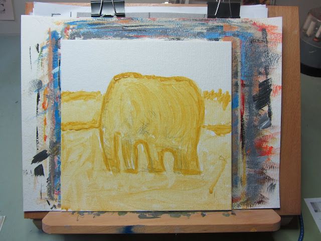
Today I took that yellow ochre sketch and added burnt sienna for the shadow areas, and the form rose off the canvasboard to meet my eye.


The point of the work is to explore using directed strokes to impart a feeling of volume and I'm actually fairly thrilled to be able to say to myself that I have grasped that just a bit. 

Burnt sienna also for the shadow under the elephant and darkening in the trees in the distance.

This is the warm underpainting that will support the cooler colors I'll by layering atop ... for which stay tuned anon.

09 July 2021

Tackling The Elephant, Part 2

3962

I like this silhouette bit more than the last time I did it. A lot more. 


I am trying to copy as close the original as I can. I was unhappy at first, with my inability to sketch this out using paint and then I had trouble thinning stuff out to the way I wanted it.

It's still not perfect. But it's better.

07 July 2021

At Last I Try To Tackle The Elephant

3961

Over a year and a half before this, I was working through a book called Learn to Paint in Acrylics With 50 Small Paintings. I got up to number 46, a painting of an elephant that explores contour painting techniques. And it was at that point that, for some reason, even though I had absorbed many of the techniques well, or so I had thought, I ran into the wall I ran into so very many times.

It's not a wall so much as a fog that pushes back. I can spend time dissecting it but knowing what stopped me wouldn't have done much more than given me labels for it all. If you're trying to reinvent yourself as an artist, you know what I'm talking about without another word and I can't find one anyway.

So it all sat there on my drawing board for more than a year, waiting for me to get back to it, while I did PBNs, wasted time off a dwindling life span (statistics being what they are) and letting my social media addiction get the best of me. Not that different from the billions of self-made aspiring artists in the virtual world, really.

I thought about the idea of shortcuts and assists, then. It occurred to me one of the things I didn't like about that first attempt at this was I couldn't sketch out the shape in yellow ochre and feel confident about it; the harder I tried, the sourer it felt. This, I theorize, is what pushed me off the track and landed me straight in the mud. And all the inertia and ennui followed.

It occurred to me that I didn't have to be flawless about my sketching to start and further, I already knew techniques that would allow me to transfer a reference to the media. It was so simple! It just involved, in this case, printing a copy of a scan from the page, coating the back of it with soft graphite (4B Prismacolor Monolith, for what that's worth) laying the print on my media (still the eight-by-eight canvasboard) and rubbing.

A bone folder from my GD days did the burnishing duty. This is what I have:


That light gray pattern is a basic outline concentrating on the shadow areas. It should be enough to get me started, again.

Wish me luck.

The Ancient Tome Has Been Recovered

3960

The secrets. I has them now. THE SECRETS ARE MINE.

The book: Editorial Cartooning. The author: Dick Spencer III, School of Journalism, State University of Iowa. Published by The Iowa State College Press, 1949. 

Since I've managed to acquire just about every modern art technique book I'm likely to want I have begun to be fond of vintage art instruction books. Bob Ross, Mark Crilley, Christopher Hart, all those, have defined this genre, but even they stand on others' shoulders: Jon Nagy, Bill Alexander, and others. Those forbears are oftimes as interesting as their intellectual descendants. 

Never heard of this Dick Spencer III guy, though. I intend to find out. Important enough to author a college-published book about the subject. 

I have some suspicion that the secrets may be beyond their pull-dates though.

05 July 2021

Trippy Walk Signal With SPC Firefly Lights

3959

This is, of course, one of my new favorite things. Credit the Brown Eyed Girl with the inspiration.


What happens here is you take one of those little 30-ct mulit-function silver-cord firefly lights that Sierra Pacific Crafts makes, and if you're lucky you have one of these lenses from a vintage crossing signal, and you just set the lights up behind it and let it go. The frosted glass in the translucent parts do the job they were intended to and the result is a very gentle trippiness.

There's a story behind that piece of glass. Back when Bill Trafton owned the VW shop at 157th and Stark, his shop was a gallimaufy of the sort you'd expect a mechanic of his calibre who's been in business for multiple decades to have. And he, for no clear reason but much gratitude from me, laid this upon me. The Brown Eyed Girl had the lights and realized that putting the two together was a natural thing. 

Trafton VW still exists, but really just as a name. A few years back, Bill retired at long last and a European auto repair operation called Steve's Imports (their main office is down on SE 92nd between the Springwater Trail crossing and the light at Flavel. When they bought Trafton's they brought a slick, shiny operation in and moved all the old-school groove out.

Now, don't get me wrong ... I'll bet they do superlative work, and probably with prices to match. Bill Trafton was the kind who'd have a VW boneyard in the back and give you a copy of Muir's Idiot's Guide or maybe even spot you the price on an expensive repair. 

He had that old-school VW spirit, and was a one-of-a-kind guy. The new operators are professionals and good at what they do ... but nowhere near as charming. 

So it goes.

A Couple Of Other Things I Love About I've Been Framed

3958

... and they are that ladykin and that window sign.


The ladykin has haunted the front part of the store for nearly a decade I think, and I first met that delightful window sign in about 2012. Mark told me a little story about it, that it was painted by another IBF fan based on a Banksy work. I just like the wittiness of it, the way it reminds me of a magazine cover, and the sassy little thanks a lot! in the lower left corner.

The back wall, I recognize; it's left of entrance as you come in ... well, when you could come in, pre-pandemic. I understand Prairie and the staff are re-thinking the store layout to make it more traffic-friendly; the idea, if I understand it correctly, is to make it so people can browse and also put some of that social-distancing logic in.

Since everything is opening up I was hoping to hear the same sort of thing coming out of my beloved IBF, but there's been nothing ... yet. And I support this, because Prairie knows best. 

The picture, for what it's worth, was taken sometime in 2017. So near in the past yet so very far away.

03 July 2021

Division and 122nd Standard Time

3957

This is a clock tower at the southwest corner of SE 122nd Avenue and Division Street, as seen from Division, going east. The Division Center, a rubric with a sort of awkward poetry to it, refers to the shopping center it serves as a landmark for. 

The building was Payless ShoeSource for a long time before it was a cell phone store. In my fantasies, it's an art supply store run by me and my wife.


We have two clocktowers on SE 122nd Avenue. One is at the Mighty Mighty Midland Branch Library, the other, here. They have one thing in common. The correct time would not be that thing.

This photo was taken at about 8:20 PM, last Wednesday. That is not, as it can be seen, the time on the face of the clock. There is little doubt in my mind that, had we gone down 122nd and the library clock would have also been askew. Not the same way, of course; that would give away the conspiracy of ... something, somehow. 

See, Out 122nd Way, you can have accurate time, or cool clock towers.

You cannot, apparently, have both.

02 July 2021

Saturday Market Buskers, May, 2010

3956

Performing in front of the Skidmore Fountain where SW 1st Avenue and Ankeny Street come together.

A May afternoon in the year 2010. 

I can't remember what music they were playing, but judging by the instruments involved, that combo needed some authentic courage.

First and Ankeny exist on a boundary of the old original town of Portland on the south and the Couch tract on the north; streets change direction at that point from aligning with the river, which trends NNE-SSW, to roughly aligning with the North Star. And it kind of shows; Ankeny is an incredibly skinny street, and First jogs its way through. The result is a delightfully oddly shaped space where the streets almost, but not quite, align. Were it now for the MAX tracks running through it would be a most lovely public square.

We have a block in town we locals nicknamed "Pioneer Square", but it's full name is Pioneer Courthouse Square, named for the building that overlooks it from the east, and despite a similar rubric, it has no spiritual congruence with Seattle's Pioneer Square.

There is a place in Portland that feels like Seattle's Pioneer Square, though ... it's the Skidmore Fountain.