31 May 2008

[teh_funnay] I Got Nuthin' Today ... Except Gorgeous Tiny Chicken Machine Show!

1582.


With this episode's victim special guest star Wil Wheaton as superagent Mushy Shorts Moishe Schwartz:


(PS: Dances real close to the NSFW line. Will probably leave you with the "Uh-Oh" feeling. Otherwise, Funnay As 7734).


You know what gives me the "Uh-oh" feeling? Unicow. That's what gives them the "Uh-Oh" feeling.


Tags: , , , , ,


Powered by Qumana


29 May 2008

[design] Business Card Critique: BestBusinessCards.com

1581.


After reading my Cavalcade of Business Cardage in this missive, we got one submitted for our considered, thoughtful opinion.


Hmm, we thought. Considered and thoughtful? Now, that's a new approach! Let's take a look, shall we?


Mark Marston ID's himself as the fellow behind BestBusinessCards.com, and in his letter to us, said:


We make laminated style business cards that are credit card sized with rounded corners. The look and feel is one of quality and almost always prompts a "Wow, nice card" response. Website address is below. Also attached is my business card, front and back.


Also,


Feel free to critique.


Oh, boy. Let's go to work.


Here's the front of his card:


Mark Marston Card Front


This is one of the hardest-working cards I've seen yet.


It's long been my opinion that blazing full color cards with extensive photography are pretty much the dog's breakfast. I'm not changing my opinion quite yet. The problem with it is that it gives the impression (to me, this is completely subjective) that it's a person who finally got a business and wants to impress you into oblivion with it. Either that, or its a real estate agent.


But if you're going to go this route, it's important that you at least make it work. Visual cards such as this are very very busy ... there's a lot for the eye to scan and the brain to digest. Does the card work? In my opinion, it does. If a welter of color photography is an excess, then the rest has to be dialed back a bit in order to compensate, and this does that by keeping the info down to the utterly necessary on the front: business name, employee name, position, one phone number, one web contact (the email­ – the company name suggests what the website address must be).


The number of fonts is kept relatively low (three); what looks like Copperplate for the name, Friz Quadrata for the rest of the info. The font that the company name appears to be in, which looks like a Times variant, I'd change that, maybe to the same Friz Quadrata that the rest of the contact info is in. The problem with using Times is that many people use it because everyone else uses it, making it the default. A default look kind of says that no actual design happened here.


The yellow outer glow around the company name makes me twitch just a little, but you've got to do something or the dark type gets lost against the light background. The palette of the photography itself is actually pretty well chosen – the light blue of the background and the light flesh tones make it all rather kind on the eyes. The contact information is rather cleverly formatted into the hand, and instead of just jamming the company's catalog on the card, the photography actually tells the story of the product in an active way.


Ample negative space allows for an uncrowded feeling, which improves the communication on the card.


And now, the back:


Marston Card Back


This is where all the verbiage and extended contact stuff go. This is a canny way to go about it. If you want to include a lot of info about what you and your business card mean, then the back is a perfect place to have it ... and a lot of companies will print both front and back for you. While a typeface that would be in harmony with the type on the front would be the best way to go, choosing a different font (as long as it were simple, like this) wouldn't completely be amiss. Choosing a font that works with the others would unify the piece however.


The big message I'm getting on this one is the quality of the stock. I haven't checked their site for prices, but regardless of the design on the card, it looks like you'll get a highly-classy product to hand around (it's kind of funny to hear a business card described as "high performance", but I understand what they're trying to say here).


The idea of getting a business card that has the durability and feel of an ID card does indeed have some attraction however.


Tags: , , , ,


Powered by Qumana


[hoaxen] You Know, That Had Me Wondering Too.

1580.


Via Dale at Faith In Honest Doubt I learned that the so-called "Biggest Drawing In The World", in which Swede Eric Nordenankar claimed to use a GPS-enabled package as his stylus and the world as his drawing paper is a hoax.


I'm not going to claim that I'm any more insightful than anyone else; indeed, in the beginning I was as impressed as anyone else. It certainly seemed possible. We know DHL goes all over the place; we know that GPS is what it is.


It's like Johnny Carson always said about jokes: buy the premise and you've bought the joke. Nordenankar was canny enough to offer us stuff we could buy, and perhaps our need to know something visionary and very silly happened got it the rest of the way. But in the story that broke the news of the hoax (via England's The Independent) we see something that bothered us, too:


But since releasing the drawing and details of his project earlier this month, bloggers were quick to accuse him of pushing a hoax.

Many pointed out that DHL delivery planes would have been highly unlikely to make the tight loops in the North Atlantic that form the hair of the self-portrait.

Others noted that many of the package's mid-route stops appear to be in the middle of the ocean.

"[He] could have at least centered the drawing over the land areas, so it would be more believable that DHL had made stops there, as opposed to a DHL plane making loop-the-loops out over the Atlantic," a reader called Shinanigans posted on the Neatorama blog.

"Were the DHL pilots on acid?" another asked.


Like I said, I wondered about that too.


I'm glad someone went to the trouble to point this out, actually. It goes from visionary art project to famous prank, and it didn't really hurt anyone (except maybe the artist, when DHL gets through with him; that's what you get for working without a net). Maybe it'll inspire someone to actually do something like it, who knows.


And so it goes.


Tags: , , ,


Powered by Qumana


28 May 2008

[design] So, I've Applied At Clark College

1579.


Yesterday we got a good deal done, at least for us. I had two major stops to do. The first was to get some papers notarized; due to checking in this marvelous little site (Thank You Senator Westlund) I found out that I had some lost money with the state. At least $50, or so they say.


The second thing that we did was to drop an application packet for a graphic designer position off at Clark College. The drop off was in Baird Administration building, where Human Racehorses is located.


Naturally I hope for a chance at the position, but what really got me was the design of Baird. It's one of the coolest buildings I've ever been in. The core of the building is a hexagon, and five office wings radiate out (the sixth is the building entry) from each face.


The middle of the building encloses another structure within, a lot like the old OMSI building enclosed the Planetarium within that big duodecahedron. I didn't investigate the little building-within-the-building, of course; I was there to apply for work, not snoop around.


But I did walk around the center of the building two or three times. It is that cool.


Tags: , , , ,


Powered by Qumana


[nifty] Looks Delicious ... And Is High In Fiber

1578.


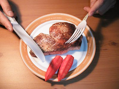
Something we found while cruising Boing Boing today: a papercraft steak dinner, complete with cutlery and two veg.


The page is in 100% Japanese, but it should be obvious what the parts you should download are (they say DOWNLOAD on 'em).


Get 'em, print 'em out, put it all together, and wipe up the drool (if you print it on an inkjet, it'll just smear the ink anyway)


Tags: , , ,


Powered by Qumana


[design] Samuel John Klein's Poster Design Featured in 2008 Art Bistro Design Gallery

1577.


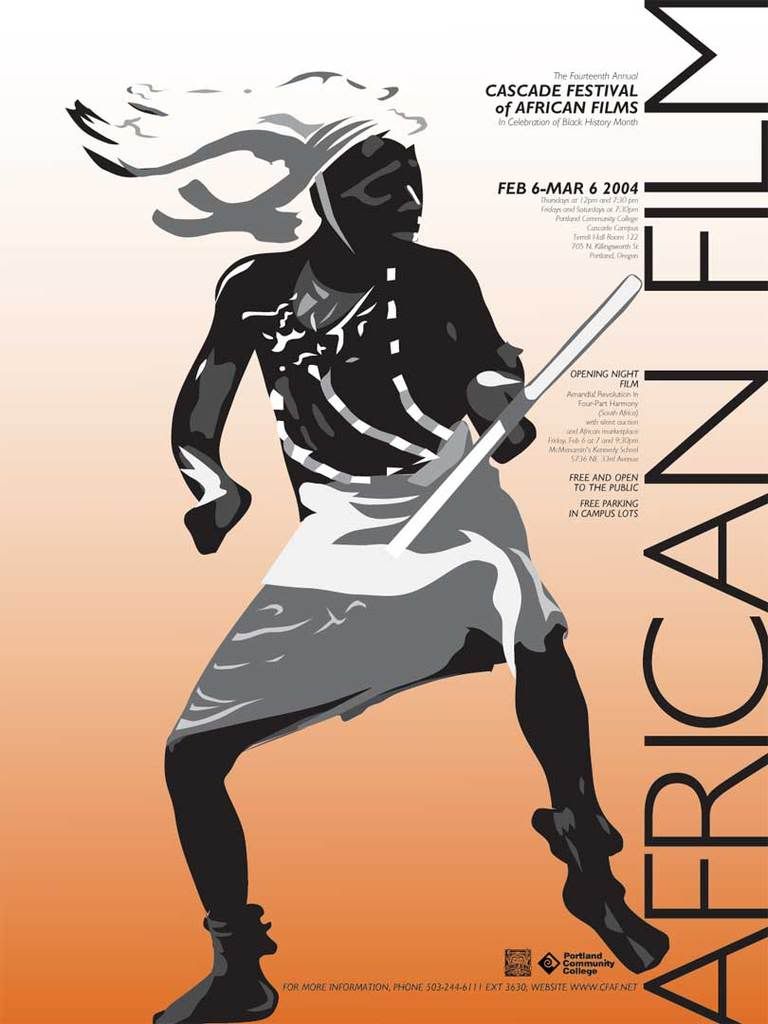
It was announced today that a design created by Samuel John Klein (that would be me) for a poster competition will be one of the featured designs in the May 2008 ArtBistro Design Gallery.


2004 CFAF Poster Contest EntryThe poster, (clicky to embiggen) designed to promote the Portland Community College Cascade Festival of African Films 2004 Series was developed using color, abstraction and type to convey a sense of passionate communication and a glimpse into a world that most of us will never see personally. The type was specifically designed to hook the viewer and engage them into the smaller textual content of the poster.


Africa is, of course, not a continent full of native tribal dancers. Selecting the main graphical image was something of of an obstacle; Africa contains a full range of cultural expression, just as much as any other continent. But the tribal dancer seems to express the same raw energy and passion that folk dance all over the world does, which can result in the best and highest of artistic expressions, culminating in films seen the world over.


Also, he was very inspiring and fun to render into a limited range of tones. Fashioning the headdress into an abstract pattern that "dissolved away" into the background was perhaps the most interesing thing.


The poster design is one of just eleven selected from amongst the thousands of ArtBistro members, such as cotourist and women's clothing designer Ana Segura.


The May 2008 ArtBistro Design Gallery can be seen here.


Tags: , , , , ,


Powered by Qumana


[modren_life] It's Just Getting Harder And Harder To Keep Up With Teh_Stupid

1576. (via Boston.com) I'm torn over how to feel about this one; due to complaints from people who can't tell an silk scarf from a keffiyeh, a Rachael Ray ad for Dunkin Donuts was pulled because ... well, you read:


Does Dunkin' Donuts really think its customers could mistake Rachael Ray for a terrorist sympathizer? The Canton-based company has abruptly canceled an ad in which the domestic diva wears a scarf that looks like a keffiyeh, a traditional headdress worn by Arab men.


I'm no fan of Rachael Ray (though she's modestly hot she doesn't really know as much about cooking as she pretends to and she's that ... bizarre ... smile that makes her look like Jack Nicholson's Joker) but this ...


Well, lets just say that when Hunter S. Thompson penned the immortal words when the going gets weird the weird turn pro, he was being an optimist.


Tags: , ,


Powered by Qumana


27 May 2008

[design] Transportation Company Business Cards – The Good, The Bad, The OOOgly!

1575.A business card has to do advance duty for you. And once it's established a beachhead, it's got to hold it for you.


One of the battles you have to resolve on your side is how much you include and how much you you put on it. What do you put? A logo? How many phone numbers? How many names? Any pictures? How choosy do you have to be with font selection?


There are general assumptions we can make ... but how do they get carried out? How much is too little? How much is too much? And just what ingredients make up a dog's breakfast?


Someone who knows I aspire to design and works in transportation handed me a few business cards from transportation companies and service providers, after having attended some convention somewhere. What follows, in a mere eight cards, is the gamut from soup to nuts.


Names have been obscured to protect the innocent, but enough information has been provided that, if you want to contact these services for thier services, you can do that too. Remember, just critiquing, not hating ... we have no haters here.


And we save the worst and the best for last. So here we go.


Barnett Mobility of Canada has a pretty well-done card. Email, with fax, landline, and cell numbers; website; toll free number, and a logo (which, while inspired and clever (note the inclined plane in back of the letters giving access to the Wheelchair Accessibility symbol which is reversed out of the B, however, the symbol is ill at ease inside the B ... but that's another subject entirely).  What's exceptional about this card is that it does organize a great deal of information with tastefully-chosen colors, an appropriate font, and a clever swoop division. This works well.
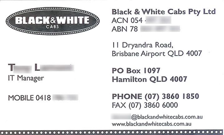


Visiting from the Land Down Under™, the designer of the card for Hamilton, Queensland's Black and White Cabs had quite a hard graft here. No fewer than five telephone numbers (we are, perhaps, incorrectly assuming the ACN and ABN digits are phone numbers), the logo, two postal addresses, email and website. To us, that's a little too much; they could have done with less; since cab customers don't often visit the cab offices, you could have done with the PO Box address only, for instance; similarly, the welter of phone numbers could have been reduced to an office/dispatch phone and the employee's mobile number. However, the designer made it work by restricting the number of fonts used to just one (the timeless Gill Sans) and leaving enough white space around the logo that, despite a diminished size, dominates the layout.


Type hierarchy is cleverly imposed with boldfacing. The recapitulation of the border of the oval at the bottom of the card is particularly charming. The designer made it work, which is admirable here.


Research Underwriters' card also tries very very hard to let you know just how reachable the fellow on the card is. Four phone numbers, full postal address (including ZIP+4), email, website, and a very interesting logo (we don't know what bears and insurance brokers have in common, except perhaps the first might find the second tasty and easy to catch).


This too is a potential dog's breakfast but the desinger was very canny here. Dividing the card into two regions allows for organization and selecting a single font (Gill Sans once again) and sizing it appropriately as well as managing to get enough white space between the info blocks so it doesn't seen packed-up have slain that problem. Leaving a space between the left margin of the gray area and the left end of the logo type also creates a feeling of space. These little touches are key to keeping a very busy card readable and easy on the eyes.


What couldn't be shown in the scan is that the thick line the bear's standing on is foil ... a very classy touch.
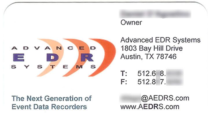


This card actually had rounded corners (as might be suggested by the shadow the scanner left along the top there). We are of two minds here; rounded corners on a card leave a positive impression, they're rather stylish, but out of a stack of cards we worry that the one with the rounded corners won't get picked out of the stack in favor of one which does have the regular corners.


The biggest flaw this card has, however, isn't layout, it's font. Arial has no business being on a business card. It's not an evil or ugly font, but it's default. Choosing Arial as your design font in applications like this is an amateur's move, and we're convinced that everyone notices this on a subliminal level – it's like wearing a wide tie to a hipster club without obvious irony. If you're tempted to use Arial, at least see if you can use actual Helvetica.


One other problem with this card is the logo. The logo isn't particularly inspired, but that's not the point. It's probably invisible at this resolution, but when we held the card in front of our peepers, it was as clear as day; the anti-aliasing was as clear as day. That's right, the designer used as small, low-res version of the company's logo. Even in my community-college classes that would have gotten me a failing grade on a project.


Layout's about that only thing that this card has going for it.


The RideCharge card, on the other hand, is sublime. I enjoy the font-smithing in the logo, which itself is a study in understatement that still communicates the company's mission (succinctly stated in the tagline). The powder-blue swoosh breaks up the white so you won't go snowblind. Two phone numbers and an email addy. Fashionable modern typeface.


Nicely done.


However, the amazing award must go to the business card of Colorado Cab:



There is just one font here, one based on the familiar FHWA fontage we see on road signs. The logo is beautiful, using just two colors to connect the Colorado Cab identity to the identity of the three companies that run under its aegis (making almost-icons out of the dots). There's a lot of information here, but inspired type size and color choices leave a great amount of air in there, which means the eyes won't cross when you try to pick out individual bits of info.


I did mention the OOOOgly. The following cards earn the not-sought-after designation of Official Dog's Breakfasts:


Here's a card which can't decide if it wants to be a business card or this company's catalog on a business card. Layout seems an afterthought ... the email is in a different font than the rest of the text for no deducible reason, the rather banal tagline is surrounded by misused quotes (which can even be found on the cab top light on the right, which actually reads "It's" Taxi Time), and just in case you were too hung over to know what those pictures were, the words "TAXI STUFF" is helpfully lobbed right into the middle of it, cratering its own little space there.


That card makes me cry a little and die a little inside.


I want to leave it and the following in a room together and fight it out for ultimate baditude:
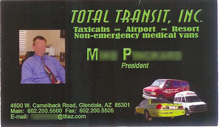


I don't know what it is about beveling/embossing type, but some people think it adds that touch of class. Three fonts on this one that just don't belong together; the artificially-italicized (we say obliqued) type above the doughy font that lists the services offered, finished up with the almost-but-not-quite-too-small Helvetica for contact information (that the black just wants to overwhelm). Color all the type a color of green that is more appropriate for halloween (or your customer's faces if your driver's style is edgy enough). Tie it all together with a photo of the card's owner and you have a heap of ugly that apparently caused a three-car pileup there in the lower right-hand corner.


Somehow, that's not the kind of message I'd want to send when I'm promoting my transportation service, but hey, as a friend has it, non gustibus disputandum. At least, that's how I think it goes. In Star Trek's classic epi "The Trouble With Tribbles", Captain Kirk had it as "there's no accounting for taste".


Well, that was fun wasn't it now? Anybody who has any OMGilicious business cards you want me to praise or criticize, send them along. I'm cranky right now, so I'd probably do a pretty good job.


Tags: , , , ,


Powered by Qumana


[modren_life] Wal-Mart Brings You The World, Incuding The Scorpion-y, Sting-y Parts

1574. (WPXI.com) In West Virginia, a young lady was injured ... by a scorpion sting.


On Sunday, 12-year-old Meagan Templeton was stung by the insect while shopping for watermelon at Wal-Mart in Barboursville near Huntington.
Meagan's father thought she was mistaken until Wal-Mart workers caught the scorpion so the family could take it to the hospital with them.


Apparently it snuck in in a shipment of fruit, most likely either bananas or watermelons.


Money quote courtesy Meagan's dad, living in denial until they found the critter:


There is no scorpions in West Virginia.


Being from an area of Oregon that had some backwards sorts in it, I'm qualified to opine: I believe that should be "There ain't no scorpions in West Virginia."


But apparently our scorpions is learning.


Tags: , , , , ,


Powered by Qumana


26 May 2008

[toons] Speed Racer Then & Now #1: Speed & Trixie

1573. One of the true joys of the new Speed Racer movie is the incredibly apt casting. I don't think they could have done any better.


Emile Hirsch was very believable as Speed, and brought the right amount of boyish sincerity to the role. Also, the physical resemblance is very uncanny.


The M on Speed's car and his helmet, by the way, are reputed to stand for the M in Mach (as in Mach 5). That's the American story. The Japanese story (the original version) is that the M stood for Mifune, the family name in the Japanese Mach GoGoGo, and the character's name is Go Mifune (go here being a homonym for the Japanese number 5, which is the number on the car, of course. Wheels within wheels.


Christina Ricci, to us one of the proverbial women who could make a burlap sack look glamorous, is note-perfect as the perky, strong, and capable Trixie:


Perfect, as far as we're concerned. And she not only flew the Mach 5's spotter copter (just as she did in the cartoon) but she also did some dead brilliant driving. In other words: our kinda woman.


Her name in Mach GoGoGo is Michi Shimura, and the anime version had an M on her blouse, standing for her first name.


Tags: , , , , ,


[portlandiana] Your One-Stop Tom Peterson's Shop


1572. Yesterday or the day before, a very generous habitué to the OLive forum boards posted a link to an old entry I'd done about that Portland advertising legend, the great Tom Peterson.


My admiration of Tom is real. From everyone I talk to about him I hear stories about what a sweet and pleasant fellow he was to work with and for, and have warm memories about his prolific TV adverts (including the Portland Wrestling sponsorship and the famous/infamous "Wake Up!" sale ads. And the higher they fly, the harder they fall ... the Stereo Super Stores acquisition and subsequent corporate meltdown are stuff of local business legend.


Along the way he had his face stencilled all over town and acted for Gus Van Sant. Tom isn't just of Portland, Tom is Portland!


It occurred to me that I have enough hits actually looking for TP that it might be useful to have an omnibus post linking it all together. Hence this:


  1. Tom Peterson Logo Love, 14 Dec 2005. I lurves me some Tom Peterson logo; here's my love letter. Includes photos of the latter-day building at SE 82nd and Foster.

  2. Tom Say "Wake Up", 14 Aug 2006. A plaintive appeal for fileage.

  3. The Tom Peterson Alarm Clock "Wake Up" Sound, 16 Aug 2006. A mere two days later, Judy of Persistent Illusion digitzed the TP alarm and sends it hither (get yours here!).

  4. A 1986 Tom Peterson's Commerical, 17 Sep 2007. His 1986 Price Expo! Complete with 19-inch Big Screen TV ... WITH Remote! A YouTube Clip sent by a secret admirer. Must-see TV!

  5. The Old Tom Peterson's Building ... Going, Going ... 7 Nov 2007. Pictures of the gutting of the legendary 82nd and Foster former location of Tom's flagship store. It's been remodeled and is now a strip retail space.


That's the lot. Anyone wanting me to post even more Tom goodness is welcome to send it along. I kinda mocked Tom when he was big, but you know, I'd give anything to have all that back the way it was.


Tom is one of a kind. I miss his 82nd and Foster empire.


Tags: , ,


Powered by Qumana


23 May 2008

[nw_life] The Way Burgerville Does Things

1571. We were intrigued by the article in The Big O today about Burgerville pulling NW legend Gardenburger for a variety of reasons.


Of course, we knew that Gardenburger wasn't an Oregon resident anymore. The company did start here, though, with the ungainly-but-charming name of Wholesome & Hearty Foods. They were in the right place at the right time. As awareness about healthy food choices rose during the late 90's, so did Gardenburger's fortunes; being a local product, it was a natural for Burgerville's product line.


Just like every local celebrity who goes to the top though, it wasn't so long until Wholesome & Hearty moved to the Cali and married a bigwig. W&H was eventually acquired by Kellogg's, and Burgerville probably continued to carry it because of loyalty and brand recognition.


But just like our food hero, Gordon Ramsay, Burgerville and The Holland (the company that actually owns BV) have high standards. And when they opened a recent shipment of Gardenburgers, they noticed right away that something was amiss. From The Big O:


The changeover was set into motion last Friday, when restaurant employees opened a box of Gardenburgers and became concerned about the look and texture of the product, Burgerville spokeswoman Ursula Herrick said.

"No customers said to us, 'This tastes different,' " she said.


This is one reason we love BV. They give a damn about the things that go into their meals. They check these things out.


Call in the understudy ... who didn't realize they were an understudy. Again, The Big O:


Weeks ago, a representative for Burgerville, a chain of 39 restaurants with a reputation for offering local products, tasted Osmunson's patties at an area grocery store. Tuesday afternoon, a Burgerville official told Osmunson, "I think we're going to want some product."

"I'm sure we can get things together," Osmunson replied.


The Osmunson named is Marie Osmunson of Chez Gourmet, a local supplier based in Lake O. From thier page about thier own patty product:


Good taste is more than flavor alone. Chez Gourmet patties feel good in your mouth. The wonderful nutty, chewy texture enhances the pleasure of eating our patties ... a reminder of the natural things it's made of.


This company knows what it's talking about. While we're more of the gourmand than they gourmet, we understand enough about dining to know that, even in the most humble of dishes, that enjoying what you eat is more than just taste. Anyone who knows about that strange term mouthfeel and what it means knows what we're getting at here. Just think about the time you chewed on your favorite food, whatever it was. You not only dug on the taste, you dug on the way it crunched, or was smooth, or was slightly rough against the palette. It all goes into the eating experience. It's probably why there are gourmets.


The Kellogg's response has been typically corporate and "oh, well ... what're ya gonna do?" and surprises our jaded view not at all. Again, The O:


Kellogg blamed the problem on construction work where Gardenburgers are produced.

"While not presenting a food safety concern for consumers," said the statement, issued by Kellogg spokeswoman Susanne Norwitz, the Gardenburgers "may not have been produced under conditions that meet our high quality standards. Therefore we asked our distribution network partners to return to us certain Gardenburger products."


Haven't you people heard of drop cloths? I mean, c'mon!


But at least it won't kill you! Eat away!


The Holland says no to that, and yes, to a tryout for Chez Gourmet. Of course, it's gotten pretty intense. From a one day production run, BV is going to need 3,000 to 6,000 patties per day. So this will be the acid test for them. But we're pulling for them, and we're once again made proud by Vancouver-based The Holland/Burgerville, who understands what they're doing locally and for whom "buy local" and "quality" are more than just cute marketing buzzwords ... they're a way of life.


Given the choice between any other restaurant and BV, we typically to for the BV when available. And we suggest everyone else do the same.


If this seems like a big love note to Burgerville ... well, we guess it is.


Tags: , , , ,


Powered by Qumana


[teh_funnay] Soothe My Mind Balls, Art Lover (some NSFW)

1570. Big Fat Brain has dropped the latest epi of Sn4tchbuckl3r's Second Chance on MyDamnChannel (NSFW, strong words):


And Grace would very much like some email, please:


Make it your weekend assignment.


Tags: , , , ,


Powered by Qumana


22 May 2008

[death_n_taxes] EcoStimulus: How much? WHEN?

1569. Like some who don't trust online tax filing (yet) or who have been dissuaded from using TurboTax (once again, The Wife™ spoke sooth when she said "No on the TurboTax") We expect to receive our Stimulus Check in the mail. But how much and when?


  1. This page at the IRS allows you to get an estimate of how much stimulus Unca Sam's going to to be sending your way,

  2. And this page at the IRS will give you an idea of when that payment is enroute.


At this point, the info you're getting is going to be educated guesses. Well educated, perhaps, but educated nevertheless.


Some important this-about-that:


  1. For the stmulus payment estimator, like other similar web apps (for instance, the Oregon DOR's "Where's My Refund" app) all amounts must be in whole-dollars; don't include the cents. Also, you'll need your tax documents in front of you. If you're quick about it, this will take 5-10 minutes to do.

  2. For the "Where's my Stimulus" app, you'll need to have to hand your SSN, Filing Status, and number of exemption to hand. If you're receiving a check in the mail, and the payment has not been scheduled yet, they won't be able to tell you anything. For example, the last 2 digits in my SSN indicate that our stimulus check should be sent out no later than the middle of the third week of June, so our payment hasn't been scheduled yet. We'll return to check later (but just between you and me, Unca Sam, I'm kinda hoping that you get a little ahead of schedule).


I'll tell y'alls what ... I can't recall ever having to re-dig back into last year's tax records so often in all my life!


Tags: , ,


Powered by Qumana


[liff] Mach GoGoGo!

1568. I don't care what any reviewer says, Speed Racer is just about the best movie that's ever been made.


Why?


Because someone finally updated a cartoon legend and didn't make a shambolic mess out of it.


Also, all the cars were made out of that stuff you make airplane black boxes out of, which is cool.


Tags: , , , ,


Powered by Qumana


21 May 2008

[design, fun] Even Those In A Galaxy Far, Far Away Get Thirsty

1567. Good against remotes is one thing. Good against a living? That's when you need the right one, with that crisp refreshing taste ...


Done as a request for my The Wife™'s Star Wars™ Role Playing Game, it's just a beer bottle label. Some fun time in Illustrator CS3. I think it came out pretty well myself.


This is of course copyright Lucasfilm, all rights reserved. Please don't sue me, George, I just did it for my wife's game, and I didn't get a dime for this, swear to God.


Tags: , , , , , ,


Powered by Qumana


[art, toons] The Year of Stan 102: The Coley Boley Archipelago

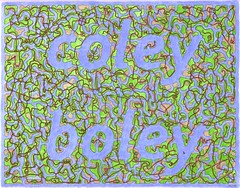
1566. This graphic is just heartbreakingly sweet and interesting.

In the middle ages, they had this stuff called Celtic knotwork. I've learned a few techniques about drawing it. If you've ever heard of the Book of Kells or the LIndisfarne Gospels, you've seen it. Incredibly detailed interlacing patterns that you can get absolutely lost in. They decorated the Irish monk's editions of the Gospels, and they encourage the reader to contemplate the infinite and to reason the unreasonable. Kind of the medieval version of the Zen koan.

Look very closely at this. If you've followed the story of Stan, then you know that he's married a lovely lady named Nicole (whose blog is also known as "Coley Boley") and moved to the state of Missouri where he, presumably, showing people things. Like his drawings!

Anywhoozle, if you look at the broken pattern between the letterforms, you can see the red lines, greeen spaces, and yellow spaces. highways, rural areas, and urban areas. Little highways connect towns and run through countryside in a beautiful little archipelago. And you follow the lines and get lost and make believe little people are driving cars down those roads, visiting other islands, seeing people and going about their business.

Now think that this is a present an artist gives his wife?

If you aren't touched by this, and impressed by this idea of romance, then you have no heart, my friend.

From someone who once created make-believe cities just for the fun of drawing maps, I must say, this is impressive work, fellow. Most impressive. Well done.

[or_politik, us_politik, or_history] A Night On Which History Turned

1565. What A Night, Huh?


  1. The great state of Oregon fell hard for Barack Obama, as expected (ironically carrying the state despite not winning Multnomah County), and in doing so, put him over the top with respect to the majority of pledged delegates – and within 86 of the magic number (2,026). Now aren't you all glad that Oregon didn't move her primary?

  2. Jeff Merkley is going to take on Gordon Smith FTW in November. Steve Novick was gracious in defeat.

  3. Amanda Fritz (who we voted for (even though she never linked to our blog) and take as an inspiration that VOE can work when adults use it) is going to be a City Commissioner. Yay, Amanda, and Yay, Us!

  4. We finally got a chance to vote in Nick Fish. We wanted to vote for him last time, but he was running against Amanda, and we like Nick, but we like Amanda just a little more (nothing personal, Nick!). So, yay us again!

  5. Sam Adams ... the first openly gay mayor of a major American city, advocate for green transportation and things of that nature. Yes, I think the tram was a bad idea and the bike bridge was a colossal faux pas, but I also think he's up to the job, and we just plain like him.


Tags: , , , , , ,


Powered by Qumana


20 May 2008

[liff, or_politik] Putting It Off


1565. Yeah, we wait until the last minute.


To some, vote-by-mail has been around forever it seems. But it wasn't actually that long ago that Oregon had its polling stations too. Election day was a real event then ... watching the news, staying up past midnight in tight races as the votes were counted from the precincts.


Needless to say, election day isn't the house party it once was. Thanks to the cool efficiency of modern vote tabulators combined with the immediacy of having all the ballots on site at 8 PM, they usually grind these things out real quick-like.


But we still sit in for elections.


And we wait until election day to drop off our ballots. It's kind of like going to the polls used to be.


Now, in this age of republicans gaming every polling system there is, vote-by-mail, which I hated coming in, looks pretty smart now, and I'm happy we do it this way. I admit it ... I was wrong about this.


But waiting to drop our ballots until the 20th ... sorry to keep y'all on pins and needles about how this household his going to vote, everyone, but it's just like old times.


Happy election day.


Tags: , , , ,


Powered by Qumana


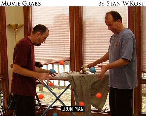
[art, teh_funnay] The Year Of Stan: Stan Goes To The Movies

1564. And now, some more silver screen goodness from our favorite ex-Milwaukiean, now living in Oronogo, Missouri (Oronogo, of course, is a local word of native American extraction which means "natures" spelled backwards).


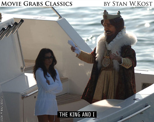
Here's a couple of fellows who, most women would agree, would be cool to have around the house:


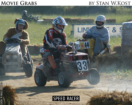
And if there's one thing I hate, it's when filmmakers ignore continuity, yes? I expected better of the Wachowskis ... even I know that's supposed to be a "5" on that car (Mach Go Go Go, indeed):


Though that Racer X you see in the distant background ... flawless. So there is that.


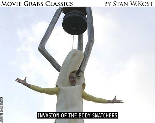
Now, I don't know about any of you, but the big smile on this guy's face just weirds me out. I don't think I'd be that happy but they, depends on the way you swing, I suppose:


And now, rimshot in three ... two ... one ...


ka-Ching!


This next one is probably a sequel to the direct-to-brie-cheese engraving I Know What You Did Last Summer At McDonalds.


Chilling? You bet. Makes me want to step out to Wendy's for a Frosty.


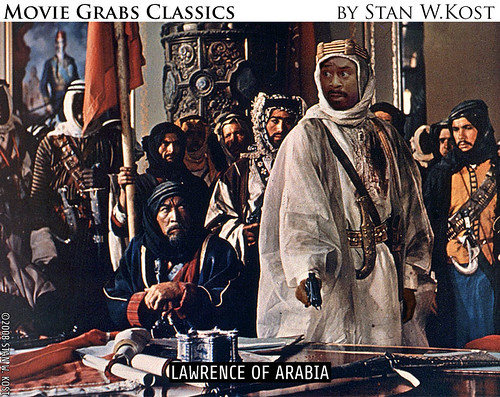
Now, I'll be honest here; I've never been a fan of Martin Lawrence; I think that there should be prosecution and imprisonment resulting from the release of a special expanded version of Big Momma's House. However, if he keeps taking daring chances like that, I'll have to change my opinion:


This film was apparently done for the hearing-impaired audience, which I think is cool:


And here's a classic:


He also could talk to the animals, but the animals found him creepy and got a restraining order.


The alternate title for this one? So You Think Dickens Can Dance?:


And now another chapter of our ongoing series, Our Not-So-Civil Servants.:


That's it for Stan Goes To The Movies for this go around. Remember, people and childrens everywhere, movies are, dollar for dollar, your best entertainment value!


Tags: , , ,


Powered by Qumana


19 May 2008

[art, toons] The Year of Stan, Day 91

1563. And I thought pan'n'scan was heinous.

Ah, well, as I like to say, I know all about art ... I just don't know what I like.

[bloggage] Fifty Kay


1562. As of 21:06, 18 May 2008, this blog logged its 50,000th visitor.

Here's the incriminating evidence:


I'm thrilled when I pass these landmarks. I like being visited, I love writing. I suppose that I could be doing better in the traffic department; sadly, the two traffic kicks I got (first from J. Bogdanski, then from Boing Boing) have not solidified into a solid increase in popularity. I just don't know the trick yet.


But it's only partially about popularity. I have found that I love writing even more when I know someone might be reading it. I love writing maybe even more than graphic design ... and I love graphic design.


If you've stopped by here and considered linking, please go ahead and do so! Any such link will be gladly reciprocated. Though a Page Rank of 5 and a Technorati authority of 54 is, for a blog of my magnitude, not too shabby actually.


I'm stll looking for street blades, folks.


And thanks to those who have recently blogrolled me. There are some blogs that I really admire that have done so: Stan (dinglemunch), Stan's Wife Nicole (Coley Boley), Kevin Allman, Little Thom, Bass Goddess Pril, Grace 'n Michelle, Middle Earth Journal, Lefty Lane, I'm thankful for you all. You honor me. And all that I didn't indicate here; just look in the blogroll, and if they come back here, they are especially nifty.


On to 100 Kay, then, Let's roll!


Tags: , , , , , ,


[or_history] Obama: Once Again, Oregon Sets The Standard

1561. Meanwhile, Freepers fill nappies at an alarming rate ...


18 May 2008, Waterfront Park, Portland Oregon. 72,000 estimated. Best. Political. Rally. Evar.


Today, a Google search with the terms Obama, Rally, 75,000 returns over 8,000 results. Oregon makes history once again, and I am a proud Oregonian.


Meanwhile, on Free Republic (via DemocraticUnderground) (followed by my witty rejoinder):


If a bomb fell on those slaving obamunists, killing every last one of them, nothing of value would be lost.


That's someone you all don't know hoping you die because you had the gall to attend an Obama rally. Welcome to Freeperland! Points for coming up with slaving obamunists, but not good ones.


This is one reason I shake in my boots....AMERICANS have been bamboozled by a TERRORIST LOVING MUSLIM!!


The scoundrel! The cur! Do tell, sirrah, where is this bounder?


There is no way McNUT can win against this evil man. WE ARE COOKED! The Obamessiah will be OUR next president. GOD HELP US!


Mc Nut? Hey, that's actually funny! Good one! The rest of that sentence strongly suggests that the poster subsequently had an aneyurism.


Never seeing anything like this only in text books during Hitler's reign!


You were alive during the Hitler administration? I don't recall the masses of happy people being speechified to by a black man, but hey, I'm not perfect.


Kind of like one of Hitler’s early rallies stirring up the masses. Both are (or were) so charismatic don’t ya know and both are just as destructive.


Logic defies me here. I got nothin'.


You forgot the Pachouli oil!


You forgot that patchouli is spelt with a t!


Portland is Seattle with better public transportation and a higher unemployment rate.


Hey! We got better public transportation! You see?!?! I told you!


Portland is the arm pit of the NW..Seattle the Ahole....period!


Little known fun fact: in Freeperland, ahole means "hello" and "goodbye", like the Hawaiian aloha. I'll differ on the body part: Portland isn't the "arm" "pit"; it's more like that spot on the nape of The Wife™'s nick that I like to nibble when we cuddle. C'mon, you guys know what I'm talking about.


Even if it is Portland, OR, there are a LOT of people at that rally for this Obama guy. This worrisome.


There are a lot of people at that rally despite it being Portland? A city verging on 600,000? You right ... that worrysome! Then we all went home and read Indymedia! That more worrysome! Hey, me not use linking verb when write! Much simple efficient!


The cool thing about Free Republic is that ... no, wait, there's nothing cool about Free Republic. Sorry about that. Although, if you're frightened by just about everything, at least there's a place where you can go and be scared to freaking death with others so like minded.


Earlier this year, I made a conscious decision to not be scared of what I'm being told to be scared of.


It's liberating. I recommend it.


Tags: , , , , ,


18 May 2008

[pdx_politik, liff] And If You Have An Election That Lasts More Than 6 Hours, Consult A Doctor


1558. J. Bogdanski calls this election porn.


Hells yeah!


After reading this collateral, I am maybe feeling teh_passion ...


Oh, I thought I'd voted before. Turns out all those other other politicos were just faking it.


Because I've never really voted ... until I vote for Sam! (yay, me!)


Teh_passion!


Just so you know, I am so expecting the earth to move when I pencil in that bubble.


Tags: , , , ,


[bloggage] "Samuel", Who Leaves Us Comments

1557. A blog I enjoy generally has just linked to me, and I'm flattered and thrilled.


Those of you who are MyDamnChannel habitués, as I am, are no doubt familiar with Grace. Her vlog, Daily Grace, is a bunch of things ... witty, funny, a little crazy, a little banal sometimes. But once you get the Grace habit, it's hard to drop it. Bedtime Stories ... oh, funny as hell.


Grace is one half of Grace 'n' Michelle, a vlogging duo in New York. I found that vlog after watching all I could of Grace on MDC. They're two women who just like being goofy and themselves and that's hella-entertaining.


Here's what I mean. Grace'n'Michelle recorded a very short video entitled Disney Digital Shorts:


They be crazyfunny women.


Crazyfunny women are some of my favorite people in the world. They always make me smile, they always make me laugh, and they are never ever dull. Grace'n'Michelle are awesome that way.


And, for commenting on thier vlog, they've blessed me with a link. From them, I am "Samuel", who leaves us comments. See? That made me smile. It made my day. Because I am. And I do.


You women rock in major ways. Thanks for the link.


Tags: , , , , ,


Powered by Qumana


17 May 2008

[modren_times] Trajectory, or The Shout Heard Round The World (NSFW or Small Children Or Sensitive People)

1556. All times PDT.


12 May, 2008, about 0900: A YouTube User whose name is already lost to history posts found footage of famous Fox Noise blowhard Bill O'Reilly throwing a childish, Peabody-award-winning tantrum on the set of his soft-news show, Inside Edition.


That stuff on his head? Hair. Seriously!


12 May 2008, not too much later: YouTube takes down the video on demands from the redundantly-named CBS Broadcasting, Inc.


12 May 2008, a little later, but likely before noon: The net pwns CBS as it allows a million copies to bloom, notably on Gawker.


13 May 2008: BillO gets dance-remixed.


Later The Same Day: Satires starring the notional floor director debut (or what he should have said) on YouTube (and other humor places):


Sometime between 13 and 16 May: Busted Tees has the T-Shirt. $14.99. Orders placed will ship the 26th.


From around-the-world to on-your-chest in less than four days.


Dayum, the intermets is awesome like that.


Fun PDX Trivia: BillO anchored KATU-2 News back in '84 (via the For Portlanders Only media archive). Legend has it he was arrogant, snotty, and hard to get along with. Sort of like Lars Larson.


Tags: , , ,


Powered by Qumana


15 May 2008

[design, us_politik] Presidential Campaign Logos Through The Years

1555. Thanks to Kevin Allman, I have a link to a glorious cavalcade of campaign logos and stickers through the years.


It's at Logoblink.com here.


Kevin recommended the vintage 1964, as do I. They're nifty!


Tags: , , ,


Powered by Qumana


[modren_times] Megan Meier Cyber Bully About To Get Comeuppance?

1554.  Softened by distance now, the appaling tragedy of the 13-year old who committed suicide through internet sockpuppetry may be receiving justice.


You all may recall Megan Meier. She was a young lady who, after having a falling out with one of her friends, was the victim of what was eventually found to be a smear campaign via MySpace that might well have been orchestrated by the mother of her former friend.


The result of this was Megan's suicide.


The most appalling part of it seemed to be indications that adults were involved, and continued to inspire the attack.


Today, according to Wired Magazine, an indictment was due to go out in the case. The likely recipient of the indictment: Lori Drew, the mother of the young lady who was on the outs with Megan Meier.


Time to let the wheels of justice turn, surely and correctly.


Wired followed up with the announcement of the indictment.


Tags: , ,


Powered by Qumana


[liff] He Lives ... If Only By Request

1553. One of the most notorious album covers of all time ... actually exists.

You know you've wondered. We sure have. You see, Newsday, that bastion of New York journalisming, posted a list of the 50 worst album covers of all time. With squinty eyes so as to cushion the blow, we went to see if it was there ... and it was. Position 12.


Ken, By Request Only. Destined to be one of the central memes underlying the intermets, popping up in image macros, in ironic graphic jokes ... IIRC, it went out into space on the disc that was sealed up in Voyager 6. In 300 years, it's gonna come back looking for him ...


Seriously, this thing is the proverbial Cat That Came Back. Years go by and then someone comes up with a Worst Album Art of All Time list and ... just like malaria, there it is, come back to haunt us.


Ken. So widespread is the image that people were starting to think it was an urban legend. You see, I'm sure just as with me, the art on this was just so jejune and compelling all at once (it's like album graphic design of the 1970s, all on one cover) that people just had to go looking to at least see what it was all about. And in this world where everything is Googleable, where some schmo in Davenport can figure out what you had for lunch on the 23rd of June 1971 just by doing a search ... we all came up empty handed.


Nothing. Even the participants on the Snopes.com message board were about 50/50 split on real/legend.


Well, it's a relief to say that, short of the actual meaning of that Carly Simon song, the most important musical mystery of le vingtième siècle has been solved, with some canny detective work by the Snopes crew and recounted in its best narrative at the friskily-named CommunistDanceParty.com. Read the entire article here, but here's the abstract:


... First off, this album is real. The first big clue came when the album, vinyl and all, went up on eBay and sold for $150. This gave the world their first look at the back cover of the album, along with the actual record itself...


...After some more digging, a Ken Snyder who matched the description and location of the album recording was linked to a church in Sheldon, Iowa, along with an updated photograph and contact information!


..."Hey, I'm Ken's daughter. Just thought you would like to know my dad has loved reading these sites about him. That record is from 1976. He used to travel and sing all over the U.S., and that was one of his records he sold. He only has about 4 left now, decided 'why not try selling them if people are actually interested in buying them?' He called me up immediately after he got a call saying that one of you had told him his record sold on eBay. He knew the album cover was under "Worst Album Cover" but didn't realize he was the talk of people online. Crazyness!"...


So, as they said on CDP, the album is real, the fellah is real, and he's alive and well in a small town in Iowa and apparently a pretty good sport about all this talk. And, at the time of that article, which was probably last year, Ken was putting up his last four copies for sale on eBay, we think it was.


So you might not be able to score Ken's magnum opus, but at least you know. Ken's real and ... he lives!


Tags: , , , ,

[typography] Play The Game, If You Dare

1552.  Courtesy I Love Typography...


Click on the illo for The Font Game. See how many you can ID out of 34.


It's harder than you'd think. I got 27.


Tags: , , ,


Powered by Qumana


14 May 2008

[net_life] The Big Time with MyDamnChannel.com=More Free Pizza, More Co-Con Action

1551. I've been invited to another Co-Con conference call put on by MyDamnChannel.com. And another free pizza (you'll come for the chat, you'll stay for the pizza ... but only if you get invited).


We note that our favorite series evar – You Suck At Photoshop – got Webbies, as did Wainy Days. And, we notice that our favorite local alt.weekly – PMerc noticed that YSAP exists. Bit late to the party, as we (and others) have been blogging about it and enjoying the hell out of it for months now, but hey.


Tags: , , , , ,


Powered by Qumana


[or_life] Tales of the DMV–Good Service, More ID, Changing Times

1550. You may have heard that Oregon is now coming up with licenses that are valid for eight years, rather than four.


Juuuust fine. You thought license photos were unkind now. Stay beautful, bunkie; the next time you renew the face that's looking back at you will be the better part of a decade younger.


Anyway! The occasion of DL renewal always takes at least two trips for me. Usually I didn't bring along the one thing that I needed and we have to come back the next day. Not this time. I brought not only my old license (don't leave home without it) but also my birth certificat and my Social Security card. As it turned out, I was good as gold–brought along too much.


But that won't always be the case. As of the 1st of June, you'll be underdressed at the DMV if you don't have your Social Security card and your birth certificate. In fact, if we read our DMV documents right, you'll have to have them along if you want to transact any business involving licenses with the agency.


So if anyone out there doesn't have them, get 'em. You're gonna need them.


Of course, we remember when DMV changed its name to DMV. That's right – it used to be the Department of Motor Vehicles; now, its the Driver and Motor Vehicle Services Dept. At least they saved money on changing those signs out. Also, they don't laminate your card right there any more. They laserprint you off a paper facsimile that can be folded into the size of a license ... and then mail you your license in about a week.


But seriously, if you have a question, just ask your friendly DMV contact person. The lady who served us was, seriously, very courteous and knowledgable, was quick on the answers, and looked over the documents I brought along and said that they would be good to go for the future. So, at least I have that then.


Tags: , , , ,


Powered by Qumana


13 May 2008

[net_life] Things That Are Getting Out Of Hand

1549. Add another entry to the growing list of "Things ... " sarcastic humor blogs:


Things Younger Than John McCain


Join me now in fondly remembering the days when the operant ageist joke was "DOLE IS 96!"


Tags: , ,


Powered by Qumana


[teh_funnay] Jack Handey's Flag

Updated @ 1335 approx: Thanks to all the traffic from BoingBoing (as well as Adam Szymkowicz) and the kudos from those who commented. If you like the work might I repectfully request a Digg? Thanks.

1548. Via BoingBoing, Jack Handey (he of the SNL Deep Thoughts) told us what his flag looked like. The BoingBoingers threw down the gauntlet.


I didn't get a horizon or the banner in the eagle's beak, and the ball of fishing line is really a reel of fishing line, but almost everything else came out ...


Tags: , , , ,


12 May 2008

[bloggage] The Category Definer

1545. Stuff White People Don't Like? Heh. That's so last year.


How about Stuff Nobody Likes? Even better!


Tags: , ,


Powered by Qumana


[us_politik] US House republicans To Mothers: Drop Dead

1544. Well, my head asplode:


It was already shaping up to be a difficult year for congressional Republicans. Now, on the cusp of Mother's Day, comes this: A majority of the House GOP has voted against motherhood.

On Wednesday afternoon, the House had just voted, 412 to 0, to pass H. Res. 1113, "Celebrating the role of mothers in the United States and supporting the goals and ideals of Mother's Day," when Rep. Todd Tiahrt (R-Kan.), rose in protest.

"Mr. Speaker, I move to reconsider the vote," he announced.


Later:


House Minority Leader John Boehner, asked yesterday to explain why he and 177 of his colleagues switched their votes, answered: "Oh, we just wanted to make sure that everyone was on record in support of Mother's Day."

By voting against it?


I'm sure there's a sane explanation for that. Oh, I can't find it. But I'm sure there is one. Somewhere.


I know I'm late to the party on this one. I thought it was a joke at first. Then it took me another day just to scoop my jaw back up off the floor.


The republican party of the USA: Keepin' it classy since 1854.


Tags: , , , ,


Powered by Qumana

[design, type_design] Blog To See: I Love Typography

1543. Recommended by LaurenMarie of the recently blogrolled CreativeCurio, there's a typography blog that was the sort of thing I was hoping to eventually grow into too: I Love Typography.


Bunch of good stuff. And, more than any other type blog, its about the type on the blog as well as the message the type carries. My eyes made love to the masthead and were thrilled even by the audacity of the red brackets around the number of comments. Naturally, the bigger and the better than I have already sung its praises, so I go on record as being a mere (but sincere) fan.


Visit. Enjoy. Blogrolled, aber naturlich.


Tags: , , ,


Powered by Qumana


[liff] A Thought Noted In Passing

1542. It has latterly occurred to me that I find myself in a world that does not love me back no matter how sincerely I adore it.


Have I offended?


Tags: , , ,


Powered by Qumana


11 May 2008

[liff] On The Occasion of Mother's Day

1541. It has latterly occurred to me that if it weren't for a certain few women, I wouldn't even have the meagre amount of success I've had.


If it weren't for one certain woman, I wouldn't be here at all.


Yes, I called her today. Did you call yours?


Tags: , ,


Powered by Qumana


[liff, modren_times] "Jungle Monkeys"

1540. And it was said, more than sotto voce, less that out loud.


"Jungle Monkeys".


A person in a situation, both of which must remain nameless for reasons we shall at the present time not divulge (and which we will not explain why, and ask you all to be down with that for the time being), whom I was working closely with, said it.


"Come again?"


"Oh, the way they call in and mumble and I can't understand them."


"You said jungle monkey?" I said, keeping it intimate. The rest of the room didn't hear it, and I saw no reason to make such a situation worse by alerting everyone within earshot.


"Well, yeah. But I didn't mean it racist"


And then my mind was reeling. In situations, in a city like this, which is still pretty white-homogenous but still, depending on the side of it you work on, sometimes actually awash in contacts with people whose skin isn't exactly white (and white people, strictly speaking, aren't white, really, but that another program) you learn one thing. White, black, brown, checkerboard, whatever color the skin in the game is, the one universality is teh stupid. You can't get away from that.


The phrase laid there like a turd on the carpet. Ugly. Smelly. And whether or not some evil thing was meant by it, evil anyway.


And I couldn't get away from someone saying something like "jungle monkey" and then talking themselves into believing that it wasn't, in some way, racist to use it, especially since it was manifestly so on its (you'll excuse the expression) face. I came very close to spraining my brain.


I detected a teachable moment (not that I'm any more or less wise or perfect than anyone else, but you don't need to be a saint to know that allowing sin to go by is wrong), but was unsure how to proceed.


I kept it gentle and positive, and just between us.


"Well, I know you didn't mean it as racist ... but it really kind of was. It came from a racist place."


The moment passed. I think the point was made. I would have liked to have crusaded on in and corrected some thinking, made a big show. It would have been nice to have done that. To anyone who's ever been in a socially dependent work sitch, one where you shouldn't go dressing down your affiliate number even if it would have been the perfect thing to do, know without being explained; the perfect is the enemy of the good. I tried to do the good thing here.


Maybe next time this fellow human will think that maybe you can't really say "jungle monkey" because to do so is racist and wrong. I knew they weren't actually being hateful. I believe them when they were convinced that they weren't trying for a racist comment. But if you swallow poison not meaning to poison yourself, you'll still die, and maybe if they remember my gentle objection, they will maybe have an epiphany that our enemies aren't black, or brown, or whatever, but our enemy is teh stupid.


Well, teh hate is our enemy too, but where there's not too much teh stupid, I've found there's not so much of teh hate.


Let's teach our fellows not to be teh stupid, little by little by little. Yeah, it's kind of banal. But if anyone has figured out this Rubik's cube called life, well, let me in on it, and I'll help do God's work.


Tags: , , , , , ,


Powered by Qumana