31 August 2006

[distractions] Gordon Ramsay London's Top Chef Again, Again

Just caught this little gem being reported across the world on various sources: in a popular survey conducted by the guide Harden's London Restaurants 2007, Chef Gordon Ramsay was voted best London cook for the 11th consecutive year.

But that's not all: of London's restaurants, five of them (including his eponymous Restaurant Gordon Ramsay, Chez Bruce, and Gordon Ramsay at Claridge's) appeared on the top-10 list, up from three last year.

While acknowledging the Chef's apt PR acumen and obvious culinary talent, Harden's does wonder if Chef's culinary dominance of the London scene might be a bit of a straitjacket, however:
"In some cases this reflects the intrinsic merits of the restaurants, but in others it is just a function of the power of the Ramsay PR machine to generate footfall...It is no criticism of Gordon - or his vaulting international ambitions - to say that for one man, or brand, to achieve such dominance over London's top-end restaurant scene risks becoming stifling."

It's all about the branding, baby.

Technorati Tags:

[design] Getting What You Want Out of Your Designer

Communication. Interflow. Keeping the lines open. Reading is fundamental. There are about a billion ways, so it seems, to highlight the importance of keeping in touch with people who are using one's services that it all seems trite to remind people that of all the communications protocols out there, simple human communication is perhaps the most important...and the most taken for granted.

Liz Strauss, of Successful-Blog, has distilled her POV down to an insightful list. In a post titled 10+1 Sure-fire Ways To Get My Best Work–and the Best Work from Everyone–Every Time, she offers the following list:
  1. Make the work important.
  2. Spend time to show me you mean that.
  3. Start by defining as many terms as you can.
  4. Be able to tell me what you want to write.
  5. Think about how you would approach the writing task if you had to do it.
  6. Imagine how I might go off in the wrong direction.
  7. Tell me where you want me to get creative
  8. Estimate how long you think it would take you to do the job.
  9. Ask for an early checkpoint or sample.
  10. Write a quick bulleted list of what we agreed to.
  11. And, the +1 bonus point: Give me all the information you can...don't hold back for fear of insulting my intelligence.
At this point I suggest you go to Liz's article and give it a quick read–it's actually quite succinct. Tell Liz I sent you. Then, come right back here. I'll wait.

In the prefacing remarks, Liz boils it down to one salient point: It wasn’t the work. It wasn’t the people. It was how we put the two together. This is the nut of the thing: It's how I work with you. It's what each of us knows about one another's work what I'm doing and you're wanting. It's the communication, stupid (sorry, nothing personal).

The list she made above captured my imagination but while it's well suited to writing–which a lot of people who aren't professional writers do everyday at varying levels of skill, so an injunction such as Estimate how long you think it would take you to do the job is a reasonable question–it wouldn't quite work in the design transaction.

Apt design is a trained skill. Not everyone can do this. Note that I am sincerely not saying the non-designer isn't smart enough to design. The truth I've learned, though, is that whether or not you get the skill through self-teaching or instruction, those calling themselves designers and who do it well pull together skills and perceptions that the average untrained designer just hasn't been exposed to. Design is a grammar; one has to at least learn some of it for one's designs to work.

It's about pulling the client into the process

The way Liz's concept works in the designer-client interplay could more be thought of pulling the client into the design process. Design is an evolution, and when a client hands a job over to a designer they may feel as though they're sending thier baby off to school, and have no hand in it until such time as they get it back.

The process can be improved by giving the client some active hand. Naturally, the designer will still be doing the designing, but I think of the client's influence as a guidon. Remember, the creativity comes with not coming up with your own vision of what the client wants, but translating that vision into a practical reality. The client wants to boat down the design river, but you're the pilot; the client wants something, and you'll be steering the client's wants away from the impractical.

But the client can take the ride with you. An ideal end to this would be an enlightened and satisfied customer, and a triumphant designer.

The List–My Version

Liz's list is a great one and very insightful, as I've said. It is, however, as I now see it, a slightly ill fit for the designer-client relationship. Here's my list:
  1. Let Me Know Why You Came To Me. I already assume that your work is important;
    Don't let me forget that the reason you're querying me is because you think I'm up
    to doing your job and doing it well.
  2. Take Time to Tell Me Exactly What You Want. I want to give you what you want
    me to give you, but I can't read your mind. Since you aren't a designer, you may feel
    that just a few words will suggest to me what you want; this is where misunderstandings start. Let's avoid those, and use whatever words you feel are necessary to explain it as clearly as you want to. Don't assume that I'll not respect you if you don't speak the lingo; I'm on board with you and will automatically give you all due respect.
  3. Let's agree on terms from the start. Go ahead and tell me what you expect from me during the process. Be blunt if you feel you must; I won't be offended unless you're trying to be obnoxious. Do you expect constant updates on progress? Do you have any questions on what I'm going to charge you? Do you want to make a list of checkpoints, either formal or informal? Let's get all your concerns on the table where we can discuss them.
  4. Let's Settle on a Timetable. I can work either with or without a timetable; I'm adaptable. If you want a timetable, though, let's hash that out in the very beginning. I'll say what's possible; you say what you're hoping for. Together we'll negotiate that to something we can both live with.
  5. Let's Agree to Disagree. After we dice out the terms it may prove that we, as client and designer, might not be the best match. We should have the mutual courage and respect to admit to each other that we have differences or, if the differences be large enough, conclude our relationship before too much investment happens.
  6. Let's Make Each Other Accessable. I check my email sometimes several times a day. Give me a way to reach you with reasonable speed. I promise to respond to you directly to any question; please respond to me as quickly as you can if I send you a query or a proof.
  7. Don't Be Afraid To Ask Me How I'm Doing. This one should explain itself. Any question? I am at your service–shoot!
  8. Don't Ever Hold Back For Fear Of Insulting Me. As Liz says: You’d be surprised how often it happens that intelligent folks hesitate to give other folks information about work for fear of insulting a person’s intelligence. Not knowing is not the same as not being intelligent. Please tell me so that I can do well for you.
This is the first attempt at a philosophy along those lines; I'm expecting to evolve this as time moves forward.

If it is a big ball of "oh my gosh", though, just remember, it all boils down to communication: you tell me what you want, I tell you want I can do for you, and in the end, we come to common ground.

Talk to me.


Technorati Tags: ,

30 August 2006

[bloggage] It's Raining Blog Services

The funny thing about the 'blog fad is, just when it seems to become trite, someone figures out a new service to debut. We now have two new ones.

Just about everyone has heard of Vox, the New Thing by SixApart. It's free but you can't just walk in and get you some; you have to get invited. Unlike Gmail, which you had to beg, borrow, Google, or bid up on eBay to get an invite, though, you can sign up for one on thier home page.

I've heard that some people are selling or auctioning off Vox invites. At the time of my posting I had five available; following up on another post will get you one, until I run out of that five.

In general, after looking through Vox, as it stands now, it's a blog service for the casual blog user, the kind who wants to share pictures and stuff with friends and family, and doesn't care much for blogrolls, or link lists, or getting thier hands dirty customizing the HTML in the template. There is customization options available, but how to contribute your own–or if they ever will allow you to do so–is far from obvious, if not completely unimplemented.

They do have a nice selection of templates with some quite attractive designs, but no apparentl way to customize your own past some preset options for the sidebars, and I couldn't find a way to get to the HTML to edit it, like you can with Blogger. If eventually having to settle for a 'blog that looks like a lot of other people's isn't for you, you might not like it much.

Vox does, however, excel in the way you can upload and share things. The interface for uploading is very cool and intuitive, and includes options for photos, sounds, movies, file collections, and even simplifies embedding links to books from Amazon...or wherever. It's very slick there. It is, though, slow-loading for those of me with dialup connections; if youu have one too, you might find the page load time irritating.

The other new service is really an old one. Blogger beta is here and in the process of being implemented in a public test phase occurring right now. Just like Blogger regular, Blogger beta is free for the asking; you do have to get a Blogger or Google account.

From what I've seen of it, Blogger beta is headed for a very slick implementation. There are new dynamic configuration features that have to do with blog appearance that include live previews. There is a new field that allows you to put what they call "labels" on your posts, which allow posters blog categories like other blog services provide. Uploading is a lot more slick, and there looks to be more sophisticated photo handling–even the ability to delete photos and pictures you've already uploaded.

The version of Minima Black that I used while playing around on Blogger beta used disclosure triangles to hide and show the archive list. Atom feeds are now avalable directly from the post, rather than you having to hack your template to install RSS links, as well as subscribing to post comments.

I'm sure I'm leaving stuff out, but it's starting to look pretty exciting. Blogger beta, being in a test phase, does not yet allow template editing, but that is apparently in the working.

It really does look like Blogger is going to take a good thing and make it better. Sa-weet!


Technorati Tags: , , , , ,

[bloggage] I Have 5 Vox Invites...

Vox, the new blogging service being mounted by SixApart, is in beta right now. Just like Gmail beta when it was debuted, admission is by invitation only.

You can sign up for the invites at the Vox home page and wait for a while to get one, or, if you're one of the first 5 commenters on this post, I'll toss you one for free. First come, first served, you guys.

Go!

Technorati Tags: , ,

28 August 2006

[pdx, sf] The Awarded Among Us: David Levine Takes The Hugo

The Hugo Award®, given annually by the World Science Fiction Society, goes to the best of the best. This year, the best of the best for short stories went to a local writer, David Levine.

The awards were given at a convention just held in Anaheim, called Interaction, and the story, entitiled "Tk'tk'tk'", went up against such notables as Mike Resnick.

The story was published in Asimov's Science Fiction in March 2005. Asimov's has mounted the story on thier website and it can be read (for now) for free here. I recommend it.

I'm happy to hear that David's won this award; I've had the pleasure of meeting him and, while I'm really no more than a nodding acquaintace I've known him to be a truly nice guy; I've never seen him that he doesn't have a smile and a good word for people he even doesn't know. And, as OryCon attendees must know, his appearances as part of the panel of the late-night "Whose Line Is It Anyway" performances are simply legend.

We should all celebrate when a decent local fellow wins; please join me in celebrating David.

NB: The photo of the 2005 Hugo (the rocket remains the same, but the award design is unique every year) was nicked from the Wikipedia entry on the Hugo Award.

Technorati Tags: , , ,

27 August 2006

[design, typography] Via design matters

Where the blogger asks a very good question:
I don't know why our field seems so curiously self-obsessive.
And arrives at a very apt conclusion:
All in all, it's a great time in which to be a graphic designer. Don't worry so much about your software skills. Instead, learn how to think. Then it won't matter how you're defined, you'll know how to solve problems, and your clients will recognize that and value you for it.
For the skinny, read this post.

My view has always been that which CeCe Cutsforth put forth in my training at P.C.C.: a designer is a problem-solver. I think that, withal, contains all one needs to know. Others, however, do require more detailed definitions. So it goes.
Also of note: it's the Wrong Apostrophe. Wrong apostrophe? Yes; you're soaking in it. Find out what I mean by reading this post (illo nicked from design matters).


Technorati Tags: , ,

[art] Why Cheap Art?

With little further ado, I lead off with Bread & Puppet's Why Cheap Art Manifesto:


I love this broadsheet. I love the play of the type, and I love the rough look of the type. I love the appeal to freedom ironically dated 1984. I love the way majuscules fight with minuscules; I love the way the type in the lower half is varied from exuberant line to exuberant line. I love the way the composer didn't give a flying damn about leading, letterspacing, kerning, or in some cases, even the baseline.

I first saw this a year or so ago when I was taking an art class at PCC Sylvania; it was photocopied and stuck to the wall over the sinks in one of the painting studio classrooms. This particular graphic was nicked from the Art Manifested site (I don't think they'll mind) whose aim is wholly laudable, though I find thier self-impression at the rather droll and obvious joke that inspired the name somewhat irritating. They advance a subject sadly missing from the current cultural conversation. Notice how there's a continuing call for the Portland Art Museum to stage events that the working folk can afford? Notice the (at least as far as I can percieve it) dearth of affordable opportunities to see orchestra?

The only time I've been to the PAM was with school field trips. My The Wife™ has never gone, and wants to. This is sad.

The only affordable events that the orchestra holds are on the weekends. I work weekends, and must arrange well in advance to get time off for things. And I certainly don't have an unlimited vacation bank, so I can't make it a habit.

There's a perception that fine art is for the Ă©lite, and there's a good reason why most "reg'lar folks" don't think real art has anything to do with them.

Technorati Tags: , , , ,

25 August 2006

[web_design] Basic XHTML Knowledge To Go

Just stumbled on: a PDF excerpt of a book called Stylin' With CSS by Charles Wyke-Smith, mounted by CreativePro.com.

The upshot of it is that to make web pages that are graphically good-to-go with the greatest number of modern browsers, you gots to use CSS; to use CSS effectively your markup should be XHTML-compliant. This excerpt gives you the fundamentals you need to know that will make your markup compliant.

Download it from the CreativePro feature article here; and while you're at it, make CreativePro.com a regular read. You get a lot of great knowledge there for no extra cost.

While I'm at it, I have a short, shamful admission to make; in the beginning, before I learnt much about CSS, I was convinced that it was just some sort of fad designed to make markup just a little more difficult. How very wrong I was. When I took the time to sit down and study up on basic CSS, I found that it's like lightning in styling and giving graphical cohesiveness to your web pages. If you don't know CSS, you're missing out; when it comes to sane web design, CSS knowledge is one of the coins of the realm.

So, I'm kind of showing what sort of innocent fool I can be, but remember, the breaking of innocence is the beginning of wisdom.

Technorati Tags: , , , ,

[design, tools] The Fray, Overlooked: Yes, Mac Good!

In the last post I mentioned a series of epiphanies I had on my last job interview, I neglected to mention one, and it has to do with technology:

Apple PowerMac is the gift that keeps on giving.

I was pleased to see that the machine they were doing design on, running Mac OS X 10.4.7, was a Power Macintosh G4, not sure what the clock speed or the number of processors is (though if they're as smart as I think they are, it's a 2-brain G4 running at least at 1.25 GHz), but it was in the 2004 Mirrored Drive Door chassis. Their set up is very similar to mine, which just so happens to be a 2-brain 1.25 GHz G4 in the MDD case.

I've notice this again and again; those who acquire PowerMacs get years worth of work out of them. They seem to go obsolete just a bit slower than ISA machine and when they age they age gracefully; I have personally known of other designers and net-heads who have Quicksilver G4s and even blue'n'white G3s running well under 1.0 GHz that are still getting good, productive work out of them.

I'll be honest; I'd love to upgrade to a G5 or one of the hot new MacIntels–who wouldn't? But I'm getting another half-gig of memory on this set up of my own and she's still turning out the work I need, day after day.

Looks like I picked the right pony here.

Technorati Tags: , , , , ,

24 August 2006

[design] More From the Fray: Interviewing as Market Research

In interviewing for jobs one sometimes finds out things one didn't know about, and it becomes a lesson, if approached at just the right way.

I was fortunate enough to go out on another interview yesterday. I walked in not knowing if I would be a good fit for this organization so I made of it a research thing.

Walking in there, I had already acquired information that I didn't have before. I'll not specify who it was over the company's own privacy interests, but in the day between when I made the appointment and walked up to the company's front door, I found out a lot more about photography (digital and film, and taking pictures of very specialized subjects) than I thought I would.

The job requires Quark experience, so I found out that despite the up-and-coming of Adobe InDesign there are still shops committed to the platform; I do note, however, that in my job searching so far, I find that I see the word InDesign a lot more than I do the word (and yes, though I tend to call the product XPress, for a while now, the products official name has been QuarkXPress). A corollary to this is, if you want to work in layout, at least try to grok QuarkXPress. Quark has a free trial copy of V7 you can download here. At least get you an orientation.

I found that, if you want to work web design, then you have an edge if you can at least understand the concept of mail merge, and that knowing where to find out about shopping carts will find you in good stead.

I also found that marketing insight is vital if you want to at least have an intelligent conversation. The company's primary web presence exists, largely, as two sites; one styled more for consumers and one styled more in thier 'purveyor-to-the-trade' mode. The consumer site can function as a front end to the purveyor site; this is what Google analytics calles a 'defined funnel'. The first site is slick, glossy, and well-designed; the second, an efficient, simply-styled site for those who know what they're looking for. I noted this in the interview and it resulted in a rather educational discussion of what this company wants its web presence to actually do for them.

I found that a really unified graphic approach indeed does make an impression. The company's graphic face uses a handful of typefaces and a simple, uncomplicated theme. The result; a luxury appearance. And it communicates that very well. Standards matter. Adhering to them strengthens the company's personality and style.

Frequently I talk logos. Even more frequently, people talke trademarks..you know, the ® thing. There is a tendency to confuse the two, and this is a dangerous misunderstanding for a designer who has anything to do them:
A logo, as understood by myself (and many), is a unique graphic device, either abstract or realistic, that may or may not also contain type, and uniquely identifies a product, service, or what-have you.
A trademark, on the other hand, is a legal thing, which uniquely describes a product or service but which confers a great number of additional rights on the trademark holder. Trademarks require distinctive character, as well; it cannot be discriptive. You can have an "Apple® Computer", but you cannot have an "Apple® Apple.". Read the Wikipedia's entry on it, which is quite complete.
Many times people will say "trademark" when they mean "logo". For the layman, this is forgivable, for the desinger who deals in identity, much less so. And there are legal steps which must be taken and billable hours expenede to get that little ® mark. Respect the mark.

Just another word on marketing, as a concept; the transition of thinking of myself as someone who can work in design to, looked at another way, something that can be marketed, has been jarring, just a little. There is a certain depersonalization, but there's an empowerment to be had there too (sorry to resort to the itchy neo-words there, but the meaning's the thing), and that comes in acknowledging the rules of the game.

Our economy–such as it is, however its working now–is a market economy, and if we cast ourselves as a value-producer, that market is where we sell those values. My market, as "Brand Me", is the graphic design field. Occupations in that field come in a dizzying array of shapes and colors, but when I come to my market I have to put my wares up front–what I have, what I can do. Understand this, and you can participate–at least until the paradigm shifts again (sorry 'bout that overused word too).

On a related note, it's not a bad company. Would be a pleasure to work for it. No chance for the grass to grow under my feet, something always needing to be done. As I said to the fellow interviewed me, "I didn't learn this trade to read a newspaper on the job".

Well, at least in so far as I'd be involved in its design.

Let's think the good thoughts.

Technorati Tags: , , ,

[inspiration] I'm for this book, See...

A fair time ago I reviewed a movie from 1985, The Quiet Earth (and here's how I wrote about it). Subsequently I found that it was a 1981 novel by a New Zealand writer and academic named Craig Harrison. Naturally I'd like to get a look at this book...

But in a world (NB if the preceding clause were outlawed from the language 93% of the motion pictures now made would have to have thier promotional shorts redone) where, even to this day, Beanie Babies (yes, Beanie Babies) can still occasionally have a show at the Baja Gresham Mall of America, where books like Battlefield: Earth can still sell (well, that's what they say, anyway), one may reasonably, I think, expect to find a single copy of a 1981 novel floating around somewhere.

One would be proven very soon wrong, ABEbooks, Alibris, Amazon, the lot...all them come up empty.

So, I'm throwing this message in a bottle (and tagging it appropriately), in hopes someone somewhere might have an connection. I'd really like to read this book!

Title: The Quiet Earth
Author: Craig Harrison
Year: 1981
ISBN: 0340265078

Let's see where this gets us.

Technorati Tags: , ,

23 August 2006

[distractions] Heather West To Stage Kitchen Reunion?

Nicked from Us Magazine, queried by reporter Eric Andersson, and via tmsfeatures.com, we hear a rumor that Chef Heather is building bridges with at least two of her former competitors:
Q: When do you go to Vegas?
A: Soon! I'm psyched. It's a big task, but I'm going to dive right in. And I've talked to [Kitchen alums] Keith and Garrett about joining the staff.
We've been saying that Heather's a class act. Here's more proof. And more:
Q: You sparred with Virginia, your cofinalist. Is it safe to assume she won't be pitching in?
A: She's a good friend of mine now. One thing I regret is how mean and hurtful I was to her. We're all just there to win.
This and many other interesting tidbits about HK and the chef's can be found on The Times' HK2006 index.

Technorati Tags: , , , , ,

[design, how-to] Brushin' It Up In Illustrator

I do work in Adobe Illustrator CS2, but it, as all Adobe graphics tools, are sprawling programs. Once one develops a style, one uses some features less than others, and I am no exception.

Just now, coming in on a situation, I was experimenting with brushes. Brushes take your vector path and apply a graphic look to it, which can be varied and changed, and there are effects already in Illustrator, such as a watercolor brush, ink splatter, and charcoal smear. But how to create your own?

With the "calligraphic" brushes and the "pattern" brushes, it's as simple as selecting "New Brush..." from the palette flyout menu or clicking the New Palette button on the bottom of the palette. When you do this with nothing selected, however, the "Art Brush" and "Scatter Brush" options are grayed-out. How to start those?

Simple, actually. The Art Brushes and Scatter Brushed require something to get started with, and that can be any vector path you already have, though the true power of this is to introduce painterly things into your Illustrator document, so if you really want to go to town, get yourself some crayon, watercolor mark, or such, and scan it. Place the scan into Illustrator to make of it a vector thing, then drag that thing onto the Brushes palette. The New dialog will pop up with Art, Scatter, and Pattern brushes selectable (and Calligraphic grayed-out this time). Select the brush type desired, then go to work on your options.

That's what I get for brushing up with "Illy".

LAYERS magazine has an excellent (and more complete) brush creation tute if you surf this link.

Technorati Tags: , , ,

21 August 2006

[design] Embarking Upon the Technical Editing Sea Anon

While it is true that the last two attempts at getting in-house design positions has come up closed-handed, this is not the same thing as saying that the situation here has been completely without success. My reputation has just helped me land a technical editing contract!

It's true. And a bit more well-paid than the last time too...

Likely as not, not many of you know who a tech editor is or what they do. If you use how-to books, specifically in my case computer software books, they've been intimately involved in the production of that book.

What a technical editor does is check the book for accuracy, clarity, and use. Particularly; the author crafts a chapter and the editor sends it along to the tech ed. Tech ed reads the chapter and does the exercises and projects, noting where things didn't quite work out or where something maybe could be worded a little better. The completed chapter is forwarded back to the publisher for finishing.

When you work with programs like Adobe Illustrator (like the last TE job I did) it's a joy; when you're doing it under the authorship of an accomplished instructor (like Pariah) it's like getting an intensive training session that you get paid for. Failing a regular full-time gig, there's seldom anything better. And I get my name in the credits of a book...how cool is that?

The contract sits upon my desk, waiting to be signed. Signed it shall be, and sent by the morrow at latest. The author tells me he suggested me only to find out that the publisher was leaning toward asking me from research he'd already did.

Now, that is flattering–not to mention being me very impressed with myself.

I love tech editing–and I can't wait to get started on this. Not to mention I just got paid a little from another project, not a kingly amount, but enough to get an extra 512MB on this G4...but I'm digressing again.

There will be more on the editing project when I get an idea of how much I can say about it.

Technorati Tags: , ,

19 August 2006

[design] Jacci Howard Bear's Design ABC's

At the DTP forum at About.com (desktopput.about.com), Jacci Howard Bear is spending the next 26 days (from 11 August) taking you on a rocket ride around the alphabet of design.

So far we've done A (Adobe, alignment, small "a"), B (business cards, balance, baseline), C (calendars, contacts, color), D (dingbat, diphthong, dummy), E (Elements of Design, Eyes & Ears, Envelopes), F (finishing, folding, fonts), G (guides, gutter, greeking), H (hairline, head, how do you DTP), and I (graphic identity).

Worth following, we think.

On a related note, I think graphic design is the only field in which I am aware that you can use words like dingbat and not be arguing, diphthong with a straight face, and dummy without necessarily commenting on your associates intelligence. Why not work in design?

Technorati Tags: , ,

[design] QuarkXPress=The Evil? Still?

Returning to an old saw I just can't quit using, "It' takes 10 atta-boys to make up for one aw, hell". As tired as that's starting to sound, I keep turning up instances where someone burned by Quark's past performance still holds little goodwill toward the quondam layout king and its signature product, QuarkXPress.

This time's bit of evidence for the file comes from the Live Journal blog The Scenic Route (pixeldrift.livejournal.com). It's a short-short entry you can read in its entirety here, but here, AFAIC, is the money shot:
The previous designer in my position was a Quark guy. His work has that style to it. I don't know what it is, but just looking at some spreads you almost want to say, "That looks Quarkish." Maybe it's because early, even clunkier versions of Quark influenced designers in their formative years and it just sort of stuck.

Well, now I'm stuck having to make updates to his old Quark files. Grrness.
Grrrness, indeed. One more Aw, Hell Quark has to make up for. Multiply this by the thousands of customers Quark took for granted Back In The Day™, and you'll get some idea why Quark is still in some trouble despite generally positive reviews for XPress 7.

In Quark's defense, the poster didn't say whether the software in question was XPress 4, 5, 6, or even 7, for that matter. And, in the interests of disclosure, The poster links to QuarkVSInDesign with the "Quark Sucks" button (it's at the bottom of the post).

Technorati Tags: , ,

[distractions] Breaking: Heather West To Actually Get Own Restaurant

Just found this bit out while scanning for news on the recently-crowned Hell's Kitchen winner...

The prize, as advertised through the show, was an executive chef position at T-Bone's Chophouse in the Red Rock Casino resort in Las Vegas. Well, Heather will be working there, but not at T-Bone's, after all. It would seem her fortunes have become just a bit more charmed.

On 18 August, the Las Vegas Review-Journal reported that Heather is set to become Senior Chef at the resort's Italian restaurant, Terra Rossa:

Red Rock President Scott Kreeger said in June that the "Hell's Kitchen" winner would be placed in T-Bones Chophouse in a position based on the chef's skill level. However, management decided her abilities would best be utilized at Terra Rossa, said resort spokesman Jeff Lovari.

The contract details had not been finalized Thursday, said resort general manager Ronan O'Gorman, but hotel officials are looking forward to West working at Red Rock.

"I think it's very, very positive for the resort. It's been an extremely popular show, we've had a lot of exposure, and we've had a lot of response from the public," O'Gorman said. "The phones were ringing right after the show with people asking where they could eat Heather's food."

Read the entire article here, which also comments extensively on the winner of So You Think You Can Dance, Benji Schwimmer.

Also: I've created this post as a central repository for all things HK/Heather West/Gordon Ramsay that I can find that's interesting, and in anticipation of HK3 next year. If I get enough interesting stuff I'll spin it off into a 'blog or site of its own, when I get enough stuff.

Technorati Tags: , , ,

18 August 2006

[designers] Jeff Fisher Rules From Above

If just getting a cool issue of HOW this month wasn't enough, local logo design god Jeff Fisher gets back-page visibility, in a major way.

On the last page of HOW is the feature "Double Vision", where the magazine asks two designers the same question to see what different responses they get. Jeff is hanging from the top of the magazine, kind of like that trapeze kid in Safe Havens, and the question is one he's got a black-belt in: How much time do you devote to self-promotion?

About 20%, as it turns out. See? Self-promo is even important to design gods.

Jeff toots his own horn about it at bLog-oMotives here.

Technorati Tags: , , , ,

[design] Get You Some Periodicals

I love me my design magazines. Some of you who aren't trying to aspire in the design profession may have heard of some of them: Print and Communication Arts come to mind as ones I see on the racks at places like Powell's and Art Media.

My favorites are two others that I am happy–nay, thrilled–to skip a meal if I have to to get the subscription money for. One is STEPinsidedesign (usually referred to as just STEP) and the other is HOW Magazine. Both are sumptuous magazines, both well-designed, and both usually inspirational.

As might be suggested by the publication names, they are not merely about design and the design world but also about design from the inside out (as a matter of fact, that's STEP's self-defined remit–and was thier tagline back when they were called Step By Step Design, a name that was changed because it sounds a little too much like a how-to book). Each month they challenge with what designers are doing, how they are doing it, and suggestions about how one could do it themselves.

Design happens on all levels...even those of the cash-starved job seeker.

This month's HOW is a themed issue, the Self-Promotion Design Annual. Self-Promo, it should be self-evident, is an important ingredient in the quest going from non-employed design professional to employed (this is an overt attempt to not portray freelancers (though I prefer the term independent) designers as 'unemployed', because that is a legitimate career path as well). It involves a whole lot of things, from production of promotional material to strategies for publicity to strategies for keeping one's attitude up over what may become months of trying to no obvious result.

So far, I've seen a lot of ups and downs, and come close to the prize only to have it evaporate seemingly like mist on the air.

This month's issue has a lot to offer in the way of insipriation: page after page of competition entries (it is a design annual, after all), and while, of course, not everyone can be the winner, all of these are quite remarkably stellar. A lot of ideas and inspiration there. There's sage advice from contributing writers about pitching oneself, writing proposals, and the most exciting one to me was the article by Jeff Domke.

Jeff's article, titled "How to Land Your Dream Job", is a step-by-step map to what to pay attention to and develop that got him to where he wanted to be–employed in a design firm. After graduating from design school, it took him 14 months to land that job...and he won an award in HOW's 2005 Self-Promotion Design Awards. He has a lot suggestions that even a modest talent as myself can use, and a positive attitude that shows through in his writing.

A good day for me is always when my copy of HOW or STEP arrives in the mail, you see.

Oh, and BTW, HOW publishing produces a range of excellent design books, a few of which are on my shelf right now, including a certain tome by a respected and well known local logo designer. You should check it out.

And get yourself a magazine subscription, if you can. Links to STEP and HOW can be found back up this article.

Technorati Tags: , , , , , ,

17 August 2006

[distractions] Hell's Kitchen, 2006–The Times' Index

During the months of June to August, 2006, FOX television served the SunDial Earth Station with a nearly fatal distraction: Hell's Kitchen. Hosted by Gordon Ramsay, the three-Michelin-starred Scottish superchef known for his exacting standards, his business acumen, and his hot temper, put twelve aspiring chefs, with skill-levels ranging from six months of culinary school to garde manger and sous chef, through the proverbial wringer. The prize: a highly lucrative and powerful position as excutive chef at T-Bones' Steak and Chophouse, called a "million-dollar" restaurant, in the billion-dollar Red Rock casino complex then being built in Las Vegas, a hand in designing the eatery, and a share of the profits.

During that time we were distracted and entertained by this crackling good program, we blogged about our feelings of the show, mixing interpretation and somewhat-inaccurate recap. This reference post provides links to all the articles written.

The twelve hopefuls were divided, as customary, into red and blue teams, segregated in the beginning by gender:

The Red Team (women):
  1. Sara, a deli manager;
  2. Maribel, a cafeteria worker;
  3. Virginia, a garde manger (salad and cold-foods chef);
  4. Heather, a sous-chef;
  5. Polly, a professional caterer.
  6. Rachel, a personal chef.
The Blue team (men):
  1. Gabe, a marketing executive with six months' culinary school;
  2. Tom, also a former stockbroker;
  3. Giacomo, a pizza chef;
  4. Larry, a fishmonger;
  5. Keith, a chef/bartender
  6. Garrett, a former prisoner and prison cook.
The Chef's Progress

The majority of the shows followed a pattern: Reward/Punishment challenge, spotlight on the challenge winners (and their treat), spotlight on the challenge losers (and thier punishment), preparation for a dinner service, the dinner service itself, then the elimination ceremony, where one of the chefs was selected to go home. Notable differences were in the first epi, where the chefs, after an extremely-brief period of settling in, were commanded to make a signature dish in 30 minutes, and the finalé, where the the two finalists got a good prize regardless of who won or lost.

The series aired in two-hour blocks on Monday evenings, on KPTV-12, with the first hour being a rerun of last week's episode and the new episode being shown second. The exceptions to this were the premiere (two new epis) and the finale (which was one two-hour epi, not rebroadcasting the penultimate epi).

The Episodes
  1. Hell's Kitchen, Three Epis Along. Me catching the bug and playing catchup. Eliminated: Polly, Larry, Gabe, Giacomo (in that order). Blogged: 20 Jun 2006.
  2. Hell's Kitchen, Epi Four. Eliminated: Tom. Blogged: 27 Jun 2006.
  3. Hell's Kitchen, Epi Five. Eliminated: Rachel. Blogged: 12 Jul 2006.
  4. Hell's Kitchen, Epi Six. Elminated: Maribel. Blogged: 19 Jul 2006.
  5. Hell's Kitchen, Epi Seven. Eliminated: Garrett. Blogged: 27 July 2006.
  6. Hell's Kitchen, Epi Eight. Eliminated: Sara. Blogged: 04 Aug 2006.
  7. Hell's Kitchen, Epi Nine. Elminated: Keith. Blogged: 10 Aug 2006.
  8. Hells Kitchen, The Finalé. Finalists: Virginia and Heather. Winner: Heather West. Blogged: 16 Aug 2006.
The Others

During the course of the series we did opine on a few other things that were Ramsay-related but not necessarily series-related. Here they are.
  1. Last Damned Post on Hell's Kitchen This Week: Seems there really wasn't a Gordon Ramsay dog after all! Blogged: 28 Jun 2006.
  2. Hell's Kitchen, This Week: HK preempted that week by some Adam Sandler waste-of-time. We were not amused. Blogged: 3 Jul 2006.
  3. Gordon Ramsay, Straight Up. Intrigued by the character of Chef Ramsay, we go googling. We find out about Ramsay's Kitchen Nightmares, and we find out that Chef recently won a British-style (loser pays the court costs) libel case. Blogged: 03 July 2006.
  4. What I Think Will Happen On Hell's Kitchen This Week. Written just before Epi Six, in which we get a little giddy waiting to see it and try writing standup. Word from our agent: Keep the day job. Blogged: 18 July 2006.
And that's it; that's all. We can finally let go of the obsession and get back to design. But we will follow Gordon Ramsay and Heather West, that's for sure.

Updates!

Interesting things can happen to the contestants in the wake of HK2006. They'll be listed below as I find them. Scroll to the bottom for the newest stuff, and, if there's anything anyone sees that they think would belong here, hey, cha-ching me on the email, baby (or something like that...).
  • 19 August 2006: Want to know what's on Heather West's mind now? Meevee.com has an exclusive interview here. Though brief, it contains surprising revelations about Heather's relationships with Garrett, Virginia...and, of course, Rachel. She's going to be a class act, we think. Earlier: MeeVee interviews Keith, Sara, Garrett, Maribel, Rachel, Tom, Giacomo, and thier original review (which had them calling Garrett "Dave" for some reason. At least I got Keith's first initial right when I called him "Kevin" a couple of times. But Dave? Open the pod bay doors, HAL...").
  • 20 August 2006: In case you missed it, Keith Greene's site, Kgrease.com, is live (and we understand has been for a little while now). It's 100% flash-based, but, mercifully, the flash file is about 550KB, so if you're on 56K dialup, you'll be able to see it while you're still young. Right now there's links to his Bio, Links, Email Contact, and his four sauces: Mojo Marinade (for chicken or fish), Money Marinade (for steak and chops), "It's Slammin'" mango BBQ sauce, and the ever-famous "Cha-Ching" Sesame Crust ("It's Lamb...and It's Money?" – Gordon Ramsay). If the website checks for the plugin and doesn't find it, it sends you off to Adobe to get the plugin (rather than giving you a choice between downloading it and connecting to a non-flash version). Also, GlitteratiGossip.com links the MeeVee interview with Heather.
  • 20 August 2006: This one deserves its own entry here: According to the Las Vegas Review-Journal, Heather won't be cheffing at T-Bones after all, but rather, Senior Chef at Red Rock's Italian restaurant, Terra Rossa. Read my own posting via this link.
  • 21 August 2006: FOX-TV have opened applications for auditioning in the next series of Hell's Kitchen. Eligibility is wide open: 21 or older, legal US permanent resident. They want basic personal information, then answer questions such as: do you have any experience or training? If so, where? And, of course, the all important: What makes you think that you, more than anyone else, can live up to Chef Ramsay's standard? This is the only email you may ever send that requires a gut-check. The FOX-TV application page is here. Also: Chef Ramsay is expanding is restaurant empire into the Americas (Via Slashfood, The Observer).
  • 21 August 2006, Even More: Two more interviews with Heather: This one at IGN.com, and this one from TV.com (via Google cache). Particularly interesting were the moments related in the IGN interview that didn't get on the series, such as the daily talk show, the orange bowling, and the dinner party. Also: The Wikipedia entry on HK has been updated with all information on HK2, including very clever and succinct grids showing week-by-week kitchen status at a glance for both HK1 and HK2. And From HK1: Runner-up Ralph Pagano battled Iron Chef Bobby Flay in the 6 August edition of the Food Network program. The secret ingredient: Barramundi (a/k/a Asian seabass). The winner, according to Answers.com: Bobby Flay.
  • 22 August 2006: Ever wonder what it must be like to actually eat in Hell's Kitchen? We just stumbled on this article at MSNBC.com which links through to this article by TVGasm's correspondent "B-Side", who was a diner in Ralph Pagano's "Frank and Lulu's" Italian restaurant in the HK1 season finalĂ© (The "Plank" Season). No, they didn't have to pay for thier meal; yes, they were paid for thier attendance; yes, the valeting was for real; no, Ralph's food wasn't all that good. Also: SnogBlog tries out cooking Chef Ramsay's Beef Wellington (from the recipe at The F-Word's site). Verdict: tasted decent.
  • 23 August 2006: Winning through despite technical difficulties, SmallPouch blogger perrik posts her witty, somewhat snarky, and unexpurgated ("FOX censors. I don't") review of the Series 2 (The "Donkey" Season) finalĂ©.
  • 24 August 2006: From BBC4's The F-Word site, intriguing interviews with Chef Ramsay. Find them all via this link, and if you don't care to click-through, find them via the "Gordon Interview" link in the navitgation on the left. May we particularly recommend this one, however, which reveals The Real Ramsay? His accents: fresh food, local ingredients, the power of the family dinner table; very much the family man. Also, tucked away at the end of that one is this interview with Gordon's wife Tana. She has her own kitchen; she isn't allowed in his. Surprised? Don't worry, it's all good: Read the interview.
  • 24 August 2006, More: Chef Ramsay says a generation of women can't cook? Before you jump to conclusions, read about his campaign to get women (who want to go) back into the kitchen. Speaking of which: Us Magazine's Eric Andersson hints (via tmsfeatures.com) that HK2 winner Chef Heather West may be working at a partial kitchen reunion:
    Q:When do you go to Vegas? A:Soon! I'm psyched. It's a big task, but I'm going to dive right in. And I've talked to [Kitchen alums] Keith and Garrett about joining the staff.
  • 24 August 2006: It's Good to Be The King... The UK's Independent notes that Chef Ramsay has finished the last year as the UK's richest chef, with earnings in USD$124M. 2nd place? Jamie Oliver (via bfeedme.com). Also via bfeedme.com: Chef Ramsay's Baked Apples with Peppercorn. And, speaking of Chef's business empire, meet Gordon Ramsay the publican; the Independent also reports that Ramsay is adding a constellation of country inns to his culinary universe.
  • 25 August 2006: Chef Ramsay's sine qua non? Before there was a famous Chef Ramsay, there was Chef Marco Pierre White, a man who came on strong and young to be the first-ever Briton to win three Michelin Stars. Did Chef White make Chef Ramsay inevitable? We suspect so: in an upcoming book to be published by Orion (via the Independent), he muses thus:
    Perhaps I created the monster Gordon Ramsay who ended up as a TV personality screaming at celebrities on Hell's Kitchen, doing to them what I had done to him
    The Wikipedia entry on Chef White references a photo in his book White Heat containing what's described as Gordon Ramsay as "a terrified commis (a commis is an assistant station chef-ed.)" whilst he was working under him. So, in this case, it's nurture, perhaps.
  • 26 August 2006: The Company They Keep: As reported by 24 Hours Toronto, quondam Posh Spice (now, of course, mere Victoria Beckham) was seen on the town at Tana Ramsay's recent 32nd birthday party, well into her cups, sans ring...meanwhile, blog Inner Toob reports that international outplacer firm Challenger, Gray and Christmas has placed Chef Ramsay on a list of the worst TV Bosses of all time–the only TV personality who actually exists that can be found there. Also: The BBC detects Gordon Ramsay doing a charity showing at Derby...just not that Gordon Ramsay.
  • 08 October 2006: It's way past time we made a cogent observation: indeed, the HK/Heather West well has pretty much run dry. As noted in this post, I'm taking down the tent and calling it happy. I very much enjoyed trying to keep track of things, and was...well, be honest, really was hoping it would take off, but alas, no. However, there will be me following the HK bandwagon next year, as well as a lot of people, I'm sure. See you then, donkeys!

Technorati Tags: , , , , ,

16 August 2006

[pdx_misc] The Tom Peterson Alarm Clock "Wake Up!" Sound

We have soundfile!

All credit must go to Judy of Persistent Illusion, who wins the award for conspicuous heroism in the face of overwhelming odds (to wit, coping with old technology) in getting us the file and converting it to an MP3. She will 'ere be a friend of this blog (and this blog needs all the friends it can get!)

Anyway! One of the premiums you could get at Tom Peterson's was, along with a little watch with his iconic face on, was this wicked cool alarm clock. Riffing directly off his "Wake Up!" ads, which advertised his all-night sales, at the appointed time, the clock would say:

Wake Up! Hey, wake up and have a happy day!

To hear the sound file, click on the above link. To download it, right (or control-) click on it and choose whatever option saves it to disk (on my Mac, it's Save Link As...). It's not a huge file, only about 63KB in size. Judy would probably want me to point out that it's a bit tinny, and I think that's probably more because of the sound reproduction technology of the day than anything else.

But now, you, too, can have Tom wishing you a happy day when your Wintel powers up...or where ever you want to plug it.

Credit also to Judy who provided the snapshot of her very own Tom clock, which makes her a whole lot more fortunate than a lot of us.

Technorati Tags: , , ,

14 August 2006

[distractions] Hell's Kitchen, The Finalé

It's Been an Exciting Trip, y'all

In the beginning, back in June, they were twelve, and one by one they fell off: Polly. Gabe. Larry. Giacomo. Tom. Then Rachel, Maribel, and at last, Keith.

And then it was down to dark horse Virginia, and strong player Heather.

Tonight's 2-hour finalé was all-new. Typical of the 2-hour block was a rerun of last week's epi followed by the new epi. This one did not retelecast Keith's Last Stand; rather, a 10-minute block up at the front of the program recounted a few remarkable seconds of each contestant in the order of elimination.

Then it was the kickass opening titles.

Then, Captain Obvious: "And, now, the conclusion of Hell's Kitchen".

Long Lost Loved Ones

After the elimination of Keith, Heather and Virginia retire to the dorm. They are both wound tighter than a cheap watch, and can't believe they've gotten to be the finalists.

And, whilst celebrating thier victory, an unexpected surprise; Virginia's mother and husband, and Heather's parents.

This is why HK is good TV, and when it's good it's deadly; they know how to tug on the heartstrings. The reunion was a tearjerker for sure, and it was sweet to watch both contestants reconnect and tell what had happened to them thus far. The reunion was as brief as it was sweet, and it was bedtime for the finalists.

Meet the Press

The very first thing next day, Heather and Virginia were tersely summoned to the kitchen by Chef Ramsay. What they found, to thier surprise, was a fully locked and loaded press conference, ready to have at them.

The remarkable part of this was watching the two women, who, save HK, were never TV personalities, handle the press. The questions (the ones we saw anyway) weren't terribly challenging, but the moment to remember was when Heather and Virginia got out front of the podium to do thier happy dance. It was hilarious...and just a little bit embarrassing for Heather. But if they could stand up to the Ramdog, they could cope with this.

It was announced then, with the flourish of a drapery, that the restaurant was to be divided in two, so that each chef could decorate her side and come up with a restaurant experience of thier own.

For one, shining night, both were to have thier own restaurant. The successful one-night-restauranteur was to be the winner.

Two Visions, One Space

Heather went with a young, video-visioned space that served family-style fare, and Virginia went with a sumptuous, cozy space that aspired to luxury. They met with the Red Rock architect and the actual designer of Hell's Kitchen to define thier visions and set them loose. The two head-chefs-for-a-night went at it with gusto and obvious heart...

...but, said Chef Ramsay, there's a bit of business to take care of first. Off to Vegas with you both.

The Last Challenge

The destination, a casino in Vegas, was to be the site of the last showdown. This promised to be interesting, with the determined Heather (who hadn't won a challenge despite her obvious skill) against the charmed Virginia (who, despite her bad luck in the kitchen, had won more challenges than anyone else). The task: an on-the fly taste test of each's signature: Virginia, the chicken roulade, and Heather, the fish and cauliflower pureé.

Twenty passersby, twenty taste tests, twenty votes. It was tight all the way; Virginia and Heather are by now very accomplished cooks. And, at the end of it all (with Virginia deploying her patented full-frontal flirting (hey, don't hate, now...she's good at it)), the two were level-pegging.

One last taster, hemming and hawing, interrupted by a commercial break...gave the challenge to Virginia. I tell you, that lady's good!

Before returning to L.A., however, they had one more surprise. Each was given a ticket to come visit London, and dine in Chef Ramsay's own signature restaurant when they could. No matter who won, they're getting a great trip out of this.
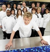
Back Into Hell

Upon returning to Hell's Kitchen, they find the remodeling well underway. And Chef Ramsay has another little surprise for them: thier kitchen staffs. Returning to Hell, we found: Keith, Garrett, Tom, Giacomo, Rachel, and Omarosa...er, Sara.

They then began to choose staffs. The winner of the Vegas challenge got the first go; Virginia, somewhat surprisingly, chose Keith. Heather, rather expectedly, chose Rachel. Virginia then selected Tom, Heather took Sara, Virginia selected Giacomo, which left Garrett to go with Heather.

It was then time to break and go get the teams in shape. Heather came out strong, with a team who looked like they wanted her to win; it was quite amazing to see even Garrett with a great positive attitude. Heather knows how to motivate.

Virginia...well, hmm. Let's just say she needs a bit of polish. She wasted little time in saying that she intentionally went for the weakest links, which went over about as well as one might think it did. We think her idea was to show what she could do with the dead-enders, while giving them a chance to be on a winning team.

Keith once again showed what his "slammin" version of class was by demanding money for performace. He'd guaranteed her that he would give his best in return for money. Tom and Giacomo didn't look very good during this exchange either; eventually, Virginia relented and promised each one $1,000 which, considering the prize in the balance, is actually getting off easy.

Troubles In Paradises

This was about midway through the day of the evening in which each Chef's respective restaurants were to open. Many problems cropped up during construction (which must have been round-the-clock) and each were taken care of in thier turn, portraying management skills on the fly, and leaving us to wonder whether or not, like the mid-service delivery three weeks back, they were 'programmed' in to test the chef's mettle.

Regardless, the remodels proceeded while the head chefs set up thier menus and coordinated thier brigades. The redesign problems faced by Heather were farily mild and were handled with easily identified alternatives, but Virginia's special effect–a 'waterfall wall'–looked abortive until a mere 20 minutes before opening.

But they were solved, the menus planned (with input from Chef Ramsay, who opined that there couldn't be two more different menus) and servers and staff ready. Let 'em in.

The Great Wall of Dining

The diners entered and began ordering; the kitchens fired up under the direction of thier respective head chefs, with Ramsay looking on. One thing they weren't told; the president of the Red Rocks resort was there to sample from both menus, and his input was to have great influence over Chef's choice of the winner.

While each kitchen had thier ups and downs, in all, Heather was solid from one end to the other. She bossed her crew with resolve, excercised excellent quality control, and prevented the kitchen from going off into the weeds.

Virginia's was more error prone. When Tom cut his finger, things started to look grim. Before that, Virginia's obsession with perfection caused her to take posession of plating everything, and they were getting buried. Also, her weak links, while better than before, were still weak, and it kind of showed. Ramsay abused Tom for being a prima donna over his finger cut–which really wasn't all that bad, we've suffered worse–and had to almost harangue Virginia into delegating some help from Keith at the pass. Once that was done, however, the service picked up, and Virginia closed the gap. Unfortunately, in Virginia's haste to get ahead, she was sending out poor-quality entreĂ©s by the end–including a fish filĂ©t that was all but swimming in oil.

Both finished strong in the desserts, and there was a very entertaining sequence where Heather had to ride Sara about obvious mistakes in plating her desserts.

The Ride is Almost Over

End of service. Both teams gathered in the kitchen, given high praise by Chef Ramsay, and complimentary yet vague insight by President Red Rock, giving both dishes he tried high marks but seeming to favor neither.

The teams dismissed. Heather and Virginia return to the dorm to await Chef Ramsay's decision.

You Have Two Doors. Behind One Of them Is Living The Dream...

Eventually summoned upstairs by Ramsay, both women find themselves before two doors. Chef explains that he's come to his decision influenced by customer comment cards and the input of Prez Red Rock. He gives them respect and admiration for weathering the course, and a job well done.

He issues both chefs a door key, one for each locked door; the winners door will open. On the count of three...One...Two...

...Commercial break...aneyurism...back from break....

One...Two...Three...go.

Heather steps through. The room below, filled with diners, guests, and the other contestants, erupt in cheers. From behind the door, we can see Chef Ramsay embrace Virginia in consolation, but, even here at the Station, there isn't a dry eye in the house.

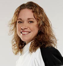
We had a feeling it would be Heather all along. From that first time she delegated her station in Week 2, when she burned her hand, we had a feeling she had the right stuff. And we all who followed Heather were right. She's a 25-year old chef who got the chance to show that she wanted the summit so bad, and took that and ran with it.

We won't feel too sorry for Virginia, however. No, she didn't win The Prize, but she won our respect, and we think that someone with her palate and design skills shouldn't have much trouble finding some sort of success.

But only one could win, our new hero, Heather West.

Chef Ramsay Gets The Last Word

"I'm looking forward to my next challenge...and f*** you all!", as he gives us a hearty laugh as he goes into the sunset.

Ready For Another Helping?

Various sources have reported that Hell's Kitchen has been picked up for a 3rd series, ETA next year about the same time.

Though we'll have to, we can't wait. But we will.

Technorati Tags: , ,

[pdx_misc] Tom Peterson Say "Wake Up!"

A couple of bits of feedback I've gotten lately on an article I did a while back about our old friend, Tom Peterson (you know, the fellow at 82nd and Foster Rd) wondered if I didn't have a sound file of his famous "Wake Up!" commercial.

Sadly, I do not. But now I'm curious if anyone has such a file? Does anyone out there have such a file? If you do, follow up here, and we'll link it out to the world...or send it hither, and I'll find some way to host it.

Those of us Mac addicts can't change the wake-up sound on our computers, but wouldn't it be cool, you Wintel folk, if your box gave you a cheery, Tom Peterson-style "Wake up!" when it did?

Technorati Tags: , ,

13 August 2006

[type] Kerning vs Tracking?

I was recently priviledged to observe a discussion amongst typeophiles over which was better to use–kerning or tracking. It's a fair question, I think, because it illustrates that the two are similar enough in concept (though strikingly different in application) to cause a certain "blurring of the lines" between the two.

Both of them are all about letter spacing. Typographers speak of something called 'text color', and what they mean by this is that, when you look at a page of type, there is a general impression of a tone of darkness (I'm going to assume dark type on a light page). The overall letterspacing will have a bearing on this: tight spacing will cause the color to darken, and loose spacing will cause the color to lighten up.

I can see I'm getting a little ahead of myself here, so let's provide some definitions for the non-typophile:

Kerning refers to altering the spacing between only two letterforms. While the exact derivation of the term is unclear (one reference I use says the term stems from a German word for corner, which I find a little suspect), the kern itself is the area one letterform 'intrudes' into another letterform's space with. As an example, if you consider the word "Tower", the letterspacing between the majuscule T and the minuscule o looks more comfortable if one actually 'scoots' the o just a bit below the top cross-stroke of the T.

On the other hand, tracking refers to letterspacing over a range of letters–from a single word to parts of a sentence to whole sentences and paragraphs and beyond; in fact, another term for it is range kerning. Desipte being similar in concept–it has to do with spacing between the letterforms–it is not the same. Tracking is typically use to apply a standard amount of letterspacing over that range, and is not used with respect to any two individual letterforms. Tracking is usually termed "loose", for more space between than default, or "tight", for less.

Without using any examples, what may become evident here is that one isn't better than the other–one is more appropriate than the other. There are situations where tracking is a more appropriate tool than kerning. I'll illustrate.

A Situation That Calls for Kerning

Kerning is most appropriate when you are letterspacing very large letterforms, such as headlines, or any large text.

The reason that letterspacing is important is that uneven letterspacing tends to arrest the eye. Break open your favorite word processor (or if you have MSWord, for instance, get familiar with it–while they can't do layout, they're amazingly advanced on typography, once one gets to know them) and take some word (like Tower) that has an initial majuscule like T that un unascended minuscule "wants" to kern toward. Now make it real big–72 point or bigger.

If you've not touched the kerning, the program used the font metrics to determine the spacing. And you'll instantly be aware–even if only sublminially–that there's too much air in general between the letterforms, and the spacing of the letterforms themselves seem rather uneven. A typographer laying this out as a headline would put thier I-beam between each pair that looks like it needs it and kern them out (increase the space) or kern them in (decrease the space).

Kerning is best used on large letters, where individual tweaking can even out the spacing in headlines. When the spacing between large letters feels equal, the eye concentrates on the letterforms, and doesn't get 'hung up' on the space between

A Situation Calling for Tracking

Since kerning is most useful when the letterforms are big, it follows that tracking, if adjusted at all, might be most aprpos for letters at body text sizes–say, 10, 12, 13 points.

Consider any regular paragraph of text type, and think about the look of the letterspacing. At that size, the difference between irregularly spaced letters becomes very small, essentially unnoticeable to the untrained eye–which is most of everyone. Kerning is just not that essential.

However, when the eye does take in this text, it takes it in as a field and any overall differences are registered much more readily.

Tracking, at least when I've used it in this wise, is a tool for copyfitting. One of the challenges of the layout artist is to 'shoehorn' edited text (that's what we have editors for) into what is, most often, a predefined space. Adjusting tracking (along with adjusting leading and space before/after) is a quick way to make overset text fit into a space that's a little small.

The catch here is that you can vary it by just a little, but not too much; the eye will notice and attention will be called to the change, arresting your eye in the same way that uneven kerning on headlines will.

The key to the trick is to adjust tracking over a big range–not one sentence or one word, but one or more paragraphs as appropriate. The bigger the range, the smaller the amount of tracking per letterform pair is required. When you spread the change out, you have to change it less, and the final result will blend in better with the rest of the page, and not call attention to itself. The final look will be more professional.

It's a balancing act for the layout artist, and usually comes down to trial and error, but for the enlightened layout artist, it's an entirely doable thing.

And Now, To Summarize

Kerning
occurs between two letters only, and is best used when the type is really large, as in headlines and subheads, but not text type.

Tracking is letterspacing over a range, and is best used when you're adjusting the type color to blend in with the rest of the layout, or copyfitting overset text. As Frederic Goudy said, "A man who would letterspace lower case would steal sheep", which has always meant to me that if you're kerning minuscules, you have a whole lot of time to waste, and are probably involved in other unsavory practices...like using MS Publisher.

It's not which is better...it's which is more appropriate.

Technorati Tags: , ,