27 January 2014

[art] Saturday in Portlandia: Handwriting Class with Barbara Getty and Inga Dubay

3019.
If it's Saturday and I'm in a handwriting class and there are adults there, this must be Portland.

That's what I couldn't help thinking while waiting for the workshop to start, and various variation thereunto.

This last Saturday, the handwriting artists and calligraphers Inga Dubay and Barbara Getty held a three-hour seminar on their Getty-Dubay Handwriting Method in a room called Kempton Hall at the Trinity Episcopal Cathedral in NW Portlandia. This was a feast for my eyes and senses on so many levels.

The room itself was large yet cozy, with the sort of clear-lacquered floor one expects to see in auditoriums and dance rooms. Inlaid into this is a large labyrinth, the kind that's popular these days to walk along as a meditative tool, and a stage at the front of the room which has seen decades of use, worn in that well-maintained, much-loved way such things can be.

All was in brown, comforting, earth tones. Above the room, on the south wall, a monumental painting of the cleric this room was named for commanded and watched over all; it's a very very kind space. And we were all there to see how we might right gud.

Er, write good. Sorry. Couldn't suppress the joke.

The seminar was free and offered me a chance to kick my obsessed-upon handwriting up to the next level, and The Wife™, who is writing more stuff these days and I couldn't be more pleased with this, wanted some tips to make her handwriting sing a little more.

Ain't no sin there, wanting to handwrite better, and I'll stand in nobody's way.

My handwriting has always been good, and the way I obsess on it, it should be. But a refresher betimes is no sin, and when you can get Getty and Dubay's insights for just showing up … well, as Tom once said, free is a very good price!
You may have heard that the preference for handwriting in America is declining, with even cursive in danger of becoming a lost art (I wouldn't be so sad as to lose cursive, but more on that later). So, even though the seminar  was on a Saturday tucked into a corner of NW Portland which is kind of hard to find parking in even on a slow day, the attendance was … well, extremely heartening. We got there about 35 minutes before the show got underway, which was lucky for us as we were kind of pushing it. Though I lived in NW back when it was still affordable, there's one thing that hasn't changed at all: Parking is hell there. We lucked and got one of the few spots in the Trinity Cathedral's microchip-sized parking lot.

I'd heard of Getty-Dubay handwriting before but this was going to be an up-close look, and I was eager, to say the least. I've been an advocate of italic handwriting (as opposed to cursive, which is what we all learned in school – I was a victim of the Palmer method) for all my adult life so far. When I was
The first of my many role-models.
Sourced from here.
in high school I had an epiphany after looking at typing from an IBM Selectric Light Italic typeball (how the olde-tymers kicked word-processing old-school, yo). I can't remember the day or time of the epiphany, but I do remember gaining, quite suddenly, the awareness of two things:

  1. I didn't have to write cursive the way they said I had to anymore, and
  2. If I made it legible, they wouldn't care anyway.
I had started in junior high, actually, writing my minuscule q a certain way that gave it a foresail-shaped banner instead of a loop, not knowing then I had discovered one of my own keys to distinctive, recognizable, and admired handwriting (I am not bragging when I say I've received more compliments than I can count on my everyday hand … it's the truth). 

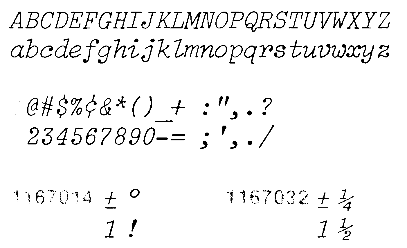
What I was busy discovering, in my reinventing-the-wheel way, was italic handwriting. To most of us, italic means what I just did with that word italic there … giving it a slant for emphasis. The word italic comes to us from Italy, where the slanted hand was first devised. And it was  used there for fine, fine handwriting … every handwriting aficionado knows of Arrighi's La Operina, and it would do one no damage to peruse a copy when the chance presents itself. This is italic at its utmost, and most poetic.

Today's handwriting is a mess. This I lay at the door of what we commonly call 'cursive'. It has a noble purpose - speed. The word cursive itself shares Latin roots with a word which also gave us coursing and Corsair … words denoting fleet speed. Some call it running script. To promote quickness in writing, letters are joined and loops introduced, and if you can do it right, it stays readable. 

It's tough, though, to do cursive right. Cursive promotes speed and speed becomes its own excuse, leading to a mess of loops and capital letters than in no way resemble either the minuscule versions or the constructed, printed version. Sure, there's a G, Q and S somewhere in the strange cursive construction meant to stand in for them. But you've pretty much got to take their word for it. Cursive destroys legible handwriting, without legibility, nobody wants to do it much. Who's going to blame them?

Italic handwriting promotes deliberation, and if you started out slowly at it at first, don't worry: you needed training wheels before you can ride on two wheels, and starting out in italic can be maddeningly slow. 

But then, you weren't born writing cursive, either.


The Getty-Dubay method teaches italic handwriting with an emphasis on simple rules you learn on the 'printing' side of the learning curve which just about anyone who can hold a pencil can aspire to. Then, when you're ready to go to the 'big leagues' of cursive italic, you learn a handful of simple joins, then you learn you can use them or not, as you care to. There's a wonderfully simple structure that you can decorate up or leave spare as you please. Italic really is more simple to learn than you might think. I'd challenge people to find this out for themselves.

Upon arrival, we were greeted by a very nice and polite young lady who gave us white envelopes with the seminar's materials. There were handouts with practice-sheets (which we all used, rather lustily) five or six sheets of good-old-fashioned looseleaf, and the most delightful example-card which now has pride of a certain place in my studio. It's pleasant just to look at, and inspirational to look at besides. It'll stay up there for a long time to come, I expect.

The teachers, Barbara Getty and Inga Dubay, give off the air of being elementary school teachers from way back and, as far as I was able to find, they were; you wouldn't think that they could deliver the basics in three hours but, by Arrighi's nibs, they sure were. The passion they had for this certainly delivered. And the classmates were as affable and friendly a group of learners as I ever wanted to find. There was free World Cup coffee, which can make a bad day good and a good day better, and they sold some of their books at a table in the back for a discount just for your having come out.

I've read books by Lloyd Reynolds and Fred Eager, and Getty/Dubay belongs alongside of them; ahead, because they are the current champions of handwriting as a thing in these modern times, a task which must seem thankless now and again. But I'd recommend this to everyone. Look, you don't have to write for anyone but yourself even to enjoy the fun in handwriting this way.

From what I've seen, Getty and Dubay run a seminar like this every January. They are more popular than you'd think, and if there's going to be another one in January 2015, then I'd just start making my plans now.

You can keep up with Inga and Betty on their website, http://www.handwritingsuccess.com/.  I've seen their books on handwriting at Powell's, as well.

26 January 2014

[PDX_liff] The Family Pictures at Midland Library

3018.
At the time of this writing, along the back wall of Midland Regional Library, on SE 122nd Avenue at Morrison Street, is a series of pictures. They're large format, and hard to miss.


There is a similar lineup on the other side of the building, these gorgeous photos of families. Well, as detailed by the poster in the next photo:


It's We Are Portland, an arts initiative by MyStory Portland, which describes itself as:
…a mobile arts organization that brings photography workshops to underrepresented Portland youth. Our programs give young people an opportunity to explore their lives through the lens of a camera, and strengthen their communities through the arts. We collaborate with community organizations in building programs that empower low-income and recently immigrated youth.
So, it's arts to the people, who always had it to begin with, but tend to get talked out of it repeatedly by our rather dysfunctional culture, which has kind of lost what it means to be an artist and to make art in many ways. So this is a thing of which you would possibly assume I approve of, and I do.

They do take great photos, don't they?


And the explanatory poster has this logo in the corner, which is just worth showing off.


Now, there are other pictures there. I didn't include them because discovery is most of the fun.

Maybe a visit to the Midland Regional Branch of the library is in order, so that they may be seen. Couldn't hurt. Got books there and everything.

[design] The Talking Leaves Of The Midland Library

3017.
There is a big painting on the right as you enter the Midland Regional Branch of the mighty MultCoLib. It looks like this (as taken from the complete other end of the building because art, don't argue with me) …


The title is Talking Leaves. It's a biggie as one can see, stretching from about head-level to almost the ceiling. Below it, behind a clear panel, is what looks very much like conceptual sketches, in charcoal, of the creative process leading up to the panel.

The whole thing is abstracted trees and leaves, and the stories they tell about themselves. The beguiling gray and white and gradated thing on the right is noted as a 'lollipop tree', a fanciful thing. The suggestion of the lazy-8 inside always causes me to kind of space into it. Above is a leaf and another abstraction of that takes up the left. In the lower left corner, a seed.

There is another meaning of talking leaves, and I hope some of you who may be reading this arrived there before I tell you this: it's what Sequoyah called books.

It's only logical, therefore, that the motif be drawn out from the painting to cover the whole building. As it is, if you look along the high ceiling …


Th leaves alternate all the way down the center aisle, anchored by the seeds at the four corners of the design.

24 January 2014

[pdx_photo] Workaday Mt Hood At Sunrise

3016.
There is a stretch of NE Killingsworth Street I use daily, near I-205.

It gives fine views and usual memorable sunrises. Thus.


My day begins after most of yours ends; conversely, mine ends when most of yours starts.

You look upon the morning commute with dread. Me, not so much. And I can take a moment out to look, really look.

Of course, some feel Oregonian is just a granfalloon. Whatever, it's an excellent thing to be.

22 January 2014

[teh_funny] The Gay Shipping Forecast, Transcribed

3015.
It's gone round the world and come right back into your face, though not in an embarrassing way.

Blighty has its own chorus howling about how tolerating Teh Gay has 'removed God's protection' from England's Mountains Green. It would seem that, similar to the hectoring warnings about increased meteorological and geolphysical travail that we get in America from fundamentalist teleministers, they get warnings that sound like mail-merge script in the UK.

Theirs is a man named David Silvester, a councilor in the UKIP (United Kingdom Independence Party), a sort of British sort of Libertarian sect which advocates leaving the EU, and he wrote a letter to a local editor all but coming right out and saying that a spate of recent flooding may just as well have happened because of tolerance of gay people. This went viral and is currently getting the right sort of ridicule, which is hard and hilarious.

Nicholas Pegg (really, you don't know who he is?) decided to have a bit of fun and coöpted a UK broadcast institution, the shipping forecast. Brittania, of course, once ruled the waves, and the feeling of the UK as a great naval power has never waned. People who have no conception of even how to dog-paddle listen avidly to the shipping forecast; Fog in Channel, Continent cut off goes a famous line.

Here, then, the UKIP Shipping Forecast:


In listening to it, though, I was entranced by the cadence and the easy way with which the areas were ticked off and listed. I wanted to read along, actually, but the words were not to be found.

I have taken the liberty of transcribing them, because I love reading lyrics with a song, and this is no different really. With apologies to the author:

(music fades in, and out)

And now, the shipping forecast, issued by UKIP, On Sunday, the nineteenth of January twenty-fourteen, at twelve hundred UTC.

There are warnings of gays in Viking, Forties, Cromarty, Southeast Iceland, and Bongo Bongo Land. The general synopsis at midday: low intelligence expected, becoming Little England by midnight, tonight. 

And now, the area forecasts for the next twenty-four hours: 

Viking, North Utsire, South Utsire: southeasterly gay 7 to severe gay 9, occaisionally bisexual. Showers, gay.
Forties, Cromarty, Forth, Tyne, Dogger, Fisher: Women, veering southerly 4 or 5, losing their identity and becoming sluts. Rain, moderate or gay.
German Blight: Immigration veering north. Figures variable, becoming psychotic. Showers, gay.
Humber, Thames, Dover, Wight, Portland, Plymouth: Benefit tourism, 98%, becoming variable, later slight, or imaginary. Showers, gay.
Biscay, Trafalgar: Warm, lingering nationalism. Kiss me Hardy, later becoming heterosexual, Good.
FitzRoy, Sole, Lundy, Fastnet, Irish Sea, Shannon, Rockall, Malin, Hebrides, Bailey: Right or extreme Right veering racist 4 or 5 increasing 5 to 7. Homophobic outburst, backpedalling westerly becoming untenable. Showers, gay.
Fair Isle, Faeroes, Southeast Iceland: Power base decreasing, variable, becoming unelectable. Good.

And that concludes the forecast. And now, it's over to Ambridge, where Bridge Farm in still knee-deep in water, and the village is counting the cost of Adam and Ian's civil partnership.

(music)

What really impresses me about all this is the insight into UK isolationism, jingoism and hyper-nationalism and xenophobia this gives us. I'm so used to the sort which grows here in America that it always seems indescribably odd that another nation should go at it with such gusto and joie de vivre, but the insight that Nicholas Pegg's piece gives us is a strangely familiar one. By the tenor and substance of his jokes, we find that UK xenophobia is not all that different from America, as the UKIP-infected shipping forecast shows, the right-wing litany is rather the same, with prehistoric attitudes on women and utter fear of the immigrant moving in to take advantage of the advantageous features of the economy (that's apparently what benefit tourism is).

Plus ça change …

There are a few references worth noting. All the boldfaced names are sea areas in the seas adjacent to the British Isles. Names like North Utsire (ut-SEARY) and Fastnet roll of the British tongue quite fluidly but sound like strange music to the American ear. Two obvious jokes there, of course: "Bongo Bongo Land", being one, and the German Blight, which is a pun on German Bight, which is the name of the elbow of North Sea which abuts Germany's northwest, between the Netherlands and the Jutland peninsula of Denmark, kind of Germany's left shoulder.

The reference at the end is for a wholly remarkable Radio 4 program, The Archers which, at over 17,200 episodes, is most likely the longest-running serial drama on Earth.

Anyone needing to know just where these sea regions are geographically located can view the map here.

I'm going to listen to that thing a few hundred more times.

20 January 2014

[pdx_photo] 82nd and E Burnside Photo Rhapsody

3014.
The photographic impressions of just doing your errands on a night when the sun sets gold behind Mount Tabor:

The platform … the front seat of our car … wasn't the best, but color of the backlit clouds above Mount Tabor was what I was after. And the atmosphere or the time.

The segement of E Burnside just east of the I-205 overpass. We like this stretch of road. Can't say why. Call it visual umame, if you must. 

New Urbanists call it 'distressed'. I call it home. 82nd Avenue looking south from Burnside.

The Chevron at 82nd and E Burnside, the Hong Phat Food Center that used to be the 82nd and Burnside Safeway, the sunset over Mount Tabor. The nose of our old Subaru. 

The Hong Phat Food Center that was once a Safeway. They're doing quite well, Haven't been yet, though. Maybe soon.
Heavy Eastside. It's how we roll.

[pdx] … And A Transit Bridge Runs Through It: An Editorial Comment

3013.
TriMet has, this week, released the list of the finalists for the name they'll be sticking on the new landmark Portland-Milwaukie Transit Bridge. They are:

  1. Wy'East
  2. Duniway
  3. Cascadia Crossing
  4. Tillicum Crossing
The four names stand pretty large in the history of the  Salish lands and the history of the American Pacific Northwest. Wy'East is, of course, the name the original locals gave Mount Hood. Duniway is for Abigail Scott Duniway, the suffragette (who already stands tall with a legacy of a park and a school), tillicum is Chinuk wawa for us folks, our people, our tribe, and Cascadia is the emerging name for our regional identity latterly.

A few problems come to mind with these names. All of them are fairly unoffensive, The first two still manage some inspiration, the last two sound like suburban shopping malls. Very historical, very important, very expected.

The real sad part, personally, for me, is who didn't even make the short list:

Kirk Reeves. To most Portlanders, he should need no introduction, but to those who arrived late in the game, here's a Working Kirk primer for you. Kirk Reeves, the white-suited man at the west end of the Hawthorne Bridge (and betimes other places, busking for a living, making bad comedy shows on local access, appearing as himself every OryCon, and basically making the world better by just being. Kirk Reeves, whose struggle with keeping the wolves at bay grew to be so wearing that he gave in, just a few months over a year ago.

TriMet has published the list of suggestions. I haven't the inclination to count myself, but a subjective peruse of the 202-page list of suggestions seems to indicate a sheer preponderance of Kirk (in some variant spellings). Joseph Rose at Soylent News™remarks that a page count comes up with Kirk's name on about 11 pages of the document; by contrast, Duniway got about four, and Wy'East, two.

So, clearly, this wasn't a popularity contest. 

It does make TriMet seem a little out-of-touch with its constituency though. Wouldn't be the first time that has happened over the last few years, we bittersweetly note, not at all.

It has been pointed out to me that perhaps a sort of wide-screen personality could really only support the idea of a bridge name. As far as that goes, Wy'East or Duniway goes just fine with me. And, as T.A. Barnhart pointed out to me, Kirk's name would fit perhaps a little better as a park name or a place where performers could come out to play. I'd picture that as a Oregonized sort of Speaker's Corner, something we really could rock, in a Portland way. Picture people debating in one part, someone playing a public tune in another, and not one of our local over-promoted, over priced you-have-to-pay-to-get-into-Tom McCall-Waterfront-Park dos, either. 

A people's space? Working Kirk Reeves People's Park? I could get behind that.

But, in the meantime, if TriMet wasn't interested in what the people really wanted, why did it bother to ask at all? If there was no possibility of Kirk's name going on the bridge, at least it could have thrown us a bone by putting it on the short list.

And, in my opinion? I think Kirk was big-screen enough for his name to go on that bridge.

I wonder, would his story have turned out any differently if he'd have known how much affection the community had for him?

I know people might disagree with that, and I'm down with it.

You can download the pdf list here, if you wanna.

17 January 2014

[liff] Odds and Sods #2, 2014

3012.
Before I sign out for the day, cats and kittens, here's a few sweepings from the studio floor.

Happy Frigga Day, and always remember to keep your precious documents out of Fluffy's way!

16 January 2014

[pdx_photos] Downtown Portland at Sunset

3011.
Posted because I found them in my photo 'stash. I love downtown Portland as the sun goes down. Always has been thus; pretty, shimmery, glimmery, ephemeral. Never more than recently.

All copyright me. Don't steal 'em, okay? If you want a copy, contact me for terms.


15 January 2014

[art,map] Port Oregon Grows To The South And East

3010.
Played around with expanding the city of Port Oregon tonight. Actually it's not an expansion such as a filling in of what was supposed to be there when I envisioned the place and cross-referencing it with my experience viewing city grid after city grid, which has been my lifetime's obsession.


In this view, North is in the more-or-less-1:30 PM position.

The next exploration is filling in the areas outside of but immediately adjacent to the original town. In a city as rigidly planned as the original 672-square-block townsite. As towns grow they tend to follow a kind of hidden logic, a combination of the way developers want to build streets combined with a sort of gestalt akin to manifest destiny … things will go this way because we want to try this and also things should be more or less going that way.

The original town and areas immediately adjacent are bound by two rivers; the wide on, on the east, which forms something of a natural harbor, and is a very short river formed by the meeting of two forks there at the bottom of the photo, and the river that flows in from the west, which rounds off the central city area on the south.

An old harbor district will form there in the blank pocket between Jefferson Street and the big river, I just have to figure out how the streets will run. Probably extended out from the main town with a few random short streets thrown in for fun in irregular positions.

The central city, north-south, measures anywhere from 2.5 to 3 miles in dimension, and that's only because I haven't settled on the length of a standard city block yet.

[logo] JCPenney's New Old Logo … Back To The Future

3009.
Forward, into the past … just quietly. Easy does it. Back away from the new-style logo change and marketing approach and nobody gets hurt. We'll not talk about this again.

JCPenney is returning to its roots in Helvetica, it would seem. It will be recalled that, back in 2011, they spiffed up their logo to an all-miniscule version that I reviewed positively (and still like). Not long after, in 2012, they changed it to a strange-looking square with an empty middle that carried the JCP trigram in the corner like the union of the US flag. While I appreciated the boldness of the approach, I didn't care too much for the design … I thought the 2011 redesign had nailed it.

In the time since, much has happened at the store once known as The Golden Rule. A new CEO was brought in, Ron Johnson, who had a ton of New Ideas™. Ironically, the same man who'd worked magic at the Apple Store and Target pancaked so hard that to say he merely 'failed' would be gilding the lily, kinda sorta.

Business schools, I'm sure,  are still trying to quantify the degree of fail hard that happened here. The new 'stores within stores', the ending of sales to favor uniformly low prices, all sorts of issues … they not only didn't attract a new constituency, they apparently nearly completely alienated the old one.

So, monumentally, he's out. And, it happens, a lot of the stuff that he tried to do died with him. Some, right away, some others, more slowly. Like the new graphical attitude. I did note, when he flamed out, a lot of that went pretty quickly. Some lingered. The website took a long time to change, but, when I heard that Penney's is rejiggering its store constellation – losing some 33 stores nationwide out of about 1,100 and losing 2,000 employees … it occurred to me that I might take a look at the website.

And here's what I found:


There's the old look. Which wasn't a really bad look, after all; the use of Helvetica and a very simple wordmark kerned hard and just-so proves at least one thing; Helvetica is a timeless font and, at least in the JCPenney context, rather a timeless look.

As Hurricane Ron Johnson impacted, Penney's went from hubris through nemesis to catharsis in what must be record time for American business. Returning to its own past is a smart thing to do here … Penney's may have had an image problem, as far as some might have said. But it wasn't being accused of not working for it.

14 January 2014

[art,map] Meanwhile, In The Studio … City Building In Progress

3008.
Inspired by Jerry Gratzinger, I retake up city creation in the studio.

Port Oregon is growing from the center out.


I forsee the city center (about 28 blocks by 24 blocks, stretching from McCall Street (1400 W) on the west to Jefferson Street (1400 E) and Front Street to 24th Street, bisected by Federal Street, which is the east-west baseline. A lush public square at the intersection of Front and Federal leads, by way of a mall-like boulevard, to a larger public park at the intersection of 12th Street and Federal, in the way Philadelphia's City Hall sits in the middle of Center City Philly.

From Federal Square at the foot of the Federal Street Mall, diagonal streets run to the SW and SE corners of the original town, interrupted by two more public squares where they intersect 12th Street. From the 12th Street squares, just for fun, two more diagonal streets run to where Federal Street leaves the original town area, at 24th Street.

This will be something of a arterial map, the pattern of streets strongly suggested, but not to an exactitude. If I decide to break this up into page panels, though, this is the guide I will work from.

[art] Guest Post: The Comic Creative, With Christina Cabral

3007.
And now, after a long,long time my little blog tries to grow up … with a guest post! I am in a sort of a mixture of renaissance/reconfiguration and I'm aiming to push this into more of a resource. This means more than just sharing my art-healing but also trying to bring more than just my fun personality every entry.

This is the first guest post of my blog and, since I've been exploring creativity I thought I'd ask one of my more inspiring Facebook acquaintances for some insight. I adore work-in-progress and the creative process … I've always imagined it was like being able to watch a nuclear reaction in real-time on the atomic level … watching small things coming together to become something more than the sum of its
Copyright Christina Cabral. More awesome
at her website.
original parts.

L.A artist Christina Cabral's work crackles with inventiveness, flair, fearlessness and take-on-the-world attitude. Since she's allowed me the privilege of a front-row seat to her creativity, I've watched her go from merely great to excellent, zooming in a superlative direction. I find her art challenging, delightful, daring and antic. It brims with a sort of confidence that's hard to contain. She's going to be something big sometime soon.

So, naturally, I wondered about how she met her creative challenge. She graciously agreed to speak a few words about it, and I'm grateful for the privilege of sharing. So, the following words, which may be read … and read through to the bottom for links that will take you into this artist's world.

And now, Christina …


Because I went to school for animation I tend to start a comic like I would a short; I make a list of things that need to get done. This is just how I get to work,I’m just a crazy list maker.

  •  Idea
  •  Story
  •  Characters
  •  Supporting characters
  •  Concepts for world and character building
  •  Storyboard full story arch/or short story
  •  Block out pages
  •  Edit
  •  Finalize pencils on pages
  •  Ink Pages
  •  Edit 
  •  Tone and/or Color pages
  •  Edit
  •  Dialog and FX
  •  Edit
Clearly editing is pretty important to the process. Ideally sticking to the list is best but it doesn’t always happen. In the end as long as the final result is the comic you want to see then you did it,you made a thing! 

Story and Characters

It’s cool to have elaborate backgrounds for every character you have but it’s not as great to make that the first 5 chapters of your comic. For Gardenia* I just made quick 3 pose turnarounds for each character and wrote some simple stats on the side of them like; name, height, age. Since it was in black and white I didn’t color them. If it was in color I’d have worked that out in concept doodles and made a small square color key on the side of the turnarounds for future pages. 

When it comes to story I’ve learned from struggling on my first comic that scripts are important. Outline first then script will make storyboarding the pages much easier. Storyboarding/thumbnailing is also super useful because you can figure out the blocking right away. If you can coloring the thumbnails that helps too. The more prep you do the less time editing you need. 

Inking and Coloring

For Gardenia* I inked it by hand and added the tone with photoshop. Whatever you work in fastest is going to be the best bet. For me inking by hand is much faster because I feel the Wacom pen lags for the way I like my lineart. As for the coloring I like to use photoshop because it’s faster to block color out and still be able to change it on a dime.

Dialog and FX

Decorative fonts are neat but think about how you read a comic. If the text is too fancy it’s hard to read and takes longer to get the story across. It’s ok to have it on background items or characters clothes but not so much fun to read as dialog. I like to use Helvetica but any sans-serif works brilliantly. FX are just as tricky especially if the font is not contrast enough on what the FX are against. Quick fix for that is to add a stroke to the font in white or black (or contrasting color) so it will read but not distract too much. 

Layout and Printing

Layout can be done easily enough using InDesign. If you don’t know how to use it there are tutorials online that I used as well. Make a booklet tutorial (http://youtu.be/GY16m7QcFj4) Ah printing … the final frontier of your finished comic. You can use your local printer if you have connections,use a service like KaBlam (http://ka-blam.com/printing/front/) or Createspace or do like my friend and I did; print it at home/Staples using a long arm stapler to connect it. I don’t suggest the latter unless you have lots of patients and less than 10 pieces of paper for your book. The industrial cutters at Kinkos/Staples/printing places can only cut through so many pieces of paper. In the long run doing it at a printer or using a service is going to be way more cost effective because of test prints. Like always the first pancake is always ugly,no matter what. 


I hope these tips helped anyone starting to make comics. Work smarter, not harder. 

… Thanks, Christina!

A notabene… The comic Gardenia mentioned above is from her zine Kitten Squad: Resurrection, a romantic and spooky tale which I've been privileged to see. The zine is on my desk and ready for a review, and that's coming soon. Really moving stuff.

To get on board the Kittie express, you can follow her at Facebook; her Kittie Cakes Designs page there is https://www.facebook.com/kittiecakes. If you want a look at some more of her art and design, Kittie Cakes Design's home on the web is http://www.kittiecakes.net/, where you can see her other art, bloggy stuff, all sorts of goodness.


13 January 2014

[creativity] Need Creativity Practice On The "Fly"? Try Blobbing.

3006.
Stumbled on at FRCH's Creative Fuel blog, we find one thing we might do when we're stuck or just need to take our brain out for a spin or don't know what to create but want to create something.

Here, the Blob isn't something to beware, it's something to encourage.

Photo by Ben Wiliams from his article at
http://creativefuel.frch.com/2012/06/06/creativity-practice/.
Go there to see the rest of the very excellent work.
That's the whole thing right there. Delightfully simple, probably has been out there all along in front of you, and Ben Williams just crystallized it for you right here.

This is an experience I've had in my own life. The maps I sometimes create I draw out of interesting natural or manufactured shapes I stumble on. A big city I created once sprang from the way a concrete walkway branched; it became two one-way streets merging to create a boulevard. Another map, a make-believe island nation, sprang from the pattern of crack-like markings in a linoleum floor.

It's not hard to imagine drawing shapes solely from nature. A leaf can become an island in a river. One of my favorites come from the land of pareidolia; the North Portland 'peninsula', an inland peninsula surrounded by water on three sides (south and west, the Willamette River, and the Columbia on the north) bears an uncanny resemblance to a human thumb, as seen from the palm side of the hand.

Look at it sometime; you'll see. Of course, you won't be able to unsee it, but you run this risk when looking at the world that way.

So, blob if ya gotta; imagine patterns in the sky as things to base silly, but intensely creative drawings on.

Read all of Ben's excellent blog entry, including links to cloudy goodness and even more goofy birds, here at http://creativefuel.frch.com/2012/06/06/creativity-practice/.

[art] New Books in the Studio

3005.
Just in, these little gems:


The one on the left, The War of Art, by Steven Pressfield, is actually one we've had for a while. It helped me when I kickstarted my notional graphic design career (which remained notional; perhaps I left some ingredients out, I don't know … I'm going over those issues now) and it's a book full of good, as anyone who has ever read it will tell you.

The one on the right is the new one. I'm just taking that one up now. Turning Pro is designed as, at least visually, not a sequel, but an extension to War, I can tell this by flipping through and reading passages here and there. This is a good thing. Because, for me, getting inspired is one thing. I muff it up magnificently betimes, but getting started isn't really the problem, keeping going is the problem. I lose focus very easily.

I could say more about that but I realized I just came up about as far as I've ever really explored that subject. I knew I've received great gifts, both real and talent-wise, my problem has always been I don't know how to use them and where to take them. Mayhap this is my next stop.

In the meantime, I'm glad that Pressfield is extending the train of thought. For those of us who can catch the ball and run with it, War is a great book and everything it's cracked up to be. For those, such as myself, who can catch the ball but are promptly bewildered by how to run with it and immediately get sidetracked by some bright, shiny thing (in that I behave much as my cats do) this book (noting Pressfield's previous style) may be just the thing. I'll be exploring this in posts to come.

Next one: Urban sketching seems to be evolving as a social activity and distinct thing-to-do. I've picked up and put down this volume many times in bookstores, but I've finally been able to bring it home:


The Art of Urban Sketching, by Gabriel Campanaro, documents the group phenomenon via sketches from several cities in which this easy-to-join club has 'chapters'. Sadly, despite the wonderful Portland skyline in the bottom of the book's cover, my artist-heavy hometown is not one of them. But the stuff that is in there is so wonderful, so expressive and passionate, that I can't help but drink as much of it in as I can.

Nobody ever draws Portland's Outer East, and 122nd Avenue. Maybe that's my place. In the meantime, I'll be consuming it most deliciously.

09 January 2014

[liff in Cascadia] Weathering the PDX Winter Like A Native

3004.
It's just water, people.

Reed College … giving away our secrets, yo.

[music] Tal Wilkenfeld. No Reason Necessary

3003.
I was going to post a witticism leading into this, but there's no reason necessary. Tal Wilkenfeld is her own reason.


Just play it.

[Toon] Sprial Notebook Comics: A Look Behind The Scenes

3002.
One of the happier things I've seen lately is what John E. Williams does called 'Spiral Notebook Comics'. They double down on the creativity and the funny by being very spare, straight-to-the-paper, and close-to-the-inspiration.

From what has to be a very brief laying-out, the ballpoint goes right out to the paper. I fancy that this makes the route from inspiration to drawing that much shorter. There's a rawness that makes these little drawings memorable, and preserves John's dry, acid wit.

John's done us a solid by putting up a blog posting showing what he called 'outtakes' to his holiday story about Lucy. Here's one:

I adore WIPs, as I've tiresomely endlessly repeated. But there's a reason. I find them just as interesting, in an ineffable way, as finished works. I would have loved to see Michelangelo's sketches for the Mona Lisa.

See the rest of John's outtakes at

http://spiralnotebookcomics.blogspot.com/2014/01/lucy-outtakes.html

[liff] Odds and Sods #1, 2014-Week 1

3001.
Just to keep things fresh, here's some stuff I found tooling about the intartubez this week. I'll try to make this a regular Thursday morning thing.

In this article at Portland Architecture we find that the idea of demolishing the Portland Building has been broached. I'm hate this idea. I fail to understand the hatred this building generates. I think postmodernism is a silly term, because it's full of silly, but it takes a certain sort of courage to design and build an edifice like this. If they're thinking of demolishing it because 95 megabucks of renovation, that's one thing, but if they're thinking of demolishing it because WE HATES HOWZ IT LOOKZ, well, geez, grow up people. I've seen a hell of a lot worse than the Portland Building in even my modest travels. It's quite pretty, I like it, and that settles that.

Idibon wonders, in this post, about streets with strangely-coined names, a subject I'm planning to explore down the road a bit; that there are fewer First Streets than Second Streets, the reality of a 4400th Street, and Evil Avenue. These streets all exist, and I've found them on Google Maps. Read the article, then go on your own adventure.

The strange world of Lisa Frank is fading faster than the fugitive colors in her psychedelic tweenie's school supplies. The center of the candy-cane unicorn's world is a pale and lonely shadow of its former self (and, yes, there really is a Lisa Frank).

SARK, the artist (not the MCP lieutenant … this SARK is much nicer and won't make you fight on the Game Grid) has a way to get you out of your doldrums that looks workable. Micromovements*. It's sold as a way for busy people to Get Things Done, but looks like it can possibly overcome a certain inertia. Might be good for people mired in certain feelings.

While you're at it, just visit SARK's website. It's good feelin's.

And, ever wonder how our favorite art supply stores can be so awesome, compete, and not compete each other to death? Well, they compete … and they cooperate. They support each other as we support them. The pie is big enough for everyone to have a slice and still keep great art local. And this article offers you a look.

Laterz!

06 January 2014

[design] Dept of "You Had ONE Job, Designer!" Dept.

3000.
Yes, friends, this is post number three thousand. Celebrate, yay, streamers, party favors, okay, all that, now back to the show.

A couple weeks back I checked out, from the mighty Multnomah County Library, the Artists and Graphic Designers Market 2014. This is part of my middle-term plan to restart my art career. Truly necessary, this book is, if there's a place worth selling to, it's in there and there are some articles about career strategy and tactics. Also … look! … a free one-year's ride on the publication's website! Such a deal!

This is the front of the book:


The premium is located on a card inside the front cover. So, remembering that this was designed by designers and laid out by layouters, let's turn to inside the front cover to find …


D'oh!

I'll be that was one awkward meeting, after these books came in.

No, I didn't take the free year. I'm snarky, but I'm not shady.

02 January 2014

[liff] Books You Sometimes Find at Goodwill

2999.
A visit to a used-book section at a Goodwill store is the very definition of a roll-of-the-dice. The distilled quiet desperation of the normal life gives the cast-offs there a certain patina of needy humanity.

The biggest used-self-help-book stocks I've ever found is at a Goodwill store. To me, this is significant, but then I am a hard-core cynic.

Sometimes, though, you strike gold. One of the life's lessons that periodically shopping the Goodwill will teach you is to always check every corner at least once. Because you never know …


Letterhead and Logo Design Volume 5, Letterhead and Logo Design Volume 8, and The Pocket Muse, a writing inspiration book, by Jessica Wood.

The Jessica Wood book is particularly adorable:


… and, inside Letterhead and Logo Design Volume 5, I find this little gem from a local Portland designer whose life I admire a great deal and, well, I'll be honest, envy just a little:


Lesson: Check every corner! 

[art] Scenes From A Wanna-Be Artist And Designer's Studio

2998.
When we moved into this house, oh, so many years ago, I was finishing on the training for living the dream of being a graphic designer.

Like so many dreams a person will have (and, I fancy, me in particular) that dream has been evolved by false starts and failures and time and perspective. But I still think of it as the studio, the place where I'm forever trying to find my creative spark.

I have a computer tuned to Facebook there, so maybe my method needs a little less madness. I am trying for discipline, which is one reason why I'm blog posting more. FB tends to get passive; this is active. But that's for another program.

This room is still a studio, and if our assumptions about its provenance are correct, the room I store stuff in is where Al Monner probably developed the photos that gave the space under the Saint Johns end of the Saint Johns Bridge the name Cathedral Park. The space I call my studio is the space, an office-sized room, which stands between the storage room and the rest of the basement.

It's still my studio, but it's also my happy place. We all deserve one, and in a life full of false-starts, artistically, it's nice that at least I have achieved this. I do try to count my blessings.

I found myself looking it its various corners, stuff stuck to the walls, my beloved how-to-art-book collection lining the place, and figured that I could do much worse than documenting my surroundings. They make me feel good, they inspire.

Herewith, some of my happy. Thanks for stepping in.

A magnet, actually. John is my middle name, so I'm not actually a Red Lectroid. I do have a Yoyodyne Propulsion Systems cloisonné pin, which I wear betimes to make people wonder just what side I'm on. And I'm now reading The Crying of Lot 49 after finishing Pynchon's iconic V, so, who knew that Buckaroo Banzai could be the gateway drug to literature? Not me.

The center starburst is my own personal glyph, as has been seen whenever one digs into my artistic endeavors. It's my brand. I did this some time ago, when I was deep into the Society for Creative Anachronism and doing the arts and  crafts and drawings and FLAVENS.

Now this one is a very dear one. Back in the 80s, when I was first getting with the young lady who would become The Wife™, my pastime was creating make-believe city maps. City maps always have and always will entrance me. This is a city on a mythical island in the Pacific off Oregon, which sits astride the western boundary of the Juan de Fuca Plate, as Iceland does across its mid-Atlantic Ridge, and the city itself is called Port Oregon. Jerry Gretzinger's Ukrania has me looking at this in a whole different way now, and I'm thinking of expanding this. How old is this piece of paper? Follow me to the next photo.

The date on this? January 1st, 1988. At the time, I was working as an answering service operator at a place called Superior Answering Service, which used to be down in Sellwood (it's gone, obsoleted by technology and torn down in  favor of a rather charming retail storefront strip. You will, I hope, notice that this is the New Year's Day 1988 schedule for KATU Channel 2. At the time, back when anyone could phone in a comment to the station and its 'public comment file' was on paper, when the office was closed on the weekend, SAS had KATU as an account, and we took the public comments. Let me tell you this … you pre-empted This Week with David Brinkley and it would be senior citizen calls all day long! Discarded paper made excellent note-taking (and map-drawing) paper. And the idea of Port Oregon is 25 years old as of two days ago.

A unique greeting. Jess Warren, of Borked Planet fame, drew me this as a birthday greeting a couple of years back. It's not the original, but a print, but it is the thought that counts. I'll always be fond of this, in as much as it's from a real artist. Those are always the best.

If I didn't have my diploma to remind me, this would; three years of kicking my own ass to get a graphic design degree at PCC. If I had learnt how to find work as diligently as I learnt how to graphic design, I'd probably have my own agency now. Going to school with a stressful full-time-job, though … well, I did the best I could. I still have the knowledge and appreciation in my head, though, so there's that.

One of my corners. In the bottom there is part of my beloved collection of how-to-art books, also revealing that I had also hoped to self-learn the bass guitar - another dream that has thusfar kinda sorta foundered on the rocks of distraction and having to do something else all the time. The three designs right are three logos I did in PCC Graphic Design school, and I"m very proud of these. From the top: AdAstra, a theme resort for SF geeks; my entry in the Cascade Festival of African Films competition, and 'SunDial', a logo for a notional art supply, map, and bookstore. The clock is very dear, also; I've always wanted a 24-hour dial watch, but I do have the wall-clock, and it's just as good. And the NCC-1701D, because Enterprise. 

When I contemplate the lunacy of the modern political process, I look at this and realize that things are the way they are because maybe crazy sells. I mean, sane sells too … but who's buying?

And, last but not least, one of my most treasured objets d'arte. This is a wooden street 'blade' from the time when there were still pieces of the land between Portland and Gresham that were in Multnomah County. After SE 202nd Avenue fell into the orbit of Gresham (though, ZIPCode-ally, it's Portland) the county retired a lot of these signs, and The Wife™, who knows whereof my mind wanders, got me this for a Christmas gift about five years back. This is a prise posession, and totally-legally-came-by, promise!

… and that's my artistic coccoon, or some of the things that matter the most.

This is the point at which I'd offer you a cup of coffee if you were here.

We'll do that in our minds, shall we?