23 April 2013

[net_liff] Gmail Ninja, The Infographic

2929.From designer Aleksander Tsatskin comes a pretty effective cheat-sheet for all the keyboard shortcuts that, if you take the time to learn them, should elevate your Gmail exprience.

Everyone knows what keyboard shortcuts are. Every pulldown has a staccato list of symbols to the right of the commands; these key combos connect you directly to the function without having to mouse, click, drop, click.

The problem with keyboard shortcuts is that they require discipline and practice. It also might be more comforting just to find and read the command in your pulldown menu. It takes a little courage; you have to know what you're going for. But who doesn't, if you use any Word-like program to assemble your documents, know what the key combo for Italic, Bold, or underline? It's even here in the Blogger interface, which saves a ton of time.

I first learned the mad savings in effort that keyboard shortcuts when learning QuarkXPress. There were a group my instructor called the 'Fab Four', and indeed I used them all the time. The keyboard shortcut, CMD-SHIFT-OPT < or >, for instance, increased the size of highlighted type by one point up or down respectively. Saved a lot of mousing and clicking.

The infographic delivers just what's needful, and that's why it's good. Graphic elements are greatly simplified but very recognizable, and the visual grammar translates instantly.


A very effective use of color, style, line and shape; green is the color of the keys, yellow are the simplified instructions. Simple lines and shapes tell the visual story.

Here's the whole thing, via a link; if you use Gmail as your primary email interface, as far as cheat-sheets one could very easily do worse.

Gmail Keyboard Shorcuts


(via Bit Rebels)

22 April 2013

[design] A Symbol For Earth Day

2928.April 22nd, upon which eve this missive is being prepared, is recognized worldwide as Earth Day. And, in this era when ecological conditions seem more dear than ever, what with the state of the Arctic icecap (I hear there are projections that the Arctic will be ice-free in summer by the year 2025) and the rather depressing staccato stutter-step of I think it's some achievement hat Earth Day is being taken seriously as a day of awareness for all rather than just something 'hippies' celebrate (as I recall was its reputation upon incarnation).

Our ecology is important; it's the most beautiful world in the world. I couldn't be happy without you.

There was a symbol, created in the 70s by cartoonist Ron Cobb, which attempts to give ecology an icon. I remember it from then. It looked (and still does look) like this:


It looks kind of like the Greek letter theta, and like many such symbols, is invested with meaning. It can be seen as a minuscule 'e', a letter which stands for many positive things; Earth, environment, ecosystem, &c, &c. The crossbar is framed by an oval with a narrowing stroke at the top and the bottom; that the narrow parts are on the vertical axis renders a minuscule 'o' shape that we typographers call 'unstressed'. This gives two silhouettes; an ellipse along the exterior (a very natural shape, planetary orbits do this) and a circle interior (we live and socially relate in circles, there's a circle of life, and to the eye the Earth from space is approximately circular in shape.

The website PeaceButtons has a delightfully wonderful graphic that explores the various meanings; enlightenment thuswise can be found at http://peacebuttons.info/E-News/ecologysymbol.htm. They even tie the square shape in.

The first design I ever saw for an Earth Day or an Ecology flag, now, looked like this:


It was also designed by Ron Cobb. It features the Ecology glyph in yellow in a green union with green stripes. The resemblance to the US flag is obvious, and appropriate as I think, with our awesome technical prowess and national drive, if only we could summon it, the USA could lead the world in cleaning up the mess that was made. One might point out that it's also appropriate in as much as the USA led the way in making a great deal of that mess, but I'm not necessarily here to point fingers.

There is another official Earth Day flag, complete with ™ and all. Nothing personal, but I like the above better. I like the symbolism in the Ecology glyph, and I like the color green. I am an Oregonian after all, and green is what we try to do here.

Think of it as you go through Earth Day. What we do affects everyone else. And, with 7 billion of us on this shrinking blue marble, now, more than ever, we are our brother's (and sister's) keeper.

At least we can be a good neighbor.

And so it goes.

(Since Ron Cobb's website is just a front page right now, here's his Wikipedia entry. He's been places, yo.)

21 April 2013

[design] Why FontLab Is My Friend

2927.In a previous post, I wrote about how I was viewing eventually upgrading to OS X Lion with some trepidation because FontLab Studio 5, where I play glyph games, is PowerPC and requires Rosetta to run.

FontLab is good to its users. The company has a free upgrade that transmogrifies FLS5 from a PPC application to a Universal application.

Problem solved. Ta muchly, FontLab!

19 April 2013

[maps] Redistricting The District - The Washington DC DIY Reapportionment Game!

2926.In case one did not know, representation amongst the states in Congress is based on the idea of the district, a sort of an atom of representation below which no further divisions can be made. The United States is, as you ought to know, overlaid with a highly-irregular grid of 435 Congressional districts which are based on population as determined at the last (2010, in this case) National Census.

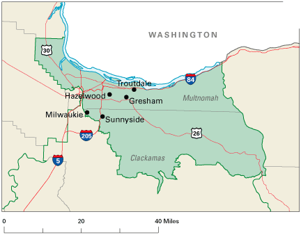
Being based on population makes area irrelevant, and the number of districts in each state are highly variable. Here in Oregon, there are 5 Congressional districts, based on population; the last Census showed a trend toward a 6th District, but we didn't quite make it. The population metric makes for some highly amusing borders. Prior to the reapportionment, this is what the 3rd looked like:


I live very near the dot marked Hazelwood. Fully three quarters of the city of Portland lived in the 3rd up to 2012, just the southwest part of town and part of the northwest being in the 1st District (currently Bonamici, formerly the ill-starred Wu). As of reapportionment last year, this is what the 3rd looks like:

Picture sourced from here.
The 3rd gained the west side of Portland and parts of Clackamas County, but lost the extreme NW panhandle of Multnomah County. Sauvie Island is now part of the 1st. At present, one Congressional district equals approximately 600,000 citizens. It has to be a more-or-less thing, of course; some Procrustean beds just can't be layed in.

The reason I told you all that was to tell you about this. You want to take a a crack at apportionment? Well, the congressional map is said and done and settled, but there is the city council of – appropriately – the Nation's capital, Washington, DC. The District is a unique animal as it has to be; politically independent of any state, the geographical size of a large city, with a population about that of a Congressional district, ruled essentially by the US Congress but with local control devolved to a twelve-member City Council which legislates for the community (the Congress still has the right to stick its nose in where it deems appropriate). Every so often the District has to do the same thing that the nation has to do, so this is kind of a microcosm.

You can take a stab at redistrcting the District, via the DC Redistricting Game, on the web at http://redistricting.greatergreaterwashington.org/, (via the regional blog site Greater Greater Washington). Following the game link above, you are taken to this screen:


This is the territory of the District of Columbia, divided into census tracts. The button on the right allows you to go into the main game if you don't live in the District or you do, but don't want The Man to know where you're spinning your nefarious plans from. Click that button, and you go here:


Now, we're down to business. These are Washington's 8 wards, which you might otherwise think of as Congressional districts in a State, only these have only about 70-80,000 citizens each. On the right there is a color coded list of Wards, populations, and whether the ward is too small, too large, or just right.

Game play from here on out is rather simple. Clicking on each census tract will display a small window giving you the population of that tract and buttons for each ward that you can assign that tract to. Naturally, you can't transfer a tract from deep within a ward to another ward; wards are contiguous, and  outliers such as enclaves or exclaves are not allowed … no gerrymandering now! The population list live-updates as you callously toss populations back and fort, and when everything's acceptable, you'll know right away. Then, you click the done button to share and boast of your Solomanic apportioning wisdom. This is what I came up with:


In order to balance things out, I took a piece of Ward 2 (green) and give it to Ward 1 (Orange); a piece of Ward 6 (pale blue), just west of the Capitol and containing mostly a bit of freeway, to Ward 2, balancing out those two districts. Wards 7 and 8, on the east point there, required a bit more finesse. I
have three pieces of Ward 5 (the dusky pink section along the NE edge (or consult that little map I have right because I'm still sucky at giving suggestive names to colors (when The Wife™ comes along and reads this, she'll proofread me, I'm hoping, because she's awesome at that)) to Ward 7 (buff, at the extreme eastern point). This overpopulated Ward 7, however, giving Ward 8 two small pieces of Ward 7 solved this problem. With those two adjustments, my map was in balance, God was in his Heaven, and civic peace reigns in the District.

Here's a link to my map which will give a better view (the swapped tracts are in a heavy outline:

http://redistricting.greatergreaterwashington.org/#25091-9mi6vq6n.

So, give it a try yourself. No smoke filled rooms now (computers hate that), or Machine politics (at least as far as I can tell, but maybe you can role play with some members of your family you don't like so much and threaten to pull funding on something or other (which DC Home Rule doesn't allow, but this is your game so, hey, play it up.

Remember, the URL is http://redistricting.greatergreaterwashington.org

18 April 2013

[liff] OS Upgrade: Striding Boldly Into The Brave New World Of 2009

2925.I've cowboy'd up, put on my big-boy pants, got up the gumption, and finally upgraded my iMac to … Mac OS X 10.6 Snow Leopard.

Stop laughing.

Seriously, there were a lot of potential pitfalls here. Before I was working with this machine, I was working (most of the time very happily) with a PowerMac G4 from 2004. That was one sweet machine, and stylish, too. And I've always loved Mac OS X, not because it was Apple, so much, but because it was Unix (Darwin, so to say) at its heart.

Despite unnerving years of experience with Windows, I still have no clear idea of what's going on under the hood there. It's a scary place.

But still, as I said, there were pitfalls. For one, the vintage of my current machine. Not the oldest out there, but a Mid-2007 (built the third week of August, to be as precise as I need to), which is supposed to support up to Mountain Lion. Still, I worried. I seem to be a little snakebit on such things; I have known failure on things that were guaranteed to work. Or maybe it's just my 'worst case scenario' way of thinking; I was sure that, since it was me we were talking about, despite having a machine that was nominally supposed to support it, I would spend the 20 bucks on getting Snow Leopard only to have it spit the DVD-ROM right back out.

It ain't easy bein' me.

I also heard many reports about how Creative Suite 4 didn't run completely well under Snow Leopard. I don't use those apps as often as I want to, but when I need them I need them. In some phases of my life, I guess you'd call them mission critical.

But when your OS is about 4 versions back on the type of Firefox it'll support, it's clearly time to do something. So I ordered.

It sure is cheaper than it used to be. A lot of the upgrade experience is moving away from the monumental thing it used to be, and I guess here is where I show of that I'm moving into the sort of person who feels his POV is a bit 'old fashioned'. I remember getting OS X 10.3, Panther, and it was in a big box typical of what I expected computer software to be in. You had something to hold. The upgrade to 10.4 (Tiger) was in a much smaller box but still had some heft. Upgrading to 10.5 (Leopard) happened because it came installed on the computer I bought from PowerMax. Now it's 10.6 time.

Man, that box is small. I mean, it could hold a box set of The Essential Starland Vocal Band and have room left over for the The Essential Terry Jacks. Yeah. That's small. And I know it's getting smaller yet; you don't even have any boxes to hold when you get 10.7 and  10.8, but … no, not yet.

At least you aren't paying $100 a pop for a complete OS. That's something.

So, I put in the disk and we go to work. Whoop … cancel the install. Almost forgot to put in Rosetta. No Rosetta, no FontLab Studio 5, no Photoshop droplets (isn't that strange).

An hour later (the computer did not spit out the disk, yay!), we're upgraded. Even that experience is attenuated … just a progress bar. No status messages. Just "yeah, it's working. Chill." And, at the end of that hour, I'm logging into my iMac and I'm running 10.6.3 and it's pretty sweet. Though the first runs of the apps under the new regime take a hella long time to initiate. After that, though, pretty smooth.

I'd say the neatest thing about 10.6 is the thing they call "Grand Central Dispatch", which finally makes efficient use of the Intel Core Duo 2 processor. I keep an Activity Monitor live icon in the dock with CPU performance graphs. I've never seen them more equally-loaded. I've noticed better performance. All my apps run. I'm so far satisfied.

10.7 is down the road a bit. Loss of Rosetta means I'll have to give up using apps that I'm not ready to give up yet. But 10.6 is doing for me what I need it to do; keeping me connected and using all the stuff I want to use, and allowing me to use updated browsers and Flash content. So, now, I'm happy.

Welcome to 2009, my mid-2007 iMac. Nice to be here.

[liff] Small Victories At Home Base Involving The Duo of Briggs and Stratton

2924.Mundane life gives us its bounty of treasure and travail.

Now, typically, our style of landscaping and yard work is what I and The Wife™ tend to call "casual" and what our neighbors call "don't look, dear God, don't look!".

I understand that beauty is in the eye of the beholder.

But one thing we do do is mow the lawn. It's the dark side of the American dream; sure, you get to own your house and punch as many holes in the walls as you want to, but when you need the landlord, hey, fellah, you're it, and I've never been very nice to my landlord. But that's another story, one which shall never be told, not if I have anything to do with it.

Anyway. The Lawn. It's lawn mowing season as anyone with a lawn will well be aware. In Oregon, that portends travail; you tend to get it done between rainshowers. Lawns are mowed in an almost lyrical staccato throughout Way Out East Portland, but they get done, except when they don't. Which was the state around our house for a couple extra weeks. Because carburetor.

Our lawn mower, a 4.5 hp hulking beastie, lives in a state of benign neglect. We've had it for over a decade and only recently have I added any motor oil to it. And we use gasoline from last season until it's gone; I have recently found that gasoline is perishable (still burns and does the 'splodey thing, which seems unfair somehow, like a mail-order product that the part that counts breaks on the third use but the rest of it stays around for years), mostly by putting that gas into the tank and trying to get started … and about three seconds after, it dies.

Now, the lawn mower engine is a startlingly simple thing, you learn when start actually studying one. One cylinder. Two strokes. One absurdly simple carburetor. On ours, it's on the left hand side of the engine (as you face front), underneath that little rubber nipple you used to stimulate prime the carburetor (dammit, but sex sells). There's a little thing that looks like a tiny reserve tank that hangs down from there. And there, as it turns out, was where our problem was.

There is a little nut (not one of our cats) which is at the bottom of this little tank-thingy, and it's creatively crafted so it has venturi jets all built in. Things can get clogged there and that's one thing that can bollix it up; old gas is another. When we were diagnosing the thing, we found this video on the Internettubes, that shows that a complete overhaul of this sort of carburetor is something that just about anyone can do, even if your most proficient technical skill is writing your own name down. Check this out (It's about 14 minutes, an education in itself):


The most complicated thing is replacing the gaskets, I swear.

Now, my The Wife™ has surprised me in many ways over the years. She's always been more adept at mechanical stuff than I have; she can fix the car, where as I can fix it – for good. And in High School, she said, she had taken a small engines repair class where, apparently, she'd gotten more than one engine running. But still, we faced a task ahead of us as we fact-found and info-gathered; we found that a full tune-up at a nearby mower shop was going to be over $100, because they're not going to do just the one thing; ethical, but expensive. We considered buying the parts to do our own overhaul: my spouse was certainly not intimidated by this prospect. In the meantime we set to finding possibilities for the loan of someone else's mower, a research that was met with no clear success.

Last night, in a burst of 'let's get on with it already'-ness, The Wife™, who was on something of a tear that day, took the mower out to perform an experiment; remove the nozzle bolt, clean it out (a bit of wire was all that was needed), reinstall and see if that would do the trick. I was there for moral support (not technical support, as was mentioned before). She sat there for about a half-hour or so while rain threatened and gasoline dribbled out the now-open hole in the bottom of the carburetor.

Re-install the nozzle. Give it a try? Sure, why not. Crank the engine, it starts …

… and it keeps going. It's about 8:00 PM on a night where sprinkles are now happening, but don't worry about the rain. I was, after all, born in Oregon. What you hear about us Oregonians is true in the 'little bit of rain' regard.

With The Wife™ dancing about, proud of her OGness when it comes to small-engine repair, which is absolutest truth. I couldn't have got this done.

And so it was, on a damp night in April, 2013, that my spouse did the smart bit, and I did the brawny-guy bit, and the front lawn is finally mowed.

Dang, but that grass was high, so.

17 April 2013

[art] Radio Station Stationery In The Close Out Bin At I've Been Framed

2923.I've gone on and on about our favorite art-supply sources. I get silly. Sorry about that, but being smitten, you get silly in public.

Our faves are faves for slightly different reasons. I've Been Framed's superpower is getting castoffs and closeouts. When you walk into the friendly storefront on SE Foster Rd just off Powell Blvd, you know what you're walking into, but you can never be completely certain as to what you'll walk out with.

Like this, today:


This, my friends, is retired stationery from KKRZ - Z100. It's nostalgic. It comes from not too long ago, the age when Portland radio didn't suck, back when you could find more than conservatalk and Yet Another New Groundbreaking Country Station.

Now I'm crying softly inside. Wait … okay. Bettah now.

Anyway, I've Been Framed.

You guys know the place. Go there, or you just have some issues, I tell you.

[net_liff] We're Guessing God Hates Anonymous Now: WBC's Facebook Page Hacked

2922.This is still in progress as we speak; so consider this breaking, but sometime last evening, that amoebic karass that everyone thinks they understand called "Anonymous" has hacked into and replaced images on … sittin down? … the Westboro Baptist Church's Facebook page.

Here's a screenshot as of the time of this posting:


The replaced profile information is a scream.

And there's also this:


As Mom Always Said™ … couldn't have happened to a nicer bunch o'people. Now you can point and laugh at Westboro with even more gusto. Heck, this is more aweseomer than that person who put up the gay-colored house across the street from Westboro a couple months back.

While you can see the carnage, it's at Westboro's FB page

16 April 2013

[blog] A Most Unique Mea Culpa: Sorry CookingSchools.Net Is Sorry

2921.We receieved the most memorable, so far, in its way, of communiques here at Home Base today.

Some time ago, we linked to and shared, via this blog, a very witty and very true infographic we found, lord only remembers how at this point, extolling the virtues and benefits of Sriracha - the famous Rooster Sauce, that Thai/Viet style red sauce in the big plastic bottle.

It's an acquired taste. One should work on that. But I digress. The infographic is at this entry hyar.

Today I got an email from on Jack Pritt, saying he was writing on behalf of the site that (I understood) originally released the graphic: CookingSchools.net (I'll not link that right now; why anon). The missive read, in part, as thus:
My name is Jack, and I'm contacting you on behalf of CookingSchools.net today. That makes this seem like a spam email, but I promise it's not. We recently lost our ranking with Google because they changed their standards for webmasters. In the past, we, more or less, pushed links onto people, begging them to please link to us when we thought that their sites would add value to ours and vice versa. It is this pushing that got us into trouble. We behaved in such a way that even the links on good quality sites aren't what they should be. It is our fault entirely.
So, apparently, CookingSchools.Net is a bad actor, at least by the lights of  Google, who de-ranked them a bit because they were way too needy with people who linked to them.

For the record, I linked there because, well, they created that nifty graphic. Honest-to-Ra-truth. But, they've been shilling so much, I guess, that Google took a dim view, and they're doing damage control there.

Well, if that's really what's been going on, then good on them for being so sincere and owning it and all. It's so easy not to own what mistakes one makes on the 'net, and so easy to make them … so, as per Jack's request, I've delinked the entry to CookingSchools.Net from that blog posting. I have, however, left the credit in the narrative.

Because … well, they created it, not me. And it doesn't seem to be a spam site or anything like that, so cut'n'paste from the text here if yer curious.

And so it goes.

15 April 2013

[pdx] Vintage Typewriters On Display At Powell's Books

2920.When we visited Powell's Books downtown store this last evening, I went to the Pearl Room, on the 3rd floor as is my wont, because I loves me them art-how-to books and the graphic design and typography books. And if you can't find it there and you don't already have it, you don't need it.

The third floor has a display featuring books on typography and type. So, what perfect accompaniment than … typewriters.

To those of you who were gebornt during the last 20-30 years or so, a typewriter is much like a computer, except your files were 'typewritten' (that Wikipedia thing would probably call this a portmanteau of typewriter and written) on things called pieces of paper, and these files were saved by a method we called putting them away in a safe place. Crazy, right?

Typewriters, while not able to run World of Warcraft, EVE Online, or connect to the cloud, did have the advantage of working during a power failure or after an electromagnetic pulse … though, honestly, if you were suffering through the aftereffects of an EMP you probably had other matters on your mind and stopped typing, at least for a while.

And you couldn't download apps to them. They kind of were the app. Anyway, please browse this brief little gallery, presented for your illumination. Clicky to embiggen.

This first one is a Royal of some make and more than a little antiquity. It was on the uppermost shelf, and was actually out of sight to me, even at 5' 11" in height. That didn't stop me from holding the camera up, though, and letting it do the dirty work:


 The next one is a Corona, distinguished most by this lovely maroon color.


Next comes a Corona that looks a bit older than the last one, with a plate on detailing the seller-servicer.

 The (poorly photographed) seller's plate tells us it was sold and/or serviced by E.W. Hall Co, Inc, purveyors of Office Appliances who were located in Seattle at 911 2nd Avenue and could be phoned at ELliot 3441. 


This next one is a Remington Model 2, or maybe Model 5. 

 
The card in the lid gives us a bit of information on one of this model's most famous owners – Agatha Christie, who we understand was a mystery writer of some note. We also note that this card does not state that this was the model Dame Agatha herself owned, the implication being her portable was of that ilk.


This Remington, in particular, was sold/serviced by Oregon Typewriter Company, 330 SW 5th Avenue, Portland, Phone ATwater 5378. That would be 503-289-5378 today. You can at least tell it was post-1930 by the post-Great Renaming address (otherwise it would be in the 80-100 range on Third Street).


If you can get by Powell's within the time these sweeties are on display, give 'em a good look. 

They also have great books on type there, several of which are in my collection.

[pdx] Is "Paths Of Glory" Right For You? Ask Your Doctor. Or Your Movie Marquee.

2919.Floating in the night over the corner of NE 28th Avenue and East Burnside Street, the marquee of the Laurelhurst Theater (where you can do Portlandy things like see a $4 movie and drink a microbrew) recalls a grander time:


But little did we know we can get coded medical advice there. Let's zoom in …


Now, I don't know what the drug 1957 Paths Of Glory is. But there are side effects to worry about, the most notable being Warm bodies on the road.

Maybe it's one of those sexy-stud drugs, with a Beatles theme.

Why don't we do it in the road? No one will be watching us …

13 April 2013

[Out_122nd_Way] The Rainbows We Grow Out Here

2918.Out here, in Bedrock, Out 122nd Way™, we do everything better.

And that includes rainbows.


This is a full bow, both ends touching the ground and a complete middle. That strip center across the street holds the Pizza Baron and the Sears Service Center. This is just about 200 feet south of SE Division Street looking east over SE 122nd Avenue.

And it's the kind of rainbow we grow out here.

It's just better than the rainbows you have in your neighborhood. I'm sorry! Shut up! It just is!

It's why living out here is excellent.

09 April 2013

[pdx_liff] The British Are Coming … For Our Smallest Park!

2917.There are some things with which a native-born Oregonian, up with which, shall not put.

This is the stuff to make the unicorns which died so that Portland might be cry.

A … well, you'll pardon the gradilocution … challenger has emerged. But about that, anon. This, of course, is the justifiably-world-famous Mill Ends Park, here in the middle of Southwest Naito Parkway, cross of Taylor Street in downtown Portland.

Sourced from thither. Photo, atul666.
Now, this is actually a park that should need no introduction. It was named after a column that Dick Fagan wrote for the late, lamented Oregon Journal, called "Mill Ends"; Fagan chronicled the doings of Patie O'Toole and his fellow fae folk in what was going to be a utility pole-hole. And from that auspicious beginning, it entered the hearts of Portland citizens, at 2 feet across, as an official city park (it's not a matter of opinion. It's the position of Portland Parks & Rec. They say it's a park, therefore it is; quod erat domonstrandum, matris futuor, as that esteemed hip-hop artist MC I$aac New-Jack-ton might have said).

But you know how it is. They see us rollin'; they hatin'. First they took the title of World's Shortest River from the D River in Lincoln City, a wound with runs … pretty deep. Now, they want to dethrone Mill Ends as the World's Smallest Park.

What scoundrels would do such a thing? What dastards, you may ask.

Well, you may ask. Go ahead.

Thank you. The British. Yeah. Those guys.

How sharper than a serpent's tooth, yeah? It seems that this little triangular park, Prince's Park, has stepped up as the pretender to the title. It's here (and here's an article about it)


View Larger Map

It's the little triangle in the center of the picture there. I used Google Maps's measuring tools and estimated it at about 10 metres on a side. It's in a locality called Burntwood, which is just adjacent and west of a place called Lichfield, Staffordshire, UK, where the civic pastime is apparently figuring out how to drop a buzzkill on The City Built on An Ancient Unicorn Burial Ground.

How very rude.

Well, I say, bring it. There's a risk in getting what you want; Let's say that they prosecute their claim and win. Where would the title move to? Burntwood, UK?

Wrong, and wrong. As some of you natives are aware, there's another notable micropark in Oregon. It's nowhere near as teensy as Mill Ends, but it's fairly large in smallness; it's Waldo Park, at the corner of Union and Summer Sts, NE, down in … Salem. Which, at 3.7 by 6.1 metres, would fit within Prince's Park. So, the title would still say in Oregon, not move to the UK.

But, like I said, bring it. Bring your seconds to Mill Ends; I'll bring my seconds. I warn you, though, my seconds are unicorns and, practically speaking, unbeatable. But you and your seconds; me and my seconds. And on that fateful day, we'll look each other in the eye and …

Hell, I don't know. Go off and  have a microbrew.

We have some killer beers around here, you know.

Read the article at Litchfield Live, where I have commented (representing, yo!):  http://lichfieldlive.co.uk/2013/04/09/worlds-smallest-park-draws-on-luck-of-the-irish-to-see-off-burntwood-challenge/

Glorified flower pot!? Indeed! How very uncouth!

07 April 2013

[logo] The 43-Year Old Kid: Rolling Out The New Wendy's

2916.According to the news I've been following, Wendy's, the of the rather tasty square hamburger, has begun rolling out the new-look designs across the country.

You'll have no trouble spotting the old one.


Heavy type, curliques, a design that just takes you right back to the late 1970s, when 'old fashioned' was the ironic selling point (recall that when first produced, Pringle's Potato-crispy-thingies were marketed with a dude with a high-collar, a huge bow-tie, and fully swashed-and-buckled type as Pringle's Newfangled Potato Chips, as opposed to now, simply being called Pringles (for which we imagine the singular would be pringle, obviating the awkwardness in calling this formed artifice a potato chip) and marketed by something that looks like an extraterrestrial with a bow-tie). Antiques were big (I was protiques before I was antiques, BTW) and everything billed as old-fashioned was seen as simple, honest, and more wholesome.

People bought that stuff in droves, man.

Despite my evident jaded point-of-view, Wendy's burgers always were better than the others, and the most satistfying fast-food option (at least until Jack in the Box invaded Oregon back in the 90s). But the 'old-fashioned' motif was carried through even to the laminate on the table tops, which was a composite of old-timey ads from old-timey newspapers.

That was then; this is now. Old fashioned has kind of gone back to being stale, dated, unimaginative, but there's Wendy's logo with the same look'n'feel they've had since the 70s.

To the brandcave, Brandman! Announced last October,  and rolled out over the past two months (Beware! Press Release! warning) the logo and wordmark brings the company's famous look forward but peels off all that retro cruft.


The new mark preserves the visual themes that those who redesigned Wendy's (the stylized cameo portrait of the founder's daughter at age 8, with the high-necked blue-striped white dress and the gravity-repudiating red pigtails, the ascending 'wave' in the name) saw as emblematic of that logo. The head and pigtails break out of the cameo circle, which is visually interesting because everything in the old logo was contained. The illustrative style of the young girl, I find, is accomplished and attractive.

They risked going Comic Sans with that script word design but safely avoided it, and made it rather attractive too.

It's tough trying to abstract the familiar into a design that looks updated without jumping the logo shark (We're looking at you, Gap logo), and Wendy's redesign isn't going to reinvent fast-food logos, but they really did a good job here. We like it.

Wendy's look has changed over the years more than is obvious. The Wendy's Company has a history of that evolution at the pdf here, which is also linked via the second press release, linked above the new-look logo there.

05 April 2013

[blog] Feed My Ego, Please?

2915.For a little while now, Google has provided me and all Blogger users with the nifty +1 button so we can get some social media heft.

Might I humbly request that, if you stumbled this way (research suggests that few come here on purpose) you kick me a +1? Two reasons.
  1. By giving me a +1 you tell me what stuff people who come here actually find interesting. That'll help me to keep active here and craft entries addressing what people would actually want to read.
  2. By giving me a +1 you are also helping me to realize a lifelong goal … world domination, as well as the crushing of my enemies. And who doesn't want to crush their enemies?
There are two way to +1 here. You can +1 the individual post (the button's at the bottom, next to the other share buttons (incidentally, please share my stuff! I'm soooooo loooonely!) or +1 the entire blog with a button at the very top bar or at the top of the sidebar.

Anyway, help me help you help me. Just takes a 'sec.

This has been a me-service message. Back to your regular, needy, distracted blog. 

[blog] Sitemeter Ist Gefloogle

2914.Sitemeter.com. Yesterday:


And, today:


And, this:

Whois info shows the domain name sitemeter.com was due to expire 03-April-2013, looks like someone else registered it.

Could be time to change all my counters since this kind of thing can take years to sort out if ever.
Well, we have also had Google toting up the stats on this blog for a while, and we like it, since it counts pageviews it seems to go up faster, making our ego very happy indeed.

Renewing your domain name; it's not just a good idea, it's the … well, it ain't the law. But it's still a damned good idea.

For now, we must consider Sitemeter in a state of gefloogle until further notice.

Further Notice: As of some time Saturday (4/6/13) Sitemeter seems to be back on line.

04 April 2013

[type] Adorable Typeface Uses A Cat’s Tail To Form Letters

2913.(Via DesignTaxi) You love kittehs. You love type. What's a type addict to do?

Helveticat, that's what.


We typically don't use the word adorbs unless it's something like this, because it is. We found this at Design Taxi (Adorable Typeface Uses A Cat’s Tail To Form Letters) and we are, of course, in love. The little guys are cute, and kind of remind us of Pusheen. And there can never be enough Pusheen, as everyone who's warmhearted will tell you.

By Bethany Lesko; get a print from Etsy here.

[teh_funnay] It's Cakeshort Season at VurgerBille

2912.Today in Life In A Post-Copy Editor world, the Burgerville at NE 82nd and Glisan:


Cakeshort is very popular in the Spacific WestNorth. Stop by the VurgerBille at EastNorth Secondy-Eighth and Glisan and have some before the endweek.

Keep smilin', and get us rewrite!

02 April 2013

[teh_funnay] What We Call Full Service

2911.Today in Bad English:

Oh, I don't want/Anybody else
When I think about you/I ask the staff. 

Must see to believe.