705 Interesting stuff from the Councilor.
He cites a new population estimate from PSU that marks the graduation of the charming town of Fishburg into the 15,000-up club. There's been a lot of growth out that way; a more than twofold increase since 1990.
Some of our old Portland area maps show a very modest, postage-stampy Troutdale with plenty of room between it and Stark Street. We have indeed come so far.
What interested me the most is the population of the places I've lived. I was born, the record will show, in Silverton, that town 15 miles east and 10 years behind Salem; when I was born there the population was 4,750, and it seemed stuck there for an eternity. Today? 8,900. Almost 10,000.
Something like that makes me feel much older than I actually am...or is that world-weariness, Oregonized?
Other interesting figures were that for Salem (149,305), especially vice Eugene City (148,595). I was a teenager in Salem during the days when the population went up to about 98,000 and seemed stuck there; I was so looking for that Rubicon "1" to affix itself to the city limits sign. Also, I remember all those years of being Oregon's third city; I feel vindicated that little ol' Snailem is Oregon's second city now. Eugene City was always way too uppity, anyway.
And I'm pulling for little old Gresham...at 97,745, we are --->this<--- close to having four Oregon cities with 100,000+. The drawback, of course, is that it's Gresham, the only city of its size with no downtown building over 4 stories, and therefore retains its position as the silliest major city in Oregon.
We also notice that the corporation in Oregon reputed to have no actual residents, Greenhorn, has experienced explosive growth-to 2, a 200% growth rate, certainly surpassing that of that shrinking violet, Bend.
You have more neighbors. Welcome to 2007, Oregon!
Links to your own copies of the reports can be found at the good Councilor's site: clicky!
Tags: Oregon Cities, Oregon Population

By Samuel John Klein of Portland, Oregon - Graphic Designer without Portfolio, aspiring artist who dawdled too long.
31 December 2006
[liff] Things We Look Forward To In 2007
704 In no particular order:
Tags: Steven Spielberg, S.M. Stirling, A Meeting At Corvallis, Emberverse, The Sunset Lands, Duran Duran, Adobe Creative Suite 3
- Steven Spielberg's remake of When Worlds Collide
- S.M Stirling's continuation of the Emberverse saga, The Sunset Lands. (sample chapters online at the authors site, but warning: it gives away the ending to A Meeting At Corvallis, so don't go to read the sample chapters until you finish that one)
- My big break (whatever form that happens in)
- Duran Duran's next album
- Adobe Creative Suite 3 (even if we aren't exactly swept away by the new icons)
- More links and blog traffic...(a guy can dream, cann'e?)
Tags: Steven Spielberg, S.M. Stirling, A Meeting At Corvallis, Emberverse, The Sunset Lands, Duran Duran, Adobe Creative Suite 3
30 December 2006
[design, bits] The New Face Of Photoshop 1: The Splash Screen & The Dock
703 Here, I present to you what looks like the new splash screen for the upcoming Photoshop CS3 Standard (clicky to embiggen):

Neat. Sweet. Petite (actually not sure about that last one...). This was, by the way, processed for web display in Photoshop CS3 public beta, so it's a quick dry run as well. The interface has some interesting improvements, but that's for another program. At this point the menu item File>Save for Web... has become File>Save for Web and Devices..., so we can see that Adobe is really keen on representing on the mobile platform.
Actually, we're still torn about this new look. Sure, slick and professional–but cool to the point of being cold.
Well, like I said earlier, I suppose it will grow on me.
Moreover, here's what it looks like in your average Mac OS X dock:

This is what we mean by 'underdesign'. From the left, then: a slice of the iTunes icon, Mac OS X System Preferences, NeoOffice, Firefox, Activity Monitor, PSCS3, Preview; after the division bar: my home directory with custom icon, Applications directory. the PSCS3 icon looks kind of drab (if functional) next to its prettier neighbors. The gradient gives it a certain visual punch–but not much.
Tags: Photoshop CS3, PSCS3, Photoshop CS3 Public Beta, Interface Design
29 December 2006
[pdx] A Photo Fit for a Calendar
702 One of the unexpected bonuses of Amanda Fritz's new blog is that Steve Fritz is a hell of a photographer.
Go off to this post right now. Gorgeous, gorgeous sunrise snap of Portland; like the post title says, fit for a calendar (we thought about hotlinking, but decided against it; from our POV, it's kinda rude. So, go look, then come back).
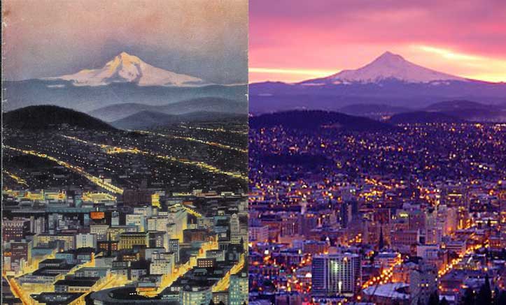
 That photo jogged our memories. One of our favorite things in the world is a collection of Portland maps going back to about 1927. Several gas station maps in this batch, and Steve's creative process on this photo seems to be channelling the artist of the cover illo of the Chevron/Gousha 1965 Portland map, which can be seen right of this very paragraph (click to enbiggen).
But you be the judge. Below find a comp we assembled using relevant cropped sections of each bit of art. The chief difference is that Steve's photo was taken at sunrise whilst the painting is purported to be of Portland 1965 at sunset. Other than that, of course, is the obvious difference in urban artifice and architecture; but my verbiage veers most verbose, so on to the photo (the painting is on the left, Steve's photo is on the right, naturlich):

Miles, John, you have competition I do believe.
(Parenthetically, checking in at Stumptown Confidential linked me to this requiem for the once-great, now-lamented main street of Thomason USA, McLoughlin Boulevard–recently published in the Oregonian's Metro South supplement)
Tags: Portland, Portland Photos, Portland History, Petroliana, Steve Fritz
Go off to this post right now. Gorgeous, gorgeous sunrise snap of Portland; like the post title says, fit for a calendar (we thought about hotlinking, but decided against it; from our POV, it's kinda rude. So, go look, then come back).
 That photo jogged our memories. One of our favorite things in the world is a collection of Portland maps going back to about 1927. Several gas station maps in this batch, and Steve's creative process on this photo seems to be channelling the artist of the cover illo of the Chevron/Gousha 1965 Portland map, which can be seen right of this very paragraph (click to enbiggen).
But you be the judge. Below find a comp we assembled using relevant cropped sections of each bit of art. The chief difference is that Steve's photo was taken at sunrise whilst the painting is purported to be of Portland 1965 at sunset. Other than that, of course, is the obvious difference in urban artifice and architecture; but my verbiage veers most verbose, so on to the photo (the painting is on the left, Steve's photo is on the right, naturlich):
Miles, John, you have competition I do believe.
(Parenthetically, checking in at Stumptown Confidential linked me to this requiem for the once-great, now-lamented main street of Thomason USA, McLoughlin Boulevard–recently published in the Oregonian's Metro South supplement)
Tags: Portland, Portland Photos, Portland History, Petroliana, Steve Fritz
28 December 2006
[pdx] One Bandwagon I Don't Mind Jumping On

701 Amanda Fritz's New Blog.
I voted for her. I liked the way she ran her campaign, I liked the way she was straight up with us voters. I liked someone who was truly grass roots and not astro-turf. I liked the way she took VOE and showed us all how to do it was supposed to be done.
I liked the way she came to it as a calling, not a crass or cynical way to acquire power. Believing in a candidate may sound corny, even in these post-post-irony times, but she actually stirred that feeling in me.
Everything Emilie Boyles was, she wasn't, and you know that's a good thing.
Frankly, I hope she tries again. I'd vote for her again.
In the meantime, I link. And sometimes, I even comment.
Tags: Amanda Fritz, Voter Owned Elections, VOE, Portland Bloggers
[design] A New Typographic Text
700 Over at Designorati:Typography I've reviewed a newly released book (it's been out about a month) which is another addition to the range of various typographic instructional textbooks that are available for students of type these days.
Amongst them are A Typographic Workbook, which was my text back in my PCC days and has gone into a new edition. These books are cool books to have on one's shelf. Each one seems to hit the same "stations of the cross": history, development, how type works, what it's made of, the era of hot metal type, Gutenberg, and modern digital type development (I'm convinced that the name Zuzana Licko will rank up there with Johannes Gensfleisch zur Laden zum Gutenberg, but that's a personal thing, and yet another digression), but each one treats the subject with a little different tone and insight.
Since you always remember your first, ATW will always hold a sweet spot in my heart. But the review I did on D:Typo was for a recent drop by Wiley and Company called Typographic Design: Form and Communication, 4th Edition. It touts itself on the cover as one of the standard texts and references for students and professionals over the last 20 years; in as much as I haven't been in design for 20 years, I'll have to concede the point. However, IMHO, if you have the name of the late Philip Meggs on your cover, your bar is automatically set higher.
If you don't know The Book, you don't know the history of Design. Anyway!
It's my pleasure to report that, as per my review, the book does indeed live up to its billing. It's got a color-splashy, grid-honoring approach that is accessible and comfortable; even though it's a college-level text any typophile will love this book.
I think people should buy one.
Tags: Typography, Textbooks, Philip Meggs
27 December 2006
[transit] A Tri-Met Open House
699 Tri-Met's a-having an open house...and everyone is invited, of course.
It's at Pioneer Courthouse Square, Thursday, 4 Jan 2007.
Here's the sordid details.
Tags: TriMet, Tri Met, Portland Oregon, Portland Oregon Transit, Portland Mall
It's at Pioneer Courthouse Square, Thursday, 4 Jan 2007.
Here's the sordid details.
Tags: TriMet, Tri Met, Portland Oregon, Portland Oregon Transit, Portland Mall
[bits] The New Blogger, or Another Unnecessary Reminder That I'm Not Cool
698 It's frustrating to wait on some things.
For months on months now, it seems, I've been hearing about the run up to The New Blogger. I've been waiting very patiently to go on over because, well, I looked at it when it was called Blogger in Beta, and we have found it to be nice indeed. I want to convert when I can.
It's turning out to be a very discouraging wait.
Some people have been seeing the migration invitation coming and going on their dashboard. I am not one of those.
It's remarkably hard to find an unambiguous, helpful answer to this. There are some people migrating and blogging their experience but they are more than the usual end-user and tend to communicate in an ethereal language I have a little trouble following. And the Blogger help page you're directed to if you try to initiate the switch is singularly unhelpful.
Notably, I've been hearing rumors of migration problems. Some blogs taking over a day to migrate over, particularly. A poster to the "Beta No More!" topic in the "How Do I?" section of the Google Groups Blogger Help Group (Google signin required if you want to participate) just now complained that even though their Blogger blog has less than 300 posts it's still migrating over after 4 hours' wait.
So, maybe even though I really want to use the New Blogger maybe it's just as well I've not been invited yet.
I'm a big fan of Blogger; it's made having a blog a real no-brainer. But the old-to-new migration? Definitely thumbs-down on that. Lots of complaints and no real help or answers. I was figuring they could pull it off a little better than that.
Tags: Blogger, Blogger Beta, New Blogger, Blogger Migration
25 December 2006
[bits] NeoOffice; A Gift for Mac Users
 697 I've long been a supporter of OpenOffice.org, the FOSS replacement for MSOffice. It works, it allows you to edit Word files, and its free.
OO.o, however, is not a native OS X app; it requires the X Window system to run. If you install Mac OS X, X won't be there without you having to go through an extra step, and if you're a Tiger, that means getting the OS install disk back out and installing X Windows from that, which is a bit of a hassle, truly. Since I've been playing installation games lately, I've adopted a "once installed, leave it the hell alone" philosophy.
Another drawback is that the fonts the X Window system uses are not the fonts that the rest of OS X uses, and if you want to use your own font library, you have to convert them with a command line utility. CLI has never scared me, but it's a pain to do and you really begin to see the point of those people who complained about it for so many years. But, in the end, it is worth it. After all, where else are you going to get MSOffice functionality (and that means spreadsheet, slideshow, word processor, basic drawing, and database) for free?
But let's be honest; you have little or no hackerly mojo or, like me, easily frayed patience. What to do then?
I give you NeoOffice.
NeoOffice is OS X-alicious. It uses your current printer. It uses your current fonts. It's free. It has an Aqua interface now. And, even though it's beta, like any good OS X app, it just works. My current tech editing project, of course, depends on being able to process Word files, and TextEdit and TextWrangler are wicked useful but they aren't full WP's. NeoOffice Write, OTOH, is.
Go to the NeoOffice site, download the app and the patch, and ditch MS Office, if you are so inclined.
Tags: NeoOffice, OpenOffice.org, FOSS, Mac OS X
24 December 2006
[design] Big Doings in Adobeville
696 By now, if you're so inclined to keep track of such things, you'll have heard that Adobe has made the beta of the next generation of Photoshop, Photoshop CS3 (version 10), a public thing.
That means that anyone can download it and anyone can run it, and almost anyone can run it beyond a two-day's grace period. You are elevated to the select if you own Adobe software already, according to this verbiage at the PSCS3 Adobe Labs download site:
Go to the site if you're interested.
Meanwhile, in the Adobeville suburb of IconDesignerTown, big changes are afoot for the look of the various Adobe (and now Macromedia) brands. The first changes were wildly noticed by the early downloaders with the splash screen of the PSCS3 beta, which can be seen by following this link to James Duncan Davidson's blog. Go there, look, and come back.
So, what'd'ja think? Didn't see that one coming, didja? Neither did we.
 The next exhibit can be seen in miniature left and in large scale (and annotated) at Veerle's Flickr here. This is the new range and the new look of Adobe's application icons. No more are the shell, the butterfly, the feather, and the flower to grace your Dock (or your Quick Launch bar for you Wintellers). Now it's just gradated color and two letters. As a matter of fact, some commenters I've read are calling them "Medeleevan" after the style which seems to suggest blocks on the Periodic Table.
Also read Veerle's blog here, where she explores the new icon look, snags an interview with an Adobean, and fields some insipired commentary.
My first reaction on looking at the new icons was that of disappointment, and I still am. I had grown to be rather affectonate toward the icons with the natural look, even if there was no real way to connect the image to the app; it was a one-to-one mapping which set up rather quickly, actually; if you want to use InDesign, click on the butterfly.
I was particularly fond of the butterfly, and thought the InDesign 2 version was best of all. But things change.
I suppose the new icons will grow on me, even if they seem underdesigned in the extreme. And I'm sure they'll field thier share of insults as well as plaudits–some commenters feel the underdesign is a good thing.
But I'll miss those friendly little icons.
Tags: Adobe, Adobe Creative Suite, Creative Suite 3, CS3, Photoshop CS3, Adobe Icons, Adobe Splash Screens
That means that anyone can download it and anyone can run it, and almost anyone can run it beyond a two-day's grace period. You are elevated to the select if you own Adobe software already, according to this verbiage at the PSCS3 Adobe Labs download site:
The Photoshop CS3 beta is available in English only but to Photoshop CS2 users worldwide. It is available to licensed users of either the Photoshop CS2 (full, upgrade, and education), Adobe Creative Suite 2 Standard or Premium (full, upgrade, and education), Adobe Production Studio Standard and Premium (full, upgrade, and education), Adobe Video Bundle (full, upgrade, and education) or Adobe Web Bundle (full, upgrade, and education).Instructions are available at the site on how to get a license beyond the two day's grace. It's Universtal Binary, which means it will run on PowerMac, MacIntels, and WinXP and WinVista.
Go to the site if you're interested.
Meanwhile, in the Adobeville suburb of IconDesignerTown, big changes are afoot for the look of the various Adobe (and now Macromedia) brands. The first changes were wildly noticed by the early downloaders with the splash screen of the PSCS3 beta, which can be seen by following this link to James Duncan Davidson's blog. Go there, look, and come back.
So, what'd'ja think? Didn't see that one coming, didja? Neither did we.
Also read Veerle's blog here, where she explores the new icon look, snags an interview with an Adobean, and fields some insipired commentary.
My first reaction on looking at the new icons was that of disappointment, and I still am. I had grown to be rather affectonate toward the icons with the natural look, even if there was no real way to connect the image to the app; it was a one-to-one mapping which set up rather quickly, actually; if you want to use InDesign, click on the butterfly.
I was particularly fond of the butterfly, and thought the InDesign 2 version was best of all. But things change.
I suppose the new icons will grow on me, even if they seem underdesigned in the extreme. And I'm sure they'll field thier share of insults as well as plaudits–some commenters feel the underdesign is a good thing.
But I'll miss those friendly little icons.
Tags: Adobe, Adobe Creative Suite, Creative Suite 3, CS3, Photoshop CS3, Adobe Icons, Adobe Splash Screens
15 December 2006
[tech, design] My Duplo Hard Drive
695 Having been made abundantly clear to me by time and events lately that a second hard drive is an Extremely Good Thing™, we went a-searching.
The usefulness of having a second hard drive of course goes way beyond at last having enough room to store all the music I own and not having to fret about free space (though it also must be mentioned that I think, on my original 80GB startup disk, having a mere 50GB free is just too damn full. And, it took me the better part of three years to fill it that full. Anyway.). Also, as time and events have taught, the processor might make the computer, but the hard-drive is what makes it your computer. It's the heart and soul, or maybe the fuel tank; you can have the hottest hemi on the block, but if you have a tiny gas tank, you ain't going far, friend.
It should go without staying, but I will; it's nice to have two Startup Disks. The facility of this was more than demonstrated by annihilating my OS X system folder and having to erase and reinstall, as per our last odyssey of chasing down the kernel panic on my no-good, very-bad, really-horrible day.
Another thing I didn't count on was in beta-testing some software (no, I'm not going to say what it is; they make you sign agreements for that). In this case, the beta release ought not to be used on your current installation, because it will very probably overwrite some common files on the startup drive, not only rendering your current production software inoperable but maybe even preventing its future re-installation.
And uninstalling some stuff to install some other stuff just to reinstall the prior stuff later on is a stone-freaking-pain.
The indicated solution? A second hard drive, of course. FireWire, I was thinking. Now, I hadn't shopped for equipment in a while, but I went a-looking; I knew the name LaCie from one of my other day jobs. They make a nice silver desktop FW drive that is a workhorse and kicks data in a major way. They were the first place I seriously checked, and the place I bought from. Little did I know how little extra storage costs.
 I give you the LaCie Brick, a mobile FW hard drive. Starting at 40GB (we have the 60GB model), they look just like Duplo blocks. The whimsical packaging allows for handy stacking quite obviously, and the model we have, 60 gig, cost only about $100. This has my beta software on it at current and has OS X installed, so it's an external boot disk as well–which will be much, much better than booting from the DVD, which must take at least 5 minutes (which, when you are restoring your system, is as eternity).
The blue Brick is the 40 gig model; the red Brick is the 80 gig; mine is the white.
Throw into the bargain that LaCie's US home is in Hillsboro, out on NW Evergreen Parkway, meant that three-five day FedEx shipping got here the very next day, which is very good news for some of my workflows. After a current project, it's going to be devoted to backups and picture and music storage amongst other things.
And, while we're at it, add my voice to the chorus of those who sing the predictable refrain from memory; back up your data. Partial, full, however you can.
Tags: LaCie, LaCie Brick, FireWire, External Hard Drives
06 December 2006
[pdx] Contemplating The Couplet
694 I read the balloon being floated about the westside Burnside-Couch couplet with a bit of personal bemusement.
When I was in high school, a spokesman from ODOT came to class–I think it was driver's ed–to talk about traffic laws and why streets were made the way they were, and up until then I didn't really 'get' one-way streets. I was stuck on the observation that not being able to go back down the street you just came up seems limiting.
The ODOT speaker put it very well–the one way street carries more traffic in one direction than a two-way street does. It was so obvious, I was missing it.
So, if we divide Burnside into a couplet running in twain with Couch, that should relieve crowding on Burnside, right?
I don't know. Each side of Burnside carries three lanes in each direction. Couch isn't that wide; I don't think that Couch could practically carry three lanes of traffic. So you haven't increased traffic carrying capacity at all; you've just moved it off to another street.
And is it just me, or is the thought of having to bust an S-curve up one block of NW 2nd Avenue and down one block of NW 19th Avenue seem just a little iffy?
Tags: Portland, Portland Traffic, Portland Streets
03 December 2006
[tech] The PHP 5, Didn't Follow All The Instructions (Even Though I Thought I Did), OS Reinstallation Blues (Complete with Off-The-Cuff FAQ)
 A while back, it will be recalled, I flirted with the idea of upgrading the native PHP on my Macintosh (that version being PHP 4.4.1), wanting to self-teach me some MySQL and reasoning that in order to have all the tools, I ought to have both of the most current versions.
I did try installing PHP 5, but omitted an important step, thus b0orkingating my Apache installation. No problem, said I to myself, said I, so I tried reinstalling OS X Tiger over my extant (and now flawed) installation.
The result is funny–provided it hasn't happened to you.
Herewith, a cautionary tale.
The First Signs Of a Problem
It may (or may not) also be recalled that I was chasing down a kernel panic problem I've had since installing Le Tigre. The thing would KP on wakeup. I was hoping to kill two birs with one stone.
For some reason which will never be within the ken of man, the OS reinstall hung in the middle of installing one of the sets of language files (ironically, it wouldn't finish Finnish). after waiting twenty minutes for it to complete the last 2% of installation, I tried rebooting the system.
Bad move. I was introduced to the feeling a Mac user gets when they reboot and find that instead of the calming screen with the Apple logo and the rotating throbber, you get a low-rez rectangle in the middle of the screen with a file folder straight out of OS 9, with alternating Finder logo and question mark.
Sighted system folder, sank same.
Strangely, this was not the depths of my despair. But I get ahead of myself.
OS Rehab
The next natural step was to boot from the optical drive. I hate booting from a CD or DVD; it takes so damn long. But it had to be done, so it was done. Nothing seemed to be physically damaged, so it was on to reinstalling the OS.
I decided to start by reinstalling OS 10.3 Panther. That went without too much hassle, and I even found that our old stuff was in the Previous Systems folders; I "root"ed them out and reattached them. My creative apps didn't reactivate then; I contemplated communicating with Quark and Adobe (amongst others). But Panther was up and stable, and so I forged ahead into Tiger
Tiger reinstalled fine (with a bit of nailbiting as we paused to watch it install the Finnish language files). Once in Tiger, the creative apps reactivated flawlessly, a beam of light in the darkness. Aside from anomalous behavior with Spotlight (which passed and did not recur) the system seemed to be stable, but, soon enough, the kernel panics recurred–and I was still at PHP 4.4.1. What to do?
This Is The Wrong Tool, Gromit–And It's Gone Wrong!
When I aquired SunDial Three, I managed to also obtain AppleCare (a $249 security blanket, but that $249 buys a lot of peace, let me tell you). Cared-for Applers know that the AppleCare box comes with a CD-ROM that includes TechTool Deluxe. Now, my AppleCare expired about six months back, but I still have the TechTool CD. In it goes.
Copying the app to the hard drive it tells me I need to update it to work with Tiger, and I do this. Everything checks out over multiple runs...except something called the volume structure. But I can't repair the volume if I booted from the startup disk so, of course, I boot from the CD-ROM.
TTD running from CD-ROM (remember, this is the version Tiger isn't supposed to be compatible with) reported volume structure errors, so, with the confidence of someone who trusts authority sometimes way too much, I forge ahead and let TTD go to work on the disk. Almost six torturous hours later (who knew it would take so damned long?) the disk repair is complete.
Did I fix it?
Oy. Did I ever fix it.
Houston, We Have Screwed The Pooch
Several grafs back, I menched how I had though I had committed the worst OS transgression ever. Had I but known.
TTD in the version I had it is, as said, incompatible with Tiger. It identifies natural OS tendencies as problems. Fix those problems, and you irrevocably break the OS.
How bad?
Well, the first sign of trouble was when the kernel panic occurred within seconds of powering-on. At least, however, this saves time when waiting for the next KP.
The next sign of problem is when you boot from the Tiger DVD and find that Disk Utility can't. Repair of the volume is impossible because of something called a corrupted B-Tree node. The volume can't even be mounted.
The final sign of hard drive Gehenna is trying to reload (once again) the OS, and finding that the Installer can't find the hard drive at all.
Yes, my friends, logically speaking, I nuked the hard drive. There may or may not have been files still there, but as far as my instrumentality was concerned, the file system was as dead as the President's concern for the poor. It was thus that, with a heavy heart, I proceeded to erase and repartition the drive, taking with it things I collected over three and a half years of use; some of it not replaceable, a lot of it uncritical, and waving a fond goodby to some apps (Internet Reconnector and Speed Download) at least for now.
Now, your saying to yourself (If you've hung on this long), hey, Sam, surely you printed off some of that reg info to refeed in case of this? To which I'd answer, are you kidding? Who does that sort of backups? Haw haw! And when you're through laughing, let me tell you about my investment plan (hint-two words: Oregon Lottery).
The State of The System
The system is back up and running and seems stable. I have had a couple of kernel panics but instead of waking from sleep they happened when I was opening a couple of apps (Real player and iTunes).
As it turned out, iPhoto (I was still using version 2) is gone too. It came bundled with my Mac when I bought it; I may dig back into the original CDs and see if maybe the package is hidden away there somewhere. I have also lost Internet Reconnector and Speed Download 3, but replacing those is irritating and maybe will have a nominal cost. All my iTunes purchaes music is gone.
If the kernel panics continue, I'll contact Crucial about that 512M memory stick I bought from them and see if they'll work with me on it.
And now, the promised FAQ
I thought I'd known enough about Unices to install PHP 5 and fix it if it went wrong, but only proved the adage that a little knowledge is a dangerous thing. Once the system was up and running, I looked at the instruction on Marc Liyanage's PHP for Mac OS page and followed them a little more closely this time.
If you're a relative Unix tyro, there are some things you should do to kick PHP 5 on your Macintosh. The following are notional FAQs that should steer you around the shoals (the Q's I FA'd myself weren't this but more along the lines of why me, God, why me? But, as usual, I digress). So now, without further ado, I give you:
Samuel John Klein's Quick, Off-The-Cuff Guide and FAQ to Installing PHP 5 in Mac OS X 10.4, Without Nuking Your OS
- Mac OS X 10.4 comes with PHP version 4.4.1. The currently available version is 5.2.x. You will probably want to upgrade if you want to use things such as MySQL5; it will work with PHP 4, but you won't have access to some of the more recent MySQL tools, we are told.
- The first step in upgrading is to obtain the current package. Marc Liyanage's highly informative PHP for Mac OS X page has linkages to PHP 5 for Mac that will run not only under Apache 1.3 (the default for Mac OS X) but also for Apache 2 (if you really want to punish yourself and install that). Go to Marc's page here. This package is a complete installation; if you just want to run PHP in a default-for-Mac-OS style, this installer will install a working PHP 5 setup on your Mac with no recompiling. Nifty.
#LoadModule php4_module libexec/httpd/libphp4.soAnd then restarting Personal Web Sharing (System Preferences>Sharing) will cause PHP 4 to wake up on your system.
#AddModule mod_php4.c
PHP5 Installation Concerns
As I've said, if you've done this, you'll know; if you haven't done this, PHP is still inactive on your system, and you can proceed to install. If, however, you really, really want to be sure, use TextEdit or a plain text editor (not a word processor) to create the following file:
<?phpcall it "test.php" and drop it into the Sites folder in your account's home folder. This is where Apache looks for your own local web pages. Then, copy the following line:
phpinfo();
?>
http://127.0.0.1/~yourname/test.phppaste it into your web browser's address box, replace "yourname" with your "short" user name (the name of your home folder) and hit return. If PHP is enabled, a bunch of tables will display with PHP Information. If it isn't, your browser will just display the unadorned PHP code. Also, do not simply drag the file into the browser; your browser has to request it from the web server who passes the code through PHP.
If You Do Have PHP 4 Enabled, then, it is imperative that you recomment the two lines in the httpd.conf file that enabled PHP to begin with before installing PHP 5. Go back there, now, and put the pound signs back in. Don't argue. Just do it. There are ways to run both PHP 4 and PHP 5, and you're welcome to learn them, but learn them first. I only need, at this self-learning time, to run one. Edit the httpd.conf file, restart Personal Web Sharing, and proceed to install.
If you were foolish enough to install PHP 5 without recommenting the crucial lines, you now have a problem. Apache isn't sure what PHP you want to use, and so Personal Web Sharing will not work at all. Marc Liyanage saith "bad things will happen"; from my POV, it looked like I broke my web server. There may well have been a way to come back from that, but my bull-in-a-china-shop approach rendered any other attempt at repair academic.
So please, as God is my witness, and by all that is holy, learn from my bad example, please?
Installing PHP 5
Hopefully we're at the point where we have cut PHP 4 out of the loop. You've made sure your httpd.conf file is correctly commented out and you've restarted Personal Web Sharing. Here's what you do next:
- Unarchive the PHP tar.gz file. Use BOMArchive Helper (says Marc), not Stuffit Expander. To make sure you're using BOMArchive Helper, do a Get Info on the file, mouse over "Open With", and select it from the flyout menu.
- Mount the disk image
- Double-click on the package file.
- Let 'er rip
Now, stop and restart Personal Web Sharing; and take this line:
http://127.0.0.1/~yourname/test.phpand enter it into your web browser and, assuming you've placed the test.php file there, a display should obtain telling you more than you ever wanted to know about your new PHP 5 installation.
Marc Liyanage's pages at Entropy.ch are a good place to go for troubleshooting info. The above was my whole experience. If you have any troubleshooting questions, go to the PHPBB discussion forums there, register, and post away.
Good luck. And don't be too intimidated; if you do the above, you should have the most recent PHP on your system with no problems.
Tags: PHP 5, PHP for Mac OS X, Installing PHP, FAQ
22 November 2006
[pdx_tech] FreeGeek Got 'Jacked
692 Word got round at OryCon on Saturday that FreeGeek, the 2cool4words tech-for-the-needy center in SE Portland, got broken into over the weekend, and lost a good deal of equipment–laptops and such.
One never knows where such stuff may turn up, so here's some vital info:
In this post, John Bartley at KiloSeven gives us the overview.
In this post, John tells us about how to ID FreeGeek hardware.
Find FreeGeek's account on their home page at this link.
We hope whoever did this gets caught, sentenced, dragged over sharp glass shards, then, after they've healed, the only computer equipment they should be allowed to touch are Vic20s. Without the extra 3K RAM pack.
Technorati Tags: FreeGeek, FreeGeek Portland
21 November 2006
[pdx_life] The ZehnKatzen Times Orycon 28 Report
671 Another year, another OryCon.
The best damn science fiction convention in the world took place this last weekend at the Portland Downtown Marriott (the one on Naito Parkway, not the one on Broadway) and by all accounts it was a rousing success.
Last event was the first time in this site, which was arranged with the previously arranged hotel (the old Thunderbird at Jantzen Beach) abruptly going away (it still stands guarding the west side of the Oregon approach to the Interstate Bridges, empty and forlorn), and the paying Con population finding, pleasantly, that it worked quite well.
This year, the second in the event's new home, was better than the last. Marriott Downtown, where have you been all our lives? There was a shuffling of spaces, with the Dealer's Room going to the lowest (underground parking) level along with the Art Show–and though the spaces were in a parking garage area, you'd not know it. Comfortable carpet lined the floor, stanchions were wrapped in fabric, and veils walled off the areas. Actually very sumptuous.
The usual selection of panels and fun were to be had; I watched writers patch plot holes and other writers speculate on what to do after the balloon goes up.
The day-to-day star of this Con was the much-taken-for-granted hospitality suite, the Convention crossroads. Last year's hospitality was a disappointment, a smallish room that was harder to get to than it was worth to go there. This year, removed to the level with the ballrooms, it was large, spacious, and comfortable-a real place to stop, put your feet up, feast on junk food, and check your email (in a master stroke, the space also housed the traditional "internet cafe" (which in the past was a room with just computers in it...hardly a cafe, really). Just keep the food and drink away from the boxes, kids...the network was fast and friendly. Used Wintel and Fedora boxes provided the access, and yes, Firefox was available to all.
Personally, to me and The Wife™, going to OryCon is one of the lynchpins of our lives; our relationship was melded through this shared experience (as well as other übergeekiness) and we couldn't conceive of a year without one. The last thing we do on the way out the door is buy next year's membership (and at $25, it's a steal over the door price, highly recommended), and we did so gladly this time; it's never felt more like a second home. Very comfortable, refreshing, and inspiring.
But then, our Artist GOH was the legendary Vincent DiFate, and while I didn't get to meet the fellow, I did get almost nose-close to some of his artworks, including works I've seen reproudced on book covers for yonks now. Meeting the Artwork in Person isn't transformative, but it comes close, let me tell you.
It also gets me tapped on the shoulder in traditional art museums. I want to see the brush strokes up close, dammit!
Acrylic on hardboard, FWIW. You can really do fine work with acrylic, as it happens. Fine detail!
Musically, the highpoint was the Heather Alexander concert on Saturday night at 2100. Heather has quite a reputation, and there's a reason: she has a stage presence that will entertain you so much that, if you're sure you don't like Celtic-flavored folk music, you'll revise your opinion after you see her.
She's had a devoted following all over the West Coast for many years now. On last Saturday she gave us all a treat; a polished, professional concert being recorded for a DVD being released early next year, I understand.
The last song was done more as a performance art piece, where she retreated backstage under a ivy-entwined arch in a dramatization of her going to join the fae folk, thus actualizing a lietmotif of some of her work we've heard over the years. It was incredibly moving. There was a feeling of putting a full-stop on a period of her performing life; someone after the performance wondered if she was retiring. We take the view expressed by the moderator of Heather's message boards that she was taking a break for a while.
Since she's been incredibly productive and creative over the past 15 years, we rather think she's entitled to one.
We recommend to you that you get the DVD when it comes available.
Technorati Tags: OryCon 28, OryCon, Heather Alexander
15 November 2006
[misc] I b0rked my OS. Recovering Now.
Really, in the end, I have nobody to blame but myself, I suppose.
I found out that, when the Mac can't find its system folder, it will flash a folder with an alternating image of a question-mark and a Finder logo.
It's all kind of amusing, actually.
Now, for some dumb reason, I'm determined to learn PHP and MySQL. Having obtained the most recent PHP, I wanted to install it, and I did so.
I'm thinking now that I didn't completely understand the installation instructions, because what I did caused PHP to break down...or at least that's what it looked like. I was treated to the amusing spectactle of typing 'http://localhost/~eagle/phpid.php" only to have Apache tell me that my machine couldn't talk to herself. Hmm.
Ah, no worry; I'll just reinstall Tiger. After waiting for it to me most of the way done, the installer got to 98% finished in installed Finnish and...stalled. I didn't panic-immediately. Things sometimes pause. But after a half and hour of being 5 minutes away from being done, I had suspecting that all was not well.
Reboot the computer. Remove the Tiger DVD-ROM. Try to reboot. And the Mac tells me "you took away my system folder, you bastich!"
So, we're reinstalling but starting back from OS X 10.3.2. The applications are complaining; I'll have to reinstall QuarkXPress, and work out an activation issue with Adobe on the Creative Suite.
But...hey...at least PHP is working again! So, there's a takeaway right there.
11 November 2006
[design, web_design] PHP and MySQL, Bearing Down on Me
Why this seems evident is still quite ineffable to me, but it seems that learning PHP and MySQL is bearing down on me.
In my day-design-job, there is a website, and significant parts of it are being actualized by PHP and MySQL. These are actually things I've always thought I've needed to learn, but never had the gumption or the need. Now I do.
What I like most of all is having the functions local–I don't like having to have to go online to get them (part of this is, of course, that I'm still limited to dialup). Mac OS X, if you aren't running the Server version, however, does not have MySQL installed. And PHP requires you to go into the system and un-comment a few lines in the /etc/php.ini file.
So, I did that and PHP is working; I have MySQL Community server to install (at least it's free), and the question now is do I leave PHP alone, or upgrade to PHP 5?
Research is ongoing.
Technorati Tags: PHP, MySQL, Mac OS X Tiger
[design] In-House: Organizing Assets With iPhoto 6
 One of my current tasks is organizing a photo library, as I've said before. At the same time, I'm learning a new corporate culture and way of communicating and looking at the world via this culture.
It's fascinating.
Also rather fascinating is the process of using iPhoto 6 to do all this.
The benefits of iPhoto are simple to list; it's quite user friendly, the interface is very accessable, you can easily shift from one size thumbnail to another, and getting information on the pictures themselves is easy.
There are some drawbacks. For instance, you can only have one iPhoto library at a time. To chance libraries one actually has to quit the application, move or rename the default library (moving which can be a stone pain if it's very large, and the one I'm working with is currently at about 80 GB...but it has a lot of duplicates), restart iPhoto, then choose the new library–which, if you aren't too familiar with the essentials of how iPhoto arranges its stuff, can be the very definition of non-intuitive.
If Apple asked me one new feature that should come out in the next iPhoto, I'd tell it that they need to figure a way to let the user maintain multiple libraries. That would be sweet.
Also, one of the big problems with iPhoto as it is is that certain older TIFFs will cause the application to crash on import (at least that's what I'm being told–it hasn't happened to me yet but I haven't been able to reproduce the exact conditions of the crash, which is kind of an impractical thing to do anyway, considering the sheer mass of the files involved).
Anyway! After flailing about with promising but ultimately unproductive experiments with Automator (which is sweet but I'm not quite on the same page with it as yet) to do things like extract the images from the folders and move them elsewhere so I can sort through them, I went back into iPhoto to see what I had to work with via that app.
And it's turning out to be productive. The first phase is complete; naming the film rolls (which is the latter-day iPhoto's way of allowing the user to view picture files by import session) by date and by descriptive contents in plain English so at least I have some idea of what I'm looking at (and I can skip, for now, rolls marked "Personal Photos").
iPhoto isn't the idea application for this, but then, I can really find no ideal application that fits all the needs. It is one of the better ones (despite being developed for the home user) which has the definite benefit of being able to catalog about a quarter of a million photos–more than any user I'm aware of might need.
So, I'm forging ahead in iPhoto, all the while with an eye toward eventually growing the cataloging system out of it. All that is wanted here is storage, identification, and retrieval, with usablility.
Somehow, I want to craft a reasonably tight system that can be maintained by cow-orkers or anyone who follows me.
Technorati Tags: iPhoto 6, digital asset managment
08 November 2006
[or_politics] Governor: It's Official...
 With 100% of the precincts reporting, we can report...
It's pronounced "koo-long-GOW-ski".
Technorati Tags: Oregon politics, ted kulongoski, Oregon governor
07 November 2006
[design] Boxing Your Text
In the previous post I detailed what it means for the electronic layouter to have much fun bossing around font files.
There is a secret weapon that allows the intrepid artist to get round the 'gotta havea font file' problem, because, sometimes, why send an entire font file when you can just send a few characters?
One of my favorite play toys in QuarkXPress is this little jewel called Text to Box, which, takes text and creates of it a Beziér picture box, complete with handles and everything. I just summarized my finding on QuarkVsInDesign here.
Just one thing: if you convert a complified font like Papyrus...watch out. You're in for some work, yo.
Technorati Tags: QuarkXPress, Text, Bezier boxes, Text to box
05 November 2006
[pdx] The Oy! Mercantile
So, I resisted the urge for as long as I could, but eventually I had to stare into the abyss: the CaféPress Emilie Boyles online shop.
It's all there; the prolific production, the awkward self-promotion ("Emilie Oy! A product of Emilie Boyles), the egregious abuse of Cooper Black. Seems authentic.
Why, she's even inaugurated a line of stuff under the banner of the new moniker b!X has crafted for her; we give you the 'Lie Boyles line. Here. No, you take it. Seriously.
It's true what they say; it does take all kinds. And twice on Sundays. Altho' I don't see much of a demand for a 100-pack of "'Lie Boyles" refrigerator magnets...but hey, I'm hardly a marketing genius. I could be wrong.
Technorati Tags: Emilie Oy, Emilie Boyles, Slow Motion Train Wreck, b!X
04 November 2006
[design] In-House: Fonts, Fonts, Fonts and Collecting For Output
This in-house designer lesson-of-the-week (more or less) is brought to you by the majesty of digital fonts and the fact that they are, in actuality, application files. It's supported by what is sometimes the sheer complexity of the actual digital design proposition.
Fonts on your computer are, in a way, not merely data files. They are produced by people–companies, individuals, consortiums, or what have you–and copyright pertains naturally, even in our currently messed-up, subject-to-politics legal system (I'm not against copyrights, mind...that's all for another program actually. Excuse the digression). As such, the original creator retains all rights to the font files, but you, the user have the right to use them to create layout and documents within reasonable limits.
Being commercial digital software, all the other limits and rights also pertain: you can't give them away, if you provide them to another then it must be within the context of a specific use, you can't sell them as your own, and you can't get a commerically-available font from another user free and use them in your own for-profit projects without risking copyright infringmement.
Yes, all that good stuff.
The Application Told You So!
Moreover, the leading layout and aggregator applications are designed with this in mind.
InDesign calles it "Package"; QuarkXPress calls it "Collect for Output..."; both options can be found in the respective application's File dropdowns. What they do is gather all the files used in production–the layout document file, supporting pictures, color profiles, and germanely, fonts, and deposit them (and plain-text report about the process) in a folder of your specification.
This is a very sophisticated and valuable function. There was a time, back in the days of Mac System 7 and OS 8 and before, when Quark was King and PageMaker was still in the game, when the digital designerista had to manually collect the graphics and fonts they used to design the layout manually (that is, finding them in the disk and copying them into the output folder that was destined for the service bureau). As far as my limited awareness of the history of electronic layout goes, font collection was kind of late to the the game, not showing up in QuarkXPress until version 4 (or maybe 4.01), in the mid-late 90's.
Since Adobe and Quark are both major shareholders in the idea of digital rights, each layout application flashes a big ol' warning sign your direction when you collect or package. Here's what InDesign CS2 tells you:

And here's QuarkXPress 6.5 harshing your vibe:

The differences in approaches are intriguing; Indy gives you the full monty (at least as succinctly as possible), QXP is a little less informative. And while, in QXP, if you don't care for the fonty restrictions you can go on without them, Indy wouldn't think to go on without those fonts (Indy wouldn't think of leaving his buddies behind!).
The upshot of all the legalese is this (as I understand it; IANA Copyright/digital rights L):
So what's the point, after all that legal blah-de-blah? Simply this: fonts are not integral to the digital file a layout artist composes. They are an include.
If I came up with a brilliant layout (If? Sorry, when...) e.g. in QuarkXPress, and gave you a copy of the .qxd file and nothing else, you'd open this up on your workstation and, if you don't have the fonts I do, you'll get the layout-file equivalent of a dog's breakfast.
Lets, for the sake of argument, assume a text layout with no graphics at all. If QXP does not find the fonts the document file tells it it's supposed to be linked to, you'll get a host of dialog boxes that encourage you to link to the proper files (or, if QXP 6.5 and later doesn't find the fonts in disk it'll ask you if you want to purchase them and then whisk you off to the appropriate retail website). If you decide to forge ahead (hey, I said forge! Like metal type! Funnay joak!) anyway the layout will be populated with defonts (what I call default fonts when I'm in a hurry). Type selection is a concious choice meant to support the overall message the design sends.
The layout collapses in a heap of embarrassment and tries to hide out as a Word doc. Not pretty.
But what if you seem to have those fonts anyway? So far so good; you diligently relink (swearing bad mojo upon the layouter who sent you the fontless layout file) and–bingo!–you have the layout as the artist intended it be seen.
Or do you?
The fact is that similarly named fonts from different founders may have differences in metrics (kerning, letterspacing and the like) that range from the subtle to the amazing. So, the text is imported and looks right but now it's not flowing properly, H&Js aren't working out, and in really irritating cases, the copy actually needs to be refit. If your correspondent is sufficiently patient and generous to refit the copy on thier end and send you back the result, it's going to be all When Worlds Collide again and the errors can pile up.
You Can Turn Off that Damn Theremin Now
The previous tale of typographical horror is just hypothetical, now. But it illustrates the reason why layouters have to be aware of what relationships fonts have to thier documents and why they have to be aware of copyright and why we collect for output.
Generally speaking, common-sense best-practices instilled as almost-ritual in graphic arts (and drummed unrelentingly into design school students heads) make the habit of checking and conforming with them almost subliminal. I hardly have a birds-eye view of the field but here at the Times we hear very little about such problems being a huge issue.
But if there are a set of commandments for layout artists, two of them must be: Thou shalt package and preflight, and Thou shalt be aware of copyright.
Technorati Tags: QuarkXPress, InDesign, Fonts, digital rights, copyright
Fonts on your computer are, in a way, not merely data files. They are produced by people–companies, individuals, consortiums, or what have you–and copyright pertains naturally, even in our currently messed-up, subject-to-politics legal system (I'm not against copyrights, mind...that's all for another program actually. Excuse the digression). As such, the original creator retains all rights to the font files, but you, the user have the right to use them to create layout and documents within reasonable limits.
Being commercial digital software, all the other limits and rights also pertain: you can't give them away, if you provide them to another then it must be within the context of a specific use, you can't sell them as your own, and you can't get a commerically-available font from another user free and use them in your own for-profit projects without risking copyright infringmement.
Yes, all that good stuff.
The Application Told You So!
Moreover, the leading layout and aggregator applications are designed with this in mind.
InDesign calles it "Package"; QuarkXPress calls it "Collect for Output..."; both options can be found in the respective application's File dropdowns. What they do is gather all the files used in production–the layout document file, supporting pictures, color profiles, and germanely, fonts, and deposit them (and plain-text report about the process) in a folder of your specification.
This is a very sophisticated and valuable function. There was a time, back in the days of Mac System 7 and OS 8 and before, when Quark was King and PageMaker was still in the game, when the digital designerista had to manually collect the graphics and fonts they used to design the layout manually (that is, finding them in the disk and copying them into the output folder that was destined for the service bureau). As far as my limited awareness of the history of electronic layout goes, font collection was kind of late to the the game, not showing up in QuarkXPress until version 4 (or maybe 4.01), in the mid-late 90's.
Since Adobe and Quark are both major shareholders in the idea of digital rights, each layout application flashes a big ol' warning sign your direction when you collect or package. Here's what InDesign CS2 tells you:

And here's QuarkXPress 6.5 harshing your vibe:

The differences in approaches are intriguing; Indy gives you the full monty (at least as succinctly as possible), QXP is a little less informative. And while, in QXP, if you don't care for the fonty restrictions you can go on without them, Indy wouldn't think to go on without those fonts (Indy wouldn't think of leaving his buddies behind!).
The upshot of all the legalese is this (as I understand it; IANA Copyright/digital rights L):
- You're about to copy software you have rights to, but do not own copyright for.
- It is your remit to to understand copyright law and license rights as they apply here. Just like the traffic code, ignorance of the law is not an excuse.
- All else being equal you do, however, have the right to pack up a copy of the font files you used for this particular job only with the document file to send to the service bureau.
- The service bureau may use the font you supply, but only for the purposes of print production of this job and nothing else.
- There may be unusual circumstances that mean that, despite the previous two allowances, your service bureau is not authorized to use the fonts you send (we certainly can't think of them).
So what's the point, after all that legal blah-de-blah? Simply this: fonts are not integral to the digital file a layout artist composes. They are an include.
If I came up with a brilliant layout (If? Sorry, when...) e.g. in QuarkXPress, and gave you a copy of the .qxd file and nothing else, you'd open this up on your workstation and, if you don't have the fonts I do, you'll get the layout-file equivalent of a dog's breakfast.
Lets, for the sake of argument, assume a text layout with no graphics at all. If QXP does not find the fonts the document file tells it it's supposed to be linked to, you'll get a host of dialog boxes that encourage you to link to the proper files (or, if QXP 6.5 and later doesn't find the fonts in disk it'll ask you if you want to purchase them and then whisk you off to the appropriate retail website). If you decide to forge ahead (hey, I said forge! Like metal type! Funnay joak!) anyway the layout will be populated with defonts (what I call default fonts when I'm in a hurry). Type selection is a concious choice meant to support the overall message the design sends.
The layout collapses in a heap of embarrassment and tries to hide out as a Word doc. Not pretty.
But what if you seem to have those fonts anyway? So far so good; you diligently relink (swearing bad mojo upon the layouter who sent you the fontless layout file) and–bingo!–you have the layout as the artist intended it be seen.
Or do you?
The fact is that similarly named fonts from different founders may have differences in metrics (kerning, letterspacing and the like) that range from the subtle to the amazing. So, the text is imported and looks right but now it's not flowing properly, H&Js aren't working out, and in really irritating cases, the copy actually needs to be refit. If your correspondent is sufficiently patient and generous to refit the copy on thier end and send you back the result, it's going to be all When Worlds Collide again and the errors can pile up.
You Can Turn Off that Damn Theremin Now
The previous tale of typographical horror is just hypothetical, now. But it illustrates the reason why layouters have to be aware of what relationships fonts have to thier documents and why they have to be aware of copyright and why we collect for output.
Generally speaking, common-sense best-practices instilled as almost-ritual in graphic arts (and drummed unrelentingly into design school students heads) make the habit of checking and conforming with them almost subliminal. I hardly have a birds-eye view of the field but here at the Times we hear very little about such problems being a huge issue.
But if there are a set of commandments for layout artists, two of them must be: Thou shalt package and preflight, and Thou shalt be aware of copyright.
Technorati Tags: QuarkXPress, InDesign, Fonts, digital rights, copyright
03 November 2006
[design] Quark's Got a New CEO. At Last.
When last we heard the travails of Quark, Inc.'s management staff, they had canned Kamar Aulakh, the CEO who was leading Quark into the new customer-centered era of corporate culture (as opposed to the Ebrahimi-led years, which typically held the customer base in veiled contempt, which was something they did because they could).
Then, on 12 June 2005, Aulakh resigned abruptly, amid cirucmstance which still remain a mystery to this day, and Quark appointed a marketing supremo as interim CEO.
The long interregum has ended, as Quark has at last anointed a new CEO: Raymond Schiavone, co-founder of Arbortext, which is apparently a company that specialized in dynamic publishing for the enterprise.
We here at the Times don't know if this will mean any change in direction for the erstwhile DTP king, but QuarkVSInDesign, of course, has something on it (credit Pariah Burke, natch), and here's Quark enthusing about it, in the press release style.
Technorati Tags: QuarkXPress, Quark Inc, Quark CEO, Kamar Aulakh, Fred Ebrahimi, Raymond Schiavone
29 October 2006
[font] Found: Tales of Typographical Horror
Well, it won't be that scary, but still.
At the quite rather funny LMNOP, there's a Halloween special: America's Most Fonted, seven atrocious fonts made even more atrocious by thier faddish overuse. Naturally, MS Comic Sans makes the top of the list (nothing personal, Vincent, I'm sure), but there are also fonts out there that are just tore up from the floor up that you didn't know had wormed thier way into way-too-widespread use until someone pointed it out to you.
People wonder why typophiles get all up ons (a phrase I use here incorrectly) over things like that. They wonder, that is, until you see fonts like MS Comic Sans and Curlz on warning signs like "High Voltage". And I've seen both.
That usually changes people.
And, over on Designorati, Pariah Burke has once again mounted a popular feature–300 free Halloween fonts. People love free fonts, and these are universally cool for private use, to give your Halloween documents that "spooky" touch.
Technorati Tags: Fonts, Comic Sans, LMNOP, Designorati, Free Fonts
22 October 2006
[bloggage] 25 Words On Successful Blog
Over at Successful-Blog, Liz Strauss is haveing a friendly little party. In 25 words (that's 24+1, mind) say what SB means to you. Here's what it means to me:
What it means is inspiration. Inspration changes thoughts into action, and takes what you want to do into the realm of what you actually do. It's important to have your eggs in more than one basket, and some of my inspiration eggs live in a compartment called "Successful Blog".
Technorati Tags: bloggage, ME Strauss, Successful Blog, tools, inspiration
Successful-Blog is a bung-puller. That's the plug that holds all the good stuff in the cask; pull the bung–it's all yours.
What it means is inspiration. Inspration changes thoughts into action, and takes what you want to do into the realm of what you actually do. It's important to have your eggs in more than one basket, and some of my inspiration eggs live in a compartment called "Successful Blog".
Technorati Tags: bloggage, ME Strauss, Successful Blog, tools, inspiration
18 October 2006
[design] Pariah S Burke Cracks the Multi-Page Size Code in InDesign
Pariah S. Burke has broken the one file=one page size law. Designers all over the world should rejoice about this one.
The first question InDesign (or QuarkXPress, for that matter) will ask the user on creating a new layout is "What size sheet are you gonna use?" You only get one choice. QuarkXPress has, since 6.5, had a new Project format which can be made up of multiple layouts, but the ingrained habits of layout artists die a hard death indeed; what many layouters have wanted was, say, a file in which several page-size spreads can live in the very same file with, say, a few legal-size foldouts (maps, for ex) and a few business cards...or even a layout file which contains all the components of your average business system (letterhead, business card, envelope) in one single file.
Pariah has teamed up with some very smart people who have caused this vision to become reality for Adobe Creative Suite users. In conjuction with the big brains behind the after-market Indy plugin maker DTP Tools, we now have this solution in the form of the plugin called PageControl.
It not only allows you to have a single Indy layout with multiple and nonstandard page sizes it also allows you resize odd sized pages at will, resize master pages and have those pages they refer to autmatically resize, and more. And since it's all the same document, you can have the same running information–page numbers, for example–continue thoroughout.
I'm proud to say that I got to beta-test this; it works like magic.
You can get a trial download (or just go ahead and buy it for $59) at DTP Tools' website here. Read Pariah's release about it on QuarkVsInDesign here.
Technorati Tags: design, PageControl, Multi-page layout, DTP Tools, InDesign, Mac, Windows
[design] In-House: The Nuts and The Bolts
Being an in-house creative is more than just breaking open QuarkXPress or InDesign and being **brilliant** .
In the case of my new part-time job, it involves a good deal of basic DAM–digital assets management.
The problem at the current posting is that while the designers who preceded me were evidently able individuals (and doubtlessly more adept than myself) the filing system is, to be generous, ad hoc, and, to be blunt, nonexistent as such.
There are a slew of folders that, while descriptively-named, were not organized or named according to any convention or method. Photos, when imported from the digital camera into iPhoto (the platform is a 1.0 GHz PowerMac G4, MDD case) were not always named (there are a metric buttload of files named DSCNxxxx.jpg, where x is a number from 0-9...you digital photgraphers know what I mean here) and when they were named, weren't named according to a consistent pattern.
Disorganization rules on the publications as well. The place is a Quark shop, but they also use MSWord for layout of trifold brochures. Some photos are embedded within them, so not only do we have files all over about .75 Terabyte of disk (two drives in the Mac and three FireWire drives outboard) that are essentially floating about but we also have pictures that we have to go into .docs to find (had to do that once already).
Good times.
My boss is dissatisfied with iPhoto (I don't blame him) and the other DAM photo management tools I've tried out so far have been lacking in some small but important way (it's important, for instance, that when a user deletes a photo from the desktop, if that's where they're putting it, it also doesn't go to the trash).
So, I'm going for basics now. The idea is to have a standard folder structure for storing files and a standard naming convention. I've blocked out the rationale for the folder structure, now I'm searching the hard drives, finding image files and organizing them into OS X Smart Folders. From there I'll see what we have, to begin with, and try to block in the outlines of a naming convention for images. We'll start with small stuff and see what works–and this is a challenge, because the place's stock in trade is something I'm also simultaneously learning to recognize.
The object is to have a file structure that is easy to find one's way around on and simple to maintain, and that's important because while the designer uses the station for graphics production in the main, others in the office have to come along, add items, and find them on thier own. In the future, if I get as good as I want to with things such as AppleScript and Python, I just may craft a custom solution. We'll see how that goes.
I am, by the way, becoming good at Spotlight and Smart Folders. By necessity. But I want to push my own envelope.
Technorati Tags: design, in-house design, digital asset management, DAM

17 October 2006
[or_politics] So, O, How's That Saxton Endorsement Working Out For You?
As a Democratic voter I was as astounded as anyone by that bizarre Saxton endorsement TheO on Sunday, and found myself wondering if the paper had been paying attention to its own reportage over the past few months.
I will admit to a bit of despair. What is it with these people? I'm an Apple Mac user and they accuse me of living in a reality-distortion field? Although, I do wonder if someone let Reinhard have the keys to the car that weekend; it reads like one of his columns.
Looking at todays Letters page in Living provides some substantial salve for the soul. From TheO:
Remember what Abe Lincoln said, boys: you can't fool all the people all the time. I know it looks that way these days. But you really can't. And if you insist on trying, eventually..well, you'll kinda look foolish.
And not in the good way.
Technorati Tags: Oregon Politics, Ted Kulongoski, Ron Saxton, Oregon Governor
I will admit to a bit of despair. What is it with these people? I'm an Apple Mac user and they accuse me of living in a reality-distortion field? Although, I do wonder if someone let Reinhard have the keys to the car that weekend; it reads like one of his columns.
Looking at todays Letters page in Living provides some substantial salve for the soul. From TheO:
From Saturday afternoon, when The Oregonian's endorsement of Ron Saxton for governor first appeared...we recieved 140 letters in response. All but four criticized the endorsement and pledged support to Gov. Ted Kulongoski.Emphasis is emphatically mine.
Remember what Abe Lincoln said, boys: you can't fool all the people all the time. I know it looks that way these days. But you really can't. And if you insist on trying, eventually..well, you'll kinda look foolish.
And not in the good way.
Technorati Tags: Oregon Politics, Ted Kulongoski, Ron Saxton, Oregon Governor
10 October 2006
[design] In-House: That Fine Feeling of Accomplishment
I had a great experience today.
Since two weeks now I've been doing in-house design part-time for a Vancouver firm. The priority project of the week has been a magazine ad.
Now, the ad itself was designed by a person already affiliated with the firm before I got there. I will not comment on the style; that'd be talking out of school to say the least. She had gotten it into the shape she'd wanted it and needed me to take it the rest of the way; make sure it was tight. And this was done.
But the thing that was really a kick was troubleshooting the file. Some of the image files were, to be honest, lacklustre–and while I won't reveal what it is or what they do (beside the point as well as giving away stuff which I ought not to)–I will go so far as to say that lacklustre photos of these subjects kind of defeat the point.
Turned out the deficiencies were twofold: The wrong color model (RGB, of course should be CMYK for print) and low, low rez (72 ppi). Upping the rez to 300 ppi really made the subjects sharpen up, and changing the color model did darken the image on screen just a tic but the colors became much deeper, much more thrilling. The difference was obvious.
Another thing I did was in kind of a consultative mien. The ad's designer discussed some fine points of the ad with me and we batted around colors and positioning of text vs. photographs, white-on-black or white-on-color and such.
My point here is that, operating as I was today, I helped make people's plans in the organization I was in real, helped make them happen and, in the end, completed the design chain.
This is what a designer does: problem solving.
Technorati Tags: design, in-house
08 October 2006
[design] Illustrator: It's Not Just For Breakfast Anymore
 One of the things I love reading about is how other creatives use thier tools. The things they use them for gives an exceptional insight in how flexible and liberating these digital applications are.
What caught my eye today was the way a local blogger, Terry Grant, uses Illy to aid and abet her quilting. I myself in the past have done drawings and I have a big drawing desk that's still on of my most inspiring pieces of furniture; just sitting down in front of it is enough to get the creative juices flowing. And, when I'm in full effect, I have my drawing affixed to it and reference drawings taped up and scattered about the edges. The way she uses layers to hold reference drawings reminds me very much of this.
Terry also sagely assays a very big reason why vector drawing programs, such as Illy, are essential to the digital creative artist. From her blog entry:
I enlarged my drawing to the size I wanted it. (That's a great thing about Illustrator—it is a vector image that can be enlarged to whatever size you want with no loss of quality)This is an important point. While pixel-oriented editors such as Photoshop (for the high end), PaintShop Pro (for the middle) and even lowly MS Paint (for the tyro) are very capable programs, enlarging parts of those drawings also enlarges the pixels they are made up of, rendering your enlargment blocky. Vector drawings, on the other hand, are made up of paths, and are stored as x,y coordinates with an equation that tells the program how to draw the line that connects the two. That means that no matter how you scale the object in question (or zoom in), a resolution-independent line with the proper attributes is simply redrawn by the software with no pixelation.
Read Terry's blog entry via this link.
Technorati Tags: design, Adobe Illustrator
07 October 2006
[distractions] The Last Word On Hell's Kitchen...Seriously.
A confession: for a little while I was also hoping to make a little traffic off the interest in Hell's Kitchen, trying to find little bits of the career of Heather West and, naturally, Gordon Ramsay, who's become something of a hero to me.
In this entry I was planning to append things I found out about any subsequent doings. As time wore on things dropped off, which I expected, but any appeal I had issued for tips fell on apparently uninterested ears despite the hits it generated (and it still does pick up a few hits now and again). There was never any demand to expand it into a blog of its own, though we were kind of hoping.
So, the buzzing little source I was hoping to become didn't pan out; so it goes. Time to tie this loose end off and move on. We do, however, look very much forward to next year, and what happens in the third series of HK.
If a drib or a drab of Heather news comes our way, count on it going up, of course!
Saynoara till then, donkeys!
Technorati Tags: Gordon Ramsay, Hell's Kitchen, Heather West
06 October 2006
[liff] It's Been a Big Pile Of Busy, All of a Sudd
Since I accepted the part-time design job, I've been a bit rushed. But it's in a good way; it's like it was in school, but no homework to stress about, so I still have my free time.
However, my contribution to Designorati and QuarkVSInDesign have suffered, which is, of course, a bad thing, and I have a logo project I need to complete. Those are my current priorities. After that, I have a big pile of neglect to get into...
Once again, we find, that liff is never cut and dried, even when it is cut and dried.
Technorati Tags: liff, Samuel John Klein, Zehnkatzen
[pdx] Now, That Was Tom Peterson's!
 A recent rainy Tuesday afternoon had us out at the corner of SE 82nd and Foster Road. The Wife™ wanted produce. I, on the other hand, wanted pixs.
A week or two prior, I can't remember why, we found ourselves near the cross of 82 and Foster and found that the old Tom Peterson's store had undergone some changes. Off had come the mustard-and-earth-toned metal siding, revealing Tom's 82nd Avenue flagship is an echo of what it once was.
The thing that surprised me the most was the posters stuck up on the windows on the 82nd Avenue side, promising "Tom's Super Service" on brands that also seemed to be of another day, brands like Magic Chef and Hotpoint.
Looking inside the newly-revealed windows we could see the shambles of tearing out the interior of the building. We've heard that they're going to pull down the building but we don't know for sure; and this is not the end of an era...not quite, anyway...Tom and Gloria have removed to Insley Street, just off SE 82nd, behind the '76 station on the corner and between that and the Asian market that calls itself "Chinese Food Value". It's almost as though Tom is kind of fading away.
Here's a couple of other good pictures:
 A view looking WNW into the parking lot of the old building (La Rog Jeweler's building is immediately on the right out of shot. Note the Tom-shaped spot on the wall where his distinctive head-logo used to be.
 The old building from across Southeast Foster Road, standing in approximatel in front of the Arby's.
Technorati Tags: Portland Oregon, Tom Peterson's, Portland Commercial History
03 October 2006
[Address_Nerd] The Way Street Signs Were, Part 1
 Dig, if you will, this picture.
As we've written here in the past, the Portland address system wasn't created, it evolved, mostly of necessity: the City of Portland as we know it today is the successor entity to three independent cities (Portland, East Portland, and Albina) founded at the Stumptown Bend in the middle third of the 19th Century which consolidated in circa 1890. The three towns had thier own system of street naming, moreover, plat developers were allowed to name thier subdivisions whatever they wished.
Between 1890 and 1930, the system began to develop a uniform characteristic until it was at last unified and rationalized into the form we know it today.
We all are familiar with the white-on-green, just-the-facts, straightforward style of the Portland street sign of today. They, of course, were not always thus. Before the Great Renaming and up to the time of the Rationalization, there was yet another style. and from the Rationalization to the modern style, signs likely looked as you see it in the picture we included. The difference, with white on very dark blue and glyphs with no curves whatsoever, is utilitarian, spartan yet with a certain indefinable Portland character of thier own. The look of the sign agrees with the look of signs I've seen in older pictures of Portland streetscenes which, sadly, I have no access to at this time.
The history of the Portland street sign is something we've long wanted to assay, regrettably, there is next to nothing available on the subject. There is a style we're going to have to draw up (probably as an Illustrator file) ourselves if we're going to show it off, as the only sources we have are poorly-resolved photos of another time published in that fabulous calendar with Portland scenes of years past which is available yearly at Powell's.
The example sign can be seen, incidentally, bolted to the wall at a restaurant called Pizza Baron, which is on SE 122nd Avenue just south of Division Street, in the shopping strip behind the All That Glitters pawnshop with the big bright animated sign in front, almost next to the Sears service center. The pizza, we must add, is fiiiine, with a crisp thin crust that will remind you of the great days of "pizza parlors", such as Shakeys.
Good times.
Technorati Tags: Address Nerd, Portland Oregon, Portland Street Signs, Portland Street Blades
01 October 2006
[design, bloggage] Tales From The Fray: More Than I Had, Less Than I Needed
On The Subject Of Employment:
As it would happen, my search for a continuing gig in production design has actually borne fruit. The downside: part-time.
In my current 'day-job' (which is actually a night job, but never mind), I work 4-10 hour shifts. This is third-shift work. While it is a little enervating, it does leave three whole days to send out resumes, make calls, do what I have to do.
I have secured employment with a firm which will let me design in QuarkXPress (do not fear the QuarkXPress, remember) and develop mad skills at doing specialized photography. I could take this quite far, though my immediate goal is to prove to the company that acquiring my services on a full time basis would be quite mutually advantageous.
The fact that it takes two of my three weekend days is more than made up by the truth that it is something I want to do, and will therefore amount to fun and play.
I'll prove to them that they need me full time. It's a cool company that does cool things with pretty objects. There's a niche I could carve for myself, I'm certain.
I Was Actually Quite Popular, A Short While Ago
That the Times is hardly the crossroads of the b'sphere need hardly be said, but is necessary for the following predicate: for a glorious few weeks a month or so ago, I was, for me, mad popular.
Up until I started 'blogging about Hell's Kitchen, I was puttering along on as few as 15-20 hits per day. Then, quite suddenly, I found I was sometimes notching as many as 100 hits per day...once or twice, I got 200 visits in a single day. This was intoxicating.
At the the time I hadn't done any research into why I was suddenly getting so many hits, but eventually Google Analytics delivered the unmistakable answer: it was the posting I was doing about Hell's Kitchen. Not bad, still, I though: You'll come for the Gordon Ramsay, but stay for the design talk and pithy observations of Portland life.
Sadly, no. As of now, I got barely 20 visits yesterday, and not even 15 so far today. Weekdays have gone similarly lackluster.
Now, I don't do that to evoke pity or to beg for hits (well, not necessarily anyway, but nevermind that for now) but to mention that such a turnaround makes one think again about why one (well, me) blogs at all.
I understand a little better why. I blog because I am opinionated. I do it because I love design and I love design tools. I love writing and the act of writing. I love working without a net when I write (I rarely write up rough drafts–maybe sometimes it shows, I don't know).
Above all I do it because it's free and its fun. Sure, It'd be nice to be the most popular kid on the block, but maybe that comes with too many obligations.
But, hey, if all y'all do care to link, please feel free. I'll certainly reciprocate.
Technorati Tags: design, bloggage, Hells kitchen, QuarkXPress, employment
22 September 2006
[tech] Things That Make You Go Hmmm: Cheap-Cheap Software
As a user of online ad-supported things, one sees amazing offers; design software that costs literally hundreds of dollars for, almost literally, a couple of bucks.
We have no evidence on this, but we suspect people like this is where a significant percentage of that cheap-cheap software comes from (via BetaNews):
V7 for less than $200, and we even Googled a price for QuarkXPress Passport 7.02–the international version–for $50. For reference, the full price for QuarkXPress 7 is $749 from jump street, and $1,499 for Passport.
And Autodesk, for those who don't know, produces the may-as-well-be industry standard CAD program AutoCAD (I remember version 10...good times). A seat of AutoCAD 2007 will set you back...are you sitting down? Good...$3,995. I was able to find a vendor who'd send you ACAD for $55.
You know how your mama said that if a thing seems too good to be true, it is? This is one of those times. The version you get from a cheap-cheap software vendor may well be cracked or compromised, and if you want to register it to get upgrades–forget it.
Yes, its true that the design software worth having is pricey. I don't like it much myself, but, despite the heavy load of cost I don't feel I've been gypped by buying honest-to-God actual software from a reputable source. QuarkXPress 6.5 is a good goer, and the Adobe CSs have been golden. You get what you pay for.
If you really want the good tools, spend the money. If you're a student, get those student-licensed products–the upgrade path is the same for student users as pros...Adobe allows you unlimted use of your student-licensed software, and even Quark has been loosening up on things lately.
Technorati Tags: design, tech, tools, software, software piracy
We have no evidence on this, but we suspect people like this is where a significant percentage of that cheap-cheap software comes from (via BetaNews):
A California man has been sentenced to seven years and three months in prison and ordered to pay $5.4 million in restitution as a result of a federal piracy case, software company Autodesk said Friday. In addition to Autodesk, 26-year-old Nathan Peterson also was copying and selling software from Adobe, Macromedia and Symantec, the company said in a statement.It got our attention because we find insanely great cut-rate prices for things like QuarkXPress
V7 for less than $200, and we even Googled a price for QuarkXPress Passport 7.02–the international version–for $50. For reference, the full price for QuarkXPress 7 is $749 from jump street, and $1,499 for Passport.
And Autodesk, for those who don't know, produces the may-as-well-be industry standard CAD program AutoCAD (I remember version 10...good times). A seat of AutoCAD 2007 will set you back...are you sitting down? Good...$3,995. I was able to find a vendor who'd send you ACAD for $55.
You know how your mama said that if a thing seems too good to be true, it is? This is one of those times. The version you get from a cheap-cheap software vendor may well be cracked or compromised, and if you want to register it to get upgrades–forget it.
Yes, its true that the design software worth having is pricey. I don't like it much myself, but, despite the heavy load of cost I don't feel I've been gypped by buying honest-to-God actual software from a reputable source. QuarkXPress 6.5 is a good goer, and the Adobe CSs have been golden. You get what you pay for.
If you really want the good tools, spend the money. If you're a student, get those student-licensed products–the upgrade path is the same for student users as pros...Adobe allows you unlimted use of your student-licensed software, and even Quark has been loosening up on things lately.
Technorati Tags: design, tech, tools, software, software piracy
Subscribe to:
Posts (Atom)