2594.Seen at one of the Michaels Arts and Craft stores that we sometimes go to find crafty things for The Wife™:

At 00$ OFF, when it comes to price here, what you see is what you get. At least they're straight up about that.

By Samuel John Klein of Portland, Oregon - Graphic Designer without Portfolio, aspiring artist who dawdled too long.
2594.Seen at one of the Michaels Arts and Craft stores that we sometimes go to find crafty things for The Wife™:
At 00$ OFF, when it comes to price here, what you see is what you get. At least they're straight up about that.
2593.The nifty thing about going to Powell's is, of course, you never know what sort of thing you'll take away from there, and I say that because if you don't leave with books, you leave with something to think about … a little philosophy, perhaps.
Seen on a book return cart in the Pearl Room (my favorite because that's where the art-how-to-books are) was this sagacity:
Now, if you're having any trouble reading this, here's the transcript:
The sticker reads:
NOTE to Supreme Court: Corporations have no belly buttons - Corp are NOT People!
The first response:
Note To Parents: Babies have no conscience - Babies are NOT people!
And the rejoinder to that:
Nonsense! Sociopaths have no conscience, and they are certainly people!
And, in an attempt to graphically define the proposition, there is a kind of circle-diagram below. I say kind of because the curve enclosing People looks more like an amoeba, which is fair, because some people I've met in my life strike me as amoebas (others as anaerobic organisms, but this isn't Rant Day, so I won't go there for now). The breakdown is kind of like this:
Sadly the diagram creator did not treat presence or abscence of belly buttons; hopefully they will revise the diagram when they figure out where the oval has to go. Hey, I'm not doing their work for them! I'm all hoi-polloi here, I do not trouble my mind with such fundamental building blocks of human thought!
I'll check again on this cart and see if it ever gets updated - providing I ever find it again.
2592.I'm sorry to say, I lied a little in the last posting. I said I can't share anything in my diary with you (specifically, my writing) but I can share one thing with you. I did a drawring:
It's okay. You can look! I've put no sensitive information there. As a matter of fact, I'm rather insufferably proud of my handwriting, so please look!
Here's a tighter angle on the girl:
As happy as I am with the way this turned out (so far - it needs inking), I must say that it is not an original. It's a copy of an illustration done by Hanie Mohd, http://onion-sama.livejournal.com, http://oniyon.deviantart.com, which appeared on the cover of the crafting zone CROQ, Issue 4, Spring 2006 (I see a lot of CROQ now that The Wife™ has taken up crafting). Here's a screenclip of a graphic I found that has that illo:
I think I came creditably close. I'm not quite finished, and may or may not ink - there's writing on the other side of the page and I don't want bleed-through to send what I've written there into oblivion.
Hanie's high-contrast style captured me as did her drawing style as pertains to pretty women (which has given me pause to realize just how much art in this world is inspired by pretty women. Also, pretty women are fun to draw, as Terry Moore (Strangers In Paradise) has pointed out … and when it comes to "pretty", let's just say that pretty is decidedly in the eye of the beholder). One of the exercises I'm putting myself through to recover my creative self is to draw illustrations I find that I enjoy looking at, and I did enjoy looking at this one. So much detail and richness out of a high-contrast image!
There are other very attractive and engaging images in this issue of the zine that I'm going to copy into my diary before I give it back to the library. Copying the illustrations of others removes a block I've had lately - coming up with things to draw. Naturally, these are not drawn to sell or even to publish for money, but simply for practice.
I thereby thank Hanie Mohd for merely existing. The lady (who I likely will never meet) has enriched my life.
And the style is just wonderful. Can't get past that.
2591.I am doing the best writing in my life right now in my diary.
… but it's my diary. Which means I can't share it with you.
Duh.
2591.This is not actually the first time we've seen a design change in the Portland Police Bureau livery. Back before 1990, they had a very smart look, a simple blue stripe with the words "PORTLAND POLICE" inline, a Portland Rose as the centerpiece, and the tagline "Sworn To Protect: Dedicated To Serve" in a subordinate position.
With the redesign to the sportier design in 90, we saw the tagline go away and the nice, balanced design. I was sad about this; I thought the layout was well done, and the tagline was very classic police branding.
Well, times change and they're going to be doing new cars - Ford's retiring the Crown Victoria nameplate and the PPB is likely going back to the revived Chevy Caprice - and this calls for a new design.
The Oregonian has a summation of some of the shortlisted designs at http://www.oregonlive.com/portland/index.ssf/2011/03/new_wheels_for_portland_police.html, and they are … interesting. There's variations on the classic black-and-white and some very daring designs; one features huge, pumped up tires, and a machine gun with distressed type beside it, and the other has flame coming from the wheels and the announcement Here comes the HEAT on the rear quarter.. My money, though, is on the stripe-design that they abandoned back in '90 to come up with the current look, but I'm a lover of old-fashioned things when it comes to things like Police. When it comes to branding for an organization that people should trust in, you should go with something friendly and approachable.
But that ATV with the back-mounted machine gun … that shows verve, elan, joie de vivre, and any number of abstruse French words that mean "risk taking".
2590.While I like Firefox 4 muchly, I'll be going back to Firefox 3.6 for now. As soon as the PDF plugin maker makes that plugin okay for FF4, I'll be upgrading. Also the DIVX plugin won't work with it … for now.
If you don't depend on those plugins or your workflow doesn't demand that they be there, I say go ahead and upgrade. But it's nice to be able to view PDFs in the browser, which is the biggest flaw in an otherwise fabulous browser.
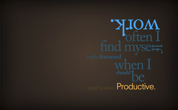
2589.My version of a popular meme, brought on by an extended browse at the Paper Zone earlier today:
It's words to live by, peoples.
2588.Firefox 4 is due to be released later today, they say, but it's available on Mozilla's FTP servers now, reports SitePoint's Craig Beckler.
Go to: ftp://releases.mozilla.org/pub/mozilla.org/firefox/releases/4.0/, and choose your system, then navigate to en-US for the USA! USA! USA! version.
And good luck.


2586.What else could you possibly call it when the Trail Blazers annihilate the Cavaliers by 41 points!?
111-70? That wasn't just a spanking, that was assisted suicide for the poor Cavs.
Fortunately, that's legal here.
2585.One main reason I enjoy the Portland Mercury so much is why many other people don't; they don't take themselves seriously. You'll find good solid news in ther - the PMerc's City Hall coverage is good, if brief, and when they do do news they take a straight approach, but an atmosphere of whimsy pretty much pervades the publication.
The best part is the cover. Sometimes odd, somtimes sublime, sometimes WTF-inducing, the cover art always engages the eye. The thing about the cover art is that it doesn't always have much of anything to do with the stuff inside - but it does catch the eye. At least half the reason I seek out PMerc each week is to see what they were audacious enough to put on the cover.
This week, though, the best expression of the most important event of the year so far was found on the cover of the PMerc. Typically they have headlines laid down with the same whimsy the rest of the publication enjoys, complete with a sarcastic or goofy tagline. This week, here's what we have:
A black wave about to engulf the Rising Sun. No slapstick and the URL of the Red Cross instead of a one-liner tag line. The thing is, it caught me by (no joke intended) surprise. The practice of non-sequitur cover-art had become something of a learned-response to me - absorb the cover art without giving it too much meaning. So, the expression of sheer minimalism and simplicity snuck up on me. Because it had the drop on me, it made much more of an impression than if it had been something I expected to see.
Well done, PMerc, well done.
I hope you don't mind me showing this little bit of brilliance off.
Here's the archive page for this issue: http://www.portlandmercury.com/portland/IssueArchives?issue=3654819
2584.Whatever you think of Portland's special atmosphere, that which makes us special didn't just happen. Oh, it's an environment that promotes itself, true, and that's a first cause, but, as Dr. Hans Reinhardt cogently said before he dove the USS Cygnus into the black hole in that Disney movie, "what caused … that cause?"

Research has slowed a bit because grants are hard to come by latterly, but we do what we can on what we have, and the direction the research is going is promising Additionally cheering is that many independent lines of research have developed, the most notable being independent scholars such as Dave Strom and Mike Vogel. Each approaches the discipline with their own style and jenny say qua, as the French say. We don't know what that is.
But still, knowing that differing reasearch lines converge toward the same thing must feel like when Liebniz and Newton independently developed the Calculus - after the hairpulling catfight over came up with it first, of course. Intellectual joy!
We work tirelessly toward a view on our shared Unicornate past, as well as the view or Portland history that that will define. Until then, on St. Unicorn's day - have a drink in their honor. But don't drink to forget - drink to remember.
Because that's the way we roll here in PDX, yo.
2584.
http://www.society6.com/studio/lucy/ABComics
Really, it's twenty-six characters no matter how you look at it.
2583.Quality is not always pretty, and pretty, strictly speaking, is not necessarily beautiful. Or sexy.
I adore the Marquam Bridge. This spare, bare, purpose-built bridge has had a lot of dirt thrown at it by dilettantish types who insist on thinking that the word beautiful is the same as beautious. It ain't so, my friends. Never has been.
You ever hear, and really think about about the meaning of the oft-tossed-off aphorism beauty is in the eye of the beholder ?. I'm sure a lot of people just toss it out into verbal play without really thinking about what they were saying. Well, my friends, this, to me, is beautiful:
Yep, it's the Marquam Bridge.
Its beauty is in its plainness, it's engineered appearance, its internal character. This is the bridge that was called the "Erector Set" Bridge when it was put up, the one that the Portland Arts Commission lodged a protest against due to its "ugliness". But now, it's part of the warp and weft of the city's physical fabric, and it has one of the most stunning views of downtown there can be had - sadly, you can't pull over to take it in, but nothing's perfect. Maybe in the future somehow.
Moreover, the bridge is beautiful in strength - it's strength is part of its beauty. As witness this report from KGW TV, in which concern for our own possible future subduction zone event has been sharpened in the wake of the tragedy in Miyagi Prefecture, Japan, which tells us that our plain-jane, no-arches, ugly-duckling Marquam Bridge will most likely be the only river crossing in Bridgedown left standing or usable when The Cascadian Big One hits.
They may insult you, girl … but I knew you always had it in you.
2582.Something I stumbled on. Be warned that this is essentially a promotional video, and some of the conclusions it asks you to draw may seem a bit glib, but it's well done, and the droll humor is worth wasting a few minutes of your time to see.
It's a brave new world. Or something.
2582.One thing a designer is called upon to do occaisionally is not to create something original (or wholly original) but to create something that fits in with a design look that already exists.
Latterly, a suggestion was made to me that a page that contained a Paypal donation button needed another button, and this button would deliver a congruent message if it were made to resemble the Paypal button. Here's the button in a bit of context:
In a subsequent section of the webpage, it would read "Thank You Gifts" and that button would lead to a page that has a listing of PBS-style thank-you premiums.
The task presents itself in a series of trivial stages. Thus:
1. Identify the shape.
This button is a recangle with rounded corners. Importing this into Photoshop I make a rounded-corner rectangle path approximately the same shape as the button, which is being kept on a hidden layer for color and shape reference. After doing this, I increased the image size to 300 px wide so I could see things just a little better.
The path is probably hardly visible around the outside of that, but it's there, trust me.
One of my favorite things Photoshop does is allows you to make selections out of paths. When I first learned PS, I used Quick Mask, but when I figured out I could do this with paths, I've not looked back. In the Paths palette, I saved the Work Path and drug it to the "make selection" button on the bottom of that palette and made the selection. Using the eyedropper tool, I sampled the orange-yellow color where it was at its most intense, and filled the selection on a new layer.
2. Create The Button's Foundation.
Here's what it looked like after I did that:
It's hard to see, but the background is transparent. From here on out, it's a rather simple process of building layers. The translucent effect is a trompe l'oeil, as what it really boils down to is layering two gradients over the yellow-orange background. Going to PS's gradient tool, I created a gradient and called it "White, Transparent" (a good idea at this point would be to probably make a "Foreground, Transparent" gradient which would then be whatever I needed it when I needed it but I was in auguring mode at this point and was very result driven, so I crafted a tool toward the specific end. And, of course, PS already has one anyway as a default preset.
But, how to fill in the gradients? That's next.
3. Adding Visual Depth With Gradients
The path that I created to make the main shape will be useful for the gradient areas as well, but I will be changing them. Narrowing them to bring them within the shape and squashing them created two new paths - one for the upper gradient, and one for the lower gradient that is just a bit more squashed than the upper. This will create the effect of light coming down from above.
Gradient one:
Gradient two:
And there's the translucent effect. It's the color plus the white-to-transparent gradient. And it was very simple to do.
The only thing that was required was to place the text.
4. Placing the Text
I'm not sure what font they used in the original button, but It looks like a Helvetica Neue would be close enough and do the trick. So, I sampled the color from the text in the original button and got to it. It too was pretty simple.
Bold obliqued Helvetica Neue bold. Looks pretty close. But we need to take it back down to a proper size (that's 110 px wide) …
I am always amazed at the way you can trick the eye into seeing smoothness by reducing the roughness to a level you can't resolve it at:
But does it work on the page?
Yes, I think it does! Mission accomplished!
2581.Donna Barr is famous for a very good reason - great art! Great art! Great art, and great stories … two! Two very good reasons: Great art, great stories, great characters … three, three very good reasons …
And here's two very important examples: This fellow is the Desert Peach:
And this fellow is Steinhard Löwhard … or "Stinz":
And they are the most amazing characters. One of the biggest draws to me for Barr's art and storytelling is the obvious affection with which she blends German history, astoundingly original characters and believable situations. The Peach blends WWII life in North Africa with a M*A*S*H-like sensibility for the absurdity of the human condition in war and the simultaneous fragility and resiliency of the human spirit, and Stinz blends the Wilhelmine German empire with … centaurs of all things. And all the characters become friends, which is just the thing that any great storyteller must do and succeed at.
Donna's two websites, http://desert-peach.com and http://stinz.com, are posting the whole run, an new comic daily. So that even though you ought to buy yourself Donna's books, if you can't, you can read them, one new (or new-to-you) comic a day, and there's even an RSS feed, yo … you load it into your RSS reader and you'll never miss one! And it's free. SUCH A DAMN DEAL!
If you aren't reading, why not? I expect a good answer to that question.
2580.It was thirty years ago, in Britain, that the niftiest personal computer ever concieved was marketed: The Sinclair ZX-81. In America, we knew it as …
Now, don't get me wrong. It was a crap-ass computer, for those of us too poor to afford Apple IIs, Macs, and IBM PCs. It only had 2K RAM unexpanded, and while the European version could be expanded to 64K, Timex in America figured all us users could ever handle was 16K, so that's all the RAM they ever made for it.
But it was nifty in its way. No sound, rough graphic, and a BASIC that makes me cry inside the more I thought of it, but it was bought for me with love, and I had a grand time playing with it. Never had a disk drive (not that I could ever afford one anyway), but it was computing, and it was mine, and I had much fun with it.
I'll always remember the fun time, loading from cassette, playing Flight Simulator (yes, they had one!), system crashes when the inside overheated or the RAM pack wiggled … oh, yes, good times. And learning elementary electronics (that I soon forgot), but one of the biggest projects of the TS owner was putting together a real keyboard for the thing.
A palmful of chips, a membrane keyboard, and Sinclair BASIC occupied many a late night when I was but a neat thing.
BBC has an article about it here: http://www.bbc.co.uk/news/magazine-12703674
2576.Since Portland is known as a foodie town, and Paula Deen IS food, y'all, what would be more perfect than a union of the Deenzilla and the awesum unicorn spirit of Portland?
I know!
Your meme of the day: Paula Deen Riding Things. Here: http://pauladeenridingthings.com/. They even got Paulas you can insert into your own graphics and submit.
Which I have done.
2575.… in which we, too, discover that Rocco's that pizza-slice-shaped pizza place cat-a-corner from Powell's City'o'Books, has quite suddenly packed it in.
And we were thinking of stopping by there soon, anyway … shoot. That pizza, with its bready crust, just-greasy-enough sausage and pepperoni, and plentiful cheese, defined pizza for me. It was scrumptious, nothing more or less.
Okay, maybe it was iconic. But it was the slices, man!
2575.Now it looks like you may be able to view Flash on your iOS device.
Oh, not as such, of course.
Enter that amazing new thing, HTML5 - HTML that people are actually doing animation and video games in. The new little beast from Adobe - codenamed Wallaby - will take your Flash file and break it down into HTML5, CSS, JavaScript - Dreamweaver-licious components, all with a simple dragon-drop, so it is said.
PC Magazine has an article about it here: http://www.pcmag.com/article2/0,2817,2381620,00.asp
… and Adobe Labs' download page for Wallaby is here: http://labs.adobe.com/technologies/wallaby/
It's in prerelease, so you'll probably find out some stuffs in it.
2574.It shouldn't surprise anyone from student level on up that not every red is identical, for example: this cadmium yellow will look a little different and mix a little different than this other one.
As Muse Art and Design has posted here (http://museartanddesign.com/2011/03/paints-pigment-codes/), there's more to the color in your tube of paint than just the artistly name on the front. For instance, I have in my hand a tube of Winsor & Newton Galeria Cad Yellow Medium. If you look on the back of the tube, underneath the color name is the line
Pigment: Cadmium Zinc Sulphide (PY35)
All pigments are made of metals and/or various chemicals. Words like cadmium zinc sulphide, however, may seem too abstruse. But never fear - the code at the end, the PY35, is part of a standard coding system amongst producers of artistic paints.
It's rather simple to learn and not to difficult to understand. The letter P signifies "pigment", naturally, with the next letter signifying the class (R=red, O=Orange, Y=Yellow, G=Green, Br=Brown, Bk=Black, W=White, and M=Metal) of color. The number uniquely identifies the chemical combination that produces the pigment. To get really abstruse about it, the color PY1, or Pigment Yellow 1, can be marketed as Cadmium Yellow Hue, Hansa Yellow G, or Permanent Yellow Deep as well as Permanent Yellow Medium. But it's all PY1, a Monoazo, arylamide, with a CAS registry number of 2512-29-0. On the other hand, PY3 is also a Hansa Yellow, has been marketed as Arylamide Yellow, Bright Yellow Lake, Cadmium Lemon Hue as well as Cadmium Yellow Lemon Hue, but it's all PY3, an Organic, Monoazo, Arylamide, CAS registry number 6846-26-6.
That's quite a prodigious flood of info, I know, but the point is, look on your paint tube and find that pigment code number. For instance, the Cad Yel Med from Winsor & Newton, in both the student and professional ranges, come in PY35. Another manufacturer, Liquitex, has a color in its Basics value-student range called Cadmium Yellow Medium Hue, which is made of PY74 (Arylide Yellow 5Gx) and PY83 (Diarylide Yellow).
Once again, a lot of abstruse info. The point I'm making right now is not that you have to know what a Diarylide anything is, unless you're that interested in chemistry, but each and every pigment mixes a bit differently and behaves a bit differently. If you came to the end of your tube of W&N Galeria Cad Yellow Med and all you have around is a tube of Liquitex BASICS Cad Yellow Med Hue, you'll probably want to do a little mixing off-palette to see how it'll react.
This is also useful info in the way Muse's article expresses, that knowing how pigments mix to create the packaged colors you buy could enable you to create your own mixes in a pinch from what you already have on hand. And knowing how to read pigment codes goes a long way toward enabling you to make consistent paint buying decisions despite the sometimes confusing welter of names colors can go by.
Muse's blog article is here, again http://museartanddesign.com/2011/03/paints-pigment-codes/; and if you want to go really deep into what all these different pigments are, the Color Of Art Pigment Database can be had via http://www.artiscreation.com/Color_index_names.html
2573.Now, I don't know what it is about mininalist art. Oddly enough, when you render something complex in an elemental form, such as black and white, somehow it becomes even more alive.
I have a hypothesis about that.
I came upon it when watching a rerun of The Twilight Zone, the classic, Serling version. One of my favorite episodes is one called "The Midnight Sun". The main part of the story concerns a young woman, an artist by profession, just trying to survive minute to minute in an environment which has become literally untenable; the Earth, for some reason, has begun to spiral into the sun, and the sun has become so big in the sky, that there is no night anywhere - just relentless heat. Hence, the title.
Effective set dressing helped, but the lack of color forced my mind to work. I could feel it happening. I watched the TV image, and while I did, my brain was overlaying sense impressions that weren't obvious because the color cuese were not there in the image. I felt drawn in and subsumed into the teleplay; it wasn't an abstract thing - a tenuous part of me was with that woman, dying under the hostile sun.
I needed a glass of water while I was watching it.
Black and white - or monochrome - art does this to you. It involves you. It makes your brain work for the image. I'm sure, if you did a CAT scan of a person percieving a B/W image vice a color one, you'd see different areas of the brain active. And I know you can't feel it, physically, but somehow I did.
There is a webcomic I just stumbled on, the full title of which is Supermassive Black Hole A*. It's also simply called A-Star. The object in question is the supermassive black hole that's supposed to be at the heart of our Milky Way Galaxy; it's called A for Aquarius, the Zodiacal sign in which the galaxy's center can be found, and the asterisk, or "star", denotes that it's the biggie, number 1. The title gives itself to a hard SF comic of the far future in which Mankind lives amongst the Galactic Core and near and around A-Star.
But enough of that. I told you all that to tell you this: this comic is amazing because its palette involves just black, white, and the occaisional shades of gray:
Everything is that way, from the interior scenes to the space scenes. It draws you in, and the storyline is harsh and unforgiving on the characters - they all play for keeps in thier contexts - and it drew me in. I wasted (not really) a couple of hours yesterday, following the story of far-future megacorps and assassinations and revenge.
I find it amazing.
Here's the URL: http://smbhax.com/
Read it or … you kinda suck. I don't mean to be mean, but I gotta tell you the truth.
2573.Me and The Wife™ are both fans of Wendy Russell, the Canadian craft mavenne who's cute and charming show, She's Crafty, is being run on IONLife right now. But when I went to teh Googel to see what Her Wendyness was up to lately, I was dismayed, for Google saith thus:
I can't believe that Wendy's site would harm my computer, except to have the hard drive populate with a ton of craft ideas for The Wife™. But then, she's whipped a corner of the basement that needs it into quite the neat shape, so it's all good.
2572.Because I just wanted to post something and don't have something to say yet today:
That design says so much about me.
Thirty-nine (in PDX, "César E. Chávez") more of them here:
http://www.1stwebdesigner.com/freebies/40-inspiring-high-quality-typographic-wallpapers/
2571.Because this amazing bit of art stands out, engages and makes love to the eye and is just so plain damn' fun:
That it almost doesn't matter that it forms the opening panel to this comic: http://www.sinfest.net/archive_page.php?comicID=3834.
Also, the simple humor and poetry of an Eastern serpent swooping out of the sky to ask Buddha if he'd summoned him is addictive.
Sinfest. If you aren't reading it … dear God, why aren't you!?
2570.Chalk as art?
It's all in the execution.
Turned on to this by Pete Vogel from Nutmegger Workshop, I present the art of New York graphic artist and chalk artist Dana Tanamuchi. You could get out your sidewalk chalk right now and get to work and still have a job of work to do to catch up to this virtuosity:
This is something that takes discipline, style, attention to detail, love of type and line, and a vision for the bigger picture.
A whole lot more can be seen here:
http://www.danatanamachi.com/chalk/
As tempestuous as my own relationship with some art materials can and has been, it's an inspiration to see someone take something to a level of art that equals poetry. This does. And I would have never thought that chalk could do so very very much. Also I most enjoy the touching back on styles that remind me of engravings from the early 20th-late 19th century. Gorgeous to look at. Very much eye candy.
2569.There's stuck and that's a good thing, and there's stuck and that's a bad thing.

2568.Funny, Because it's true …
The next frontier in LOLTopia.
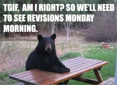
Weekends are for other people, after all.
Peep the rest of Client Bear at http://clientbear.tumblr.com/.
Via Right Brain Resource.

2566.MSFT is countin' 'er down.
At the website http://ie6countdown.com they're counting down the percentage of users still using IE6. Worldwide, it's down to 12 per cent.
Oddly enough (or maybe not, I don't know) the country with the highest percentage of IE6 users would be … China. They have a lot of suggestions of what to do - not surprisingly, none of them involve, say, moving to Firefox or even Safari.
Seems to me people are figuring that one out on their own.
2565.The Wife™ and myself finally got the chance to see TRON: Legacy at the Academy Theater out here, Montavilla way last night.
It's worth the wait. The Academy, which was a whole lot of things for a whole lot of years after it quit being The Academy for a while, is a theater reboot done right; the original details preserved, the archiectural designs and history honored, and with 2nd-run movies at Very Nice Prices Indeed (2 adults can get in on Tuesdays for $4 for the both). The Academy is our choice, both in and out of these sketchy economic times.
As far as the movie went, though, it shouldn't be a huge suprise to find out that I'm not only a huge fan of the original movie but own its 25th Anniversary edition. TRON, for all its flaws - and they're legion - is a smart, inventive and, for its time, risk-taking motion picture, if only for the fact that it gets you to buy into a concept that's gibberish on its face: the programs we wrote as little-kid BASIC programmers were little beings that looked like us, had lives, saw their own purpose, and saw us Users as Creator.
Life on the Program level, it turns out, involves an innumerable pantheon of gods.
Bringing TRON into the world of 2010 couldn't have been easy. The evil ENCOM megacorp was drawn so sketchily that about all that you could tell about it was that it was a huge company that did something with computers somehow - just what, aside from a kickass security program and world-beating video games that still appeared kind of lame next to the games we actually played at the time - was never made clear. The ENCOM of "today" is a lot more clear - it's a software and hardware giant of the stripe of Apple or Microsoft; the distraction to kick-off the story, the worldwide release of ENCOM OS 12 - "the most secure operating system of modern times", as Ed Dillinger, Jr (apparently, greasiness runs in the family) termed it, happened at midnight, just as big-ass software releases do here in Realtopia (I imagine, in the film's world, geeks of all strips were lining up around Best Buy to purchase the first retail copies).
And what does the main characater, Sam Flynn - disaffected but still the majority shareholder do? He hacks the mainframe and makes ENCOM OS 12 available for free - "On the Web", as Bruce Boxleitner's Realtopia characater, Alan Bradley, observe drolly in the ENCOM board meeting just minutes before the midnight release. Sam Flynn's hackerly might is evident. Bow before it.
Another subtext I enjoyed was the weaving of themes I can only think of woven in from Buddhism, mostly as expressed by the character of Kevin Flynn, who has been living in the "Outlands", off the Grid in the System, for the 30 years he's been captive in the system (when his digital double, CLU 2.0, took over, Flynn couldn't get back to the I/O Port in time and it closed, locking him in the system, almost as a wu-wei counterpoint to CLU's active conquering of the System, sincerely following the dictum of his creator - create a perfect world. As most quests for perfection go, it's misguided, possibly by an unfortunate misconception I find quite often, that perfect means flawless.
Perfect, it ought to be remembered, also means finished, completed. Flawed things can be just as perfect as flawless things.
The quest in the movie takes the form of Sam and Kevin's attempt to Go Home Again™ while keeping Flynn's identity disc out of CLU's hands. Kevin Flynn, being who he is, has everything ever needful to know about The System in its entirety encoded on the disc, and its information would be CLU's key to expanding his persuit of a perfect world from The System itself - which resides on a squestered computer (with a kickass interface) in the basement of Flynn's Arcade (now closed in what is now a deserted, neglected area of The City) - into Realtopia itself. The disc does change hands a few times, and the Quorra character (the adorable Olivia Wilde) gets. The movie riffs in manifold ways on the old prequel - CLU's carrier bears a strong resemblance to SARK's from the original movie, and there is a ride on a Solar Sailor across the Simulation Sea. It dances around questions of life and death, mortaility and philospohy and religion the way the original one did.
But above all, it was a good time, and it did what I thought would be difficult - continuing the story - with aplomb and unexpected deftness.


