31 March 2006

[pdx_geography, history] Damascus Gets On With It

I was fascinated by the front page of today's O, in no small part by the map which had pride of place and the front page story.

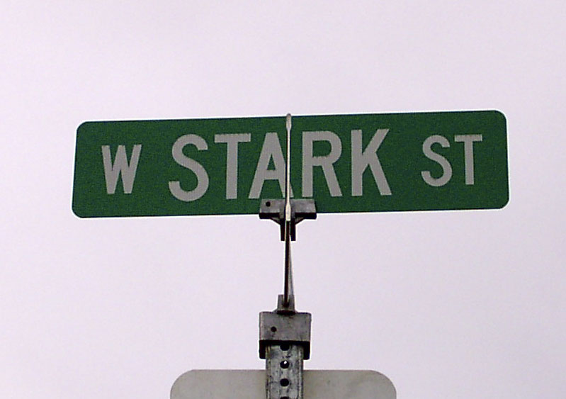
Reading the story, I couldn't help but think of the old joke where someone asked the dog that, now he'd caught the car, what he'd do with it now. Banal observation, I know, but consider: the City of Damascus, all 7-or-8-odd square miles and 15,000 (more or less) people of her, came into existence because of, essentially, fear and loathing of Metro brought on by the Urban Growth Boundary expansion. They wanted local control.

Before the incorporation, the questions of growth could, I suppose, have been framed as how to balance respect for personal property rights whilst preserving Oregon's biggest selling point–our quality of life (from where I'm sitting, it sure isn't economics). Different people might see it different ways, of course; that's not my point.

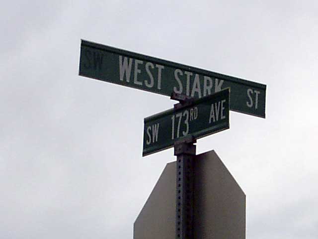
Now, Damascus, in search of more local control, draws a legal line around itself only to find that the decisions that might have been made on NE Grand Avenue now get made somewhere along SE Highway 212, and they're the same ones, only now it's up to them. The plan for the area was forged by a whole group of people over the past couple of years, and they still can't please everybody. Everyone agrees that we shouldn't screw up our countryside, but it tends to be real hard to find people who are willing to pay the price when the stuff hits the other thing. Now that there is a plan, they're all howling for running city government out on a rail already.

Although I'm not trying to cop a superior attitude here, I must admit to being amused, being a resident of a city who is cursed by everyone else in the state who doesn't live in it for "trying to annex the state" (whatever that's supposed to mean). Hammering out a new identity isn't for the squeamish.

One thing's for certain: Damascus stands to give us a good idea of 21st Century growth and planning and what directions and forms it could take, more than any other area mostly because they are forging an identity as a city. All us amateur (and professional) students of urban growth are going to be keeping a watchful eye on little 'ol Damascus.

I started off on this missive noting the map in the O. I was reminded of a post I made what seems ages ago about the new city limits of Damascus back in November of 2004. Having turned up the PDF of the Damascus city application and doing a little elementary editing, I came up with the likely limits of the new city. After seeing the plan boundaries I though I was pretty close, so, with the help of the O, I went to the homepage of the Damascus/Boring Concept Plan, and downloaded the map that had the current boundaries of Damascus (and a portion of Happy Valley)(Follow this link if you want to just grab the file). Here's what I found:


I'm quite satisfied to see that my estimation of Damascus's city limits was largely on target. There's a chunk of the southeast corner of the city that didn't go in, but other than that, pretty much dead on. Yay, me!

One thing I do find remarkable is the piecemeal annexations by Happy Valley up and down SE 172nd Avenue. I recall reading in the O sometime back that Damascus and Happy Valley were going to the mat over that area, and Happy Valley's strategy here is pretty clear: send out a shoot and pick off this lot and that lot along that shoot–much like some say Beaverton's trying to corral in Cedar Hills by throwing a stem out around it and then assimilating the resulting island. Happy Valley really wants that area along 172nd,it's pretty clear.

[news] Well, I Didn't Have Any Weekend Plans Anyway...

Oh, oh...


It's always something, innit?

More details (including a bulletin on the event) from the IEDAB here and here. Thanks to "Things of Interest" (formerly known as "Sam's Archive"...some other Sam, not me. But I do admire him).

And, before I forget, happy First of April, everybody.

28 March 2006

{Address_Nerd] The Far End Of West Stark St.

Dig, if you will, this picture.

A while ago, during the early stages of Nerdery, I pontificated at length on how the addresses run out in Washington County. One of the important things to note is that, unlike in Multnomah County, the line that divides North from South (NW from SW, in this case) is a surveyed one; in the main, no road follows it. At least, not largely.

The street name nominated to extend westward from the Multnomah/Washington County frontier was Stark. While we don't have a record of the decision, we can presume why. As a commenter then noticed, West Stark is laid out along the exact same surveyed line that SE Stark St does; it's a logical extension of the street name. Since West Burnside devolves into Barnes Road and which drops away to the south, this wouldn't serve as as ready a division as East and West Burnside do; Stark Street, as surveyed, is only five standard blocks south of where Burnside would have extended, so the difference is minor.

While the NW/SW division is largely invisible to the area resident, noted only by the changes in street prefixes and run of address on numbered avenues, West Stark Street does exist in one or two places (as well as some other street names found in unexpected places extended out from Portland into deep Washington County, but, ah, that's a tale for another post soon to come). There is a piece of Stark that the map claims extends west from Miller Road into the Leahy Road neighborhood near St Vincent's Hospital, but the map calls this "NW Stark St". Another bit, not too much farther west, crosses Barnes Road between the Cedar Hills Blvd signal and the crossing at Cornell and Saltzman. The map calls this "W Stark St", but the sign at the intersection calls it "NW Stark St" (I don't have a photo of this...you'll have to trust me on this one).

The other part of West Stark Street, and the most remote west section of it, can be found in Washington County, off 173rd Avenue between NW Walker Road and West Baseline Road. It's easy to overshoot but a street directly south of it, SW Nazaneen Drive, allows you to go in the back way via SW 175th Avenue (see the second illustration, which we took whilst stopped in the area where the red-on-white sign says, well...not to stop)

This part of West Stark Street only runs between 173rd Avenue and 175th Avenue (at least, the public part does). It's a pleasant street, in a neighborhood that has a mix of old farmhouses and new developments. The south side of the street shows the new development, including three micro-sized dead end streets called SW Parvenu Pl, SW Pasquirade Pl, and SW Palatial Pl.

You mind the Q's; looks like Washington County public works has the P's covered.

The north side of the street is only paved about 1/3rd of the way over; that side of the street has a charming white wood country-style fence with lovely manicured trees. It is actually quite a charming place.

The next photo has something telling in it. See if you can guess what it is before reading on:


Notice the asymmetry of the typography on the sign, and the unusual expansion of the directional: we typically don't spell out the word: that should read "W STARK ST". If one takes a good look at the blank area on the left hand end of the blade, one can just pick out the majuscule letters "SW". This blade once read "SW WEST STARK ST", and the SW was removed.

Credit to The Wife™ for getting the above. I had her doing Sherpa duty whilst I was out taking those pictures, and I was at the wheel of the car, and had her snapping away.

Indeed, there seems to be a bit of revision going on in that area. Baseline Road, long labelled SW Baseline Road to reflect its physical position south of the logical base, is being renamed on the signs to West Baseline Road along its entire length. We saw many signs that used to read SW, with a blank spot where the S should have been, and could trace the outlines of the freejack letter.

We're going back out that way, to visit the Cedar Mill Community Library, tomorrow; I hope to hit the Leahy Road area, and bring back some Stark Street signs from that trip, in order to fully document the thing.

West Stark Street, in the Elmonica area, facing east (toward 173rd Avenue) from 175th Avenue. The street sign at the right that can just be seen marks the entry to SW Parvenu Pl. In the distance can be seen the western flank of the Tualatin Mountains (the part of the West Hills that contain Forest Park and the transmission towers)

27 March 2006

[teh_funnay] Found Object: Henry's Windows XP Linux Review

From a post at "Henry the Adequate", current holder of the best. comedy. sentence. evar.:
It says "Press any key to boot from CD". After careful consideration I determine that the best key to press would be the spacebar.
Read the whole thing, if you dare:
Henry The Adequate: Henry's Windows XP Linux review

23 March 2006

[pdx_history] Malcolm X Street, ca. 1991

A couple entries back, in the entry I wrote about Martin Luther King Jr Blvd, special correspondent Alan DeWitt commented thus:
Do you happen to recall the unauthorized overnight renaming of Front Ave. to "Malcolm X Blvd." about that time? As I remember it, the pranksters relabled the street blades, the black historic district signs, and even the freeway signs over northbound I-5. Apparently there were leaflets that went along with the signs, although I never saw them.
Yes, I did. I remember, as I said, getting slightly irritated at the signs, but in a Address-Nerd-sort-of-way, not a social message sort of way. More on that in a moment.

Alan suggested a certain URL that laid the credit at the feet of a Reedie. I went exploring and found out a few things...

The evidence seems to suggest that the prank was the result of a then-Reed student named Igor Vamos. In 1991, either in reaction to or in commentary on the then-in-play MLK Jr Blvd imbroglio, he and a group of fellow-Reedies calling themselves "Group X" had white-on-green signs made up, in approximately the style of Portland street blades, that looked approximately like this:
(Well, actually, I was going to post an illustration of my own, but Blogger still has its head up its patoot and won't let me do it. Wish I had enough money to pay for my service, then I could complain. I was hoping to get permission to post the image to the 'blog, copyrights being what they are, but even if I did, Blogger wouldn't let me put it up...anyway...)

A graphic of then KATU-TV newsman Bandon Dunes (a/k/a That Exploding Whale Guy) with an actual photo of one of the signs in the Vanna box over his shoulder can be seen at this link (click on the photo captioned "A."-its on the left hand side, it should take you about a millisecond to recognize it. It clearly (well, about as clearly as a screen shot can, anyway) that the words "MALCOLM X" were in caps with the abbreviation "st" is in all lower case (not "Blvd" as some remember).

As an Address Nerd, my problems with it are thus:
  1. No directional. It should have been NW or SW, depending.
  2. The street type ("st") is in miniscules. Should be majuscules.
  3. If they weren't going to call it "Blvd", they Should have made it "AV", not "ST", anyway.
Igor has gone on to quite the heights afterward. Since graduating Reed, according to this piece by the Weak Willy, he went on to cultural jamming stuff such as the Barbie Liberation Organization and the most recent and fun version of his art, The Yes Men. We hear that he is not only a professor at Rensselaer Polyinstic Tehnitute in Troy, NY, as well as the recpient of a Guggenheim fellowship. Since he has parlayed screwing around into a highly lucrative position in academia as well as becoming something of a guerilla celebrity, we admire him. We are also insanely jealous, and think we hate him, but we're not sure about the hating part.

19 March 2006

[design] Three Thumbs Up!


A cool idea by Von Glischka, principal of Salem's Glischka Studios. Anybody can become a member, and members upload thier work (illustrative, graphically communicative), and work to improve thier technique.

Anyone, member or no, can view the TTU Gallery. This may make some famous designers.

Get good enough and you, too, can recieve the soon-to-be highty coveted "Three Thumbs Up!"

18 March 2006

[Address_Nerd] Portland Signs: MLK Jr Blvd.


(Street blade photo provided by Stan Kost, but Blogger still has its head up it's tookie, so no neat formatting. At least I get to show off Stan's work.)

In modern times, having a street named after the greatest civil rights and social justice pioneer of the last century is something of a fashion. If your town doesn't have a street named for Martin, it's the same as wearing brown shoes with your tux; it just isn't done.

This isn't to say that naming a street for MLK is trivial, though the way it's done sometimes seems to have more than the whiff of politics-for-appearances-sake about it.

Those who have lived in this area for a great long time know that, until the mid-80s, NE (and SE) Martin Luther King Jr Blvd was known as Union Avenue. Before the Great Renaming of 1891, Union Avenue was known by a number of names since, when East Portland was being first developed, it was the practice of the cities to allow developers to name the roads they were building pretty much anything they wanted (which was why the Great Renaming was necessary to begin with). Snyder has it thus:

This avenue originally had several names, on various segments along its length. in 1891, at the time of the Great Renaming, city officials decided there should be only one name on a single street, no matter how long it might be. The multiple names were deleted, and the entire length was renamed for the "Union", that is, the United States.
Therefore the first renaming of the street was of decided necessity.

The story of how Union Avenue became Martin Luther King Jr Blvd was one of percieved necessity. The following relies completely of my memory of how it was reported in The Oregonian of the day and is heavily accented by my own perceptions (I supported the idea and still think it was a good one).

By the mid-1980s the Northeast corridor along Union Avenue was in an advanced state of decline. Today various forces are attempting a commercial renaissance of the area; the jury's still out on how well it's going. But then, Union Avenue had a bad reputation as one of the meanest streets in our fair town, and if you wanted to get a wife for the night, that's principally where you went. Bad scene.

About that time, I can't clearly remember how, a groundswell of ideas began to happen on how best to rescue the troubled area. The idea of renaming Union Avenue and the median strip that currenly runs up that road were just two of them. As renaming Union to MLK gained traction, there was a great deal of arguing about it. Many of the merchants were against it, and a few well-known citizens, the most notable (some would say notorious) being Walter Huss, an archconservative populist whose name carried some weight in those days.

Eventually the pro-renaming faction (who I believe had the City's support) won the day, even despite an attempt to change it back from MLK once the name had been applied. In response to the feeling that the change had been somewhat forced down the throat of the people who didn't want it, the City drafted a set of detailed rules to bring about changes in city street names (which was then subsequently bypassed in a rush to rename SW and NW Front Avenue to Naito Parkway–but we'll be crossing the bridge, friends, when we get there), and for about five years people were treated to the sight of a very long "NE Martin Luther King Jr Blvd" street blade with hapless-looking "NE Union Ave" street blades perched atop them.

Now the Union Ave blades are all gone, and virtually nobody refers to it by that name anymore. Sort of lost in all the tear-up about it is the actual nobility in naming a street for such a worthy and noble man, whose example I think of when I think of someone who endured for what is right against the status quo. And the still-late-aborning rebirth of the meanest street of NE Portland (save for the place where Alberta Street crosses it) may not be the one that the name was hoped to inspire. And the median strip has done more to kill the MLK commercial strip dead than it has done to revive it.

But there are signs of life up there these days, and maybe someday soon MLK Blvd will run through an area that gives the name its proper due. Maybe.

Nota Bene: The "Union" name still survives: a short road fronting Delta Park, across outer MLK from the Jubitz Truck Stop area, still carries the name N Union Court, a name insipred by the old name of the major street that runs alongside. The street bends over the N-NE dividing line at that place, so its official directions is N, not NE.

Geographical Trivium: MLK Blvd runs north and south. If it were a numbered street, it would be NE and SE 4th Avenue. There does happen to be a SE 4th Avenue, in the industrial area between the river and the Grand/MLK Viaduct south of Stephens Street, and since the Bridgeton area alone NE Marine Drive has been developed, there is an extremely-high-addressed one- or two-block section of NE 4th Avenue, hard up against the north Portland shore.

[net_life} Yoda Apparently I Am

I try to resist the impulse to take those benighted What _____ Are You? quizzes because...well, they're just kind of stupid. But sometimes I can't resist...

...and I find out that this deranged script thinks I'm Yoda:

Which Fantasy/SciFi Character Are You?


Also, it turns out I'm different–just like about 113,000 other punters who got suckered in.

Click on the above image to go to the survey if you're so inclined. And my condolences.

16 March 2006

[logo_design] Quark Redesigns Again, Again

For all those who thought the first redesign of the Quark, Inc. logo was something "we knew they should have turned right at Albuquerque", we give you the New New Quark.

I think they should have bothered, and I think they've got a genuine article here. I call it evolution in action, and it was done the way they should have done it the first time; in-house. They recognized that Quark knows what's best for itself, and actually, given its past as the acme of creative applications, it's a mystery why they didn't do that to begin with. As my friend Pariah Burke said in his post on Quark VS InDesign:
The 2005 logo is still featured in SicolaMartin’s online portfolio as a warning to other prospective clients of the Austin, Texas firm seeking unique branding.

It'll probably take SicolaMartin a while to recover from this bruise, I wot...well, at least amongst creatives, anyway.

There have already been some negative reviews of the new new logo, but I don't agree with them. Maybe it has to do with stacking this new new look against the old new look and recognizing that it's a distinct improvment (it has character and style, the change to the tail of the Q make the typography look more polished, the dynamic tension caused by the concentric asymmetry, and the Q that actually looks like a Q rather than an "a"). But then Quark has been so insensitive and arrogant toward paying customers in the past it will always have some animus from people against it.

What's actually surprising is that it's so strong. Check out this post at a place calling itself "Things That Suck" . This is perhaps a little übercranky but the root is typical of the sort of anti-Quark sentiment I keep seeing as a writer at D: and QVI. Sour grapes? Maybe. But I've found when there's enough complaining about something then it's not always on the complainers–in other words, there's good reasons why there's so much moaning. They don't even care that Quark 7 is about to happen–and that's even after trying the public beta.

As one wise person I knew a while ago (who has since executed the function shuffle (mortal_coil, off) once said, "It takes ten "attaboys" to make up for one "aw, hell". I don't think Quark has worked its way past five yet.

But, over everything else, I think the re-rebranding is, at last, a success.

I guess the real question is: too little, too late?

15 March 2006

[artists] Thomas Kinkade Is Teh Suck

Doin' a little catch-up here. The comments I got on this post were quite good and got me to thinking, always a dangerous thing amongst amateurs.

Anyway! In the aforementioned post, we discovered that the vaunted "Painter of Light", Thomas Kinkade, has rather decided feet of clay (story from the LA Times, via Arts & Letters Daily). pril and Carla commented.

Per pril:
JMO here, but his stuff makes me ill
I just hate when you equivocate. Tell us what you really feel, won't you? After describing her revenge (go to the comments, it looks much better in context), she continues:
I don't mind that other people are fanatical about it, or even like it just a little bit, but I'll take the Pre-Raphaelite Brotherhood over Kinkade's stuff anytime, at least as far as luminosity and detail goes.
Or maybe even Maxwell Parrish, who, while not counted as a pre-Raphaelite, was contemporary to some of the later ones and certainly had his own way with light. Come to think of it, in terms of luminosity and style, Kinkade is probably what Parrish whould be like when you subtract passion. Public piety (he tends to make a meal of how Christian he is) and sentimentality are all well and good but art without passion creates paintings that are just like Kinkades–technically adept but hardly moving.

Carla had this to say:
Yup--gotta go with pril on this one. I find Kinkade's work contrived and uninspiring, personally. I would definitely take a Pre-Raphaelite work (or a 18th century Impressionist, for that matter) over Kinkade easily.
Like I said–unmoving. Cute, kitschy, but 100 years from now people will still be talking about certain artists, and I'm pretty sure that Kinkade won't be one of them. Maybe they'll refer to him dismissively, sort of an American Biedermeyer maybe. But that's about it.

Carla's last sentence gets the last word, because someone had to say it:
Sounds like the guy spends a little too much time insulated from reality.

Couldn't agree more.

14 March 2006

[design] Professional Designers Cry NO!SPEC

Spec? What is this Spec then?

"Spec" is short for "speculative". While there are many types of speculation the one that designers should be watching out for is the prospect of doing hard work for the hope of getting paid.

What sort of insane fool would do hard work for only maybe getting paid for it?

That's a fair question. The answer is, regrettably, rather a few (refer: "LogoWorks") . And it's not due necessarily to any moral failing on the point of the participants but, perhaps of the desperate desire to "get one's work out there" coupled with a healthy dose of good old American "gettin' soemthing for nothing".

Design is a serious business. Sure, designers get to do fun things and play with fun toys (maybe that's why so many people want to be one these days) but it's all toward a serious end: communication. Designers solve problems, and they've acquired specialized knowledge to do this.

One of the most egregious ideas of recent time is the "logo design competition". While there may indeed be times and places for such a thing, a trend has been emerging toward larger operations who should know better opening a logo competition as part of, say, a corporate redesign. Replete with the promises of "getting your work 'out there'" and "practical portfolio pieces", and the possiblity of a payday, such competitions gather work from hard working and hopeful designers the world over.

All these designers take time (a non-renewable resource) to come up with what is hopefully a stand-out design. And in the end, the client (the group running the contest) gets what might be an able design without the headaches of paying an hourly amount to a designer.

Win-win, right?

Wrong.

Here, for further edification, is a short list of the losers:
  • The losers. You might think this observation rather obvious, but think a little deeper: not only did the losers lose the competition, the effort, whatever research they did, and most importantly the time–all important things that professionals quantify and bill for–are lost, and everyone knows you can't get back lost time.
  • The winner. Sounds kind of insane? Think about it though; professionals bill by time, effort, and resources expended. The prize, while welcome, seems, by my informal watch on the field, likely of a value less than the money that would have been made by billing professionally. But, hey you do have a memorable piece right? Well, no maybe not. More on that in a paragraph or two. And do you have rights to your design any more? Maybe...maybe not.
  • The client. But the organization got a good deal, true, and they now have a well-designed logo, don't they? Well, possibly. Will it survive with the company? Maybe, maybe not.
The point have having a professional design your logo is that professional is in a defined relationship with you; you pay them, they are completely focussed on your needs, history, and culture. This is a level of relationship that a contest entrant can never have; they learn what they need to to represent you and once the contest is done, so is the relationship.

That contest oriented company might re-engage the designer to do futher work, but it's presumably likely that, having learned the lesson that if they need professional design work done, all they have to do is announce a contest and take the pick of the litter at a discount, they'll simply hold another contest. Whatever history of knowledge the previous designer had will simply not be accessable. The result of this is a company that undermines its own brands with a design strategy that is a hodge-podge at best. With branding, perception is reality, and if your public can't make a connection between you, your brand, and your brand's history, they won't remember you so well. There goes that good will.

Trust me on this: the layman may not "know design", but the layman certainly senses when they're not getting your best effort, and they act accordingly.

This begins a sort of circle of devaluation. Clients in search of a deal undermine the professional approach to design by creating a competive arena where desperate designers compete for work like gamecocks in a fighting ring which in turn convince clients that that's the best they'll expect or have to go out for.

We support professional design. We support stable, defined business relationships between designers and clients, which provide benefits for all. We support inspired and insightful design that adds value.

We cry NO!SPEC.

Epilogue: Memorable Great Logos

Saul Bass and Paul Rand are two names who have had a lasting, decades-long impact on not only American design but also the look and feel of popular culture. Between those two names have emanated the most memorable and influential logos in American design history, whether they are still in use or not. They have likely influenced and started more trends that can be counted.

Saul Bass created the following and well-known or remembered marks:
...and those are just three; he created the United Way logo, Celanese, and a host of them. The AT&T logo bears special mentioning; when it was still the Bell System (before the divestiture) his reductionist interpretation of the Bell logo was recognized by over 90% of the American public, and while AT&T has recently redesigned thier logo (check it out here) it still pays strong homage to Bass's own landmark redesign.

Now, I give you Paul Rand:
Classics, all. We all have reactions to seeing the ABC and IBM logos; they are as recognizable as the American flag, and timeless enough to have each survived decades of use. The UPS logo has recently updated as well (check that out here) but the shield shape is still there; Rand didn't design it, but he left his mark.

All those designs were created by paid professionals who knew what they were doing, without a hint of a design contest about it.

Something to think about.

13 March 2006

[us_politics] Finally...A Candidate You Can Trust

Here's one fella whose campaign I can really get behind.

Where do I sign up to volunteer?

[sundial_life] Dreaming of 10,000

Sometime over the last weekend, this humble 'blog notched its 10,000th visit (viewer, search hit, whatever).

Stand back. I'm growing fast. Watch out you big boys, I'll catch up to you in, oh, seven or ten years...

In the meantime, more in the offing. More street names, more logo talk, more of just me.

Ain't it Wonderful?

08 March 2006

[design] iPod, with More Cowbell

Ever wonder what MicroSith would do with the iPod's image if they, somehow, acquired Apple?

Patrick Corcoran somehow aquired a glimpse into this fresh hell of a Twilight Zone and, having done so, worked it out by designing the package. It's a look into an alternate dimension, a dimension of mind, a dimension of sight, a dimension where everything worth doing is worth overdoing.

Follow this link to view Patrick's vision.

(Via Designorati)

07 March 2006

[artists] I Should Have Posted This With The Kinkade Bit

Now Yanni's beating up on his girlfriend:

Read all about it at the Yahoo! News story here.

To me, the real revelation was that the fact that his real name is John Christopher.

How very prole.

I guess this is that center-not-holding thing going on.

[design] Quark: State of the XPress, Spring 2006

In our playing with QuarkXPress's 7 public beta, we've had an eye on marketing moves.

Even the lowliest consumer senses that about half (sometimes more) of what any big company does is marketing and managing perceptions. Quark, Inc. is no exception.

Quark is coming up with some good deals to get the punters to upgrade to QuarkXPress 6.5, though, with the end goal to setting up thier user base to move up to QuarkXPress 7 when the time comes.

One of the great open secrets in the digital design tools world is that, surprisingly to the tyro, InDesign isn't Quark's biggest competitor; QuarkXPress Version 4 is. That may sound strange until one remembers that when QuarkXPress 4 was the current release, it also was the king of the electronic layout (we don't like the term DTP) hill. The only real competition was the quondam king, PageMaker, late then of Aldus Corporation but then Adobe's foothold in the electronic layout world, and PM was at its creaky end. Though the first Adobe InDesign was nigh, it would turn out to be a wan debut compared to the current glory that is the current CS2. As far as Quark was concerned, it p0wned the market with no challenge in sight.

Then, of course, was the rise of InDesign and the plateauing of Quark. But, as they say, you can't argue with an installed user base, and this was true for QuarkXPress 4. Workflows industry-wide were based on this. A great majority of Quark's enterprise users are rumored to still run workflows based on 4.11.

Intervening versions gave Quarkers no reason to move up from software that was working for them. Version 5 missed the boat on Mac OS X compatiblility, which gave Quark a huge black eye, and has a reputation as having more bugs than a bait store; Version 6 was Mac OS X native, but that was pretty much all it brought to the table, while at the time InDesign sales were soaring based on features that XPress didn't–and apparently couldn't–provide; integration with Photoshop and Illustrator, transparency, and even finer typography.

QuarkXPress 7 is going to be a necessary update. In our opinion, the update will not blunt the Adobe assault on Quark's market share; it may slow it a bit, but it will be level pegging with InDesign CS2 at best, not leapfrogging. And this with the release of CS3 less than eighteen months out.

Quark's imperative at this point is to seem to convince QuarkXPress 4 users that there has been no better time to get ready to go to 7. They certainly have a nice upgrade offer up; according to this page, for those who already own an earlier version of XPress, a $199 upgrade is available which the promise of a $79 upgrade to QXP7, which is bargain basement pricing for Quark (it will be recalled that before the current marketing war, a seat of QXP regular ran about $1,000, with a seat of QXP Passport clocking in at about $1500). Don't have XPress at all? You can still get advantageous pricing of a new copy of XPress for $749 (currently it's retailing about $699) with the same $79 upgrade path to 7.

This should go a long way toward eliminating QuarkXPress 6/7's major competitor-Version 4.

Not just this, but if you take this deal, you get the highly popular ShadowCaster XT (transparence plus a whole lot of neat effects) XTension, a former ALAP product, for nothing.

Which, as it would seem, would be the same deal that current 6.5 owners (of which I am one) is getting. Nothing, that is; there is not a word on what people who stood with Quark and upgraded to 6.5 all this time are getting. At this point, we all get to sit on our hands.

Guess the QuarkXPress marketing attack still needs a bit of fine tuning.

Maybe Quark shouldn't give away the store to 6.5 users, but I think we deserve some respect for keeping the app on our hard drives all this time in current form.

[art and artists] Thomas Kinkade, Painter of Light, Acting Out

I've admired Thomas Kinkade from afar. As an artist, he's much much more able than I could ever be; as a producer of modern kitsch, he has no equal.

He's also incredibly wealthy (am I a little envious? Perhaps. Sure, I'll cop to that; but in my defense it would be nice to be able to pay the bills without having to budget to the penny. But I digress).

In another example of how The Rich And Excentric Are Different From You And Me, this story at the Los Angeles Times (I think you need to register to read it) shows (I guess) the result of all that pressure on a person. It's tough to be a Painter of Light, and I guess all that pressure will get to you after a while.

02 March 2006

[sundial_life] I Am Two-Tired

I have a bike.

I love bicycling. It's a sort of freedom and, so far, the only effective tool I've ever known to keep my weight down.

Some time ago, before the moving and the grooving to the site of the present Station, I purchased a used bike from a cow-orker. A mid-90's (I'm guessing) Schwinn World Sport, 10-speed, 27" wheels, middling-to-tall frame, drop handlebars (the way God meant a 10-speed to be, in other words), and in my dross-filled life, even though it was such a find, I parked it and never got round to fixing up the tires and cleaning the gears.

Lately, I've been chiselling bits out of our chaotic garage, bit by bit, and dug it out. Needed to air up the tires...should have been no big deal. But I couldn't find any of our bike pumps, not a one.

Get a new one, sure. Only...when I was more active, a bike pump was a long thing, like a short cane, with a hose that screwed into one end and an end which screwed onto the stem. The current ones clamp on to the valve stem (of which I've learned there are two types: the good old-fashioned (Schraeder) and the overbred (Presta) and look like they've been designed at DARPA.

I mean, what the hell? When did things get so difficult?

Wish I had Lance Armstrong here. We'd share a beer or two, I'd help him get over Cheryl, and he could explain all that to me. You know, liveSTRONG and all that. Anyhow.

At first I tried a Bell pump. The design of this left a hell of a lot to be desired. Returned it to Freddy's and got something from Target that had the Schwinn logo on it, that's supposed to mount on my frame...somehow. That's not exactly clear just now. Moreover, the storage hasn't been kind to the front tube, and no matter what I did, the front wheel wouldn't inflate. Of course, I might have been misusing the SuPeR-ScIeNcE bike pump (developed, you will recall, at some secret government lab).

One thing I did come away with were two 27" tubes that were self-healing, coated within with a substance imagintively named "Slime". This, I am certain, is an experiment in dealing with disposing of some toxic byproduct of something, but if it keeps me from having to change my tubes often, the tumors and the birth defects will have been worth it.

Actually, things looked up once I installed the new tube in the front wheel and aired it up (finally-the infuriation I felt at the futility of the old tube might have ruined lesser marriages, and that's all I have to say about that) and wheeled her out on the street in front of the house...

And then, the sturm und drang was all worth it. There is nothing, nothing at all in the world, like riding a bike. Nothing.

Now, here's the plan: from my advantageous positioning in Baja Gresham I am a shout away from the Gateway Transit Center. Reviewing transit fares reminded me why this area was originally outré: it's in TriMet Zone 3, meaning the cost of a monthly pass that will get me where I need to go is actually more than filling the Beetle (whose mileage looked great in '72, but now, not so much) for the same commuting each day. However, I can now ride the Schwinn to the GTC, MAX to downtown (2 zones, not three) and then leg it the rest of the way to the Salt Mine.

Which is a cool idea. Because you have absolutely no idea how much I need physical activity.

[42] Tagline of The Month

Whenever I hear the word spiritual, I reach for my revolver.
This tagline on the back of a book was enough to get me to buy it.

That book is ruining it for everybody, by Jim Knipfel, who, by the first few sentences in the introduction, seems about as on good of terms with the universe as I am. Since this chronicle may be read by children, if only accidentally, I'll not use them here.