31 March 2009

A Visit To Muse Art and Design, or Gamblin Torrit Gray; We Haz It!

2003.A few discourses back I mentioned stumbling on news of a new art supply store here in town, Muse Art and Design. Today, we got a chance to check it out, and we were well pleased.

It's a cozy little space tucked in just to the east of yet another vintage store on the corner of SE 42nd and Hawthorne, on the south side. It goes back a ways, and is a little store, but they pack a lot in there, oils, watercolor, acrylics, inks, the requisite endcap for Sumi-e materials (I joke, but you do seem to find them everywhere), Copic markers for the manga-ka, even beeswax for encaustic.

The web page touts affordable prices and this is one boast, I'm happy to say, that gets lived up to. There were a whole lot of affordable art materials there, including Daniel Smith watercolors (I understand you can't find those too many places hereabouts) and everything had a price break on it. My mind is hardly an eidetic store but I dont remember getting too much sticker shock there.

Prices were reasonable and the stock was of a rather respectable quality, with all the brands you'd expect to find in a first-rank art store. The fellows behind the counter were affable and approachable and loved chatting about what they were doing with the store.

Particularly this month they're having an artist a day come into the store and set up shop in the front window, to have the work product displayed on the walls, day-by-day (they already have the canvases up for them–speaking of which, they have an excellent selection of grounds as well).

Now, mind you, we have a powerhouse art supplier in Art Media and Aaron Brothers will do in a pinch. But I do think that the Portland area can (and ought to) support a few more good art supply sources in town, and Muse Art and Design certainly deserves support. We plan on returning there from time to time; I'm taking up manga, see, and they sell Copic markers ...

Anyway, the other thing to come out of this is that, well, y'all'l remember a few missives back I reported on Gamblin's unique and brilliant idea to take the particulate out of the Torit filters and create the unique Torrit Gray. Around the first of April, Robert Gamblin sends Torrit Gray out to art supply stores where it's free for the asking.

While at Muse, I asked. And they did. Here's the proof:


PROMOTIONAL, NOT FOR RESALE, says the label on the top; below the logo, we have In honor of Earth Day, we make this color from recycled pigments collected from our air filtration system. Which, as I've said before, is cooler than cool.

With the reputation for quality and the commitment to being awesome to the environment that this suggests, I, not for the first time, wish that Gamblin made watercolors.

Also I mentioned that Gamblin does a Torrit Gray painting competition, and it's on; you can submit three paintings made with Torrit Gray, white, and black (a value study; always challenging). First prize is $500, and there are two $350 Honorable Mentions.

Information can be found at http://gamblincolors.com.

I don't know if I'm going to submit anything. I will be playing with this though.

Technorati Tags: , , , , ,

New Street Blade at 75th And SE Division - But We Need Rewrite!

2002.Spotted another new street blade, this time at SE 75th and Division:


It was notable for being one of the half-and-half assemblies (half-old, half-new ...  The Wife™ calls them "hybrids") with the old one atop the new one. As such, it's not worth getting too excited about – certainly not worth going back and getting another look at right away, except for one thing. And if you've got a sharp eye, you've probably already seen it. Here it is up close:


That's right – the block index, which should be on the named blade, is on the numbered one. There's a couple of incorrectitudes here; it suffers from the general assumption that SE Division Street is the 2500 block along its entire urban length (it isn't; from SE 42nd to SE 82nd Avenues it jogs a block north, and becomes the 2400 block) and as this is actually on the north side of Division, if indicating the block face were the intent here, that ought 2300, not 2500.

In as much as all of the new blades up until now have supported the old convention of displaying the crossing-block, we are compelled to assume that this is a bit of an error, and plaintively call for rewrite as I did for those blades out alone NE and SE 148th Avenue.

The documentation is ongoing.

Technorati Tags: , ,

Colors In Hyperspace

2001.From color wheels to the Wilcox Bias Wheel we've gotten theoretical. Now get ready to go seriously abstruse.

Just as the inhabitants of Flatland know there is a third dimension above the two-dimensional world they live in but can't comprehend, the world of the flat 2-D color wheel tells just half of the story. There is a way to arrange color values along a three-dimensional rationale.

Color can be quantified three ways:
  1. Every color has a hue, or its essential color. When we say Yellow, we are talking hue.
  2. Every color is also modified by its value. This is how light or dark the color is. A simple value scale is a gradient from black to white through tones of gray. Art students typically are asked to create 10-step value scales as an exercise.
  3. And, every color has a chroma. This is how "colorful" your color is, how yellow your yellow is; when artists speak of saturation, this is what they're saying The most colorful color is, for instance, that yellowest yellow – the least colorful color is gray – if you take all the yellow out of your yellow. Colors with low key chroma are dull and gray, and this is the same for all colors.
Just there exist three axes we can use to construct a 3-D conception of colors and how they relate to each other.

We've gone to the next level; welcome to color hyperspace.

Originally, color theorist Otto Runge (ca 1810) concieved of a sphere an idea that was forwarded by Johannes Itten later, perhaps reasoning via the love of the human mind for symmetrical depictions of natural things. Ostwald, even later, depicted the color space as a double-cone.

The flaw in this reasoning has to do with human perception. When plotted on a 3-D solid, one would assume that the pure colors would line up about the equator of the solid, and this is not the case:
The problem with both the sphere and the symmetrical cone conceptions of colour space is that, as we have just seen, different hues reach their maximum chroma at different tonal levels.  Putting all of the pure colours on the equator of the solid ensures that the vertical dimension does not represent lightness. Consequently neither the Runge-Itten sphere nor the Ostwald double cone is a true hue-chroma-lightness space. If the vertical dimension of the solid is to represent lightness, then we need in some way to tilt the colour wheel through space, so that yellow occupies a high position opposite light grey and blue occupies a low position opposite dark grey.

So if your axis, your value scale, is to work, you also have to respect that the purest colors will not occur at the same values. The symetrical solid will not work truly.

In order to make a solid work, an irregular solid will work. Purest blue has a lower value than purest yellow, so the solution turned out (through the work of various color theorists staring ca 1880, culminating in the work of a certain Albert Henry Munsell in the early 20th) to be a skewed double cone, something we call today the Munsell Color Solid. Above and to the right should be a image from Wikipedia giving the basics (and click here to see the big version or click on the illustration itself). Here, from David Briggs article at HueValueChroma The Dimensions Of Color is an illustration that really spoke to me about it. You can probably find others yourself with teh Google:


Illustration copyright David Briggs, included for illustration only.
Creator retains full rights to this illustration.


When smoothed out, it looks like a squished globe. The plot in the lower right there really makes the concept come up. As you can see, from up to down everything gets darker. On the lower right of the 3-D display, note that the blue there is the bluest blue; on the upper left, they yellowest yellow is of a significantly higher value. The system is consistent, respects its own rules, and works.

It is not necessarily likely that you'll use the Munsell solid directly, but like the most abstruse philosophy, the thinking behind is presumably underlies the color theory that the layman is most familiar with. It is data that will probably help you a little bit in deciding on using colors based on the qualities you actually see them with.

Here's a few links for you:

Technorati Tags: , , ,

State of nogerO: Oregon, Backwards

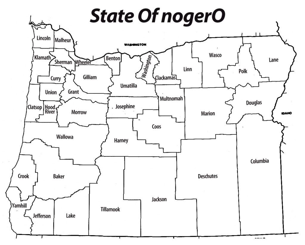
2000.There are thirty-six counties in Oregon and just about thirty-six ways of looking at things. What if we took the names of those POVs and mixed them up just a bit?

This map is a map of Oregon's thirty-six counties but the names have been changed to provide food for thought. In a spreadsheet, I ordered the counties largest-to-smallest population, then created another list from smallest-to-largest. Pairing the lists and remapping the names, I then went down the combined list, labeling the county with the smallest population (Wheeler) with the name of the county with the biggest population (Multnomah). Here's what I got:


Clicky here to embiggen (Some of the names come out pretty small).


I found the way the names broke to be interesting both in the expected and the unexpected way. As I expected, a lot of wetside counties fled east and a lot of dryside counties fled west. Notice that the three biggest Oregon counties – the legendary Portland Metro area – still touch, but to get to Washington (schematically anyhow), you'd have to travel through Clackamas. Polk (now sitting in Union County's place) now separates Marion (whose seat is the state capital, Salem) from Lane (seat: Eugene), and I'm sure the idea of the U of O somewhere in the Wallowas sets more than one extreme sports-oriented college student alight.

Ironically, the three counties of the Portland Metro Area still abut the Columbia River, but along Clackamas and Washington – which is exactly the opposite from reality.

As interesting as the counties that changed region is the ones that didn't so much, like Jackson-which simply shifted eastward across the lower tier-and Harney and Deschutes counties have simply switched places. Counties containing regional centers-such as Josephine (seat: Grants Pass) and Jefferson (seat: Madras) mapped to each other.

If nothing else, it seems to show a clearer division between small-town Oregon (places like Fossil, K-Falls, and Prineville) Mid-size town Oregon (Bend, Pendleton) and Big-city Oregon (Portland, Salem, Eugene).

And, finally, really if nothing else, the mental luggage that each name carries mapped to an unexpected place really causes you (well, me anyway) to look at assumptions we tend to carry about regional stereotypes and character. With Oregon covering nearly 100,000 square miles, this is info recoding writ large.

And it was a fun little mental game too.

Technorati Tags: , , , , ,

Cincy's Going For A Streetcar-But They Almost Had A Subway, Once

1999.In a posting that appeared on CincyStreetcar Blog and has been linked about to here in  Unicorn City, it would indeed appear that, at least on paper, Portland Oregon and Cinicinnati Ohio are kind of the same: Similar populations, similar median incomes, even similar climates and acres of parkland per acre of city.

Cincy doesn't have rail transit yet, but they're working on that. Visit the blog linked above and you'll see that they are coming up with a pretty nifty looking streetcar line similar to our own Portland Streetcar. The blogger is quite insightful, actually, has visited Portland and has been serious enough to know the difference between streetcar and light rail. It's a good read.

I hope they get thier system, because Cincy has been denied rail transit, and it's particularly disappointing in this case because they almost had a subway once.

Not something that calls itself a subway or something that is inspired by a subway, but an actual, big-city style subway. It's one of the great missed opportunities of modern times.

If you look at a map of central Cincinnati Ohio, you'll see a peculiarly arranged street called Central Parkway. It's shaped like an L; the baseline part is where Eleventh Street would be, and is about three full standard city blocks on either side of the dividing line of Vine Street (East Central Parkway and West Central Parkway). The upright part usurps Plum Street's place in the street hierarchy, and leads you out of the central area (and is parallel to and one block east of Central Avenue, coincidentally)

A wide, promenade-y street is what it seems. And a street hanging a dogleg in the center of town like that is highly unusual. But there is a reason-and it's even more interesting than that.

A great long time ago, a canal ran through central Cincy there, on that route. As time passed and wheeled transportation began to take over from river freight, the canal fell out of fashion and out of use.

A trench through the middle of town ... what a great place for a subway! You won't have to dig ...

And so, in 1910, planning on the Cincinnati Subway had begun. It was to be merely the pivotal segment in a rail loop that would have served central Cincy as well as communities north and east on a great real loop, from which greater things might have grown.

Central Parkway is the above-ground legacy of the Subway-that-might-have-Been, resulting from covering over the old canal bed in anticipation ov the transit service that was to follow. But that service never happened. At first, it was too expensive (in light of WWI). Then it was planned and replanned. Then they ran out of money. Then history passed it by.

In Portland, we have the legendary Shanghai tunnels, those underground passages found in downtown that were reputed (but to our knowledge, never actually proven-but it makes a great story) to have been used to shuttle drunken sailors-to-be to their new jobsites at the old waterfront. Not everyone knows about them, which is another commonailty between Cincy and PDX; not everyone knows about the Cinicnnati Subway and some who do apparently think it a legend.

Unlike the ultimate purpose of PDX's Shanghai Tunnels, however, ample photographic evidence exists for the Cincy Subway. And it's obvious from the architecture what those tunnels are good for:


Photo nicked from Cincinnati-Transit.net
excerpted for fair-use purposes only
all rights belong to the photographer


There is about two miles of tunnel and four constructed stations (Liberty Street, Race Street, Linn Street, and Brighton Corner) and despite the neglected look, much of the tunnel and station architecture is still quite sound and can be expected to last a while, not least because since Central Parkway, a major road, runs over the top, regular maintenance and inspections can occur. Being available, the water utility also runs a main through the subway tunnel.

It was also designated as a fallout shelter during the Cold War Era.

Even though Cincy is getting rail now, it's interesting to wonder what it would have been like for them had they gotten a real big-town subway. I still think building MAX on the Mall here in Portland missed a big chance at making a subway for this town. But then, Seattle built a rail-compatible transit tunnel, and it still just takes buses. So, who knows.

Cinicnnati-Transit.net unwittingly provided me the stuff to tell this tale, but its a fascinating way to waste your time. Endlessly interesting.

Technorati Tags: , , ,

30 March 2009

Leaked: The Made In Oregon Sign's Actual Final Design

1998.Nota Bene: I see by my incoming stats (as well as my higher-than-normal-visitor-count for the day) that this post has been tipped not only on Oregon Reddit by Dave of Dave Knows Portland but also by Matt Davis at PMerc! Nifty! if you stopped by from either of those points of departure then thank you muchly for stopping by! Please consider browsing the rest of my fine establishment, and say hi! Any linkage gladly returned! And the unicorns will smile upon you too!

by After secret and very tense negotiations between all the stakeholders in the "Made In Oregon" sign imbroligo over the weekend, which took place at the Coffee Romance at SE 82nd and Powell by the Food "4" Less store, we have an exclusive look at the design which has been leaked to us by a highly-placed but unnamed horse. Here it is:


This goes beyond the mere replacement of the words to remodel the bounding stag into a true reflection of the soul and sprit of the city of Portland which was, if I might remind everyone here, built over an ancient unicorn burial ground.

Attending the confab along with Commissioner Randy "I'm not a meanie" Leonard were Dread Lord "Dave" Frohnmayer, Amanda Fritz, Dan "I'll Bet You've Forgotten I'm A City Commissioner" Saltzman, Nick "Nick Fish" Fish, the Black Unicorn, and the White Unicorn.

Special refreshments were brought in by a squadron of Keebler Elves.

Thank God we finally got this settled!

(Portland + Unicorns = AWESOME!)

Technorati Tags: , , , , , , , , , ,

28 March 2009

Made In Oregon: It's The Battle Of The Brands

1997.It's kind of the down-side of popularity. Everyone wants you; soon enough, everyone thinks they own you.

I am, of course, talking about Beau Breedlove.

Whoa, whoa, whoa, Sorry. The iconic Made In Oregon sign, sorry about that. My bad.

That I called it iconic says something right there. A lot of people look on it and, since it's in public view, a lot of people have feelings about it. It's certainly unique as a sign, and there's been some sign in that area designed as a landmark since the early 20th Century, when the Apostolic Faith Church used a building in that area as a meeting hall.

In short, it's part of the warp and woof of the way Portland looks and feels (if you'll excuse the Apple-esque termage). It may be as simple as a great assemply of steel, supports, glass, and electroluminescent gas, but it matters to people; people care. We all notice when a tube goes dark. We all look every year for the placing of the red bulb, the transformation of a simple abstract leaping dear into Rudolph The Red Nosed Rubicon, which has become as painfully Portland as meeting under the Meier & Frank clock or listening to the Cinnamon Bear on KEX used to be.

Enter the University of Oregon. The old Norcrest China building, once capital of the Naito Empire and home to the flagship Made In Oregon store, has been nicely reborn into something that stops just short of actually being the U of O Portland campus – store, offices, classrooms. And, with the building goes the sign. It's a package deal.

In that view, it's entirely reasonable that the U of O get to remake the sign with whatever message it wishes. It's part of the brand, and what a brand that is! We should all be so luck as to be gifted with that store of good will.

If it was just a sign, then that would have been the end of it.

Since the leaving of the Made In Oregon store, and belieing the pure corporate history of the sign itself (from White Satin sugar to White Stag sportswear to Made In Oregon), the three-word legend has gone from business name to generic tag. I myself was fortunate enough to have actually been made in Oregon. A lot of people I know who came here wish they could say the same. Oregon and all her intangibles are still desirable and seductive, even in our highly cynical age.

It's not just a sign.

Think more of When Worlds Collide.

The crack-up is so far kind of messy. Dread Lord Frohnmayer refuses to talk or deal in any way shape or form, reputedly (and I do mean reputedly; we've got PR coming out the gazonga on this) so intractable on this as to put off Randy Leonard. This, my friends, is no small feat.

Commissioner Leonard, for his part, is doing something typically Leonardesque. Don't want to discuss changing the sign to something less UO-specific? Fine. David Frohnmayer is finding out that when you go balls-to-the-wall with Randy Leonard, he's only too happy to oblige. The ace-in-the-hole; eminent domain.

If Buckaroo Banzai doesn't want to give up the Overthruster, then we'll just have to take it from him! In the, ah ... national interest, of course.

By this time next week, the sign and roof which supports it will be city owned and leased, respectively, most likely. UO Prez Frohnmayer, for his part, had threatened to let the sign go dark if he wasn't given his way. The City of Portland has the trump card here, or may well–as near as makes no difference.

Both sides understand the power of Branding.

Ironically, the illustrative photo (nicked from Commissioner Leonard's blog) juxtaposes the MIO sign with another icon, the Old Town rooftop watertank on the same building, which also resembles the logo of the adjacent Pearl District's business association ((pictured right) proving also that distintive architecture easily becomes a branding unto itself).

U of O would like nothing more than its brand on an icon, stamped in brilliant lights on the skyline of the state's principal city (because who ever heard of Portland State University?)

The City of Portland (as personified by Commissioner Leonard) would like something more universal,as befits the scope of the state's largest city (which includes both Duck fans and Beaver fans) such as the simple word "Oregon".

Both sides cannot see eye-to-eye.

Let the Battle of the Brands commence.

And so it goes.

Technorati Tags: , , ,

The Wilcox Color Bias Wheel: Yellow and Blue Don't Make Green? (Updated)

1996.In my quest to understand color better I've collected a great deal of references. One of them, and one I commend to anyone at least to push the envelope of their color thinking.

Michael Wilcox is one of the new colorists who has some views which seem bombastic but have "bang-bang" headlines to get your attention then shows eminent and solid logic that even the tyro and the layman and the beginner can grok.

But Blue and yellow don't make green? Strange thing to say, especially due to the conventional wisdom as due to the color wheels we've seen certainly seem to solidly suggest that they do. If you take out your paints and play, you pick a good-looking blue and a good-looking yellow and they sure do seem to go to green, or something that looks like a good green.

What might not be obvious to the beginner though is that color theory is predicated upon idea, perfect color. The red, blue, and yellow primaries we toss about in discussing color like so much grade-school tempera are in fact perfect pure ideals: the red we think about is the absolute red, the yellow and the blue also absolute.

Of course, nothing is perfect. In reality, no such thing exists. No matter how primary you red paint is going to be, there's going to be a semmingly-infinitesimal about of yellow or blue; in every blue, a tiny bit of yellow and red, and in every yellow, a tiny bit of red and blue. Moreover, of these combinations, say, in a red, there's going to be a preponderance of one or the other of the other two primaries–more of the blue than the yellow.

All of this is a roundabout way of saying that all primary-color paints are subtly biased one way or the other toward one secondary or the other. Every red is either subtly violet-red or orange-red; every blue is either subtly violet-blue or green-blue; every yellow is either subtly green-yellow or orange-yellow. Starting out you may not notice this, but as you get better at looking at color, you'll start to see it. Select any two different-but-similar primary colors, lay them out on a ground and compare, and the result may become instantly apparent.

This will open your eyes. It opened mine wide.

The illustration at right s the result Mr. Wilcox came up with to abstract the entire concept, and it does it with astounding clarity. It resembles our classic color wheel in that you have red, yellow, and blue primaries, and orange, violet, and green secondaries. But see the arrows and note that the red on the side of the orange is orange-red whereas the red on the side of the violet is violet-red. This is actually the state of the primary colors you're likely to run into as a painter, be it oil, watercolor, or what have you.

It opens the door to a system where knowing your colors and their biases means mixing color is a thinking process rather than a chance process. As Wilcox himself says in the book Blue And Yellow Don't Make Green:

To define red, yellow, and blue as primaries is only true in a rough and ready way – leading to rough and ready color mixing skills.

If you're trying to learn color theory and plain on painting, you need to at least acquaint yourself with Michael Wilcox's work. His School of Color is a commercial concern that will sell you books and materials that will do the trick, or at least find yourself a copy of Blue and Yellow Don't Make Green and let the information sink in. It's all so very logical and interesting that a whole lot of things quickly become possible to you.

Update: I see I'm not the only one that sees this book and Michael Wilcox's work as important. Canadian artist Michael King also was impressed, for mostly the same reasons. Wilcox's insight into color and how it works may indeed have been a quantum leap in how artists see and work with color.

Sadly, the review of the book is pretty shallow (sincerely sorry to say, Mr. King). If you're serious about paints, you know by the time you've gotten to Wilcox's book why paints work on the page and the insight isn't so much how the paints work but why color biases exist and why that's important (there is no such thing as a pure primary in paint and how to use that as a basis for color thinking and mixing).

But I do appreciate the updated cover design. Very smart.

Technorati Tags: , , , ,

25 March 2009

New-PDX-StreetBladePalooza and More Curbstone History In Sellwood

1995.Today I found not one but two new-look PDX street blades. We go into Sellwood with gun and camera ... minus the gun.

This is a view down SE Tacoma Street looking toward the 13th Avenue light. That spire on the right is a Columbia Sportswear store that at one time, not too long ago, was the Sellwood Theater movie house:


A thing to see in the area is the sign to the Methodist Church, there on the left, which typically has Korean (well, at least it looks Hangul) on the readerboard. Very interesting to view.

And, askew on the SE corner of SE 13th Avenue and Tacoma Street, The Wife™'s sharp eye picked out this:


Tacoma Street is the 81st full block south of Burnside, so Tacoma equals the 8100 block.

The signs are looking better and better. The block index, which seemed to crowd the name at first, now seems more natural that way. Here's a closer look:


And the Avenue blade:


The kerning on this sign is very well done. There's a companion for it, over on the NW corner of the intersection, adjacent to the dental clinic (which, I note, is accepting new customers).

Some time ago I had a "day job" down in little ol' Sellwood, and decided to leave the area on a circuitous route, doubling back on SE 17th Avenue to go either north out that street or east out SE Tacoma. Little did I know that Sherrett Street had a surprise for me. Here you go:


It's a longer name, there's a longer blade, and the block index number is a little condensed (the numbers themselves seem a little bit squeezed skinny). Note also here it's a mixed set; like the 92nd and Ellis assembly I showed off a little while back, the SE 17th Avenue blade is the old-look, extruded style. The new Sherrett Street blade is only on the NE corner of the intersection; it's companion, on the SW corner, is the traditional old-style (complete with bolted-on block index tab on the Sherrett blade), is pretty weathered and could use replacing itself.


I remember when I worked in this area, about two-three blocks south of here. If I didn't know it before, I'd not recognize it now; something is always being built or remodeled around there these days:


That convenience store there on the right, Foster's Market and Deli, has been there an awful long time, and if it's still owned by the Fosters, under the same ownership.

Nice, dark photos, yes? When you've lived in a place all your life, you tend to take the environment for granted, including the seemingly-everpresent Oregon overcast. It's not till you get the photo home that you realize how dark it was out there. You'd think I was shooting day-for-night here.

One other remarkable thing. My obsession with the Portland address grid should by now be a matter of wide public record. I've also documented that frequently the archaic street name was preserved in the curbstone of the corner; I don't know exactly why they decided to do that, though I've always thought that it was for the benefit of pedestrians (of which there were undoubtedly more of back before 1930). But the point I'm driving at is that when the city street grid was rationalized in The Great Renaming of 1933, some numbered avenues actually changed thier names too. In a posting made on 23 Nov 2005, I published some pictures and findings detailing the changes that occurred over time at the corner of SE 53rd Avenue and Woodstock Blvd (which were once known as, respectively, 54th Street SE and 60th Avenue SE).

The corner of SE 17th Avenue and Sherrett Street has a similar treat in store. The corner holds the name of the contractor who poured the cement and dates it to 1910, twenty years after the merger of Portland, East Portland and Albina into the kernel of the modern-day City of Portland and twenty-three years before The Great Renaming. Looking down at the corner side facing onto SE 17th Avenue, one finds the following:


It may be a little hard to read at that resolution, but it says:

E. 19 ST. S

In 1910, what we call SE 17th Avenue was known to the people who lived in Sellwood rather as East 19th Street South. The suffixing of South is unexepected, as the general Portland street naming scheme of the day suggests it would have merely been East 19th Street only. Perhaps the suffixing of South was reserved for streets in the city's outer areas, as Sellwood is today, and with the slower travelling modes of the dawn of the 20th Century, would have seemed like the boonies.

But how did 19th Street move down two places to become 17th Avenue? We can only guess that they started counting from a slightly different place, or decided to call 15th 17th for some reason. But some number changing went along with the name changing.

Technorati Tags: , , , , , , , ,

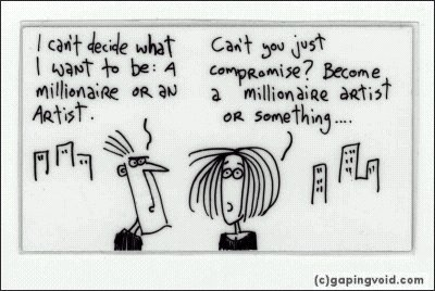
Cartoons Drawn On the Back of Business Cards

1994. Hugh McLeod:


My dream.

GapingVoid.com.

Also: Join the Crazy, Deranged Food Mailing List. It's the right thing to do.

(PS: It's Deranged Fool, not Deranged Food. I just wanted to point that out, but I wanted to leave it up as Deranged Food, because that's just such an awesome idea. Kind of like Attilla the Bun.)

Technorati Tags: , , ,

24 March 2009

A New PDX Art Supply Shop: Muse Art and Design

1993.Just got wind of this one via a little bird: we have a new art supply star to add to the firmament.

Muse Art and Design is located at 42nd and SE Hawthorne Blvd and has a brief little page up, not too much on the stock and what they got yet, but some good basic information and enticing enough to get you to get a toe in and see what their all about.

The rationale seems to be professional-level encouragement for everyone to produce something, because creating something feels good! (We can relate):

Whether you've been creating art for years, or just starting, you'll find a full range of QUALITY ART SUPPLIES at Muse Art and Design, along with affordable prices, and friendly, knowledgeable service. Have an idea but not sure how to get started? We'll help you choose the right materials to fit your budget.

We haven't browsed an art supply store in a while (it's a wonderful experience). We think this one would require a visit, perhaps. Will report back.

Technorati Tags: , , , ,

What Happens When Matt Davis Gets Vexed And Ratty

1992.While I'm reluctant to read anything into anyone else's work that's not obvious (oh, well, okay, I'm not actually), I'm guessing that the our favorite PMerc reporter finds a certain debate a little wearying (warning before you click that link – there's a bad word therein).

I've stolen the graphic and Bowdlerized it a bit so that the kiddies can see it:


(two offending letters were left smeared a bit just so you know they were there)

Technorati Tags: , , , ,

The New Greatest Warning Diamond EVER

1991.In Number 1981, I shared what I thought was the greatest yellow warning diamond sign ever. It looked like this:


John B, over at the local blog Sellwood Street, went me better. I bow the greatness and the awesomeness of this sign (link is to the actual photo as per John's comment in 1981; it's a biggie):


The sheer awesomness of this warning diamond floors me. MAX tracks, not one but two street names (N Thompson St is about a block ahead, so you're giving trucks adavnce warning), and building lines ... it's a map in and of itself!

Mad props to JohnB, and thanks for me mention of my blog on yours. I return the favor.

Technorati Tags: , , , , , ,

21 March 2009

Tropicana OJ Redesign FAIL: The Brand Redesign That Should Have Worked ... But Didn't

1990.Sometimes you get a design that clicks, that's solid, that absolutely nails it. Anyone who knows anything about design ... and a lot of people who don't know design and aren't emotionally invested in your look ... will look at this design and say "Good golly–that's dead cool."

Such a design, in my opinion, is the recent Tropicana redesign. Leaving behind the "straw into the orange" and traditional type with the studly majuscule T in the front is a picture of the actual product was a clean, bright design by the Peter Arnell concern.


Illustration via Logo Design Love

Now, this is what I call an evolved design. Unified, accessable, appropriate type, and the product–and all its percieved quality–right up front (ever tried to actually suck orange juice out of an orange via a straw? Mur-der, at least on the old cheeks, there. And notice that the plastic cap has become a little tiny half orange (called by some wags the orange b**bie, where *=o).

Brilliant, tight, designed.

And everybody hated it. Hated, Hated, Hated, Hated, Hated it![1]:

IT took 24 years, but PepsiCo now has its own version of New Coke ... The about-face comes after consumers complained about the makeover in letters, e-mail messages and telephone calls and clamored for a return of the original look.

Some of those commenting described the new packaging as “ugly” or “stupid,” and resembling “a generic bargain brand” or a “store brand.”

“Do any of these package-design people actually shop for orange juice?” the writer of one e-mail message asked rhetorically. “Because I do, and the new cartons stink.”

Others described the redesign as making it more difficult to distinguish among the varieties of Tropicana or differentiate Tropicana from other orange juices.
Tropicana's old design will return within a month due to apparently-overwhelming consumer demand. I hear the orange "b**bie" will remain, however,

A lot of designers I've read via teh Google are unhappy with the redesign as well, so the design mind is hardly of monadic character on this. I disagree. The new design is clean, appropriate, relies on a strong typographical theme and puts the quality of the product right up front. I think it was timely, but as with ever New Coke moment, sometimes you just can't help but underestimate how emotionally attached customers are to a look and feel.

For a lot, Tropicana without the orange-with-a-straw just isn't Tropicana.

Well, someone did once say a day without orange juice is like a day without sunshine.

Just for the sake of the record, the design is (at this writing anyway) still up at the Tropicana products website. Here's a screenshot:


And here's an example of the print ad design:


The warm oranges being a counterpoint "splash of color" next to black and white photos of smiling nice people form an interesting dynamic tension. The print ad format and the website format are winners too. I respond to them. Shame more people don't.

The designer whose name is on the project, Peter Arnell, is put in the odd situation of defending a successful redesign:

According to Peter, it’s about giving each other hugs, and “the power of love”.

Upon such intangibles is identity design supported, but it seems axiomatic: allying Tropicana with warm colors and affectionate images bespeaks similar qualities in the product itself–warmth, affection, goodness. Logo Design Love has the designer speaking at a press conference about it, which can be viewed here.

[1] apologies to Roger Ebert.

Technorati Tags: , , , ,

The New PDX Blades: NE Oregon and 102nd

1989.For our first spotting of the new-look Portland street blades, we go just south of Gateway, to NE 102nd Avenue and Oregon Street:


Just across the street used to be a shabby apartment complex. Now they're getting ready to build some office complex on the site. The tan building on the right in the middle distance is part of the Gateway Fred Meyer store. The dark, high-topped building in the far distance is either part of The Oregon Clinic's Gateway location or part of the Providence Gateway clinic. The Gateway MAX Station/Transit Center is behind those trees in the left-distance.

Mug shot time:

NE 102nd Avenue:


And, NE Oregon Street (the 8th Street name north of Burnside, hence the 800 block crossing-street):


Most designs local authorities debut I find have to grow on me. This is not one of them. I've liked it from the first.

I'm also pleasantly surprised as the speed at which this is being rolled out. If you're like me, and you want to record and preserve the way the old ones look, though, you'll have to get busy. They may not be around much longer.


Technorati Tags: , , , , , , ,

19 March 2009

Undo Send? Yes, Gmail Now Gives You Five Seconds To Yank That Message Back

1988.We all have emails that we wish we hadn't sent; that's so axiomatic an observation to have become trite. Who knew that a Google Labs employee would finally come up with an Undo for sent emails?

Well, to be completely correct, you can't yank back emails that are already out the door. But what Gmail's Undo Send does for you is hold that email for five seconds so, for instance, if you (as I sometimes do) click the "Send" button instead of the "Delete" button (like you meant to) you can prevent anything from an embarrassment to confusion to a complete train wreck.

I just tried it in one of my Gmail accounts, and it works like a song. This is not a joke but a real function. To enable it in your Gmail account, go to the Settings page, then the Labs tab, and look down until you find it (they have quite a few toys to play with there). All one need do is click Enable and you're good to go.

You'll know you have it when you hit "send" and you see this message across over the sending window:


The undo disappears automatically after the message is away. Turns out that 5 seconds is a bit longer that you'd think–but then a watched clock never boils, so they say.

Technorati Tags: , , , ,

Sci Fi Channel To Change Logo, Open Rift In Time And Space

1987.The Sci Fi Channel has served up to us SF fans a heaping helping of world-changing stuff over the years, from swell-done to shouldn't-a done, but regardless, it's a channel that's near and dear to most of our hearts–and not just for making Battlestar Galactica artistically relevant, elevating it from some dorky 70s "me-too" version of Star Wars for television.

Now they plan on messing with the very fabric of time and space itself. Over the next several months, culminating on 7th June, they plan on utterly remaking thier image and identity.

Good bye, Sci Fi ... hello, "Syfy". get a look for yourself:


Stunning. Well, I'm stunned, anyway.

Set logo on "stun".

Okay, I'm done with that witticism. Promise.

Such a strange redesign begs comments and questions. The New York Times's Stuart Elliott covers it quite aptly by casting light on several aspects of branding that no doubt went through the minds of the creative team who evolved this.

They're good questions to ask; how do we differentiate, how do we stand out, with our brand? How do we make ourselves like nobody else in this arena? And, most importantly, how do we come up with a brand that we can copyright? Stuart Elliott:

One big advantage of the name change, the executives say, is that Sci Fi is vague — so generic, in fact, that it could not be trademarked. Syfy, with its unusual spelling, can be, which is also why diapers are called Luvs, an online video Web site is called Joost and a toothpaste is called Gleem.

And that's also why Intel gave us the Pentium, instead of giving us the i686 (the processor names up until that time, for instance the 486, came from the part designation (80486, which couldn't be copyrighted as it I think referenced an industry-wide spec).

But what I'm thinking of is the throwing away of a quite-nicely done current-logo. The ringed-planet constructed by two sweeping arcs and a type which in its clean clear regularity suggests streamlined futurism is very approprate. The structure of the logo, with the ringed planet acknowledging the type and the type acknowledging the ringed planet is impeccable. It says what it needs to say.

Syfy says ... well, what, though? It's trademarkable, sure. But it means nothing outside of what history connects it to the entity it represents. Sci Fi executives in the article are quoted as saying that this doesn't "throw the baby out with the bathwater". I extremely disagree here. "Syfy" would look as at-home on a pack of water crackers at the European import food store as it would ... well anywhere actually. The tagline Imagine Greater would work just as well on ... well, anything that wants you to aspire to buy it.

The tough part about design punditry is that having an opinion on something not only compels you to say how you'd do it better but also how well you'd think it would do. To those questions, I have but two answers: 1: I would have left it alone and stuck to creating game-changing science-fiction media, like BSG, and 2: it's going to leave a lot of Sci Fi's consumers, many of whom I read already pretty p*ssed about what I hear is the inconsistent content quality, scratching their heads with a hearty WTF?

But you can't really tell until they use it a while. They may well be running this one up the flagpole to see who salutes. We'll see.

Technorati Tags: , , , , ,

18 March 2009

Troy Worman Has Changed It Up Again

1986.It was Orbitnow! then it was uncategorized and now it's back to being Orbitnow! again.

I don't know why.

I do think that it's nifty that he links to me. Just wanted to say that where it counts.

PS: don't wait for permission to succeed.

Technorati Tags: , , , , ,

1964-2009: That Was Tom Peterson's (And Gloria's, Too!)

1985.I'm wondering, did I miss the announcement or the party?

It would seem that Tom Peterson & Gloria's Too is no more:


Now Tom Dechenne of Norris, Beggs and Simpson's name is up on the wall next to Portland's two favorite and most famous appliance and furniture mongers.

The thing was, I don't remember the announcement of the sale or the retirement. Last year, The Big O's inPortland supplement did a respectful and sweet profile of the two. Not long before that, Tom and Gloria moved the old store from the signature southwest corner of SE 82nd Avenue and Foster Rd to a smaller, pokier building at 8225 SE Insley–sandwiched between a Union 76 gas station and the Oriental Food Value market, a building which used to hold a branch of the Tom Peterson's appliance empire (and which still has the old signs in the ceiling announcing CAR STEREO, CAMCORDER, VIDEO LIBRARY, VIDEO, and AUDIO. Go to OFV and see it sometime).


The real estate signs perched on the roof were the first giveaway. The window art (which has the touch of Extremo the Clown about it–looks like his style in the type) was the second. And if you go up and look in, there's nothing but nothing in there.

We had come by here via SE 92nd and Ellis, still exulting in finding another example of the new street blades (just look back one posting). We were, as it happens, on our way over to Oriental Food Value, and there was Tom and Gloria's place.

Thanks for 45 years.

This was the sort of thing that should have gotten a write-up in The Oregonian or something on the news. But when it was time for Tom and Gloria to retire, it came quietly, with nary an announcment or an advertisement.

I asked one of the OFV clerks about it, and she said it closed at last about a month ago. And we shared memories of "Wake Up, Wake Up!!!" and other things.


It's been fun having Tom Peterson's around. I'll miss it. I've heard of a lot of local business legends, but none have ever accrued the good will Tom Peterson did. I've written about Tom Peterson before and nobody ever had a bad word to say about him. I remember Xonix and Muntz TVs, appearances in the crows nest with Frank Bonnema on Portland Wrestling, the Wake Up sale commercials, free hot dogs, free TP haircuts, Stereo Stupid Stores, "I'm listening to my wife!". I'll remember it all.

We've had some interesting TV characters since, but Carpet Carl, Marmoleum Mike, Leif Hansen, even The Outrageous Audio Guy (ALL MoNtH LONG!) can but stand in the shadow of Tom and Gloria's awesomeness.

I'd always said to The Wife™ that we ought to go in and buy something small from Tom, just maybe a table or a coffeemaker or something, just to say we've been. We'll never have that chance now.

Abysinnia, Tom. You too, Gloria.

PS:Seriously's, I've doen teh Google on this. I can't find a thing about the last days of Tom Peterson and Gloria's Too. Not a word. Would have liked to say goodbye ...

Technorati Tags: , , ,

New Style Street Blades Sighted At SE 92nd And Ellis

1984.At last! The first example of the new-look City of Portland street blades has been sighted off SE Division Street–just outside of downtown Lents, at SE 92nd and Ellis.

Coming in from the north on SE 92nd Avenue–our destination being the Oriental Food Value market on SE Insley just east of SE 82nd, and at that time of the day, coming in the "back" way rather than down 82nd is just the smarter thing to do–the SE Ellis Street blade presented itself with a visual shout, which is probably why they settled on this design:


Notable here is the way the new street blade for Ellis was perched atop an old street blade for SE 92nd Avenue (note that it's the extruded blade, and not a sheet, as the new design is).

I was somewhat disappointed that there was no new 92nd Avenue blade until The Wife™ pointed across the intersection, on the Lents Little League field side of the street:


The visual difference is obvious. These blades are so easy to spot and find, which is proved every time we find a new one like this.

Here's the money shot:


It's interesting to see a new named-street blade that doesn't say "SE Division St", for now we have some idea of how the rest of the city will look once these blades are the standard.

And here's a shot of the new-look cross including the 92nd Avenue blade:


And the documentation continues. If anyone who passes this way by these humble blog missives and lives in Portland (obvious point, yes) sees these new-look blades anywhere else in town, won't you clue me in? I'd like to get some idea of how far these are going.

Technorati Tags: , , , , ,

17 March 2009

I Am All Oregon, Baby, The List Explained: Nos. 11-20

1983.Way back a few months, before the colossal computer failure, I'd reprised the I'm All Oregon, Baby list that I'd revised in Number 1831 of 29 October. At the time, someone somewhere else released a list of you know you're Oregonian if ... trivial points, and I knew I could go that better. And, I did.

I thought that a little more exposition was in order, so I released Number 1841 later on, detailing personal explanations to numbers 1-10. Really, it's a subjective thing, but there's cultural commonality that means that some people are just ... well, more local than others. And since I was (and still am) unforgivably smug about being lucky enough to be born in Oregon, I think that I ought to walk my talk.

Peforce, we take up again the deep glimpses into the elements of my list, and why I think they really make you The Compleat Oregonian. Let's take it up with number 11:

11. You remember how the building that housed that Morrison Street store was levelled (this doesn't happen often in Oregon)

By "That Morrison Street Store", I'm referring to the legendary Morrison Fred Meyer, the Fred Meyer store that was downtown and about the size of a large drug store–hardly the 1-stop Shopping that Fred Meyer made famous, but a traditional location for a Fred Meyer, being as the original store was located a mere one block south, at SW 5th and Yamhill.

The Morrison Street Fred Meyer was on the first floor of the Corbett Building. What is on that block now is a part of the Pioneer Place Mall, and the Corbett had to go. The method was, as far as we know, Portland's first (and so far only) controlled demolition implosion.

Emporis has a page with an awesome picture here. The Corbett Building died on 1 May, 1988.

12. You remember what sort of imported car Tom McCall stuffed his 6-foot-plus frame into during his tenure as Governor.

While I don't remember the model, it was an Audi. I do remember the news photos of it. It was kind of funny, watching this Central Oregonian rancher's kid stuff himself in the back seat. But that was Tom McCall for you.

13. You consider Tom McCall God. There's no passes on this one.

He cleaned up the Willamette River, opened the beaches to all, and told everyone to please visit Oregon again and again, but don't come here to live. Said in earnest jest in an interview with CBS's Terry Drinkwater around 1970, it defined Oregon as a state of quirky individualists.

They only made one Tom. Ther're Governors who came close, maybe, since. And maybe Governors of similar stature elsewhere. But if you want the best damn governor Oregon ever had, it's Tom.

That's my story, and I'm-a stickin' to it.

Tom McCall died in 1983, aged 69.

You all know I have terminal cancer—and I have a lot of it. But what you may not know is that stress induces its spread and induces its activity. Stress may even bring it on. Yet stress is the fuel of the activist. This activist loves Oregon more than he loves life. I know I can't have both very long. The trade-offs are all right with me. But if the legacy we helped give Oregon and which made it twinkle from afar—if it goes, then I guess I wouldn't want to live in Oregon anyhow.

14. You remember what Tom McCall did to make the beaches of Oregon open to everyone, all the time. You know that, in Oregon, signs that said "Ocean Beaches" was just Oregonian for "This way to the coast".

In 1967, Tom got HB 1601–the Beach Bill–passed:

In 1967 Governor Tom McCall signed the Beach Bill with great fanfare, calling it "one of the most far reaching measures of its kind enacted by any legislative body in the nation." The bill granted the public recreational rights to the dry sands of Oregon’s beaches all the way to the vegetation line.

This was kind of an evolution of something Governor Oswald West did in 1913–declaring the wet sand beach portion of the beach a public highway (and it kind of was–Oregon Coasters used opportune sections of beach to get from town to town before there was a US 101). But naturally this left enough leeway for developers to take as much dry sand as they could, and knowing the usual Oregon developer, I don't doubt they tried.

And it's true that, all during the last half of the 20th Century, if you were going to the Oregon Coast, you followed the signs reading "Ocean Beaches" which pointed westward from every likely cross-highway access from the Valley cities. Latterly, the signs say "Oregon Coast".

I mourn the passing of those old signs.
15. You understand that the correct way to say Glisan is seen as incorrect, and the incorrect pronounciation is what everyone uses.

The actual correct pronounciation of Glisan, I am told (and they say there's evidence to back this up) is as the word glisten. It makes sense. As far as I'm aware, a vowel after two consonants should generally be pronounced "short". Somehow, over the years, we've vowel-shifted it to rhyme with the last name of The Great One.

So you have a choice: say it wrong and be a regarded a local, or say it right and be regarded an anal-retentive goober (and get corrected a lot).
16. You have spent at least one (preferably more) camping holidays at Detroit Lake (or similar reservoirs in the Cascades.

Oh, yes, summers in the Cascades. At the time all I was interested in was Detroit Dam, but the trees, the lake, the stream tumbling down from the mountains ... it's an Oregon thing. If you grew up in Albany or Corvallis you went out to Green Peter or Foster reserviors, if you grew up down in Eugene you went down to Dexter reservior. It's an east-west-east rhythm that easily rivals any vacation crush to the Borscht Belt.

17. You remember when Bend had a population of about 15,000. Wasn't all that long ago.

In the mid-late 20th C, before Bend was "discovered", it was kind of a poky little place of 15-20,000 and grew kind of slowly. As late as 1990 Bend only had about 20,000 people in it, kind of a Central Oregon version of Pendleton.

Then the housing bubble grew, "lifestyle" migrations became fashionable, and Bend was "discovered".

There are still people trying to recover from that, but nevermind. Statstics show that Bend added nearly 23,000 people between 1980 and 1990, and current estmates of its population put it near 80,000.

Now it's Central Oregon's version of Yakima, population-wise-speaking.

18. You know what they Round-Up in Pendleton each year.

Cows. And then they use the cows to round up cowboys, and the cowboys round up spectators. The Pendleton Round-Up is amongst the most famous rodeos in all of Oregon, if not the west.

19. You have eaten frozen food products by Ore-Ida.
Via Wikipedia: Founded in the early 1950s, Ore-Ida was the pioneer of Tater Tots. The company's name is a portmanteau of Oregon and Idaho. Indeed, the company's original logo looked like the map silhouettes of Oregon and Idaho fused together, with the name Ore-Ida superimposed on it in italicized letters. Ore-Ida's primary production facility is located in Ontario, Oregon, and employs over 1,000 local residents.

Yep. OreIda made Napoleon Dynamite necessary, and intoduced us all to the allure of Tots. Life was never the same.
20. You have had earnest discussions with someone east of the Cascades about what Oregon really is.

Everyone knows that there are two Oregons: Us, on the Wetback side of the Cascades and north of about Eugene look around and see lush, green moist climate, growing things, compact cities going through growing pains. Drysiders see ranches, wide-open spaces, not so much rain, beautiful volcanoes rising striaght up from the plains, and, if you're in the 1/3 of what's west of the Cascades that isn't the Valley, beautiful mountainous country that's dry and hot in the summer and cold and snowy in the winter.

Sometimes it's as though three excellent states were smooshed together to make one awesome one. And if we argue about what Oregon really is, where the heart and soul of Oregon can be found, we'll all eventually agree that we wouldn't want to be any-damn-where else.

We'll do 21-30 soon ... and not wait so long at it! Bis naechsten Mal, schloss für heute!

Technorati Tags: , , , , ,

16 March 2009

Filed Under: The Color Initiative

1982.For those who wonder, I am creating a new label for filing my posts about color, of which there will be more, and related to a project I'm nurturing under careful development.

This label will the The Color Initiative. My main thrust is color and mood and what I can find out about it, but the thing about color theory is that if you dig your beak into it just a little, a whole lot starts presenting itself.

It's my public diary about my exploration of color, and, as usual, everyone is invited along.

Technorati Tags: , , , , ,

J. Alfred Proofreader: More Anal About Copy Than Even Us

1982.I don't go on about it much, but I'm quite the snot about copywriting. I just do it for free: on my blog, in my diary, and other appropriate places.

I try to write like I talk. I also try to talk like I write.

Well, if there's anyone in America who's more anal than an inveterate diarist who's married to one of the original grammar and spelling Nazis, it's J. Alfred Proofreader who, with respect to this banner ad:


Wrote the following scathing review:

As you can see in the screen shot highlighted above, the word guarantee was butchered by ad copy writers and editors. They misspelled it "guarentee." If they were trying to be intellectual and distinguished, they could have gone with guaranty, a variable and accepted form of the word.

Also, a hyphen should be separating the words "money" and "back" rather than a space. Interestingly, the people behind this ad copy managed to correctly spell Rachael Ray's name, which, evidently, is no easy task. According to Yahoo.com, in 2007, Rachael Ray's name was the second-most misspelled word typed into Yahoo Web searches. Yet, the correct spelling of guarantee still eludes these advertisers.

Wow ... Rachael Ray's name was the second most misspelled word?

How many of those were looking for them FHM photos she did (rrrowr!!!111!!!)

Have some laffs at some inattentive copywriters' expense: read The Copy Edits Of J. Alfred Proofreader and be thankful you aren't one of the targets of his yellow highlighter.

(content lifted from J. Alfred because it was too good not to share, with apologies)

Technorati Tags: , , ,

Greatest Railroad Crossing Warning Diamond EVER

1981.Now, Portland is no stranger to funny warning signs, as any bicyclist who rides near the Portland Streetcar tracks will tell you.

But is there anything for the truck driver with a truck with a long trailer who made the unwise decision of turning down that backroad-bit of NE Cully Blvd between NE Columbia Blvd and Portland Hwy?

No, you think?

Think again:


Whoa, that's pretty – well, graphic. Let's take a closer look:


Now, picture that you're the truck driver that ignored this warning. Awkward. Awkward.

Technorati Tags: , , , ,

15 March 2009

The Allure of Boxed Water–Is It The Concept or the Design?

1980.This just found during a random act of clickage: a glorious package design blog called The Dieline. Which is blogrollable, to be sure.

But what caught my eye was this:


Yes, Boxed Water brand water.

I don't know what's more intriguing–the idea of putting bottled water in the classic milk carton, the spare design, or the way there's a Macintosh-style "hello" on one panel, or the name Boxed Water, which is reminiscent of a piece Steve Martin once wrote of "Folding Soup" (You can find it in the book Cruel Shoes, I do believe).

It's all quite adventurous. And while there is an environmental impact with paper cartons, to be sure, it's certainly got to be a whole lot less of a problem than that of plastic leavings. Moreover, the very packaging is its own advertisement. You're not going to soon forget that carton.

This is kind of what I mean when I talk about "painting with type".

Visit the Boxed Water website for more looks and a look at their rationale.

Technorati Tags: , ,

SE 145th & Division: The New PDX Street Blade Look on Old Blades

1979.Our other catch today on the Street Blade Safari (in the rain and the cold, but I'm Oregonian, and that's how I roll) is a distinctly unexpected surprise – the apparently-new street blade design, but not as I expected it:


SE 145th and Division is immediately northwest of the Division Street Fred Meyer. On the northeast corner there's a KFC; on the southwest, a gas station. The parts of SE 145th Avenue north of and south of Division do not meet square, they 'jog'; it's a signalled intersection, presumably because getting into that area of neighborhood both north and south of Division over on 148th is a bit impractical maybe.

And it's where the new Portland blade design – which, on Division at SE 117th, SE 101st, and SE 57th Avenues are on big, white-bordered sheet – are here applied to the traditional, extruded metal blade which are the standard for Portland blades

The fit of the letterforms on the blade is a feels a little force and awkward, but it works fine really. Particularly good is the way the layout artist aligned the block index (2500) and the generic (ST) along margin on the left ends of the respective text blocks.

I have wondered if there was going to be some way to deal with the fact that the new big-blades, which appear to be sheet, might need the strutctural-stiffness the ribbed extruded shape provides for support of Portland's numerous neighborhood sign-toppers. One reason this redesign pleases me so much is because many of those sign-toppers result in the loss of the block-index tab, which can be a great help to visitors in finding thier way around and for delivery drivers and others who might take the time to memorize the blocks but probably find just having to find a sign to get them saving a huge step.

These new blades grace the northeast and southwest corners of SE 145th and Division. I have the ones here on the northeast corner, by the KFC; it was just too rainy and cold to stay out and take many more pics (I'm Oregonian, and that's the way I roll, but I'm just insane about street blades, and not about standing out in the cold and wet).

Here's a couple more pixs. First, a view from the north of the SE Division blade:


And now, the full monty. Maybe it's just that it's a newer blade, but there's something crisper and better-proportioned about the letterforms on the new blade (when I first saw them from the side, I thought they were using Helvetica for a split second):


And the documentation continues.

Say ... has anyone seen these blades in thier 'hoods? One curiosity is that these are only appearing (so far as I know) along SE Division Street. Why nowhere else? I see about my share of corners in the city, but no other examples of this yet.

Anyone else see these around town?

Technorati Tags: , , , , ,