31 January 2012

[art] My PDX Skyline Photo - Coming To Campaign Materials Near You

2778.Disclaimer: This posting does not necessarily imply an endorsement of the Jefferson Smith for Portland Mayor campaign, though I do understand that he's a pretty nice and smart guy.

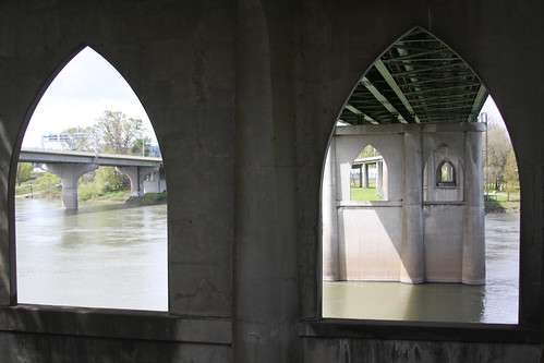
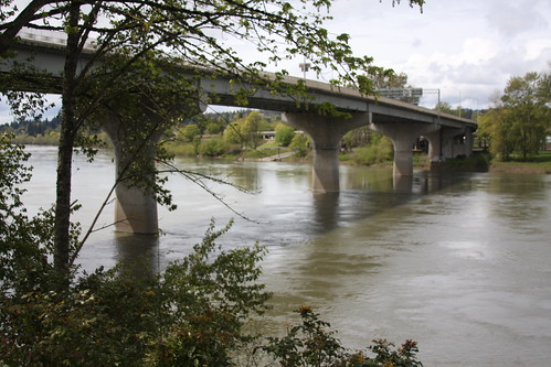
It's my extreme joy (seriously) and a thrill besides to announce that I've sold the rights to a photo which appears to be on its way to at least a semi-icon status. The photo is, of course, this one:


And it's been licensed to a designer working with the Jefferson Smith for Mayor campaign for use in campaign materials through the 2012 campaign.

I'm not saying at this point who I'm voting for, but if the people Jefferson Smith gathers about himself for campaign purposes are any indication, he'd probably make a good mayor. Friendly, coöperative, and incredibly generous in spirit.

Jefferson's campaign's web presence is here if you're so interested: http://www.jeffersonsmith.com/

In the past this photo has been used by others, both who've asked and purchased a license and … surprisingly, given my little-fishy status … those who haven't. Those who have asked and been granted permission include a (now-former) Portland-based Liberal talk-show host and a funky music-themed spot on Belmont.

In the next posting, I'll be touring some of the web-based peoples who didn't ask permission. 

[print] The Gutenberg Wireless Media Player

2776.No monthly contracts? Infinite battery life, you say? Read in bright sunlight?


Well, hell's bells, sign me the tintype up!


[logo] The New, New JCPenney Logo. No, Really.

2775.The aphoristic guide to appreciating Oregon weather … if you don't like it, wait five minutes, it'll change … has its counterpart in marketing now.

Who would have thought it would be JCPenney?

Back in August of 2011, not even six months ago, I noted that, the preceding February, the towering American retailer rolled out the first change in its visual identity in forty years, forsaking the old for this sexy new number:


I still find it an effective updating, and rather clever to boot.

Not clever enough, apparently. Now, thanks to Ben Rippel for tipping me off to this one, JCP has changed its visual attitude yet again. This had flown under my radar again but, once I got tuned into it, I found pretty much a metric ass-ton of commentary had been squawked about it ...

But I get a little ahead of meself. Here's the new, new JCPenney logo:


A bold, red square, a solid blue square 1/4 the size of the red one aligned in its NW corner with the minuscule trigram jcp in.

Ayup. 

The first reaction is to scratch one's head. Why change a logo that was changed just a year ago, and one  which was, as far as this commenter's concerned, working pretty well. I liked the update. These are the times when staying with something like a logotype based on Helvetica actually comes off as kind of bold, especially given Helvetica's reputation amongst some folks. 

I've read various interpretations coming from the world of logo-speak on this. They all ring pretty valid. The absolute squareness of the logo is supposed to make the shopper think of foursquare honesty, honest and square dealings and square deals (and here again the company's history, beginning with the reputation intended to be promoted with the store's original name, The Golden Rule, factors in). The logo, which I presume will usually appear on white (thats my memory of most Penney ad collateral) is a very patriotic palette of red, white, and blue, and it's not lost on anyone that the positioning of the blue square in the upper-left of the mark, an arrangement that vexillologists call a canton, combine to remind one of the American flag.

So, square-deal, honest mercantile, patriotic, American, cowboy hat!, yep, got it.

It's not a poor showing for a redesign. And, lordy, it ain't no New Gap Logo, to be sure. Some actual design seems to have gone into this. But only a year and we're trying on a new identity? The old new one didn't sink in really. 

If JCP were to ask me about this, I'd say if you're going to change logos again, at least wait longer than 12 months. Even the most venerable companies change logo looks now and again. But twice in two years? Even with the complete company image rework, the new 'stores-within-stores', and the delightfully creepy NOOOOOOOOO! commercials, the taint of desperation obtains. Give this one a chance to sink in.

Stick with it.

Of course there is one thing I'd like them to settle, as The Consumerist's article remarks:
We think the first thing the company should do is decide whether it's JCpenney, JCPenney, JC Penney, J.C. Penney, Jcpenney, jcpenney, JCP, or jcp.
Word. 

Other readings;

26 January 2012

[logo] The New DC Comics Logo

2774.This just over the transom: word has wafted our way that DC Comics (noted that "DC" no longer is considered an initialism meaning Detective Comics, so the corporate name isn't Detective Comics Comics, even though that's how my brain is going to parse it for a while) has relogoed again … the last time was only 2005, six years ago. Here's a version:

New DC Comics logo, Watchman Version
Sourced from here.

The new logo a 'D' applique, peeled back to reveal the 'C' beneath. It suggests that they can use it for a lot of customized effects for different franchises, as revealed in a graphic in this article at Designer Daily: http://www.designer-daily.com/dc-comics-logo-re-design-22643. The above is a clever play on Watchmen, which I guess needs no introduction, and in all holds a different mood and attitude than the old logo:


First thoughts about such a redesign is that of all the places that a little OTT design is in order, a comics empire's logo might be it. Thought that the 2005 redesign was a fine bit of work and that it might have had more than 6 years worth of legs.

My mind was changed a bit when I saw the cool attitude that it helps give the DC Comics webpage:


On a scale of 1 to 10, it's in there somewhere, though, trust me. Not too bad though. Will have to grow on me.

Stumbled on this review from a fellow Portlander who's obviously a much more successful designer than I am (who isn't?) which I enjoyed because she don't like it and say so. Take it away, Sarah Giffrow. She does nail down the most salient point about it which is the logo don't say 'comics'. This is a subjective point, but you remember a few inches up when I mentioned that if there's anyplace an OTT design is in order, the logo of a comics empire might be it? Same point, different words.

The new logo is sedate, serious, and clever. Whether or not this'll fly the distance only, of course, time will tell … but comics fans are a vocal and visually-oriented lot, and will doubtlessly chime in presently if they've not done so already.

Agree? Disagree? Comment!

[pdx] Like A Troubled Bridge Over Water: The Sellwood Bridge Construction Cam

2773.Your tax dollars at work, Multnomah County (but not yours, Clackamas … just sayin') Just announced via email: the Sellwood Bridge project's webcam.


Clicking on that excerpted piccy should get you to the page at http://www.sellwoodbridge.org/?p=construction-camera; if it don't, just click that link I put there.

The camera is, as you can see, on the east bank just about a block north of the bridge and pointing more or less WSW. On the right on the west bank is the old Staff Jennings marina; the hills beyond are swathed in the necropolis known as Riverview Cemetery. It's a beautiful place along the river there, one we much enjoy.

What's apparently happening now is that the crane in the river is doing preliminaries for the temporary supports the old bridge is going to be moved over on, where it will be a stand-in for the new span.


25 January 2012

[net_liff] Search Terms of Endearment

2772.The strangest search terms cause hits here. Witness:


You read it right. The missive about two back titled The Bridges of Marion County turned up in someone's Yahoo! search where the terms where (ahem):

marion county constipation protocol forms

Yah, baby.

I didn't know you had to fill out forms to do that. When it happens to me - not that it happens often, mind - it just sort of happens. 


As far as 'protocol', my guess is a lot of hard cheese and drywall should do it.

[design] A Tutorial A Day, More Or Less: #1, Calendar Page Blog Icon

2771.Wanting to practice some photoshop, I found a tutorial that used layer styles, gradient overlay, and, oddly, inner glow to produce this:


… that is supposed to be a calendar-page icon for a blog.

Not too bad. Inner glow was kind of odd.

Here's the tutorial - http://www.stunningmesh.com/2012/01/how-to-design-blog-calendar-icon-in-photoshop/

How close can you come?

24 January 2012

[OR_liff] The Bridges Of Marion County

2770.Well, not all of them. Actually, life in the Willamette Valley outside of Portland is a very east-side/west-side thing; the side of the river you live on divides us from them. In Marion County,  which to me has always been the heartland of the valley (as well as where I first stepped into this world we share) there are amazingly few places to cross the river, in fixed form: two of the marvellous river ferries, the Wheatland (at the north end) and the Buena Vista (at the south end) connect Marion and its sister Polk counties, and other than that, there are just three other bridges into Polk: Two in Salem and one coming back in the other way, from Independence, leading back into Salem along River Road S.

Therefore, most of the cross-regional traffic, east from the coast to the mountains, west from the Cascades to the sea, is going to go over one crossing-point. Oregon State Hwy 22, which crosses westbound over the Willamette in downtown Salem as the Marion Street Bridge, and eastbound into downtown from West Salem as the Center Street Bridge.

Now, as anyone who knows Salem will tell you, Salem doesn't have much of a reputation as a bridge town or a river town ... memorable river traffic ended with the all-too-brief riverboat era on the Willamette. Lying rather passively along the Willamette, and with a river crossing designed to get you over it without much notice, the Cherry City's cool with being associated with Oregon's signature river, but they're just acquaintances, really. There's no river orientation with downtown, really, at least no strong one. There's a Salem Riverfront Park at long last, but for Salem, when I was growing up there, the river was something back behind the railroads that then choked Front Street and the Boise Cascade paper mill (now being pulled down, I understand).

It's with some joy, then, that I see the author of the blog Cyclotram, another one of us underrated Portland Blogs who get no notice or press but deserve some, is apparently on a project to record Willamette bridges, and in these two slide shows, he shines a rather affectionate light on Salem's two queens of the river:

This is the Marion Street Bridge:

Marion Street Bridge

And here's a link to the entire Flickr album for this: http://www.flickr.com//photos/atul666/sets/72157628985687099/show/

And this is the Center Street Bridge:

Center Street Bridge

And here's a link to the Flickr album for thathttp://www.flickr.com//photos/atul666/sets/72157628985687099/show/

The history of bridges in Salem is that we'll do fine with what we have, and maybe we'll build another one, someday, maybe. Perhaps. When I was in high school in Salem, they were talking about it then, and that was … well, long enough ago. They've been batting around the idea of a third Willamette bridge in Salem for the last few decades like a bored cat. There's a proposal to do that still. This one's been under study since … 2002. Yep. 10 Years. That's how they roll down in Snailem. Or, as brx0 aptly put it:
Based on past history, the most likely candidate would be the city deciding it's time to build the fifth Center Street Bridge, and start demolishing the current one while you're still on it. It's not a city that does anything quickly, though. There's a current proposal out there to build an additional bridge in the greater Salem area, and it'll be years before they'll even break ground on it, if they ever do. So chances are you'll have had plenty of warning -- months or years, probably -- plus I just told you there was a miniscule but nonzero chance it might happen. So can't say you weren't warned.
Salem. Just accept it.

[or_liff] Chip Kelly: So Oregon It Hurts

2769.Chip Kelly, the U of O's head football coach, loves his work.

Or does he have sights set higher? Say, the NFL?

Oh, wait one … I guess he don't. Staying in Eugene. Unfinished business, so they say.

But he made ya look … didn't he?


22 January 2012

[type] Mission:Impossible - IKEA Protocol; Inapt Type In Movies

2768.This is the way serious typographers roll, yo.

Matthew Butterick, the mind behind the blog Typography for Lawyers, has a … gentle problem … with the recent film Mission:Impossible - Ghost Protocol. And, he put it in a letter to the movie's director, Brad Bird:
Inapt typography is not uncommon in movies. But big-budget studio films employ scores of people specifically to worry about the details that ensure the on-screen experience will be seamless. Therefore, it’s incongruous to put all that care (and money!) into the frame and then overlay it with an inapt font, which in its own small way, breaks the illusion. It’s not Mission: Impossible — IKEA Protocol, is it.
Which is all in pursuit of the answer to the question If you're going to spend that much to make every facet of the movie perfect, why skimp out and use Verdana?


The irony in my own posting is that, I think, when bolding and italicizing text on this blog, the software doesn't italicize, it obliques. Which I abhor. Got bigger fish to fry right now though.

Also that we refer to the Cruise-controlled MI series as The Franchise Which Must Not Be Named. Seriously. MI:2 is the only action film my wife ever returned to the video store midway through viewing for a refund. 


But Butterick has a point. Brad Bird, why you no pay closer attention to type?

Via the Candlerblog, here: http://www.candlerblog.com/2012/01/20/mission-impossible-typography/, where you can read the whole letter, which nails it utterly. What Cruise has done to the franchise is another matter entirely, best addressed in The Hague, perhaps.

[design] 26 Free Photoshop Documents From 2011

2767.This via Designm.Ag on the Smashing Network, is a quick list of the 26 free downloadable PSDs the author has seen over 2011.

There's some good stuff there. I like these because one of the better ways to keep learning Photoshop is to see how others construct thier PSDs. It's like watching artists work in a way.

Right now I'm reviewing a document with glossy shield shapes, perfect for icons and decor.


Glossy textures are still fashionable, and it's educational to see how this artist accomplished it.

The direct link to the shield PSD download is http://freepsdfiles.net/graphics/glossy-shield-psd-icons/,
but you'll want the entire list (which contains nifty UI elements and other goodies), and that's here:
http://designm.ag/freebies/26-free-high-quality-psds-to-download-from-2011/.

Happy Photoshoppery.

21 January 2012

[pdx_liff] Portland: Still Tops In Blighty, Gets On Yet Another List

2766.Note here that I said Blighty, not blight, which is a whole 'nother issue around here.

In the UK's The Guardian, writer Tom Dyckhoff has nominated his own Five Best Places To Live. Portland's number one, followed by the St. Pauli district of Hamburg, Germany; the north coast of Maui, Hawai'i; the Cihangir district of Istanbul (not Constantinople); and Santa Cruz, Tenerife.

For a bit, it looked like something of a have-on; I can think of fewer more non sequitur leagues to be in, also, the capping of the Portland section with not a typical shot of the MAX downtown or a beautiful panorama of the city's core but a snap of some of our less-than-inspiring west-side housing tracts (that pic could be Bull Mountain, say) But the commentary seems earnest in the main, and is based, at least partially, on surroundings and creature comforts with an eye toward home prices (which are quoted in Portland as being £128,000 for a 2-bedroom detached on NE Sacramento.

My favorite line? This:
So very liberal is Portland that it's a home from home to anyone from Europe, especially if they read the Guardian. 
Also: Cyclists are loved, not loathed. Well, not by everyone really, but we are a force to be reckoned with.

Read all about it: http://www.guardian.co.uk/money/2012/jan/20/five-best-places-to-live-in-world

[design] Momentus: Iconizing American History

2765.Cool: the graphic treatment of American history as a series of iconized, stress-typed graphic art 'cartoons'.

It's called The Momentus Project. And here's a slice of the election of 2000:


It's got great design sense, and it'll make you think.

It's all at http://www.momentusproject.com/

[design] 50 Reasons Not To Date A Graphic Designer

2764.In my case that would include the fact that I'm married already; I suspect The Wife™might object.

Of the rest, I must say the one that resonates the most is 19. They hate Comic Sans with the same passion they love Helvetica. It's only coincidental that 19's my favorite number.

I would also put in that I think the whole list is a tad glib, what with not mentioning that graphic designers are always arguing whether Adobe is too big and monolithic and that The GIMP and Scribus are apt successors to Photoshop and InDesign, but that's just me.

Here's the whole list, at A Bourbon For Sylvia: 
http://abourbonforsilvia.wordpress.com/2010/11/10/50-reasons-not-to-date-a-graphic-designer/


19 January 2012

[print] Physical Print On Demand At Powell's Books - Best Of Both Worlds?

2763.Just heard the news that Powell's Books is going to have something called an Espresso Book Machine installed at the flagship store.

You've heard of Print-on-Demand, of course. This machine - if I read the story right - will allow you to go online at Powell's Burnside store and have the book printed, finished, and bound for you right there.

And, of course, here's a video of an EBM


I'm conflicted about this, but on balance it might be a good thing. Simply going to Powell's, even if you don't have the money to buy anything just now, is just a invigorating experience; I hate the ideas that book stores may someday go away, if some of the more pessimistic ideas about print are correct. Bookstores are closing nationwide, and Borders, no matter what I thought of them, was a good place to get the mass market stuff.

The idea of combining POD with the Powell's experience has an intriguing side. As long as a book exists in a digital version, this suggests that the idea of a book ever truly being 'out of print' may become somewhat obsolete. That's always been POD's strength - keeping niche books available.

So, POD for books you can't find even at Powell's + Physically visting Powell's may just = a good thing, on the balance.

Via.

[or_liff] High Water In Silverton

2762.The downside to a Willamette Valley snowfall is that, more often than not, the very next thing is a warm mass of air, the freezing levels go up, and rain falls. What this means is that, after a strong snowfall which pretty much paralyzes the region, high water comes and does the same thing.

The Statesman-Journal has a bunch of pics of high water in my old home town, where they're evacuating the old Silver Gardens home on South James Street.


[logo] Tasty Bakery Logo

2761.This design is both warm and cool …


See the whole thing at Tim Frame Design: http://timframe.com/TIPTOP.html#

Via The Vonster.

[teh_funnay] If You're For Internet Freedom And Against Delicious Mexican Desserts …

2760.
There are sopapillas moving through Congrefs right now. STOP THEM BEFORE ITS TOO LATE, or before Congrefs eats up all the good ones. They are delicious, but must be stopped before we become a flanocracy. Though I loves me some flan, too.


Source.

[net_liff] SOPA/PIPA Stopped … For Now

2759.The past day of protest may or may not have had anything to do with the new reluctance on the Congrefs's part. But some of the rules have seemed to have changed: A thing that was a sure thing is still a possible thing, but not a sure thing anymore.

It's important that one Senator who supported PIPA - Sen. Rubio (R-Florida) and two Representatives who supported SOPA (Terry (R-Ind), Quayle (R-Ariz) have pulled support. To me, it's important that they're conservative Republicans. It's no longer politically safe to do.

However, it's not over until it's over, as Yogi said, and the legislation is shelved, but only for now. Perhaps they think that they just have to tinker with it, I don't understand why. It's simply a bad idea.

Given that online piracy is a disease, SOPA/PIPA is curing the disease by killing the patient. We, as a nation, cannot say with a straight face that we promote free enterprise and, at the same time, make it impossible for free enterprise to flourish.

TechCrunch has a very good overview of the whole magila at this link hyar.

We're safe from SOPA and PIPPA for the moment, though, which means we can blow off some steam by making jokes about it. Such as:


So sweet, so pretty, and so very dangerous to a free and open internet.

Word.

18 January 2012

[design] Creative Pencil-Shaped Salt and Pepper Mills (SOPA-Compliant)

2758.I don't like to be too far away from my art supplies, as a rule. You usually have to put down the pencil/paper/paint/what-have-you to at least pick up the fork/knife/spoon/what-have-you. With this cute set of pencil-shaped salt-n-pepper mills, you at least won't be far away from what looks like an art supply:


It's available from a European vendor (Panic Design) for £42. which, we believe, is 27.50 centipedes in the Metric system. But it's worth checkin' out.

[comics] A Look At The New Little, Brown Tintin Graphic Novel Covers! (SOPA-Compliant)

2757.Good news, fellow Tintin fans! As far as I'm concerned (and I'm sure I'll get no disagreement here), a rerelease of the Tintin stories has been a needful thing for far too long. I just found, via Facebook, that several Tintin albums are getting the graphic-novel treatment and will be released again soon. I don't know if this means the format of the pages will change, I suppose that can go either way) but it's got to be some kind of good news.

I've gotten a look at some of the covers, and I like them muchly. Here they are:


I'm looking forward to them, aren't you?

Yeah, I knew ya were.

[design] Nifty Illustrator Pen Tutorial (SOPA-Compliant)

2755.Just found this nifty Adobe Illustrator pen tool tutorial that's just a basic exercise that I wanted to share. It's pretty simple. It involves downloading an Illustrator document, opening it, and simply following the instructions in the document.


Go to this URL here (http://veerle.duoh.com/design/article/illustrator_pen_tool_exercises) and download the files. They're free, and they have CS3/4 and CS5 versions.

[net_liff] SOPA? Why Does You Hates Us, Congrefs? (NOW! With Creator-Approved Piracy!)

2754.As it turns out, I'm just not smart enough to block out this entire blog, and even though I'm not the most popular destination of the Intertubez (I've kinda made my peace with this (no, I haven't)) eventually there comes a time when you do have to say something.

The Oatmeal has invited everyone to 'pirate the shit' out of the following animated GIF. It explains it all in terms that anyone should be able to get. If you don't like The Oatmeal, you're uncool and should have your Internet connection downgraded to dialup, but that's just me for you.


What I don't understand is where Congress (or, as they called it in the days of the founding of our republic, Congrefs) got the idea that we want this stuff. I didn't say, gee, Congrefs, when you go into session next year, could you please come up with a law that will turn me into a criminal just for linking to someone's site, and make it impossible for me to say, start a business without having to have a legal team the size of the First Army to make sure my legal i's are crossed and my t's are dotted?


I didn't say that. Did any of you? Didn't think so.

So much for all that. If you want to pirate The Oatmeal's animated GIF, go here (http://theoatmeal.com/sopa), and we really recommend that you read this short, comprehensible FAQ produced by teh Google: https://www.google.com/landing/takeaction/sopa-pipa/ and note that Google and Wikipedia both blacked out for the day, and imagine what it would be like to have to deal with an Internet like that, because if we get stuck with SOPA and PIPA, that's just what we'll have ... all the time.

Piracy is a problem. SOPA and PIPA are not the solution.

17 January 2012

[pdx_liff] Snowpocalypse 2012 Can't Defeat Our Tiki Torches

2753.The Wife™ has many wishes and dreams. One of them was to have our tiki torches burning during a snowfall.


Since I am The Ideal Husband™, we Made This Happen™.


Indeed, it's What We Do™.


Suffice to say, it's How We Roll, Yo™.


The falling of snow engenders a great deal of sturm und drang in the Portland area, complete with tiresome smugness from all those snotty sorts who chortle arrogantly about us clueless Portlanders. Well, bucko, I scan the headlines when snow hits those 'experienced' cities like New York and Chicago, et. al., and you know what I found out? They shut down and have auto accidents too. They just know how to market themselves.


In the meantime, relax and enjoy the picturesque beauty of tikis glowing softly in the falling snow. And, if you can, do what every sensible Portlander who can, and gets caught in the falling snow, does … go home, and watch it on TV.

We recommend KPTV if you're looking for that apocalyptic touch. They seem to do everything like it was the end of the world.

[teh_funnay] Bob Ross: The Way Of The Artist

2753.Is he in the Rosswalk?


Then give him a pass.

[design] Photoshop, Sweded … As Real As It Gets

2752.For a Photoshop ad spread, a design studio, Bates141 Jakarta, created a diorama-like Photoshop screen … or, as they have it, sweded (after the ad-hoc movies created by the video shop in Be Kind Rewind):


It's pretty nifty.

Via this semi-popular guy, blogged about by The Inspiration Room here: http://theinspirationroom.com/daily/2008/photoshop-as-real-as-it-gets/, and if you want to know how it happened, check out the flickr album of the creators here.

[design] Adobe Photoshop For Those Who Love To Cook

2751.… we give you Photoshop CS3 Cook Extended, which will revolutionize the way you see the kitchen. And Photoshop. And cookies.


We don't know if it's been upgraded since CS3, but if it is, you'll hear it here first, unless you here it somewhere else first.

Via Holy Kaw.


[liff] We Can See For Miles And Miles

2750.… well, we could, if we gained several hundred feet in elevation.

With the approaching snowstorm promising wintry hell for those 500 feet and up and wintry heck below (from this we coin that Oregonized term wintry mix) we naturally wondered how far about mean sea level Chez Klein is. Via this nifty free app at http://veloroutes.org/elevation/ we found out that Home Base is, indeed, about 311 feet above the ocean's waves … at least until global warming takes its toll.

You can do it too. Just tap in your address and it'll do the rest.

Something else we've found out that amuses and amazes us is just how low-lying a great deal of the Portland area actually is, despite its apparent relief. Courtesy of Your Tax Dollars At Work, NOAA has a fun little chart at http://www.wrh.noaa.gov/pqr/elevations.php. Did you know that downtown Portland at the seawall is only about 20 feet above sea level (and ocean levels are predicted to go up how much due to climate change?)? PDX itself is only about 20-25 feet up. 

[art] Muse, Located At Last.

2749.Amanda Patterson, at her tumblr blog, has located at last, I believe, the physical manifestation of my muse:


Great legs. Not so hot about the Alannah Currie hair, though. But then you don't choose your muse, so to say.

Circle Amanda Patterson on Google+ at https://plus.google.com/u/0/103636214904400746295/posts.

[pdx_liff] PDX: Really More Strip Clubs Than You Can Shake A Bqqbie At?

2748.It would appear that the vaunted statistic that Portland is something of a chimera:

A local paper began with the assumption that only Las Vegas and San Francisco could possibly beat Portland in the metric of strip clubs per person.

It turns out that no respected statistical compiler bothers with toting up the strip clubs per capita here in Unicorn Town, but there still seems to be a lot of them, what?

Read all about it: http://www.econinternational.com/blog/2011/12/urban-legends-shaky-statistics-behind-portlands-claim-of-having-the-most-strip-clubs-of-any-city/


10 January 2012

[pdx_liff] Seattle's Last Nerve

2747.Apparently, Portlandia's getting on it.

There are some people, Portlanders mostly, who claim the city to the south has now supplanted Seattle as the bastion of Pacific Northwest cool. They cite Stumptown Coffee, with its ridiculously precious tasting notes (Panama Duncan Estate: “A rose fragrance debuts flavors of pear, coconut and marshmallow with caramel throughout the cup”) gaining ascendance over Seattle’s java scene, but that only works if your idea of Seattle joe is corporate behemoth Starbucks rather than, say, Vivace or any of the other indie sources. Portland has a “beer scene,” they bleat. Who cares? Seattle is now all about craft distilleries.

Here's the whole thing, at Slatehttp://www.slate.com/blogs/browbeat/2012/01/06/portlandia_premiere_has_portland_replaced_seattle_as_the_northwest_s_bastion_of_cool_.html

I was drinking espresso in Portland before it was cool, yo.

[coffee] Furniture From Recycled … Coffee?

2746.Those of us who imbibe of the bean need not be reminded of the life-enhancing properties of the great coffee. But who knew you could make furniture out of it?

The square that looks like an enormous slab of chocolate there is a material called Çurface, which looks like the mug of someone you don't like much but is probably prounounced 'surface' and is actually a material made of shredded plastic and coffee grounds … things which would be found in abundance in the trash of most restaurants in Portland … provided they don't throw it into the recycling, of course.

The blog Dear Coffee, I Love You has an article here (http://www.dearcoffeeiloveyou.com/curface-furniture-made-from-coffee) that tells the tale of a non-profit industrial design firm, Re-Worked, which created Curface furniture, very attractive, created from Çurface and recovered wood, for a good example of sustainable furniture design.

Sadly, Re-Worked has suspended production and only left a spare and terse note about having to suspend production with a hoped-for mid-2012 re-start. It was in the UK, anyway, so I'd of expected none of this to turn up anywhere in Oregon anytime soon, alas. However, it does suggest what great things can be done with leftover coffee grounds.

Coffee. More awesome than you can imagine.

[fonts] 9 Free Display Fonts from TheNextWeb

2745.The actual reason the internet was created wasn't to share free porn; it was to share free typefaces. And here's 9 free* display typefaces mounted by the Design & Dev blog:


Blanch mixes the traditional and the contemporary. Kind of art-decoish, if you ask me.


Ribbon is sharp edges and interesting lines.


Vevey is a very classy font, at home on haute-style printed matter and design.


Folk looks warm and friendly, like you cut it out of potato-stamps.


League Gothic is very serious, square-shoulders, and all-American, to me.


Ostrich Sans gots itself a looong neck.


Oh Mai Mai, the favorite font of ghosts everywhere.


Quicksand, an utterly geometrical font that makes me think of Futura.


Color Lines, a experimental font that's actually a vector file made for your Illustrator and Photoshop and such things of that nature.


* we must append our standard advisory that free fonts aren't always free; they may be free to obtain and install but carry conditions upon use. READ YOUR FONT LICENSES THOROUGHLY!

07 January 2012

[pdx_liff] Portland VS Seattle 2: This Time, It's Personal

2744.What can you say about a city so generous it built a synagogue for the six Jews that live there?

Well, how about:
Three mountain ranges, four lakes and a f*cking Sound. That's a geographical feature your hometown hasn't even heard of.
Measure it up here:

http://rottenindenmark.wordpress.com/2012/01/03/my-hometown-is-better-than-yours/

I guess the battle never really is over, yes?

Portland VS Seattle: Portland Wins!

2743.In a 10-round bout, Rosaria beats New York Alka-Seltzer.

So saith the Seattle Post-Intelligencer


So let it be written.

They forgetted the unicorns, though.

05 January 2012

[pdx_liff] Passing The Cool Torch To Pittsburgh … Or Are We?

2742.My friends, my fellow adopted- and lifelong-Oregonians and Portlanders, I have great news: 'The List', that ever-so-adept (and never-incorrect) arbiter of what's now cool and what was cool, has deemed Portlandia no longer teh hottness … and has wrenched away our cool badge and given it … horrors … to … Pittsburgh? 


Good god. Next thing you know, Salem will get its own Trader Joes.

Oh, you mean it has?

Oh, my.

The piece celebrating this epochal event, written by a Washington Post writer expatriate of Pittsburgh, Maura Judkis, is a thoughtful, considered piece, going into depth about the shallowness and superficiality of determining social trends and community qualities through surface styles and trendy notices in the press. Further, it delineates that despite trends, the qualities of community that made Portland so fashionable didn't spring up overnight but grew and developed in time over years; indeed, Portland's uniqueness is a quintessential quality that was here before we got fashionable, and will linger here long after fashion changes.

Well, sorry, I tell a lie there. That's just me being Portland-style ironic, or sarcastic, or something. Actually, the Judkis piece spends so much time doing the we're-cooler-than-Portland happy dance it fails at its modest goal of even scratching the surface. The deep, thoughtful article that should have been written was written but … wait for it … a Portlander, Brian Libby:
Instead of reading the tea leaves of decades-long socio-economic urban trends that have emboldened Portland and Pittsburgh, or any number of smaller cities around the world, this article and others before it - particularly those covering the Portlandia TV show - have instead confused them with trite, fickle pop cultural cache. The notion of 15 minutes of fame was of course coined by Pittsburgh-born Andy Warhol, but the mentality shown here is less that of a visionary art provocateur than of a TMZ or E! reporter genuflecting or scoffing at a Kardashian depending on the time of day.
The whole thing should be a required read for anyone who thinks Judkis made a point here. Including Judkis.

In the meantime, fashion and fame being the chimera so stipulated, it's notable, as Judkis herself points out, that Portland is the home of Portlandia, and I would add, two other series, one which even relocated its setting to Portland after pretending it was set in Boston for the past several seasons. whereas Pittsburgh, not to be too nebby here, is still, even now, only subbing for other locales.

If 15 minutes of fame is, as Pittsburgh-originated Andy Warhol dubbed it, nothing more than a duration of freshness rather than a tart commentary on the insipidness of the fame-culture then, sorry to say, Yinzers, Portlandia's clock still has a few minutes left to run. Don't get too impatient. You'll get your turn. Maybe.

Predicting what's next is a bit like betting where lightning will strike.

And no matter what happens, we'll still have our unicorns. You can't take that away from us.

04 January 2012

[pdx_liff] Mattress World Closing ; Officially Too Late To Sleep Like A Baby

2741.And now, following Tom Peterson into the pages of Portland advertising history, Mattress World, they of the awkward logo and the too-catchy jingle.

A few twittering birds told us that the Mattress World website had been replaced with a large letter of apology, and here's an excerpt:

What has happened?
I believe in being responsible for my choices. Simply stated, during good economic times, Mattress World grew very quickly, and expanded to service more of the community. However, we did not prepare the business for any potential downturn, and when the recession hit, it negatively impacted our business, like many businesses in this community and across the country. Mattress World made continuous adjustments the past two years, and when it appeared the company would survive the economic crisis, we were hit with, what we consider, an excessive and unfair tax assessment by the State of Washington - this even as an Oregon company, with no retail stores in the State of Washington. We have and continue to fight this. But, this new element created an unrecoverable financial blow, which has been reflected in our customer service and has done great harm to the reputation Mattress World worked so hard to build. I would like everyone to understand that no one at Mattress World is responsible but me, Sherri Hiner. The staff and family members were not given enough information to take care of you in the manner of which we pride ourselves. I have been liquidating everything to make sure all our customers will be taken care of. My deepest apologies for how long this has taken. It is my full intent to make sure each and every customer has been taken care of the best way possible. I ask for your patience while we use the promotional company to take care of all current customers and help us to take care of the past customers.
Since this last decade, the Mattress World commercials, with the stick-in-your-head jingle, have wormed their way into the head of every Portlander or Vancouverite who had the luck to have the idiot box on late at night, becoming the latter-day Tom Peterson's "WAKE UP!!!" commercial.

They weathered the recession ... just, to hear the tale ... only to be cut off at the knees by Washington sales tax law, even though they physically made no direct deliveries in Washington nor do they have a single location there. Sherri Hiner, the face of Mattress World, explains it all in this article at KGW. There's no video but the report on the news was something of a tearjerker.

Goodby, Sherri. We'll miss you, seriously we will.

There will still be two MW stores - the ones in downtown Canby and at MLK and NE Couch here in Portland ... but they're franchises. Mattress World in memory only, really.

And, here's a MW commerical for the road:


03 January 2012

[art] Where Type Meets Color: The Chromatic Typewriter

2740.A Washington-based painter, Tyree Callahan, has combined type and color into a device called the Chromatic Typwriter. Here's what it looks like (via This Is Colossal)


A spectrum of paint colors is loaded into pads which replace the letters on the typewriter hammers, which is then mapped to the keyboard, enabling you to paint by typing, which is a damned clever re-interpretation of technology and art.

More pictures here (http://www.thisiscolossal.com/2011/12/the-chromatic-typewriter/) and Tyree's tumblr blog is here: http://tyreecallahan.tumblr.com/post/13602352689/a-picture-from-a-thousand-words-this-is-the

Tap, tap, tap.

01 January 2012

[diary] New Years Rulin's!

2739.Something delightful that has been making the rounds lately has come from the body of work of perhaps the greatest folk-singer America ever had, and he who gave us Arlo, Woody Guthrie. One year, in the pages of one of his diaries, in the MIDDLE OF BOOK (as the charming notation at the top center, where water has stained the pages tells us), he listed, not a list of New Year's Resolutions, but New Years Rulin's, each accompanied by a silly but evocative little drawing (or, perhaps as Woody would say, drawin').


They're such gentle, general things that it's hard not to smile. Don't get lonesome, stay glad, and keep hoping machine running are three things that any of us could do. Dream good is one of those things that goes without saying but needs to be said, as is Bank all extra money and Save dough.


I don't hold much for New Year's Resolutin', but this gives even me a bit of food for thought.


See the full spread here: http://www.woodyguthrie.org/newyearsrulins.htm