The hits from Sitemeter have told me that the Channel Surfing Series, in which I collect and comment (and snark a little) on all the TV Logos I can find is getting its fair share of search hits.
The series is up to Channel 12. It's not complete but, as I've envisioned it, not too far off. It occurs to me that it might be handy to have references in one place so, for convenience's sake, here's the list of what I've done so far. Happy touring!
That's the limit for now. All I need is to compile a Channel 13 article to get the whole VHF dial covered, which I will do by February 2009. which, as we all know, is the end of an era.
A couple of blogs that I regularly read have gone un-updated for quite a while.
Witigonen.Last post 13 August; last post before that, 23 June.
Beaver Boundary.Last post 20 November 2007, ironically, two posts after declaring an end to post-election dormancy.
I miss 'em. Anyone heard of what happened to them? Did they all get in a car accident or something? I hate it when people stay out late and don't call to say they're behind schedule.
(via Art Bistro) Here's why MS Painters continue to impress me. This is artist ElectricAsylumArt, producing the Mona Freaking Lisa in 2 hours and 30 minutes (the video only runs about 5):
I am always extremely impressed by people who can push elementary tools to the limit. There's no reason to reproduce the Mona Lisa in MS Paint ... except maybe the same reason Hilary ascended Everest.
Because it was there. Can you push this basic-basic tool to the limit?
When someone does, it's like Evel Knievel jumping the Snake River Canyon, only he made it.
(via the Yahoo Graphic Design Interest Group) Here's a couple of tutorials about how to use Illustrator to create logos.
Between the dynamic creative duo of Adobe Illustrator and Adobe Photoshop, the preferred tool to create logos is Illustrator. The reason is scalability. Photoshop, being a pixel editor, gives you images that may scale down fine and may look great at the native resolution, but if scaled up becomes jaggedy and looks bad. Illustrator uses vectors, and vectors and their effects can scale up and down endlessly – and logos need to look great at every size. With vectors, you can create one design and scale it to any size. With pixels, you need to create a separate file for every resolution.
So, Illustrator it is. But how to use the basics? Arriving at the meat of the thing, we find two good tutorials for the beginner to the intermediate.
In this tutorial, hosted by Vectordiary.com, the author starts from a thumbnail sketch to create the design you see here. We learn about importing sketches, turning them into template layers, and tracing over the templates. We also visit clipping paths (mad useful), warp effects, and using shapes to clip out other shapes. The Pathfinder palette is also explored, in as much as using it to create new objects from shapes go.
The only critique I could offer this is that it reads strangely. The logo was initially envisioned as "Honey Farm", but it reads "Farm Honey", proving that not every unorthodox reading direction can be reinforced by hierarchy. The use of colors to unify and impart a hierarchy, though, are well done. And that font ... no complaints there.
The next one, hosted by how.todesignyour.com, is a video tute that describes how to create a logo that uses all of the above and the gradient tool to create dramatic effect. This is a bit more of a complex logo, and some of the parts get individual attention, but again the skills used here are basic and essential Illustrator practices:
The video technique itself seems a little rough around the edges: particularly distracting was the way the narrator would spell out the keys he used (such as saying "see-tee-ar-ell-see" instead of simply "copy" ... I think even the most basic Illustrator user should be sufficiently conversant with keyboard shortcuts that all you should have to say is "Copy" and the keysequence "CMD-C" should come to automatically to mind for the Mac user, "CTRL-C" should come similarly to the PC user), with a staccato that sometimes made it hard to understand what he was saying. But the video is perfectly followable and very solid.
To be a bit pedantic about it, the tutorials are really about creating your logo in Illustrator, not designing. Designing includes sketching, talking to the client, getting to know the client and the values. Some design thought was going on during the video tute, which is perfectly fine given that the narrator was just picking out a concept to design to. But, remember, if you're designing in your program, you're designing a little too late.
Aries (21 March-19 April) : Erudition can turn away rack and ruin. Too bad you dropped out of school in fifth grade. Expect the unexpected ... for instance, being employed as monosodium glutamate somewhere (who saw that one coming?).
Taurus (20 April-20 May) : You are tops in reading, writing and arithmetic ... you smug bastard. Late in the week, you will meet a tall, dark stranger. He will throttle you to death.
Gemini (21 May-20 June) : Use your brains! You make a better door than a window! Your romantic desires and needs are extremely funny, and that's all the stars have to say about that.
Dwayne (22 June, 10:30 AM to 3 PM, odd minutes only) : Your application to join the BPOE? Rejected. Sorry.
Cancer (21 June-22 July) : Envision winning. Picture exactly how you'd like your week to end. Got it? Good. Enjoy your third shift security job on Saturday and Sunday, because that's how it's actually going to work out. Try not to be too bitter. You will meet a tall, dark stranger, who will throttle you to death.
Leo (23 July-22 August) : The stars thought you were going to win the lottery ... but then remembered your sign has a dorky name, so they gave it to Taurus, whose name sounds like one of them hot alien chicks in Star Trek.
Virgo (23 August-22 Sept) : The face you show to the world tells the world how to treat you. The stars indicate you should seriously consider plastic surgery. We say go for it.
The Duke (23 Sept, 7 PM Eastern, 8 PM Pacific, in odd years lacking a Q) : Slap some bacon on a biscuit and lets go! We're burning daylight!
Libra (23 Sept-22 Oct) : Dude!
Scorpio (23 Oct-21 Nov) : Important people close to you inspire you to be a better person, but you've always been kind of snotty, so you'll ignore them as you usually do. You will meet a tall, dark stranger, who will throttle you to death.
Sagittarius (22 Nov-21 Dec) : Look, it's bad enough that you have the upper body of a human and the lower body of a horse, and on top of that you carry a crossbow? Write you a horoscope? You're lucky we don't run your backside out of town, freak.
Capricorn (22 Dec-19 Jan) : Check out Sagittarius's horoscope. You're even worse. Take the hint. And we still haven't forgiven you for that fake mission to Mars.
Aquarius (20 Jan-18 Feb) : While your skills at math and gaming are without peer, the fact that you are a video game/computer console only produced by Mattel Electronics for four months in 1983 has severely limited your career options to hanging out on a shelf at a Goodwill just waiting for some ironic collector to pick up for 1/20th of the original price. Your speech at the Democratic National Convention will come off as awkward, complicated by the fact that you weren't invited to make one.
Pisces (19 Feb-20 Mar) : You enjoy working for scale. You are a tall, dark stranger with a penchant for strangling people. You will need to find space for three bodies this week, most likely those of Taurus, Cancer, and Scorpio. But you didn't hear that here.
IF THE 25TH OF AUGUST IS YOUR BIRTHDAY: You are a newborn and couldn't possibly be reading this. Beats us how you're accomplishing that.
(via The New York Times Effect On Man) I knew I wasn't the only person in the world who obsesses on addresses and their meaning and how they lay the way they do. Christopher Gray of the NYT:
EVERYBODY knows the best addresses: Park Avenue and foremost, Fifth Avenue. That's why the developer Jack Heller secured special permission to renumber the old hotel he is converting to condominiums at 2 East 86th Street, 100 feet east of Fifth Avenue, as 1049 Fifth Avenue.
Who would ever consider the sidestreet address more prestigious?
Lots of people, that's who, back to the early 19th century when the idea first arose that cachet was to be found where most people wouldn't look.
"Cachet" ... that certain something that can separate the wheat from the chaff, is inherent in street addresses. Cachet is defined as one finds it ... and though today, a Fifth Avenue address in Manhattan is one so desirable that developers will, as demonstrated above, attempt to bend spacetime in order to make sure they get one.
It's as true here in Portland as anywhere else. Simply say your home address is in Southwest and people tend to assume you live in a cosy, solid, expensive-ish house on a curving, tree-lined street. Northwest tends to connote the yupscale, the artsy. Northeast is kind of a mixed bag, but upper middle-class predominates. Southeast? Blue collar. North? Still a lot of negative baggage with that one.
Your mileage may vary with your own experience there of course.
But Gray's article does demonstrate that tastes and perceptions change but the idea remains the same: addresses can say a lot about the resident thereon.
(via The Fire Wire) A designer will be asked from time to time to design a "business system", by which we usually mean a coordinated system of stationery ... envelope, letterhead, and business card.
Doing this is fun. Not only do you figure out how to implement a logo and identity into a presentation, but unify it across various pieces. The opportunities I've had to do this (not nearly enough, and have I mentioned I'm available?) I can tell you there's a sort of rush you get when you can establish a solid connection between such disparate parts.
I imagine that sometimes, though, you get the client that allows the budget to really try and break out and do something delightful, aesthetic, clever, and even award-winning. I saw a few over at The Fire Wire today (the following images are hotlinked for commentary only. All credit goes to Larry at The Fire Wire). Here are a couple that really caught my eye.
This first one, right, is for a landscape engineer. The game goes in two stages. To the unaided eye, it looks like your normal business card ... but wait. We find out soon enough that it's an envelope; to be exact, a seed packet. We're further engaged by instructions on the packet that invite us to get in on the act with the firm:
For best results, spread seeds then add Lush
Lush is, of course, the name of the firm (and an apt one at that). The card encourages you to have fun with it ... and when you're ready to take it farather, so are they.
Another of Larry's finds that I enjoyed quite a bit can be seen there on the left. A business card, complete in shrink wrap and a styro tray, suitably stickered, and your business card is now on the market ... the meat market perhaps, but designing is somewhat of a dog-eat-dog business, as I've found.
What I enjoy the most about this one is the way the supermarket-product paradigm was so skillfully employed, down to the realistic looking sticker on the outside. It might be too good ... you almost don't want to open it, because if you do, you'll ruin it. You can be too clever. But you can't deny the flash of inspiration that this involves, and the way it invites you in.
And for one more, let's get a look at the one on the right there. Kevin Mitnick is a legendary figure in the annals of computer security, and perhaps the most notable syscracker of the 20th Century. He used his mind like a set of lockpicking tools, famously ascertaining passwords and other access keys through shrewd social engineering (getting people to divulge priviledged information by sheer social manipulation). It's fitting, then that Mitnick's business card – made of metal – actually contains what appear to the uninitiate to be actual lockpicking tools. If you go to his site, you'll find a link to a QuickTime movie where someone actually uses these implements to pick a lock (and how you can get one of his cards for your very own).
Kevin Mitnick hardly needs to sell himself, but still, when you want to leave a signature, you go with what you know, with your passion.
I won't nick every picture from the article; just enough to make a point. What's the one common thing that all these cards have? They draw you in, make you a part of the game or allow you to have a little bit of the fun yourself. Certainly they're adventurous and brave. But by doing what they do, they share a little more of the card-issuer's passion and personality. You get to know them a little better. By the time you've met them again, they're not just a business contact, they're a friendly acquaintance with a sense of humor.
Business cards can sometimes do a whole lot more than we can count on. It just takes a little more inspiration (and, perhaps, the concomitant production budget).
Since I am, in my humble opinion, a vastly underrated blogger, I look for any opportunity I can to network and to get the name out there. And one of the things I've stumbled on is Verve Earth.
Verve Earth is (or seems to be) another way to aggregate blogs, with each person who embeds Verve HTML into thier pages being mapped to a Google earth map. It's easy, once you click on the Verve badge, to begin to surf blogs as to location and region. So far, the Verve-linked blogs in Oregon mostly center in the greater Portland area, though there are a few out in the hinterlands.
I'm favoriting local blogs as a way of trying to connect to the greater whole. I've found some unexpected Verve-ers; Bpaul, whose blog I enjoy (and have linked to) is one, as so is The Wines Family's blog (I'm not big on Duck football, but I do find the "What Is It" regular feature quite witty).
Is there any other local Verve-ers who'd like to connect? Just click on the Verve Earth Badge in this post (or in the sidebar) and shout at me on the Wall. You might find out I've already favorited you ...
We just learned via phone (and posting via ASCII terminal) ... ... It's Obama/Biden.
Now, the fun begins.
UPDATE: Just to go on the record, we don't like Biden because he loves the credit card companies too much, and helped them get the Keep The Poor Poor Bankruptcy Reform Act though. But from the field of possibles, he's about the best choice, if only because he's brilliant in foreign policy – which he'll have to work like a bee-yotch during his first administration.
Everyone join me in voting Obama/Biden ... if not because their better, at least because they're less worse.
"And now, America, what you've all been waiting to hear!" shouted the Junior Senator from the state of Illinois, as an American-flag-decorated curtain dropped behind Mr. Obama, immediately followed by the familiar opening drum beats and funk synthesizer chords of Astley's 1987 hit single, "Never Gonna Give You Up."
Pumping his fists downward in a striking motion as he spoke, Mr. Obama continued, "you just got Rickrolled, America!"
Gods, I hate you, Mr. Pollak. Why couldn't I have thought of this? Why, why, why?
I love you, too; the riffing on Cory Doctorow was priceless and dead-on, including the ending stating "it is assumed that as of press time, Mr. Doctorow is still talking."
Donnie's got his bolt-hole ... and a few minutes to teach us about filling a space with defined patterns:
Of course, his way of hiding out is quite easy for Sn4chbuckler to figure out. It should be remembered, however, that the only thing Donnie excels at is Photoshop ... in everything else, he's a shambolic mess.
What Define Patttern does is allow you to select a bit of some pattern, whatever it is, and create a pattern swatch out of it. This pattern can then be used as fill in other selections or in objects or whatever.
Actually, the demonstration of Define Pattern is a good one, but there's more at work here. What you got here was a basic lesson in tessellation. Tessellation is simply the covering of a surface in tiles such that there are no gaps or breaks. At its heart it's not really even complicated ... if you take 25 Scrabble tiles and lay them out in a 5x5 grid, you've got a tesselation right there.
The magic happens when you use the tiles to carry a patter. M.C. Escher was the Zen master of tessellations, of course. When Donnie is berating you into selecting a certain part of the soundproofing pattern such that repeating it will create a seamless look, he's trying to make you think of dividing out a pattern chunk so when it's tessellated, it'll repeat with no obvious breaks.
Your not only thinking inside the box, you're also thinking outside the box ... and along the boundaries of the box, how that box will intersect with the other boxes, and how those other boxes will continue the pattern.
The folks at Big Fat Brain are brilliant this way. I wonder if they knew they were teaching a highly advanced art concept?
Well, just watch Donnie. Hope for the best. I don't like the look of that fellow peering in through the window ...
(via Creative Curio) One thing I learned in tech editing Pariah's last book on Illustrator is that Illy can be used to create nearly realistic (or completely realistic, if you're guru enough) renderings of objects that almost look as good as photos.
These can get quite challenging ... it's advanced, though the components are easy enough to understand. In this bit, guest author Esben stops by Lauren's Creative Curio to tell the tale of creating a realistic vector banana.
The tale is quite interesting, and should be tried even if you don't get it done the first time:
But what is the point of realistic vector renderings? I can hardly imagine any customers wanting this and less so, paying for it! Well, why do people climb K2 in a blizzard? The same reason I guess: to show off and impress girls. Heh, other than that, this tutorial seems pointless.
Of course technical drawings could be an answer, but since I can’t tell Philip screws from - ehm… regular ones, I don’t think there is a reason to go through this, except for the girls of course! But is there anyone who has an idea how this could be useful or perhaps even receive this kind of work from a paying client?
Clients aside, I do think this exercise is important for establishing best practices. I’ve seen my fair share of amateurish vector designer, making complicated logos with tons of opacity mask. All that fluff just makes it difficult to work the file in an efficient way.
Do you want to be a typography PM for Microsoft? You'll have to know about VOLT and FontLab and stuff like that there. And do the teamwork thing. Have your actions words ready.
Click the blockquote to connect to the article, which has a link to a place you can apply. Good luck.
Of course, you have to work in the kind of place that has Photoshop. Alternative, and if you are so blessed, take your Photoshop-enabled laptop to work and have your beer on your lunch-hour.
Photoshop artist Eren Göksel provides us with this wicked cool tute via PSDTUTS. It uses a wide range of PS skillz, including work paths, curves, gradients, warp transforms, layer masks, and more.
(via UtterlyBoring.com) Google StreetView is blanketing Oregon, slowly covering our fair state in its loving, slightly-BigBrotherly goodness.
Not only can you viturally tool around most streets in the Portland urban area, but you can also tour Ontario, that dry, dusty, but sweet and friendly town on the Oregon-Idaho border.
We also note that StreetView takes in a goodly chunk of southwest Washington, as well the environs of the capital of the Inland Empire, the comely Spokane. Looky here:
But what iconic, undeservedly-overpopular northwestern city doesn't still have one inch of StreetView?
(via The Fire Wire) Some photos look amazing enough that you've just got to believe they're Photoshoppery ... but they ain't. They're real.
Cracked magazine, which at one time was the poor man's Mad magazine but, on the intarweb, has become trenchant, witty, and quite cool, have compiled a list of 15 images you won't believe are real ... they sure look like they used more than $125 worth of Photoshop. Photos such as this:
This really is a jet airliner coming in for a controlled landing a mere handful of feet above the heads of people on a beach.
And this beggars explanation. For all we know, it might be coming for us. And it's real.
And they have the pictures of the parking garage directional signage that I did a few entries back.
The whole article is right here. One of them is kinda-NSFW and in poor taste ... even though it's lighthouse gummis. It's yours for the finding.
David isn’t going to get sued because he’s taking advantage of a provision in the much-derided Digital Millennium Copyright Act, which gives him a compulsory license if he operates as a “non-interactive Webcaster”. In English, that means he can stream any music he wants, as long as he pays a royalty, and if he’s running the equivalent of an online radio station.
The paradigm is that you can upload your own music or pick-a-mix from the tracks people have already uploaded. And the first few times you play back your own mix, you only hear 30 seconds of each song, which works into the copyright law. Somehow. We think.
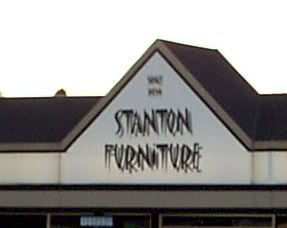
It is called, ironically, ITCMatisse. It makes me cry a little and die a little inside whenever I see it. Here it is on a Beaverton business front:
Please note, this is no commentary on Stanton Furniture which, if I correctly interpret, has a stellar and honest reputation as a seller of such. Only on their choice of signature font.
There are some fonts that work well within the design in which one embeds them. Then, there are some fonts that find their way to signs that just seem to call out "I have no real design, I just want to look neat!" Fonts that strive to be different ... just like everyone else.
If it were just overused that would be forgivable, if it were at least pleasant to look at. My synesthetic mix suggests textures when I look at shapes. And Matisse makes me think of little knives, piercing my eyes over and over.
How this font got named in honor of one of the great old master painters beggars the intellect. I can think of few other fonts so inelegant, so atrocious, so visually cacophonous, so lacking in actual style. I see it, I want to start stabbing myself in the face.
It's too late to save Stanton Furniture (though if you folks want a redesign, I'm available!) but maybe it's not to late to keep it from becoming as ubiquitous as Algerian. If you know someone who's designing an identity and is edging toward using this, box them soundly about the ears ...
Kevin and Pril, in the discusson threads having to do with my recent paean to NBC News Overnight, picked up on a reference I was able to dig out and pointed me in an unexpected direction.
On the YouTube clip with the first part of Overnight's inaugural, we got a look at a quick promo for NBC 4's news team, and saw that one of them was a lady who was referred to as (to the uninitiated) "Tricia Toyota". I remembered her from NBC News Updates. What I remembered the most was the unusual spelling of her first name: Tritia, not Tricia. It's also not every day you actually see a person of obviously-Asian descent with the same name as a popular imported automobile.
Tritia Toyota (born Letritia Miyake, which explains the variant spelling on the first name but we still cannot figure out why she decided on the last name) was born in Portland, which was really the thing that got me going on this tangent; another Portland kid run off to the bright lights and did good. Her photogenic good looks and poised style stood her in good stead; she had a long and successful history in LA TV news.
And she did her part in inspiring artists to write songs dedicated to her, even though they may be decidedly silly. Round about 1980, the historic SoCal punk band The Dickies did a song, with the first name predictably misspelt: "I'm Stuck in A Pagoda With Tricia Toyota":
I came home one night tuned my T.V. in my favorite show was about to begin as I was scanning across the dial I saw her read the news with delectable style Then I was sure that within a while
I was Stuck Stuck in a pagoda with Tricia Toyota I'm Stuck We were watching Abe Vigoda then every thing will be fine
Later that night we went for a drive and I can say I never felt more alive taking in the sights of old Tokyo with Tricia by my side and money to blow I knew then I never wanted to let her go
[Chorus]
[Lead]
[Chorus]
Always in a daze Always in a dream Always find that things are not what they seem A little Asian Goddess came from up above I thank you NBC for sending my love And Tricia is the one I've been dreaming of
[Chorus]
You can buy this from iTunes. I did. That's $0.99 in the pursuit of the strange and silly. You're welcome, everyone. I do and do and do for you people! I mean, do you see there how they worked in Abe Vigoda? Brilliance!
You don’t hear much about Toyota anymore. She adroitly avoids the spotlight. But for those of you who wonder, after leaving the news biz, Toyota, now 61, earned a Ph.D. in anthropology at UCLA where she is a featured lecturer in anthropology, Asian American Studies and the media. She is also a force in alumni affairs and an advocate for human rights and Asian Pacific American causes. Toyota is married to politically influential Riviera Country Club CEO Michael R. Yamaki and lives in Brentwood.
Often dismissed as Asian eye candy although she had evolved into arguably one the market’s best non-scripted on-air talents, Toyota once rued that many of her fellow anchors refused to recognize her as an equal. Turns out the Portland-born Japanese American stood head and shoulders above her colleagues all along.
It notably points out that she was the only LA colleague who stood up at the death of legendary 'caster John Shubeck (one of the first millionaire 'casters, and one of the few to anchor for all three networks in a major market). Shubeck, who had died more-or-less forgotten, was penniless: Toyota paid for his funeral and bid him tribute on her own broadcast.
Toyotas do have a reputation for quality, so we maybe shouldn't be surprised that she accorded herself with such class over the years.
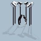
(via BoingBoing) More creepy and dead-on surveillance society commentary, this time as T-Shirt images from Australian graphic artist Ross Robinson.
The two images, titled The Kiss and CCTV Government, kinda grab you by the intellectual gonads and make you laugh. Nervously. It's funny, but in a very dark way. Especially when gracing the pecs off that special man or the rack of that special woman:
That's Kevin Allman's take on the new local editions of The Huffington Post:
If you're getting the idea this is personal, it is. I've been hired to consult with Gambit, the alt-weekly here in New Orleans, and I'm working on their Web site, Blog of New Orleans (aka Gambit Daily). We're introducing guest bloggers on the site (bloggers, it should be noted, whose work kicks the shit out of Messrs. Cusack and Armisen) and the first rule was: guest bloggers get paid. (Not much, but they get checks, fill out tax forms, the whole W-9 yards.) I wouldn't be asking them to do it otherwise -- I've been agitating for years against the cruel hoax of "writing for exposure," and I believe what writers do is worth money. And respect.
We agree with Kevin (if we didn't, we wouldn't still have the NO!SPEC banner on our page here). What's more, we find that someone who's as wealthy as Arianna expecting people desperate for exposure to provide content for free unseemly. If it's good enough to publish, it's good enough to compensate.
Would you expect your mechanic to fix your car for free in hopes of getting more work if he does a good job and you tell people about it? Decent creative work deserves a decent paycheck.
You want to know why I love blogging and the intarwebs even though the national love affair with me has yet to start? Because you can post a loving remembrance of what has to be the best damn news program ever and one of the anchors of the program, someone who you've admired for years and wished you could thank personally, stops by to thank us for the kind word.
Linda Ellerbee checked in in the comments.
So I finally get to thank someone for the great work they did. The intarweb is awesome that way.
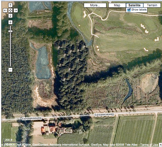
... after all, what exactly could Holland be developing that would require such ham-handed use of Photoshop's clone stamp tool? Stealth clogs? Cancer-curing cheese? Attack polders? High-megaton musicals?
I'm sure the Dutch government will never say. But, as broken by Photoshop Disasters, about one mile west of the town center of Brummen, which is about 12 miles SE of Apeldoorn, along a road with the tonguetwisting name of Eerbeeksweg and along the west side of a local golf course (the Dutch got golf courses?) there's a most interesting hurst of trees:
Follow this link to Google maps view and zoom in real close. those white tops to the trees look suspiciously similar for a reason; they were, most likely, either copied-and-pasted or, even more likely, produced with the clone stamp tool. You do this to cover up things.
But why would someone be so ham-handed about it?
Probably to generate a bunch of blog posts.
Mission accomplished.
Of course, we do notice the recent proliferation of Dutch Bros. coffee stands here in the Portland area, and can't help but wonder.
In which case, we welcome our new Dutch Masters. They have great coffee. They can have the cigars, though.
During the 6 PM edition of Channel 8's report, Joe Donlon reported that the Merkley and Smith campaigns and the station have reached an agreement to one (and probably more) televised debates. As reported on OLive by The Big O's Dave Hogan:
The hourlong debate on Oct. 8 will be broadcast live by KGW-TV from the station's Portland studios beginning at 7 p.m., said Rod Gramer, KGW's executive news director. Sponsors will include KGW and The Oregonian.
This looks like the beginning of a series:
The two candidates may hold as many as five other debates before the Nov. 4 election, said Merkley spokesman Matt Canter, but discussions are continuing.
When I was but a neat thing, I dimly remember a certain program that aired after all sensible people had gone to bed.
Nobody ever accused me of being sensible, even at that tender age. Anyway!
In 1982, NBC, in a moment of clarity and sanity, debuted a news program for insomniacs. NBC News Overnight, it was called. Though it ran merely an hour (and usually ran at about 2:00 am) it packed a lot of information in.
Moreover, it had a smart, somewhat sarcastic, extremely witty approach to the day's events. Please give us about 10 minutes of your time, and view the debut program, which aired on 6 July 1982. And please .. pay attention. I do not make this request flippantly. I'm serious about it, because this is how witty, smart and fun an American news program could have been:
(all credit must go to YouTube user LATVNews, who wins the award here. And if you caught the name "Tritia Toyota" in the promo just before the program started, here's a PDX connection; she was born here)
Like Lloyd Dobyns (who must be the most underrated news anchor in national TV history) said of the Lunar eclipse which happened to grace the inagural program, "what other progarm ever did that for you?"
Well, no other program even now, as far as I can remember.
Another thing that NBC News Overnight gave me was an enduring affection for Linda Ellerbee. Not only because she was just as witty as her opposite number, but because she formed an opinion of women I hold to this day: intelligent, well-spoken women are hot.
I still have a crush on Linda Ellerbee ca. 1982. If I met her today, I'd still be thrilled.
Sadly, the span of the program was only 367 days (though it was 5 days a week; the show ran from 6 July 82 through 3 December 1983). According to Wikipedia, the duPont Columbia Awards deemed it "possibly the best written and most intelligent news program ever", and that credit remains, in my arrogant opinion. I've been a consumer of many newsers since, ABC World News Now came close in the wit department (especially in the Aaron Brown/Lisa McCree inaugural days) but nothing has ever been as intelligent, no other program has treated its viewers as intelligent, thinking people instead of voids waiting to be filled with whether or not Britney wore her underwear today.
Like I said, NBC News Overnight was not only what broadcast news should have been, it's what news should be now. And that's why some of us bitch about why news is so very sorry today.
And if all that weren't enough, how classy can a news program be that closes with a tagline out of Vonnegut and still doesn't make you feel left out of the loop.
And So It Goes, saith Linda every night. Because of her, I read Vonnegut.
Here's some more '80s goodness. A segment where Lloyd and Linda report on such 80s landmarks as the Dow going above 2,000, and the delivery of the then-new Space Shuttle Challenger being delivered to the Cape. At least this is worth watching for the corn elevator in Iowa collapsing and being caught in the act (and too many 80s-era news nuggets to recount here):
And here's the first part of the last, or 367th, edition of the program, co-anchored by Dobyns's successor, Bill Schechner ... including lovely unemployment numbers sliding from above ten percent to almost eight percent, which pleasantly surprised Ronald Reagan – as Linda said, the news is better that it has been, and that's a fact.:
This is what broadcast news could have been ... and is not.
Thanks to the magic that is Google Alerts (what would we do without them, good peoples?), one of mine which is set to "InCopy", I get this from a rather mysterious blog called When I Grow Up (spelling and punctuation as per the author):
So my newspaper is getting sold. I don't know what that means for me. Sadly, nothing. I doubt any company will come in and whisk us out of ignominy and truly make us quality. All the reasons I didn't go to work at construction-company owned newspapers are becoming nonreasons.
It'll mean we may give up incopy because we might not have bought the licenses as a newspaper, but as a chain, or the new Sam Zell will make us buy something he wants us to have. It means we'll be in extra limbo because not only will we be in normal limbo, but we won't know if this will be a place worth working at.
The newspaper business, we hear, is in a state of flux. Locally, our signature daily, The Big O, is inveigling people to accept buyouts and the pretender to be The Second Pape In A One Pape Town™, the Portland Tribune, has not only cut back to only one edition per week (when it debuted it published thrice-weekly) but has lost its inimitable editor, Dwight Jaynes (who wrote the most readable, iconoclastic sports column this side of Canzano). The handwriting, as they say, is on the wall.
Anywhoozle, this commentary just struck me as OMC-level bizarre because the correspondent spoke regretfully of losing Adobe InCopy in the midst of concern over the change of ownership of the pape. I (moving again as I do from the editorial we to the personal I) adore InCopy. It's the light that Adobe hides under its considerable bushel.
In Googling Sam Zell, we find that he's apparently, in December 2007, purchased the Tribune Co., which means he's bought the Los Angeles Times and the Chicago Tribune, amongst other properties, and the deal is going decidedly pear-shaped. We draw no inferences on which paper the blogger works at, and we have no intention of trying, but we offer this link to the Business Week article and merely note the perversity of the universe is, as Murphy had it, at a maximum, when the presence or absence of Adobe InCopy is apparently worthy of mentioning and indeed seems to be something of a deal-maker for working in a news environment.
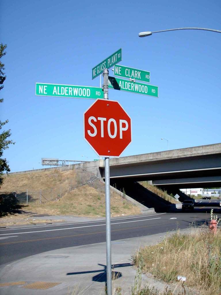
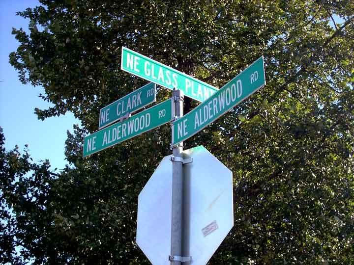
This is my new most favorite intersection in Portland.
Do you see what they did there? The only clarity you have here is which one is NE Glass Plant Rd. Here's a closeup:
Not one, but two NE Alderwood Rd blades; one seems to be doubly-named, with a "NE Clark Rd" blade perched bird-like atop it.
I mean, pray you don't get stranded at this intersection. Imagine trying to order a cab there. You'll have the dispatcher wishing hot flaming death upon you by the end of the call.
There's actually a pretty simple explanation for it all. NE Clark Road is being absorbed into the new alignment of NE Alderwood Road. This location is just west of I-205, and you can reach it by going north on NE 105th Avenue from Sandy Boulevard, then taking an extremely sharp left after you cross the Columbia Slough (NE 105th runs up against the side of I-205 at this point, and has to swing away from cardinal North).
Now, if you look at the first picture, you see how the road goes under the freeway. That short bit of road connecting this corner to NE 105th is all that there was to NE Clark Rd. It provided access from NE 105th to Glass Plant Road (and perforce the Owens-Illinois glass plant, which travellers can see from I-205 as you near the Killingsworth Street exit). That's pretty much all it did, allow traffic to get under the freeway at that point. There was never any room for addresses along it.
The complexion of the area has fundamentally changed. Alderwood Road, which began life as an extension of what was NE Cully Blvd and latterly as a road slanting though Colwood National Golf Course to connect to NE 82nd Avenue just south of its terminus at Airport Way, has been extended east over the years as the Portland International Center (that new commercial area where the IKEA store is) developed. Alderwood Road has been extended far enough east to connect to the intersection at Glass Plant Rd and Clark Rd; the intersection has been realigned and the combined road is renamed to NE Alderwood Rd, obsoleting the NE Clark Rd name. NE Glass Plant Road has also apparently been vacated north of the old intersection.
If you're a fan or streets named Clark, don't worry: theres' still a N Clark Avenue by the Willamette riverfront in lower Albina.
Why the city felt it necessary to have not one but two blades for NE Alderwood Rd is an exercise for the reader.
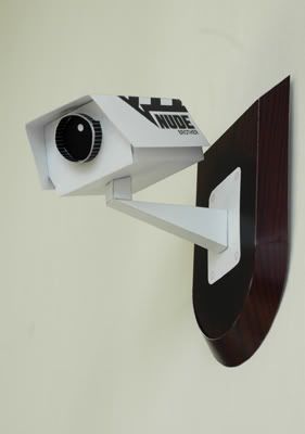
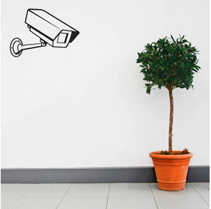
Via BoingBoing, something that could only be funny in this modren world; a decal of a CCTV camera that is so popular these days at traffic intersections and the like.
Though at $22.00 for one each, I'd want one that actually took pictures. That way, it would be so very recursively ironic that the very fabric of time and space would ... ah, you know.
Also, they've set up a special: enter coupon code BOINGBOING to get 10% off your order.
My Australo-Celtic friend, SmokyBanjo, in a comment a few missives back, wondered why I don't post more of my design work here.
It's a fair question. After all, I do try to make this about design and not just my ruminations and perambulations. The current dry spell and the demands of just bringing in enough money to prevent us from being thrown out of house and home mean I haven't had much to post ... lately. But I do have an online portfolio at ArtBistro, and anyone whose interested a sampler (which is just a slice of what I can do) can view it here:
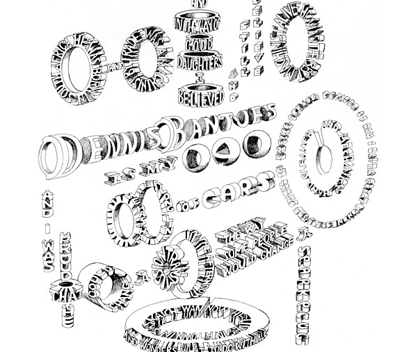
(also via Programmer Fish) Marian Bantjes, the Canadian illustrator/artist/typographer who is taking the design world by storm (STEP inside design magazine named her one of 25 up-and-comers to watch in 2005) has done a monograph.
You'll have to subscribe to Creative Review magazine to get one. This one won't be available on the newsstand.
(via Programmer Fish) Ryohei Hase creates disturbing, macabre images of realistic detail. Some of them are the stuff of bad dreams. If Hieronymous Bosch had a computer and Photoshop, he'd paint things like this.
Hase works entirely in Photoshop, proving that PS is not just for LOLcats anymore.
I'm betting if someone asked him what his influences were, he'd cite Giger.
If you want to see how he does what he does and get an idea on how he did the human rabbits, he has a short tutorial on basic skill here at DeviantArt. Don't let the "DeviantArt" part fool you ... this display is done to a very high standard.
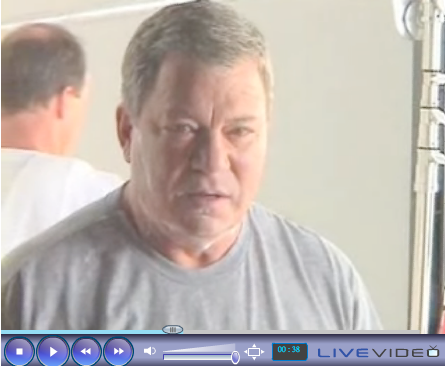
(NB: There may (or may not) be those who would point out that, by rights, the last post (about ShatnerVision) should be post #1701. That's the way the yarrow sticks fall, people.)
A few days back I commended you all to a series about letterpress printing that Lauren at CreativeCurio.com did. I thought it was wicked interesting and I think everyone should read it. I also mentioned that there was a comments drawing where Lauren was giving away a few sets of the very lovely cards that she was making in that print run.
I am pleasantly surprised to find out that I'm one of the lucky winners. I will be recieving a set of letterpress cards with the Happy Day! design, which will do a bit of cheering up, no mistake there.
Stumble: Turned down for yet another designer job:
Thank you for your interest in the position of Graphics Designer. It was a difficult process to select those candidates who most closely met our requirements.
Although you have enough training and experience to meet the minimum qualifications, you are not among the candidates being considered for further processing.
The discouragement factor inherent in being told that I have the necessary training and experience to do the job but will still, with no reason given, not be considered even for an interview is left as an exercise to the reader.
Stumble: Later that same day, when borrowing the computer, a family member upended a beverage on my graphics tablet. It's still acting up. No money in the budget to replace it.
At the dazzling Beijing Olympics opening ceremony, China's invention of printing 1,968 years ago was celebrated by thousands of performers hoisting tiles bearing Chinese characters above their heads. These squares symbolized the imprinted clay blocks used during the infancy of Chinese printing. It was also a reminder of how far Chinese printing has come into the computer age.
When peasant Bi Sheng devised movable block type in 1040, he was merely writing the first page of the story of the Chinese printed word - a legacy complicated by the fact that Chinese is written in hanzi, or characters developed from pictographs.
It's a well-known thing that the pictographically-based Chinese alphabet contains thousands of characters – unlike Latinate alphabets, where we assemble words from a limited set of glyphs, each character becomes a word. And there are innumerable words in English as well.
The sheer number of characters in the Chinese "alphabet" (in a country that famously speaks more dialects than this autodidact can count) makes print publication a daunting task, to gild the lily somewhat. The China Daily article further details what printing was like, as channeled though the testament of a worker from those times:
The vice-president of the China Academy of Printing Technology, Chi Tingling, said most printing houses of the era had about 60 blocks of nearly 6,000 characters in every typeface. They were stored in small cartons stacked inside booths spread among several rooms, covering more than 66,000 sq m.
...
Once his department received the last copy at 2 am, the printing house team would begin frantically hunting for and inserting the blocks in a 13-kg metal frame
...
The characters would become increasingly distorted throughout the night from being mashed in printing page after page, so every day they would melt the blocks down to cast new ones. Those making the lead type worked with toxic chemicals, such as potassium cyanide.
Printing in earlier times, even in the West, required using materials that we understand better these days to be toxic and deleterious to the health. Of course, it should also be remembered that when Marie Curie did die, it was of complications from prolonged exposure to ionizing radiation from her own researches.
The multiplicity of characters in Chinese has (if compared to digital printing in the West and in Europe) caused it to lag behind, relatively speaking: As late as 1990, regional editions of national dailies had to replicate pages by hand after them being physically delivered. Withal, it's not whether or not Chinese is a better or worse system, just a large and more complex one, that took longer for technology to catch up with:
The man who came up with the solution was Wang Xuan (1937-2006), a researcher at the Chinese Academy of Sciences and the Chinese Academy of Engineering, and the former chair of software leader Founder Group.
Hailed as a modern Bi Sheng, Wang developed a large-scale integrated circuit capable of efficiently storing compressed information in hanzi and a five-stroke input method in 1975. He went on to devise a laser-printing system for characters. In 1980, a 26-page text about kung fu that rolled off his press became China's first laser-printed book.
The next time some fifth-grader complains about spelling tests, they should feel fortunate that they didn't have the travails that Chinese print had.

 snark a little) on all the TV Logos I can find is getting its fair share of search hits.
 "Cachet" ... that certain something that can separate the wheat from the chaff, is inherent in street addresses. Cachet is defined as one finds it ... and though today, a Fifth Avenue address in Manhattan is one so desirable that developers will, as demonstrated above, attempt to bend spacetime in order to make sure they get one.
 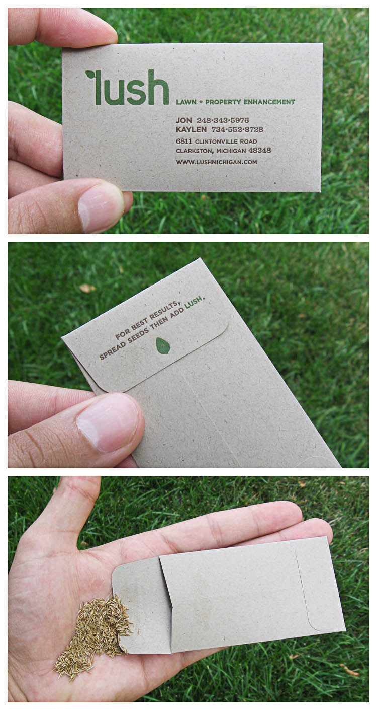 I imagine that sometimes, though, you get the client that allows the budget to really try and break out and do something delightful, aesthetic, clever, and even award-winning. I saw a few over at The Fire Wire today (the following images are hotlinked for commentary only. All credit goes to Larry at The Fire Wire). Here are a couple that really caught my eye.
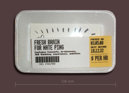 Another of Larry's finds that I enjoyed quite a bit can be seen there on the left. A business card, complete in shrink wrap and a styro tray, suitably stickered, and your business card is now on the market ... the meat market perhaps, but designing is somewhat of a dog-eat-dog business, as I've found.
 annals of computer security, and perhaps the most notable syscracker of the 20th Century. He used his mind like a set of lockpicking tools, famously ascertaining passwords and other access keys through shrewd social engineering (getting people to divulge priviledged information by sheer social manipulation). It's fitting, then that Mitnick's business card – made of metal – actually contains what appear to the uninitiate to be actual lockpicking tools.
  We just learned via phone (and posting via ASCII terminal) ... ... It's Obama/Biden.
  These can get quite challenging ... it's advanced, though the components are easy enough to understand. In this bit, guest author Esben stops by Lauren's Creative Curio to tell the tale of creating a realistic vector banana.
 Of course, you have to work in the kind of place that has Photoshop. Alternative, and if you are so blessed, take your Photoshop-enabled laptop to work and have your beer on your lunch-hour.


 On the YouTube clip with the first part of Overnight's inaugural, we got a look at a quick promo for NBC 4's news team, and saw that one of them was a lady who was referred to as (to the uninitiated) "Tricia Toyota". I remembered her from NBC News Updates. What I remembered the most was the unusual spelling of her first name: Tritia, not Tricia. It's also not every day you actually see a person of obviously-Asian descent with the same name as a popular imported automobile.
 (via
(via 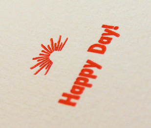 A few days back I commended you all to a