31 December 2013

[art] You Can't Legislate A Man's Neck; or, Art in the Art Supply Store by the Employees

2997.
This is one reason why I love my favorite art stores, and one reason why we have to have more than one.

I have rhapsodized in past missives about my two beloved east-side art supply sources, I've Been Framed and Muse Art and Design. Today's IBF's turn for some sloppy love. They both have different characters, each unique from the other, both like sides of a whole.

Kind of like this taijitu here.

Both are friendly, both are crazy knowledgeable, both almost-unsanely-affordable, but where Muse is cool, ordered, and tailored to fit its location, IBF is kinda wild, kinda wooly and exuberantly unafraid of being what it is. And, today, what it is is a happenin', accidental gallery for its employees.  I wasn't looking for anything this day, The Wife™ was. I come out of the long corridor of decorative papers …(and tho IBF on Foster is in a small building, it seems to go on forever … like 'dis …)


… and I look at this, and can't stop giggling.


Flesh Beard. You can legislate a lot of things, but you can't legislate a man's neck … Well, yes and no. In American culture you certainly can't argue the point, but during the French Revolution they legislated a whole lot of men's necks, if I understand what goeth on thereth correctly. Turning about a quarter of the clock's turn to the right, we have a windowpane simply full of delight.


There is some connection between Nathan (whoever he is) and coffee (or, perhaps coffeee) that we will have to leave to more learned heads … Erich VanDaaniken, say, or Richard Hoagland, perhaps … to puzzle. At this time, I can only bask in the infinite power of such a connection.

Another incident where the inanimate speak. First, it was 'bacon bits'. Now …


I guess that colors having an off day. GEDDIT? OFF … COLOR!!! Let's try it with the bonus Commonwealth U: OFF COLOUR!!!! My God this is comedy gold!

A couple more for good measure, or least odd measure

It's the newest model, 70s cool, with all the options (as noted)

Stravinksky from the Drawing on the Right Side of the Brain school.
And whooo's your Daddy? I guess we'll never know.
The illustration of the building façade? You know I'm in love with this.
Is it any reason a visit to IBF leaves me feeling kid-antic inside, and full of the idea of the possible?

My recommendation to you, dear artist friend, is to also adopt both IBF and Muse. Do it. Don't argue with me. Just go.

And don't forget to stop and smell the art along the way.

[Out122ndWay] Starfleet's Own Ace Hardware Store - The USS Powell Villa

2996.
The Powell Villa is that old-school shopping center across from the Safeway at SE 122nd and Powell. And the Ace Hardware store that is there has been there for decades, so they say.

It has a tradition of service that comes down from the stars, and is highly … logical.


That's the USS Powell Villa, Captain Shawn-Luc Picard commanding.

Heck, I didn't even know they were cousins. Live and learn.

My wife goes there when she wants fasteners and such for small fixes, and I go there to get that delicious hardware-store popcorn (the only thing better is movie-theater popcorn, and I stand in fear of no contradiction here, in as much as the secret ingredient is it's free!) from the replicator.

Oh, they call it a popcorn machine, but who do they think they're fooling?

It's been broke down the last couple of times, so someone from engineering best get on that. This is a hardware store, though. How hard can that be?

The hull number is the store's ID number, so they say. I say it's the holodeck program file code. Like I said, they ain't foolin' nobody.

28 December 2013

[art] The Klein Line of Fine Christmas Cards, 2013

2995.
The Wife™ is getting mad crafty. Or maybe the banality of printed holiday cards just isn't doing it for her anymore. Either way, as Christmas approacheth, she geth buthyth.

This is this year's line:


Both hand-made, hand-design, and utterly original and unique, by The Wife™, equally utterly original and unique, and I'd not have it any other way.

I just adore the design on the left. So whimsical! The circles were salvaged from some used Christmas wrap, so, very recycled, very PDX! The one on the right has a lot of simple charm to it. They went over big time at work.

[design] New Typography On Taco Bell's Sauce Packets

2994.
I shelved this one a while back, but it made me react so I'd have to say something about it. It's a good change.

Recently (but see stipulation above), Taco Bell has changed a bit of the design on its sauce packets. It created a better attitude, one I like better than the old one.

Below photo shows the packets on parade; the old style is on the left, the new style is on the right.


The whimsical, wacky type is gone, along with the old tagline Think Outside the Bun, which is a good change because it all seemed to be trying too hard, from the jaggedly lines to the forced and awkward edginess of the cute sayings in the middle of the design.

The literary review is strictly subjective. Maybe Things just got real just kind of annoys me less, in an unarticulatable way, than Sometines I crave myself … is that wrong? (For the record, it kind of is. If you're going to consume yourself, at least get a room before you do so. Thanks from me and everyone else).

The large type has a nice, straight-forward strength to it that hints as to why Swiss design got so dam' popular. It's straight ahead and just tells you what you want to know … as helped along by the elimination of the "Border Sauce" brand (the 'run for the border' tagline being almost older than the 1990s), which made for an awkward coinage at best. Besides, nobody I've heard ever called it that; the cashier at the window just wonders if you want Hot or Fire, never asks "Do you want some Border Sauce Hot?"

What it all comes down to is keeping the image current without trying too hard. The graphics on your sauce packets don't have to do the heavy lifting, they just have to harmonize with the rest of the brand. And this, they do. 

[art] New "Mewse" Spotted In Studio … on Caturday

2993.
I don't make a habit of Caturday posts, but if I did, this would be one of them.

I'm going to cast 2014, the 'year' being the human artifact and overlay on the natural world that it is, as an 'art-healing' time. I have only the barest of inklings as to what that means, but I've a sense, and some years I get very little right, but I've never failed if I find something happy like that and just rolled with it.

So, art-healing it is.

We have a recent addition to the cat company at home base; we rescued her a couple of years back. She started out very anti-social but has warmed considerably.

Encouragingly, she has condescended (trust me on this … as all of us cat-people know, cats, by default, consider themselves a higher form of life, but this girl walks and talks it) to share time in what I call my studio space with me. More often than not she'll be circling my chair while I'm diarizing or writing blog postings.

She started out as an aloof Ice Princess, and is still standoffish in most of the rest of the house … but in the studio, she's one cool kitten.

Allow me to introduce KiKi.


She also disdains the paparazzo, which, in case you didn't know, is the singular of paparazzi, which by the ending -o, would be male, in this case, would be me.

Just one more purrson I'll disappoint if I don't get off my artistic assets, already.

Which reminds, we'll be going to I've Been Framed today. Since my work sked has been rejiggered, we don't get round to there nearly  enough.

[liff] Moon Over Outer East Portland

2992.
A recent cold morning, arriving home at dawn after work on the flip side (my day begins when your day ends, yo. You're welcome, Portland!) and a crystal clear sky tempted me to take a picture of the moon.


It's a nice camera, and I'm taking much better pictures, now (thanks, Jason, You Know Who You Are™) but I think I'm pushing its envelope here.

Still, beautiful color, what?

And close-up:


Check out the earthlight on the dark limb. Very romantic, I think.


[pdx] A Little Bit Of PDX in GTA?

2991.
This, via Soylent News™ (Remember, Tuesday is Soylent News™day) … if you like living the dream in Liberty City, you'll love a certain transitional homeless camp there.

It looks pretty close to a little local landmark.

Art imitating life? Or kind of mocking it a little?


26 December 2013

[liff] Do Not Taunt Happy Fun EXTREMELY HOT Pepper

2989.
The measurement of 'heat' in a hot pepper, the Scoville, indicates how much capsaicin - the stuff that makes your mouth light up - in it. The more Scovilles, the more zowie.

Your usual bell pepper - zero, zip, zilch, nada.

The jalapeño, that pepper that seems so peppy when you're a kid but, as you mature you realize it's just a 'starter' pepper … 2,500 - 10,000 Scoville. Sriracha, despite its punchy taste, only rates 1,000 - 2,500.

Well, the jalapeño begat the serrano, which is a gateway to the chipotle (which is actually a smoked jalapeño), which ascend in a dare-match scale up to what was the gold standard of pain … the habañero. Your habañero, now, measures up to about 850,000 for the feistiest specimens. And you'd think the capsaicin arms race would end there …

… but, no. That's not how we monkeys roll.

The habañero led to the Red Savina, which led to the Trinidad Scorpion Butch T. This monster, which starts at just over 1,400,000 Scoville … remember, our humble jalapeño maxed out at 10K, so we're at orders-of-magnitude groesquerie here … was the big gun. It's said that, to cook with it, they had to go in looking like the meth cooks in Breaking Bad, and they still had to endure two days of numbness in the hands.

Now, I hear you asking, why would someone cook with these peppers? Your question is invalid. We're already past the bounds of reason. I say someone cooks with these peppers, you just accept this.

They were just warming up for the peppers, yo.
Since why don't we stop here is not, as I intimated, the way we monkeys roll, you know they didn't stop at ol' Butch T. Oh, no.

Allow me to introduce you to the winner and new champion, the Carolina Reaper. 

Yep. Reaper. As in Grim, we presume. We have the amusingly-named cultivator Ed Currie to blame thank for this tiny little literal bit of hell, which screams directly through your cauterized esophagus at nearly 1,600,000 SHU. Eat it? Shucks, you look at this pepper and I'm sure your eyes begin to dissolve into liquid pools of flaming misery.

But if you want to get you a mouthful of this, you can go to his website, the (heh) Pucker Butt Pepper Company (hah!) and see if you're man, woman, or whatever enough to try. We presume they call it Pucker Butt because The Liquify Your Anus Pepper Company doesn't scan all that well.

In the words of Dr Robert Oppenheimer, creator of a bomb that, quite frankly, is a wet firecracker next to this pepper which I swear to God was scowling at me out of its photo, "Now I have become Death, Destroyer of Worlds."

Indeed. What hath God and Man wrought?

ABC News' Nightline explores the Boschean depths of this thing. Because Nightline is that classy.

[design] When Is A UPC Barcode More Than A UPC Barcode?

2988.
When I was but a neat thing, MAD Magazine was a hold-out. Held out against putting ads in. Held out on getting any class at all (and we loved them for that). And, in the day of the multiplying UPC symbol, held out against putting that on the cover, until the April 1978 edition (which actually came out in February, I think. MAD loved putting the cover-date two-or-three months ahead of the actual month), which, in a fit of EC-style rage, looked like this:


Well, it didn't, as history will show, and if history won't show, we'll say shut up, history. I'm writing this article, not you. It did provide for a long string of sarcastic jokes at the UPC symbol's expense (mine was a callout that proclaimed it the World's first computer-written joke), so at least MAD got that out of the deal.

Today, the UPC symbol has made its home in commerce; it, and similar barcodes, are pretty much everywhere. Their utility cannot be denied. Still, designers design around it, put it in a corner which gets pretty much ignored but for the scanning beam of Chad Vader's new, more powerful laaazer checkout system. But it need not be …

The scanner will scan the barcodes if they are correctly printed, but like a lacklustre gem, the proper setting can make all the difference:


Nifty! I don't know about anybody else, but I'm down.

More coolness from Benjamin Starr at Visual News here: http://www.visualnews.com/2013/12/23/design-around-lines-barcodes-dont-boring/. Read carefully within the text for more nice links, all of which I tried and all of which are distracting in the good way.

[art] A Henna Artist's Positive Ramble on Getting Unstuck and Creativity

2987.
Peep this, cats and kittens:


This positive, happy woman rambles on for about ten minutes and ten seconds (eleven, actually, but ten minutes and eleven seconds just doesn't fall as trippingly off the tongue) about being stuck as a henna artist and how to become unstuck as a henna artist. But, there's always a level of arting around that works universally, beyond, above, and below the obvious level of expression and art media.

This video has very good suggestions and ruminations about inspiration, looking, and being for not only henna artistes but any artist who feels 'stuck'. It's ramblin', but in the good way, most definitely.

She is, fortunately enough for me, someone I happen upon betimes in the workaday world. She's typically a very happy, dry-humored sort and if she brings that brio to her henna work, it's gotta be good.

She also has a blog (http://www.freehandmehndi.blogspot.com/) , a YouTube channel (http://www.youtube.com/user/FreeHandMehndi), and a Face-to-the-Book page (https://www.facebook.com/fhmhenna), which may be read and viewed and enjoyed.

[OR_liff] Oregon: You Like Us, America, You Really Like Us!

2986.
Well, it looks like you're still lovin' us, America™.

Various outlets have released the findings of the United Van Lines 2013 Migration study, which I cannot yet find online but is available to some people somehow, and the word on the street, streets, roads, and freeways is that people is lubbin' Oregon more than anywhere else.

Generally, it shakes out that the most popular places to come to are all in the Pacific Northwest and Northern Cali … except for the Bay Area, where the rent, as they say, is too damn' high. Oregon, with 63 percent of all moving traffic being inbound, stands atop the peak this year. Hasn't done too shabbily in the last few years, usually ranking 2nd. Of cities in the last year, Portland is 7th most popular amongst the top 15.

Tom McCall's a-spinnin' in his grave right now, I'm certain.

The Biggest Loser in this moving parade?

New Jersey.

Love it or leave it.

I'm just hoping the nation doesn't love us to death. Seeing the sort of ideas that come into this state every year, I have my worries.

OTOH, if any new Oregonian would like to know how to be an Oregonian the right way, I'm available for consultation. I have a sliding fee scale; it does tend to slide easier one way than the other, however. Just sayin'.

20 December 2013

[art] LineWorkNW Comics Festival in PDX: New, Small, Nice, Just the Right Price

2985.
Just stumbled to this on the Book'o'Face:


It's a good day, and it's a good price (free). I'm putting this on my calendar; I'm scheduling an artistic rebirth for the most of the year 2014, and I'll need all the inspiration I can get.

Here's LineWork in its own words:
Linework NW is a new illustration and comics festival taking place in Portland, Oregon. Linework NW’s goal is to focus attention on the creators who continue to inject new energy and vitality into these venerable mediums that share so much in common, whether their work is to be found in comic books, original art, graphic novels, prints, or other forms. Drawing upon a wealth of talent from the Pacific Northwest and beyond, Linework NW seeks to cultivate a vibrant cultural experience for creators, readers, art lovers, and collectors alike. 
Where-ever great drawing happens, I want to be there. This would be that sort of place.

The Norse Hall is a rather historic Portland building located at the NE corner of NE 11th Avenue and Couch Street (on the Couplet). The exhibitors that have already committed seem more than worth the free price of going.

So, 12th of April '14, NE 11th and Couch. Free comics festival. It's a date, I tell's ya.

Visit on the web at http://lineworknw.tumblr.com/, Twitter at @LineworkNW, Facebook at https://www.facebook.com/lineworkNW.

16 December 2013

[art,map] A Direct Portal to Jerry Gratzinger's Ukrania

2984.
Almost forgot this. In the WIRED article there's a link to this, but if you don't want to spend time finding it and watch to dive right into wasting hours scanning around a recent version of Jerry's amazing map, there's a zoomable version at http://www.grinsdesign.com/jerrymap/.

Have a few hours reserved. You won't get them back, but you won't care. Ukrania gives back in terms of imagination more than those paltry few hours will subtract from your lifespan.

[map,art] Jerry's World - What'cha Gonna Do When The Void Comes For You?

2984.
It's not looking good, suddenly, for the city of Fields West.
A new Void has appeared in the city of Fields West this morning (map year 1086).
This largely unprotected city of over 700,000 souls saw the relocation of an estimated 15,700 individuals to the alternative dimensions inside the Void.  This portion of historic old town will be greatly missed by the remaining residents.
The white spot used-to-be. Now it's not, no more. 

Our correspondent is one Jerry Gretzinger, of northern Michigan, and on-and-off now, for a period of decades, he's nurtured a very personal, evolving, and awesomely-creative world which is his, and his alone.

Starting with a make-believe town he called Wybourne, he simply drew and drew and drew. Coming to the edge of one sheet of paper, he expanded onto another. The resulting world which, if I'm reading the reportage correctly, goes by the name of Ukrania, but which the artist seems simply to refer to as The Map, is now truly large, consisting of over 2,500 8-by-10-inch panels.

Over time the expression has changed somewhat. Bits of collage have worked their way in, and abstract color patterns in others. I recall the days in which I'd create cities of my own; I kind of worked in this direction, but never went all the way. Jerry not only went all the way, he took it in directions that can only be termed a certain sort of genius.

He expands and evolves (any map panel is open to some sort of change) his map using a deck of playing cards, actually a deck made up of more than one deck, each one decorated with some sort of paint pattern and each one containing a rule. With this, and a set of rules he applies and evolves along with the work, this world expands and changes. Over time it has grown to cover an area the artist estimates as equivalent to Connecticut and a great-sized piece of Massachusetts - some 12 or 14,000 square miles … and has rail lines, highways, and quizzical and interesting cities with English-countryside-inflected names like Leyemouth, Southchurch, Fields West, and of course, Wybourne … a city suffering from its own void incursion.

This is such an entrancing thing to me that I cannot put it into words. And I'm hardly the first one who's noticed; Wired magazine has a wonderful article here (http://www.wired.com/wiredscience/2013/09/jerry-gretzinger-map-ukrania) and I understand that The Atlantic has an article on it, but I'm too entranced by his blog to be bothered to find that one. He puts on shows and his work has garnered him some attention.

The idea of a void whisking some sections of landscape off to some other unknown dimension is most intriguing, though. His blog reports dryly on the loss of numerous thousands of residents to the unknown void, and in the void-vacated areas, new areas can emerge. Now, it's possible to stave off the void with barrier walls, but, sadly, Fields West seems undefended by them. Tough times in that town.

Ukrania must have one of the most bemusing insurance industries known to man.

The evolving nature of the map and the cards which issue commands and the rules which evolve over time also form a dead-fascinating idea: an artwork which revises itself and an artwork which changes the artist at the same time the artist is augmenting and revising the other two.

It it art recapitulating life, life infusing art, or a third thing that, dear God, I just can't find the words for right now?

I don't know.

Just read Jerry's blog: http://jerrysmap.blogspot.com/

[map] Tales of the Grid: Zion, An Illinoisan Erstwhile Utopia

2983.
Brenda Balin over on the Book'o'face recommended this town to me, while I was going on about The Grid two articles back. This is a good one. She's written about it before and knoweth whereof she speaketh.

There is a town in northeastern Illinois, not-quite-but-almost snugged into the northeastern corner, on the Lake Michigan shore just south of the Wisconsin state line, called Zion. A name like that suggests a churchgoing pioneer, and that would be correct: the founder of the city, a man named John Dowie, who formed a church there on the city's founding, in 1901.

In Zion, numbered streets run east and west, named avenues (most of which in the town proper and all but one in the original city itself had been drawn from the Bible) ran north and south. A map view of the town plan shows a distinct, yet half-realized pattern:

Satellite view of Zion, Illinois. Credit: Google Maps Satellite View
Image courtesy Google Maps satellite view (of course) 
A circle at the center, with four wide boulevards converging from the cardinal points and three diagonal streets aiming that general direction but never quite getting there. There is a suggestion of a fourth, in pointing northeastward from the central square, but zooming in in Google satellite view suggests that the only thing that ever got built in that right-of-way was a foot- or bicycle-path.

The piety of the original founder is preserved in that there is a church there in the central circle, in Shiloh (another biblical name) Park.

Zion was completely planned out before it was built; a 'planned city' from the get-go, and the plan's inspirations were twofold. One was the Biblical inspiration for the names. The other was from the planner's heart – he was a import from the Commonwealth, specifically Scotland, and his graphic inspiration was, specifically, this:


… the Union Flag of Great Britain. When viewed on the modern-day planning department's zoning map, the image of the flag is perhaps a bit clearer:


Zion in at the beginning must have been quite a place. The founder not only envisioned a perfectly-planned physical town (eventually hoped to contain as many as 200,000 people) but also envisioned it as a religious utopia here on Earth:
Dowie owned everything personally, although settlers were offered 1,100-year leases (i.e., 100 years to usher in the Kingdom and 1,000 for Christ's millennial reign — after that, seemingly, you were on your own). The leases specifically forbade gambling, dancing, swearing, spitting, theaters, circuses, the manufacture and sale of alcohol or tobacco, pork, oysters, doctors, politicians — and tan-colored shoes. The city police carried a billy club on one hip and a Bible on the other; their helmets were adorned with a dove and the word "PATIENCE." At the height of his power and influence, Dowie was worth several million dollars and claimed 50,000 followers, 6,000 of whom lived in Zion City.
I couldn't make it there myself. I mean, I can do without circuses and oysters, but pork and tan shoes? I draw the line at pork and tan shoes, man. If there were a just God, he'd not want me to do without my tan shoes.

A top of the hat to the Wikipedia page who provided the basic historical skeleton, and for a more thorough exploration of the man John Alexander Dowie (a man, whom I'm sure if God were asked would opine Now, that one is a piece of work, and how) read this unexpectedly-compelling page at a site about music in the works of James Joyce: http://www.james-joyce-music.com/extras/dowie_bio.html. He started out a piece of work and built himself into a towering and rather absurd edifice, but isn't that a classic American story?

[art] The Superheroine In the Produce Stand

2982.
NOTE: While the author of this blog much admires the artistic aptitude displayed herein, he makes no recommendation, positive or negative as to the professional service the artist offers, unless, of course, it's the art. Which is excellent.

In Portland, there's great art everywhere. You just have to stumble on it.

Allow me to set the scene. On SE Hawthorne Blvd, between SE 23rd and 24th Avenues, is a year-round produce stand under a tent. Kruger's Farm Market, one of three around Portland, and we were going by it and The Wife™was suddenly of a mind to see if she couldn't get a few things in the sweet potato form for some upcoming meals.

It was 7PM, they were open 'till 8. Strike while the produce stand is open, as I say.

While she busied herself with the selection I made my way to the back of the facility. There's what they have they call a "Community Board" with literature, ads from locals, sort of like that yellow-card board you see on the way to the men's and women's in the Fred Meyer except a lot more interesting. So, I'm browsing back there, looking at the publications (running the gamut from the interesting to the absurd) and the locally handmade crafts and things (same gamut), and I see this:


A purveyor of some service has created an ad and torn it from a sketchbook? Anyone who knows me knows I'm there. Let's look closer:


Artist and life coach. Okay. Looking over the ad, I can see I'm not exactly in the constituency for it, but still I get something from this. That art's pretty dam' good, yo. A powerful mermaid figure, with a generous and affectionate wink the viewer's direction. Well drawn and visually satisfying to look at, a cartoon with interesting mass and warm intention. And just plain gorgeous to look at.

We'll pull in a bit closer, because the note off the maid's left shoulder caught my eye and invited me in …


Note: (it reads) I draw better than this - but I didn't have an eraser. But, on the edit: I draw MUCH better than this … and I was boggled. If this is how good she draws without an eraser at hand, she must do some smashing work with one.

The hand-drawn (and lovingly lettered – the initial I in the website address has the most stylish swash going on, and was all deliberate even where it was slightly loose) notebook-page is the calling card, according to the text, of Shauna Washington, who's an artist and a life-coach whose web-address is http://innersuperheroinedesign.com. I, as I said, don't seem to be in the constituency for her professional service … but at least I can enjoy her art. Which apparently rocks. 

15 December 2013

[map] Tales of the Grid: Masonic Towns And Vanished Turnpikes

2981.
The sort of thing I troll the intearwebz for, since my adoration of city street grids and the maps thereunto has never waned. involves putting search terms such as "city grid pattern" into teh Google and seeing what interestingness comes up.

I have preferences. I adore a square grid that starts at an angle, aligning some local reason-to-be, and then straightens out as the planners adopted a cardinal-north orientation as the city grows. I love the way the central grid is tilted to follow the railroad track, the way it gently bends as the city grew east, west, and south (not much room on the north, with the Snake River and all.


View Larger Map

I like the layout of Canton, Ohio for the same reason, though I seem a bit obsessed with it. Maybe it's because it was the first city outside of the Pacific Northwest that named and gave directional suffixes to its streets in the manner that cities in the PNW tend to do (which was, I realize now, something of a misconception, but still, it seems a particularly Cascadian thing to do).

While we will see what we want to see, pareidolia being what it is, patterns do crop up. Cities are planned around human wants and needs, or at least what they're perceived to be, and being the sorts of artists that they are, city designers like to lay symbols in, or at least seem to. Washington DC, being founded and planned by men who were deeply involved in so-called 'secret societies' such as Masonry (it always seemed funny to me that secret societies should have easily located temples and used resources on the shelves at Powell's, but maybe there's a roguish meaning to the word I've not considered) has its legends of Masonic symbols baked into the city design, which are both advocated for and dismissed.

But what if there really was a city with a Masonic design in it? It's not so odd as one might think. We humans, whether we're Masons or not, love us our symbols and designs … a whole industry has grown up on creating them.

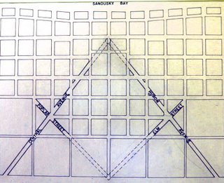
At the blog Masonic Traveler, the eponymous author makes a case, convincing, if brief, for just such a place, but no place so big or fashionable as the capital city … it's Sandusky, Ohio:
I found the city of Sandusky, Ohio, where the original grid planner, a Master Mason named Hector Kilbourne, built the biggest symbol of freemasonry right into the cities layout. Kilbourne also happened to be the first Worshipful Master of the Sandusky Masonic Lodge.
The original layout of the city's plan certainly seems to bear him out here (included from that blog for purposes of illustration):


Compare with that most culturally-recognizable of Masonic emblems, the compass-and-square logo:


It would seem as good an explanation as any.  I personally don't see any problem with baking a symbol like that into the design of a town - it makes an interesting frame to create a community around, what with its diagonal streets, triangular blocks, and interesting intersections forming possibilities for public squares and quirky parks.

Of course it depends on the symbol. If I saw a town based on a Nazi-esque approach to the swastika, I'd likely recommend quick and thorough urban renewal, were my opinion to be asked.

On to a another interesting find, ever notice how, sometimes, something sticks out and seduces you into wondering why. Josh Jackson, the author of a blog post at LOST magazine, tells us about his personal, human experience with such a thing:
Last fall, I was walking through Prospect Heights, Brooklyn, when a residence caught my eye. The building was a fairly standard one — a classic three-story brownstone built, in this case, from brick. Rather, what caught my eye was its position: it was rotated about 60 degrees from the rest of the street grid. Buildings don't build themselves, and whoever built this one located it the way they did for a reason. Especially in brownstone Brooklyn, where row houses are the dominant architectural feature, buildings usually face the street.In this case, either someone decided to build it differently or the street it once faced no longer existed.
The buildings he mentioned are near the intersection of Prospect Place and Underhill Avenue, in Brooklyn, NY. The buildings he mentioned do rather stick out like the proverbial sore thumb in a view from the air (courtesy Google Maps)…


Just as interesting to me is the way the wall, and one would imagine through inference, property line, of the building to the immediate right (east) and the lot east of that, coincide exactly with the canted buildings along Prospect Place. That diagonal street at the right-hand edge of the picture is Brooklyn's Washington Avenue, and we do immediately notice that the angle of the buildings align more with this street than they do the streets they actually abut. 

Why? I mean, we can probably deduce there was some survey before that somehow governed the different buildings, but where the real interest comes is in exactly what those reasons, now obscured by centuries of development, must have been.

In the article linked in the pull quote above, Josh goes on a quest almost Holmsian in terms of deduction and certainly compelling in terms of interest.

It might be better termed Finding Flatbush Turnpike. But read it anyway. And marvel upon the things one finds when they try to figure out the exception to the rule.

In case you don't want to scroll back up, here's the links:
The Masonic Traveler's article on Sandusky OH is at http://masonictraveler.blogspot.com/2006/10/coincidences-and-tangents-sandusky.html.
Josh Jackson's LOST Magazine article is at: http://www.lostmag.com/issue14/prospect.php.

Happy hunting.

12 December 2013

[pdx] Rich, Cold Sunrise, 12/12/13

2980.
Nothing much to say here except, my gosh, the rich color!


Taken this morning near Portland International Airport. The colors are much hotter than the weather and just as memorable.

10 December 2013

[art] What This Brony Can Teach You About Creativity and Community …

2979.
Yes, I said brony. 

Don't laugh, sit down and listen to Dr Wolf. He has a view about creativity and acquiring new hobbies that's worth listening to.

He starts out by telling you that it only takes about 20 hours to familiarize yourself with a new hobby to the point that you can start creating. This isn't much a surprise, at least not to any one of us (in which I count myself and many people I know, and I'm fortunate enough to know people who aren't satisfied just knowing what they know and doing only what they do) who's tried.

What really speaks to me is what Dr Wolf seems to have to say about learning the community around any given hobby, studying the connections, and then stepping into that playground to play. His ideas are universal, really; take out 'Brony community' and replace with 'drawing student community' or 'video-making community' and the reasoning is just as sound.

And if you do believe Friendship Is Magic, then there's lotsa cyooot pastel ponies to look at.


H/T Scott Sanford hither.

09 December 2013

[liff in the PNW] Best Places Guides Series Fades Away

2978.
Today's entry in our "The Death Of Print" file comes via Ben Lukoff on Facebook, wereupon we find that a Pacific Northwest original has published its last edition.

The biannual "Best Places" guides, apparently due to changing times and perhaps mostly the proliferation of smartphones and the absolute surfeit of review websites (I feel a bit guilty here, as I love Yelping) has made the charming local guidebook rather redundant … at least amongst the constituency that would patronize a business likely to be listed in a "Best Places" guide.

The first edition came out in 1975 to much acclaim, and 17 editions subsequently. The editor of the first (and we presume several), David Brewster, writing at Crosscut.com (a great PNW-interest website he founded) cites three major factors, as he sees them: dilution of the market by non-local publishers, a sort of "Gresham's Law" view; a loss of trust in guidebooks in general, where the reading public begins to sense there's a bit of quid pro quo going on, and the proliferation of sites like Yelp, Urbanspoon and the like, which are just a smartphone away.

The entire article has some history and is plain good story telling and reasoned opinion, and can be found at http://crosscut.com/2013/12/09/books/117825/best-places-guidebook-rip/?page=single. I highly recommend Crosscut as a place to stay current on many Washington issues as well as regional ones.

[design] Free Stuff: 196 Country Outline Vector Silhouettes From Freepik

2977.
And now, something stumbled on that will interest anyone looking into maps to use in a layout.

The online consortium Freepik has released an archive file containing 196 vector outline silhouettes of the world's countries. The icon possibilities here, as well as the artistic remix possibilities should be self-evident.

I found it via an article on Spyrestudios' blog extravaganza, and downloaded it to check it out. Here's what I found:

• Three graphic files, .ai, .eps, .pdf and .cdr, containing each of the vectors arranged on one artboard in a grid pattern. Though not immediately obvious, it's a continent-major, country-alphabetic-minor arrangement.
• Two Preview files, one in .jpg and the other .png.
• A 'cover' graphic.

This is a good collection of country outlines which will do well in any appropriate application. They're vector outlines, so anyone reading this who is looking for such a thing needs no further introduction, I think.

Two nitpicks:
• The map of Brazil is only about two-thirds of the country, lopping off the extreme western and southern parts for no discernable reason.
• There is absolutely no licensing readme at all. Spyrestudios' article mentions that this collection of vectors is licensed such that "you can use these icons commercially. No credit or link back is required!", which suggests to me unlimited rights, but the producer doesn't explicitly state this in the archive anyway. So my suggestion is proceed deliberately when using. I'm sure Spyrestudios has better things to do than to unwittingly mislead us on rights, but in this litigation-happy DMCA world, my policy on using free resources might be found to be charmingly Reaganesque: Trust, but verify. Let's be careful out there, kids!

Now that that ugliness is out of the way, you can check them out for yourselves:

[art] How-To Art, in the Days Before North Light Books, et. al.

2976.
While assistance in creating one's self an artist has been been findable, the format has gone through some surprising (at least to YT) evolution. Maybe I shouldn't be surprised, in retrospect, but it just seems amazing to me that the how-to art book hasn't been anything other than a medium-to-large, glossy, fun-to-look-at and exciting-to-hold explosion of color and photography that makes you feel as though you're looking over the artist's shoulder as they demonstrate it to you.

But art how-to books weren't always the satisfying fun that they are now. Found about a week back at Periodicals Paradise that, quite honestly, surprised me in its aspect. Here's what it looks like:


How To Draw and Paint, by Henry Gasser. This paperback … in the popular format so widespread in those days … claimed to be able to impart to the beginner the techniques needed to get started in a variety of media and popular materials. And it's just this little paperback.

The introduction sounds big-chested and confident:
"Do it yourself!" Every day new thousands of American men and women alike, are discoverign the fun, the deep and lasting satisfaction they can derive from making things themselves, with their own hands.
This book is addressed to the aristrocrat of all "do-it-yourselfers" – to you, the beginning artist. Whatever your goal in art – whether you hope to become another Rermbrandt, a top-flight commercial artist, or just a happy amateur – How to Draw and Paint should help smooth the way for you.
Makes some big promises to be sure, and the enthusiastic and chest-thumping "American DIY pride awesome" text not only connects the urge to learn to a great democratic American tradition but also pats the self-trained artist on the back with special strokes – you aristocrat, you! But after leafing through this book, those promises are more than just hand-waving, huffing-and-puffing. Somehow, the artist-author has indeed managed to squeeze into this little 240-page book the basic tips and ideas that wouldn't get you all the way to Rembrandt stage but some first steps on the road, and if you were looking for enough protips to start arting around for your own self, well, this would probably get you most of the way there.

And casein! This little guy will get you started in casein, which I don't see a lot of how-tos on these days. His wheelhouse, it is big.


The obverse, as can be seen above, is an ad for the Grumbacher line of art supplies, a line whose name stands pretty tall as one of the American old-guard, and whose products can still be found in art stores today, though its reputation seems a bit more pedestrian than the Gamblins and such … more of a poor-artist's Winsor and Newton.

What really surprised me was the amount of availability this book had as far as even this edition went. I found it for sale on eBay here, here and here.  It's apparently been through several printings; this availability on Amazon UK suggests a larger format and a more modern cover.

If you ever find one of these in a used bookstore, get it. It's a fun read, and actually kind of solid, even in todays world of art how-tos that do everything but draw your drawings for you.

08 December 2013

[art] If You Don't Want To Use Adobe Illustrator CC …

2975.There are many reasons why a digital artist would not want to (or can't) use Adobe Illustrator. Cost and the hazards of the cloud are two reasons I've heard; there are those I've spoken with who still can't wrap their brains around the idea of a application you have to subscribe to to have continue to work (and I'll admit, I'm one of them). The idea of your personal information getting compromised (as has recently happened to Adobe) does not argue, at least not to me, in favor of the idea of the cloud.

I'm a bit old fashioned, so go ahead, point and laugh, and let's get past this together.

If Adobe Illustrator seems no longer a viable idea, or if your budget puts it out of the question,  this article at Spoon Graphics gives you ways to go. Vector drawing is a thing, and other applications are more routes to that thing. I've tried Inkscape before, and I like it; I'm installing it on my iMac right now to get a better taste.

The link is: http://blog.spoongraphics.co.uk/articles/7-adobe-illustrator-alternatives-for-the-casual-designer

[pdx_liff] #OregonSnowmageddon2013

2974.Yeah, it happened again. Bunch of snow and hideously cold weather hit the Pacific Northwest, and Portland in particular.

Here's some scenes from a certain transit home from work on a certain recent Friday morning for a certain 3rd shifter involved in a branch of the transportation industry.


SE 102nd and Stark Street, in the bustling Oregon metropolis of Russellville, which is actually a sub-metropolis of Portland.

This'll be notable for recording the gas prices on a certain Friday morning in December 2013 as anything else.

This next shot proves that there are some stretches of Hawthorne Blvd that are less fashionable than others, but just as cold and wintry. More evergreen trees, too!


Next, SE Stark and 122nd, looking east. Look at that line of headlights dwindling into the east there. Not only was the traffic on the greater Portland freeway system historic, but the side streets were no great shakes neither. But interesting looking.


SE Stark, looking east from about 112th Avenue. They say, today, in the weather, now that we're in Bitter-cold-and-the-water-in-your-bathroom-pipes-is-frozen-and-I-hope-to-God-they-haven't-burst-alypse 2013, Oregon is actually a few degrees colder than Alaska.

So now we know where Alaska goes for vacations.

Here.


While it is personally easier to survive steely cold snaps than it is the heatwaves (one can always put on another layer) it's no less horrid. The prolonged extraordinary cold can be just as oppressive as the hot, and just about as enjoyable. We look forward to the warming this coming week with a mixture of eagerness and apprehension - those frozen pipes don't exactly encourage.

Seeing "12 degrees" on the home weather station is only amusing for just so long, and it's a lot of a shorter time than you'd otherwise think, oddly enough.

And so it goes.

04 December 2013

[art] What To Do With Your Uncalendar™ If You Aren't Really Collecting Clients Right Now

2973.The Uncalendar is my favoritist paper toy right now. It takes a head full of buzz and fuzz and tempts me to create order. Me and discipline have never been the best of friends.

But right now I'm back in Finnegan* mode, and am not exactly trying to crowd it with events and clients. So what to do? Well, since anything goes, and it's a nifty frame to hang things on

… idea scrapbook!


… a parking stub from OryCon 35, some randome thoughts pinned down and stunned with formaldehyde and displayed, and 2 versions of a logo concept.


… Samantha Phillips' SIG image, and some more notes.

The little graph about 2/3s of the way down the left-hand margin of the verso is serving as a checkmark. If the idea to create can be quantified, I can sum the number of checks in three activities: "Write" (diary primarily right now), "Blog" (you're looking at it, I can check it off!) and "Draw" (still trying to negate inertia there. Number of checmarks/21 gives a decimal fraction that will increase as I push myself to do more.

Get you some Uncalendar (why don't you guys have a FB? I'd like that so hard!)

* Finnegan mode: Beginning again.

03 December 2013

[photoshoppery] RPG Sig Image Design - Samantha Phillips

2972.Just completed this for a friend who loves her some Star Trek online roleplay …


It's simple Photoshoppery, but it's fun. Best to keep ones hand in.

Bored? Short of work? Find a tech friend who needs a favor. Give a gift to someone you like. Knock off a bit of Photoshop for them.

[liff] Caffeine über alles

2971.Dept of "Things-we-keep-close-to-our-heart" Dept.


[art] Hillsdale Art Supply Company … Art Is Local, Now In Southwest Portland

2970.I've been following their adventures since they debuted on the Book of Face.

Frisky posts, come-hither art supply photos.

Awww, you know you had me at phthalo blue.

Around the side of the Jade Dragon Restaurant, at 6327 SW Capitol Highway, in the Hillsdale Center, in downtown Hillsdale (notice a pattern?) there is a little gem of a store you have to see and enjoy.

Appropriately named, it's the Hillsdale Art Supply Company.

It's a search, but it's worth the find.


Just go in the door behind the modest sign …


… and then enter a cozy-yet-spacious world. In the words of the owners, it's a small shop in Sw. Portland, run by two, artist moms. We sell New  Recycled Art Supplies and some locally made art too. It's a terse yet apt description.

It's a small shop, yet it seems large.


What caught The Wife™'s eye was this case full of used pastels. She loves pastels; this is still a land I have but to timidly explore. These are good-quality useds; not junk, but art materials looking for someone to give pastels a try.

Fill a bag with what catches your eye, fork over a fiver, and they're yours.


They have pleasant knick-knacks. I used my digital camera to take a pic of this analog TLR, because meta.


The used and recycled art … seriously, westsiders, you need to get in here. There are retired drafting gear, airbrush paint and airbrushes (no compressor, alas, but anyone cagey enough to find pretty used airbrushes probably have a line on a compressor already), bits and bobs for scrapbookers …

We were most pleased with the variety that Hillsdale could pack in their cozy space, and the good quality.

Here's a find. Wife is a Crayola nut. Collects Crayola sets. And when she found this:


… where do you think it went? Home with us? Oh, yeah. And the chalk was in terrifically usable condition. This other box of chalk:


Well, its contents were near-to-pristine, even if the box was pleasantly-distressed. I'd use that photo for a color reference.

They're not all about used, you want the new, they got it. Good prices on the Golden acrylics:


Got watercolors, Gamblin oils. Yeah, they're serious about it. As well as about the art. There's funky, quirky art and sculpture all over the shop, all for sale.


Hillsdale is part of the new breed of local art supply stores, joining Muse and I've Been Framed in the class of art stores run by artists, for artists, both tyro and experienced. Classes are offered; enthusiasm is obvious. The new breed of local art supply stores are as much about making new artists and getting them to make new art as it is to sell to people who are already arting around.

Lots of good reasons there: more people making more art are having more fun in the trying; more art around is a more colorful world, and creating repeat customers (hey, they are a business, so no harm there!)

Here's a look at just part of the recycled items wall:


Any scrapbooker or collagist that steps away from those shelves without an inspiration should just go have their pulse checked, because you probably don't have one.

Only (so far as I know) available at Hillsdale is this nifty Portland wrapping paper. Have a look:


… send your friends in other towns (who wish they lived here, c'mon, you know everyone wishes they were really a Portlander) packages literally wrapped in Portlandia.

The cute knicknacks – just can't outro without sharing this, which we all laughed at:


You read that tag line right, pard. Safe. Fun. Constructive. 

I mean, I don't doubt it's fun … but Safe? Constructive? I can see the manufacturer used a dictionary that's loong out of date.

We're fortunate here in Portland. Local artists wanting to create other artists … a people's artist paradise we are. Stores like Muse, IBF, and now, Hillsdale, lead the way.

Support Hillsdale, you westsiders.


Follow their advice. Go out … and MAKE ART.

UPDATE: Looks like I'm not the only blogger who's noticed: see http://tansydolls.blogspot.com/2013/06/hillsdale-art-supply-company.html