126o. Once again I'm riffing on Empty Easel's Photoshop-tutes-for-the-people, which I think is a pretty cool thing.
I too find the Pen tool mad useful for defining selections. There's a maxim that covers use of Photoshop – select it, then affect it – which I've found to be a good guiding light when I'm not sure where to go with what I'm doing. Selecting things in PS is half the battle to using it, and EE's information shows you how to use the Path Tool (a/k/a the Pen Tool) to create selections.
I mention this because when I use PS I frequently find myself using some paths time and again to create selections or fill areas with color, what have you. It just takes two clicks:
First, go to the Paths palette (or Panel in CS3):
To start the save, double-click on the path thumnail. A rather small dialog box will open:
Type the name you want to have the path to have (remember making it meaningful makes it more useful) and click OK.
Notice the change in the thumbnail and the path name.
Now you can drag this down to the selection button, create selections, stroke the path, whatever you can do with the path, just like Empty Easel shows you – and it's saved in a meaningful way.
It certainly helps me keep the welter of information in the rich PS UI nailed down.
1259. I just realized I had a Channel Surfing chapter of the 10's up and I've not posted it. Bad me! So, without further ado, here we go.
Wichita's channel 10, KAKE, is on your side. When I was a kid, if you had cake on your side, you were a messy eater due for the bath (and maybe with a cuff on the head)...
And now, Channel 10, Goodland KS. KBSL ... nothing much original here. Coverage you can count on, familiar sliver-crescent that looks more like a bowshock with the little flare of light along it. I guess that CBS eye also doubles as a navigational deflector ...
Next we have KENV, Channel 10, Elko NV. Yeah, I know ... I thought a place like Elko was too small to have a station, but it does. It, like many micro-market stations, provide entertainment by broadcasting an adjacent large-market station's content (in this case the feed is from Reno's KRNV Channel 4). It bills itself as the only local station serving northeastern Nevada, and we believe them at that. But thier "little engine that could" newscast really won me over with its heart and charm.
How small is KENV? I never noticed any reporters, as such – the people being interviewed usually held their own mikes. Looks like the news photog was the only person in the remote crew. You can view thier entire newscast at the KENV home page here, but be warned ... the volume is a little loud.
Next, we have KFDA Channel 10, Amarillo – burly 10 filling the frame, CBS eye completing the square by pinning down the corner. This works well. And they're channeling news with a burshed-metal sheen:
KGTV is SanDiego's NBC, Channel 10, who hides the call under a bushel as so many do. But they do bring the sun motif, which is in character for a Pacific coast city at that latitude, into the design very well. Dynamic tension is provided by allowing the 10 to touch the side of the circle, opening it up:
Down in hurricane country, KLFY, Lafayette, LA, embraces the whirlwind with a logo that looks derived from the meterological symbol for them:
KMOT, Channel 10, Minot ND, serves Williston on satellite channel 8. The similar logo treatments are another example of consistent branding. The obliqued numerals and the off-center parallellogram are playfula and energetic:
KTMF, Channel 10, Helena MT is being included here because it's Channel 10 ... definitely not due to its design-free logo (Couldn't they have made it Helena's The CW? Couldn't afford an apostrophe-s? What? And apparently they used up the design budget before all the letters in HELENA were properly kerned):
KOLN 10, Lincoln, co-brands with KGIN, 11, Grand Island NE, for a cool unified logo that also reaps the whirlwind (though being Nebraska, we're thinking tornado instead of hurricane):
KOLR, channel 10 Springfield MO, depends on the heavily obliqued bold type to get the impression of energy across, and blue and gold never go out of style:
KSAZ, Phoenix's FOX station, gets points for making the zero in the 10 look just like the O in FOX, which unifies the design. However, since I've said before I hate that zero/O, I take the points back, making it a wash.
KTEN has the luck of having the best call sign a channel 10 could have. Serving the mythical land of Texoma with a brushed-metal dominance, the two glyphs merge into one:
The flat color on the peacock tail feathers (in the coverage you can count on position) is interesting; mostly stations tend to give them a highlight to make them look 3D.
KTTC, Rochester NY, hides its channel number rather than its call:
KTVE, Monroe LA, has a dramatic presentation that's almost chirascuro. There is chrome, naturally:
I enjoy KTVL, Medford OR's, logo. It works on a level that's a little hard to put into words, but the interplay of shape and color just are nicely done here – as is aligning the CBS eye to the crook in the shoulder of the 1, and the use of Eurostile:
KTWX, Waco, TX, presents two eternal Texas verities; the red-white-blue color scheme, and the Lone Star. The two numerics are merged into one shape, and the star stands smartly at the center of the circle:
KXTV, Sacramento, doesn't make use of the cool call sign with the X (for 10) in the middle. It does have a pretty decent treatment, though, with the businesslike letterforms:
The backwards barb on the underline is an interesting visual reinforcement.
KZTV brings Action News to Corpus Christi with cool blue and metallic type all nailed down with the eye in the middle:
WALA, Mobile AL, gets originality points for making the channel number a fully-minuscule "ten" which has the audacity to sidle up against the "you will be assimilated" FOX logo. Like many FOX stations, though, the call is absent ... and when you have a fun one like WALA, that's just unfair:
Albany, GA, gave us the musical group REM and a whole musical school which emanated from there through the 90's. Something about the 10 in the logo seems to make sense with the musical sensibility down in those parts:
Coverage you can count on provided courtesy of the Peacock, of course.
WAVY, Channel 10, Norfolk VA doesn't display its call sign. It doesn't have to. This is brilliant work ... the way the design is unified by the eye completing the wave shape:
WBIR TV, channel 10, Knoxville TN, does a clever thing with the heart that connects the 1 and the 0. Their slogan happens to be Straight From the Heart ...
WNBS, Channel 10, Columbus OH ... Just the facts, just the 10:
The logo of Channel 10, WBUP, Ishpeming MI (on the Upper Peninsula) look very DIY, but they work. I'd not oblique the call if it's going to live in the same circle as the number though. And if I ever get rich and famous, I'm giving $100 to the best non-serious explanation of what an Ishpeming could be (other that what it really is, some native American word for something or other):
WCAU, Philadelphia, brands itself as NBC 10 ... the logo is a simple thing, notable because they use Copperplate for the letters NBC rather than the house style:
On the Iron Range, it's WDIO and its sister WIRT serving Duluth and Hibbing, MN. They too combine thier numbers into a distinctive look that works hand in globe with the ABC logo (and I enjoy the whimsy with the curvy slash)
WGEM, Quincy IL, gets its message across with lustrous gem-tones ... but no "10" ...
WHEC, Rochester, NY: News on the vertical, 10 on the horizonal. This adapts no doubt very well to mic flags, demonstrating appropriatenss of application:
WILX, Lansing MI's Channel 10, has a logo that works as a jacket patch:
WIS, channel 10, Columbia SC – we've seen this "knocked-out" 10 elsewhere, but this is a different take on it, with no obliquing and 3D shading that I find kind of funky:
WJAR, Providence RI, has the same design as Philly's WCAU:
WKNO, Channel 10, Memphis, is eductional ("W-Know") and does us the dignity of including the channel number:
I enjoy the "raster-scan" lines there. Nice touch.
WPLG, Miami, goes the "Miami Vice" route – rich color, dynamic presentation with the swoopy swoosh. The color bars further iconize the merged-numeric 10:
WSLS, Roanoke VA ... sliver crescent, "on your side" ... yawn ...
WTAJ, Altoona PA, has a very cool look ... the grooved parallelogram, the unexpected and cool detailing in the numerals bringing it very much alive:
WTEN, Albany, NY, also plays it straight though the green and yellow color scheme is more of what I'd expect of a sports team rather than a news team:
WTHI, Terre Haute IN, has a type style that looks the same but does a cool cut-out parallelogram thing with the 10 which I enjoy (and gives the eye a place to be):
WTSP, Tampa, does a WAVY-type thing, in that a water-reference is used well (not as cool as WAVY, but well done ... nothing personal, WTSP, but nobody can out-wave WAVY):
And lastly, WWTV, Channel 9, serves the eastern Upper and Northern Lower Peninsulas of Michigan from Cadillac, and has a satellite station WWUP to cover its market, which is reputed to be the largest market in area in the US:
Join us next time on Channel Surfing, where one and one will make eleven. Take us out, baker man:
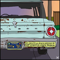
1257. Being proud of your family ... that's what really counts, isn't it?
An historical note: a long time ago, Oregon license plates were yellow on blue. During the same period, so were Cali's, but the numbers actually came in front of the letters. I remember distinctly an episode of Adam 12 where Malloy asks Reed "you know how to tell the difference between Oregon and California plates, don't you?" and Reed gives the correct answer.
No point there except to tell the story.
Also, mad points to Stan for getting the whole thing down; the rustbucket Ford Falcon really makes the joke.
1253. The blogger at Howdy from Moresville, a resident of Denver (Quark, Inc's home town) has gone from being a Quarkster to an InDesignista:
In the meantime, I'm a convert--and I feel sort of bad in saying this, seeing as how I spend some days less than 50 yards from said software's headquarters.
1252. Cafe Unknown has a very thought provoking post on the influence of Robert Moses on urban design and planning and how it left its mark on Portland, making some of the urban design and development issues we have today not only possible but (in our opinion) in some cases, necessary).
1250. Everything seems to be rated on a scale, and the 2008 Vancouver Twister is no execption. It was, the consensus seems to be leaning to, an F0 storm .. and F1 at best, with estimated winds somewhere between 65 and 153 mph.
The metric for estmating tornado strenght is the so-called Enhanced Fujita Scale. This provides six levels of strength, EF0-EF5, (usually simply said F0-F5 in the parlance, in the style of the earlier Fujita Scale.
The thing to understand about the EFS, though, is that it is a quantification of damage produced by the storm, which is used to infer the likely range of wind speeds. It's about as easy to measure actual wind speed as it is to hit ... oh, I don't know, a 2-meter thermal exhaust port.
And it is the National Weather Service that makes the final call on whether or not something was a twister, but judging by the pictures that all the newsers have up, it's hard to see that it was anything but.
1248. Head back from Robin at W+K today, thanking me for my submission (which was, in fact the street blade poster here) and giving me a timeline for when I should expect a reply. Exciting! Also she invited me to send along a resume.
One of the strange things of my current life is that I have and maintain a resume. Before I had graphical ambitions, I was the kind of worker that didn't really need a resume. Now that I have such a personal obligation, I find coming up with them rather fun, and it's a challenge to include a little humor and not too much irreverence. Here's a very recent one:
Yes, I am a TV kid. C'est la guerre, mon cher. And so it goes.
1247. And they both hit Vancouver. Talk about bad luck.
Carl Click, KATU News:
I talked to a sheriff's deputy, and he said that that tornado came off Vancouver Lake and touched down at 78th and Fruit Valley Road, now that's before you get to I-5, before you get to Highway 99, before you get out to Saint Johns* where that billboard was down, I'm now up in the hills just above that, I see a big, huge tree that came down, and it's, ah, leaning against the house, ah, big, huge section of a fir tree, ah, came down, and that police officer, that sheriff's deputy, told me that there are several big trees down on Fruit Valley Road ...
The last time a real tornado tore up the ground in the Portland metropolitan area was also in Vancouver. On 5 April 72, according to Waymarking.com:
On April 5, 1972, a F3 tornado struck at 12:51 PM, leaving death and devastation in its nine-mile path across the east side of Vancouver to the Brush Prairie area. A Waremart grocery store lay in rubble. A bowling alley was damaged. Peter S. Odgen Elementary School was demolished. Students and faculty from Fort Vancouver High School had watched the elementary school collapse and without a second thought, they ran to help the children. They lifted the debris off the children and performed some first aid.
This doesn't look as ruinous. The trouble with twisters in the PNW is that since the odds are so staggeringly against one and there isn't a "tornado season" as such they tend to strike without any warning and frequently nobody is watching. It'll be a surprise indeed if someone gets a picture of this one.
* There is also a section of Vancouver called Saint Johns (for those of you Portlanders who don't know). It's east of I-5, and just north of S.R. 500. This storm tracked almost due east.
1246. No, no Mario! No Princess here! Try Next Castle ... maybe Yankee Candle, or The Body Shoppe, or Hot Topic (but just between you and me, I think she's at Spencer Gifts).
1245. We note in passing that 94/7fm has announced that they have selected 20 finalists, and the work will be unveiled at the Industrial Design Center at the Art Institute of Portland, 722 NW Couch, Saturday, January 19th, from 5-7pm, at which time the winner – whose art will be wrapped on the Scion they will win, will be revealed.
They also say that the 20 finalists will be notified by email. Knowing how fast email goes out these days, and inasmuch as we haven't gotten such an email, we suspect we have not made the cut. Will advise as circumstances warrant, of course.
I am head over heels in love with this building, as I've said before, and I don't care who knows it. Yay, us! Raise a glass of Hefeweisen or pinot noir or what-have-you (got any Portland Punch around?)!