

We have a new name for the next generation of MSWin...as well as a subtly different logo style.
The current version of the Windows logo is a refinement of a long time standard. The latter days of Windows version 3 saw the beginning of the abstraction of the logo from the real-world 4-paned casement window into a four-color block with a flag-like ripple. Win95 and 98 took the abstraction further with a pattern of black and colored blocks coalescing to form the logo, as views left to right; a tilt, a sky-with-clouds background and a lens flare on the upper left corner connoted dynamic energy and an excited flow into the future. The adoption of a clean, Helvetica-like font for the typography connoted precise engineering and design (putting whatever one's opinion of the actual product experience might be).
WinXP advanced the abstraction by removing the window fram altogether. The resulting flag retains the colors used so far for each of the panes and the tilted aspect, respecting the brand's past, the even-more-simplified representation speaks of sophistication through simplicity. The "Microsoft" corp name remains but its importance is diminished through hierarchy-Windows is what it's all about.
One of the most talked about product developments of late is the next generation Windows, fashionably and famously known by its developer codename of Longhorn (or, to its critics, Longwait, Long March, or just "Moo"). Earlier today the media showed reports of a Longhorn's new public face: it's marketing name and logo.
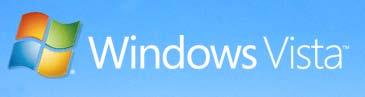 Windows Vista was announced on the Microsoft page with a view of a man and woman on a mountaintop looking into a wide vista composed of clouds and other mountaintops peeking through. The typography...which seems to be the same font used before...has been lightened for the main product name and even moreso for the product point-name, which I take as even more sophistication by simplification. The highlights on the flag have changed, from realistic ripples to a white flash in the middle which feathers out from the center. If the symbolism of that is unclear, at least it gets the attention on a subtle level, encouraging the user to keep thier eye out for Microsoft's Next Big Thing[tm]
No comments:
Post a Comment