
 Dig, if you will, this picture.
As we've written here in the past, the Portland address system wasn't created, it evolved, mostly of necessity: the City of Portland as we know it today is the successor entity to three independent cities (Portland, East Portland, and Albina) founded at the Stumptown Bend in the middle third of the 19th Century which consolidated in circa 1890. The three towns had thier own system of street naming, moreover, plat developers were allowed to name thier subdivisions whatever they wished.
Between 1890 and 1930, the system began to develop a uniform characteristic until it was at last unified and rationalized into the form we know it today.
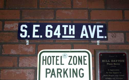
We all are familiar with the white-on-green, just-the-facts, straightforward style of the Portland street sign of today. They, of course, were not always thus. Before the Great Renaming and up to the time of the Rationalization, there was yet another style. and from the Rationalization to the modern style, signs likely looked as you see it in the picture we included. The difference, with white on very dark blue and glyphs with no curves whatsoever, is utilitarian, spartan yet with a certain indefinable Portland character of thier own. The look of the sign agrees with the look of signs I've seen in older pictures of Portland streetscenes which, sadly, I have no access to at this time.
The history of the Portland street sign is something we've long wanted to assay, regrettably, there is next to nothing available on the subject. There is a style we're going to have to draw up (probably as an Illustrator file) ourselves if we're going to show it off, as the only sources we have are poorly-resolved photos of another time published in that fabulous calendar with Portland scenes of years past which is available yearly at Powell's.
The example sign can be seen, incidentally, bolted to the wall at a restaurant called Pizza Baron, which is on SE 122nd Avenue just south of Division Street, in the shopping strip behind the All That Glitters pawnshop with the big bright animated sign in front, almost next to the Sears service center. The pizza, we must add, is fiiiine, with a crisp thin crust that will remind you of the great days of "pizza parlors", such as Shakeys.
Good times.
Technorati Tags: Address Nerd, Portland Oregon, Portland Street Signs, Portland Street Blades
1 comment:
That's the one thing I forgot to do when I was at Pizza Baron...measure the thing. I thought about it only after I'd left.
I suppose that I could infer the size from the bricks and such surrounding, but I'd probably just get that wrong.
Post a Comment