Well, it won't be that scary, but still.
At the quite rather funny LMNOP, there's a Halloween special: America's Most Fonted, seven atrocious fonts made even more atrocious by thier faddish overuse. Naturally, MS Comic Sans makes the top of the list (nothing personal, Vincent, I'm sure), but there are also fonts out there that are just tore up from the floor up that you didn't know had wormed thier way into way-too-widespread use until someone pointed it out to you.
People wonder why typophiles get all up ons (a phrase I use here incorrectly) over things like that. They wonder, that is, until you see fonts like MS Comic Sans and Curlz on warning signs like "High Voltage". And I've seen both.
That usually changes people.
And, over on Designorati, Pariah Burke has once again mounted a popular feature–300 free Halloween fonts. People love free fonts, and these are universally cool for private use, to give your Halloween documents that "spooky" touch.
Technorati Tags: Fonts, Comic Sans, LMNOP, Designorati, Free Fonts

By Samuel John Klein of Portland, Oregon - Graphic Designer without Portfolio, aspiring artist who dawdled too long.
29 October 2006
22 October 2006
[bloggage] 25 Words On Successful Blog
Over at Successful-Blog, Liz Strauss is haveing a friendly little party. In 25 words (that's 24+1, mind) say what SB means to you. Here's what it means to me:
What it means is inspiration. Inspration changes thoughts into action, and takes what you want to do into the realm of what you actually do. It's important to have your eggs in more than one basket, and some of my inspiration eggs live in a compartment called "Successful Blog".
Technorati Tags: bloggage, ME Strauss, Successful Blog, tools, inspiration
Successful-Blog is a bung-puller. That's the plug that holds all the good stuff in the cask; pull the bung–it's all yours.
What it means is inspiration. Inspration changes thoughts into action, and takes what you want to do into the realm of what you actually do. It's important to have your eggs in more than one basket, and some of my inspiration eggs live in a compartment called "Successful Blog".
Technorati Tags: bloggage, ME Strauss, Successful Blog, tools, inspiration
18 October 2006
[design] Pariah S Burke Cracks the Multi-Page Size Code in InDesign
Pariah S. Burke has broken the one file=one page size law. Designers all over the world should rejoice about this one.
The first question InDesign (or QuarkXPress, for that matter) will ask the user on creating a new layout is "What size sheet are you gonna use?" You only get one choice. QuarkXPress has, since 6.5, had a new Project format which can be made up of multiple layouts, but the ingrained habits of layout artists die a hard death indeed; what many layouters have wanted was, say, a file in which several page-size spreads can live in the very same file with, say, a few legal-size foldouts (maps, for ex) and a few business cards...or even a layout file which contains all the components of your average business system (letterhead, business card, envelope) in one single file.
Pariah has teamed up with some very smart people who have caused this vision to become reality for Adobe Creative Suite users. In conjuction with the big brains behind the after-market Indy plugin maker DTP Tools, we now have this solution in the form of the plugin called PageControl.
It not only allows you to have a single Indy layout with multiple and nonstandard page sizes it also allows you resize odd sized pages at will, resize master pages and have those pages they refer to autmatically resize, and more. And since it's all the same document, you can have the same running information–page numbers, for example–continue thoroughout.
I'm proud to say that I got to beta-test this; it works like magic.
You can get a trial download (or just go ahead and buy it for $59) at DTP Tools' website here. Read Pariah's release about it on QuarkVsInDesign here.
Technorati Tags: design, PageControl, Multi-page layout, DTP Tools, InDesign, Mac, Windows
[design] In-House: The Nuts and The Bolts
Being an in-house creative is more than just breaking open QuarkXPress or InDesign and being **brilliant** .
In the case of my new part-time job, it involves a good deal of basic DAM–digital assets management.
The problem at the current posting is that while the designers who preceded me were evidently able individuals (and doubtlessly more adept than myself) the filing system is, to be generous, ad hoc, and, to be blunt, nonexistent as such.
There are a slew of folders that, while descriptively-named, were not organized or named according to any convention or method. Photos, when imported from the digital camera into iPhoto (the platform is a 1.0 GHz PowerMac G4, MDD case) were not always named (there are a metric buttload of files named DSCNxxxx.jpg, where x is a number from 0-9...you digital photgraphers know what I mean here) and when they were named, weren't named according to a consistent pattern.
Disorganization rules on the publications as well. The place is a Quark shop, but they also use MSWord for layout of trifold brochures. Some photos are embedded within them, so not only do we have files all over about .75 Terabyte of disk (two drives in the Mac and three FireWire drives outboard) that are essentially floating about but we also have pictures that we have to go into .docs to find (had to do that once already).
Good times.
My boss is dissatisfied with iPhoto (I don't blame him) and the other DAM photo management tools I've tried out so far have been lacking in some small but important way (it's important, for instance, that when a user deletes a photo from the desktop, if that's where they're putting it, it also doesn't go to the trash).
So, I'm going for basics now. The idea is to have a standard folder structure for storing files and a standard naming convention. I've blocked out the rationale for the folder structure, now I'm searching the hard drives, finding image files and organizing them into OS X Smart Folders. From there I'll see what we have, to begin with, and try to block in the outlines of a naming convention for images. We'll start with small stuff and see what works–and this is a challenge, because the place's stock in trade is something I'm also simultaneously learning to recognize.
The object is to have a file structure that is easy to find one's way around on and simple to maintain, and that's important because while the designer uses the station for graphics production in the main, others in the office have to come along, add items, and find them on thier own. In the future, if I get as good as I want to with things such as AppleScript and Python, I just may craft a custom solution. We'll see how that goes.
I am, by the way, becoming good at Spotlight and Smart Folders. By necessity. But I want to push my own envelope.
Technorati Tags: design, in-house design, digital asset management, DAM
17 October 2006
[or_politics] So, O, How's That Saxton Endorsement Working Out For You?
As a Democratic voter I was as astounded as anyone by that bizarre Saxton endorsement TheO on Sunday, and found myself wondering if the paper had been paying attention to its own reportage over the past few months.
I will admit to a bit of despair. What is it with these people? I'm an Apple Mac user and they accuse me of living in a reality-distortion field? Although, I do wonder if someone let Reinhard have the keys to the car that weekend; it reads like one of his columns.
Looking at todays Letters page in Living provides some substantial salve for the soul. From TheO:
Remember what Abe Lincoln said, boys: you can't fool all the people all the time. I know it looks that way these days. But you really can't. And if you insist on trying, eventually..well, you'll kinda look foolish.
And not in the good way.
Technorati Tags: Oregon Politics, Ted Kulongoski, Ron Saxton, Oregon Governor
I will admit to a bit of despair. What is it with these people? I'm an Apple Mac user and they accuse me of living in a reality-distortion field? Although, I do wonder if someone let Reinhard have the keys to the car that weekend; it reads like one of his columns.
Looking at todays Letters page in Living provides some substantial salve for the soul. From TheO:
From Saturday afternoon, when The Oregonian's endorsement of Ron Saxton for governor first appeared...we recieved 140 letters in response. All but four criticized the endorsement and pledged support to Gov. Ted Kulongoski.Emphasis is emphatically mine.
Remember what Abe Lincoln said, boys: you can't fool all the people all the time. I know it looks that way these days. But you really can't. And if you insist on trying, eventually..well, you'll kinda look foolish.
And not in the good way.
Technorati Tags: Oregon Politics, Ted Kulongoski, Ron Saxton, Oregon Governor
10 October 2006
[design] In-House: That Fine Feeling of Accomplishment
I had a great experience today.
Since two weeks now I've been doing in-house design part-time for a Vancouver firm. The priority project of the week has been a magazine ad.
Now, the ad itself was designed by a person already affiliated with the firm before I got there. I will not comment on the style; that'd be talking out of school to say the least. She had gotten it into the shape she'd wanted it and needed me to take it the rest of the way; make sure it was tight. And this was done.
But the thing that was really a kick was troubleshooting the file. Some of the image files were, to be honest, lacklustre–and while I won't reveal what it is or what they do (beside the point as well as giving away stuff which I ought not to)–I will go so far as to say that lacklustre photos of these subjects kind of defeat the point.
Turned out the deficiencies were twofold: The wrong color model (RGB, of course should be CMYK for print) and low, low rez (72 ppi). Upping the rez to 300 ppi really made the subjects sharpen up, and changing the color model did darken the image on screen just a tic but the colors became much deeper, much more thrilling. The difference was obvious.
Another thing I did was in kind of a consultative mien. The ad's designer discussed some fine points of the ad with me and we batted around colors and positioning of text vs. photographs, white-on-black or white-on-color and such.
My point here is that, operating as I was today, I helped make people's plans in the organization I was in real, helped make them happen and, in the end, completed the design chain.
This is what a designer does: problem solving.
Technorati Tags: design, in-house
08 October 2006
[design] Illustrator: It's Not Just For Breakfast Anymore
 One of the things I love reading about is how other creatives use thier tools. The things they use them for gives an exceptional insight in how flexible and liberating these digital applications are.
What caught my eye today was the way a local blogger, Terry Grant, uses Illy to aid and abet her quilting. I myself in the past have done drawings and I have a big drawing desk that's still on of my most inspiring pieces of furniture; just sitting down in front of it is enough to get the creative juices flowing. And, when I'm in full effect, I have my drawing affixed to it and reference drawings taped up and scattered about the edges. The way she uses layers to hold reference drawings reminds me very much of this.
Terry also sagely assays a very big reason why vector drawing programs, such as Illy, are essential to the digital creative artist. From her blog entry:
I enlarged my drawing to the size I wanted it. (That's a great thing about Illustrator—it is a vector image that can be enlarged to whatever size you want with no loss of quality)This is an important point. While pixel-oriented editors such as Photoshop (for the high end), PaintShop Pro (for the middle) and even lowly MS Paint (for the tyro) are very capable programs, enlarging parts of those drawings also enlarges the pixels they are made up of, rendering your enlargment blocky. Vector drawings, on the other hand, are made up of paths, and are stored as x,y coordinates with an equation that tells the program how to draw the line that connects the two. That means that no matter how you scale the object in question (or zoom in), a resolution-independent line with the proper attributes is simply redrawn by the software with no pixelation.
Read Terry's blog entry via this link.
Technorati Tags: design, Adobe Illustrator
07 October 2006
[distractions] The Last Word On Hell's Kitchen...Seriously.
A confession: for a little while I was also hoping to make a little traffic off the interest in Hell's Kitchen, trying to find little bits of the career of Heather West and, naturally, Gordon Ramsay, who's become something of a hero to me.
In this entry I was planning to append things I found out about any subsequent doings. As time wore on things dropped off, which I expected, but any appeal I had issued for tips fell on apparently uninterested ears despite the hits it generated (and it still does pick up a few hits now and again). There was never any demand to expand it into a blog of its own, though we were kind of hoping.
So, the buzzing little source I was hoping to become didn't pan out; so it goes. Time to tie this loose end off and move on. We do, however, look very much forward to next year, and what happens in the third series of HK.
If a drib or a drab of Heather news comes our way, count on it going up, of course!
Saynoara till then, donkeys!
Technorati Tags: Gordon Ramsay, Hell's Kitchen, Heather West
06 October 2006
[liff] It's Been a Big Pile Of Busy, All of a Sudd
Since I accepted the part-time design job, I've been a bit rushed. But it's in a good way; it's like it was in school, but no homework to stress about, so I still have my free time.
However, my contribution to Designorati and QuarkVSInDesign have suffered, which is, of course, a bad thing, and I have a logo project I need to complete. Those are my current priorities. After that, I have a big pile of neglect to get into...
Once again, we find, that liff is never cut and dried, even when it is cut and dried.
Technorati Tags: liff, Samuel John Klein, Zehnkatzen
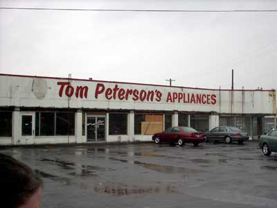
[pdx] Now, That Was Tom Peterson's!
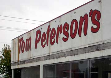 A recent rainy Tuesday afternoon had us out at the corner of SE 82nd and Foster Road. The Wife™ wanted produce. I, on the other hand, wanted pixs.
A week or two prior, I can't remember why, we found ourselves near the cross of 82 and Foster and found that the old Tom Peterson's store had undergone some changes. Off had come the mustard-and-earth-toned metal siding, revealing Tom's 82nd Avenue flagship is an echo of what it once was.
The thing that surprised me the most was the posters stuck up on the windows on the 82nd Avenue side, promising "Tom's Super Service" on brands that also seemed to be of another day, brands like Magic Chef and Hotpoint.
Looking inside the newly-revealed windows we could see the shambles of tearing out the interior of the building. We've heard that they're going to pull down the building but we don't know for sure; and this is not the end of an era...not quite, anyway...Tom and Gloria have removed to Insley Street, just off SE 82nd, behind the '76 station on the corner and between that and the Asian market that calls itself "Chinese Food Value". It's almost as though Tom is kind of fading away.
Here's a couple of other good pictures:
 A view looking WNW into the parking lot of the old building (La Rog Jeweler's building is immediately on the right out of shot. Note the Tom-shaped spot on the wall where his distinctive head-logo used to be.
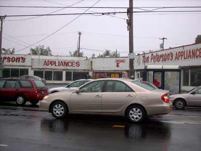 The old building from across Southeast Foster Road, standing in approximatel in front of the Arby's.
Technorati Tags: Portland Oregon, Tom Peterson's, Portland Commercial History
03 October 2006
[Address_Nerd] The Way Street Signs Were, Part 1
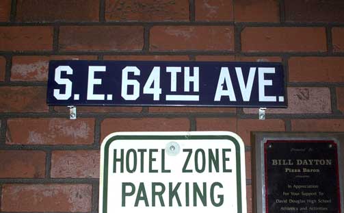 Dig, if you will, this picture.
As we've written here in the past, the Portland address system wasn't created, it evolved, mostly of necessity: the City of Portland as we know it today is the successor entity to three independent cities (Portland, East Portland, and Albina) founded at the Stumptown Bend in the middle third of the 19th Century which consolidated in circa 1890. The three towns had thier own system of street naming, moreover, plat developers were allowed to name thier subdivisions whatever they wished.
Between 1890 and 1930, the system began to develop a uniform characteristic until it was at last unified and rationalized into the form we know it today.
We all are familiar with the white-on-green, just-the-facts, straightforward style of the Portland street sign of today. They, of course, were not always thus. Before the Great Renaming and up to the time of the Rationalization, there was yet another style. and from the Rationalization to the modern style, signs likely looked as you see it in the picture we included. The difference, with white on very dark blue and glyphs with no curves whatsoever, is utilitarian, spartan yet with a certain indefinable Portland character of thier own. The look of the sign agrees with the look of signs I've seen in older pictures of Portland streetscenes which, sadly, I have no access to at this time.
The history of the Portland street sign is something we've long wanted to assay, regrettably, there is next to nothing available on the subject. There is a style we're going to have to draw up (probably as an Illustrator file) ourselves if we're going to show it off, as the only sources we have are poorly-resolved photos of another time published in that fabulous calendar with Portland scenes of years past which is available yearly at Powell's.
The example sign can be seen, incidentally, bolted to the wall at a restaurant called Pizza Baron, which is on SE 122nd Avenue just south of Division Street, in the shopping strip behind the All That Glitters pawnshop with the big bright animated sign in front, almost next to the Sears service center. The pizza, we must add, is fiiiine, with a crisp thin crust that will remind you of the great days of "pizza parlors", such as Shakeys.
Good times.
Technorati Tags: Address Nerd, Portland Oregon, Portland Street Signs, Portland Street Blades
01 October 2006
[design, bloggage] Tales From The Fray: More Than I Had, Less Than I Needed
On The Subject Of Employment:
As it would happen, my search for a continuing gig in production design has actually borne fruit. The downside: part-time.
In my current 'day-job' (which is actually a night job, but never mind), I work 4-10 hour shifts. This is third-shift work. While it is a little enervating, it does leave three whole days to send out resumes, make calls, do what I have to do.
I have secured employment with a firm which will let me design in QuarkXPress (do not fear the QuarkXPress, remember) and develop mad skills at doing specialized photography. I could take this quite far, though my immediate goal is to prove to the company that acquiring my services on a full time basis would be quite mutually advantageous.
The fact that it takes two of my three weekend days is more than made up by the truth that it is something I want to do, and will therefore amount to fun and play.
I'll prove to them that they need me full time. It's a cool company that does cool things with pretty objects. There's a niche I could carve for myself, I'm certain.
I Was Actually Quite Popular, A Short While Ago
That the Times is hardly the crossroads of the b'sphere need hardly be said, but is necessary for the following predicate: for a glorious few weeks a month or so ago, I was, for me, mad popular.
Up until I started 'blogging about Hell's Kitchen, I was puttering along on as few as 15-20 hits per day. Then, quite suddenly, I found I was sometimes notching as many as 100 hits per day...once or twice, I got 200 visits in a single day. This was intoxicating.
At the the time I hadn't done any research into why I was suddenly getting so many hits, but eventually Google Analytics delivered the unmistakable answer: it was the posting I was doing about Hell's Kitchen. Not bad, still, I though: You'll come for the Gordon Ramsay, but stay for the design talk and pithy observations of Portland life.
Sadly, no. As of now, I got barely 20 visits yesterday, and not even 15 so far today. Weekdays have gone similarly lackluster.
Now, I don't do that to evoke pity or to beg for hits (well, not necessarily anyway, but nevermind that for now) but to mention that such a turnaround makes one think again about why one (well, me) blogs at all.
I understand a little better why. I blog because I am opinionated. I do it because I love design and I love design tools. I love writing and the act of writing. I love working without a net when I write (I rarely write up rough drafts–maybe sometimes it shows, I don't know).
Above all I do it because it's free and its fun. Sure, It'd be nice to be the most popular kid on the block, but maybe that comes with too many obligations.
But, hey, if all y'all do care to link, please feel free. I'll certainly reciprocate.
Technorati Tags: design, bloggage, Hells kitchen, QuarkXPress, employment
Subscribe to:
Posts (Atom)