Showing posts with label Typographers and Typography. Show all posts

22 January 2012

[type] Mission:Impossible - IKEA Protocol; Inapt Type In Movies

2768.This is the way serious typographers roll, yo.

Matthew Butterick, the mind behind the blog Typography for Lawyers, has a … gentle problem … with the recent film Mission:Impossible - Ghost Protocol. And, he put it in a letter to the movie's director, Brad Bird:
Inapt typography is not uncommon in movies. But big-budget studio films employ scores of people specifically to worry about the details that ensure the on-screen experience will be seamless. Therefore, it’s incongruous to put all that care (and money!) into the frame and then overlay it with an inapt font, which in its own small way, breaks the illusion. It’s not Mission: Impossible — IKEA Protocol, is it.
Which is all in pursuit of the answer to the question If you're going to spend that much to make every facet of the movie perfect, why skimp out and use Verdana?


The irony in my own posting is that, I think, when bolding and italicizing text on this blog, the software doesn't italicize, it obliques. Which I abhor. Got bigger fish to fry right now though.

Also that we refer to the Cruise-controlled MI series as The Franchise Which Must Not Be Named. Seriously. MI:2 is the only action film my wife ever returned to the video store midway through viewing for a refund. 


But Butterick has a point. Brad Bird, why you no pay closer attention to type?

Via the Candlerblog, here: http://www.candlerblog.com/2012/01/20/mission-impossible-typography/, where you can read the whole letter, which nails it utterly. What Cruise has done to the franchise is another matter entirely, best addressed in The Hague, perhaps.

28 November 2011

[type] A Peek In Typographer's Sketchbooks

2722.(via my newsfeeds) One of my favorite things to do is to watch artists work, and artists' sketchbooks are amazingly fun to get a peek inside.

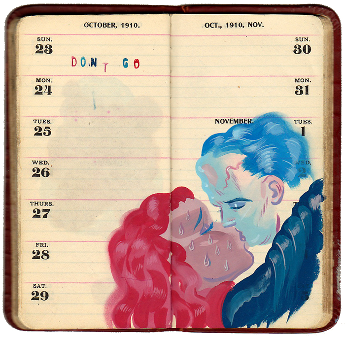
Ryan Heshka, amongst others, have contributed to yet-another-design-book-coauthored by Steven Heller,  Typography Sketchbooks, by him and Lisa Talarico, published by Princeton Architectural Press. I'm hoping to get a look at this myself sometime soon, because it's filled with wonderful pictures of the insides of these wonderful little tomes, including this by Heshka:


Good gosh, I don't draw nearly enough.

Here's also a link to a bit at the Laughing Squid.

26 October 2011

[type] A New Font For Dyslexics

2715. (VIA) Dutch type designer Christian Boer's Dyslexie is a font which is designed to make reading for dyslexics much more possible.

The font is interesting even if you aren't so affected. Dyslexie achieves its aim by distorting shapes to, for instance, make the d and p less symmetrical, which prevents the dyslexic brain from "flipping" the shape. Other irregularities make for a very organic feel, which is not altogether unpleasant to look and is actually rather artistic.

Dyslexie font sample screenshot from designer's website

The font can be seen in action at this article in Scientific American (which has a link to a PDF of the article formatted in Dyslexie), and the designer's website Project Dyslexie (most of which is laid out with the font). A single-user license will set you back 69 Euros, or about USD 98.00.

06 April 2009

San Francisco Sign Geeks Find Little to Like About New Blades

2014.Proving that I'm not the only "blade-head" in existence, or at least, not the only sign geek who obsesses about the little things, a post I stumbled on on San Francisco Metblogs exhibits some SFers displeasure with an update on an old classic. Here's a blade identifying the 500 block of Precita, older (there was some wear, we see, where the block index tab meets the main blade):


I love SF Street blades. They are a participant sport.

Anyway, the above graphic (as well as the one below) of a new and old (respectively) blade for the 500 block of Precita Avenue in SF were nicked from Metblogs San Francisco, at least some-of-whose participants are as passionate on the basics of good street blade design as I am. Look upon this graphic just a moment:


What caught my eye was the "stripy" visual texture to the sign's actual stock, which is all but identical to the sheet stock that seems to be used by Portland right now. Compare:


It's visible on the white areas (which is where the stock shows through – and I just noticed this, did you? – in SF, they apply the letters to the background, whereas here in PDX they obviously cut the letters out of the background. Anyway, digressing here).

I came for the new blade on that post but I stayed for the commentary, because the posters there noticed some things which may seem minor to most but are compelling to blade heads and even if you think it's minor and unimportant, my point is here, you noticed it, even if you aren't a typographer or designer. From SFMetblogs commenter cmarlboro:

I think it’s the same font, but they’re digitally stretching the type to (sort of) fill the space rather than using it centered at its normal set width. It’s most noticeable on short street names like NOE. It looks like crap, but that’s what happens when you rely on jail labor rather than hiring a typographer.

Cmarlboro may or may not be a designer or a typographer, but he's nailed it absolutely to the wall here.

The type is indeed justified left. This is great for the typed page, but horrible for the street blade, where unless there's a manifest reason for type to be forced over, it just seems to look better centered in the blade. That's my visual experience, as well as cmarlboro's, and I've got the gut feeling that that's the way it works for most people.

The other thing that the commenter noticed, the "stretching of the type", is also something that should be avoided. Typographyers call this "extended" type, and there are two ways to get it; to design a type that's extended, and to do so digitally.

If you want extended type to fill a space, it is vastly preferable to use type designed as such. Artificially extended type looks stretched and bad, and people will notice that it's ugly. Type designed as extended is true to its own internal structure and every bit of it looks as though it was meant to be that way. That may sound a little abstruse, so looking at it from the other way, if you stretch type to create an artificial extended type, what's thick becomes thin, which leaves the parts that didn't get stretched looking thicker than they should and wrong.

I don't think everyone aspires to be a designer, but I do believe that everyone registers crappy design, if only in the back of their minds. This is why design has to be tight, has to work; if it strikes a sour note, people will notice, and if they don't disrespect you out loud on a blog somewhere, you will lose credibility with them in the mind.

I don't know if SF in particular makes their blades with jail labor, as cmarlboro suspects, but as far as hiring a pro typographer, I'm all for that! Where do I send my rezumay?

And taking this SF street blade thing as far as I can: One commenter on the SF Metblogs post described the blade illustrated right (and gleaned from the link to Google Maps (which you can dial up yourself by Google Mapping the intersection in SF), at 21st Avenue and Anzo Street in the city's Richmond district, to be an "abomination". I wouldn't go so far as to say that, but then, I'm not emotionally invested in the look of SF's blades as the commenter (who I'm assuming is a local) would be.

I think the design has much to say for it, and is a logical evolution of the SF blade (by reducing the number of parts you have to attach and rivet on, you reduce the difficulty level of actually producing the item and the cost). The type is preserved, the black-on-white look is still there, the omission of the generic from the named street, the black stroke around the edge of the sign ... all very SF looks.

The fault I'd find with this is that the numbered avenue blade breaks the rule of eyeflow: your natural eyeflow in the Western mode tends to go left to right and up to down, so you are as prone to read the sign as 21st 500 Av rather than 21st Ave (500). This can be fixed by putting the Av generic over the block index and arrow.

Technorati Tags: , , , , ,

NB: The Precita Street blade pictures and comments from SF Metblogs are copyright the creators and are used for informational and illustrative purposes only.

01 April 2009

MyFonts Nabs Exclusive Interview With Typemaster Eric Gill

2004.After years of seculsion, one of the great masters of the art of type, Eric Gill, has consented to interview, and has given one to the fine folks at MyFonts:
Eric Gill has never been easy to pigeonhole: a socialist Catholic, a spiritually minded family man, a keen and active admirer of female and typographic curves alike. For many decades, Gill — a stonecarver, graphic artist, type designer and writer — has been one of the most fascinating figures on the British design scene (although, as he explains in his own inimitable style, he is not particularly fond of "design").
Read alla boutit here.

A man of complexity, he speaks frankly about his art and about design.

Technorati Tags: , , ,