Showing posts with label font design. Show all posts

13 March 2017

[type] Futuracha: The Auto-ligature-spawning Cockroach-inspired Font Everyone's Talking About

3462.
Futuracha Pro is sweeping the design world right now, and it's easy to see why. The font design combines elements of history, nature, and whimsy … in short, it's font design at the top of its form, and its most effective.

The font, designed by the designer Odysseas Galinos Paparounis of Greek creative agency høly, was originally available as a font that could be used mainly in graphic design and layout apps, not as a font for the people at large. That's in the process of changing, of which more anon.

The font grew out of Paparounis' obsession with Futura Pro and a sharp eye for nature. As told by HuffPo:

Futura, Paparounis told HuffPost in an email, had become “something like an obsession” during his graphic designer studies. When he was tasked with creating a typeface as a class assignment, he found himself examining two Caribbean cockroaches he was using for an illustration class. Inspired by “the antennae and thorns on their feet,” he garnished the Futura framework with rounded spurs and swooping ligatures.

The design world already seems in love with Futuracha Pro, and the originators have correctly deduced there's a huge demand for a font with swooping nature-inspired swashes that change as you type it. The effort to bring it to an OpenType version anyone can install, powered by IndieGogo, has three days left in the campaign at the time of this writing, and of a $4,000 goal, over $68,000 has been raised.

The IndieGogo campaign is at https://www.indiegogo.com/projects/futuracha-pro-design#/. There are pictures of Futuracha Pro works that will be visible for a time after the campaign concludes; the swooping swashes lend themselves to much design other that merely displays and titles.


The idea of a font changing as you set the type isn't a new one, though Futuracha's implementation is fairly joyous and innovative. This reminds us of Ed Interlock, an OpenType font with various ligatures and swashes created by Ed Benguiat and inspired by 60s TV title design. This would be a further evolution of this thought.

The appeal to nature, however, is particularly bracing, fun, and sets this interesting design well apart from the rest.

09 October 2016

[type] Google/Monotype's Noto project: A Half-Gig of Free OTF Fonts To Get The Tofu Off Your Screen

3391.
Add to the list of logisms about the type tofu. Any time a computer displays web text, and the fonts on your system don't carry the glyph that the content requests or (worse) doesn't have the font at all, you get small boxes (most of the time) as place holders for the letter from the computer would draw if only it knew how.

For your device, it's a teachable moment. You learn it up by downloading a font, installing, and refreshing the font cache, usually by closing and relaunching the app. To he right of this Latin text you'll see a illustration from Wikipedia's article on the Deseret Alphabet before installing a font that has those glyphs defined.

That's tofu, intermountain-West style.

This is an issue that has developed as more information that didn't come from a core early compuiting constituency … Latinate-script using Westerners … came under the unblinking gaze of the Earth's developing, evolving technological consciousness. A lot of things, like the Deseret Alphabet or the Shavian script, were invented, not evolved and extant at the time computers began developing, and a lot of encodings weren't thought of at first. So, you'll go to the Wikipedia page on Shavian without the proper font file installed and come up with a case of tofu, all nicely arranged in boxes:

Yummy tofu, Shavian style

Which fill in quite nicely once a font file, such as andagii_.ttf is installed and recognized:

Fully cooked, Shavian in all its odd glory
It's a problem that you'd think that Google, with its Borg-like focus on assimilating information and returning it in a usable format, would be thinking about, and you'd be right about this.

Just announced and made available, the collaboration between Google and font foundry Monotype has goal that is simple if huge; eliminating tofu from your screen.  From the Google Developers' Blog:
Five years ago we set out to address this problem via the Noto—aka “No more tofu”—font project. Today, Google’s open-source Noto font family provides a beautiful and consistent digital type for every symbol in the Unicode standard, covering more than 800 languages and 110,000 characters.
There are, at this writing, 114 Noto fonts including Devangari, Cuneiform, CJK, Osmanya and, yes, Deseret and Shavian. Installing the extant Noto fonts should cover you in a variety of situations so wide that the average user stands more of a chance seeing tofu in their stir-fry, where it belongs, rather on their screens.

The biggest news for the font-avaricious is, perhaps, that the entire Noto family is free to download and use as thou wilt, and is licensed under the SIL Open Font License. That means they're free to download and use in any way you deem necessary; not only free as in Open Source, but free-as-in-free-beer-free. The whole zip archive is close to a half-gig of free fonts; the design, as seen in the illustration a the right, isn't out to be flashy or game-changing; the basic Noto Serif and Noto Sans are good, basic book-hands, meant to be pleasing to the eye but not to be the star of the piece. It's meant to harmonize, not to dominate.

The Noto Project's website is https://www.google.com/get/noto/ : this'll take you directly to a download page where you can download any number of the available font files or the whole thing at a go (about 473 MB worth). It's totally and wholly up to you, font explorer.

08 April 2014

[font] Comic Neue … The Aesthete's Comic Sans

3049.
So. MS Comic Sans.

Insert Whitmanesque YAWP here.

I firmly believe that Comic Sans isn't bad; it's just drawn that way. Vincent Connaré had no idea that when he composed that font for use in Microsoft BOB that it would become the most levelling influence in the visual arts since Helvetica.

No insult meant to either, there.

But since then the world seems betimes swimming in inappropriate uses of Comic Sans. I'm sure, on some nuclear reactor nearing EOL somewhere, there's a sign reading EMERGENCY REACTOR SCRAM written in Comic Sans - either through irony or simply lack-of-awareness, who can say … and really, does it matter?

No. No, it does not.

Anywho, in the occasional quixotic drive to create a cultural counterpoint to CS, the Japan-based designer Craig Rozynski has hammered out the weird and visually-discordant bendy bits, engineered some kerning and other things, and created Comic Neue*. Here's what it looks like, with screenshots from its site:


The designer tried to draw the line between the casual 'honesty' of Comic Sans and the lack of good design. He's pretty much succeeded; it's like CS only not terrible, and doesn't feel like daggers of evil piercing your eyes. So, in as much as addressing the flaws of CS, it's a success.

The deeper philosophical question of necessity is an exercise I leave to the sojourner. And, as far as Mr Connaré hisself?
I guess there's just no pleasing some people.

The designer, in a gesture of generosity to the greater good, has released the font as public domain. Get your copy here, if you must: http://comicneue.com/

04 April 2013

[type] Adorable Typeface Uses A Cat’s Tail To Form Letters

2913.(Via DesignTaxi) You love kittehs. You love type. What's a type addict to do?

Helveticat, that's what.


We typically don't use the word adorbs unless it's something like this, because it is. We found this at Design Taxi (Adorable Typeface Uses A Cat’s Tail To Form Letters) and we are, of course, in love. The little guys are cute, and kind of remind us of Pusheen. And there can never be enough Pusheen, as everyone who's warmhearted will tell you.

By Bethany Lesko; get a print from Etsy here.

26 June 2012

[web_design] OregonLive Redesign: Say Hello To My Prelo-Slab Friend

2847.In case you've somehow, during the past day, not dialled-up OregonLive, the The Oregonian-ish website run by Advance Publications, The Big O's parent, you're in for a surprise, boy-o.

If you've sworn off OLive (as some I know have), here's what you're missing:


A cleaner, leaner design. A big, meaty guts-column of real-time-updated stories, theme selectable by a drop-down (Top Stories/News/Sports/Entertainment/Opinion). A buff-colored, spacious header that extrudes into the page as you scroll down.

Departments? They got'em:


Each one of those blue buttons open a dialog that allows you to select criteria, you click a search-button, and it's off to the races. This is all below the "fold" in the right-side column. Below this, you'll find a most read/most commented block, and at the footer, direct links to direct sections.

One of the biggest complaints about OLive over the years it's existed is its clutteredness. It was not the most useful of interfaces, and unless you knew what you were looking for, you could indeed get lost while looking for what you were (or weren't finding). The most irritating thing to me was the center, where sports stories were thrown together in a mixed-hierarchy goulash. While the sections were laid out across the top, it was a matter of guessing to see to it that you picked the right one to drill down into.

This is, indeed a better design. Although the menus that would explode into the screen when you merely moused over the section titles along the top were a little tough to get use to … well, all interfaces have a learning curve. This one's mercifully short. I already, after just a few minutes, know where I want to go to get what I want to know. The clean, clear, and organized look of the site is a refreshing change from the gallimaufry chaos of the original OLive.

The most striking feature of the redesign, and the one that leaps right out (and almost grabs you by the throat), is that heavy, authoritative font. It's called Prelo-slab, you can find some here, and boy is it an aggressive look in the application. It almost dares you not to click it. Actually, in the ways it's being used, it comes off as a little too heavy; I note, at the vendors page, there's maybe another weight I'd use for those headlines.

But you know what? I like the redesign.

Although, biggest flaw? For a few minutes I thought I'd stumbled into some big ol' Reddit.

12 December 2011

[type] The Most Horrifying Picture A Graphic Designer Can See …

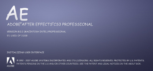
2725.… is the opening splash to any Adobe Creative Suite app … in Comic Sans …


There's even more tomfoolery at The Comic Sans Project, a tumblr blog whose unholy purpose seems to be re-imagining all sorts of logos and stuff with CS in instead of what belongs there.

Sinful. You'll want to watch, of course: http://comicsansproject.tumblr.com/

26 October 2011

[type] A New Font For Dyslexics

2715. (VIA) Dutch type designer Christian Boer's Dyslexie is a font which is designed to make reading for dyslexics much more possible.

The font is interesting even if you aren't so affected. Dyslexie achieves its aim by distorting shapes to, for instance, make the d and p less symmetrical, which prevents the dyslexic brain from "flipping" the shape. Other irregularities make for a very organic feel, which is not altogether unpleasant to look and is actually rather artistic.

Dyslexie font sample screenshot from designer's website

The font can be seen in action at this article in Scientific American (which has a link to a PDF of the article formatted in Dyslexie), and the designer's website Project Dyslexie (most of which is laid out with the font). A single-user license will set you back 69 Euros, or about USD 98.00.

21 March 2009

Tropicana OJ Redesign FAIL: The Brand Redesign That Should Have Worked ... But Didn't

1990.Sometimes you get a design that clicks, that's solid, that absolutely nails it. Anyone who knows anything about design ... and a lot of people who don't know design and aren't emotionally invested in your look ... will look at this design and say "Good golly–that's dead cool."

Such a design, in my opinion, is the recent Tropicana redesign. Leaving behind the "straw into the orange" and traditional type with the studly majuscule T in the front is a picture of the actual product was a clean, bright design by the Peter Arnell concern.


Illustration via Logo Design Love

Now, this is what I call an evolved design. Unified, accessable, appropriate type, and the product–and all its percieved quality–right up front (ever tried to actually suck orange juice out of an orange via a straw? Mur-der, at least on the old cheeks, there. And notice that the plastic cap has become a little tiny half orange (called by some wags the orange b**bie, where *=o).

Brilliant, tight, designed.

And everybody hated it. Hated, Hated, Hated, Hated, Hated it![1]:

IT took 24 years, but PepsiCo now has its own version of New Coke ... The about-face comes after consumers complained about the makeover in letters, e-mail messages and telephone calls and clamored for a return of the original look.

Some of those commenting described the new packaging as “ugly” or “stupid,” and resembling “a generic bargain brand” or a “store brand.”

“Do any of these package-design people actually shop for orange juice?” the writer of one e-mail message asked rhetorically. “Because I do, and the new cartons stink.”

Others described the redesign as making it more difficult to distinguish among the varieties of Tropicana or differentiate Tropicana from other orange juices.
Tropicana's old design will return within a month due to apparently-overwhelming consumer demand. I hear the orange "b**bie" will remain, however,

A lot of designers I've read via teh Google are unhappy with the redesign as well, so the design mind is hardly of monadic character on this. I disagree. The new design is clean, appropriate, relies on a strong typographical theme and puts the quality of the product right up front. I think it was timely, but as with ever New Coke moment, sometimes you just can't help but underestimate how emotionally attached customers are to a look and feel.

For a lot, Tropicana without the orange-with-a-straw just isn't Tropicana.

Well, someone did once say a day without orange juice is like a day without sunshine.

Just for the sake of the record, the design is (at this writing anyway) still up at the Tropicana products website. Here's a screenshot:


And here's an example of the print ad design:


The warm oranges being a counterpoint "splash of color" next to black and white photos of smiling nice people form an interesting dynamic tension. The print ad format and the website format are winners too. I respond to them. Shame more people don't.

The designer whose name is on the project, Peter Arnell, is put in the odd situation of defending a successful redesign:

According to Peter, it’s about giving each other hugs, and “the power of love”.

Upon such intangibles is identity design supported, but it seems axiomatic: allying Tropicana with warm colors and affectionate images bespeaks similar qualities in the product itself–warmth, affection, goodness. Logo Design Love has the designer speaking at a press conference about it, which can be viewed here.

[1] apologies to Roger Ebert.

Technorati Tags: , , , ,

The New PDX Blades: NE Oregon and 102nd

1989.For our first spotting of the new-look Portland street blades, we go just south of Gateway, to NE 102nd Avenue and Oregon Street:


Just across the street used to be a shabby apartment complex. Now they're getting ready to build some office complex on the site. The tan building on the right in the middle distance is part of the Gateway Fred Meyer store. The dark, high-topped building in the far distance is either part of The Oregon Clinic's Gateway location or part of the Providence Gateway clinic. The Gateway MAX Station/Transit Center is behind those trees in the left-distance.

Mug shot time:

NE 102nd Avenue:


And, NE Oregon Street (the 8th Street name north of Burnside, hence the 800 block crossing-street):


Most designs local authorities debut I find have to grow on me. This is not one of them. I've liked it from the first.

I'm also pleasantly surprised as the speed at which this is being rolled out. If you're like me, and you want to record and preserve the way the old ones look, though, you'll have to get busy. They may not be around much longer.


Technorati Tags: , , , , , , ,

15 March 2009

The Allure of Boxed Water–Is It The Concept or the Design?

1980.This just found during a random act of clickage: a glorious package design blog called The Dieline. Which is blogrollable, to be sure.

But what caught my eye was this:


Yes, Boxed Water brand water.

I don't know what's more intriguing–the idea of putting bottled water in the classic milk carton, the spare design, or the way there's a Macintosh-style "hello" on one panel, or the name Boxed Water, which is reminiscent of a piece Steve Martin once wrote of "Folding Soup" (You can find it in the book Cruel Shoes, I do believe).

It's all quite adventurous. And while there is an environmental impact with paper cartons, to be sure, it's certainly got to be a whole lot less of a problem than that of plastic leavings. Moreover, the very packaging is its own advertisement. You're not going to soon forget that carton.

This is kind of what I mean when I talk about "painting with type".

Visit the Boxed Water website for more looks and a look at their rationale.

Technorati Tags: , ,

SE 145th & Division: The New PDX Street Blade Look on Old Blades

1979.Our other catch today on the Street Blade Safari (in the rain and the cold, but I'm Oregonian, and that's how I roll) is a distinctly unexpected surprise – the apparently-new street blade design, but not as I expected it:


SE 145th and Division is immediately northwest of the Division Street Fred Meyer. On the northeast corner there's a KFC; on the southwest, a gas station. The parts of SE 145th Avenue north of and south of Division do not meet square, they 'jog'; it's a signalled intersection, presumably because getting into that area of neighborhood both north and south of Division over on 148th is a bit impractical maybe.

And it's where the new Portland blade design – which, on Division at SE 117th, SE 101st, and SE 57th Avenues are on big, white-bordered sheet – are here applied to the traditional, extruded metal blade which are the standard for Portland blades

The fit of the letterforms on the blade is a feels a little force and awkward, but it works fine really. Particularly good is the way the layout artist aligned the block index (2500) and the generic (ST) along margin on the left ends of the respective text blocks.

I have wondered if there was going to be some way to deal with the fact that the new big-blades, which appear to be sheet, might need the strutctural-stiffness the ribbed extruded shape provides for support of Portland's numerous neighborhood sign-toppers. One reason this redesign pleases me so much is because many of those sign-toppers result in the loss of the block-index tab, which can be a great help to visitors in finding thier way around and for delivery drivers and others who might take the time to memorize the blocks but probably find just having to find a sign to get them saving a huge step.

These new blades grace the northeast and southwest corners of SE 145th and Division. I have the ones here on the northeast corner, by the KFC; it was just too rainy and cold to stay out and take many more pics (I'm Oregonian, and that's the way I roll, but I'm just insane about street blades, and not about standing out in the cold and wet).

Here's a couple more pixs. First, a view from the north of the SE Division blade:


And now, the full monty. Maybe it's just that it's a newer blade, but there's something crisper and better-proportioned about the letterforms on the new blade (when I first saw them from the side, I thought they were using Helvetica for a split second):


And the documentation continues.

Say ... has anyone seen these blades in thier 'hoods? One curiosity is that these are only appearing (so far as I know) along SE Division Street. Why nowhere else? I see about my share of corners in the city, but no other examples of this yet.

Anyone else see these around town?

Technorati Tags: , , , , ,

11 March 2009

The Periodic Table of Typography

1973.The Periodic Table of the Elements has always been a nifty framework to show off witty and wry humor and to combine any sort of element for illuminating display.

Here's type arranged by famililies and classes. It really is amazing how the format lent itself to this.


The number in in the upper corner is the ranking of the font based on a number of metrics. To read about that, go here (Awesomness courtesy of Behance). A link to an embiggened image can either be found at that posting or if you just want to cut to the chase, clicky here then.

(Combined h/t to Larry Fire and Alan Cordle, who both emailed me at about the same time here. A design consipracy! Nifty!)

Technorati Tags: , , ,

09 March 2009

The New Portland Street Blades, Now at SE 101st And Division

1971.I have no rules of thumb as to city sign rollouts, but it seems to me that the first time is a test run, the second time would be a pilot project, but the third time would be a trend.

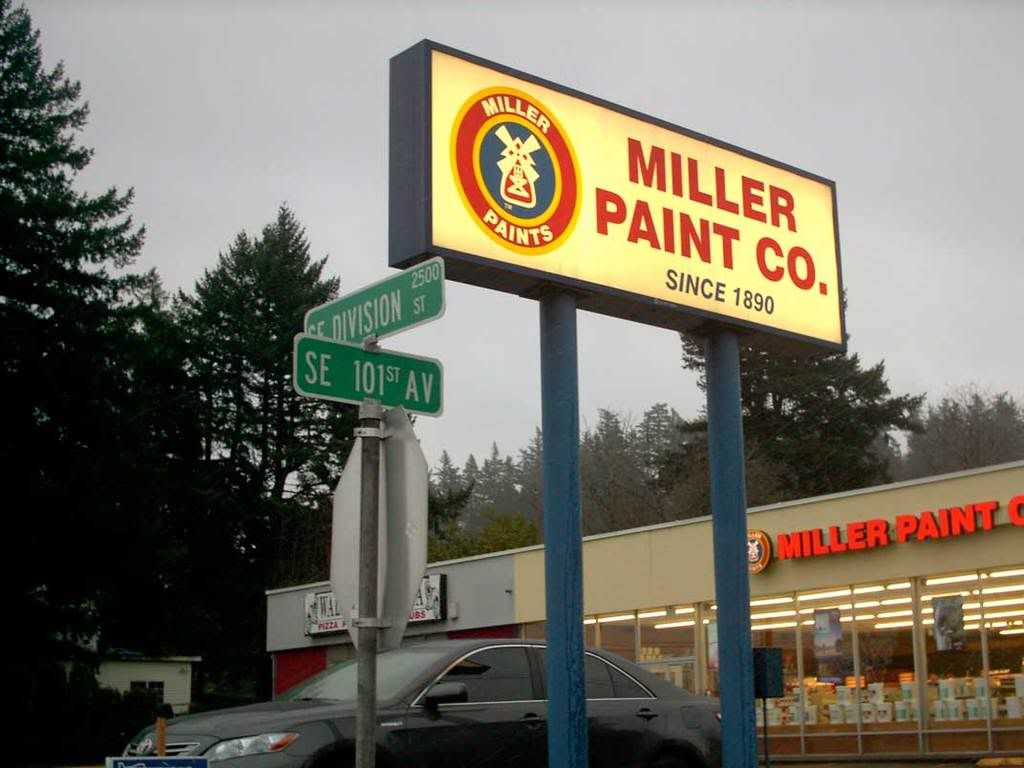
One this snowy(!!!) March Oregon morning, we go to SE 101st Avenue and Division Street, just down the street from the big "I" at Division and I-205:


This is in front of a Miller Paint store, of course. The store with the gray face was, up until recently, a Radio Shack. It's now Wall Street Pizza Co (they have some tasty pizza there too).

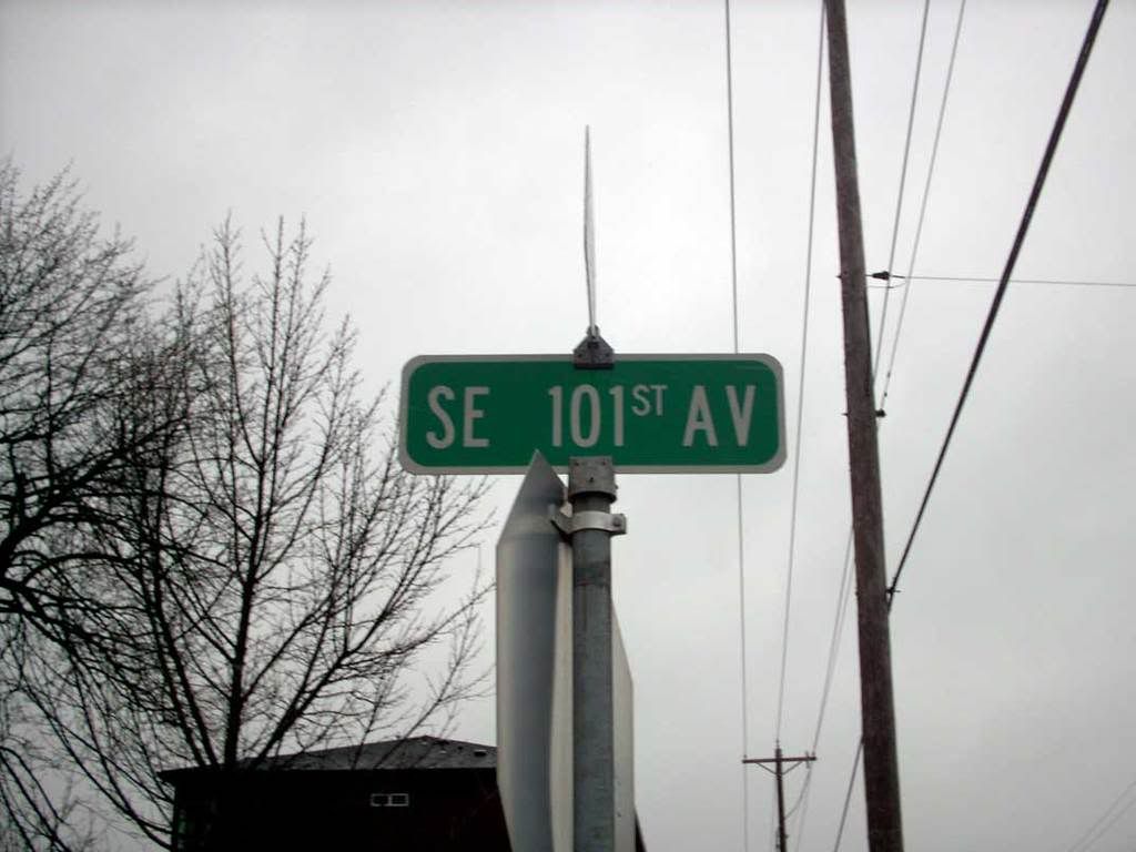
The numbered avenue:


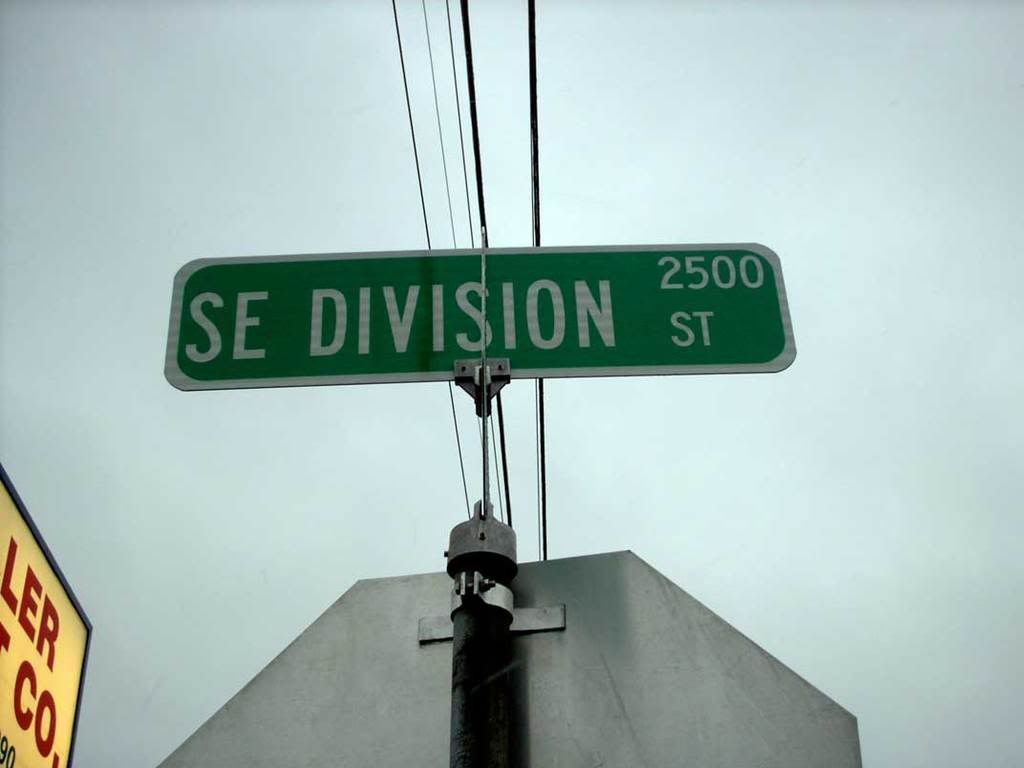
And the named street (SE Division is, remember, the 25th street south of Burnside, therefore is the 2500 block of crossing streets):


One thing I find curious is that all three occurrences of the new blade design has been along SE Division Street. I've had my eyes peeled for more, but just those three, and just Division so far. The blades they replaced didn't seem overly worn – I can think of others that need it more, but that's me for you.

More as I find 'em.

Technorati Tags: , , , ,

04 March 2009

A Closer Look At The Cupertino Street Blades

1964.We revisit the look of the street blades they grow in Cupertino, California, thanks to my Cupertino Bureau Chief Sharon, who sent a bigger picture (with my profious thanks):


We can see the font a bit better now. It looks very much like they're using the Souvenir font here, or something like it.

That's an important point. Type carries baggage with labels like "meaning", "mood", and "import". The usual faces we find on street blades, namely simple, clean sans-serifs, very business-like, devoid of sentimentality or cosyiness.

That's not a criticism, by the way, but a simple statement. There are situations where certain approaches are appropriate. Street blades with simple, clean, businesslike type are eminently appropriate design usages.

The type of the Cupertino signs, however, puts you in a different frame of mind. The type is serfed, artistic, soft. Just by mere comparison to the faces you usually find on a street blade, they evoke a sort of "country-club" feeling; sophisticated, quaint, poised, refined. They encourage the eye to linger a few moments longer. The type in and of itself is more interesting.

One can argue that a softer-type approach to labelling streets is called-for or not, but what can't be argued with is that looking at these street-blades, you feel as though you've driven into a more exclusive neighborhood, and as far as that goes, if that was the aim of the jurisdiction, it works and works very well.

There are absolute design concerns, certainly, and there are relative ones as well. The intersection of those two streets is where you'll find the most workable application for the context.

Technorati Tags: , , , , , ,

11 February 2009

Extensis Offers/Font Haiku Contest. Deadline:/Valentines Day, Yo

1943.Want to win some nifty prizes? Like fonts?

If you're like us, we know you do. Hie yourself over to Extensis Manage This blog and read the entries and submit your own.

Remember, it's 5-7-5. 1st Prize include at $50 iTunes gift card and at $20 Starbucks card, which is a pretty good return on very little work. Oh, a cool t-shirt and a laptop skin as well.

Deadline is the 14th.

Right this way
.

Technorati Tags: , , ,