Showing posts with label OryCon. Show all posts

21 November 2021

The Face of a Minstrel

4038

There was an OryCon this year, OryCon 42. And they're taking a year off, a 1-year hiatus isn't a big deal when you consider 42 years without a break, including Pandemic Year, when it was virtual.

This made this our last chance to do a thing until 2023; seeing Alexander James Adams do his thing, which is a good thing.

The performance this year was a mild comedy of errors; filker Cecelia Eng and Alec appeared to be scheduled for the same space at the same time. In the spirit of full-speed-ahead that characterizes Pacific Northwest fandom, it kinda became an hour of Alec and Friends, and was no bad thing. Now, Alec lets us take pictures of him as he performs, which is totally generous. 

I got this:


This is not Alec mugging the camera. It is not posed. I happened to be pointing the camera his way and squeezed he shutter at just the right moment, and it's important to point this out because it expresses the way he approaches his performances and his life as a musician; all-in. Alec has an act, be he himself is not the act; that's real enjoyment, real emotion, 100% authentic; the expression of someone killing it at what they were born to do.

We've been listening and seeing Alec when we can for more than 30 years now. Watching him grow and develop during the years, even in our desultory way, is and will be the dearest of dear memories, for as long as we have lives to live. 

20 November 2017

OryCon 39 and the Ghost of OryCons Past

3526.
The occasion of OryCon is, as one could probably expect after one reaches a certain point in their journey, an occasion to remember things and to evaluate how those things have changed, just like spending long quality time with any loved one in ones' life.

The location of Ory39 this year was the Red Lion Inn on the Columbia River, at Jantzen Beach. Jantzen Beach, for those who don't know, is essentially a neighborhood on Hayden Island, which is just within the boundaries of the city of Portland and the last bit of Oregon as you head north on I-5 before you enter Vancouver, Washington. It's seen many changes. For a very long time a very many years ago, it was one of Portland's then-more-numerous amusement parks; it was the place where the first traffic bridge from Portland into Vancouver was built (and is still rockin' away), and it had a front-row seat to Vanport.

In my time it's been the home of two hotels that loom large in Portland fannish history: one on the west side of the bridge, the other, on the east. And that's still the case.

When I began attending OryCons, back at the ninth iteration of same, it was being held at the one on the west side, then known as the Red Lion Columbia River. The one on the east side of the bridge was known as the Red Lion Jantzen Beach (it's rubric has flowered somewhat), and since most of the Orys happened at this hotel, that was was affectionately referred to as the other hotel. No further explanation was needed. That which was known as the Red Lion Columbia River began and ended life as the Thunderbird, which was a local chain based here in Portland (it's original edition, between Interstate Avenue and the Willamette River adjacent to the Memorial Coliseum, is what gave that dead end street there, N Thunderbird Way, it's name).

The Red Lion Columbia River/Thunderbird was a cool hotel to have an SF convention at. It, with it's five room wings extending like pincers to the west and east of the main hotel building, even reminded me of a spaceship. And in the early days, me and The Wife™ entered the hotel on Friday afternoon and didn't leave until Sunday afternoon, so it was pretty much the same thing as.

Mapquest tends to update on some levels slower than Google Maps on the satellite view. You load that into MQ and zoom in, and here is what you see.


That is just a cool layout, as I said. Walking the corridors linking the five wings, which were all named for local features, was like traversing a sort of space station.

In the interim since the last OryCon was held there, the property has seen some adventure. Around 2003, the Red Lion sold off the property, and it simple became the Thunderbird again. In 2005, it closed for good. In 2012, most of it burned to the ground, taking a whole lot of memories with it.

But part of it still stands, and that's the part that really is cosmically hilarious. It's still a hotel. A Rodeway Inn, as a matter of fact.


Those last two wings are still in business. They even have the names of the old wings up on the outside: Multnomah Wing, St. Helens Wing.

We drove around it on Sunday on our way out from our end of 'con. There's a new lobby area ... it was the ground floor lobby on the Multnomah Wing back in the day ... and they've built a new entrance. Driving around the back side, though, it's hard not to remember the rest of the hotel attached to it ... and the good times it held.

And now, OryCon's home is what we used to call the other hotel, perhaps illustrating that axiom that implies that while you can return to whence you came, you can never really go home again - but, all you really need is now, anyway.

And so it goes.

19 November 2017

OryCon 39: Timothy Zahn Talks To the Fans

3525.
This is also the sort of reason why OryCon means so much and matters. OryCon has long had a reputation as a 'literary' SF convention which is appropriate; most Portland SF fans try to realize some sort of dream as a writer (I've known few who haven't), and in a city with events like Wordstock and famous for establishments like the Mighty Multnomah County Library and Powell's City Of Books, it just makes sense that people attracted to the craft and activity of writing would make OryCon he sort of place it is.


In this talk, author Timothy Zahn talked about things authory and Star Warsy: it was Zahn who brought us Grand Admiral Thrawn, one of the most enduringly-popular and arguably important characters in the SW Expanded Universe; Zahn is credited by some I've read with setting the table for a great deal of what followed. In his talk, he was a bit more modest about it, leaving the impression of someone who felt he was at the right place at the right time.

But the point I was striving at he just what a nice guy he was; affable, indefatigably friendly, the kind of Author GoH I remember OryCon seems to attract and invite. The kind of author all us aspiring SF writers hope to be.

He's our kinda guy.

07 February 2017

[design] Return To OryCon: The OryCon 37 Souvenir Program

3446.
I return to revisiting my program design work for OryCon with the design for OryCon 37. Coming away from its dark period, I re-entered the fray with a con that had a SF, adventure-y feel: The Quest For The Ultimate Artifact.

Tanya Huff was the Author GoH, and Alan M. Clark was the Artist GoH. As anyone who's seen Alan's work weill recognize, there's an atmospheric quality to it as he lets some of his materials play a chaos game in the background while he lets intelligence guide the foreground. The combination usually imparts a near-incomparable air of mystery to all his works, be they SF, horror, fantasy, or anything else he does.

The cover illustration, Buckets of Bad Weather, is a thing to get lost in:


The steampunk-y construction is inscrutable, it keeps its own counsel; it appears to be siphoning something off and sending it somewhere else, but while it's guessable, it's unclear what or where or why. It may be an unwelcome thing, taking from the local environment but giving little or nothing in return, and you might think otherwise, but the title has a sinister note to it. Also, it seems rather ancient; the parchment revealed seems to imply that but it, like the construction, holds its secrets well.


The portrait of Alan illustrates the sense of mystery, stress, wonder, and tension which seems to be his main art materials.

The idea of a quest inspired me to find a "Raiders of the Lost Ark" style font, and that may seem an uninspired, perhaps even lazy choice, but the type used for that movie is a brand that connotes intriguing, mind-expanding, crazy and just-dangerous-enough-to-be-interesting exploration. The Creation Station people really went to the wall with that one.


It's an example of type supporting the message, and again, the type and the art merged to create an atmosphere and feeling for the rest of the book.


10 December 2016

[SF] The OryCon 33 Souvenir Program Design: Horror Has a Jape

3432.
With OryCon 33, in 2011, the dark theme continued, script flipped to the side: the them was The Lighter Side of Horror. With Author GoH E. E. Knight, author of Vampire Earth, that premise was delivered on. The other side of the look'n'feel coin was, of course, and as always, the art.

Jim Pavelec brought his dark and disturbing vision to OryCon's Art Show and Souvenir Program and it cast a spell to good effect. I still can't look at the images for very long without feeling more than a little out-of-synch and wanting to see things in reality that aren't there … or are there, but shouldn't be.


If that cover illo don't make you kind of illo, I'll check you for a pulse, kiddo.

That's Jim's dark design. From his Artist's Statement at http://www.jimpavelec.com/artists-statement/:
I built up a body of work, at first consisting mainly of twisted figures that I simply called demons. I needed to call them something familiar as a jumping off point for the viewer. I wanted them to be iconic; modern day visions of godlike beings that existed in my imagination.  I pushed myself to incorporate jagged structures and impossible atmospheres which these demons would call home, thus fleshing out the world that had been in the recesses of my mind since my youth.
Most people and artists recognize their dark sides and incorporate them into their outlook and art. Jim saw his dark side at an early age and decided that when he grew up, he'd build a summer home there. He lets it drive him. This is the sort of art that, as Chekhov is said to have said, "break the ice within one, as a brick" (I paraphrase).

Disturbing? Yeah, you bet. Difficult to view? Definitely. Valuable? Totally, after taking a further look through his Artist's Statement, which dwells a moment on Jung's thesis that humans needed symbol and ritual, to arrive at an iconoclasmic statement of its own:
Through the work I am doing now I mean to create new symbols for others to cherish. I hope that people will take what I have given them and use them, as the word says, symbolically. In other words, use them as a spring board for independent thought. Use them as a marker for their frustrations with the status quo. Use them to strip the meaning and power from the old symbols.
Interpret that as one wills, but I see the idea of looking in as a way of looking back out and re-evaluating what one is certain of. The reassignment of symbol and creation of new as needed.

Iconoclasm.

Now, like I said, this was the 'lighter' side of horror, and there was more than a little whimsy there. The work Zombei Atack, which I used as the back cover, is a great example of that:


It takes a zombie schoolgirl to really drive home how demons and grotesqueries can be funny and memorable.

The rest of the publication took the by-now-usual path. I drew unification by extending the type into the heads and subheads:


… and at this point I must point out that, despite my endless bagging on Papyrus, there are times that it works. The problem with such fonts isn't that they are used, it's that they are overused, thoughtlessly. Not every publication is going to be that important, so one may see my p.o.v. as rather overweening. Still, a second's thought can turn a document that is forgettable because the designer went with a fad or fashion or just accepted the default (a designer worth the term never accepts the default) into one that has a voice of basic good taste and a modicum of thoughtfulness. Type carries weight both visual and emotional; think of someone who formats a serious warning sign in that perennial villain, Comic Sans. Are you thinking of the warning, or are you thinking what kind of mind would joke around with a font like that?

But in this case, Papyrus, though overused it be, also struck the right note and, like The Dude's rug, tied the thing together.

Also, I'd like to point out one other thing. If you're likely (or hopefully-to-someday) to be invited to a convention, have at least one good promo portrait. E.E. Knight's was properly authorly and friendly, and Jim Pavelec's was well, well, done, I thought. The pose in front of the pagoda? Well composed and full of visual interest and intrigue.

Really, it would take you no time at all. If you think you might ever be a GoH at a convention, do this thing.

This would prove to be the last time I would do a OryCon program set. I can't remember what prompted me to let go, but I guess that I had figured that I had brought all I could to the form; not only that, after hoping only to do one, I'd managed to do not one, two, or three, but four consecutively. Not too bad, I thought.

I had a good experience and had delivered a labor of love for a thing I adored times four. I didn't think I'd ever be in the position to do this again.

Life, as they say, had other plans. 

08 December 2016

[SF] OryCon 32 Souvenir Program Design: OryCon Works Dark

3430.
The next year, OryCon 32,  I was back as publications again, and this was the first of two years when the theme went 'dark', as they say.

The Author GoH was P.N.Elrod, creator of The Vampire Files: the Art GoH was Chad Savage, macabre artist extraordinaire. What better them than The Dark Side of Fantasy?


This program was a bit of a new experience because, whereas the previous ComCons were content with my decisions on everything from headline fonts to layout, this year the remit included a bit of art direction via the con chair. She had a definite idea as to fonts for headers and headlines, and was obviously quite sensitive to the visual and emotional weight that the fonts transmitted to the content.


The GoH's, page, backed with a screened-back bit of his art, cast a certain mood. This was the first time I attempted this, and I thought it worked quite well.


The spread showing off the GoH along with a snazzy little ad for WorldCon 2013.

I must admit this was a challenge for me in more ways than one. The art directing, while minimal, was a factor I hadn't contended with in the previous two publications and it was a new experience, and a welcome one. The big up here was, as previously mentioned, the Con Chair clearly understood that thoughtful choice in cover design and typography is an essential starting-point to a successful overall design. She pointed me in a good direction and, as every solid graphic designer knows, when it's not necessarily your vision, it's your duty and job unify everything so it supports the client's look-and-feel. This succeeded very well on that level, and was a real creative workout for me.

The other part was ... well, in saying this, I don't want anyone to think that Chad Savage's art is bad. I don't. I think it's splendidly-done, and if I were 10 times the draughter I am now I'd be, at most, 1/100th the artist he is. That he has talent and vision cannot be gainsaid. The crux is that I don't find dark themes pleasant; they don't speak to me so much. So this really opened my mind to listening to an artistic voice that didn't quite transmit on my wavelength, and that was a real workout, and a valuable one, too.

I'd suggest that a good way to expand your design chops and your visual repertoire, as a publications designer, is work with edgy art that's not exactly to one's taste. I'm still not one with the macabre art, but I can hear the voice it speaks in and help it communicate when it must, and that's something else an effective designer does. 

Push ones' own envelope from time to time. After all, art shouldn't always stroke your happy place. A diet of art that doesn't sometimes disturb is just as stultifying to the visual health as eating the same thing is to the physical. 

The other notable thing about OryCon 32 was the loss of one of the granddaddies of the OryCon/PorSFiS community. John Andrews, a regular and one of the maintaining forces of the original OryCon crews, passed away at an extremely untimely age.


One of the ironies of my life is that my nocturnal-by-necessity nature means that I see some people in my own tribe, who live in the same city as myself, only once-a-year; necessity has made of me rather a recluse. But one of the signals that this was indeed OryCon was meeting John Andrews at the pre-reg table; as long as there was a John Andrews helping hold things up, everything was aright. 

He left us a legacy of a scholarship fund that sends a fan to WorldCon in his memory. We should all be so lucky as to inspire such a mark in Con history.

John only made it to age 48. The community he helped build continues with a newer generation every year, it seems: a posterity anyone would be thrilled to leave behind. 

28 November 2016

[SF] The Orycon 31 Souvenir Program Design

3426.
The year after my triumphant debut as OryCon publications, I managed to finagle another go at it. OryCon 31's Guests of Honor included urban fantasy author Patricia Briggs and mononomial artist Lubov. Lubov specializes in fantasy and SF painting and illustration but seems to have a heavy accent on the whimsical, softer side of fantasy. Her paintings were a fresh revelation to me and seemed to call for a similarly whimsical typeface. I found one which I loved, a font which looked sketched and chaotic yet compelling called 'karabinE.' And, as the whimsy got itself into the thinking, it asked that I arrange the type vertically, like so:


This is the full wraparound of the cover, of course; the front cover to the right of center, back cover to the left. Doesn't the idea of a parade with flying sharks make you feel king of antic inside? It did, me. Fanciful, whimsical, romantic, fun. The use of a gradient on the right and left gave me the space I needed to make the type readable but also to bridge the gap between the white space and the illustration, unifying all the parts.

This spread demonstrates how the type announcing the GoH's names allows more than one GoH's bio and info to spread across the spread and live together while still remaining separate:


The type dominating near the artist head-shot sets up a strong relationship, even when it appears, contra-expectation, to the right of the artist's info, rather than the left.

The above gelled, of course, after the cover and the TOC page (below) were hammered out, suggesting again how the them developed organically, like roots finding their way in the soil. Even now I remember how satisfying it was to watch it develop front of me, almost like a living thing that had something of a mind of its own.


25 November 2016

[SF] The OryCon 30 Souvenir Program Design

3424.
Starting with this post, I'm going to do a little look back. The centerpiece of our year is OryCon, Oregon's premier SF and F convention. All the people I've known and loved over my years of living as a Portlander come together each year to throw the best party ever thrown and continue to do so. 2016 saw OryCon 38, and 2017 will see OryCon 39. I've attended since Orycon IX.

Wife goes me one better. She hit OryCon VIII.

After I learned graphic design and got layout skills, I wanted to contribute in the way that spoke the most to me: creating the program guides. OryCon standardly puts out two: the Pocket Program, which has all the tough details about who's going to be where and doing what and what panels and where and such, and the Souvenir Program. So far, I've designed the main publications for OryCons 30, 31, 32, 33, 37 and 38. Six of the last nine. That may or may not be more than any one person has done in the history of the 'con, at least as far as I know. The fact may be a little different.

In 2007-2008, I finally got my chance. I seemed to find myself on a tabula rasa, of sorts; there wasn't anything but inspiration and a little organizational memory to go on. The Guests of Honor that year were author Harry Turtledove and artist Jeff Fennel, amongst the others, and I took a little spiritual inspiration from both, though it clearly was the artist that influenced the tone … as well as the theme, Days of Future Past. Looking at the future through the lens of what we thought it would look like during the salad days is a base SF tends to touch on a semi-regular basis and it's got a powerful pull.

Here's the cover of the OryCon 30 Souvenir Book, which is centered on a particularly beautiful example of Fennel's retro-futurist style:


The idea of retro-future influenced the type chosen: Futura Condensed seemed a natural choice. And here's where the influence of the art translated into visual theme: somehow it occurred to me that setting half the name in Futura Condensed Medium and half in Futura Condensed Bold would be visually complex while retaining a simplicity, visually playful without losing its earnestness. A perfect encapsulation of the innocent, antic yet serious hope the past had for the future.

An epiphany quickly followed, one step in front of the last, in which I realized how the half-and-half type approach would lend itself to a certain unifying treatment; putting one work in Medium in a black block at the ear of the page, forming an ready anchor point to let the rest of the page 'hang' from. Here's how it worked on the bio page for the Author GoH, Harry Turtledove:


The black block nicely defines the vertical space in which I could tuck a photograph of just about any size (sometimes you get very small graphics and have to make do with them) and provides a reference point that I can hang the rest of the page design from. The eye goes right to the black block and since the bold type outside the block is on the same baseline as that within, the unity is provided, and one's vision falls naturally down to where the text begins.

I had great fun coming up with this design and idea. It went over very well, as I recall.

One other page I want to show off: The table of contents:


I think it was on this page that I really hammered out how the type was going to play together and I just let the snowball run on out from here.

Note in the upper left-hand part of the page. The blue disk with the red swallowtail and the green Oregon shape with Portland picked out by a particularly bold star was a one-off; part of the 'Days of Future Passed' theme involved getting NASA photos from the 70s and 80s as illustrations (along with Jeff Fennel's art); I even found one where the Star Trek original series actors posed along with Roddenberry at the rollout of the Enterprise STS glide-test vehicle. It inspired me to come up with a sort of mission patch for OryCon 30 based on the NASA designs I've known (notice how the margin of the design (pictured right) is full of details, including the GoH names arranged as though they were a crew on a manned space mission. This is proud bit of inspiration; the simplified mark (with just the words OryCon at the 12 o'clock position and Portland, OR at the 6) appears to have been informally adopted as a logo/icon for OryCon*, a bit of indirect flattery which I'll cherish as long as I have memory to.

The logo of the 2017 edition of OryCon at http://39.orycon.org


It was a coming of age as a ComCon member and a demonstration to myself that I could take on a big project and make it work and succeed. And it was finally contributing in a real way to something in my life that I love very very much to this day.

I would go on to do it, so far, five more times unto the present day. Of which, more to come.

* IMPORTANT NOTE: The author does not speak for nor represent the views of OryCon and any views I have on the adoption of the 'mission patch' design as OryCon's logo are strictly my own impression and not to be construed as a statement of OryCon policy.

22 November 2016

[OryCon] An Artifact For The Ages: The OryCon Travel Mug

3423.
Another example of the OryCon logo in action. This year we got the chance to purchase a travel mug with my OryCon logo on.

This is what it looks like:


It's a stainless-steel thermal mug, with the 'con logo etched out of the surface. This isn't a decal. It'll last.


Sweet!

[design] OryCon 38 Souvenir Book: The 'Why' Of The Cover

3421.
When I first got the chance to come up with a design for the OryCon 38 program books, the rationale pretty much wrapped itself up for me and gifted itself to me on a silver Manticorean platter.

The real challenge to designing an SFF Con's program book is finding the one key thing that will blossom into a theme. Once you have that, everything else falls into place pretty quickly, and it's just a matter of making everything fit. The theme idea inspires the cover, the typographical approach to headings and display pages through out. It's a catalyst thing.

The reason it came so easy this year is because the Honorverse books of David Weber and the art of David Mattingly combine almost organically to present a certain gestalt from which a handle on the feel and form can easily be grasped. Once I saw the motifs I knew that an approach calling to mind the covers of the Honor Harrington books was demanded. This is this year's cover:


The choice of font was easy too, as Friz Quadrata is a font used in several of the Weber novels' covers. They were filled with a dramatic gradation to evoke the feeling of the type on those covers, and the star title ORYCON 38 was set in a black cartouche to evoke the feeling of the heavy-line framing used on many of them. The illustration involved, David Mattingly's Honor Amongst Enemies, seemed a natural; the right line drawn between complex depiction and simple composition to show off the richness of the art and the incredibly seductive detail of Mattingly's tech depictions and space vistas and still work well with the bold type.

Honor's steady, gimlet gaze looking out at the reader gives the theme a very personal punch.

A theme is born. The inspirations that brought this together cascaded through the document to anoint page headings and subheadings and headlines, like a catalyst.

The result is a satisfyingly laid out document and one which, once again, I'm proud to say I did.

[pdx] It's OryCon 38, Days Two and Three

3420.
I wasn't able to get right back to blogging about OryCon, but there were two more days of it. And it was very, very good, of course. And here are some highlights.

Day two was the one where I got to some panels. OryCon isn't just a great place to hang with some of the best people on earth, but the panels are always thoughtfully done and usually very well chosen.

My interest in art making ramping up yet again, I wanted to keep my knowledge fresh by attending a panel titled Composition 101. The panel description said it was going to be a discussion of light, value, key, and other basics, but it evolved away from that into this bracing metadiscussion of how ideas happen and how to be a working artist. The three artists there, Herb Leonhard, Paul Groendes, and Vincent Vaughn provided keen insights on working, how to keep working, and the function of cliche. I was able to firm up my own ideas about cliche as well. There was a bit of a round-table feeling to the panel. This was one I was glad I didn't miss out on.

After that was an Art Show docent tour. You want a decent docent, of course, and there are few more decent than the Artist Guest of Honor, David Mattingly. He's notable in the context of the 'con because he's the artist that gave David Weber's (our Artist Guest of Honor), Honorverse its visual look and feel via the masterful cover art he did: his art graces every Honor Harrington novel cover. Many of those covers were available as 3D lenticular art (you know those pictures that have the grooved plastic surface that seem to have depth and perspective changes as you change your angle of viewing? Those.) and he described the process and some of the business considerations of doing that. That was good enough just to show up but the real treat was moving about the Art Show and commenting on specific artists' work.

David Mattingly comes close to being an artist's artist here. His knowledge is deep and his insights insicive and generous; to an artist who does superb fired-clay sculpture, Mark Chapman, when seeing that sculpture he seemed quite astounded that Mark wasn't operating at a higher level than he was. He encouraged him to punch through to that next level, and was plainly impressed at this talent (which you can meet by going to this link here on FB). Mark had also branched into drawing and David viewed that as well, and Mark's drawing is pretty good, definitely approaching a good level of skill, but David emphasized that his strength was with sculpture, not illustration so much, but, and this is where David's generosity of spirit really shown through with a shout, if he wanted to expand his drawing skill, he told him to consider Rodin's sketching style and suggested that, instead of pencil, he should try sketching with paint.

I remember back when I was studying graphic design, the critiques were sometimes the best part of the design process. It wasn't just identifying what wasn't working it was also coming up with ideas on how to make what was working, work better. David is splendid at this; he had a way of commenting on a weakness in a way that perhaps could be nurtured into a strength … if not a main strength then a very strong supporting player in the artist's lineup of tools

To an illustrator named Lizzy D. Hill he suggested studying some of the old masters, John Singer Sargeant and Andrew Wyeth, for ideas on how she could push her watercolor hand to the next level as well, because, to his eye, it was splendid, and must only get better.

David had many cogent points to make about original work and the pleasure of seeing it rather than a print, and also how prints might not do justice to the originals. I pointed him toward Herb Leonhardt's work and David asked me if Herb was here, and I said he was and how I'd just been in a panel with him moderating. David asked me to have Herb seek him out if I crossed paths with him again, and I said I would (thank you FB for helping me bring two artists together).

The other panel I visited was a talk on visions of TEOTWAWKI in literature led by Roget Ratchford. He discussed a variety of doom scenarios and classed them from worldwide to personal, and talked of the ascendance of AI in a way that makes me want to hide in the basement until the day I die. Let me tell you this much my friends: the man can communicate. 

Day three was mostly just us hanging around, connecting with people, and attending one panel which is a perennial favorite and a uniquely OryCon experience: Onions and Orchids, the feedback panel. The orchids were well-placed and the onions were deftly proffered. Anyone who wants to get an idea of what ConCom has to do to get a Con on the road but doesn't want to volunteer for anything that world-shaking, I recommend this panel to you.

As anyone can see, attending an SF convention, when it's done right, is an expanding experience. You can't help but come away with at least one thing that you didn't have before, one nugget of knowledge or inspiration that isn't important. I got a few myself.

I hope everyone who went did. We put on a pretty good OryCon, I think. There were a lot of happy people there, and they had a great time.

So it goes.

19 November 2016

[pdx] It's OryCon 38, Day One

3419.
Spent yesterday evening and afternoon at OryCon 38, at the Marriott down on Naito Parkway.

This is the 29th consecutive time I've attended OryCon. It's like a homecoming, it always is. And I have more than just a history of being a member, I've contributed: in the OryCon 30s, I've designed no less than six of the Souvenir/Pocket Program sets: 30 through 34, then 37 and 38. I'm most proud of that. I feel very invested in the past and legacy now. I wasn't there at the beginning, but I still remember when it was a very young convention. I feel as though it were a part of me and now, for better or otherwise, I'm a part of it no matter what else I do.

I've even left a legacy of my own, at least for now. The illustration on the left I did as a one-off for my first stint as publications designer, back at Ory 30. It's evolved into a semi-official-unofficial logo for the event; it is the profile picture on both the event's Facebook presence as well as its Twitter.

I never became the successful graphic designer I though I was going to be. That is a kind of a sadness. Life intervened and possibilities did not come to flower. However, the contributions I've done here are very sustaining to me and remind me that, if I didn't attain the success I've hoped for, I do have the ability to create under pressure and under deadline, and that it can be good. 

The first day of 'con is for settling in. I breathe the atmosphere, connect with old friends, meet new ones. I saw opening ceremonies, which culminated in the host getting led away by someone in battle armor over the quality of the script (everyone's a critic). I got a good look at the dealer's room; attended the Art Show reception for the first time (urbanely snacking on cheese and crackers whilst browsing the works is a terribly, terribly ennobling thing for someone as feral as I). I got to meet a favorite cartoonist, Roberta Gregory. I wrote several pages in my dairy at an unclaimed table in the gaming room. All good things.

Steeped in the company of such interesting people makes a good many things feel possible. It's a renewal and a spiritual refreshment.

As long as there's an OryCon, the world isn't entirely broken, yes?

Next we meet, I may have pictures, or maybe just impressions.

21 November 2015

[PDX] Snowy Volcanoes on an OryCon Friday

3243.
OryCon 37, the yearly must-do and the SF con I designed the program books for this year (which I'll talk about perforce) opened today and we went down to get the lay of the place, connect with much confriends, and get copies of my program book.

I was too busy to take photos inside, but let me tell you, the kids are alright, and the adults aren't doing too badly, not neither. The daytime parking … the nearby SmartPark garage offered $15 flat for four hours or more … that's another matter. Weekend parking is going to be a lot more kind, economically speaking.

The view from the 7th floor of the 2nd and Jefferson SmartPark was almost worth the price of parking there. Actually, priceless.

I give you two Portland icons. In the foreground, the Hawthorne Bridge. On the horizon, Mt. Hood, called by our Multnomahn predecessors Wy'east.  You won't be able to see this view forever though, in the next few years, a new and monolithic Multnomah County Courthouse is going up on that block between this POV and the bridge. How, I'm still not certain, but they're promising it's going to happen, much to the Veritable Quandary's dismay.


What is that white stuff on it, you may ask, fellow Oregonian?

Snow. It's snow. We haven't seen it out there in a while. And an ironic moment for me was realized when I remembered that that stop-sign in the middle, at the bottom, where the traffic from northbound Naito Parkway patiently waits for eastbound access to the bridge, is where Working Kirk Reeves did his best work.

Still miss that fellah. Haven't seen that vivacity around here in a long time.

Cropping the photo to more focus on the mountain gives a different feel. More drama. You lose the deck of the bridge but you gain the feeling of a whole other world.

I love Mount Hood.


Of course, when it comes to volcanoes …


… we got 'em coming and going around here. But not quite erupting just now, a kindness that. Saint Helens reminds us we have to keep our eyes open.

They do make for an almost-indescribably-beautiful mountain, though. 

25 November 2013

[liff] More Views From the OryCon Crow's Nest

2951.
A couple of days ago, in this post here, I shared a view I snapped of downtown Portland from the 15th Floor of the Doubletree Hotel, site of OryCon.

I'm addicted to the downtown Portland cityscape and skyline, so this, of course, isn't the only one. The Hospitality level is a great crow's next, as shall be demonstrated.

Two years ago, during that OryCon, and this was when +Occupy Portland was about to be broken up down in the Plaza Blocks (a/k/a Chapman and Lownsdale Squares, between the Federal Courthouse, City Hall, the Multnomah County courthouse, and the Justice Center), the weather was a bit more unstable and chaotic than your usual Oregon November. The view from the 15th was a bit more exotic:


The clouds over the West Hills were directly southwest of city center. The semicircular building you see in the bottom center is the south end of the +Oregon Convention Center , the twin glass spires hiding behind the building at stage left there.

I don't think I have to point this out, but the clouds seemingly held back by the bulk of the hills backing up the west side of town are exquisite and speak eloquently of Oregon weather (well, most of the time, anyway) as a beast who's just too darn mellow to mess with anyone much.

The Tualatin Mountains form the physical western barrier to the city, and extend northwestward from just west of the center of town all the way toward the town of Saint Helens where they more or less merge into the Coast Range. This is the home of our world-famous Forest Park. And the clouds were trying to get round that rampart too … and just weren't getting the job done. To a very beautiful effect.


The bow in the center-left distance is the arch to the Fremont Bridge. The short tower in the middle distance is a retirement community called Calaroga Terrace; that tower on the left is the Lloyd 700 building (7th and NE Holladay) and the one on the right is the even-more-functionally-named Lloyd Center Tower.

Everybody talks about the weather, but nobody takes pictures of it, except with digital photography, everyone does now. And even though we are there for OryCon, this causes us pauses and we think outside ourselves for just a moment.

Of course, there are snacks to be had just down the hall. So we come out of that reverie perforce.

04 November 2012

[pdx] OryCon 34 - Portland Unicorns Got Legs

2886.So, as it is getting known, Portland, as we have said, is built on an ancient Unicorn Burial Ground™.

This is true. Just accept it.

But it's easy to forget that the percolation of this awareness through the general population can be slow. I was confronted, however, with a very cheering thing waiting in line for a panel tonight:


I made the mistake of taking this on my TracFone, so the resolution on the photos are crap; the lady was sweet enough to pose for me told me, exultantly, that there is such a legend. The motto on the shirt says, simply, Portland: built on an ancient unicorn burial ground. Trust me on that.

I let on that I was part of the cabal that was making it known to the wider world, so that Saint Unicorn is properly remembered. So, we haven't made it into the New York Times, but with sweet people willing to believe … can it really be that much longer?

And so it goes.

21 November 2008

Official Non-Judgmental OryCon 30 Fashion and Print Design Report

Out: Pirates. Sorry. Eh, I mean, saaaaarghry.

In: Gothic Lolita, in a big way, and by big I mean decolletage. Just in the last six hours I've seen my yearly requirement of tiny schoolgirl skirt and cleavage. And by my yearly requirement, I mean 2009. Yes, I'm already over limit for next year.

Program Books: Devinely designed, and I should know.

13 November 2008

If You Like Urusla K LeGuin, Hayao Miyazaki, And Northwest SF/Fantasy Writers, Do I Have An Auction For You!

1859.


The Endeavour Award (http://www.osfci.org/endeavour/) in an annual award given by the PNW SF/Fantasy community to encourage the growth of local writers. It's awarded annually at OryCon, and comes with a $1,000 grant. This year's nominees include:


  • The Book of Joby by Mark J. Ferrari

  • Bright of the Sky: Book One of the Entire and the Rose by Kay Kenyon

  • Not Flesh Nor Feathers by Cherie Priest

  • Powers by Ursula K. LeGuin

  • The Silver Ship and the Sea by Brenda Cooper


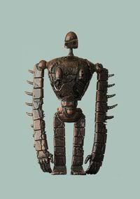
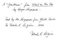
Miyazaki Gardener FigurineIn pursuit of fundraising to encourage future writers (NB: This is a Good Thing™) Portland's own Ursula K. LeGuin has donated two Hayao Miyazaki statuettes; one a Gardener from Laputa: Castle In the Sky and the other a castle from Howl's Moving Castle. The figurines (pictured, the Gardener) and notes from LeGuin for provenance's sake (see also picture).

Details on the auction can be found here, so read them!


The auction will begin on eBay on Saturday, 22 November 2008, and the link to the auction will then magically appear on the page linked to just above.


LeGuin NoteSo, if you have a few hot dollars in your pocket and you want to help support PNW writers of cool books, then consider dropping them on the Endeavour award. You get two Miyazaki figureines and notes from Ursula, Endeavour Award gets mo'money. Win-win!


Tags: , , , , , ,


Powered by Qumana


20 November 2007

[liff] My OryCon 29 Photos

1136. Not so many photos as others, and my set is kinda lame (except for the AJA photos), but I forgot my camera at home unitl Sunday. So it goes.

View 'em at flickr here.

Technorati Tags: ,,

[liff] Favorite T-Shirt Seen at OryCon 29: All Your Unix...

1135. Every so often, a t-shirt seen at OryCon sticks with us for being wicked clever smart funny. See our winner for OryCon 27 here. This one will similarly stick with us:

chown -R us ./base

A translation, for those who don't speak one of the many Unixy OSs out there:

  • chown is a command that allows you to change ownership of a file or directory.
  • -R is a command line switch that means recursive, and tells chown that if the thing to be chowned is a directory (folder) to also chown everything in that folder and in the folders it contains.
  • us is the user name of the user we want to change ownership to.
  • ./base is the name of the folder.

The translation, of course: All Your Base Are Belong To Us. Who says the joke is dead?

Technorati Tags: ,,,

[liff] OryCon 29 In The News–We're All Just Having A Good (and Smart) Time

1134. As long-time OryCon habitués, Y.T. and The Wife™ are used to a certain cliché in reporting on such gatherings–without putting too fine a point on–that characterizes your average group of SF convention attendees as suspicously wierd.

it's a pleasure therefore to find two local writers mentioning it and showing that that they Get It™. Kristi Turnquist's article for The Big O (14 days free, then you pay), stops by what looks like the usual "fandom-as-group-of-weirdos" station with its opening paragraph:

It's not hard to spot the attendees checking in for OryCon 29 at the Portland Marriott Downtown Waterfront hotel Friday afternoon. They're the ones wearing black tricorns finished with sweeping purple feathers. Or medieval milady frocks, revealing ample cleavage above corseted folds of ruby velvet and black satin. One volunteer sports elaborate facial tattoos and piercings. Others sweep through the hotel lobby in Goth-black full-length coats.

I think I know which tattooed volunteer she was talking about. He's a pretty nice fellow.

At any rate, to those used to the typical look-through-cynical-lenses view that seemed to typify popular press about SF conventions, this may seem a familiar tune. But, suddenly, after a single informational graf, a decided shaft of sunlight:

For those who aren't members of this fan community, it's easy to get stuck on the costumes and tempting to indulge in some eye-rolling jokes at their expense. But that kind of reaction misses the point -- by light years

Well, saying someting about an SF community missed the mark by astronomical measure is still a little clichéd, but given the rather warm embrace forshadowed by that bit of prose, we are more than willing to forgive it. The rest of Kristi's article touched on a lot of the reasons I like to think we all go to OryCon (and to you lucky devils, other cons)–smart people having the kind of good fun smart people know how to have; literary minds who like a bit of adventure in thier lives; the childlike joy of play for adults of all ages with an intellectual slant.

A Saturday morning panel featured authors Ursula K. Le Guin, Kate Wilhelm, David Levine and Leslie What discussing the value of writing workshops. After the session, Le Guin -- an icon in the science fiction and fantasy literature world -- said she doesn't often attend OryCon, but wanted to this year to honor the 25th anniversary of the Susan C. Petrey Clarion Scholarship Fund. It's a program the nonprofit, all-volunteer OryCon operates to send writers to the acclaimed Clarion writing workshops. "I'm not a big partygoer," Le Guin says, with a smile. "But these people work so hard, and I wanted to support that."

We think Kristi ranged over quite a bit of the convention; whilst my The Wife™ was chatting with Alexander James Adams in Dealer's (which I wrote about a couple of discourses back), she thinks it was Kristi who paused to ask them a couple of questions about thier costumes. My understanding is it was fielded with Alec with aplomb).

Meanwhile over at WW, Claire Evans takes a rocket ride around the convention. It's a short article, so not everything gets mentioned (find links to flickr albums as the end of it, tho), but she successfully blends the absurd fun (a mock bad-acting trial of James T. Kirk  on counts of fashion sense, stilted delivery, and bad hairpiece) with the smart:

Every year, OryCon plays host to a cadre of high-profile writers and SF personalities, and this his year was no exception: the grand dame of Oregon fantasy literature, Ursula K. Le Guin, held court, along with legendary animator Will Vinton and award-winning author Robert Charles Wilson. The big names weren’t the only appeal, though: a “gaming room” was well-stocked with men in Utilikilts rolling dice, while the program ran late every night with pagan ceremonies and hearty rounds of Filking (trust me, you’re gonna want to Google that.)

OryConners are amongst the most interesting people I've ever known. I'm thrilled that the mass media–or at least two versions thereon–seem to understand just what goes on there: good fun and a great party put on by fun people.

And any news article mentioning Utilikilts pretty much rocks, as far as we're concerned.

Technorati Tags: ,,