Showing posts with label The Color Initiative. Show all posts

13 April 2010

[design] A Double Hit Of PMS 4975 Looks Tasty

2393.The excellent things one finds by following printers and designers on twitter – according to Tyler Ashcraft of Bridgetown Printing:
Soft touch aqueous on a rich brown (double hit of PMS 4975) is reminiscent of melted chocolate. Just sayin...
Colors evoke memories, and that's true. Blue, green (like the crops around Salem) and golden brown work very well for me. By a "double hit of PMS 4975", he means you take a spot ink – PMS stands for Pantone Matching System, and specifies an exact colored ink (rather than the approximation you get from four-color process) and overprint it. The "soft touch aqueous" is a coating that creates a shiny translucent surface over that ink. Here's what a double-hit of 4975 looks like in InDesign, with the overprint preview turned on:


Put a sheen on that – yeah, that'd do it.

I love the way printers think. Like water for that chocolate?

Follow Tyler Ashcraft at Twitter by dialing up @TylerInCYMK.

Technorati Tags: , , ,

16 July 2009

[print tech] I May Not Be Rich, But My Black Is

2153.I got a tipoff to a great article today about three sins in print design, and they're good things to remember.

They reduce down to three things they even teach you in Community College design school, they are that basic. they are, in order: Designing in RGB rather than CMYK; using black rather than "rich" black; and not using 300 dpi images in designs meant for print.

The first and last can make up an article all on thier own. But the second really caught my attention, because I also have a love of words that make things that don't necessarily happen together stick in the mind. Though the idea of "rich" black should stick in every print designer's mind.

Okay, enough circumlocution, and besides, what non-designer readers might want to know is, just what is rich black (disposing of the quote marks hereinafter)? It's pretty much what it suggests it is: black with a little "something extra".

Color print (other than spot printing) involves using the four so-called process colors cyan (C), magenta (M), yellow (Y) and black (K) to create the colors you see on the final product. Nothing is perfect, so CMYK can't produce every color you find in nature, but the gamut (a color theorist term for the range of possible colors that can be produced) is wide and useful enough that you'll never run up against a wall. Since inks aren't perfect, then black isn't perfectly black. You have to give it a little help. How? By adding one of the C, M, or Y inks.


On the left, true black @ K=100, On the right, rich black at C=90,
M=60, Y=30, and K=100. Inspired by the linked article.


Long ago, some wag said you can never be too rich or too thin. In the CMYK model, that's only half right: as you can see, you can indeed be too thin. True black ink, printed at 100%, may seem black, but when put up against rich black, it seems gray. A very dark gray, to be sure, but unmistakably gray. You amp up that black by throwing in a bit of one, two, or three of the other process colors.

Amusingly (and perhaps predictably) there is more than one opinion as to what constitutes a good rich black. One of the commenters in the linked article, Darren, put it in a way that's both interesting, has a clear grounding in color theory, and is easily rememberable:

I am a prepress technician and a true rich black or super black is 100% K and 40% Cyan for a cool black or 40% Magenta for a warm black. Don’t use any other percentage combos as they cause problems for the printer. Also don’t use a rich black for any text under 20pts (printers hate that). And if you do any of the above most printers will convert your pdf to the percentages I have above. Only use it for large black areas and text over 20pts.
And that's another thing: rich black isn't ideal for every part of the application. True black is typically adequate for small black areas and type you're going to be reading; the more ink you use, the more saturated the paper is going to become, which has the unfortunate tendency of munging up the works.

But if a real good black is part of the overall design scheme, you'll want to remember to use rich black. Black is a powerful color, and if you're looking to make an impact with that design, you'll want it to crackle and pop, and if you take the edge off your black, the pop just won't be as large.

Technorati Tags: , , , ,

07 April 2009

Color vs Mood: That 70s Ring

2018.The idea of color matching mood is one that apparently runs deep within our own Western culture. And nowhere does that idea have a more whimsical fruition than that iconic bit of 1970s mass-market jewelry couture, the mood ring.

This trifle, a staple of the 1970s – a decade that could still glimpse the free-love and emotion vibes of the 1960s and the Summer of Love – purported to disclose the mood of the wearer via a color change. A typical rundown might go as follows:

  • Black Very stressed
  • Gray Very Nervous
  • Amber Anxious and/or uncertain
  • Green Calm
  • Teal Calm and relaxed
  • Blue Happy
  • Indigo or Violet Happy, romantic or passionate

Some of the mentioned colors may align with ones' personal subjective impressions of color, and some may govern ones' subsequent reactions to a certain range of colors. Some may simply make little or no sense. Follow this link for a nearly-insanely detailed list of possible meanings.

The rings worked on a very simple principle: body heat. The usually-inexpensive rings had a layer of liquid crystal bonded to a surface over which was mounted polished glass or some inexpensive transparent gem. The liquid crystal responded to changing body heat which was held to be in specific response to specific moods, refracting light and changing the reflected color as body heat changed ... as mood changed.

What I find interesting here is that many of the colors listed correspond to already-held assumptions about color in Western society – blue, green, and cool colors were held to connote clamness and cheerfulness, whereas colors such as black, which is found in situations of gravity and grimness, connote stress and strain.

The connection to mood and bodily response is one whose validity is open to question, depending on one's point of view. The interesting thing about the mood ring is that instead of color determining mood, mood determines color – which is a thing that wouldn't occur to us in the gestalt if we didn't think that color did indeed, somehow, influence mood.


Technorati Tags: ,

28 March 2009

The Wilcox Color Bias Wheel: Yellow and Blue Don't Make Green? (Updated)

1996.In my quest to understand color better I've collected a great deal of references. One of them, and one I commend to anyone at least to push the envelope of their color thinking.

Michael Wilcox is one of the new colorists who has some views which seem bombastic but have "bang-bang" headlines to get your attention then shows eminent and solid logic that even the tyro and the layman and the beginner can grok.

But Blue and yellow don't make green? Strange thing to say, especially due to the conventional wisdom as due to the color wheels we've seen certainly seem to solidly suggest that they do. If you take out your paints and play, you pick a good-looking blue and a good-looking yellow and they sure do seem to go to green, or something that looks like a good green.

What might not be obvious to the beginner though is that color theory is predicated upon idea, perfect color. The red, blue, and yellow primaries we toss about in discussing color like so much grade-school tempera are in fact perfect pure ideals: the red we think about is the absolute red, the yellow and the blue also absolute.

Of course, nothing is perfect. In reality, no such thing exists. No matter how primary you red paint is going to be, there's going to be a semmingly-infinitesimal about of yellow or blue; in every blue, a tiny bit of yellow and red, and in every yellow, a tiny bit of red and blue. Moreover, of these combinations, say, in a red, there's going to be a preponderance of one or the other of the other two primaries–more of the blue than the yellow.

All of this is a roundabout way of saying that all primary-color paints are subtly biased one way or the other toward one secondary or the other. Every red is either subtly violet-red or orange-red; every blue is either subtly violet-blue or green-blue; every yellow is either subtly green-yellow or orange-yellow. Starting out you may not notice this, but as you get better at looking at color, you'll start to see it. Select any two different-but-similar primary colors, lay them out on a ground and compare, and the result may become instantly apparent.

This will open your eyes. It opened mine wide.

The illustration at right s the result Mr. Wilcox came up with to abstract the entire concept, and it does it with astounding clarity. It resembles our classic color wheel in that you have red, yellow, and blue primaries, and orange, violet, and green secondaries. But see the arrows and note that the red on the side of the orange is orange-red whereas the red on the side of the violet is violet-red. This is actually the state of the primary colors you're likely to run into as a painter, be it oil, watercolor, or what have you.

It opens the door to a system where knowing your colors and their biases means mixing color is a thinking process rather than a chance process. As Wilcox himself says in the book Blue And Yellow Don't Make Green:

To define red, yellow, and blue as primaries is only true in a rough and ready way – leading to rough and ready color mixing skills.

If you're trying to learn color theory and plain on painting, you need to at least acquaint yourself with Michael Wilcox's work. His School of Color is a commercial concern that will sell you books and materials that will do the trick, or at least find yourself a copy of Blue and Yellow Don't Make Green and let the information sink in. It's all so very logical and interesting that a whole lot of things quickly become possible to you.

Update: I see I'm not the only one that sees this book and Michael Wilcox's work as important. Canadian artist Michael King also was impressed, for mostly the same reasons. Wilcox's insight into color and how it works may indeed have been a quantum leap in how artists see and work with color.

Sadly, the review of the book is pretty shallow (sincerely sorry to say, Mr. King). If you're serious about paints, you know by the time you've gotten to Wilcox's book why paints work on the page and the insight isn't so much how the paints work but why color biases exist and why that's important (there is no such thing as a pure primary in paint and how to use that as a basis for color thinking and mixing).

But I do appreciate the updated cover design. Very smart.

Technorati Tags: , , , ,

16 March 2009

Filed Under: The Color Initiative

1982.For those who wonder, I am creating a new label for filing my posts about color, of which there will be more, and related to a project I'm nurturing under careful development.

This label will the The Color Initiative. My main thrust is color and mood and what I can find out about it, but the thing about color theory is that if you dig your beak into it just a little, a whole lot starts presenting itself.

It's my public diary about my exploration of color, and, as usual, everyone is invited along.

Technorati Tags: , , , , ,

13 March 2009

Color In The News: Gamblin's Unique Torrit Gray

1978.When going over what I could find out about color today, I was pleasantly surprised that not only was color in the news, but that it was a well-regarded Oregon maker of world-famous oil paints that was making the news.

Gamblin Artists Colors, I've the impression, is a company in the tradition of the colormen of the 16th and 17th centuries–utterly committed to providing artists with the best-concoted oil paints. Oil paints in and of themselves are a fascinating medium, whether or not it's your medium of choice (what painting I do I do in watercolor), and are, as far as I am aware, a very simple thing; you mix powdered pigments (some of them quite nasty and made from heavy-metals) and linseed oil.

Gamblin brings their "A" game by committing utterly to not only quality but also by a committment to being kind to the environment–very wise considering the qualities of some of the pigments, and very appropriate, being an Oregon company. In their studio, an efficient filtration system removes any particulate matter using products from a company called Donaldson Torit. Throughout the manufacturing and sample process, doubtlessly samples and bits of paint are discarded. Add all this waste together, colorwise, and what do you get?

Gray. In the ideal paint world, when you mix a great many colors together, the colors do not necessarily sum up to black; what they do is neutralize each other (an ideal red mixed with an ideal violet, for instance, being complementary (note they are 180 degress away from each other on the color wheel) cancel each other out to the degree they are ideal, resulting in, not black but gray).


If you mix together all the paint-leavings from around the studio and the particulate strained out of the air in the Torit filters, the result is, apparently, a luminous, somewhat pearly gray, with a green note. John Foyston of The Big O tells the story:

Each February, cardboard drums of pigment powder trapped by the factory's Donaldson Torit air filter are added to an oil base and buckets of waste paint, then run through the roller mill that gives Gamblin paints their trademark silky texture. Torrit Grey (with an extra "r" to avoid any trademark infringement) is the result, and it's packed into date-coded 37-milliliter tubes marked "always complimentary, not for sale" and then given away -- 11,000 of them last year -- to artists, students and teachers starting every Earth Day.

Torrit Grey is always free and it's always gray, because that's what happens when you mix together pigments from the dozens of different paints that Gamblin makes and sells to artists around the world. But don't think that gray is a synonym for boring: Any artist worth her palette knife knows that gray is a many-splendored thing. Far from being simply black and white, gray has a range of hues and shades -- they are the mid-tones that make up much of our visual world.

So it should be available in your local gentlemany art supply emporium pretty soon now. Locally I trust Art Media and Utrecht for new art supplies. You will, likely, not find this at your local Michael's, but I might be wrong about that.

Something else that occurred to me was that the Gamblin company (and, by extension, Mr Gamblin himself) are very canny marketers. Each Torrit Gray tube is as individual as what sold that year, and each are valuable in and of itself as subtly distinctive and individual.

It's a quirkiness that lends itself to amazing self-expression. The Gamblin concern even runs a contest each year for the most creative work produced by an artist using Gamblin Torrit Gray, White, and Black oils. Using these three colors is a bit of a challenge, because instead of using color, which, even when inexpertly-mixed, can tell a very subjective story with relative ease, using just black, white, and gray means you work only with value–the relative whiteness or blackness of a thing. As it happens (and this I've found true when you reduce your canon or your working tools to minimum) limiting your range to simply values seems to infuse even more creativity, resulting in works that are even more moving and compelling than you'd think. Gamblin's current gallery of Torrit Gray competition works can be found here; if they change it, just go to the Gamblin page and look up Torrit Gray.

Gamblin has a reputation of care and committment I find admirable. Torrit Gray is a brilliant stroke of genius. If Robert Gamblin only did what he did for oil paints to watercolors, I just shudder to think what would result.

Visit the Gamblin company here.

View the Oregonian article here, complete with a nifty video about how they do it.

(illustrations were taken from the Gamblin site for purposes of illustration only. All copyrights and rights obtain to them)

Technorati Tags: , , , ,

A Sort Of Inscrutable Color/Mood Graph

1976.As part of my researches into the intersection of color and mood, I stumbled on this chart. Follow the below link to view it.

Color Mood Chart

It's a little inscrutable. It's not clear how one might use or or how the list below maps to the diagram up top, but it does suggest connections.

Moreover, I'm finding charts that seem to be in agreement. It's hard to say if it's a group-think thing, or perceptions reinforcing preconcieved notions. The trouble with such suggestve things is that we cross-associate a great deal of things in our heads, and no two people, no matter how similar in overall outlook they may be, are really wired exactly the same. The color blue may suggest the same overall thing to the notional you versus me, but it does not mean that while the notional you might find blue with experiential biases toward happy things, I might find it biased toward sad or indifferent or not as happy as you.

What verbiage! I just barely avoided not wading through it.

In this list, for example:

Blue represents peace, tranquility, calm, stability, harmony, unity, trust, truth, confidence, conservatism, security, cleanliness, order, loyalty, sky, water, cold, technology, and depression

From the color mood chart linked above, we have Blue meaning:
  • RELAXED
  • AT EASE
  • CALM
  • LOVABLE
There is some congruence.

I'm still trying to find any scientific color study (you know, like that one in The Andromeda Strain (the better one made in the 70s, not that recent abomination) that told the engineers what colors to paint the walls on the underground WildFire lab) and will report back soon on this. I'm sure it's just around the corner.

Technorati Tags: , , , ,

Color Wheels Through History

1977.Something I didn't know until recently was that the concept of the Color Wheel itself–the flash of genius that caused someone to realize that you could arrange the producible colors in a logical wheel that not only displayed the natural progression but also turned the idea of color combining into an accessable thinking thing–blazed in the mind of none other than Sir Isaac Newton.


Not to belabor the point overmuch, but this is your general basic additive RYB color wheel. It's more than a logical progression for colors but a guide on how to produce more. To cover the obvious just for the sake of completeness, you start with your primaries–Red, Yellow, and Blue. These are the primaries, the colors from which all others flow and which cannot be further reduced. Exactly halfway between these colors are Green (Yellow+Blue), Orange (Yellow+Red) and Violet (Red+Blue), made with ideal equal proportions of the ideal primaries. Rounding out (if you'll excuse) the primaries and the adjacent secondaries produce the tertiaries.

In practice, of course, there's no such thing as an ideal, perfect primary. every color you get from a tube, crayon, or pencil has a very subtle bias, which is an idea I've lived with for a while and will write on very shortly.

The reason I wrote all the obviousness above is because the idea of the color wheel is a natural poetry that appeals. It's such a simple thing and works so very brilliantly, it's the most simple and effective guide to how to get what you want out of what you got ... it's born in logic and then transcends logic.

And I can't believe how highfalutin' I've gotten all of a sudden over the simple color wheel but I do whenever I realize what a quantum leap it was. I'd like to have been in the lab when Newton hit upon this. Well, that and when he figured out how to make them cookies (mmm, Fig Newtons(™ probabaly))!).

The reason I visited the color wheel is that I wanted to look through history. Wikipedia, while not 100% trustworthy, seems to have good examples.

This, for one, is Newtons original color wheel, diagrammed, correlated with musical notes and astrological symbols for planets (see, I said it was all kind of subjective):


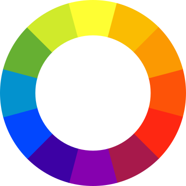
Note, interstingly, that Newton came up with only seven colors. The color wheel's evolved since it was devised. As a matter of fact, let me direct your attention to Boutet's wheels, which came in seven and twelve color flavors:


Ahh, cherubs and unnecessary illustration. This dates from the 18th C, 1708 to be exact, so this was probably sehr teuer, if you catch my German drift. Not too many could have afforded the book that contained it.

Speaking of the German, even the great Goethe got into the act:


This from his 1810 work, Theory of Colours.

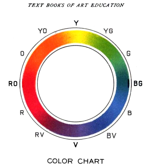
This color circle, from a 1904 book, wouldn't look to out-of-place in an art manual in modern times:


It also ID's the colors by initialisms around the rim. Very useful.

Actuallly preparing a color wheel should be something I will do very soon now, since it's simply fun playing with paint, and something I will post here as soon as I can get it up.

There are a couple of other nifty wheel designs to be seen at the Wikipedia entry here.

Technorati Tags: , , , ,

06 March 2009

Color and Mood, Part 2: What Does Green Suggest On A Map?

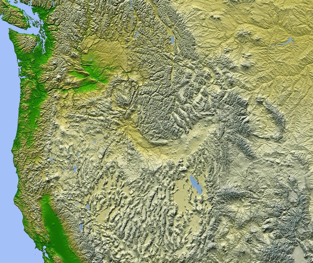
1965.Clear your mind of as many preconceptions about color vs perception as you can, and look at this map for a few minutes (which I sourced from here)


Now that you've had a chance to look at it, What's the overwhelming sense that you get? If you sense colors as dquivalent ot temperatures, as I do, you feel attracted to the green areas because they speak of coolness, especially when contrasted against the buff and textured areas.

You'd be partially correct ... but not wholly so. Naturally, the areas nearer the water that are green tend to be the most temperate, but the area in the lower-left–California's Sacramento River Valley–can get scorching hot in the summer. And, while the area around the Columbia River curling east and north into the Washington interior is green, anyone who lives in the agricultural areas of northeastern Oregon and southeastern Washington will tell you that cool lushness is anything but the order of the day during much of the year. The choice of color does communicate a sense of sparseness in the hieights though, however, in the Snake River Basin, which is a buff-yellow near the river itself, the grasslands frequently go to green where there is much irrigation.

But such is the drawback of using color to indicate altitude. Note, this is not a criticism, just an observation. For as many trained in art know, colors have a subjective "warmness" and "coolness"; a red-violet is warm, a blue-green is cool.

This is actually quite an apt color scheme. I recall US maps from grade school, and if you went to school in the good ol' U.S. of A., you know what I mean; lowlands were colored green and gradated to a rather aggressive red the higher up you went. The highlands seemed veritable infernos!

The colors tell a story about the highlands that may be consistent but may not be true. Again, this is not the fault of the cartographer, and nobody's fault really–it's just the way we're all wired.

Since color suggests so very much subjectively, we need to use it with consideration and care in our logo, print, and web design.

Technorati Tags: , , ,

04 March 2009

Color and Mood, Part 1: What Color Goes With What Mood?

1962.Color, to express an obvious point, is a subjective thing.

Our responses to color are conditioned by context, present mood, expectiations, and culture. What color connotes in one culture is different than what another says about it. For instance, in Western Culture, the color white can be thought to connote purity and "good" and might therefore induce a cheerful, sympathetic response in the viewer.

On the other hand, in Chinese culture, white is the color of death and funerals, and use of white as a design element will probably send the wrong message.

By way of anecdote, colors such as red and orange seem to sharpen the appetite. You find them used widely in steakhouses and Italian restaurants–it's not by accident, perhaps that the stereotypical checked tablecloth in Italian restaurants have a great deal of red on them.

A personal story might also illustrate. I adore pork chops, and some time ago, my wife cooked a singularly spectacular meal centered on chops. She loves to experiment, so she used some fruit juice to cook the chops in. The resulting color–a deep, rich, reddish-brown that diffused upward through the meat–rang so many appetite bells that I still remember the sensousness of eating this perfectly-otherwise-ordinary pork chop even today.

Color has power, and our reactions can be–well, colored–by the hues we use.

What colors are best for what uses? People like the good folk at Pantone have been researching this for years and can give you answers. With this post, I'm embarking on a personal research program in pursuit of updating a logo for a client (whose responsible in a large way for getting me back on my computing legs).

I don't know if that's what he meant to do, but it's a scary thing and an exciting thing. Color is ephemeral and subjective, and seems notoriously difficult to quantify. In the process, I'll be rooting out and finding every study I can. At the end, I don't think I'll have a definitive statement on color, but I expect I will have had a very wide adventure.

I'd like to call it a series of white papers, but that seems unfair somehow.

Technorati Tags: , ,