Showing posts with label photoshop tutorials. Show all posts

25 January 2012

[design] A Tutorial A Day, More Or Less: #1, Calendar Page Blog Icon

2771.Wanting to practice some photoshop, I found a tutorial that used layer styles, gradient overlay, and, oddly, inner glow to produce this:


… that is supposed to be a calendar-page icon for a blog.

Not too bad. Inner glow was kind of odd.

Here's the tutorial - http://www.stunningmesh.com/2012/01/how-to-design-blog-calendar-icon-in-photoshop/

How close can you come?

10 March 2010

[design] Making A Business Card In Photoshop

2341.
You can think of a million reasons to have a business card and a million situations to have one. You could also find out the figures you need to make it or … Tutttoaster has a nifty perspective on the basic-basic of the business card workflow that you can peruse. The tutoral file (included at the end of the posting) contains all the layers that were in the tute: The front looks like this:


And the back looks like this:


It's a nice design, but why not download it and come up with your own variations – if you're a designer, you shouldn't be satisfied with what you get handed, anyway. Never be satisfied with the default!

It's a fine foundation to build all sorts of business cards in, including your own, and with cheap business card services proliferating by the day, it's a fine file to have in your collection, or alter to your own workflow.

If you're any sort of designer, even if your an unsuccessful one like me, you'll want to do that.

Technorati Tags: , , , , ,

03 February 2010

[design] Just What IS "Basic Photoshop"?

2317.In exploring and using Photoshop, I find that people I know who have little experience and have acquired a copy of their own, say, an older version – Photoshop 7, CS, or CS2 – and want to start using them right away.

I've never pretended to guru status, but I do have a bit of training and experience in Photoshop and have always said that Photoshop is the pixel editing king for some very good reasons – most of which are hard to say but which unfold under use, one by one, like the petals of a blooming flower.

A couple of readers have recently asked me where an online place could be found to get beginners skills – they'd found a copy of Photoshop 7 and installed it but their eyes glazed over when they saw all the goodies. So I wondered, what would be the best things to let a tyro Photoshopper in on, the basic skills that would enable them to bootstrap themselves into basic Photoshoppery and thus the ability to explore the interface and use what they will?

The way I see it, the tyro Photoshopper needs to go in with the following toolkit:

  1. The Basic Paradigm of Photoshop: "Select it, then affect it". 99 per cent of what you're going to do in Photoshop reduces to this (well, if it's not 99 per cent, then it's a pretty good deal of it). Photoshop includes an armful of ways to select out what you want to change, and a seemingly unlimited bag of things you can do to those selections. A lot of the time you'll find yourself deciding what to do with a graphic, and excluding out the areas you don't want to mess up.
  2. Layers … Layers is what separates the pros (or wannabe pros) from the amateurs. Layers allow you to save copies of things you don't want to destroy, blend things with other layers, and non-destructively alter other parts of the photo or graphic. At the very least, layers allow you to orgranize parts informatively, and with the sprawling nature of some projects, the value there can't be ignored.
  3. The Basic Tools. To me, these are any thing that selects, in this case, anything that creates a marquee, brushes, and the path tool. Coming out of the "select is and effect it" paradigm then it follows that, out of the toolbox, your best friend is anything that will create a marquee – the basic selection medium. Knowing about marquees equips you to understand what you're doing with quick-masking and the Magic Wand, to use two examples, and the brush, being the basic tool for making marks, transfers into other tools (quick-mask uses a brush-approach). The Path tool, illustrated like a pen, works just like the pen in Illustrator, and paths can be converted into selections, saved – I love paths.
  4. How To Select Colors. You came to Photoshop to work in color, or most of you did. Understanding how colors are selected and saved should be considered a basic skill
Those are my basics. I wonder what other Photoshoppers consider basic?

Technorati Tags: ,

14 January 2010

[photoshop] Into The Blending Modes With Gun And Camera, Part 2: The Contrast Modes

2298.In the last missive in this series, we reviewed the top three groups on Photoshop's layer blending modes list: Normal (Normal and Dissolve), Darken (Darken, Multiply, Color Burn, and Linear Burn), and Lighten (Lighten, Screen, Color Dodge, and Linear Dodge).

The section after this, comprising seven modes starting with Overlay and ending in Hard Mix, are known as the Contrast modes, because the modes cause colors in the base and/or blend layer to darken or lighten, thus increasing the contrast. The measuring point is the value of the blend layer or color; usually here, lightening happens in some way if the blend is brighter than 50% gray, and darkening happens if they blend is darker than 50% gray. The principal difference between the modes seems to be how each accomplishes that.
  • The first mode, Overlay, allows the upper layer (blend layer) to overlay the lower layer (base layer), multiplying or screening the color depending on the base layer. This has the effect of maintaining the highlights and shadows of the base layer. According to Photoshop Help, the base color is not replaced but mixed with the base color to reflect the lightness or darkness of the base color.
  • Soft Light makes the blend layer kind of behave as a light source. The color is lightened or darkened depending on the blend layer. As a result, the image looks as though you're shining a soft spotlight on it. From Photoshop Help: If the blend color (light source) is lighter than 50% gray, the image is lightened as if it were dodged. If the blend color is darker than 50% gray, the image is darkened as if it were burned in. Painting with pure black or white produces a distinctly darker or lighter area, but does not result in pure black or white.
  • Hard Light works differently, of course; whereas the Soft Light blend lightens or darkens, Hard light multiplies or screens the color, depending on the blend layer. The effect is as though you're shining a harsh spotlight on the image. If the blend is lighter than 50% gray, it's lightened as though screened; if the blend is darker, it's darkened as though multiplied. This is useful for adding shadows to an image. Painting with black or white results in pure black or white.
  • Vivid Light burns or dodges the images by increasing or decreasing the brightness, depending on the blend layer. Blends (the light source) brighter than 50% gray result in a lightening of the image by decreasing the contrast, and darker than 50% gray are darkened by increasing the contrast.
  • Linear Light works as Linear Light does, but where Vivid darkens or lightens the image by changing the contrast depending on the blend, Linear Light darkens or lightens image by changing the brightness depending on the blend. Again, the cutoff is at 50% gray.
  • Pin Light actually replaces the colors, depending on the blend color. If the blend layer is lighter than 50% gray, pixels that are darker than the blend are replace where those lighter are left alone. If the blend is darker than 50%, the lighter pixels are the ones that are replaced.
  • Hard Mix is the most radical of this group. Remember that the RGB digital values can range from 0 to 255. Hard Mix adds the RGB channel values of the blend layer to the base layer; if the channel result is greater than 255, then that channel is set to 255; if it's less, the channel is set to 0. As a result, all pixels are changed to primary colors: red, green blue, cyan, yellow, magenta, white, or black.
These blending modes are a little hard to explain; I depended on Photoshop Help and tried to rephrase them a little better, with alternative success. Now, one can begin to see why a lot of Photoshoppers it's a process of trial and error.

In the next chapter of this exploration, I'll try and increase my own understanding of this by actually blending layers and examinging the results; along the way, we'll get to the next group, the Comparison modes, comprising Difference and Exclusion, and try to make some sense out of those.

Technorati Tags: , , ,

09 January 2010

[photoshop] Into The Blending Modes With Gun and Camera, Part 1: Normal, Darken, and Lighten Groups

2291.Originally, this was Missive 1816, done on the 18th of October 2006. I figured that since layer blending modes was one of the thumping hearts of how to use Photoshop, it would be good to reasearch and make notes on just what each blending mod did and make my findings public here.

Photoshop blending modes allow you to, of course, take two layers and make one influence the other in some way. Knowing how they work makes using them a thing of knowledge rather than of chance. The problem with blending modes is there's so darned many of them!, and some of the names are far from suggestive about what they do. You have all these great tools, but more than you can use, and you're not certain that the one you use will be the one you need.

That's not to say trial'n'error is inferior, but there's a time when you have the time to muck around, and there's a time when you don't (say it with me: dead-line. Very good.). Therefore, this exploration.

At the time, I planned on going through each group, then after I did this first group, I got distracted by … well, who knows? But I'm funking around with the Shop again, which means that it may be timely to go back into the blending modes again, with gun and camera.

That said, on with the show …

Working the last few tutorials has again reminded me how useful Photoshop's blending modes are. However, when I was trained in PS, I wasn't given a very deep understanding of them. The modes were used in a trial-and-error fashion, which, for a beginner, was kind of a relief ... the list can be eye-glazing to the tyro.

However, for long-term artistic development, one really wants to have a somewhat deeper understanding of what blending modes (with their odd names) mean. Along the way, and from various sources, I've made my own list. It's a work in progress, but it helps me a bit.

Knowing which tool to use improves your workflow; you save yourself the trial-and-error step and go straight to tweaking the mode.

The blending modes in PS are divided into a handful of groups, which are related by the general effect they have on the pixels they govern. In the following, I use three terms: base color is the original color in the image, blend color is the color that's being applied with the editing tool, and result color is the color that, of course, results.

 Herewith the list, divided by groups:

The Normal Group: causes no fundamental change to the pixel's color values
  • Normal Normal blending is just what it says; the normal mode of operation. To be specific, any painted pixel on a layer above simply covers up any pixel below it. This is the default.
  • Dissolve This one I don't use much. On a layer with a faded edge, Dissolve randomly replaces the pixel color with the blend color, depending on the opacity of the location. On something with a soft, blurry fade, Dissolving with another layer will turn it into a choppy, noise-y sort of thing. If you drop layer opacity below 100%, Dissolve will dither all pixels.
The Darken Group: Blends the pixels on the active layer to a darker color depending on the setting.
  • Darken The result of this is the blend color or the base color, whichever is the darker one. If the pixel is lighter than the blend color it's replaced; if not, no change.
  • Multiply Mathematically multiplies the two colors together; the result is the new blend. Multiplying any color by black will give you black; multiplication with white produces no change. Paint with this mode active and get darker and darker colors with each successive stroke.
  • Color Burn darkens the base color to reflect the blend color by increasing the contrast. I'm not too clear on what that verbiage means, but the result is what one site calls "crisp, toasty" colors. They look rich, warm, and overexposed.
  • Linear Burn darkens the base color to reflecting the blend color by increasing the brightness. The result is less lurid and smoother than Color Burn.
The term "Burn" comes to us from the photographer's darkroom, where an area of a negative was overexposed by by screening out the light all around. The Photoshop Burn tool icon itself reflects this heritage: the hand forming an aperture just so was a common way photographers isolated a burn.

The Lighten Group: Blends the pixels on the active layer to a lighter color depending on the setting.
  • Lighten replaces the base color with either the base color or the blend color depending; pixels darker than the blend color are replaced, and pixels lighter are not.
  • Screen mathematically inverts the colors, multiplies them, then inverts them again. The result is usually a lighter image. The name is wholly non-intuitive.
  • Color Dodge with the dodge modes we once again return to the darkroom. Dodging an image was the opposite of burning an image; instead of isolating an image for more light, the photographer used a paddle-shaped tool with a wire handle to block out the light, resulting in a lighter area. Similar to Color Burn, Color Dodge lightens the base to reflect the blend by decreasing the contrast. Each color becomes a value-brightness multiplier; black drops out entirely.
  • Linear Dodge Lightens the base color to reflect the blend by decreasing the brightness. Gives a smoother effect than Color Dodging.
We'll treat the next groups, Light, Invert, and Color blending modes, in a near-future missive.

Technorati Tags: ,

02 January 2010

[photoshop] Layer Masks, or More About The Alpha Channel

2287.A commenter in the missive, a few back, about creating the big-dot halftone
, further expanded on the notion of what an alpha channel is, and provides insight on how to better understand and use Photoshop masking technniques.

An alpha channel, as this artist understands it, is a separate informational channel, a companion to (If it's an RGB channel) the Red, Green, and Blue channels. It is not viewable – it is, however, used to store transparency information for the other channels.

"Storing selections" is one way of thinking of it. But, perhaps, a more catholic way of thinking about it is to think of alpha channels as masks. They are 8-bit channels, meaning each pixel can store one of 256 levels of gray, and can be worked on just like any other image. But the real power in the channel comes not so much from what you do to it, but what you do with it. Photoshop

If a Photoshop artist doesn't work with alpha channels much or is only now getting acquainted with them, the quickest way to get an introduction is to create Layer Masks with PS.

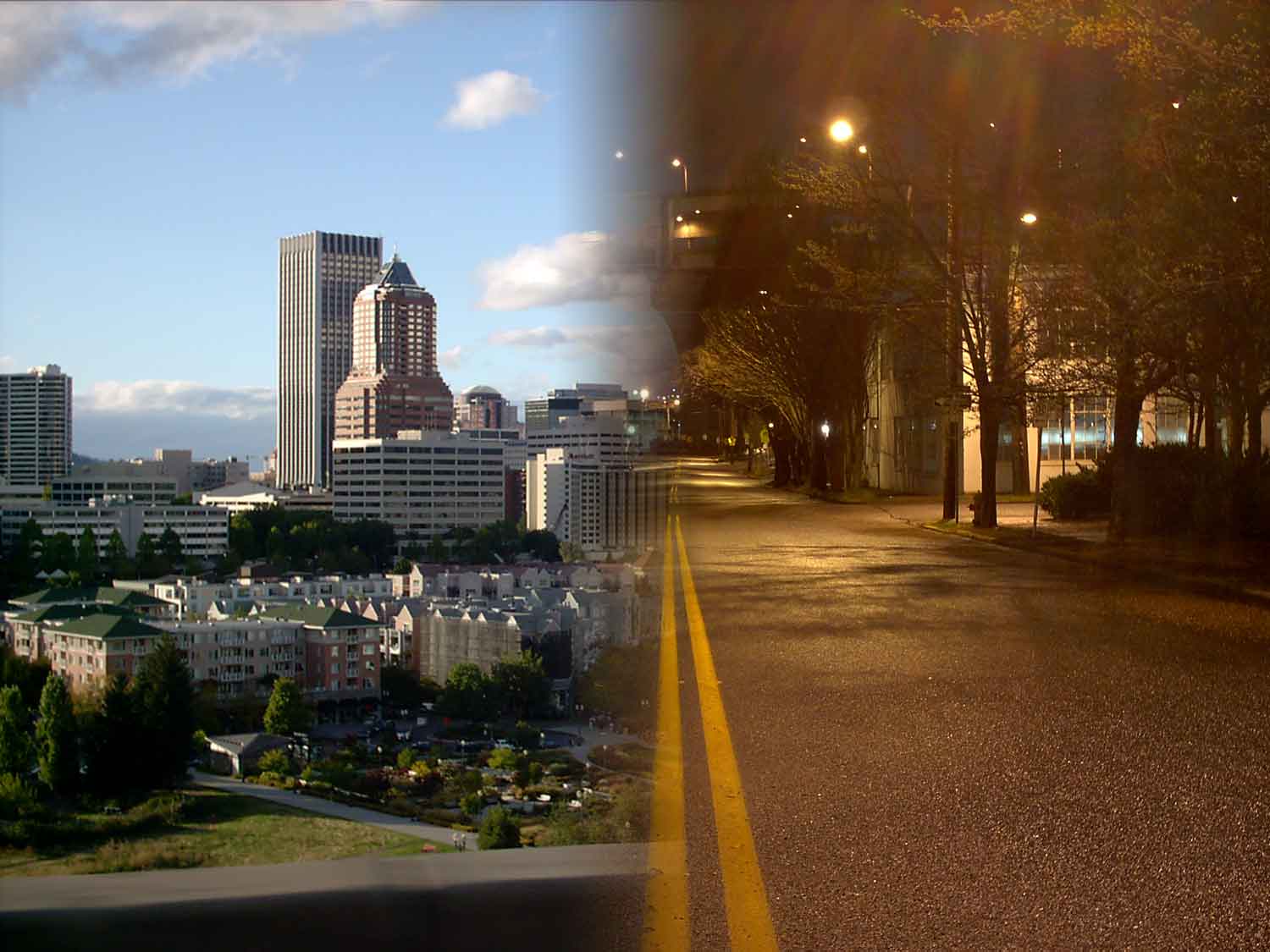
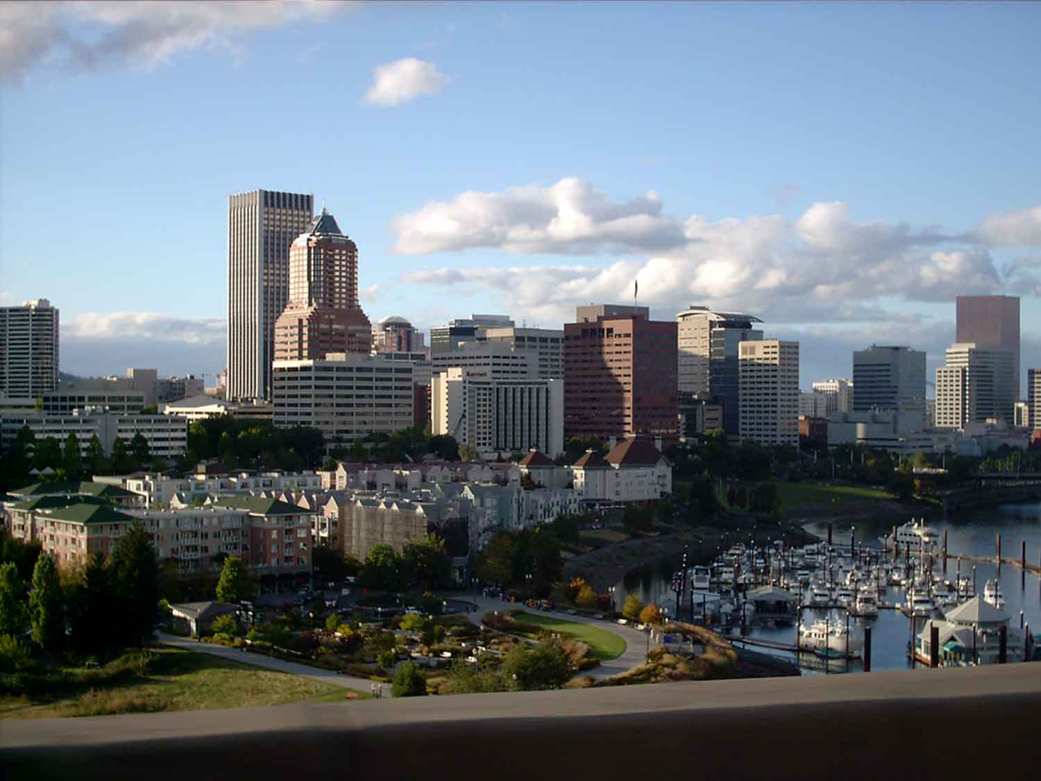
You probably know "layer masks" as those easy ways of combining two photos into one with an artistic transition, say a gradient or a whatever brush-or-eraser work you want to do, or custom brushes, or whatever. In my example here, I combine this image:


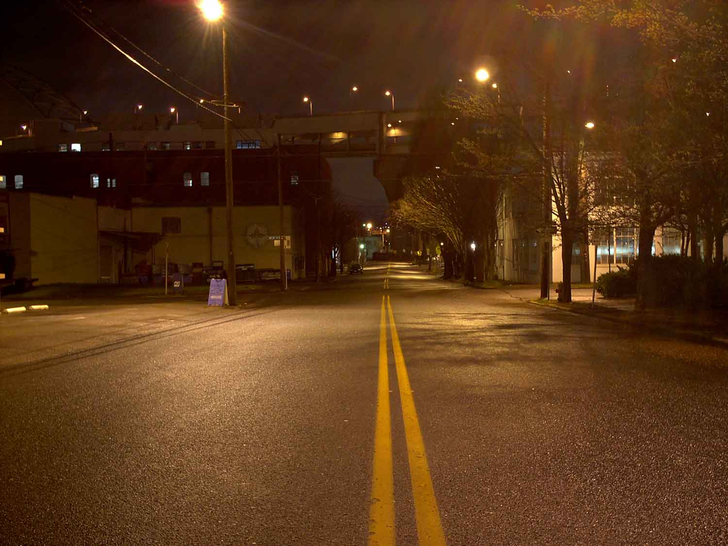
and this image:


To create, say, this:


It's very quick for the Photoshop user, and it's implemented via alpha channels and the information they contain (the amount of gray determines how much of the image below shows up – you're not really destroying the image, but I get ahead of myself).

Layer Masks are enabled via the menu bar pulldowns Layers > Layer Mask > Reveal All/Hide All/Reveal Selection/Hide Selection. The differences between reveal and hide might be kind of obvious, but to define, if you have two images, one on each layer, the Reveal option will have the effect of letting you paint or change the top image to reveal the image below; the Hide option hides the top image and working the image you see causes the top image to show through. It all has to do how Photoshop interprets the alpha channel – which becomes the layer mask.

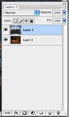
In the above two images, the city skyline sits on Layer 1 and the night scene sits on Layer 0:


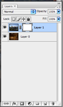
With Layer 1 selected, I go Layers > Layer Mask > Reveal All, and this is what I get:


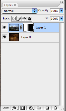
Note how a white rectangle, highlighted with corners and linked, has showed up in the Layers palette. This is your layer mask, and editing that layer mask will cause the image on Layer 0 to show through.

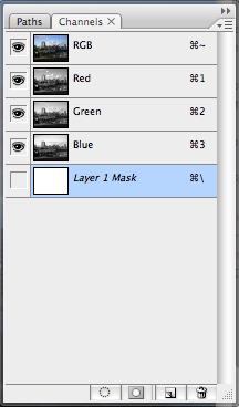
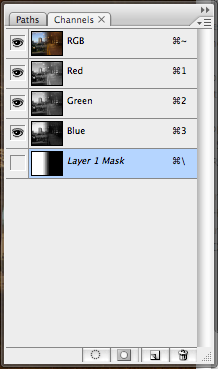
The white color is significant. If we look at the Channels palette, based on what we've found out about alpha channels, we begin to get an idea of why:


The layer mask is actually an alpha channel. It's solid whiteness tells Photoshop that the opacity of this mask is at a maximum, and if applied to a layer as a mask, it'll cause that layer to give maximum opacity. You'll see nothing through it – as long as you leave it alone.

If I go back to the layers palette, leave the layer mask highlighted, and do a foreground-to-background, linear gradient, this is what I get:


See how the layer mask icon on Layer 1 has changed? By making a gradient, I've changed the alpha channel info:


… which tells Photoshop how to interpret it as the mask which governs the opacity, giving me the half-reveal and the fuzzy transition in the middle which partially-obscures and partially-hides the lower layer – because that part was neither white (hide all) or black (reveall all) but gray (hide the lower layer to the degree that the mask is gray).


And that's not all. If you're sufficiently clever or if you want to operate directly on the mask, you can simply go to the channels panel and operate directly on the Layer 1 Mask channel.

Technorati Tags: , , ,

01 January 2010

[photoshop] The Big Dot Halftone

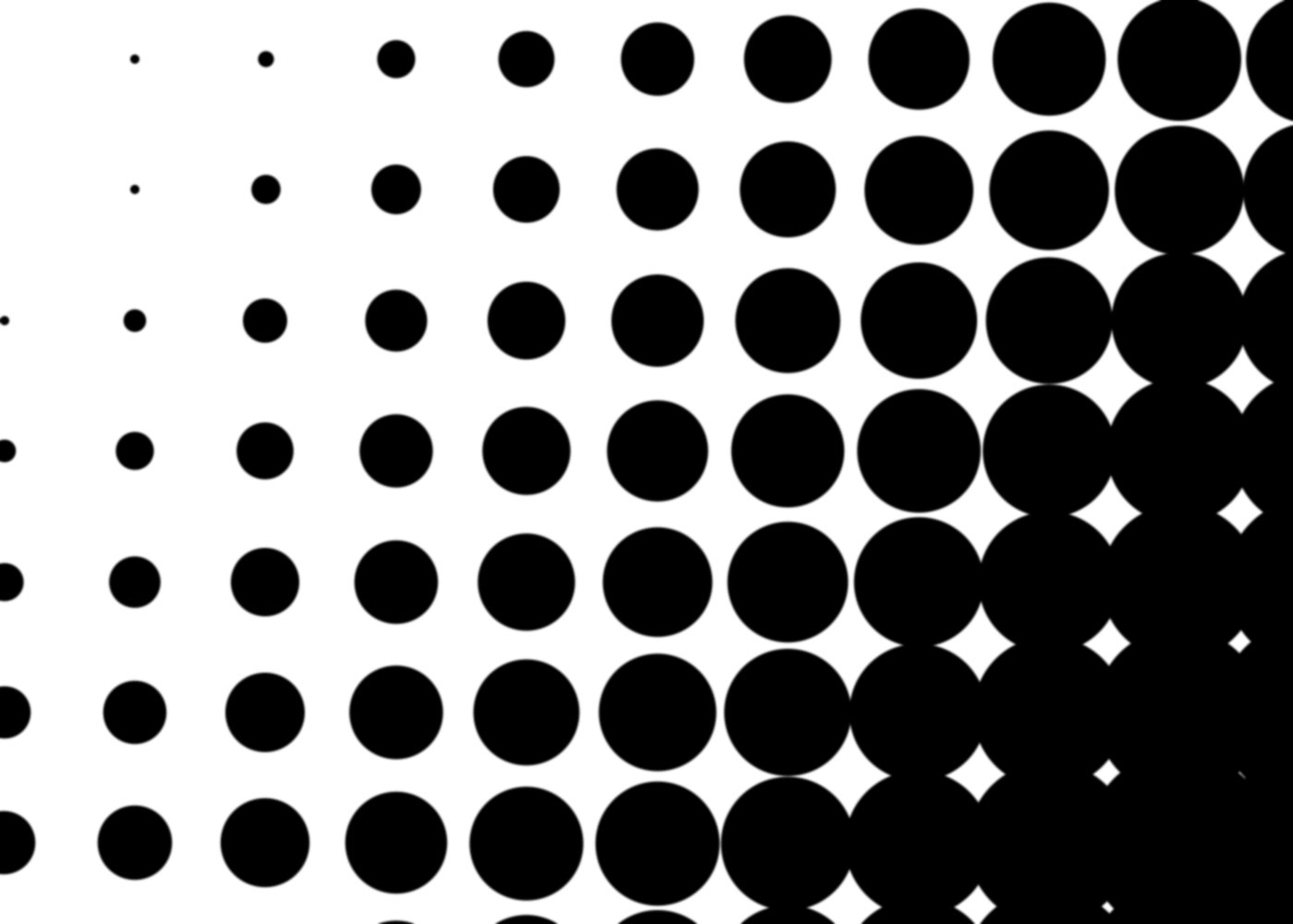
2284Dig, if you will, this picture:


Nifty, yes, You can picture using this for background texture for a funky bit of photoshopping, some sort of retro touch to a design. Well, this is what I call a big-dot halftone, and I can show you how to make it quickly and easily, and it involves alpha channels, which mean you can use it in a dozen-and-one ways, just as a selection.

That's why alpha channels are awesome. You should know about them.

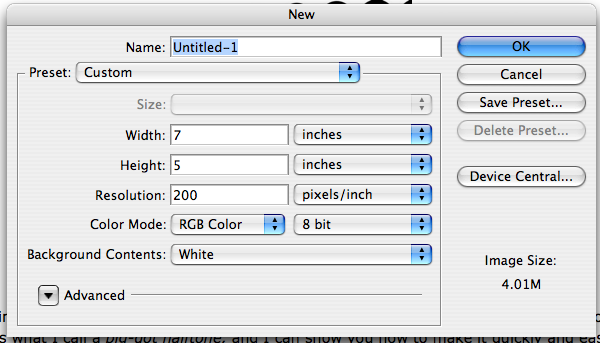
First thing you do, in this case it will be sufficient to open Photoshop (I use CS3) and create a standard photoshop document (I just used 200ppi for no particular reason. Use whatever suits you, though more than 100ppi would probably be better for experimenting, and once you get the hang of it, play with settings):


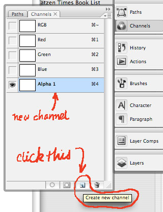
Second thing you do is to create an alpha channel. To do this, go to the Channels panel and click it to open. The standard documents just have (in the RGB case) the Composite RGB channel, and the R, G, and B channels separate. Click on the "new channel" button on the bottom and the channel will be created and automatically named "Alpha 1" and autoselected (rename the channel if you wanna).


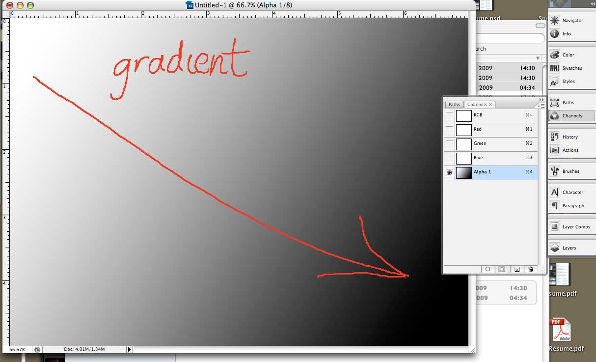
Third thing you do is create a gradient in this alpha channel. I took a linear gradient and just swept it whatever-which-way I felt at the moment.


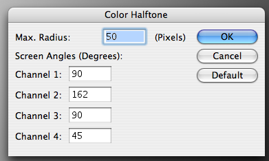
Fourth thing you do is where we start to get to the meat 'n' tatoes of the thing. While still in your alpha channel, Call up Filters > Pixelate > Color Halftone from the menu dropdowns. You'll get this:


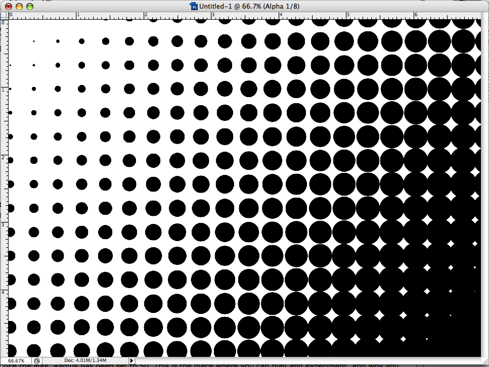
Notice the Max. Radius has been set to 50. This is the place where you can play and experiment, and why you might want to have an eye toward how many ppi's are in your document. But for now, just follow along. Another important thing to notice here is that the screen angles here can be specified for all four channels, but recall when working with black and white only, the only one you have to worry about it Channel 1. I want a up-and-down, horizontal-vertical screen of halftone dots, to I set the Channel 1 screen angle to 90 degress. Here's what I get when I apply the above settings to my alpha channel gradient:


Now, remember this is still alpha channel. It's true that you can do the same sort of thing on the actual PSD by invoking the Color Halftone dialog, selecting the color or channel and invoking that that way, but by doing it in the alpha channel you have that thing that Photoshop makes so very profitable – a saved selection. You know the basic Photoshop workflow - select it and affect it. Well, here you have the selection locked in. Now, by dragging the alpha channel to the Create Selection button on the Channels panel, you have instantly created a selection that you can grow, choke off, fill with whatever color you want. It allows more creative power.

Now you have a way to use gradients, alpha channels, and selections to make funky effets for fills, backgrounds, or whatever. But you can also kick this up to the next level. As you've probably deduced, the rate of dot growth depends on the steepness of the gradient, how close to white the white end is, and how close to black the black end is. And there's more than one way to create a gradient, of course, and by that, I mean make a selection and blur. I've seen other Photoshoppers and tutorial authors do this, and I'll show you how I'd carry this out.

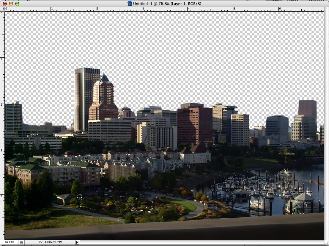
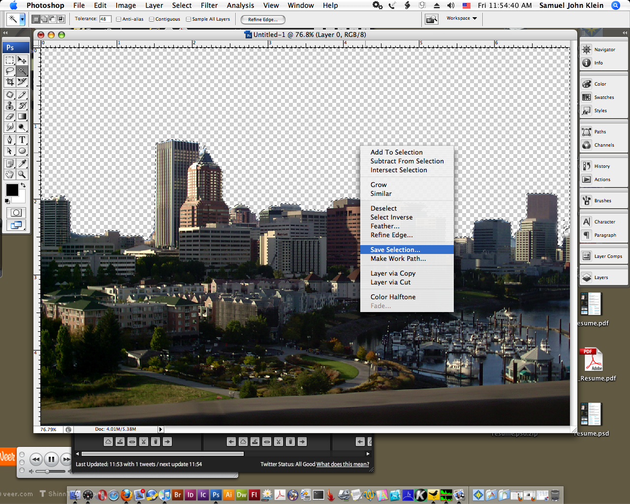
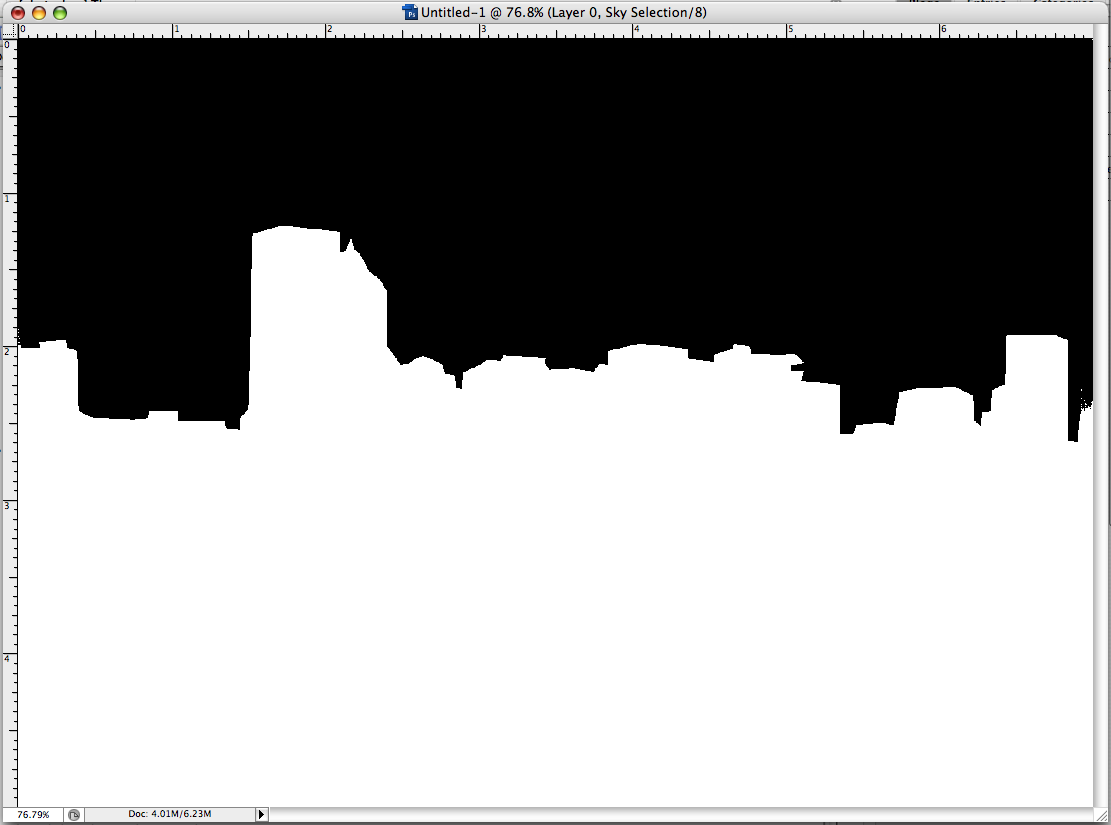
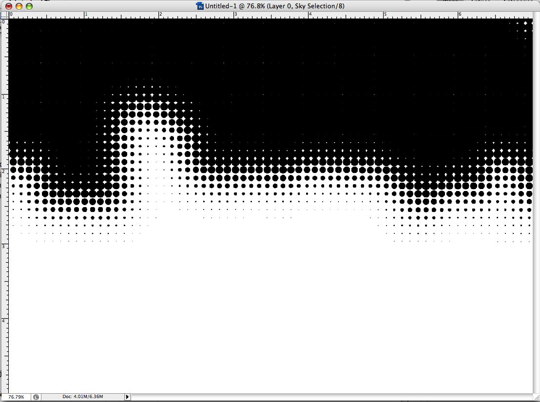
First, get a neat shape you want to decorate. I took one of my favorite pixs and used a path to create a selection that subtracted out the sky and made that clear area a selection. Then, I created an alpha channel with that selection by CTRL-clicking (or right-clicking) to make the screen menu come up, then selecting "Save Selection" to create an alpha channel out of that selection:

1. Picture with sky subtracted out:


2. Selecting the clear area and creating a selection:


3. The alpha channel created:


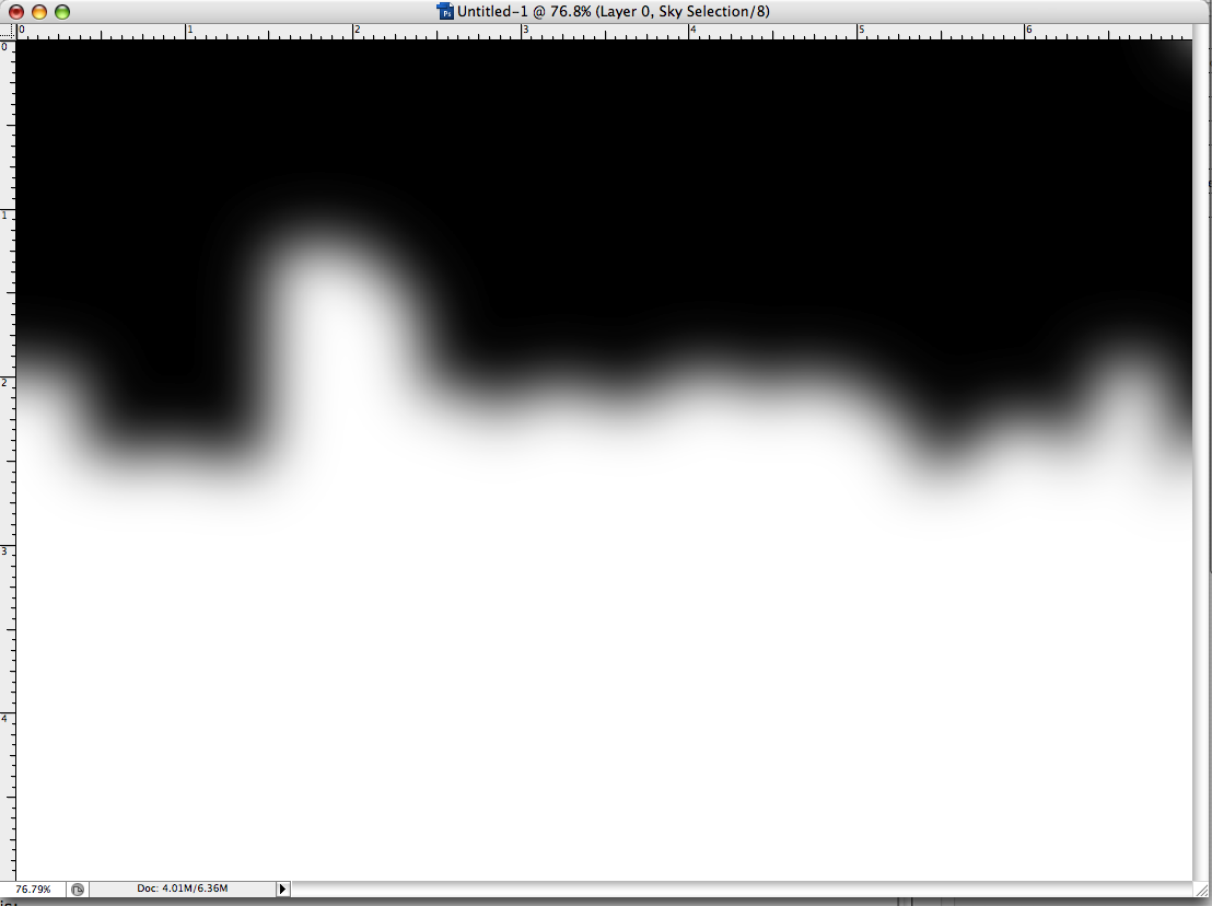
Now, to create the gradient with blur. To that, we turn to the Photoshopper's best friend, Gaussian blur (how did with ever get along without this genius bit of code?) I appled Gaussian blur to the whole channel and played with the pixel radius until I got something that struck me as close enough for jazz, which, as it happened, looked like this:


I just went with this, knowing I could use the History panel to dial back and try again. It's play time!

Now, the moment of truth! Using the same Color Halftone settings as before, but reducing the Max Radius to 15 px (I didn't want them too chunky), I got this:


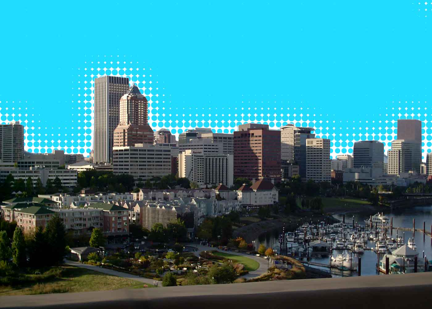
This is looking promising. My alpha channel is good to go, the selection info done and saved. Now, going back to the full composite channel, I create another layer and make sure it's behind my layer with the picture in it. Returning once again to the Channels panel, I drag the alpha channel to the "Create Selection" button, and fill that selection with a nice-yet-unnatural blue tone. That was the journey, this was the destination:


Funky? You bet. This stuff's just looking to be made into one of those black-light-flock posters. True, that. Contact this blogger if you're looking for the rights to do just such a thing.

Technorati Tags: , , , ,