
2325.… and it's better. Still not great, but better.
Lest you think I'm simply belittling it, let's take a tour … A three-logo tour.
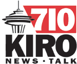
Some time back, Seattle's KIRO was AM talk radio, and they had this logo:
Technorati Tags: broadcast logos, radio logos, KIRO, rebrandingLest you think I'm simply belittling it, let's take a tour … A three-logo tour.
Some time back, Seattle's KIRO was AM talk radio, and they had this logo:
… and I fairly rhapsodized about it. And why not? To align the slanted end of the red stripe with the leg on the front of the R is cleverness of the highest order. The well-done Space Needle icon is just icing on the cake here: the alignment trick sets up an internal structure that makes the whole thing hang together just on the alignment alone. This was a logo done right.
Well, KIRO moved to FM, and debuted this:
Which I took a dislike to for two reasons: First, the stacked FM just makes the thing ring with discord, and the rejiggering of the numbers and the type in the red stripe knocked the slanted end completely out of alignment with the leg of the R. The nifty in the logo had been killed and the body hidden somewhere, maybe on Mercer Island, who knows.
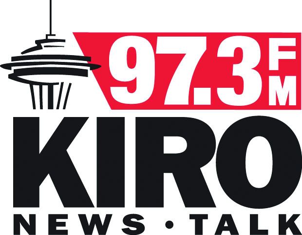
Well, our Seattle correspondent Ben alerted me to a new alignment of the parts – and here we have it:

They've applied some textual healing. And, like I said, it's better. Not great but better.
On The Upside:
On The Downside:
Sometime soon I might redesign this logo just as a something-to-do, hypothetical project. I have wondered if I could do it better, in case anyone wonders.
H/t to Ben for the headsup.
Well, KIRO moved to FM, and debuted this:
Which I took a dislike to for two reasons: First, the stacked FM just makes the thing ring with discord, and the rejiggering of the numbers and the type in the red stripe knocked the slanted end completely out of alignment with the leg of the R. The nifty in the logo had been killed and the body hidden somewhere, maybe on Mercer Island, who knows.
Well, our Seattle correspondent Ben alerted me to a new alignment of the parts – and here we have it:
They've applied some textual healing. And, like I said, it's better. Not great but better.
On The Upside:
- The stacked type is gone, gone, gone. The problem with the stacked type, even for something as minor as two letters FM, is that it brings your eyes up short. You're reading, left to right, and then ZANG you have to jink upward. It's unnatural. Eyeflow is, as far as I'm concerned, as important in a typographic logo as it is in any textual context.
- The black type – red stripe – black type makes for a stable, ordered logo. Business-like. Presents a sober, serious image for a news-talk station, which is appropriate.
- I've not said too much about it before, but I like the Space Needle drawing. Or maybe I did say something about it, I don't know, but I can see why they'd be reluctant to let that go.
- The way the Space Needle graphic breaks out of the boundaries keeps the logo serious without becoming too locked-down and boring.
On The Downside:
- Is it just me, or does that 7 look a little too thick to be with the 9, 3, and decimal point on the top?
- I still miss the dead-cleverness of the original logo. I admit it. Maybe I love these things a little too much.
Sometime soon I might redesign this logo just as a something-to-do, hypothetical project. I have wondered if I could do it better, in case anyone wonders.
H/t to Ben for the headsup.
No comments:
Post a Comment