Showing posts with label maps. Show all posts

13 February 2020

The 1994 Map Of Silverton, Oregon

3607
I've been on a deep dive through more than 20 years of collected paper ... maps, many of which I've collected, a great deal of which I've drawn myself, because city maps were always a passion for me.

I'm proud to call myself a Portlander, but my birthplace, along with several greats and other near-greats, was (and still is) a place called Silverton.

When I was a kid, life was not always kind. I was the bullied one, that one in every class, the one that kids let new kids know about so they have a head start on it.

That was then. I lived. One of the things I did to make me feel good was to deep dive into maps. I soon discovered I was transfixed by the patterns of streets, the way they ordered themselves amongst each other, the shapes and patterns of blocks, the shapes created by the city limits and the way the pattern of streets lived withing them. And, perhaps in what I should have seen as a presage of blunted ambitions, just as I got to the grade in Mark Twain Junior High (as it was then) and was in the middle of a class on how to draw a map of Silverton ... that's when we moved to Salem.

It's okay. It is what it is, or what it was. I wanted out into the wider world anyway; Silverton, as it was, was a small, stifling place. Had I been born there and grew up in the Sliverton that exists today, I may well have stayed. It's certainly not the same place.

But as you can take the boy out of Silverton, you cannot fully take Silverton out of the boy, and there is a corner of my mind that remains posessed of the place, the rearview seasoned to a large degree by the sepia tones of nostalgia. The parts of my childhood in Silverton that were kind? They were quite nice. We lived in a house on the edge of town a road that still has an awesome name (Steelhammer) and I had a bedroom that had a dormer window that looked east across the fields north and east of town. My mom worked her tail off; we never felt poor. On clear days, Mount Hood/Wy'east  could be easily seen, starting a visual love affair that continues unabated to the present day.

In 1994, still nurturing dreams of becoming a drafter or somehow working my way into drawing city maps for a living, I took an ODOT map of Silverton dated 1986 and created my own. Here's what it looks like:


This is Silverton very close to the way it was when I was in elementary school. Things changed very slowly in Silverton, if and when they changed at all: comparing this map to a modern map shows the city boundary flung out considerably in just about every direction, encompassing a couple of wholly new neighborhoods on the east and south edges of town; especially on the south and west to rope in the Oregon Garden (if you had told me as a kid that Silverton would eventually become a tourist destination, I'd have thought you un-sane). Silverton as I knew it scarcely had more 4,500 people; now there are more than 10,000, and it has become a hub of art and culture.

You know how you feel when your ex goes off and finishes themselves and become magnificent and your still struggling to get your stuff together? I know what that's like, only it's with my old hometown. Anyhow.

Here's a detail of the city center:


Starting from a primly-gridded downtown and city center, Silverton just grew any old way it pleased. The leg-shaped extension of the city going south was constrained by the narrowing valley that Silver Creek flowed out of. The grid tried to right itself on the east, but just kind of straggled up the hill on the west; the northwest corner of the city seemed to have its own ideas. North Water street became an east-west street. And up near a mill on the north edge of town which had become a manufactured-home plant by the time I existed, a tidy 3-by-4 block grid became its own neighborhood: Milltown (which, as it happens, was what Silverton was called before it was called Silverton).

And this is a detail of my side of town:


If you follow East Main Street to where it ends there at Steelhammer Road, and follow it south past where Reserve Street ends, there's a segment between Reserve and the bend where it becomes Evans Valley Road which is where my childhood home was, about dead center in that segment. The house I was a child in still exists, but there is what looks like an upscale cabinet maker there now. in the area south of Reserve and between the city limits then and Steelhammer/East View Lane that was an absolute blank and as I knew it then was a bramble-filled gully is now a capacious subdivision full of what I can only assume are fairly-expensive homes, all of which have been annexed into the city ...

... except for my old home. The city limits dance around it. Still just outside of town. I find this too cosmically funny to put into any effective words. Never mind the glandular subdivision that's sprung up at the south end of town, around the intersection of Hwy 214 (South Water Street) and Ike Mooney Road.

The area I lived in there was called by adults East Hill (West Hill being the opposite side of Silver Creek, where West Main Street ascended the heights) and was called by us kids Danger Hill: at the foot of it, just east of Third Street, where East Main ascended in about a 5% grade, a red diamond sign proclaimed DANGER and a rectangular sign below it explained HILL. Danger Hill. I don't know how they deal with it these days; those houses on East Main between Fifth and Rock, which are perched on that slope, must have some pretty nervy days when its icy or when the snow that seems to visit us more often comes to pay another visit.

Sic transit gloria iuventae, and all that. So it goes.

16 September 2017

[map art] JAMS: The Growth Of Portland Artistically Mapped At 82nd And Division

3498.
On the SW corner of SE 82nd and Division is a building that's been there a long, long time. For a great many hears it was the SE Portland home of Banner Furniture (which is now merely a single location out in Hillsboro), and before that, it was SE Portland's Piggly Wiggly outlet (according to the indispensable Michael Long) - I would have guessed a Safeway, since Piggly Wigglys never got down to Silverton or Salem (as far as I knew) when I was a kid and the old Safeway on East Main had a similar design and footprint).


Currently it serves as a community event venue and center called JAMS (Jade/APANO Multicultural Space), which is currently being leased by APANO, and is one of the current and evolving features of the core of area along SE 82nd between E Burnside and SE Powell which has been dubbed the Jade District. A great number of east Asian-owned businesses and culture have come out this way to join those that were already there (the Canton Grill, the late Legin (once the Lung Fung East - the pagoda-styled building razed to allow PCC-Southeast to expand) and the FuBonn shopping complex, amongst others) to form a burgeoning outer-east Portland cultural community that is evolving by the day, it seems.

JAMS bills itself as a temporary step between here and there; the building while in good repair, is clearly venerable and ripe for up-development. Until then, it's the community center that this area needs, and while it's there, it's using the old front windows, facing SE 82nd, to good effect.

There are large posters there, and one series that has caught my eye in the past few months, in the top tier of the windows facing 82nd, is a series of posters that appear to show the territorial growth of Portland since 1845.

Here's the one for 1845:


... and Portland in 1875 ...


... and Portland in 1915 ...


... by now you're noticing three things. First, the information is minimal; the visual profile of the Willamette and Columbia Rivers are clearly recognizable, the city's apparent extent limned by a thick red line, the interior of the shape filled with a vigorous, energetic, rough cross-hatching that looks like it was made on scratchboard. Secondly, the presentation is not complex, it's simple as it is direct. And, thirdly, it's rather inaccurate. The city area seems outsized and shifted to the north and west of where it should be.

So, it's a map ... but it's as much art as map. It's beginning to give me a gut-level, subjective idea of how Portland grew and despite - or perhaps because - of the informational subjectivity, it's incredibly engaging.

Now, 1945:


... 1975 ...

... and, appropriately instead of any particular year in that decade, we have the 1980s. Not only was this a 'fuzzy' time when old Portland began to change into new Portland, I can't really think of one exemplar year that would do justice to the whole decade. It was so chaotic it so many ways politically, economically, socially, and artistically.

The map does have a particularly valuable insight, in that the uniform red boundary line elsewhere in the map expands to a region on the east, and the caption 'unincorporated East-County' seems to appear as an explanation. That's an excellent way of noting that culturally and economically, even though the area between 82nd/I-205 and Gresham was part of Portland in every way but governmentally; that area was still Multnomah County. During the 1980s, of course, that era swiftly closed out, as the unincorporated land between Gresham and Portland was divvied up between the two in a rapid series of annexations which left the only unincorporated areas of Multnomah County those northwest of Linnton and that east of Troutdale and Gresham by the turn of the 2000s.


The sequence ends in 2016.


This is Portland as we have it today, with six major freeways slicing it into six easy pieces. The freeway meanders reduced to pixel-like steps, the area of "Portland" spilling over into what's actually Vancouver, the informational inaccuracy is at once aggressive on the left brain but informative to the right. Portland always has been a state of mind, now more than ever, and whysoever the art was designed this way, it's very engaging on a mind and soul level.

13 September 2017

[map] A Comparison Graphic: Salem, Oregon 1956 vs Salem, Oregon 2017

3495.
As a way of exploring GIMP and telling a story I've always wanted to (and indeed, fascinates me) I created a graphic giving one an idea of how much the capital city of Oregon, Salem, has grown territorially over the past sixty years. My sources are the city limits as defined by Google maps (close enough for my level of work) and the city limits as shown in the inset of the 1956 State official map I showed off a few entries back.

Here's what I came up with.


I am as impatient a cartographer as I am an any other mode of artist, so this was totally eyeballed. But GIMP allows me fine enough control that I was able to pretty much nail the aspects.

What I'd like to do is figure out how to realistically estimate areas of irregularly-sized objects. I can get the modern square-mileage of any town easily enough; the historical data is much more obscure. The magic beans for that, I not yet have and not know how to find.

I think a poster containing nothing but silhouettes of Oregon cities, arranged adjacent to each other and at the same scale for gut-level comparison of territorial sizes, would be devilishly interesting. I know I've always wanted to see such a thing. I'd stare at it for hours.

NB: After posting this I realized there was a considerable swath of territory that I had included in the incorporated area which was on the southwest side of the city, east of the southward bend in the river and west of the actual city boundary, at the western edge of Minto-Brown Island Park. This error has been corrected.

04 September 2017

[maps] Portland to Salem, from the Official Oregon State Map of 1956

3483.
As a companion to the Portland-Salem map I posted a few days back, which see, I give you this clipping, which is from a circa 1956 Oregon official state map.

And what a visual difference there is.


... and what a difference there is, yes? This is handcrafted, a thing that went out of style in the Pacific Northwest for about half-a-century before coming back into vogue with the coming of the microbreweries. A steady, practiced, passionate hand accomplished this work. 

All the place names we know so well are there, including one that not longer is (note the "To Valsetz" director in the lower-left-hand corner of the map, a little south and west of a small place called Falls City). The footprint of the City of Salem was appropriate for the city limits during the 50s, but seemed to survive on Oregon state maps well into the 70s, after the city had annexed much territory (as noted in that entry on that map).

While the roads are largely where they were going to be, a few reroutings strike some intrigue. 99E and 99W area still US highways at the point. Longtime Salemites will no doubt be delighted by the old routes of Hwy 22 going west and east - particularly Hwy 22 to the east, a great diagonal expressway reaching out to just east of Stayton, follows a much more circuitous route. That can still be followed today, if one cares to, by going south on Lancaster Dr SE until it becomes Aumsville Hwy SE. Follow that back road to Stayton and you'll get a hint as to how our grandmothers and grandfathers got out that way.

You'll also find US 99 north from Salem in the familiar alignment of today's I-5. The Interstate highway system was just aborning at that point. The bridge over the Willamette at Wilsonville was, at most, only a fraction of a year old by this point (it opened sometime between 1956 and 1958). Also, State Hwy 217 in the Beaverton-Tigard area followed a route that still exists today as SW Hall Blvd to Tigard and SW Boones Ferry Rd from Tigard south to Wilsonville.

And, while well-served by paved roads, a great deal of the mid-Willamette Valley could only be gotten to by gravel roads. Modern times were still a few years off for some of these places (and indeed could be argued they still haven't gotten there - modern times being what they are, that might actually be an asset, these days)


28 August 2017

[map, art] A Club For Those Who Want To Map Like Jerry

3481.
Back in 2013-2014, which I documented for the record, I documented my stumbling upon the organic life's work of a man named Jerry Gretzinger, who was creating, as he went, an imaginary world, 8 x 11 sheet by 8 x 11 sheet.

It's quite large now. over 50 feet long in one direction, and his world has toured the world, being shown in museums and art galleries. At first it was said to be called "Ukrania", but the name which has stuck is simply "Jerry's Map". Since it's been a while, here's the idea: Jerry began creating an imaginary city during lulls in a tedious job. The year: 1963. The original town, Wybourne (the original tile, pictured right) grew and grew from that beginning and then, as interests do, he moved on and shelved it. Eventually, a nephew discovered the stored map, asked him what it was, and he started growing it again. And never stopped.

This is something I've done and many aspiring artists and map affectionados such as myself have copied it. To us, Jerry is a hero because he's made a true commentary on the many forms art takes ... process, evolution, accomplishment. He operates on a set of basic rules controlled and governed by his own internal logic and directed by a deck of around 100 command cards fashioned from recycled playing card decks. These cards prompt for everything from introducing new colors to generating new tiles to creating new collages on the tiles to archiving and refreshing the world. So, to my mind, like no other artist, Jerry's Map not only chronicles the change in art over time, but it chronicles the changes the artwork makes on the artist, who folds that back into the process. The changer is changing the changed, and the changed is changing the changer.

Today I stumbled on a sub-Reddit called "Mapping Like Jerry!". It's a collection of similarly-inspired and aspiring artists who, seeing what Jerry has done, are moved to create their own versions of imaginary worlds. Jerry himself takes part, joyous as the friends he's obviously made along the way.

The sub-Reddit is at https://www.reddit.com/r/JerryMapping/.

27 August 2017

[maps] Oregon State Offical Map 1971, The Mid- and North Willamette Valley

3479.
This is a further scan from the 1971 Oregon-official state map I've uncovered. The previous map scan was of an inset-map from the back of the map, where city detail thumbnails and lovely state photographs can be found. This particular one is from the front, and is clipped from the main state map.

The ardent reader will by now have noticed the fold-marks, dark areas, and some areas slightly out of focus. All an occupational hazard when scanning maps that have spent the better part of the last twenty years folded and scanned in on a desktop scanner; please excuse the technical difficulty.


Only cities north of 30,000, give or take, are given the dignity of footprints on this map; the yellow-outlined areas are meant to give an idea of the expanse of the incorporated areas of the towns. Still, the were rather out of date at that time; the city limits detailed for Salem are more appropriate for about 1955-60, rather than 1971, which was about the time urban growth in Oregon really picked up steam.

At the time, that inaccuracy infuriated me; now, it's the most charming thing in the world, as is the kind layout, the conservative choices of colors and typefaces (especially for the larger town; the thickness and the squashed aspect ratio of that type has a subtext of cheerfulness, approachability, and friendliness.

A sort of "Oregon nice".

26 August 2017

[OR_liff] Portland-Salem Area Map, From ODOT, 1971

3478.
This I'm just posting because it's map, it's dear, it's sweet, it's nostalgic, and it's Oregon.

This is a map of the greater Portland-Salem area, the population and power center of my state, from an offical Oregon state map of 1971, from ODOT:


Everything in this is the landscape of my childhood. Even so, the city boundaries are somewhat out of date, even for them; Salem only had a population of around 68,000 (it's over 160,000 today); Gresham has topped 100K; all the city boundaries have expanded considerably.

But the roads are still largely in the same place. It's still Oregon, that's for sure. 

23 August 2017

[Maps] Google Maps Traffic Records The Eclipse

3473.
Sometimes it's more interesting to take an indirect look at something amazing. And, as amazing as watching Monday's total solar eclipse was, Google's live mapping of everything that moves under the sun brought an unexpected surprise.

Nobody wired is unfamiliar with Google Maps's traffic layer. It's useful in getting the idea of how tied up a place is and for enabling anxiety in getting from Out 122nd Way to the Woodburn to view the eclipse.

No need to take my word for it, just ask my wife.

After the event (and finally home from a three-hour trip from Woodburn back to town) I was checking in on line and caught a posting from a Facebook friend, Mike Selvaggio, which showed a screenshot of the southeastern United States in Google Maps with Traffic turned on, and the following explanation:
Easy way to identify where the eclipse path has been... Just look at a traffic map of the U.S. (as for us out west, we are *still* on our way home at 4mph.)
... and there, dawdling downward and rightward from Saint Louis, a handful of stretches of interstate highway along a curving path into South Carolina stood out in slow-n-go orange and traffic-jam red within a remarkably tight corridor.

As anyone who tried to make it home in a hurry from the mid-Willamette Valley knew that day, getting there was surprisingly easy. Apparently, everyone who was going had gotten there and was just waiting for the event. Going back, though ... well, picture it's like if the State Fair or the Aerosmith concert had gotten out, only 750,000 other people went and they all hit the road at the same time. For us, an 18-mile trip from Woodburn to Oregon City along Highway 99E was done at about 6 miles per hour on the average. A historic traffic jam to match the celestial event; no shit, there we were.

Mike's observation lit a fire and, before too much more time had transpired, I fired up Gmaps and turned on the traffic and did three screenshots of my own, stretching from Oregon to South Carolina, transcontinentally. And this is what I got:


The road network out here in the Great American West is sparser, but it still provided enough points to make a line. I do note that some jammy areas exist a little to one side; well, humans are a swarming thing. We aren't neat and don't obey the discipline an eclipse's umbra is; outliers are a thing.

But it's all close enough for jazz, and makes Gmaps traffic layer an indirect lens through which to view the eclipse all across the country. There isn't a stone you don't drop that doesn't make a ripple. 

14 April 2016

[pdx] Portlandness Is The Atlas Portland Needed.

3316.
There's a section, near the front of the book Portlandness: A Cultural Atlas, (David Banis and Hunter Shobe, $24.95, Sasquatch Books, www.sasquatchbooks.com) which tries to define just what 'Portlandness' is, and then goes on to illustrate just where that Portlandness is thickest. In it, the book's authors, faculty in the Geography department at Portland State University, surveyed students in one of their courses to find out what qualities define life in Portland. The list of answers were largely what one would expect – things like green energy use, breweries, liberal politics, food carts – and they then related these qualities to things that could be measured via GIS and then, plotted the density of these qualities individually and then combined them all into an infographic that illustrated the combined density of all these statistics. 

The results  come off as one might expect: the more you go toward the center of Portland, the more Portland Portland is. Or maybe the more Portlandia. And the assaying is a valuable thing, because it represents a moment in time for Portland, one which our hometown has gone from adorable regional town to the west-coast's 'It Girl'. 

Latterly, Portland has become painfully fashionable and the subject of a national love affair which, if it may be levelling off, shows little sign of abatement very soon, for better … or for worse. Is there a Portland state-of-mind? Is there a way to objectively look at  that peculiar state of being that seems to be Portland and, here in the 2010's, and lay it all out for you, comprehendably? If there is, Portlandness: A Cultural Atlas  comes as close as anything can at the moment ... a witty, earnest look at what it means to be Portland right here, right now

Portland, for all its reputation and buzz, is still on a cusp of sorts. We're still at a place in the national consciousness where we can get either even more popular or pass the crown of the new cool on to another city (sorry, in advance, new city, if we do). But we weren't always this way. There is a story, a context, to how Portland is now and what that's made up of. Portlandness tries to tell that story, as it is now. If 'Portlandness' is a thing, this atlas does its best to describe it as it finds it. In the first part, as mentioned above, it tries to quantify that. 

Portlandness is divided into seven sections, after the introduction which sets the Rose City into a Cascadian context, which group maps and infographics according to overarcing themes: Urban Landscapes, The Once and Future City, Wildness, Views of the City, Social Relations, Food and Drink, and Popular Culture. Amongst them, there's scarcely a base that hasn't been touched, from historic street names to the hauntedness level of various areas of town; one map that combines all the historic plans of how Portland could have grown into one clear-yet-detailed graphic that makes you think of what may have been; the geography of the invisibility of our city's homeless; the interface between the coyotes of Portland and its chickens; a comic on geek culture and its spatiality; another demonstrating how far one is from the nearest indie coffee shop and plots that against Starbucks; a set of set tables demonstrating how long you're going to be waiting for that food at the Screen Door cafe; Chinatown then, and now; the evolution of the Guilds Lake area; a sorely-needed 2-page spread on how the city's annexations have created its shape (my favorite); soccer culture (would you ever doubt? - there's even a set of diagrams showing the loudness levels of various sections of Providence Park during a Timbers/Sounders match), even the story of Maywood Park. One section relates how children see the city, another composites how a group of students in a PSU course made mental maps of the town, characterizing it with their impressions. There's even a map of downtown that shows you the route you must take if you wish to be surveilled by the fewest cameras. And it even tries to answer the question does Portland have more strip clubs per capita than anyone else, making smart side-stop at the reason why that would be.

The design is a tight, disciplined, visually delightful thing, which herds all these infographic cats into something with a grand sense of order. Typography is beautiful, and the infographics are well-done and diagrams you can get lost in. By starting with a strong introduction (which even compares the Portland of Oregon to the Portland of Maine and finds more similarities than you might think) to give a regional setting and context, this book goes beyond mere interesting (and well-designed) fact presentation via infographics and does what a solid reference atlas should do … behave as a snapshot of a moment in time of an important time in the story of the place that is Portland. 

This is a fine book that I really can't put down for long, and anyone who loves, is intrigued by, aggravated by, or loves from afar Oregon's biggest town really should find a space on their shelf for it. 

The Portland of 2015 is a curious thing. Portlandness: A Cultural Atlas is the atlas Portland needs for this time. I'm kind of hoping that the authors decide to do a 2nd edition sometime down the road. 

The comparison would be epic.

Portlandness: A Cultural Atlas, (David Banis and Hunter Shobe, $24.95, Sasquatch Books) is available via Sasquatch's website (http://www.sasquatchbooks.com/book/?isbn=9781632170002&portlandness-by-david-banis), which also has links to other places you can purchase the work.

08 March 2016

[map] Mars, As The Medieval Explorers Saw It

3294.
Well, naturally, there weren't medieval explorers on Mars, but there should have been, and with Eleanor Lutz' map, you can pretend there were. An excerpt:


The antique look is nailed exactly, precisely, and satisfyingly. Using authentic-looking fonts and a razor-sharp eye for the style, Eleanor has lovingly recreated the style of medieval mapmakers on a world that's never seen humans, complete with hints as to name origins and official looking seals denoting probe landing sites, with portolans emanating from them for the win. Forming the basement to the art is official NASA photos of Mars to help fix the artistic geography to the real, and tie the whole look together.

Eleanor is a PhD student at the University of Washington whose passion is art and infographics; she's been published in various places including Popular Science and the International Business Times; and judging by her FAQ, she's a smarter person than I'll ever be … and she has the wit of a Karen Wynn Fonstad.

Her blog, where you can buy the above and get to know her work better, is TableTopWhale.com

(H/T to The Wife™)

09 April 2015

[map] A 1955 Portland Map Reproduction You Can Afford … At Powell's Books

3174.
As time goes on, one has a hard and harder time finding old maps of Portland. Either you've seen them before or they're just too expensive.

Powell's City of Books to the rescue. In a bin just to the right of the elevator doors in the Red Room, for less than five dollars a pop, you can find this:


It's the map on the right, of course. It's a "Map Wrap" from Nu-Vue Studio, a Minnesota company that does a rather admirable range of them. On 60# Text, it's good for wrapping things … or makes a nifty poster.


The detail is honest and pure and lovely to look at. Particularly delightful is the incomplete Banfield Expressway … the entry to which at the time was at what we now call the 43rd Avenue offramp. The future still lay ahead.


Remember, what we today call US Highways they then called Interstate highways. They were the interstate highways.


And that was the way it was in 1955.

Red Room. Powell's City of Books. Less than $5.

You can't go wrong.

09 April 2014

[liff] Odds and Sods, Tax Time Edition

3051.
Some neato stuff I want to write about but can't because they speak just fine for themselves:


05 April 2014

[maps] Here, Have EVERY MAP THE NEW YORK PUBLIC LIBRARY HAS!!!!

3043.
It's Christmas (or Samhain, or Cthulhumas, or whatever appropriate mid-winter gifting celebration fits your weltanshauung) in March for you and me and every map loving nerd you know.

Via various sources in the backchannel, I've learnt that the New York Public Library has taken the extreme generous liberty (these days, anyway) of HD-scanning and making their entire map library … that's over 20,000 pieces of cartography … absolutely free for the taking. Anyone, anywhere can create a free account and download until their DSL connection gets all shiny.

The maps are downloaded (and some can be 'rectified', though what that entails I'm not entirely clear as of yet … there's a lot of functionality there) and viewed through a website/webapp called the Map Warper. To create a free account, follow this link, then respond to the activation email, and go crazy.

Why is the NYPL doing this? They're answering a dire need in society; everyone is so concerned about protecting any opportunity to mine the commons to create wealth, there's less and less of the public domain to wander around in every day, or so it seems. Releasing this, they hope to spur inspiration and creation … they want to see this stuff disseminate into the world and spark imaginations …
It means you can have the maps, all of them if you want, for free, in high resolution. We’ve scanned them to enable their use in the broadest possible ways by the largest number of people.Though not required, if you’d like to credit the New York Public Library, please use the following text "From The Lionel Pincus & Princess Firyal Map Division, The New York Public Library.” Doing so helps us track what happens when we release collections like this to the public for free under really relaxed and open terms. We believe our collections inspire all kinds of creativity, innovation and discovery, things the NYPL holds very dear.
(clicking on the pullquote above will send you to Mark Knutson's NYPL blog entry about the collection, and should give you some idea of the intent).

So, go! What are you waiting for?

01 April 2014

[maps] Nineteen Eighty-Four: The Only Map We Need For The Only War We've Got

3040.
Nineteen Eighty-Four is one of my favorite novels. It is a book I've read again and again; Its atmosphere nonpareil; the world of Airstrip One, despite mostly being descriptive writing and very little dialogue, is incredibly real as told by Orwell.

Or maybe it's because of the overhwelming amount of exposition. I was struck hard by the fact that this book dealt very little in dialogue between people. Orwell was a masterful writer, no doubt about it; the paragraph-on-paragraph of exploration of the perceptions of and inner dialogue of Oceanian Everyman Winston Smith have the eventual effect of leaving you alone in this world with him, and since you identify with him, you are eventually alone in Oceania with yourself.

Of the many perceptions of life under INGSOC we eventually adopt is the political-cultural geography of the then-world-of-the future. Smith hears of it as he works in the Ministry of Truth, relentlessly revising The Times; he is illuminated more upon reading The Book … Emmanuel Goldstein's Theory and Practice of Oligarchical Collectivism, of course. The world of his time is populated by three great superstates and two large disputed regions.

Each of the superstates has its own proof against conquest from without: Eurasia, its vast interior land spaces (as someone once said, never get involved in a land war in Asia); Eastasia, the industriousness and fertility of its overwhelming population, and Oceania, its vast sea reaches. The disputed lands are the grim sandboxen in which the three play war amongst each other.

They are described very functionally and schematically in The Book  and most cartographers tend to take the descriptions fairly literally. The boundaries between the three powers are, while largely stable, locally fuzzy, and not-necessarily clearly defined. The modern cartographic renderer, in their quest for exactitude, tends to draw the boundaries clearly. What I've stumbled upon is a display that makes much more sense.

This map I found at the map gallery at Chris Mullen's vast intellectual playground, The Visual Telling of Stories. Go there when you have time to waste; it will gulp it all down and ask if you have more. The thing to remember is that in the world of Nineteen Eighty-Four, you have three superstates constantly at each other's throats, and, when convenient, ally swaps one-to-one for enemy, with the mass media wiping and rewriting the mass memory pretty much at will.

At a pivotal point in the story, June 21st/22nd 1984, Oceania's 'glorious ally', Eastasia, and its 'age-old enemy', Eurasia, swap places. Winston and his rewrite crew are called in for a week-long gluttony of overwork, and banners, posters, and even a speech being hectored in a public square are changed, literally, on the fly. The map would be useful to an Oceanian if it weren't for the fact that the Oceanian citizen had to be totally non-cognizant of any other alignment than the extant one ever being extant (this awareness, never more than vague and constantly doubted by Smith himself being one of the chief causes of his ongoing bemusment).


The two legends make the map doubly-illustrated. They are keyed such that the proper hatching matches the proper legend depending on how the map is viewed. Viewed in landscape, Eurasia is the ally. Viewed in portrait, Eastasia has become Oceania's friend.

Taken as a piece, it's two maps in one, and actually rather aptly demonstrates the Newspeak concept of doublethink, the ability to hold two contradictory truths in mind and accepting both … and in acknowledging them both, crimethink. 

The research stations in the remotest areas on Earth and the two disputed areas are represented suitably-amoebically, and the interface between Eastasia and Eurasia is, while evident, still vaugely-defined in a way.

This, therefore, is the perfect world map for this world, and the only one one ever needs.

The map itself is from a book by R.C.Churchill, A Short History of the Future, published 1955. The illustrator is credited asJ osef-Jan Szostak.

Via Strange Maps, whose article is also a nice exploration of the world of Nineteen Eighty-Four for the non-familiar.

15 December 2013

[map] Tales of the Grid: Masonic Towns And Vanished Turnpikes

2981.
The sort of thing I troll the intearwebz for, since my adoration of city street grids and the maps thereunto has never waned. involves putting search terms such as "city grid pattern" into teh Google and seeing what interestingness comes up.

I have preferences. I adore a square grid that starts at an angle, aligning some local reason-to-be, and then straightens out as the planners adopted a cardinal-north orientation as the city grows. I love the way the central grid is tilted to follow the railroad track, the way it gently bends as the city grew east, west, and south (not much room on the north, with the Snake River and all.


View Larger Map

I like the layout of Canton, Ohio for the same reason, though I seem a bit obsessed with it. Maybe it's because it was the first city outside of the Pacific Northwest that named and gave directional suffixes to its streets in the manner that cities in the PNW tend to do (which was, I realize now, something of a misconception, but still, it seems a particularly Cascadian thing to do).

While we will see what we want to see, pareidolia being what it is, patterns do crop up. Cities are planned around human wants and needs, or at least what they're perceived to be, and being the sorts of artists that they are, city designers like to lay symbols in, or at least seem to. Washington DC, being founded and planned by men who were deeply involved in so-called 'secret societies' such as Masonry (it always seemed funny to me that secret societies should have easily located temples and used resources on the shelves at Powell's, but maybe there's a roguish meaning to the word I've not considered) has its legends of Masonic symbols baked into the city design, which are both advocated for and dismissed.

But what if there really was a city with a Masonic design in it? It's not so odd as one might think. We humans, whether we're Masons or not, love us our symbols and designs … a whole industry has grown up on creating them.

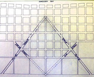
At the blog Masonic Traveler, the eponymous author makes a case, convincing, if brief, for just such a place, but no place so big or fashionable as the capital city … it's Sandusky, Ohio:
I found the city of Sandusky, Ohio, where the original grid planner, a Master Mason named Hector Kilbourne, built the biggest symbol of freemasonry right into the cities layout. Kilbourne also happened to be the first Worshipful Master of the Sandusky Masonic Lodge.
The original layout of the city's plan certainly seems to bear him out here (included from that blog for purposes of illustration):


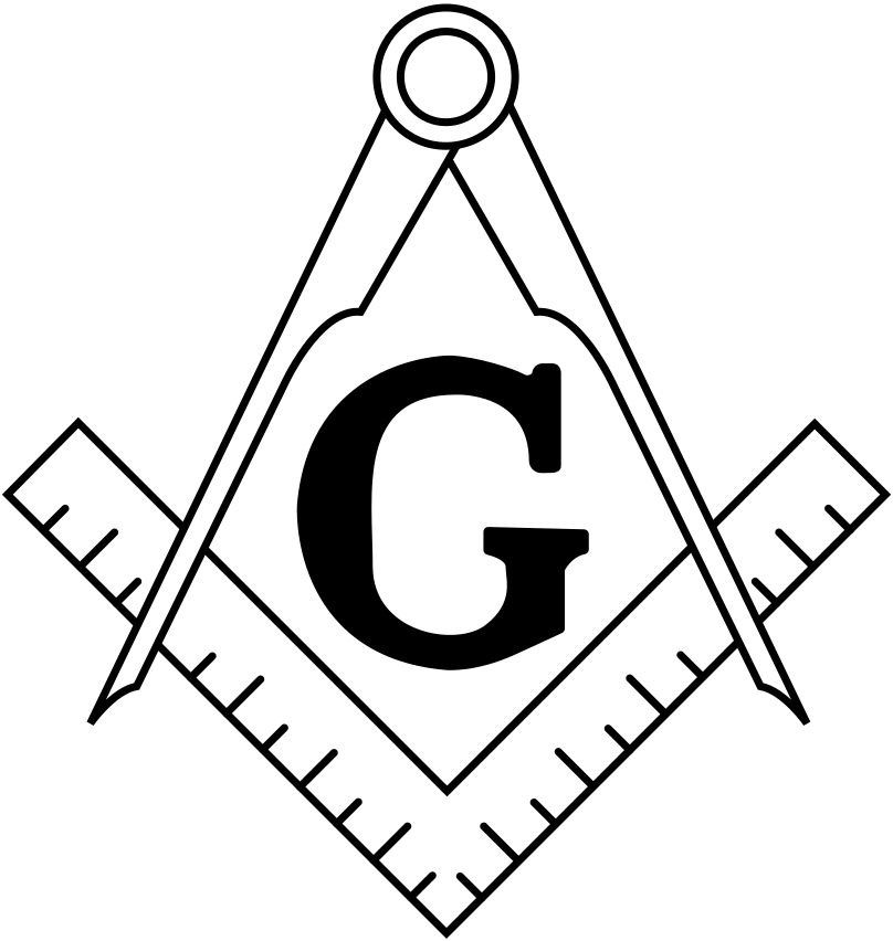
Compare with that most culturally-recognizable of Masonic emblems, the compass-and-square logo:


It would seem as good an explanation as any.  I personally don't see any problem with baking a symbol like that into the design of a town - it makes an interesting frame to create a community around, what with its diagonal streets, triangular blocks, and interesting intersections forming possibilities for public squares and quirky parks.

Of course it depends on the symbol. If I saw a town based on a Nazi-esque approach to the swastika, I'd likely recommend quick and thorough urban renewal, were my opinion to be asked.

On to a another interesting find, ever notice how, sometimes, something sticks out and seduces you into wondering why. Josh Jackson, the author of a blog post at LOST magazine, tells us about his personal, human experience with such a thing:
Last fall, I was walking through Prospect Heights, Brooklyn, when a residence caught my eye. The building was a fairly standard one — a classic three-story brownstone built, in this case, from brick. Rather, what caught my eye was its position: it was rotated about 60 degrees from the rest of the street grid. Buildings don't build themselves, and whoever built this one located it the way they did for a reason. Especially in brownstone Brooklyn, where row houses are the dominant architectural feature, buildings usually face the street.In this case, either someone decided to build it differently or the street it once faced no longer existed.
The buildings he mentioned are near the intersection of Prospect Place and Underhill Avenue, in Brooklyn, NY. The buildings he mentioned do rather stick out like the proverbial sore thumb in a view from the air (courtesy Google Maps)…


Just as interesting to me is the way the wall, and one would imagine through inference, property line, of the building to the immediate right (east) and the lot east of that, coincide exactly with the canted buildings along Prospect Place. That diagonal street at the right-hand edge of the picture is Brooklyn's Washington Avenue, and we do immediately notice that the angle of the buildings align more with this street than they do the streets they actually abut. 

Why? I mean, we can probably deduce there was some survey before that somehow governed the different buildings, but where the real interest comes is in exactly what those reasons, now obscured by centuries of development, must have been.

In the article linked in the pull quote above, Josh goes on a quest almost Holmsian in terms of deduction and certainly compelling in terms of interest.

It might be better termed Finding Flatbush Turnpike. But read it anyway. And marvel upon the things one finds when they try to figure out the exception to the rule.

In case you don't want to scroll back up, here's the links:
The Masonic Traveler's article on Sandusky OH is at http://masonictraveler.blogspot.com/2006/10/coincidences-and-tangents-sandusky.html.
Josh Jackson's LOST Magazine article is at: http://www.lostmag.com/issue14/prospect.php.

Happy hunting.

09 December 2013

[design] Free Stuff: 196 Country Outline Vector Silhouettes From Freepik

2977.
And now, something stumbled on that will interest anyone looking into maps to use in a layout.

The online consortium Freepik has released an archive file containing 196 vector outline silhouettes of the world's countries. The icon possibilities here, as well as the artistic remix possibilities should be self-evident.

I found it via an article on Spyrestudios' blog extravaganza, and downloaded it to check it out. Here's what I found:

• Three graphic files, .ai, .eps, .pdf and .cdr, containing each of the vectors arranged on one artboard in a grid pattern. Though not immediately obvious, it's a continent-major, country-alphabetic-minor arrangement.
• Two Preview files, one in .jpg and the other .png.
• A 'cover' graphic.

This is a good collection of country outlines which will do well in any appropriate application. They're vector outlines, so anyone reading this who is looking for such a thing needs no further introduction, I think.

Two nitpicks:
• The map of Brazil is only about two-thirds of the country, lopping off the extreme western and southern parts for no discernable reason.
• There is absolutely no licensing readme at all. Spyrestudios' article mentions that this collection of vectors is licensed such that "you can use these icons commercially. No credit or link back is required!", which suggests to me unlimited rights, but the producer doesn't explicitly state this in the archive anyway. So my suggestion is proceed deliberately when using. I'm sure Spyrestudios has better things to do than to unwittingly mislead us on rights, but in this litigation-happy DMCA world, my policy on using free resources might be found to be charmingly Reaganesque: Trust, but verify. Let's be careful out there, kids!

Now that that ugliness is out of the way, you can check them out for yourselves:

20 May 2012

[map] 1,012 Years Of European Boundary Changes In 2 Minutes and 33 Seconds

2824.When I was a kid I got the standard, substandard American training in world history, meaning that, here in Oregon, it was all Oregon Trail (this was pre "you died of dysentery") with the occasional dash of Lewis & Clark, numerous attempts to correctly pronounce "Champoeg", and periodic field trips to the Oregon Capitol Building (which provided me with a love of architecture but not much of history). As far as American, US, and world history, I'm pretty much an autodidact.

When I started reading The Rise and Fall of the Third Reich, I was still not completely clear on the fact that international boundaries are not permanent verities, although the 1990s really started to change that, at least insofar as the Germanies could reunite. Reading the history of Nazi Germany, with its de facto boundary changes due to out-and-out annexations (Austria, the reattachment of east Prussia, and such) was a real lesson for me.

Someone, somwhere, somehow, has done a huge service, though, by taking all the European boundary changes from the year 1000 CE to the present day and animating them. It's a flawed production: there should have been an animated timeline, and the colors that change are not defined. But to watch the boundaries fluctuate over time is quite compelling. If you're familiar with such things as the Holy Roman Empire (which was only Holy and Roman in that it was beholden to Rome; it was actually a German empire), the Ottoman Empire, the growth and decay of Lithuania and the numerous divisions of Poland, you'll have some idea of what's going on and when.

I was also surprised, by the by, when I found that, for a time, Rome belonged to the French. Like I said, I got the standard American education in history.

All that being said, the video.

18 December 2009

[maps] Get Ready To Dial 10, Downstaters!

2278.At first it was just us in PDX and Salem. Then they made the rest of the northwest corner of Oregon dial 10.

The fact that I still live in the 503 is something of a consolation, of course.

The three-quarters of the state of Oregon in the 541 have gotten away without having to dial 10 – digits, that is – until now. They've come for you, Eugene, Medford, The Dalles, Ontario, Pendleton, Burns, KFalls, Keno, Suntex, Juntura, Sisters, Culver, Mitchell …

It's your turn now. As of 10 January, here's the way it's gonna be:


You'll have to start dialing 541+ the number for all your calls now, like we have in the 503 since about the year 2000, because you've got enough phones now you'll get what's called an overlay area code for cells and newer lines, 458.

I rib, but I remember the good old days, barely 10 years ago, when we were all united under the proud 503. It's the A/C of my birth, the A/C of Oregon, dammit!

The old days … they aren't so long ago. But they seem an eternity, yes?

Technorati Tags: , , , , ,

16 December 2009

[maps] The Bus-Train Map Design Connection

2277.The various designs of city transit railmaps that can be found in the USA and globally are beguiling works of abstract art, the designs of which seem driven in the main by the famous design of the London Underground, with its simplified and straightened ways and absolute horizontal, vertical, and diagonal lines.

Simplification is good, and it renders a map which can be used. But not always does it render a map that communicates reality. The most useful versions of these connect the abstraction of the rail routes to the reality of the bus network it is supposed to work with. But, as Michael Perkins of Greater Greater Washington correctly laments, this is not always the case:

Out where those spur lines diverge, it's often faster to take a bus between the lines rather than ride into downtown and out again. It's more efficient for the network too, since those trips route people through the congested core unnecessarily. Boston's highlights the major crosstown routes and routes reaching important destinations not served by the rail system.

Could Metro do something similar?

His post (http://greatergreaterwashington.org/post.cgi?id=4289) points out the example of Boston's MTA rail map, which actually shows key transit routes that will get you between rail lines, and does it clearly:


The style of the lines is very well done too.

He gives Portland credit for doing the same sort of thing, though the execution is somewhat different – just the route numbers, not the routes themselves, though the omission of actual routes preserves the communicative clarity given the graphic approach:


The small numbers ranged along the stations tell you exactly which other schedules you should be referring to. The crossings are not given for the city center area in the main; that presumably, with the welter of lines coming together in those areas, is a bit impractical. But in the outer areas it's immensely useful, and helps you get an idea of which route you're going to need before you get there.

It's a simple thing, but a good thing.

Technorati Tags: , , , , ,

24 November 2009

[liff] Pareidolia: New Jersey In The Sky

2264.We see what we want to see – or, more appropriately, we recognize what we recognize. And when confronted with a field of random, visual information, we impress meaning upon it, especially if that random information happens to form patterns we are familiar with.

This is what we call pareidolia. It's what we humans seem helpless to resist doing to make sense out of a senseless world. For instance, in this picture (nicked from Strange Maps), the cloud just happens to resemble New Jersey:


Just to see how close, here's an actual map of New Jersey along side:


Uncanny, isn't it? There are some places where the match misses it by a mile, but it's close enough for jazz, as we like to say.

The post at Strange Maps is here, and includes asphalt Maines, many versions of Australia, even a food-based District of Columbia.

Pariedolia is a strange and wild beast. It's why some think there's a human face on Mars; it's why so many see Jesus in peeling paint and the Madonna on a grilled cheese sandwich. We're programmed to recognize things we know, and if things just so happen to fall into a familiar pattern, our recognizer turns on and sees what we recognize.

Sometimes it's a very close resemblance, but sometimes it can be a mile off but still be reminiscent.

The next time you see something that makes you think of something else (Tanzania has always reminded me of Wisconsin, and both make me think of toast. This can lead to an incidence of grilled cheese sandwich), take a moment to let it open some perceptive avenues. Think about how a random assortment of meaningless forces made something that you recognize. Some may see God in the display; some may see the cosmos talking back to them; some may wonder at the amazement that wild impersonal chance can produce.

Thinking about this always makes me go inside and outside at the same time, which, for someone who isn't very religious, is a mind-stretcher, to say the least.

Technorati Tags: , ,