Showing posts with label info design. Show all posts

04 May 2016

[info] Uber, By The Numbers, 39 Ways

3322.
Uber ... love it or hate it, it's hard not to be fascinated by the beast.

Did you know, for instance, if you were an angel investor in Uber and you laid down $20,000, you might be $40,000,000 richer at this point? Or that 20% of drivers are women and 25% are over 50 years old?

Or that, if Uber had to engage its drivers as employees, it would cost Uber $4.1 Billion?

No matter what you think of it (for the record, I'm not a fan), it's an educational trip to get an awareness of the sheer numbers swarming around the phenomenon. This graphic ... 39 Facts About Uber, by Cardude of MisterBeep.com, gives the skinny. The original article is at http://www.misterbeep.com/39-facts-about-uber/.


Made by: Mister Beep

01 May 2014

[info] The Science Fictional Oracle; An Infographic

3076.
One thing that gets tedious pretty quick these days is the insistence of people on some kind of oracle.

The future, by definition, hasn't happened yet; it's unknowable. It's guessable. You can predict things, but there's always the chance that you'll be wrong, no matter how sure the thing, unless some sort of fix can be put it. But people will dream, so people will nominate oracles.

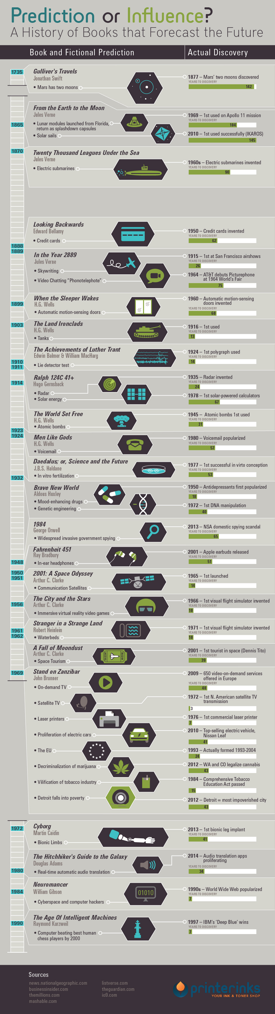
Modern days' favorite oracle is the well-envisioned science fiction story. SF, as a genre, seems to have had a contentious time with the idea that it is a predictor; at times, shunning the idea, at others, wholly embracing it. I have my own thoughts on the subject, but first, check this graphic out. The graphic was produced pretty much as blogbait by a printer ink purveyor (link after the graphic) but I found it carefully done, attractive, and quite enlightening. Please view, then join me again at the bottom.

History of Books that Forecast the Future Infographic
Infographic brought to you by PrinterInks

Whew … that was a long one. Was worried you'd lose your way, but it's good to see you.

Okay. What have we got? Three columns, essentially: on the left, a timeline, with what the graphic artist considered notable books called out in the year of publication. In the middle, the noteworthy 'predictions' that the stories made, and on the right, a bar graph that's designed to quantify how apt the vision was by the number of years after publication that the envisioned development occurred. More green, the longer we had to wait.

One thing that comes right out, at me anyway, is the earlier works had much, much longer to wait before what they foresaw came into being. The laser visionary works gave much shorter lead times. This tells me something about technology and the willingness of the writers to go out on a limb. Writers today have so much instant information to work with, thanks to the Internet, the 24-hour news cycle … time was, we had to go out and get our information. These days, it gets pushed at us so fast that those basements we used to blog out of in the last decade are being used to hide from the onslaught in this.

More, so much newness is feeding back into the system so fast that it's influencing things a a much more pitched rate than ever before.

See, that's the difference I have with the 'SF as predictor' trope. SF doesn't predict anything. We see things we recognize in society and evolve to meet us. SF has never predicted anything, it's really just given us our number, gauged our character, and the most apt SF writers have taken these traits and played with them as a happy child with Legos does, putting them together into different combinations with situations and then seeing how they react. Are they stable … or do they fall apart?

Since SF so quickly enters the pop culture these days, it goes from entertainment to zeitgeist in record time. We evolve the direction we think it shows us because it's really not telling us anything we don't know about ourselves; we look into SF and see ourselves reflected back. SF only exists in the future because that's the place we're all going anyway.

So, I don't see SF as some sort of oracle; sure, Star Trek 'predicted' things like the iPad and the smart phone, but did it? We've always liked portable, flashy toys, and instantaneous communication and entertainment via personal devices didn't start with Star Trek. It just picked up a well-played ball, dressed it up in chrome and flippy cover, and ran with it with inimitable style. That's not to say that Trek didn't do it smashingly well … it did. I just thing that Trek gets maybe a little too much credit for envisioning our personal technological future. Dick Tracy gave us the 2-way wrist radio, after all.

Rather than predicting anything, SF does a sort of odd dance with the present, whispering into our ear what things might look like, and also asking us to think about them and what they do to us. Of course, we only half listen to that. But it's there, if we pay attention.

Maybe, like the crows we frequently make fun of, we get too obsessed with the bright shinies.

23 April 2013

[net_liff] Gmail Ninja, The Infographic

2929.From designer Aleksander Tsatskin comes a pretty effective cheat-sheet for all the keyboard shortcuts that, if you take the time to learn them, should elevate your Gmail exprience.

Everyone knows what keyboard shortcuts are. Every pulldown has a staccato list of symbols to the right of the commands; these key combos connect you directly to the function without having to mouse, click, drop, click.

The problem with keyboard shortcuts is that they require discipline and practice. It also might be more comforting just to find and read the command in your pulldown menu. It takes a little courage; you have to know what you're going for. But who doesn't, if you use any Word-like program to assemble your documents, know what the key combo for Italic, Bold, or underline? It's even here in the Blogger interface, which saves a ton of time.

I first learned the mad savings in effort that keyboard shortcuts when learning QuarkXPress. There were a group my instructor called the 'Fab Four', and indeed I used them all the time. The keyboard shortcut, CMD-SHIFT-OPT < or >, for instance, increased the size of highlighted type by one point up or down respectively. Saved a lot of mousing and clicking.

The infographic delivers just what's needful, and that's why it's good. Graphic elements are greatly simplified but very recognizable, and the visual grammar translates instantly.


A very effective use of color, style, line and shape; green is the color of the keys, yellow are the simplified instructions. Simple lines and shapes tell the visual story.

Here's the whole thing, via a link; if you use Gmail as your primary email interface, as far as cheat-sheets one could very easily do worse.

Gmail Keyboard Shorcuts


(via Bit Rebels)

20 May 2012

[map] 1,012 Years Of European Boundary Changes In 2 Minutes and 33 Seconds

2824.When I was a kid I got the standard, substandard American training in world history, meaning that, here in Oregon, it was all Oregon Trail (this was pre "you died of dysentery") with the occasional dash of Lewis & Clark, numerous attempts to correctly pronounce "Champoeg", and periodic field trips to the Oregon Capitol Building (which provided me with a love of architecture but not much of history). As far as American, US, and world history, I'm pretty much an autodidact.

When I started reading The Rise and Fall of the Third Reich, I was still not completely clear on the fact that international boundaries are not permanent verities, although the 1990s really started to change that, at least insofar as the Germanies could reunite. Reading the history of Nazi Germany, with its de facto boundary changes due to out-and-out annexations (Austria, the reattachment of east Prussia, and such) was a real lesson for me.

Someone, somwhere, somehow, has done a huge service, though, by taking all the European boundary changes from the year 1000 CE to the present day and animating them. It's a flawed production: there should have been an animated timeline, and the colors that change are not defined. But to watch the boundaries fluctuate over time is quite compelling. If you're familiar with such things as the Holy Roman Empire (which was only Holy and Roman in that it was beholden to Rome; it was actually a German empire), the Ottoman Empire, the growth and decay of Lithuania and the numerous divisions of Poland, you'll have some idea of what's going on and when.

I was also surprised, by the by, when I found that, for a time, Rome belonged to the French. Like I said, I got the standard American education in history.

All that being said, the video.

18 May 2012

[OR_liff] 30 Minutes on Mass Transit in Oregon

2823.This also speaks to mapping and information design, as well as being just darned interesting.

Before I quit the computer for the day, my wandering eye happened on this article at The Atlantic, titled "30 Minutes on Mass Transit in 20 World Cities": http://www.theatlanticcities.com/commute/2012/05/30-minutes-transit-20-world-cities/2033/. It is what it says it is, but it gives you a concrete idea by diagramming it against maps of those 20 world cities.

Alas … this is one list Portland did not make. Didn't anyone tell them we were hip?

The maps in The Atlantic's article were generated using an interactive tool called "Mapnificent". Mapnificent allows you to zoom in on any city featured and, via a simple graphic slider, choose your time span. Three Oregon transit systems opened their secrets to Mapnificient, and they are, of course, Portland (TriMet), Salem (Cherriots) and Eugene (LTD). Here is Mapnificent's idea of how far you can get in Portland in 30 minutes on TriMet, starting from Pioneer Square:


Here's Eugene, on LTD, point of departure being Eugene Station (the block between 10th and 11th Avenues and Willamette and Olive Streets):


And Salem on Cherriots, departing from the Courthouse Square block, between Chemeketa, High, Court, and Church Streets NE (Mon-Fri only … Salem you are awesome!):


The intriguing part is the discontinuities on the smaller cities' diagrams. One can only assume that schedule information is a little incomplete, or the data set is elided due to some sort of express route or lack of stops along certain streets in certain areas.

The tool is located at http://www.mapnificent.net/. You can watch a short instructional video or just zoom in to the city of your choice, click on the marker, and use the slider to your hearts content. The interface is rather self-explanatory.

26 April 2012

[infographic] Eat Sriracha Or Slowly, Slowly Die

2810I have been recruited to the Rooster Sauce side of the Force since some time ago. There's very little that can't be improved by Sriracha.

We all know what The Oatmeal had to say about the Rooster. But did you know that it was just so damn' miraculous? I didn't. The skinny … and there is some skinny … on a long, skinny infographic, perforce.

Clicky to embiggenate. You are the Embiggenator.

Eat Sriracha For Your Health
Created by: CookingSchools.net

Via here

30 November 2007

[street_blades, info_design] New Portland Overhead Signs, and a New Street

1164. If you've been looking up and forward whilst waiting at any light in the Portland corporate area latterly, you'll have seen a sign bound to the overhead like this:

The City is, at last, addressing a real need in road signage. Most other larger towns up and down the valley (and across the Columbia too) have large signs denoting the street name on the traffic signal arm. Any driver who's been saved from having to frantically scan about on the corners to see what street they're crossing don't need to be told how good this is.

The standard has seemed to have been set; the iconic representation of the "Portland Rose", the red rose with three green leaves, and a simple representation of the street name at cross.

The notation on this particular sign deserves some explanation. For the past several months, a major realignment of the connection between Killingsworth Street and Columbia Boulevard has been becoming reality. The old Columbia Boulevard opening, a two-lane underpass under the railroad tracks, is a bottleneck. This old T intersection is being deprecated (and looks like it's being closed completely) in favor of a new higher-capacity, split access to a short road which is apparently being called Columbia Parkway, which goes frm NE 89th Avenue and Killingsworth Street over to Columbia Boulevard at the Holiday Inn Airport.

The (SB) denotes the split access–Columbia Pkwy splits into separated Northbound lanes and Southbound lanes.

The old part of Columbia Blvd east of that new intersection (which is also fully signalled) appears headed to a destiny as a dead-end stub.

Technorati Tags: ,,,

29 November 2007

[info_design, street_blades] Salem Street Blades-The Way They Used To Be

1161. Posting about Salem street blades got me reminiscing about growing up in Salem, and I remember seeing some of the evolutions of that form. The following comes from memory ...

When my fam moved into town, the street blades (inside town, anyway-the Marion County blades were wooden, and standard off-white on green) weren't green-on-white, as detailed two entries back, but rather looked like this:


That's m4d Photoshop skillz, yo. The letterforms were slightly different too, but the current editions are close enough that this looks very close to the way they used to be. But this was just an intermediate step in their evolution. Perhaps influenced by styles seen elsewhere, the name blade used to be slenderer–with only room for one line of type, the street name; the block index went on a tab that was riveted to the main blade:


I believe this style was current in Salem through the late sixties and was supplanted by the other style as signs needed replacing. Moreover, street blades during those times attached to these burly, rebar-reinforced concrete pillars, not the lengths of pipe we are quite familiar with today.

Tags: , , , , ,

[info_design, street_blades] A Tour Of Salem and Keizer's Street Blades

1158. Latterly, as detailed before in this consciousness stream, we visited Salem to see Fam and overeat generally. Missions both accomplished. But what Yours Truly had in mind was to snap some images of something we don't see often: Salem and Keizer street blades. Lets just cut to the chase, then.

The first of the two cities one comes to is, of course, Keizer. Formed in 1982, mostly to keep Salem out, Keizer is one of the two areas where Salem ever got any sprawl on before urban growth boundaries sprang up around Oregon cities back in the day.

Here's a typical set of blades in a typical Keizer neighborhood. 14th Avenue NE is notable because it is to greater Salem what Peacock Lane is to Portland–it's the street where all the neighbors go all out every holiday season in a Christmas decoration extravaganza:

The block number indexes are notable here. You're looking at the intersection of the 1300 block of Harmony Dr NE and the 5700 block of 14th Av NE–in constrast with Portland, where the block number is placed on the crossing-street blade and omitted from the numbered Ave blade (the block number of the named street being easily deduced from the number of the Avenue). Other notable traits are the blue color of the sign (in constrast to the green background of Salem's (and almost every other city which we've been in) and the standard look of the font.

There is also one rather delightful difference:

Keizer really personalizes its street blades by putting the city symbol on. I really like this and I think it would be quite cool if more cities locally did it. It's visually interesting and leaves you no doubt as to which jurisdiction you're in, contributing to sense-of-place (this is also why, digressing now, Hillsboro standardized addressing and street naming in the Reedsville area where all its recent annexations are being completed).

The banner on the bottom displays the city's motto: Pride, Spirit, & Volunteerism. This was chosen early on over some other motto ideas such as We're not Salem, Dammit, Death to the Salem Overlords, and the recently-floated Those Pedestrian Barriers Aren't What They Look Like, so Stop Saying That, Oh, Hell, We'll Spend More Money to Replace Them.

Casting a glance back at the Harmony Dr sign ...

... we take our leave and wend our way down River Road N into the north end of Salem. Address, wise, Salem is divided into five "quadrants", four east of the river (N, NE, SE, S) and one west (NW). There is no defined SW area of town (there is one that could be west of Eola, but that's getting off the program again). All directional areas are represented in the Salem corporate limits, but North is the smallest–literally just a handful of square blocks. Stark St N (no obvious relation to our Stark St) lies just inside the Salem city limits from Keizer, and the River Road N name continues for a fraction of a mile inside Salem. River Rd N forms the dividing line between N and NE, and all streets on the N side of River Road are in the 100 block:

The Salem street blades are nothing if not readable, and the same stadard font look applies. Presumably Salem, Kezier (and maybe even Marion County) use the same sign shop. What isn't evident from these photos (though perhaps it can be sensed) is how big these newer street signs are. I had to back up a aways to get this shot framed properly.

River Road N does a three way split int Commercial, Liberty, and Front Streets NE about two blocks south of this. We proceeded perforce onto the cardinally-oriented grid of north Salem's streets; in short order, we reached the place where the street pattern doglegs to the canted orientation of the city center which, along Commercial St NE, happen where Commercial, South St NE, and Jefferson Street NE come together. Perforce, photeaux:

If the Stark Street side seemed big, this seems particularly Brobdingnagian.

The Commerical St blade seems a bit off-kilter here–maybe because it's so large? And just to drive home the point as to how big these signs are, consider that I stood at the corner of Commercial and Jefferson, meaning I took this photo from about 100 feet away:

Moving along from here, my Fam lives on the east side of Salem, beyond Lancaster Drive. So, after going through downtown Salem (pictures of that were here) we proceeded out State Street.

State Street, in the geography of Salem, serves the same purpose as East Burnside Street here in Portland; it divides the main north side of the eastside from the main south portion. Therefore, naturally, streets north of State Street are suffixed NE; those south are suffixed SE (Liberty Street on the other side of this pictures intersection would be Liberty Street SE). Uniquely for State Street, however, there is no directional suffix at all. Historically, State Street has only been State Street, not State Street NE or State Street SE–and certainly not State Street E (which would be logical even though people would wonder why there's no State St W–the reason why this is is obvious from looking at the physical and human geography of Salem).

Here's the State Street sign up close:

We note that the generic ST seems to have been applied on a patch. We have a guess as to why that is; that will come a little ways down the road, literally as well as literarily.

We also find that Salem has taken an interesting approach to sign-topping. Informational content is preserved because the block index is on the main blade.

Here's what the Liberty St NE blade looks like up close:

Moving west we find there are no numbered streets until we cross the railroad tracks at 12th and State, then they start increasing as one moves east. At 21st St SE and State (they don't line up, indicating that the north side of State may have been developed at a different time than that south of State), we find a particularly "horsey" example:

This seems overwhelmingly big even without immediate context. But the real howler here? This is on the south side of State Street. That sign should read 21st St SE, not NE (any Salem reader wants to verify this, just go to the US Market & Cigs quick-shop at the corner of 21st and State, and look at the street sign on the corner across 21st (but don't go into the US Market & Cigs, as romantically named as it is–it looks kinda sketchy).

Just down the street we come to State and 24th, and another oddity:

Yes, you read it right. This says "State St SE". Now, it is on the south side of State at 24th, but the preponderance of signs which simple read "State St" (including the newer ones like the photo of 21st St) suggest that this is the out of place example. It was also the only example of State St with a directional we were able to find along State, and we also suspect that the one at State and Liberty, which is approximately the same vintage, was also labeled with a directional–the patch looks about the right size and shape. I did eagle-eye the sign across the street–it did say "State St NE".

And, before we leave this discourse, I did mention above that there are no numbered streets before you cross 12th St going east. this is not strictly true. As Salem grew north, a different (yet still parallel and rectilinear) plat obtained in the north end of town with differently sized–smaller–city blocks. Downtown street names are carried north, but due to a new block size there is an additional north-south street to name between Liberty and Broadway (the extension of High Street NE into north Salem) and Broadway and Church St NE. This problem was solved: the first street is called 4th St NE, and the second one, 5th St NE. They are close enough to being the 400 and 500 blocks that this works logically. The photo details the cross of Jefferson and 4th Streets NE, one block east of the picture location of Jefferson and Commercial.

Technorati Tags: ,,,,,,

21 November 2007

[info_design, street_blades] Street Signs from the Heartland

1141. We return to the street blade beat with a couple more from the Heartland, courtesy of our Mid-Continent Bureau Chief, Stan Kost.

This following image should have some resonancy with you if names of jazz like Count Basie and Charlie Parker mean anything to you:

What we have here is a couple of blades out of the heart of the 18th & Vine National Historic district in Kansas City, MO. As it happens, 18th & Vine had a hot jazz scene back in the day, and some of America's more famous jazz musicians came from or passed through there; it's credited with being one of the cradles of jazz in America. It's said that the KC flavor of jazz has its own spice to it; I'm no jazz fan, so I'll have to take Wikipedia's word for it (for what it's worth, the entry on 18th & Vine seems written by a fan, but there's Wikipedia for you). It is known as the historic center of KC's African-American community.

Technically speaking, the street signs are very simply informative. The location in a historic district is merely indicated by a brown square on the blade's left end–the eye naturally starts reading there, so nobody misses the fact of the esteemed area of town that one is in; the banner tells the story of what happened there. As far as the blades' structure, it's notable that the sheet-steel sign is supported by a bracket which is itself mated to the sign. While not uncommon, it's unusual here in Oregon (we certainly can't think of any examples of this construction here about), and we can make the observation that such a construction not only allows for the support of sheet blades that could be quite large, but also probably makes replacement and repair comparatively simple.

Next, we go to Leavenworth Kansas:

This is a view of the corner of 4th and Shawnee, presumably in downtown Leavenworth. This street blade is not one of the "Car-level" blades, but of the class that sticks to the overheads above the traffic by the street lights (this is our clue to its elevated purpose). These are designed to inform the driver whilst still allowing them to keep thier eyes on the road in front–very simple level of information, all that one needs to know in transit at a glance.

The color and the font are what are of note here. From the banner on the right we can assume the historical importance to the state of Kansas of Leavenworth, and the design of the blade echoes this, with the brown tone of the sign suggesting sepia-toned daguerrotypes and the serifed font seeming to speak to a classical, old-fashioned vibe. I'd be interested to find what the small letters on the right end of the blade say, but the resolution of the photo resists this analysis.

We still have some more blades from Stan, which we'll post in a further discourse. If anyone out there has been following this, I want to see what your hometown street blades look like–they can by ordinary ones or special or funny, whatever, Let me share them with the world.

Send any of your street blade picture submssions hither for commentary, display, critique, and general fun.

Technorati Tags: ,,,,,

15 November 2007

[info_design] Road Blades Not For the Ridiculous or Wimpy

1117. It's sure a tough world out there; if you're a wimp (who happens to live outside Redmond, Oregon), they'll put a sign on your road so bullies can find you:

NW Wimp Way, greater Redmond, OR – photo courtesy Crallspace
Used with permission

And, as this street blade sighted near Veneta, Oregon (in rural Lane County about 15-20 miles west of Eugene) will attest, it's not so hard to find the route to the absurd – you just have to find the right sign:


Ridiculous Rd, Veneta, OR – Photograph by Crallspace
Used with permission

Links in the text above take you to a Google Maps display of the road concerned. We note that Ridiculous Rd comes off Suttle Road, which is ironic, because ridiculousness is rarely "suttle" (subtle).

Tehnically speaking, the two signs present location information in a certain way. The bare minimum is represented by the NW Wimp Way sign. It's in a location along US 97 north of Redmond called Terrebonne, an unincorporated community which is the closest thing Redmond has to a suburb. A sign with this information (which doesn't look municipal or county but looks like a standard sign put up by the State authority) is very useful if you know the local area and clearly readable if you don't but aside from the hint of an urban-style address grid centered on nearby Redmond, it doesn't tie you psychologically to the local human geography. The initial W is important, because street names increase alphabetically from the Redmond center, but that wouldn't be obvious to the visitor.

The Ridiculous Rd sign shows another form of geoencoding. The small number, tucked underneath the street type in the lower right hand corner, is actually a county road number. This is useful to county maintenance entities, probably somewhat useful to EMS, but not terribly useful to the traveler except to perhaps connote the fact that this is an official road and not a private drive, which would at least prevent embarrassing turnaround behavior.

Though both signs have little more than basic info, they are designed well in that they are clearly and unmistakably readable, though if someone who's looking for Ridiculous Road still can't figure out to turn down that road after seeing the sign, we don't know what sort of extra help they might need. Time to seek professional assistance, or maybe a spirit guide – and considering that the Oregon Country Fair occurs every year near Veneta, there should be something appropriate available nearby.

OH WOW UPDATE: Stan of Dinglemunch finds a ... disturbing detail in the Google imagery for the NW Wimp Way area. Wow.

Technorati Tags: ,,,,