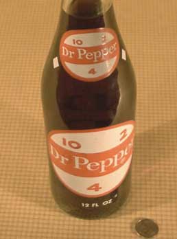
 Design geeks know that package design is a particularly unique subschool of design. Package design influences what we buy, loads our expectations of what we'll find inside, and forms sentimental associations that we carry with us all our lives.
Peep, por examplay, the photo illustration of the old Dr. Pepper bottle...with the old 10, 2 and 4 clock positions, deemed ideal by someone in marketing Back In The Day to suggest people take a break with the Dr. These days if you drank a high-fructose-corn-syurped soda at 10 AM, 2 PM, and 4 PM I suspect you'd test positive for Type 2 Diabetes by 6 PM...but I digress (It was a simpler time, neh?)
The neat thing about the internets is (unless the big guys manage to steal them from us, of course) if you can't find a site documenting what you want to see you can put one up. This is apparently what the suspiciously-pseudonymously-sounding Ian House has done by erecting the virtual edifics of the American Package Museum, with a fair-sized armful already of historic packages that have graced American pantries and market shelves through the consumer age.
They are clearly authentic and delightfully enthralling. The collection isn't as big as I'd hoped it to be but I'll be he'll accept exhibit donations.
It's The American Package Museum, and we give it five stars. Sam Bob says check it out.
Technorati Tags: graphic design, package design, online museums, commerical history

No comments:
Post a Comment