 707 Designorati's stock continues to rise.
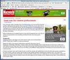
You can embiggen the screenshot right by clicking thee upon or you can visit the Macworld Creative Notes blog entry of writer James Dempsey here. Dempsey cites Designorati as one of his current "Good Sites for Creative Professionals" that merit a look. In saying that D: offers a well-rounded view of the creative world, we find that our little group of D: contributors are accomplishing our mission in having a "360 degree view of the creative world."
He does have a bit of a brickbat about the site layout. Personally, I've always liked it, but in my view his comments–as a user–are fair enough, and especially so if sincere. Speaking for myself only, a site serves its users best when it presents itself well. Pariah has no doubt noted James's opinion and you can count on the fact that it (as well as any other feedback we get) will be carried forward into whatever design evolution the web face of D: enters into. The current layout is a change from what it was at first.
But in all it's bon mots all round, and if it weren't a work night I'd have a little celebration. Suffice it to say that brainfather Pariah (as well as all us braingodparents) are feeling a little proud.
Tags: Designorati, Designorati.com, Macworld, James Dempsey, Designorati Reviews

No comments:
Post a Comment