
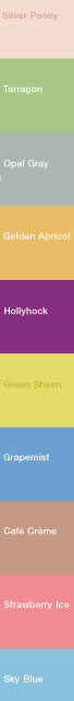
 710 Trend-spotters and culture-vultures take note: Pantone, the God of Standardized Color, have announced the fashion and fashionable colors of Spring 2007. I stripped out a sample in the illustration (clicky to embiggen). They are, from the top: Silver Peony, Tarragon, Opal Gray, Golden Apricot, Hollyhock, Green Sheen, Grapemist, Café Creme, Strawberry Ice, and Sky Blue.
But what if you don't speak Fashion Designer? No worry; the Pantone 2007 Spring Color guide includes everything including the Pantone numbers and CMYK formulae for all colors.
Part of the obligation of any designer is to stay as current as one can with trends. Pantone, the name for color, interviewed a scad of fashionistas, including such lights as Betsey Johnson and Kimora Lee Simmons, to see what colors they were using to infuse excitement into their spring designs. This is what will be seen on the runways soon, and from there these colors will diffuse into the design world at large–fashion, print, web, and so on.
So even if you aren't a fashionista yourself, you can include one or two of these colors into your print designs and layouts as the opportunity presents itself, and that's an easy way to stay fashionable indeed.
Oh, yes, the Pantone 2007 Spring Colors report is a 2MB PDF available hither.
Tags: Pantone, Spring 2007 Colors
2 comments:
It's so... 1984. The Olympic year, not the novel.
Interesting how "such lights" could be interpreted two ways. I'm going to read it as newtonian.
aleviate my pain, pantone!
It's so... 1984. The Olympic year, not the novel.
Well, you know how it is...wait long enough and everything will come back into fashion.
Interesting how "such lights" could be interpreted two ways. I'm going to read it as newtonian.
Okay, I'll admit it; I have no idea what you meant there.
Lately, the only Newtonians I've been interested with are the ones with figs in them.
Hey, it's a weakness.
Post a Comment