16 January 2014
12 December 2013
[pdx] Rich, Cold Sunrise, 12/12/13
28 March 2009
Made In Oregon: It's The Battle Of The Brands
I am, of course, talking about Beau Breedlove.
Whoa, whoa, whoa, Sorry. The iconic Made In Oregon sign, sorry about that. My bad.
That I called it iconic says something right there. A lot of people look on it and, since it's in public view, a lot of people have feelings about it. It's certainly unique as a sign, and there's been some sign in that area designed as a landmark since the early 20th Century, when the Apostolic Faith Church used a building in that area as a meeting hall.
In short, it's part of the warp and woof of the way Portland looks and feels (if you'll excuse the Apple-esque termage). It may be as simple as a great assemply of steel, supports, glass, and electroluminescent gas, but it matters to people; people care. We all notice when a tube goes dark. We all look every year for the placing of the red bulb, the transformation of a simple abstract leaping dear into Rudolph The Red Nosed Rubicon, which has become as painfully Portland as meeting under the Meier & Frank clock or listening to the Cinnamon Bear on KEX used to be.
Enter the University of Oregon. The old Norcrest China building, once capital of the Naito Empire and home to the flagship Made In Oregon store, has been nicely reborn into something that stops just short of actually being the U of O Portland campus – store, offices, classrooms. And, with the building goes the sign. It's a package deal.
In that view, it's entirely reasonable that the U of O get to remake the sign with whatever message it wishes. It's part of the brand, and what a brand that is! We should all be so luck as to be gifted with that store of good will.
If it was just a sign, then that would have been the end of it.
It's not just a sign.
Think more of When Worlds Collide.
The crack-up is so far kind of messy. Dread Lord Frohnmayer refuses to talk or deal in any way shape or form, reputedly (and I do mean reputedly; we've got PR coming out the gazonga on this) so intractable on this as to put off Randy Leonard. This, my friends, is no small feat.
Commissioner Leonard, for his part, is doing something typically Leonardesque. Don't want to discuss changing the sign to something less UO-specific? Fine. David Frohnmayer is finding out that when you go balls-to-the-wall with Randy Leonard, he's only too happy to oblige. The ace-in-the-hole; eminent domain.
If Buckaroo Banzai doesn't want to give up the Overthruster, then we'll just have to take it from him! In the, ah ... national interest, of course.
By this time next week, the sign and roof which supports it will be city owned and leased, respectively, most likely. UO Prez Frohnmayer, for his part, had threatened to let the sign go dark if he wasn't given his way. The City of Portland has the trump card here, or may well–as near as makes no difference.
Both sides understand the power of Branding.
U of O would like nothing more than its brand on an icon, stamped in brilliant lights on the skyline of the state's principal city (because who ever heard of Portland State University?)
The City of Portland (as personified by Commissioner Leonard) would like something more universal,as befits the scope of the state's largest city (which includes both Duck fans and Beaver fans) such as the simple word "Oregon".
Both sides cannot see eye-to-eye.
Let the Battle of the Brands commence.
And so it goes.
Technorati Tags: Made In Oregon Sign, University Of Oregon, David Frohnmayer, Randy Leonard
18 March 2009
New Style Street Blades Sighted At SE 92nd And Ellis
Coming in from the north on SE 92nd Avenue–our destination being the Oriental Food Value market on SE Insley just east of SE 82nd, and at that time of the day, coming in the "back" way rather than down 82nd is just the smarter thing to do–the SE Ellis Street blade presented itself with a visual shout, which is probably why they settled on this design:
Notable here is the way the new street blade for Ellis was perched atop an old street blade for SE 92nd Avenue (note that it's the extruded blade, and not a sheet, as the new design is).
I was somewhat disappointed that there was no new 92nd Avenue blade until The Wife™ pointed across the intersection, on the Lents Little League field side of the street:
The visual difference is obvious. These blades are so easy to spot and find, which is proved every time we find a new one like this.
Here's the money shot:
It's interesting to see a new named-street blade that doesn't say "SE Division St", for now we have some idea of how the rest of the city will look once these blades are the standard.
And here's a shot of the new-look cross including the 92nd Avenue blade:
And the documentation continues. If anyone who passes this way by these humble blog missives and lives in Portland (obvious point, yes) sees these new-look blades anywhere else in town, won't you clue me in? I'd like to get some idea of how far these are going.
Technorati Tags: Street Blade Gallery, PDX Street Blades, street blades, street blade design, sign design, Portland Street Blades
15 March 2009
How Do You Get A Rewrite For Street Blades?
Didn't I get that wrong just there? Yep. So did whoever put up the street blades.
Also, I've been remiss. In my excitement over the apparently-revised look of the standard Portland street blade, I've left out mentioning there's apparently an entire new look for the major intersections, as well. Let's look:
The difference is of a class. Instead of having one type size handle the directional and the specific and smaller one for the generic on the Street blade and one type size for all type on the Avenue blade, we have one size for the directional and generic and a larger one for the specific on all blades.
This has the distinctive characteristic, via the design concept of hierarchy, to make the specifics (the street/avenue names themselves) come up front and center. While the supporting information is now smaller, it's uniformly so, but not so very small; moreover, these signs are about 20 per cent larger than the old design, so everything is large.
Also, due to what has to be some error (or perhaps a rift in the fabric of space that happened that I missed), Northeast Glisan Street at the corner of Glendoveer Golf Course is crossed, improbably, by Southeast 148th Avenue.
Going down to 148th and Stark, in the shadow of the 7-Eleven store, we have the same anomaly:
Also:
The mistake at the southwest corner of 148th and Stark was repeated over on the southeast corner as well. Just looking at the signs is kind of mind-bending.
Can the city sign shop get rewrite on this? Or, put another way ... can we fix this in "post"?
27 February 2009
These Things Tend To Work Out, With The Right Spirit
We're so sorry about the photo. Obviously our graphic designer didn't do due diligence on the image used. Lesson learned for next time. But thank you for being so cool about it. You're right, we are small fish just starting out. In the essence of turning every negative into a positive, we'd love to buy you a beer and maybe even use you to do some graphic design for us some day.I've always thought that where we can we must be excellent to each other.
May fortune smile on thier enterprise, and good instant karma all around. It sounds pretty cool.
And if you can, go to their party and have a beer and a slice for me, will you? I'll be drudging away somewhere dreary, but I'll feel a little better about things if you do this for me.
Technorati Tags: Samuel John Klein, Hall of Records, flyers, photographs, copyright issues, bonhomie
26 February 2009
Hey! How'd My Photo Get On That Cool Poster!
Now, look at the piccy I took back in March of '05:

I'm flattered, to say the least. I adore that type. The funky vibe is represented. I fully approve of the poster and my photo's use in it.
Just one thing, though. I check my sitemeter logs regularly; this must be one of the most hit parts of the blog, this picture. It's probably been round the world once or twice. One of the risks you take with putting your creative work on the web is that people tend to help themselves to it.
And I understand that. Hell, a couple of posties ago, I ripped off a photo from the PMerc. But it was satire, and they were credited.
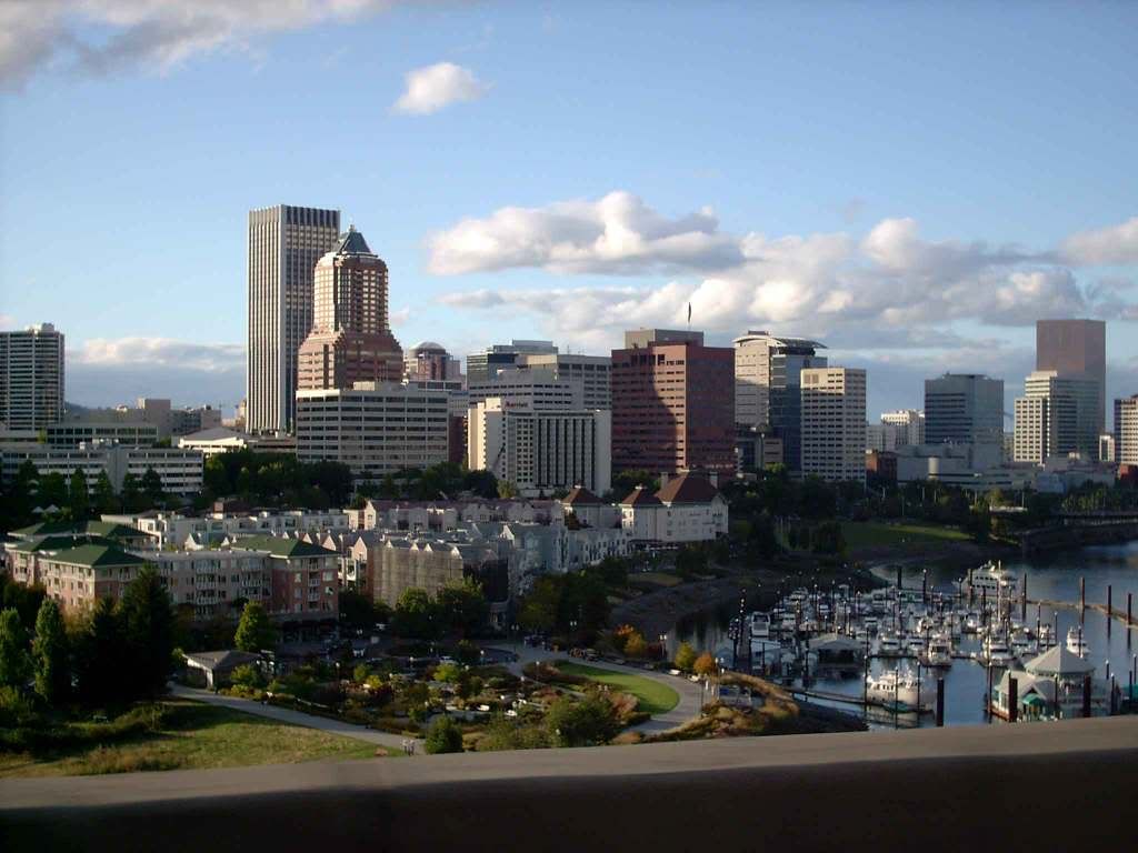
But this photo is particularly dear to me. It was taken by me, foolishly, with my camera in one hand and the steering wheel of my '72 VW in the other, at speed, hurtling over the Marquam Bridge on cold spring morning after one of my evenings at work. I'm in love with my cityscape, and I'm in love with tthis photo of it.
So, if you want to use it, that's cool. But don't assume that I have put it in the public domain; I have not. Write me and ask. You might be surprised. I could very well just say yes, and if you're a little fish just starting out like the Hall Of Records is, the only price I might ask is that you credit me for it.
Thanks. And hey, since I'm too poor to go and work nights and weekends anyway, go on over to the Hall Of Records party for me. Have a brew and a slice in my name. I'll catch the spirit.
(Update: Checked the metadata for the photo. I actually took it in 2004 on Sept 16th, at about 11 AM.)
Technorati Tags: Portland, Portland Photos, My Photos in the Wild, Copyright Issues, Portland From Marquam Bridge by Samuel John Klein, Samuel John Klein
07 February 2009
Bridges and Signs
Don't know why ...
... There's no sun up in the sky ...
... stormy weather ...
Those heavy clouds just above the buildings are poetically beautiful. Also, it looks like they are going to eat them.
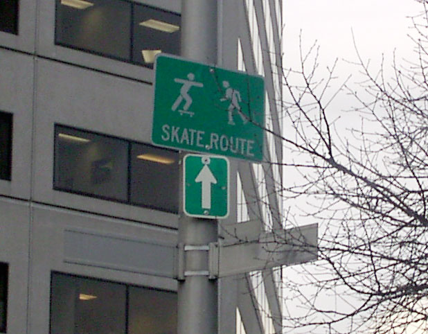
At the west end of the Hawthorne Bridge there's a sign at SW 1st and Main that just seems to quinessentially PDX:
I mean, they pretty much skate everywhere, yes, but the sign is pretty cool anyway.
The nice thing about this time of year is that a few days later, the weather will change:
The Greatest Volcano Evar taken though the front window of that little Subway just north of SE Division on 122nd Avenue. On the left, a Les Schwab Tire Center, on the right, the shabby Shell station on the corner.
Despite the crush of sprawl obscuring the landscape, this doesn't make me feel as forlorn as it ought to. Strange, that. Maybe it's the juxtaposition playing cosmic tricks with my perspective; maybe it's because "Out 122nd Way" is another way of saying "home" to me.
I'm a human; I can't help it. Cities comfort me. Especiallly Portland. Strange, but there it is.
Technorati Tags: Mount Hood, Portland Oregon, Downtown Portland, SE 122nd Avenue, SE Division STreet, Portland Pictures
28 January 2009
The New Look Of Portland Street Blades Comes To 57th And Division
Back on 28 December, in posting #1888, we shared a happy discovery we found at the corner of SE 117th Ave and Division Street, in our humble neighborhood. It looked like this:
(go to this posting to see the other images, and the design discussion on it) We were quite excited about it at the time ... the design of Portland's street blades is something we think has been a long time in coming. The breakthrough was in the large, clear format which still had that "Portland" look to it, and most importantly, includes the crossing street block number as an integral part of the design, which is a boon to people trying to find an address.
Well, coming east on SE Division Street a few days ago, we spotted another example of this sign in the Franklin High School area, specifically, SE 57th and Division:
That building in the background there is Atkinson Elementary School. But is this not nifty? Here's a view of the Division Street blade:
The "2400" block index on the sign isn't an error by the way. Between SE 42nd Avenue and SE 82nd Avenue, Division Street jogs a half-block to the north to become the 24th street south of Burnside, therefore the 2400 block. The 2500 block is defined by a little street called SE Windsor Court, which exists in a few fragments one block south of Division in that area. Everywhere else, it's 2500.
The numbered avenue blade also fowards the design we saw on SE 117th Avenue:
As you can see on the right there is one of the MetroFi WiFi antennas. Kind of a set here: the street blade is your tax dollars at work, the WiFi antenna is your tax dollars at rest. Oh, were do I find the wit for these things?
But it's not just the north side of the street that gets the new blades. It's on the south side too:
It's nice and visible even at the kinda-crappy resolution of my awesome plastic fantastic.
For those of me who obsess about these things, this is a big signal. One new set of street blades at a street corner out near 122nd and Division could just be a test. Three new sets ... including a completely-signed intersection on both sides of the street ... indicate that this may indeed be the new design for Portland's street blades.
It's intriguing that they've so far done two intersections that so happen to be on Division Street.
And this design is a good one, as I've said before. I don't know who came up with this look, but, seriously, you've hit it out of the park, yo.
Technorati Tags: Sign Design, Street Blade gallery, street blades, Portland Street Blades, SE Division Street, SE 57th Avenue
Powered by ScribeFire.
13 January 2009
Photos From Portland's Left Bank
The only problem was, I didn't bring my tripod, and the camera, the ViviCam 3705 a/k/a the Plastic Fantastic, isn't all that sophisticated (it was when we got it, but the world has moved on). However, a little jiggle produces a very romantic blur:
And of course the streaks of light from moving cars and such are an artistic bonus.
There are some times that a jiggling camera produce these wonderful emotionally-moving alternate worlds:
Notice the dotted line of the flashing bike-light there? Like I said, a bonus.
The sun kept going down, and the night-time beauty just kept coming out:
Aren't the reflections on the river rather romantic?
And now, the Steel Bridge again:
And the Morrison, with the beautiful indigo lights courtesty the Willamette Light Brigade (I have their 2009 calendar in the studio this year):
And one with a focus on the downtown skyline, too:
I wonder what I could do with a much newer camera. My friends have such cameras. One word: covet.
But I'm pretty happy with what I'm doing here. Just want a better camera!
Technorati Tags: PDX, portland photos, portland bridge, downtown portland
Powered by ScribeFire.
01 January 2009
A Trip On The Tram ... A Long View for the New Year
It's supposed to be costing taxpayers a bundle. At least, the ride is nice, as is the view.
Here's a video I made with the might plastic fantastic Vivitar VivCam 3705, as recieved and posted by YouTube:

Clicky here to embiggen this.
Clearly the Aerial Tram, regardless of the policy that got it built, has given us incomparable views of the greatest town on Earth.
Happy Neo-Year!
Powered by ScribeFire.
28 December 2008
A Snowy Calm, Just Before The Storm
Clicky here to embiggen.
Technorati Tags: Downtown Portland, Oregon, Portland Photos, Oregon Photos, Oregon Winter Storm 2008
Powered by ScribeFire.
A New Style of Portland Street Sign Debuts at 117th and Division?
Recently I saw, on the north side of SE Division Street at 117th Avenue, the street blades you see here:
This represents sort of a quantum leap in the design of the basic Portland street blade. But more about that in a 'mo. Here's a few more views.
Next:
It reads well from a distance. Nifty!
The avenue blade retains the traditional Portland look, now within the new white frame with rounded corners. It's looking pretty good ... and readable!
Now, for a little design discussion.
One of the biggest drawbacks of the basic Portland street blade is the lack of a block number. Whether or not you get that the crossing street blade holds the block number of the street you're one (the block number of the named street being self-evident from the number of the avenue), we take it as axiomatic that it's just plain nifty to have the block number on the street sign itself, thus preserving your sanity and relieving you of the need to peer at the front doors of nearby houses, thus perhaps drawing reproachful return glares.
But in general it saves you a step. You have the block number at a convenient, findable place, and it's finally been integrated into the design of the blade itself, just as it has in almost every other major city in the Willamette Valley. Currently, the block number comes on a tab bolted on to the blade itself, and, due to the ways you can have the blades stacked, not always in the same place. Moreover, several somewhat-poorly designed sign-toppers for neighborhood identification omit this information entirely, and the tab has been removed in some of these cases. This design neatly solves that problem.
Now the question becomes how efficiently the information gets delivered. We feel this design does the job quite nicely. By placing the directional (SE), specific (Division) and generic (St) all on the same baseline, the eye reads the street name at one go quite naturally. Reducing the type size on the generic preserves the traditional Portland look. And, by placing the block number a bit up and toward the upper right hand corner of the blade, the eye arrives at an important supplemental bit of information last.
On top of all that is the sheer niftiness of giving the blade a new rounded-corner profile with a wide white stroke around the outside actually contains and defines the design into an aesthetically pleasing whole.
I don't know who in the Portland department of making street signs came up with this idea, but my friend ... you've nailed it.
Beautifully done.
Please make sure you get more of these up. You make me proud to be a Portlander.
Powered by ScribeFire.
02 October 2008
Looking North On Southwest Fourth ... A PDX Cityscape
1793.
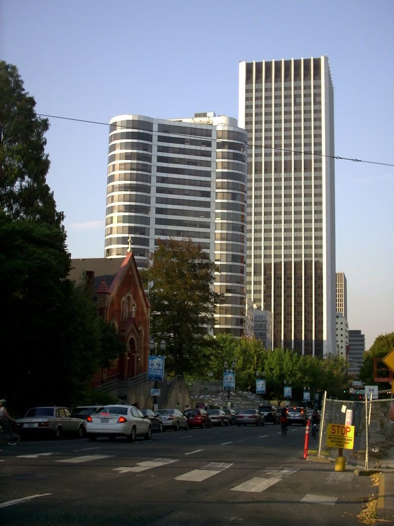
Among the photos me and The Wife™ snapped on a walk around the Portland Center area yesterday is one which will go up there amongst my personal favorites ... because the Wells Fargo Tower is just that cool to me:

The Portland Center Apartments (that building on the left that looks like it came out of Logan's Run) is pretty funky too.
I love SW 4th Avenue.
Tags: Portland OR, Portland Photos, PDX Pictures, PDX Cityscapes, Wells Fargo Tower, Portland Center Apts
Powered by Qumana
28 September 2008
[pdx_photos] St Johns Bridge and Cathedral Park: At the Toe of a Giant
1789.
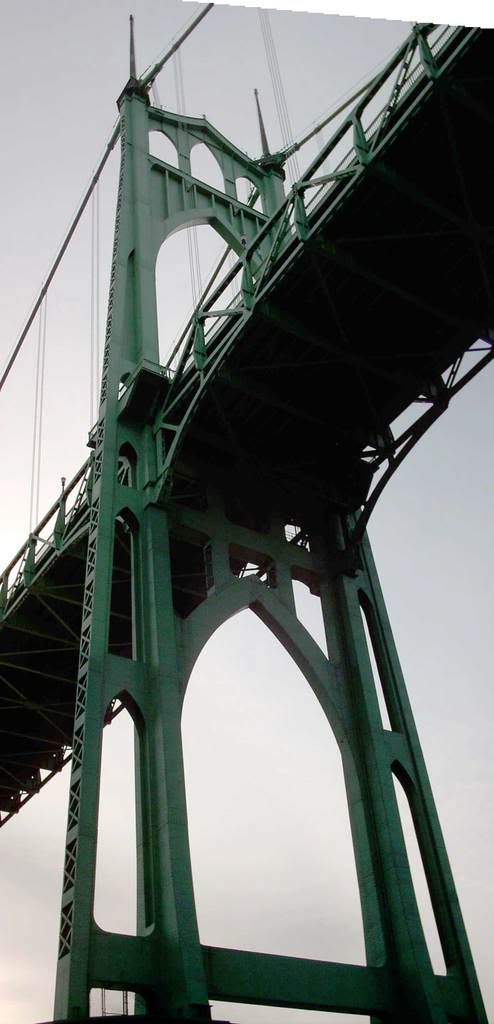
The Saint Johns Bridge is indeed a curious creature. From a distance it is a delicate thing of spun green glass. But from close up:

.... intimidating. The gothic spires - recapitulated in the outer margins of the tower - are inspiring, and tend one toward contemplation of the infinite.
There should have been an M.C. Escher-esque artist out of Saint Johns.
The view down the arches is what gave Cathedral Park its name:

Cathedral Park, says the Portland Dept of Parks and Rec:
...got its name from a photo of the St. Johns Bridge by Al Monner that appeared on the front page of the Oregon Journal in 1968. Reference was made to its beautiful cathedral-like arches and the park found its name.
As we've established elsewhere, the house we live in is the one Al Monner owned when he was working his magic. His custom darkroom is just off my studio space. So, even though I'm not the only person to have ever taken a picture of Cathedral Park, I somehow think this completes a sort of circle.
Tags: Cathedral Park, Saint Johns Bridge, Al Monner, Portland Parks, Portland Bridges
Powered by Qumana
27 February 2008
[lolz] One Dog Night In Portland
Yep. Them ladies sure do like the vans. Um hm.
Tags: lolz, loldog, image macro
[pdx] Mt St Helens at Sunset, With Time Lapse, and one of Mount Hood
About a week or two back, inspired by this production linked from Brittney Gilbert's blog here, I decided I wanted to do a time lapse of either a sunrise or a sunset. Sunset today is what the fates presented us with. And Rocky Butte is a lot more accessable (and it turns out a much better vantage) than Council Crest.
So, equipped with my trusty ViviCam 3705 and a very patient The Wife™, I squeezed off about one shot every thirty seconds between about 16:05 and 16:35 (I guess ... didn't set the camera time, drat it all):
It's not as dramatic as I'd hoped, but it came out much more spectacular than I'd thought it would. What impressed me the most about the video Brittney linked to (which was actually taken by a camera powered by the UC Berkeley from the Lawrence Hall of Science, which was used as exterior shots of the "Colossus Programming Office" in Colossus: The Forbin Project) was the way the clouds did this stately procession across the sky. That was what I'd hoped to catch and I did.
The sequence stopped just as the alpenglow started to be cast on Mount Hood (Wy'east), which was spectacular enough that we had to stop doing the above and get a few snaps of that. Here's one of my favorites that we got today (not as clear as I'd like, but you can only do so much with a ViviCam 3705):
Have I mentioned before how much we love living in Portland?
Tags: Portland, Rocky Butte, Mt St Helens, Time Lapse, Mt Hood
12 February 2008
[pdx, Street Blade Gallery] Unusual Portland Street Blade - SE 63rd and Flavel
1358. Update, 1330 on 2008-02-13: I see someone has posted this on OLive's Oregon Reddit! This is a first for me ... thanks whoever did that. Skookum!
While on the way down to Milwaukie today to check out some information me and The Wife™ had, we had occasion to go down SE Flavel Street in order to get there via SE 52nd Ave, Harney Dr, Johnson Creek Blvd, and SE 32nd Ave. On the stretch of Flavel between 72nd and 60th I caught a most unusual street blade, but we weren't able to get a pic on the way there. On the way back, I did though:
The segment of SE 63rd Ave going south from Flavel Street is a very short, very narrow dead-end. It serves seven or eight houses of very recent design (very infill-y), and by the construction of the street, it looks very much as though it was privately-built and is probably privately-maintained, and specifically designed to serve the handful of infill-houses that it serves.
To the both the practiced and the novice blade-spotter, there is nothing unobvious about the differences in this sign:
- Standard city street blades are white type on green. This is green on white.
- The standard format for the generic on a numbered avenue (the part that says "AVE" here) is the same size as the rest of the type (save the ordinal on the number) and only two letters ("AV"). On this sign, the generic is the same size as the generic on named streets. By what seems to be the Portland standard, this is a style sheet more appropriate to a named street.
- Despite the differences, though, the font looks to be an MUTCD-approved one, and appears, in fact to be identical to the one used on standard Portland blade.
We suspect that this is a privately-built and maintained street for two main reasons: the design of the street itself, which is clearly different from the street it connects to; and the reverse-color of the blade. There is local precedent for this; in Clark County, particularly, the blade color scheme of private roads which get official street names is notably different, being dark type and light background rather than the standard light type on dark background (they also bear the legend PRIVATE DRIVE so as to remove every confusion).
There is nothing that says that a private road can't have an official, 911- and Post-Office-licious and compliant street name. It makes a great deal of sense for navigation and dispatch of emergency and law-enforcment services, since a grid-based address system allows for quick location of any address point on a map without first having to know which roads connect in. Once the spot is located, presumably, the route to get there should be self-evident.
But so far as we can determine, this is the only blade if its type in Portland – indeed, in the three-county area, where private roads don't usually get named.
And, just to preserve a moment in time, here's a little of middle-south-SE Portland, Flavel Street looking westbound from 63rd. That light in the distance is the blinking light over SE 60th and Flavel.
People call this area (unfairly, I think) Felony Flats. McArthur records it as Errol Heights, because it's at the top of the hill overlooking a locality once known as Errol, which was a station on the Oregon Electric line that once ran where the Springwater Corridor Trail does now right about where Johnson Creek Blvd crosses its eponymous stream. Latterly, in the era of modern Portland neighborhoods, they call it Brentwood-Darlington.
There are some cool people in this area, and some who are a little scary, but if you really look, you'll find that the area you live in might have the same sorts of people.
There is also a Vietnamese Buddhist monk along the north side of Flavel about a quarter-mile east of this point. Like I said, cool people.
Tags: Oregon Photos, Portland Photos, Portland Street Blades, Street Blade Library
30 December 2007
[meme] ZehnKatzen's Weekly Winners #4: Lloyd Center Hypergammaspaces
I enjoy indoor spaces, especially spaces which enclose worlds which are small and large at the same time. Portland's famous Lloyd Center is just that sort of thing.
One of graphic design's central concepts in juxtaposition. Moving significant things next to significant other things creates a visual dependency, just as moving your significant things next to your significant other's things can create a sense of co-dependency:

At the end of the upper level of the food court is the office level of Lloyd Center. The Nephew™ (whose back is to us) mentioned the way the Apollo College sign near the Billy Heartbeat's (that burger joint in the background there) seems to imply that Apollo College (one of those modern-day churn-'em-out private vocational schools) offers sundaes, shakes, and hamburgers.
While we agreed that that would indeed be righteous, it was felt that Apollo should stick to milling out diplomas and let the burger stand do what it does best. We do, however, note that a pollo, in Spanish, means a chicken, so if that vocational school doesn't work out, they could transition into modern Mex food without much of a change to the name.
Again, interior spaces have thier own logic and reality. What I thought of when I sighted this line was the interior of the U.S.S. Cygnus from that risible yet oddly enjoyable Disney skiffy pic from 1979 The Black Hole.
Compare and Contrast:
The Cygnus' main corridor during a climactic scene:

The Lloyd Center's office level (low light, no tripod, gives a nice subjective feel):

See? I guess that's why they filmed Logan's Run in a shopping mall. These spaces just give themselves over to that use.
Badge! I don't need no steeking badge! You do, tho ...

Tags: ZehnKatzen, Portland photos, pdx photos, Weekly Winners, Sarcastic Mom, Lloyd Center