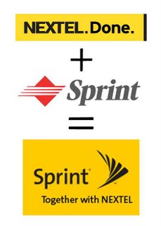
 By now any Sprint or Nextel cell user is well aware of and dealing with the effects of one of the biggest mergers of recent times. In merging the corportate indentity, Sprint had a dilemma as well; how to graphically signifty the marriage of its organization with Nextel, one of the more liked brands of recent times.
In matters of design, illustration, logos, and communication in general, there is a thing best referred to as 'baggage'. This can be good (think Quaker Oats, with its health and corporate longevity connotations) and bad (think Microsoft and you think "Longhorn", "Long-wait", "Long March"...you get the idea).
Sprint seems to have seen that the challenge in marrying Nextel was to bring forward every good thing they could identify and communicate through the logo, merge the concepts, and let the new identity speak to the market of all the positive things that they want people to perceive them as carrying forward.
A logo carries great communicative power, of course, and since its impact is graphic, most people understand it as a symbol standing for something. Successfully factor in enough of the parts of a merging company's logo design, and one can imagine that the positives inherent in that design may well transfer over.
Given that assumption, take a moment to review the Nextel logo. It's simple and simply colored and designed. Clean black sans serif type on a yellow background. The pre-merger Sprint had a good logo but not one I'd consider great; while the whole assembly of abstract symbol and obliqued type create a dynamic tension that connotes speed and modernity, but it says nothing about what Sprint's business is, and I've always felt it kind of weak.
In creating Sprint's new corporate logo, it seems clear that Sprint wanted to leverage the positive connotations that the Nextel brand was seen to have, preserve a link to the Nextel name (which will continue as a Sprint brand) but reflect the fact that Nextel is subsidiary–the Sprint name is still predominant.
The solution to bringing the Nextel identity in is simple and elegant. By adopting the Nextel corporate colors, particularly portraying black images on a yellow background, the Nextel impression is preserved (and especially by the tagline "Together with NEXTEL", which cements the relation).
Sprint's own image is enhanced by updating its type ot a more modern, technological font as well. But the real genius in that updating is the rendering of a long-time Sprint trademark, the pin dropping (which has been a Sprint signature for as long as there's been a Sprint) into an abstract design that not only brings forward the abstract diamond shape but also clearly speaks of a pin dropping and rebounding from the tabletop, as it has in all those commercials.
I think the Sprint/Nextel identity update is as close to textbook as one can get to how to combine and bring forward corporate identity.
Heck, I wish I'd of done it.

4 comments:
Now if we can be assured that they have done away with that cross-eyed, trenchcoated door-to-door salesman from the commercials, I will consider the merger a success.
I like the color being salvaged from the Nextel corporate identity. I like the design elements of the new image. However, the first moment I saw the new identity something has bugged me about it - visually the word "Sprint" seems too far away from the icon. To me it looks like one element of the design might need to make a cell phone call to the other to make a true connection.
Stan:
Awww, shucks. I kinda liked that guy.
But that campaign IS kinda getting long inna tooth, I gotta agree with you that way.
Jeff:
I believe you just identified a bug in the design that could very well be a feature.
Actually I look at that space and I understand exactly what they mean when they say trapped space is uncomfortable. It is. It sticks right there in the mind's eye.
Move it over, and it develops into a sort of arrow, which is a very dynamic shape...but wouldn't that also move the eye straight off the logo?
Tough choices those big guns have to make.
Post a Comment