
2055.The Seattle radio station constellation has shifted just a little bit once again.
Tip o'the cap to Gentleman Ben in Seattle who keeps an eye out for these things for me, for which I am grateful. He catches such interesting things!
KOMO 1000 AM radio, a big talker in the Space Noodleplex, has signed an agreement to simulcast over 97.7 FM, KFMY, licensed to Oakville WA, currently broadcasting a Classic Hits format and serving the south Puget Sound area. It's branding is The Eagle 97.7 FM, which is kind of a confusing fit until you see all the motorcycles, pick-um-up-trucks and bikini babes on the site.

But it's going on May 15th, so get your looks while you can, you chauvinists. Anyway. An Agreement between The Flag and South Sound Broadcasting will get KOMO 1000 AM signal on both KFMY and KOMO, and KFMY will be rebranded KOMO News Radio 97.7 FM.
The KOMO AM logo looked like this:

Very straightforward, static and dependable, with a red slash under the word 'radio' for dynamic interest. The spare typographic treatment brings to mind The Flag's former empire style, and synchs up well with the style used by all the KOMO broadcasting outlets, both radio and TV.
Adding a frequency calls for a change to the logo in KOMOland, and here's what they did:
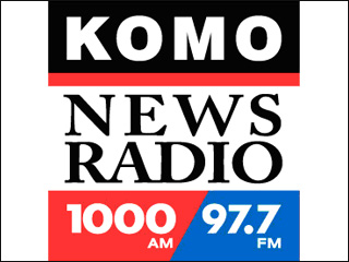
This has works and not-works to speak for it. Overall it's an improvment, but I'm not sure I'd execute it quite that way.
Here's the works about it:
And a slant as part of the logo design of a news station can work: just check the slant in the KIRO AM logo, which I analyzed to death pretty much, here.
Thanks again, Ben. You have an esteemable eye!
Technorati Tags: KOMO, Eagle 97.7 FM, News Radio, Seattle Radio, Graphic design, logo design, broadcast graphic design
Tip o'the cap to Gentleman Ben in Seattle who keeps an eye out for these things for me, for which I am grateful. He catches such interesting things!
KOMO 1000 AM radio, a big talker in the Space Noodleplex, has signed an agreement to simulcast over 97.7 FM, KFMY, licensed to Oakville WA, currently broadcasting a Classic Hits format and serving the south Puget Sound area. It's branding is The Eagle 97.7 FM, which is kind of a confusing fit until you see all the motorcycles, pick-um-up-trucks and bikini babes on the site.
But it's going on May 15th, so get your looks while you can, you chauvinists. Anyway. An Agreement between The Flag and South Sound Broadcasting will get KOMO 1000 AM signal on both KFMY and KOMO, and KFMY will be rebranded KOMO News Radio 97.7 FM.
The KOMO AM logo looked like this:
Very straightforward, static and dependable, with a red slash under the word 'radio' for dynamic interest. The spare typographic treatment brings to mind The Flag's former empire style, and synchs up well with the style used by all the KOMO broadcasting outlets, both radio and TV.
Adding a frequency calls for a change to the logo in KOMOland, and here's what they did:
This has works and not-works to speak for it. Overall it's an improvment, but I'm not sure I'd execute it quite that way.
Here's the works about it:
- The overall balanced aspect of the logo – the square, stable shape – has been retained. The call-sign and frequencies have remained in a very modern, machine-like font, which resonates with the old look, thereby maintaining the identification on a visual level.
- The same blue, black, and red colors are used. Consistent use of color continues to stableize the brand identification.
- The serifed, humanist type in the middle would be an off note, but it's bookended top and bottom by the stable rectangular shapes that define the limits of the design. It's not unlike a book and its pages that way; you have thick covers and thin, flexible pages, but it's a single unit. The choice of a serifed font is a dignified touch that gives an impression of seriousness and tradition.
- My essential crotchet about this design comes from the division of the bottom stripe into red and blue parts with a slanted line. In and of itself, this isn't such a bad thing; it reminds one of a slash one might write when making a note about the two frequencies (1000AM/97.7FM), and also is engineered to be parallel to the slated strokes in the 7's. The sour note that rings comes from the inclusion of a slanting element where it seems actually rather awkward. The entire logo bases itself on a stable, locked-down look, which is appropriate for a broadcast outlet that specializes in news – a commodity that you want people to trust when it's your product. The slanted division introduces tension in a logo where tension isn't necessarily a good thing.
And a slant as part of the logo design of a news station can work: just check the slant in the KIRO AM logo, which I analyzed to death pretty much, here.
Thanks again, Ben. You have an esteemable eye!
Technorati Tags: KOMO, Eagle 97.7 FM, News Radio, Seattle Radio, Graphic design, logo design, broadcast graphic design
2 comments:
AAARGH! I was relying on 97.7 for good classic-rock once KIRO moved to 97.3. I guess I'll have to go back to KZOK 102.5. :(
I'm intrigued that Seattle talk radio is really placing its bet on the FM side of the dial.
We've just had one FM talker, KTRO, but it didn't last long ... all it had were B-list conservatalkers, the biggest star was Hugh Hewitt (yawn).
Post a Comment