Showing posts with label digital design. Show all posts

21 May 2012

[design] Photoshop Masking Techniques Everyone Should Know

2826.Can you name them without looking at the app?
In case you can't, here they are:
  1. Magic Wand
  2. Quick Selection
  3. Quick Mask
  4. Lasso/Magnetic Lasso
  5. Eraser
  6. Pen
  7. Layer Mask
  8. Channels
They have various approaches to doing the same thing – selecting things for changing them. Select it, then effect it, goes the maxim. And some are better than others; the eraser is the one the noobs use then abandon as they soon find there are things like the layer mask that allow you non-destructively edit things, so you always have the original to go back to.
While, generally, I personally don't recommend the eraser tool the beauty of Photoshop is that it offers enough tools to do any one thing that you can approach anything the way it works best for you.
I found this nifty article at Spoon Graphics' blog that summarizes it all very nicely:
http://blog.spoongraphics.co.uk/articles/photoshop-masking-techniques-everyone-should-know#

29 February 2012

[design] Multiple Tools? The More, The Abler

2786This graphic I found interesting because it reinforces some things I've conceptualized about the practice of graphic design and digital tools:

  1. Photoshop is teh awesum:
  2. Adobe is massive:
  3. QuarkXPress is the minority platform.
I don't think a designer should be necessarily counted out because he or she doesn't have skills in, say, Illustrator as well as Photoshop as well as InDesign. But the skills required to use all three at a basic level of proficiency are pretty transferrable from one to the other: the BeziĆ©r-based Path tool works the same basic way, and the difference between how a vector and a pixel conspire to make your .ai file different from your .ps file are quick to learn and become intuitive soon enough.

An enlightened teacher or mentor in the art and practice are essential, of course. 

But if one's going to learn one, one should get into the others. Being a triple-threat Illustrator/Photoshop/InDesigner says more than you know how to use three important tools – I think it also shows that you're willing to rise to a certain challenge.

The biggest surprise? QuarkXPress isn't mentioned at all.

(via Pariah Burke's repin of Calvin Lee's pin at Pinterest at http://pinterest.com/pin/124974958379513909/)


Show off your graphic design skills with business cards from UPrinting!

29 May 2011

[design] QuarkXpress's Days of Future Past

2632.Punditry is full of its own pitfalls. It tends to create them for you.

It must be said, it really can't be helped. Even the most clear-eyed, prudent, and sober prognostication still amounts to throwing the dice. And when trends seem to be strong, they can't be denied in the moment.

One of my favorite articles ever written is one done by Scott Kelby, in 2003 for (then) Mac Design Magazine, which was succeeded by Layers magazine. Kelby is of course justly famous as one of the premier Adobe Photoshop doyens, with a fairly sparking wit besides. His writings, salted and peppered with his inimitable humor, are always a pleasure to read.

Back in 2005, I got permission to post to this blog this aforementioned column, titled "Big Trouble in Page Layout Land". It was a witty survey of the scene in 2004, when I first started learning page layout, at what seemed to be the trajectory of QuarkXPress … and it wasn't looking promising.

Quark, Inc had rightfully displaced PageMaker as The Layout App To Have If You Were Only Having one. XTensions technology was innovative, XPress had a way to do everything you could do in print at the time. But, in 2002-2003, QuarkXPress 4 still ruled the roost. QuarkXPress 5 was rolling out, but wasn't bowling the DTP world over - it had tables, which was nifty, but wasn't enough to cause the installed base to storm on over the Quark for an upgrade.

Things were looking pretty grim for Quark. Because not only was Adobe bringing its "A"-game on InDesign, as well as evolving it into an integrated Creative Suite - eventually bringing drag-and-drop simplicity between InDy, AI, and PS, and a slick look and feel, but Quark didn't make XPress OSX-native until XPress 6, which debuted more than 2 years after InDesign 2 which was, while not quite the Quark-killer everyone had hoped for, winning fans for being OSX-native. InDesign 3 was the equal of Quark 6, passed it when reinvented as the Creative Suite, and hasn't, in my opinion, looked back. It zoomed out ahead, taking a good deal of Quark's market share along with it.

Reliable market-share figures are hard to come by, but the rumor and buzz I hear are remarkably consistent … upwards of 50-60 percent of the electronic layout market has moved over to Adobe InDesign. Locally, I've applied for my share of design jobs, and the refrain I hear over and over and over in skills-desired-lists is InDesign, and very little Quark.

In 2003, Scott predicted that QuarkXPress would be, in my words, to InDesign what Microsoft Publisher was then to Quark - an entry-level layout package for the small-office and non-professional design market, complete with templates for newsletters, business cards and such … the sort of person who would use Publisher then, someone who needs to get out publications but not necessarily design them.

The dice have come up a little differently though. Quark, in 2003-2004, seemed to be slow to start and slow to catch up. Scott's prediction seemed not an unreasonable one. Well, mabe Quark is now the scrappy underdog that can, because in the meantime, while XPress has lost a great deal of market share, it's hanging on the minority position it enjoys, and a strong one - 30-40 per cent, if the buzz I'm hearing is correct. Quark is applying itself to the digital trend aptly (rather than clumsily as in the old dark days there), with Quark Design Studio locked and loaded for the iPad. 

So while it would seem that QuarkXPress's days as the dominant platform are over, predictions of its demise (by more than one of us) were rather overstated.

That's not the fault of any of the punditry. It sure looked like that's the way it was going.

And, for what it's worth, I'd still trust Scott Kelby on the trends in the industry. 

But even the best shot misses one or two occasionally.

 
Technorati Tags: , ,

27 October 2010

[design] Perils Of Layout - Don't Be That Guy Who Doesn't Embed Fonts Edition

2529.
Placing PDFs for illustrations and ads in publications seems a natural solution. PDFs travel fairly well, come in a bunch of standards for almost any application, and - generally speaking - you don't have to worry about things like having fonts available on your system.

Well, generally speaking. If you're a designer or layout artist, you know that not all PDFs are created equal, or even whole (I relearned this lesson in the very last, major-moby-bigass layout project I just did, of which I'll probably regale y'all perforce. But that's for another missive). PDFs for ads, which typically have a typographical component (and some which are quite type-heavy), can provide a nasty, embarrassing pitfall.

What needs to happen is, your pro-design-type-guy-or-gal needs to load the thing into Acrobat and take a look at those fonts, and see if they're embedded or, if not, you have them on your system. And if you can, you do; if not, you try to have fonts as outlines, which are independent of whether or not you have the fonts installed.

And just what can happen if sufficient proofing doesn't occur? Well, via Typophile (http://typophile.com/node/75600) this can happen:


Yes, this apparently was published as is.

On the one hand, someone's butt probably got cooked real good over this onee.

On the other hand, though, it does bring unexpected life and interest to a type-heavy ad with a kind-of-tired-and-overused-display font on.

Though I imaging the advertiser wasn't going for Dada which, at last check, is still dead.

Click the link above for the whole picture. It's a hoot!

Technorati Tags: , , , , ,

Powered by ScribeFire.

06 June 2010

[design tools] The Question Of The Mac Mini For Design: Answered ...

2429.... and the answer is good!

A few chapters back I wondered aloud about whether or not a Mac Mini would be a good machine to base my design center around. I'd noticed the specs and cogged that I would get more than twice the computer I have now on my desktop and use my current monitor (a 17" Apple Studio Display) and keyboard for less than half the price of the original G4.

I did get quite a few hits from MacSurfer's Headline News, who notice I asked the question, which made me happy, and somewhat less comments (which made up for in quality what I didn't get in quantity), and the results are, so far as I'm concerned, in … the Mac Mini looks like it'll be a nifty machine indeed, and quite enough for me to go forward from the old G4 with.

A top concern was basic performance. Anonymous (1st commenter) allayed this:
So my first Intel mini was a 1.85MHz and it simply rocked. Not only with photoshop and InDesign, but rendering video (not the heavy stuff, but the day to day conversions.

I purchased the latest generation of Mini and it really rocks, due to the inboard GFX card, not relying on CPU RAM, but it's own.
Kevin Cole chimed in:
Can't hurt. Grab the one w/the best card and most RAM available and it'll work dandy. (We're already using one in the office and it couldn't work more smoothly. Don't know if I'd want to do a LOT of video at once, but for what we're doing, it's smooth!)
Gahlord Dewald had this to offer:
I am very satisfied with my Mac Mini. I am easily driving a Samsung 26" LCD, have my Wacom medium sized tablet plugged in, have a brace of external RAID arrays (though the internal disk is great, I love the speed of RAID stripes so I keep them on hand). I am currently running CS4 and plan to upgrade to CS5.

...

Not sure how it will go for you, but I can say that I do not regret my Mac Mini at all. Wish I had done it sooner.
Jeff, who works at KGW (I'm guessing on the PDX Tweeter's favorite program, Live@7 (@TheSquare), reported in from the trenches:
Go for it. The mini is a powerful little box. I've used one with dual monitors (19" and 24"), and it worked like a champ. We use a couple of previous-gen minis as render boxes at KGW, rendering full HD After Effects projects, and they've never failed to handle the workload. Dollar for dollar, probably Apple's best computer.
Also, as a couple of commenters pointed out, the Mac Mini does indeed have a fan, which means I was probably confusing the concept of the Mini in my mind with that of the G4 Cube, which worked by convection only (which I thought nifty). The form factor of one is reminiscent of the other to me.

Bottom line, though? The Mac Mini will equal my current needs and exceed them a little, and get me back up near enough to the leading edge tech-wise that I can take a role in the reindeer games once again, which is what I need right now.

So, after that payment comes through from the tech editing job, I have a date with PowerMax, or maybe The Mac Store, whichever. They have good deals. And at the price of a new Mac Mini, I won't have to settle for a used unless it makes better economic sense along the transaction. And both stores have excellent return policies.

Since I rarely get feedback or comments, also, a huge thanks and word to the commenters on that. I enjoyed reading them and watching them come in, and really kind of treasure them. You guise were the excellent kind of excellent, and I thank you very muchly indeed.

Mac Mini, here I come ... by and by.

NB: Young, non-creepy SJobs and Macs sourced hither: http://s787.photobucket.com/albums/yy160/kdlipton/?action=view&current=steve-jobs-1984-macintosh.jpg&newest=1

Technorati Tags: , , , , , ,

Powered by ScribeFire.

31 May 2010

[design] I Like Windows 7 - But I Still Prefer Mac OS X. Here's Why.

2425.Just like a lot of people trained in design, I love Apple. And the previous post where I solicited public comment on the idea of using a Mac Mini as my design center made me think about why I was so set on staying Mac.

I love Apple.

Well, let me qualify that a bit.

I like the company. Jobs sometimes leaves me with that "uh-oh" feeling. But I love Mac OS X.

I've had a foot in both the Mac and PC worlds almost ever since I owned a computer. I've known friends who swore by their Macintoshes while we were piecing together Windows machines before we could finally own a Mac. I've seen and used Windows 7 and I've got to say that, within the Windows paradigm, all the upgood press you've heard about it is dead on the money: Win 7 looks good, works good, and is the most well-behaved Windows yet.

But, given my choice I'll stick with the X.

Why?

One word: Darwin. Another word: architecture.

Installing applications in X is a breeze and, even though the under-the-hood works has changed since the days of the earlier Macintosh OS's, the basics are still the same: for most applications, uninstalling still remains a matter of simply dragging the file to the trash.

I've just never been able to do that in Windows, even Win 7. And what dependencies there are are pretty easy to find. I don't need a "wizard" to install or uninstall a lot of things. That's simplicity because I can see what's going on. DLL? What's that?
The organization of the file system makes a great deal more sense to me. It's more intuitive. I also know Unix ... not as a pure power user, but enough of a power end-user that if I need to find something, I can break open Terminal and go looking. To me, the command shell of DOS is was always like a kind of poor-mans Unix, that doesn't quite work the way it ought to. Unix command line cryptic? I took one look at DOS Power Shell and my eyes instantly glazed over. And, unlike Windows, since Darwin is a flavor of Unix, it has a bunch of nifty and useful things installed that I'm well familiar with – vi, ftp, rlogin, ssh, all sorts of stuff that I learned to use effectively a long time back.

So, it's my hat's off to Win 7. It is indeed everything they're selling it as. But I'll stick with the X, because the X makes a whole lot more sense, and I feel a lot less lost in the Darwin environment.

It just works ... for me.

Technorati Tags: , , ,

Powered by ScribeFire.

29 May 2010

[design tools] A Mac Mini for Graphic Design?

Special Update! 30 May 2010 Z1637: I am quite suddenly (and delightfully) getting merrily hit by MacSurfer's Headline News page, an am already on the way to having the biggest Sunday this blog's ever seen! Nifty, and gratitude obtain! Whoever loved me enough to put me at the top of the opinion section – words cannot express!

I am seriously interested in the opinions of designers about using the Mac Mini for everyday use, so if you have any opinions, please, sound off! I like the information I'm getting so far! - Samuel John Klein


2422.Presently, an opportunity might present itself for me to upgrade my equipment.

Not that I'm all that dissatisfied with the old stuff. But it is, as they say, old.

My design center has, for a long time now, consisted of a dual-processor PowerMac G4. It's a lovely thing. It has (in two versions, thanks the the donations of a few angels back when the first one let me down about two years back … thanks to you all, I still appreciate this boon) served me very well.

Actually, it's not so much as it's showing its age as the world is moving on. It's a 1.25 Ghz 2-processor machine, mounting standard 80 GB hard drive (and a couple since added), and runs Creative Suite 3 pretty well (unless I want to try drawing in 3D in Illustrator, which makes it cry like a schoolgirl).

In particular the moving on has been in the move of Apple to Intel, and the move of software away from the old Power PC. Snow Leopard – if I could get it, wouldn't run on this machine. Adobe Creative Suite 5 – forget about that. In the tech editing job I'm doing right now, I'm borrowing a Windows 7 laptop (and it's a nice OS, that – almost like using a Macintosh).

So, however successful I  do get, even though the old Macintosh is running quite well right now, I'll have to try to keep up.

As budgets go, I could move up to a 13" MacBook Pro, or something like that. And then more than one acquaintance suggested I look into the Mac Mini. I'd heard of them some time ago and loved the idea but I didn't know how they would support graphics apps. But looking at the specs of recent models has caused me to consider it seriously.

For less than $800, I can get a Mac Mini that has this amazing-looking SuperDrive, more than three times the OEM online storage of my original G4, and a clock-speed that's more than 2x as fast - and something that only consumes 14 watts when idle and uses no fan. That's something that turned my head. It's like getting more than twice the computer I have now for less than half the price I originally paid for the old warhorse G4.

And they're not making software I need for the Power PC anymore.

So, I'm wondering - is the current brand of Mac Minis worth it to do design work on? They make excellent economic sense for me, and would get me back closer to the cutting edge, where I need to be.

If anyone has anything to say, especially users of Mac Minis who may right now be using them to do design work, I'd be interested to hear it. Sound off in the comments.

Technorati Tags: , , , ,

Powered by ScribeFire.

[webdesign] Web Pages as Posters

2421.There are at least two main rationales for how to lay out effective web pages that I can think of.

The first, which leans toward sheer functionality, depends on the observation that people tend to read web pages in a capital "F" pattern: along the top, then down the left side, scanning right as interest or necessity or interest directs.

The second depends on a sense of play. I've recently noticed a trend in web page design that takes precisely this antic approach to amp up the interest, and it works quite well.

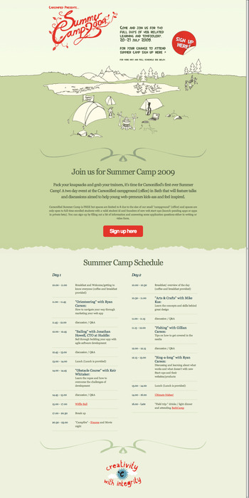
A good example, pointed at by this article at Sean Nieuwoudt's blog, is the Carsonified "Summer Camp" event, whose web pages looks very much like a poster. As a teen I covered my room with them: posters are teh awesoem, providing witty decor, in many cases, long after the event they promote has faded into history and memories:


This could work very well as a poster in a public place, or decorating your studio or bedroom wall, or being framed as a kind of an ironic objet d'arte. It's cool style and simple touches provide a lot of fun for the eye: you remember it.


And, even though the event happened in 2009, you still like looking at it. It transitioned from information delivery into a kind of art work, in a nifty way.

Your eye pretty much eats up the charming imagery. The amusing "Sign Up Here!" sticker, looking as though it was picked at by some mysterious bored finger at some point, is a visual bonus. The hand-crafted-looking type speaks for itself.

In Sean's article, Design Posters Not Landing Pages, the principles of poster design are made relevant to web page design, allowing for an alternative way to present over the intartuebz: You can have your sober, ordered, pinstriped-navigationerly web page where it's appropriate. But, where it's possible to have the fun, you can think of your web page as a poster, imagine what it would look like on your wall & and design it accordingly.

It dovetails very nicely with the trend toward "hand drawn and lettered" looks in web page design that we seem to see in so many places these days. It's kind of a breath of fresh air, mixing it all up.


Technorati Tags: , , , , ,

Powered by ScribeFire.

19 May 2010

[design] Free Scripts To Help Adobe InDesign Deal With MSWord Files

2415.Here's some free niftyness that I stumbled on today, via CreativePro.com: four scripts that will help you deal with text formatting in imported MSWord files, which is pretty much the bulk of the files you'll be importing and styling and which, even I can say, will occasionally give you unforgivable pains in da tuchas ...

These scripts help you correctly apply styles without having to bother with overrides, deal with GREP and export character styles. They also help you apply nested styles and turn GREP styles to character styles.

And a bonus free nifty free thing! I just found this out, but a membership to InDesign Secrets, a very good resource site to keep as one of the tools in your online toolkit, is now free! I just signed up and since there's no such thing as too much good quality free advice about InDesign, I think everyone should.

Just go to http://indesignsecrets.com and click on the Become A Member! link on the upper right below the search box. They'll send you a registration code … put the code number in the box and you're home, son!

Technorati Tags: , , , ,

Powered by ScribeFire.

14 April 2010

[web design] Wear My PDX Skyline As A Firefox Persona

2395.Here's a goodie for Firefox users I couldn't help but share - I've crafted my first Firefox "Persona". Now, you can wrap your browser in one fantastic downtown Portland skyline (clicky to embiggen):


And you can get it here: https://www.getpersonas.com/en-US/persona/183994

Enjoy!

Technorati Tags: , , , , ,

Powered by ScribeFire.

13 April 2010

[design] More Connectivity On My Website

2394.More contact choices for the ZehnKatzen Graphic Arts website:


Now my Twitter and Facebook connections are upfront, and "Contact" has morphed into E-Mail - because "Contact" is kind of vague. Maybe someone's looking for E-Mail.

The implementation, in this Web 2.0 world, is very simple - a high-quality JPG and an image map. That's it. My website expresses an ideal, that it's fine to come up with things that are obviously technically brilliant, but sometimes, Good Enough is just as genius. I like getting a lot of mileage out of technical princples that still are ironclad. JPGs and image maps make for econonmical yet vivid website design.

You can go all-out with Flash design if you want (and so can I), but this is very easy to update, keep current, and maintain. It can go anywhere, even on servers without a lot of space.

Technorati Tags: , ,

Powered by ScribeFire.

08 April 2010

[design] How To Become An Online Designer Plenty Quick

2386.
Pariah Burke, how knows more about establishing an online presence than most people I know have forgotten, breaks it down:

  1. Get a domain name
  2. Install WordPress
  3. Use a nifty, fashionable template

You've probably heard of the free blogging software WordPress. Thanks to the efforts of a massive community of diverse users, WordPress has grown into much more than a platform for blogging. For example, WordPress is an excellent host for easy-to-erect and easier-to-maintain portfolios. Even if you never write a blog post, you can use WordPress to get your portfolio online, in front of prospective clients, and you don't have to learn HTML, CSS, or any other Web design language.

Here's the skinny and the details: http://www.creativepro.com/article/put-your-portfolio-web-without-touching-code

Technorati Tags: , , , ,

23 October 2009

[type] Laika – A Font That Dynamically Responds To You

2244.I've always felt that type is not as static as people think it is. Even printed, unchanging type has the power to move, influence and change moods (imagine a Last Will and Testament in Times Roman. Now, Imagine the same document in Comic Sans. How would that make you feel?)

In a video that has to be seen to be appreciated, Swiss typographers Nicolas Kunz and Michael Flückinger exhibit Laika, a font that was designed to transition seamlessly between any number of outside stimuli.

Art imitates life, typographically:

LAIKA from Michael Flückiger on Vimeo.

Laika can be further assayed at its website: http://laikafont.ch .

Technorati Tags: , , ,

08 October 2009

[design] Hardcore Prepress Artists Get Tats With Crop Marks

2224.(Yes, I've moved off count again, meaning that there are at least three duplicates down the stream there. Ah, well).

How do you know you're hardcore prepress?

How do you tell the world that you'll quit electronic layout when they pry your Mac from your cold, dead hands?

How does a hardcore designer represent?

With ink, of course:


Photo via The Font Feed. Copyright belongs to them.

Via Jurgen Siebert at The Font Feed:

Long time Adobe InDesign product manager Will Eisley is so dedicated to his job that it has gotten under his skin – quite literally. Will recently had his initials tattooed on his inner forearms, together with the regis­tration marks, crop marks, and colour and grayscale bars which are part of InDesign’s printing marks.

I think they're beautiful, even though the color and grayscale bars happen inside the crop marks, which will cause trouble when his arms eventually do go to press, but that's what you get when you don't sign off on a press check, even I know that.

Find another better picture and what Will wants to have tattooed next at The Font Feed
. Also a few snarky comments. My favorite:
The dude has his color bars inside his crop marks… He might be a quark user, or even worse.. corel..
Oh, snap!

(from a RT via @Extensis on Twitter. Love Extensis.)

Technorati Tags: , , ,

08 September 2009

[design] PortlandOnline Design Contest Throws Light On The Poison Of "Spec Work"

2206.The recent retracking of the PortlandOnline.com "Refresh" web design contest into a banner-design only contest (thanks to local creative professionals standing up along with AIGA to remind the city that good design work comes from committed professionals, and not from a cattle-call) is welcome news, and gives us a chance to see what "spec-work" really means to the graphic design profession – as well as, maybe a profession near you.

Spec-work – speculative work – is something that happens when one is expected to do a job for free in hopes to get a plum (or any) assignment.

How would you feel if, say, you worked in a fast-food restaurant, any shift, and there was a new plan of compensation: there was an amazingly big paycheck at the end of the night – but only one person was going to get it, and the winner was the person who worked the entire shift and not only did their job better than anyone else, but also won the popularity contest amongst the customers?

Manifestly unfair, isn't it? I don't think anyone would argue that if you work in such an occupation, you deserve to be paid – however much you have a right to expect to be paid – for your work if you delivered a skillful performance.

There are sites out there, most notably 99designs.com and crowdSPRING.com, that work under just such this principle. Contests are fielded for designs for logos, websites, anything a graphic or digital designer could be expected to do, and prizes are awarded for the best designs. Customers expect everyone to bring their A game, but if they don't like your design – well, that's the breaks, kiddos. You've done a complete job, you've invested time, sweat, and skin, but sorry. You lost.

If you're like me, you and everyone you know, you can't get that time and effort back.

But it's making bank for the proprietors of crowdsourcing sites, and others are noticing there's big money to be made off desperation. Some purveyors are offering turnkey site kits that allow you to set up your own design contest site in no time. Spec work poisons the profession by encouraging the perception of the professional designer as someone who will do anything for the chance at a couple of bucks, which drives down the amount of money designers can expect to get for their hard work, which undermines professionals, and makes easier for beginners to get in the profession and actually become professionals themselves, a negative feedback loop; also, the quality of the work tends to go down, because you can't get professional work from people you don't treat as professionals.

If you've chosen to become a professional, to really commit to creating, then you deserve to be paid, not to hope for a chance at getting paid. Designing is more than just getting a hot computer and a copy of Photoshop. It requires training, and any designer that respects themselves and their work will tell you that design, like any other creative work, is hard work.

The greatest logo designer of the 20th Century was the great Paul Rand. A modern-day Paul Rand wouldn't stand a chance in today's crowdsourcing environment.

So, Portland's decision to recast the web design competition was welcome, if not 100% perfect; I appreciate the creative professionals in this town and the local AIGA for standing up for people who believe that a profession should be treated as one, and the best way to get a professional job is to contact with one.

You pay a professional, you get a professional job.

You cut corners with crowdsourcing, you get what you get. Hope that works out for you.

No!Spec is essential for anyone who wants to understand why crowdsourcing is poison to the design profession. You can visit them at http://no-spec.com.

SpecWatch is a Twitterer who provides an ongoing look at what a sordid web crowdsourcing sites can become. Visit their stream at http://twitter.com/specwatch.

Respect your profession. Respect your work. Respect yourself. Avoid crowdsourcing and spec work contests.

Technorati Tags: , , , , , ,

28 August 2009

[design] Paste Into – The "Other" Paste Command In Photoshop

2200.The joy of Photoshop is that it has more features than you can shake a stick at. That's also the heartbreak, because there are so many it's easy to forget ones you would find mad useful. And one of those is Paste Into.

It's an advanced version of the Paste command, which you can find in the Edit pulldown just underneath the Paste command. The reason it's awesome is that it saves you a ton of steps if you want to paste an object into a certain area.

What Paste Into does is this: given a selection (which you can create any which way you want), it pastes the copied image data into the current document on a new layer, and then creates a layer mask with the same shape as the selection. The effect is that your pasted content appears to be pasted into the selected area – the layer mask – which can then be gradiated, changed, whatever you want to happen.

There's a good and quick video tutorial supported by CreativePro.com which can be viewed at http://www.creativepro.com/article/combine-images-quickly-photoshop. It's a short video which hints at real design power that can be leveraged. Also, this tutorial takes a quicker approach if you just want to learn the basics: http://www.photoshopessentials.com/photo-effects/paste-into/, which details just what goes into the process but doesn't demonstrate anything else … but if you're a good enough Photoshop Ninja, you should be able to take it from there.

I feel an article about alpha channels coming on, for some reason …

Technorati Tags: , , ,

08 March 2009

Which Websites/Blogs Do I Hate The Most?

1969.The ones that have a music track ... that plays on loading, whether you're in the mood or not.

DSL is easier to get than ever, but music still consumes enough bandwidth that you're slowing the load, and on older computers, you'll notice.

Moreover, I know what I like to listen to when I'm websurfing ... I'm already listening to it (right now, I'm listening to Deutsche Welle via iTunes as part of my person German immersion program. It's amazing how much I understand ... but it call goes so fast). So, when I'm working on something and your horrid jangly geetar rawk crashes through it, it pisses me off.

Proud of your music? Great! We should all have something we should be passionate on. DONT PLAY IT AUTOMATICALLY ON LOADING OR I WILL HATE YOU. Give me a link if you want me to sample it, but don't get all hurt if I don't listen. I like what I like. It's not personal.

But if you load up and fling your music at me when I load your site and make me look all over the place for the mute button, I'll think twice about coming back to see you again.

Wow me with design. Don't puncture my eardrums with your music.

K, Thx.

Technorati Tags: , , ,

11 December 2008

The Quest: We are Re-Computered

The PowerMac G4 arrived from PowerMax today, and there was no problem in plugging it in and powering it on.

I am currently running off that machine. It's good to be at my workstation; it's good to look at the computer on a big screen.

It's good to be back in the studio.

I still have benchmarks to complete. First will the the installation of the old "SunDial Three" hard drive into this case, then the SuperDrive from the old machine.

I owe it all to the people who thought enough of me to donate money to make this happen.

Thank you, thank you all.

09 December 2008

The Deed Is Done: The Replacement Computer Is Coming

Thanks to the incredible good will of the people who've donated, I will once again have my beloved CS3 apps available to me.
Link
I have just completed the purchase of a pre-owned PowerMac G4 MDD, with FW 800 and about 1 Gig of memory, from PowerMax. The amount in the fund has been updated to reflect the money spent.

I've learned a great deal about myself from this, and great deal about the people who come here to read or comment. You could have put that money down anywhere else. You deemed me worthy of it. Your generosity and belief in me has improved my outlook dramatically, and I'm more ready to take on the world than I have been in some time.

It has been a rather hard quarter. Losing the computer I depended on hasn't been the only travail hereabouts ... just the most germane to the mission of this blog.

Thank You, Judy!

I'd like at this time to thank one last contributor. Judy, my logo design client, with a donation. I enjoyed working for you, Judy, and I hope you and your son's realities are playing out in the way you want them to.

I'm fond of you as a fellow blogger, and I read you regularly ... just don't comment as much as I should.

Why Buy Over The 'Net When the Vendor Is Across Town?

I'll be recieving the new machine in 5-10 business days, hopefully sooner. I looked into PowerMax because of thier reputation and their smug pride in living in Oregon (that part of the character is right up my street, if you know me). Those of you familiar with PowerMax know that the actual location of the business is in Tualatin, off I-5, exit 290 (you know, the one where they want to put in a Stars Cabaret strip joint).

If they're right across town, why buy over the 'net and wait for delivery?

Convenience is one good reason. For poor folks, we're busy. This cuts out just one more trip to do.

A couple more reasons are the guarantees that PowerMax extends to internet shoppers of pre-owned Macs. They are two: 1: What they send you will work as advertised. If it doesn't, they'll replace it with one that does. 2: The 90-day warranty. If the purchase is unsatisfactory (I don't expect it will be) they will give me full credit toward something else.

As you can tell, I like having some form of guarantee. It tells me some things about the seller: that they have good will and a good rep (and are willing to take steps to preserve it by making sure they don't sell you junk).

So now, the waiting begins. UPS, don't fail me now.