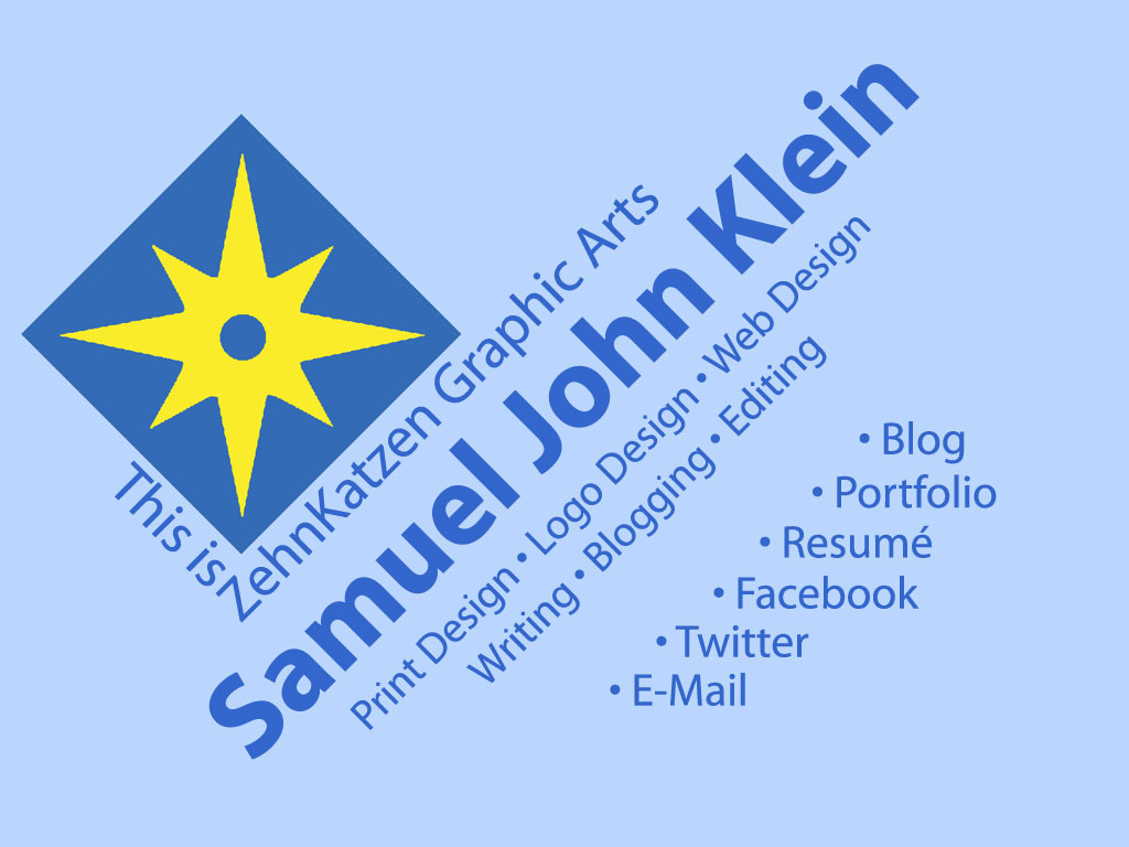
2394.More contact choices for the ZehnKatzen Graphic Arts website:
Now my Twitter and Facebook connections are upfront, and "Contact" has morphed into E-Mail - because "Contact" is kind of vague. Maybe someone's looking for E-Mail.
The implementation, in this Web 2.0 world, is very simple - a high-quality JPG and an image map. That's it. My website expresses an ideal, that it's fine to come up with things that are obviously technically brilliant, but sometimes, Good Enough is just as genius. I like getting a lot of mileage out of technical princples that still are ironclad. JPGs and image maps make for econonmical yet vivid website design.
You can go all-out with Flash design if you want (and so can I), but this is very easy to update, keep current, and maintain. It can go anywhere, even on servers without a lot of space.
- It's updated! ZehnKatzen Graphic Arts page at http://www.rdrop.com/users/eagle (with a .com address to come!)
Powered by ScribeFire.


2 comments:
That's coool. Say, when are you going to make some firefox personas? Portland-themed, unicorn-themed, Portland-unicorn-themed, etc?
I'm sure you know of them, but if not ...
http://www.getpersonas.com/en-US/gallery/
You're right, Dale, I should; I have avoided updating Firefox because Firefox 3.6 refuses to preview sites in Dreamweaver. However, Flock will do just as well.
That's really cool of you to wonder why I haven't done that yet. I think you might understand why a person would say that.
Post a Comment