
2421.There are at least two main rationales for how to lay out effective web pages that I can think of.
The first, which leans toward sheer functionality, depends on the observation that people tend to read web pages in a capital "F" pattern: along the top, then down the left side, scanning right as interest or necessity or interest directs.
The second depends on a sense of play. I've recently noticed a trend in web page design that takes precisely this antic approach to amp up the interest, and it works quite well.
A good example, pointed at by this article at Sean Nieuwoudt's blog, is the Carsonified "Summer Camp" event, whose web pages looks very much like a poster. As a teen I covered my room with them: posters are teh awesoem, providing witty decor, in many cases, long after the event they promote has faded into history and memories:
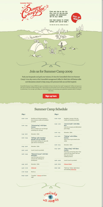
This could work very well as a poster in a public place, or decorating your studio or bedroom wall, or being framed as a kind of an ironic objet d'arte. It's cool style and simple touches provide a lot of fun for the eye: you remember it.

And, even though the event happened in 2009, you still like looking at it. It transitioned from information delivery into a kind of art work, in a nifty way.
Your eye pretty much eats up the charming imagery. The amusing "Sign Up Here!" sticker, looking as though it was picked at by some mysterious bored finger at some point, is a visual bonus. The hand-crafted-looking type speaks for itself.
In Sean's article, Design Posters Not Landing Pages, the principles of poster design are made relevant to web page design, allowing for an alternative way to present over the intartuebz: You can have your sober, ordered, pinstriped-navigationerly web page where it's appropriate. But, where it's possible to have the fun, you can think of your web page as a poster, imagine what it would look like on your wall & and design it accordingly.
It dovetails very nicely with the trend toward "hand drawn and lettered" looks in web page design that we seem to see in so many places these days. It's kind of a breath of fresh air, mixing it all up.
Technorati Tags: web design, typography, Sean Nieuwoudt, Carsonified, poster design, visual web designThe first, which leans toward sheer functionality, depends on the observation that people tend to read web pages in a capital "F" pattern: along the top, then down the left side, scanning right as interest or necessity or interest directs.
The second depends on a sense of play. I've recently noticed a trend in web page design that takes precisely this antic approach to amp up the interest, and it works quite well.
A good example, pointed at by this article at Sean Nieuwoudt's blog, is the Carsonified "Summer Camp" event, whose web pages looks very much like a poster. As a teen I covered my room with them: posters are teh awesoem, providing witty decor, in many cases, long after the event they promote has faded into history and memories:
This could work very well as a poster in a public place, or decorating your studio or bedroom wall, or being framed as a kind of an ironic objet d'arte. It's cool style and simple touches provide a lot of fun for the eye: you remember it.
And, even though the event happened in 2009, you still like looking at it. It transitioned from information delivery into a kind of art work, in a nifty way.
Your eye pretty much eats up the charming imagery. The amusing "Sign Up Here!" sticker, looking as though it was picked at by some mysterious bored finger at some point, is a visual bonus. The hand-crafted-looking type speaks for itself.
In Sean's article, Design Posters Not Landing Pages, the principles of poster design are made relevant to web page design, allowing for an alternative way to present over the intartuebz: You can have your sober, ordered, pinstriped-navigationerly web page where it's appropriate. But, where it's possible to have the fun, you can think of your web page as a poster, imagine what it would look like on your wall & and design it accordingly.
It dovetails very nicely with the trend toward "hand drawn and lettered" looks in web page design that we seem to see in so many places these days. It's kind of a breath of fresh air, mixing it all up.
- Visit Carsonified at http://www.carsonified.com
- Visit Sean Neiuwoudt at http://isean.co.za/post/606572840/design-posters-not-landing-pages
- Jakob Nielsen's Altertbox article on F-shaped web page reading patterns is archived by useit.com at http://www.useit.com/alertbox/reading_pattern.html
Powered by ScribeFire.
2 comments:
ya its very nice to see the Blog... i too got the web developing process from here http://www.tucktail.com/ Also can get free hosting services... In a few months will get ready my new blog...
I like this blog very much....
Post a Comment