Unlike (apparently) a lot of people, I was a little taken aback to find that the day after Thanksgiving, up until this year called "The-day-after-Thanksgiving", of "The-busiest-shopping-day-of-the-year", has been given the moniker "Black Friday".
Say wha'?
See what happens when I take my eye off the ball for a few days? Sheesh. I miss the old news cycle that closed down at night, but anyway.
For a day that held so much hope for retailers and the economy, "Black Friday" seems a pretty darned sombre name. Not that I could think up a better one; I thought "The-day-after-Thanksgiving" worked pretty well, and you don't mess with success in my world.
Then I saw the Wal-Marts. You know, the ones where people are lining up before dawn in thirty-degree weather to get in? And the appalling behavior in Orlando that hit the national news.
No, when people are lining up in front of Godforsaken Wal-Marts to buy stuff, then, I guess "Black Friday" applies just fine.
Oh, and if anyone's paying attention, please understand the following: There is nothing in a Wal-Mart worth lining up for before it opens. There never has been. THERE NEVER WILL BE!!!
In other words, if you're waiting outside a Wal-Mart before it opens to buy something, brothers and sisters, it's time you looked deep inside yourselves and asked yourself if you really need it all that much.

By Samuel John Klein of Portland, Oregon - Graphic Designer without Portfolio, aspiring artist who dawdled too long.
28 November 2005


23 November 2005
[Address_Nerd] History in the Curbstones, Part II
Dig, if you will, this picture:
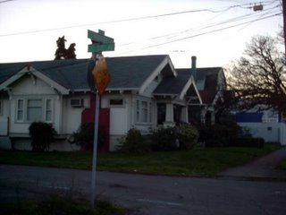 This is the corner of SE Woodstock Blvd and SE 53rd Avenue, facing WSW, taken late on a recent late Fall afternoon (which, of course, is not all that late, but for the early sunset, which is why the light is so low). SE 53rd Avenue is the small unpaved street in the foreground, and it ends in a dead end about 100 feet or so off to the left. On the right hand, and just out of shot, is Woodstock Blvd, the Our Lady of Sorrows Catholic Church across the street, and immediately left and out of shot is a small drive-up espresso stand. Less than a block east on the same side of the street is a Plaid Pantry store; the bluish building in the background of the shot is the Mike's Auto Parts store at 52nd and Woodstock.
Recall, a few weeks back, I noted that before the street name rationalization in ca. 1930, the area sout of division and east of 39th out to the city's edge had a different pattern than the rest of the city; numbered avenues ran east-west crossing numbered streets, all suffixed SE and based on our modern baselines of Burnside and the river. In this area, many streetcorner markings in the pavement date from that time, so, if you come to a corner and look down, you can actually see what the streets used to be called.
Woodstock is the 6000 block south of Burnside, so in the old system it would be 60th Avenue, SE; what we today call SE 53rd Avenue would be 53rd Street SE. Let's go to the evidence:
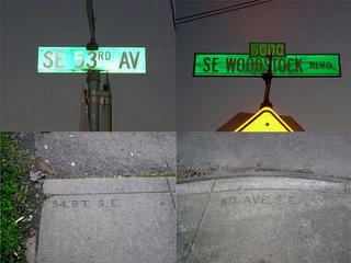 The curbstone picture beneath the sign is the marking you see on the street the sign belongs to. So we see that, as predicted, the curb (on the right) under the SE Woodstock Blvd sign says 60(th) AVE S.E., but the curb on the SE 53rd Avenue side reads, not 53, but 54 ST S.E..
A look at a map suggests that someone, at some time, needed to make a judgement call. Between SE 52nd and SE 57th Avenues on the south side of Woodstock Blvd there are three dead-end stubs. Today they are 53rd, 55th, and 56th. At the time they were made it must have seemed more appropriate to number it 54th; very close by, entering Woodstock from the north, is another part of SE 54th Avenue.
These pavement markings still exist in a great many places in S.E., and though we can't expect them to stay indefinitely, the city doesn't seem to be in a hurry to remove them, so there's still time to find 'em.
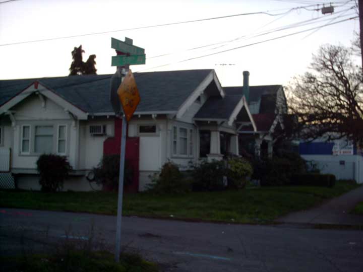 This is the corner of SE Woodstock Blvd and SE 53rd Avenue, facing WSW, taken late on a recent late Fall afternoon (which, of course, is not all that late, but for the early sunset, which is why the light is so low). SE 53rd Avenue is the small unpaved street in the foreground, and it ends in a dead end about 100 feet or so off to the left. On the right hand, and just out of shot, is Woodstock Blvd, the Our Lady of Sorrows Catholic Church across the street, and immediately left and out of shot is a small drive-up espresso stand. Less than a block east on the same side of the street is a Plaid Pantry store; the bluish building in the background of the shot is the Mike's Auto Parts store at 52nd and Woodstock.
Recall, a few weeks back, I noted that before the street name rationalization in ca. 1930, the area sout of division and east of 39th out to the city's edge had a different pattern than the rest of the city; numbered avenues ran east-west crossing numbered streets, all suffixed SE and based on our modern baselines of Burnside and the river. In this area, many streetcorner markings in the pavement date from that time, so, if you come to a corner and look down, you can actually see what the streets used to be called.
Woodstock is the 6000 block south of Burnside, so in the old system it would be 60th Avenue, SE; what we today call SE 53rd Avenue would be 53rd Street SE. Let's go to the evidence:
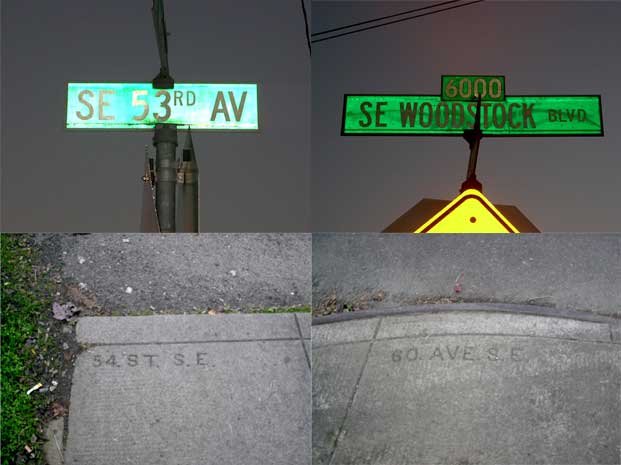 The curbstone picture beneath the sign is the marking you see on the street the sign belongs to. So we see that, as predicted, the curb (on the right) under the SE Woodstock Blvd sign says 60(th) AVE S.E., but the curb on the SE 53rd Avenue side reads, not 53, but 54 ST S.E..
A look at a map suggests that someone, at some time, needed to make a judgement call. Between SE 52nd and SE 57th Avenues on the south side of Woodstock Blvd there are three dead-end stubs. Today they are 53rd, 55th, and 56th. At the time they were made it must have seemed more appropriate to number it 54th; very close by, entering Woodstock from the north, is another part of SE 54th Avenue.
These pavement markings still exist in a great many places in S.E., and though we can't expect them to stay indefinitely, the city doesn't seem to be in a hurry to remove them, so there's still time to find 'em.
[logo_design] The Adventures of Pajamas Media, we mean Open Source Media, no, we mean Pajamas Media after all
 This week, a blog network/portal site debuted with the name of Open Source Media. The site, an alliance of blogs and personalities self-described as conservative, chose a fairly slick looking logo: a dark cyan spiral paint stripe emanating from the majuscule O in the OSM, with the rest of the acronym punching through the spiral, the S seeming to be centered on it. The expansion of the acronym, "Open Source Media", lay below the M and aligning with its left stem stroke, was a dialed-back gray so as to inform the viewer of what OSM was supposed to stand for but not to distract from the trigram; it seemed apparent that from this display (as well as the website address – www.osm.org) that the OSM mark was to be the core identity.
It looked pretty slick, and in my opinion it's not a bad logo at all. It's got good eyeflow, divides and encloses the space interestingly, and delivers information.
And it immediately showed the symptoms of a raging case of Quark disease.
DTP maker Quark, if you'll recall, recently freshened up its image. Problem: it's redesign looked a heck of a lot like a number of already-existing identities (for back story see Gene Gable's commentary on CreativePro.com here, Pariah S. Burke's on QuarkVsInDesign.com here, Jeff Fisher's Logo Notions commentary at Creative Latitude here, or my own comments on Designorati.com, if you're a glutton for punishment (I also have one on somewhere here on the Times, but I think that'll be enough linkage for one article).
Anyway, it wasn't long before Quarkitis hit. Blogger Jonathan Miller, at this post on his political commentary site Blogoland, wittily and snarkily noted two similar logos – philly.com and Lucent Technologies. Are they similar enough to be plagiarized? Likely not. Are the similar enough to make OSM look unoriginal? Could be. That's kind of in the eye of the beholder – follow the links and judge for yourself.
The biggest conflict isn't the logo, though, it's the name. Open Source Media already seems to be in use: an independent journo who promotes a podcast through his URI http://www.radioopensource.com uses just that name for his site.
A combination of pressures – liability to the already extant Radio Open Source and general humiliation amongst them – have contributed to the site going back to its working title, Pajamas Media, a reference to the oft-forwarded remark that bloggers post news to the world whilst sitting in front of thier computers in thier pj's (the URI, http://www.osm.org, remains unchanged). The illustration at the head of the article is a screenshot of the logo as currently represented on the site's masthead, and is a clever and somewhat self-deprecating way of shifting identity. The new identity is typographical rather than graphic but preserves the colors of the original logo – the dark grey of the letterforms and the dark cyan go to the dots over the minuscule i's.
It's true you just can't check enough, and thorough research is a necessary thing, but one wonders exactly how much happened when a simple Google search could have turned up conflicts.
21 November 2005
[pdx_life, blogs] The One True Prodigal b!X
"FURIOUS nads! are the true riches of a city."
—not C.E.S Wood, that's for certain.
—not C.E.S Wood, that's for certain.
20 November 2005
[beaver_nation] There's Always Next Year
I give you the 2005 OSU-UO Civil War: living proof that OSU's season, as I thought, ended four games ago.
OSU Football is the only football I listen to on broadcast. This time, got up late, tuned in with three-something minutes left to go, heard the score and about two minutes worth of commentary, and turned that radio right back off, friends.
'Cos that, my babies, is what they call...
 (Image borrowed from a site I found Google searching, copyright everyone, Star Trek belongs to Paramount, copyright this that and the other thing, copyright Paramount, please don't sue me Paramount it's only a joke. And tell Spock to stop mind melding with Coach Riley for chrissakes!)
OSU Football is the only football I listen to on broadcast. This time, got up late, tuned in with three-something minutes left to go, heard the score and about two minutes worth of commentary, and turned that radio right back off, friends.
'Cos that, my babies, is what they call...
 (Image borrowed from a site I found Google searching, copyright everyone, Star Trek belongs to Paramount, copyright this that and the other thing, copyright Paramount, please don't sue me Paramount it's only a joke. And tell Spock to stop mind melding with Coach Riley for chrissakes!)
18 November 2005
[pdx_geography] Exits on the Banfield Freeway
An interesting thing I found whilst going about lately satiating my craving for information on the Mount Hood Freeway was a bit about the exits on the Banfield Freeway (I-84) that I'd never noticed before.
Exit numbers, as many are aware, in Oregon are keyed to the freeway mile. The exit from I-5 to Keizer is in freeway mile 260, so the Keizer exit is Exit 260.
On the Banfield eastbound, in the stretch that rounds Rocky Butte to the east, the 82nd Avenue exit is Exit 5; it's in freeway mile 5. The I-205 southbound/Salem exit is Exit 6, the Gateway exit is Exit 7, the I-205 northbound/Airport exit is Exit 8, and the 102nd Avenue offramp is Exit 9.
But the distance between exits 5 and 9 isn't between three and four miles...it's only about 1.2 miles. Strange, but explainable.
It developed that the stretch of Mount Hood freeway from I-5 to I-205 was to be added to the Interstate system as I-80N (or I-84 as we have today), and the stretch of Banfield between city center and I-205 was to be dropped from the Interstate system, simply signed as US 30. The shift of the route, with I-84 and 205 "duplexed" from what is now I-205 and Powell Blvd to the Gateway area, would account for the "lost" mileage. The mileage on I-84 east of I-205 is reckoned as though the Mount Hood freeway was actually built.
This, friends, is serendipity in action.
Exit numbers, as many are aware, in Oregon are keyed to the freeway mile. The exit from I-5 to Keizer is in freeway mile 260, so the Keizer exit is Exit 260.
On the Banfield eastbound, in the stretch that rounds Rocky Butte to the east, the 82nd Avenue exit is Exit 5; it's in freeway mile 5. The I-205 southbound/Salem exit is Exit 6, the Gateway exit is Exit 7, the I-205 northbound/Airport exit is Exit 8, and the 102nd Avenue offramp is Exit 9.
But the distance between exits 5 and 9 isn't between three and four miles...it's only about 1.2 miles. Strange, but explainable.
It developed that the stretch of Mount Hood freeway from I-5 to I-205 was to be added to the Interstate system as I-80N (or I-84 as we have today), and the stretch of Banfield between city center and I-205 was to be dropped from the Interstate system, simply signed as US 30. The shift of the route, with I-84 and 205 "duplexed" from what is now I-205 and Powell Blvd to the Gateway area, would account for the "lost" mileage. The mileage on I-84 east of I-205 is reckoned as though the Mount Hood freeway was actually built.
This, friends, is serendipity in action.
16 November 2005
[design] Would You Believe...A Sudoku Generator for Adobe InDesign?
Over on Designorati, the inimitable Elisabetta Bruno, DTP doyenne extraordinaire, let us all know about a couple of free plugins from Rorohiko.com.
One is a nifty-sounding thing called "Place-auto-synchronize", which makes live subscription to placed files possible. That's cool enough. But would you believe they make a free plug-in that generates Sudoku puzzles for your layouts?
'Strewth! Go here to see it.
Meanwhile, over on Designorati:Photoshop, PShop expert Jeremy Schutz is producing a series of nifty little how-tos – bite-sized tutorials on little useful things, like how to get that pet-eye reflection out of your photos (a technique that was, per se, developed by one of my other Designorati colleagues, Sara Froehlich).
It's useful stuff, you people! Other people would make you pay for it, but we give it away–how cool is that?
One is a nifty-sounding thing called "Place-auto-synchronize", which makes live subscription to placed files possible. That's cool enough. But would you believe they make a free plug-in that generates Sudoku puzzles for your layouts?
'Strewth! Go here to see it.
Meanwhile, over on Designorati:Photoshop, PShop expert Jeremy Schutz is producing a series of nifty little how-tos – bite-sized tutorials on little useful things, like how to get that pet-eye reflection out of your photos (a technique that was, per se, developed by one of my other Designorati colleagues, Sara Froehlich).
It's useful stuff, you people! Other people would make you pay for it, but we give it away–how cool is that?
14 November 2005
[or_roads] Oregon State Highway 1? Why Not?
 During my lifetime, I've lived near a great deal of Oregon State Highways. When you live in eastern Marion County, Silverton-Mollalla-Mount Angel-Stayton and the like, State Highways are like the Force (insert lame joke here). They do bind the world together, and since one seems rather distant from an Interstate and even moreso from a US highway (none of those run through Marion or Polk counties), they define existence to a degree (I was born on a bluff overlooking State Highway 213).
One thing that might happen to the native Oregonian and map lover (myself, to be precise) is that one notices the subtle differences in usage and attitudes in the common arena. For instance I noticed, long ago, that surrounding states either called thier signed highways "State Route" (like SR 14 in Washington-I don't hear "Washington Hwy 14" often) or affixed the state name ("Califonia 1"). I also noticed a certain cachet about certain route numbers that migrated into the names of businesses along the route. When I was small, a lot of business along the Coast Highway called themselves "Hwy 101 [this or that]"; an old tavern on Portland Road in Salem just north of the Hazelgreen Rd-Chemawa Rd junction called itself "Flight 99" (even though it was adjacent to the old bed of Lake Labish-no airport in sight); the famous drive-in in Newberg still calls itself the "99w".
I also noticed that there is no signed Oregon State Highway 1.
That was not always the case. The early Oregon highway system not only had a State Highway 1 but also a State Highway 2. Highway 1 was roughly congruent to today's Pacific Highway (99, 99E, 99w) and Highway 2 was, at least in part, the highway west from Portland to Seaside, today's Sunset Highway.
In Oregon, highway numbers have a strange double life. There are two systems of highway numbers in Oregon; the numbers on the signs (what the average Joe Motorist things of as a State Highway number and what ODOT calls a "Route" number) and a so-called "secret" highway number, though I prefer to think of it as an inventory number (kind of like the stock inventory numbers grocery stores use on things they sell). For instance, US 26 and I-84 are still designated Highway 2 in the state inventory. Likewise, signed State Highways 99, 99E, and 99W are inventoried as Highway 1, 1E and 1W respectively.
Latterly, the state is resigning some unsigned state routes to give them state highway signs agreeing with these inventory numbers. For instance, the highway cutoff from the south end of the Boone Bridge in Wilsonville has a new name: State Hwy 551. And not many know this, but the route described by North Marine Drive past the Expo Center and North Portland Road leading to the Fessenden Six Corners in north Portland is a State Hwy: the Swift Hwy (named for the old meat-packing concern), State Hwy 120. When that one will get a shield is anyone's guess.
Anway, my point (and I do have one) is that if we can designate and mark these routes, why not establish the ultimate state highway cachet address: Oregon State Hwy 1.
Highway 1's are cool. Look at US 1, California 1. People remember these routes. It' be very fine indeed to give directions to a place and be fortunate enough to say "I'm just off State Hwy 1".
The only problem I see is choosing which roads to designate. Oregon is a place with great variety. Also changing route numbers is a tricky proposition; people know the current route numbers very well indeed.
I do have a suggestion: Hwy 99E would make a marvelous Hwy 1. We'd still have Hwy 99 (shifted from 99W) which is a cachet designation in itself. South of Junction City it could duplex with Hwy 99 to Eugene, then dance around I-5 through southwestern Oregon. That's just my idea, anyway.
I think it's time we had an Oregon State Hwy 1.
(Credit where it's due: the illustration I've posted is of Highway 213 northbound leaving Silverton (as Oak Street), and was altered by one taken by Chris Elbert and posted at the very find highway sign site at calrog.com)
[pdx_geography, history] The Mount Hood Freeway
 A bit of the past, giving a glimpse of the future that could have been.
When the Mount Hood Freeway was being debated in the Portland community, government, and media arena, I was but a neat thing in elementary school in Silverton (motto: Because Salem doesn't have Gresham to look down on). Even then, at that age, I found anything Portland fascinating, and the idea of a freeway leading to Mount Hood just fired me up.
Of course, I didn't understand the difference between naming something after something and actually having it as a destination; when I was that young, I thought the Ross Island Bridge went to Ross Island, and I wanted to go there because I like bridges and I loved islands.
Back to the subject though; at the forums on the SkyscraperPage (http://www.skyscraperpage.com) a heavy regular going by the forum name pdxstreetcar (mad props, if you all please) went to the PSU library and found some old proposal graphics. It's a look back to the time when it was thought the freeway would solve everything, and that a dog of project would squeak by if you just threw a transit station or community center in.
View the forum thread here.
[blog] It's Jim, Again!
Jim retired his 'blog a couple of months back, cryptically.
It seems to have returned. Commentless, but Jim without comments is much, much better than no Jim at all.
It seems to have returned. Commentless, but Jim without comments is much, much better than no Jim at all.
13 November 2005
[blog, linkage] Tuning in Radio Gretchen
Two reasons to listen in:
- Designers are just plain cool.
- There are never enough pictures of kitties blissing out on catnip.
09 November 2005
[logo_design] SprintNextel: The Power of Legacy
 By now any Sprint or Nextel cell user is well aware of and dealing with the effects of one of the biggest mergers of recent times. In merging the corportate indentity, Sprint had a dilemma as well; how to graphically signifty the marriage of its organization with Nextel, one of the more liked brands of recent times.
In matters of design, illustration, logos, and communication in general, there is a thing best referred to as 'baggage'. This can be good (think Quaker Oats, with its health and corporate longevity connotations) and bad (think Microsoft and you think "Longhorn", "Long-wait", "Long March"...you get the idea).
Sprint seems to have seen that the challenge in marrying Nextel was to bring forward every good thing they could identify and communicate through the logo, merge the concepts, and let the new identity speak to the market of all the positive things that they want people to perceive them as carrying forward.
A logo carries great communicative power, of course, and since its impact is graphic, most people understand it as a symbol standing for something. Successfully factor in enough of the parts of a merging company's logo design, and one can imagine that the positives inherent in that design may well transfer over.
Given that assumption, take a moment to review the Nextel logo. It's simple and simply colored and designed. Clean black sans serif type on a yellow background. The pre-merger Sprint had a good logo but not one I'd consider great; while the whole assembly of abstract symbol and obliqued type create a dynamic tension that connotes speed and modernity, but it says nothing about what Sprint's business is, and I've always felt it kind of weak.
In creating Sprint's new corporate logo, it seems clear that Sprint wanted to leverage the positive connotations that the Nextel brand was seen to have, preserve a link to the Nextel name (which will continue as a Sprint brand) but reflect the fact that Nextel is subsidiary–the Sprint name is still predominant.
The solution to bringing the Nextel identity in is simple and elegant. By adopting the Nextel corporate colors, particularly portraying black images on a yellow background, the Nextel impression is preserved (and especially by the tagline "Together with NEXTEL", which cements the relation).
Sprint's own image is enhanced by updating its type ot a more modern, technological font as well. But the real genius in that updating is the rendering of a long-time Sprint trademark, the pin dropping (which has been a Sprint signature for as long as there's been a Sprint) into an abstract design that not only brings forward the abstract diamond shape but also clearly speaks of a pin dropping and rebounding from the tabletop, as it has in all those commercials.
I think the Sprint/Nextel identity update is as close to textbook as one can get to how to combine and bring forward corporate identity.
Heck, I wish I'd of done it.
[sundial_life] Favorite T-Shirt Seen at OryCon 27
ROSES ARE #FF0000
VIOLETS ARE #0000FF
ALL MY BASE ARE
BELONG TO YOU
07 November 2005
[Address_Nerd] The New Sherwood Addresses, By The Numbers
A while back I posted as to how the addresses in Sherwood were being changed.
A quick recap: up until this time, addresses in the older parts of Sherwood (those around Sherwood Blvd, south from the city center to about Sunset Blvd, and a little east and west of there) had an independent grid from the greater Metro metagrid. Pine Street and N and S Sherwood Blvd divided the old town area east from west, and West Villa St, Railroad Avenue, and Oregon Street divided north from south, resulting in a cross defining four familiar sounding directional areas-NW/SW/NE/SE.
Since then the new areas of town (mostly in the old Six Corners, north and west from Pacific Hwy, and south of Sunset Blvd west to the Pacific Hwy junction) have adopted the metagrid and have not extended the city address pattern. Presumably to simplify dispatch of city and county services, Sherwood decided to eliminate its traditional address pattern in favor of normalizing all city address areas to correspond to the county address grid.
That process is well underway. Very recently I got a copy of the new Sherwood address list, and there are a few more changes than merely the house number and the changing of all directional prefixes to SW.
The house numbers, of course, will be changing. A notional address at the corner of what was NW Washington Street and NW 1st Street in Sherwood Old Town would adopt either an address in the 15900 block of SW 1st Street or the 22400 block of SW Washington Street. Addresses that were once on NE Oregon Street, from the address baseline out to the city 1800 block, now run as 15300-14600 SW Oregon Street. N Sherwood Blvd, which ran from the city 300 block out to the city 1100 block at old Six Corners, are now 22300-21500 on SW Sherwood Blvd.
Those are mere examples, but reproducing the entire list is a bit much for the scope of a 'blog entry. But there are changes in city street names that can be listed and definitely bear mentioning. These follow.
SE G&T Drive will now be called SW Brickyard Dr.
This is, to me, an unhappy thing. G&T Drive is such a very cool name, and I'm sad that they feel as though they have to ashcan it. New addresses run from 14700 block to 14900 block.
SE Roy St. becomes two new streets: SW Upper Roy St and SW Lower Roy St.
With the disappointment that is losing "G&T Drive", at least we have this little nifty bit of local character. SE Roy St jogs at SE Willamette St, creating a discontinuity. The new plan recognizes this by making the north part (old addresses from the base to the 200 block, new addresses 22100 to 22480) SW Lower Roy St, and the south part (old addresses 400-1800, new addresses 22600-22900) SW Upper Roy St. Willamette Street still forms the division between the two.
South Sherwood Blvd to be renamed to SW Main Street.
South Sherwood Blvd was the logical (if not physical) extension of the main n-s road through the old part of town. On the map it appaears as though the old downtown grid interrupts Sherwood Blvd. Physically, South Sherwood Blvd acted as an extension of old NW Main Street into the south portion of town. This change applies the Main Street name onto the road that extends out of the old downtown core. New addresses range from 22400 to 23400.
NE and SE Oregon Street now SW Oregon Street along its entire length.
Not an unexpected change, but a welcome one, eliminating a rather silly confusion.
SW Park Row now known as SW Park Row Ave.
Apparently they're allergic to any but the standard street types. New addresses in the 22800 and 22900 block, formerly 500 and 600 blocks.
West Villa St (Rd) renamed to SW Villa Rd.
Old addresses in the 400-999 range, now in the 16200-16699 range.
And that's it! Enjoy your new addresses, you Sherwood people, and be prepared to give directions to cab drivers.
A quick recap: up until this time, addresses in the older parts of Sherwood (those around Sherwood Blvd, south from the city center to about Sunset Blvd, and a little east and west of there) had an independent grid from the greater Metro metagrid. Pine Street and N and S Sherwood Blvd divided the old town area east from west, and West Villa St, Railroad Avenue, and Oregon Street divided north from south, resulting in a cross defining four familiar sounding directional areas-NW/SW/NE/SE.
Since then the new areas of town (mostly in the old Six Corners, north and west from Pacific Hwy, and south of Sunset Blvd west to the Pacific Hwy junction) have adopted the metagrid and have not extended the city address pattern. Presumably to simplify dispatch of city and county services, Sherwood decided to eliminate its traditional address pattern in favor of normalizing all city address areas to correspond to the county address grid.
That process is well underway. Very recently I got a copy of the new Sherwood address list, and there are a few more changes than merely the house number and the changing of all directional prefixes to SW.
The house numbers, of course, will be changing. A notional address at the corner of what was NW Washington Street and NW 1st Street in Sherwood Old Town would adopt either an address in the 15900 block of SW 1st Street or the 22400 block of SW Washington Street. Addresses that were once on NE Oregon Street, from the address baseline out to the city 1800 block, now run as 15300-14600 SW Oregon Street. N Sherwood Blvd, which ran from the city 300 block out to the city 1100 block at old Six Corners, are now 22300-21500 on SW Sherwood Blvd.
Those are mere examples, but reproducing the entire list is a bit much for the scope of a 'blog entry. But there are changes in city street names that can be listed and definitely bear mentioning. These follow.
SE G&T Drive will now be called SW Brickyard Dr.
This is, to me, an unhappy thing. G&T Drive is such a very cool name, and I'm sad that they feel as though they have to ashcan it. New addresses run from 14700 block to 14900 block.
SE Roy St. becomes two new streets: SW Upper Roy St and SW Lower Roy St.
With the disappointment that is losing "G&T Drive", at least we have this little nifty bit of local character. SE Roy St jogs at SE Willamette St, creating a discontinuity. The new plan recognizes this by making the north part (old addresses from the base to the 200 block, new addresses 22100 to 22480) SW Lower Roy St, and the south part (old addresses 400-1800, new addresses 22600-22900) SW Upper Roy St. Willamette Street still forms the division between the two.
South Sherwood Blvd to be renamed to SW Main Street.
South Sherwood Blvd was the logical (if not physical) extension of the main n-s road through the old part of town. On the map it appaears as though the old downtown grid interrupts Sherwood Blvd. Physically, South Sherwood Blvd acted as an extension of old NW Main Street into the south portion of town. This change applies the Main Street name onto the road that extends out of the old downtown core. New addresses range from 22400 to 23400.
NE and SE Oregon Street now SW Oregon Street along its entire length.
Not an unexpected change, but a welcome one, eliminating a rather silly confusion.
SW Park Row now known as SW Park Row Ave.
Apparently they're allergic to any but the standard street types. New addresses in the 22800 and 22900 block, formerly 500 and 600 blocks.
West Villa St (Rd) renamed to SW Villa Rd.
Old addresses in the 400-999 range, now in the 16200-16699 range.
And that's it! Enjoy your new addresses, you Sherwood people, and be prepared to give directions to cab drivers.
[design] Updating My Portfolio, 2005-11-07
As busy as it's been around here, I've been able to make the time to update my online portfolio with the lastest bestest stuff I got. This update includes:
- A new and newly redesigned résume
- The logo I designed for Designorati:Cartography
- The logo I designed for Designorati:Graphic Design
[design] Local Designers: Philip Obermarck
A designer you may not be aware of who deserves more notice is Philip R. Obermarck.
He's been doing his thing for quite a long time now, designs fabulous album covers, and gets to be married to this righteous Celt babe (go to her website and you can see his designs on her albums). He's also a darned nice fellow.
I'm sure Phil doesn't need my help to get known, but you know how you feel about someone who just knowing them makes you feel good–you want to tell other people about them. Phil's that kinda guy.
Click here to go to Four Paws Graphics & Web Design.
He's been doing his thing for quite a long time now, designs fabulous album covers, and gets to be married to this righteous Celt babe (go to her website and you can see his designs on her albums). He's also a darned nice fellow.
I'm sure Phil doesn't need my help to get known, but you know how you feel about someone who just knowing them makes you feel good–you want to tell other people about them. Phil's that kinda guy.
Click here to go to Four Paws Graphics & Web Design.
[design] GD:USA-Free Periodical for Design Pros
Now that I've skipped over to Jeff Fisher's blog, I note he's referenced a publication, Graphic Design:USA, that comes free to design pros.
After looking over the web page, I can see there's quite a bit of good stuff there that more than justifies the price (did I mention it's free?).
Design periodicals keep us connected to trends and to what's important. Also, they're just plain fun to read. Surf on over to GD:USA and grab you a free sub if you're kickin' it pro-style. Go!
After looking over the web page, I can see there's quite a bit of good stuff there that more than justifies the price (did I mention it's free?).
Design periodicals keep us connected to trends and to what's important. Also, they're just plain fun to read. Surf on over to GD:USA and grab you a free sub if you're kickin' it pro-style. Go!
[blog] Jeff Fisher's bLog-oMotives
I was extremely pumped to find that one my my heroes, Jeff Fisher, he of Logo-Motives, has not only established a 'blog of his own, but linked to this very own humble 'blog of meselfs!
The blog is bLogo-Motives. The name alone means you should be following it. Seriously. Bookmark it, people. Goes in my links list, of course.
The blog is bLogo-Motives. The name alone means you should be following it. Seriously. Bookmark it, people. Goes in my links list, of course.
[sundial_life] OryCon 27
Another year, another OryCon...at the Marriott on the waterfront.
Me and The Wife™ did Orycon 27 which, as of this release, was no longer at its longtime home, known variously as the Thunderbird Jantzen Beach, then the Red Lion Columbia River, then the Doubletree Columbia River, then the Thunderbird Hotel again, before being abruptly closed last April.
You may not have noticed it except in small bits in the Business section of the Big O. It was quite sudden. The hotel was almost literally cut out from under the OryCon Convention Committee (ConCom); the holding company told no clients or even employees. Everyone with any relationship with the hotel found out in the paper.
The idea, as was publicized, was to do some sort of renovation or rebuilding of the old facility into some sort of boutique-y, resort-y unit. More on that in a moment. What this is really about is the absolute triumph of the ConCom.
I believe that many organizations would have taken this as a sucker punch. In the short space of half-a-year, ConCom went from a body blow to mounting a successful Con in a new facility. That's not to say that there weren't moving pains-the elevators proved to be a bit of a bottleneck, and there was no obvious way to get from the Marriott's Restaurant level to the 3rd floor, where the hospitality suite was localted and just below the start of the guest room floors.
The buzzword here is 'vertical convention'. The spaces on LL1 and LL2 were made into wonderfully apt science fiction convention spaces but instead of a site that sprawled horizontally everything was up and down, and that was a bit disorienting for the seasoned OryConner. But everything worked out very well, the hotel staff was routinely cited as bending over backwards to accomodate the Con-goers, and by the end of the event, people were starting to feel comfortable in the new space and many were of the opinion that they wouldn't mind coming back next year.
The biggest liability is the lack of free parking, but there are Smart Park garages at hand (1st and Jefferson, particularly) which offer reasonably priced weekend parking ($12 for the weekend, just no in-and-out. We adapted).
Hopefully this will be the beginning of a beautiful friendship.
And the old hotel? Word is that they wanted to build an eight-or-nine-floor boutique hotel on the site but, for some reason, nobody checked the zoning (I thought they had legal staffs devoted to this) and it now lays fallow. They have to chase off trespassers, I hear.
If we ever have a natural disaster hereabouts, the hell with FEMA. Just put OryCon ComCon in charge.
Me and The Wife™ did Orycon 27 which, as of this release, was no longer at its longtime home, known variously as the Thunderbird Jantzen Beach, then the Red Lion Columbia River, then the Doubletree Columbia River, then the Thunderbird Hotel again, before being abruptly closed last April.
You may not have noticed it except in small bits in the Business section of the Big O. It was quite sudden. The hotel was almost literally cut out from under the OryCon Convention Committee (ConCom); the holding company told no clients or even employees. Everyone with any relationship with the hotel found out in the paper.
The idea, as was publicized, was to do some sort of renovation or rebuilding of the old facility into some sort of boutique-y, resort-y unit. More on that in a moment. What this is really about is the absolute triumph of the ConCom.
I believe that many organizations would have taken this as a sucker punch. In the short space of half-a-year, ConCom went from a body blow to mounting a successful Con in a new facility. That's not to say that there weren't moving pains-the elevators proved to be a bit of a bottleneck, and there was no obvious way to get from the Marriott's Restaurant level to the 3rd floor, where the hospitality suite was localted and just below the start of the guest room floors.
The buzzword here is 'vertical convention'. The spaces on LL1 and LL2 were made into wonderfully apt science fiction convention spaces but instead of a site that sprawled horizontally everything was up and down, and that was a bit disorienting for the seasoned OryConner. But everything worked out very well, the hotel staff was routinely cited as bending over backwards to accomodate the Con-goers, and by the end of the event, people were starting to feel comfortable in the new space and many were of the opinion that they wouldn't mind coming back next year.
The biggest liability is the lack of free parking, but there are Smart Park garages at hand (1st and Jefferson, particularly) which offer reasonably priced weekend parking ($12 for the weekend, just no in-and-out. We adapted).
Hopefully this will be the beginning of a beautiful friendship.
And the old hotel? Word is that they wanted to build an eight-or-nine-floor boutique hotel on the site but, for some reason, nobody checked the zoning (I thought they had legal staffs devoted to this) and it now lays fallow. They have to chase off trespassers, I hear.
If we ever have a natural disaster hereabouts, the hell with FEMA. Just put OryCon ComCon in charge.
04 November 2005
[pdx_media, design] KPAM Shows Signs Of Life
 So, I'm surfing over to check out the slow death that is KPAM radio–a shadow of its debut self, and a sad thing to see–and what do I see, but a new look and a new face!
The outfit may have something to say yet.
Regrettably, they still broadcast that thug Hannity and that bizarre bit of illogic Elder. However, they have debuted a show by a long-missed Portland radio legend...but I get a little ahead of myself.
The redesign of the website was welcome and needed. For what it's worth, I am still limited to 56K dialup. This means if your website is sufficently graphics-rich, it's not a matter of if my connection will dive, but when. KPAM's was a site that routinely made me reconnect and reload multiple times. The new webpage sports a cleaner, less complex (but still visually interesting...it can be pulled off, people) look, with a revision of the logo, which has a bit more punch and interest than the old one did. The concentric circles around the yellow disk hark back to the old logo, but the overall effect really does freshen the brand up.
The page features 'photos of the personalities' which are voice sound signatures, which is actually rather a clever joke.
The new face would be an old and missed one...Tom Parker. I remember Tom back from the days when KXL-AM 750 was still listenable, he was in the time slot that KEX had Rush Limbaugh in. Predictably, he was eventually gone. He's back, and it's welcome that KPAM would put a local voice on in afternoon drive-which is fairly competitive. In as much as he's competing with Mark & Dave on KEX, Portland's most remarkable afternoon team in many a year, he's got his work cut out for him. KPAM must feel that he has what it takes, however.
Unfortunately, despite the pull of Parker (and morning stalwart Bob Miller) KPAM still has the feeling of a cut-rate Fox News outlet with Hannity and Elder. But the willingness of KPAM to put Parker on in the afternoons suggests that perhaps they will be worth keeping an eye on. Maybe more changes are in the offing.
I'm certainly hoping so.
01 November 2005
[design] Shortcut to Photoshop Tutorials
Between creating content for Designorati, keeping my eye on the ball for upcoming freelance opportunities (yes, me! whodathot) and resting up from 10 hour stints at The Job Which Must Not Be Named, I don't get a lot of time to practice Photoshop. That's why I turn to tutorials.
I've used tutorials to make glassy, OS X-style buttons, make a cool microphone, and more. Scott Kelby's Photoshop books are dead necessary items in the toolbox. But sometimes you want to surf out to a site that'll tell you how to do this or that little effect, or just play around with teh hotness that is Photoshop.
Recently a query was posted in the Yahoo! Graphic Designers Resource Group asking for tutorial websites. User "Char" responded with a list that I thought was quite good.
Here it is, offered without warranty; where-is-as-is, guys.
Now, as I said, I can't guarantee thier quality; I've only visited a few. The myJanee.com site is a very friendly and sweet site, and very cheerful. Team Photoshop is great, as is Planet Photoshop. Additionally, if you want to hone your newfound gurutude, some sites–myJanee.com I am aware does this–hold Photoshopping competitions for bragging rights. Sort of like Fark.com without the gutter humor. No cash prizes but great opportunities to flex your PShop muscles.
I've used tutorials to make glassy, OS X-style buttons, make a cool microphone, and more. Scott Kelby's Photoshop books are dead necessary items in the toolbox. But sometimes you want to surf out to a site that'll tell you how to do this or that little effect, or just play around with teh hotness that is Photoshop.
Recently a query was posted in the Yahoo! Graphic Designers Resource Group asking for tutorial websites. User "Char" responded with a list that I thought was quite good.
Here it is, offered without warranty; where-is-as-is, guys.
Now, as I said, I can't guarantee thier quality; I've only visited a few. The myJanee.com site is a very friendly and sweet site, and very cheerful. Team Photoshop is great, as is Planet Photoshop. Additionally, if you want to hone your newfound gurutude, some sites–myJanee.com I am aware does this–hold Photoshopping competitions for bragging rights. Sort of like Fark.com without the gutter humor. No cash prizes but great opportunities to flex your PShop muscles.
29 October 2005
[font_design] Free Thanksgiving Fonts from Designorati™
 Pariah S. Burke once again delivers the goods and gobbles with a selection of 13 free Thanksgiving-themed fonts. Turkeys, Puritan hats, pumpkins and pumpkin pies...they're all there, including one which really turned me on, "LMS Post-Thanksgiving Shopping", strewn with shoppers and credit cards.
They're available at Designorati by following this link the the post.
The fonts are all Windows TrueType, but never fear Mac addicts–there's a link to TTConverter15.hqx, which will convert them to a Mac-licious TrueTupe good for OS X and on down.
(NB:All fonts are free of charge, but are subject to the terms and conditions enumerated in each one's license, all of which are included with the downloads)
27 October 2005
[net_life] Fear The Wrigles
As you may or may not recall (or care), I documented the first hint that wrigles may have plans against the human race in this post.
Read it first. Go ahead, I'll wait.
Done? Good.
Well, as I just found out, someone has redirected the original "Dentyne Ice" entry to a more coherent article, one that has such vital components as correct spelling and grammar.
This can only mean one thing.
The wrigles caught the security leak and closed it. Unlike our government, they are quick and effective...
While it may put me in some personal danger, I intend to stay on the beat, following the wrigle menance until, Kolchak-like ('70's version, that is, not that poncy-*ssed -0ughties poser) I have documented it and end up a rumpled, careworn reporter banging out stories on a 1942 Underwood, such is my dedication.
It's a promise, people. Stay tuned here for the latest on the impending wrigle menace.
Read it first. Go ahead, I'll wait.
Done? Good.
Well, as I just found out, someone has redirected the original "Dentyne Ice" entry to a more coherent article, one that has such vital components as correct spelling and grammar.
This can only mean one thing.
The wrigles caught the security leak and closed it. Unlike our government, they are quick and effective...
While it may put me in some personal danger, I intend to stay on the beat, following the wrigle menance until, Kolchak-like ('70's version, that is, not that poncy-*ssed -0ughties poser) I have documented it and end up a rumpled, careworn reporter banging out stories on a 1942 Underwood, such is my dedication.
It's a promise, people. Stay tuned here for the latest on the impending wrigle menace.
[us_politics] This Just In...Miers Is Out.
Just heard over the television and the radio...
Harriet Miers has apparently withdrawn her nomination for Supreme Court Justice.
Details will have to come from smarter, more well-connected people, but we just heard it here, just now.
Harriet Miers has apparently withdrawn her nomination for Supreme Court Justice.
Details will have to come from smarter, more well-connected people, but we just heard it here, just now.
25 October 2005
[sundial_life] Today, At The Mall 205 Target Store
Me: "I found the blank video tapes, hon™. They're eight for ten dollars."
The Wife™:"Eight? For ten dollars?!"
Me: "Yep. VHS is going out of style, you know."
The Wife™:"Eight? For ten dollars?!"
Me: "Yep. VHS is going out of style, you know."
[net_life] You must be --[this]-- tall to edit Wikipedia
Much has been made lately of the flaws in the vaunted Wikipedia.
I must say, at the apparent risk of a little potential embarrassment, that I have used Wikipedia as source material and found the articles I've referenced generally well done, if sometimes the writing is a little amateurish and stiltled. I understand these are people who care about what the write about, and I dont depend just on Wikipedia–that, indeed, would be suicidal.
But since my searches have so far been highly targeted I tend to go right for the wheat and bypass the chaff.
Comes to my personalized Yahoo! home page, the option to get a feed on new Wikipedia articles. Nifty, yes? Maybe no. Seems the warts and all dichotomy spoons all the warts on the new entries. Exhibit A (and only) (well, the only one I can stand, anyway) was posted just today, deailing an unnamed researcher's insight into the towering subject of...Dentyne Ice.
Observe:
And that's it. That's all. Don't believe me? Go here, if you dare.
What can we conclude from all this?
I must say, at the apparent risk of a little potential embarrassment, that I have used Wikipedia as source material and found the articles I've referenced generally well done, if sometimes the writing is a little amateurish and stiltled. I understand these are people who care about what the write about, and I dont depend just on Wikipedia–that, indeed, would be suicidal.
But since my searches have so far been highly targeted I tend to go right for the wheat and bypass the chaff.
Comes to my personalized Yahoo! home page, the option to get a feed on new Wikipedia articles. Nifty, yes? Maybe no. Seems the warts and all dichotomy spoons all the warts on the new entries. Exhibit A (and only) (well, the only one I can stand, anyway) was posted just today, deailing an unnamed researcher's insight into the towering subject of...Dentyne Ice.
Observe:
Dentyne Ice
From Wikipedia, the free encyclopedia.
Dentyne Ice is a gum made by wrigles. Known for its "cold" minty flavour it is a favorite.
And that's it. That's all. Don't believe me? Go here, if you dare.
What can we conclude from all this?
- Wrigles, whatever they are, manufacture Dentyne Ice, and, presumably, the rest of the Dentyne line. We know not what designs the wrigles have on human society. Fear the wrigles.
- Since the words "flavour" and "favorite" appear in the same sentence, the poster is or is not in the UK (or the British Commonwealth), is or is not brain damaged, or may or may not be Madonna.
- Civilization is doomed, doomed, utterly doomed.
[zeitgeist] Tragic Count
As of today, the 2,000th American soldier died as a result of the Iraq war.
Is it worth it yet?
Is it worth it yet?
24 October 2005
[pdx_life] Another Eastside Sign Code Victim
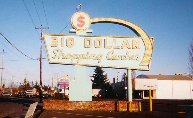
Facing east, SE Division Street just west of SE 164th Avenue, Approximately mid October 2003:
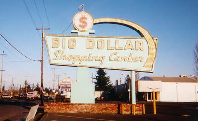
This was a noble old sign, back from the days when such places were where the housewife did the shopping. It just radiates Chevy Bel-air-tailfin-women in Capris-suburban '60s, don't it?
Sadly it, too, is gone. Seems the old Big Dollar Shopping Center is going through some renovations, and the sign is gone, replaced by a sign that is really not worth going out and taking a picture of.
Sic transit gloria mundi.
This was a noble old sign, back from the days when such places were where the housewife did the shopping. It just radiates Chevy Bel-air-tailfin-women in Capris-suburban '60s, don't it?
Sadly it, too, is gone. Seems the old Big Dollar Shopping Center is going through some renovations, and the sign is gone, replaced by a sign that is really not worth going out and taking a picture of.
Sic transit gloria mundi.
23 October 2005
[design_culture, humor] They do stuff.
 Got a huge design budget and noplace to spend it?
Got the need to tell the world you have a ton of cash to spend on consultants?
Then go to huhcorp. Why?
They do stuff.
(PS:Bored designers have the wickedest senses of humor)
(PPS:I'm a bit behind the curve on this one, but it just occurred to me now to share it)
22 October 2005
[design] If You Do Layout, You Need Adobe InCopyCS2
I just finished an article over on QuarkVSInDesign.com about Adobe InCopyCS2. It's part of a 6-article series on Adobe's hidden charmer (Adobe InCopy CS2: In Production) at QuarkVSInDesign.
This application rocks my little designer world.
What is InCopyCS2?
Those who have read my pontifications here are aware that I use layout programs for design (see last article). Of course, in a production workflow, designers and layout artists do the grunt work of putting things on the page whilst editors, naturlich, direct the work and form the connection to content.
In small workgroups, say 2-20 (and maybe even larger ones) the workflow is linear and serial. That is to say, editors push content to designers who push proofs back to editors who change content or suggest changes which are pushed back to the designer. PDFs fly all around.
Now, this is not necessarily a bad thing. In fact, editorial-design interplay is better than its ever been. But, just as in computer hardware, the serial flow has its drawbacks, especially when working in a group where asynchronicity is the order and reality of the day. Thus we have editorial systems. Quark does, with Quark Publishing System, and Adobe does, with InCopy.
InCopy is a hell of an app, but, until this cycle, has been kind of tucked into the background, sold only as part of enterprise-level editorial solutions. With the release of Creative Suite 2, Adobe has liberated InCopy, which is now available as a stand-alone purchase. This is an application that every designer should know about and get if they can, and every editor of a designer who works in an Adobe workflow should have.
What InCopy brings to the table is simultaneous collaboration. Editors work on content while desingers do layout, leaving the layout sacrosact to the designer only. Instead of doing a change and firing off PDFs, it's all on for everyone-but the designer working the layout controls who has access to what via story and frame assignments.
The stories are edited in an interface that resembles the InDesign Story Editor, only with a supercharged hemi under the hood. The editor can delete text, mess with styles, track changes and save off deleted text as notes that travel with the file like sticky-notes, preserving them as alternative suggestions.
I can even use this as a single-user workflow, because the text editing capabilities of InCopy are just that good. The InDesignCS2 Story Editor is a huge improvment. Using InCopyCS2 in place of it just jacks up the copyfitting and editing capability to an insane level.
But I won't go on too much more here. Go read my article. See why this program is so exciting.
Like I said: editors, layouters, you need this program. You at least need to look at it. Yes, I could be an evangelist for this program. It's that good.
Quick Links:
This application rocks my little designer world.
What is InCopyCS2?
Those who have read my pontifications here are aware that I use layout programs for design (see last article). Of course, in a production workflow, designers and layout artists do the grunt work of putting things on the page whilst editors, naturlich, direct the work and form the connection to content.
In small workgroups, say 2-20 (and maybe even larger ones) the workflow is linear and serial. That is to say, editors push content to designers who push proofs back to editors who change content or suggest changes which are pushed back to the designer. PDFs fly all around.
Now, this is not necessarily a bad thing. In fact, editorial-design interplay is better than its ever been. But, just as in computer hardware, the serial flow has its drawbacks, especially when working in a group where asynchronicity is the order and reality of the day. Thus we have editorial systems. Quark does, with Quark Publishing System, and Adobe does, with InCopy.
InCopy is a hell of an app, but, until this cycle, has been kind of tucked into the background, sold only as part of enterprise-level editorial solutions. With the release of Creative Suite 2, Adobe has liberated InCopy, which is now available as a stand-alone purchase. This is an application that every designer should know about and get if they can, and every editor of a designer who works in an Adobe workflow should have.
What InCopy brings to the table is simultaneous collaboration. Editors work on content while desingers do layout, leaving the layout sacrosact to the designer only. Instead of doing a change and firing off PDFs, it's all on for everyone-but the designer working the layout controls who has access to what via story and frame assignments.
The stories are edited in an interface that resembles the InDesign Story Editor, only with a supercharged hemi under the hood. The editor can delete text, mess with styles, track changes and save off deleted text as notes that travel with the file like sticky-notes, preserving them as alternative suggestions.
I can even use this as a single-user workflow, because the text editing capabilities of InCopy are just that good. The InDesignCS2 Story Editor is a huge improvment. Using InCopyCS2 in place of it just jacks up the copyfitting and editing capability to an insane level.
But I won't go on too much more here. Go read my article. See why this program is so exciting.
Like I said: editors, layouters, you need this program. You at least need to look at it. Yes, I could be an evangelist for this program. It's that good.
Quick Links:
- My article on InCopy CS2 at QuarkVSInDesign.com is here.
- Pariah Burke's first article ("InCopy CS2, the World; World, InCopy CS2) in this series is here.
- Adobe's InCopy CS2, including links to a 30-day free trial copy and hands-on files to get to know it, is here.
21 October 2005
[design] Layout War II: Why QuarkXPress Has To Answer The InDesign Challenge-Kelby Explains It All
When I started learning Graphic Design, one of the first technological aquaintances I had to make was an application known as QuarkXPress.
A "layout" application, in the creative trade, is one of the designers most valuable tools, allowing a single designer to import textual and graphical content from a variety of sources into a file (for this reason I sometimes term QuarkXPress and its competition Adobe InDesign aggregators), lay them out as they will, and set and style type with incredible accuracy and flexibility–something that, before PageMaker and Macintosh created the 'desktop publishing' discipline in the 1980's, was the province of whole groups of people.
Adobe and Quark are, as every designer knows, the two giants of the design industry. There are many other purveyors, but just as the professional mechanic can be distinguished from the shade-tree mechanic by the presence of a "Snap-On" toolkit, the professional (or professionally-slanted) designer and layout artist can be deduced by noting that they use XPress or InDesign instead of, say, MS Publisher or even Adobe PageMaker. It is all but certain that any professionally-produced publication–from newspapers like The Oregonian and national magazines like Time and Newsweek to humble local and community newspapers–
were produced using QuarkXPress (and, increasingly, Adobe InDesign).
That this market-tussle is joined is, therefore, of interest to just about everybody who thinks about print. The layout application is the bridge between the creators and the publication you read over your coffee in the morning.
Quark's checkered past in the design world is a matter of history, and since I've commented at length about at length myself, I'll not recap it yet again. Suffice to say at this point, because of its own company strategy, past attitude, and apparent corporate culture (I'm hardly a Quark insider despite my activities at QuarkVSInDesign.com) Denver's Quark, Inc. is in a vulnerable position, and one it never thought it would be in; playing catch-up. They've changed thier public style and approach because they understand that thier complacency has starved the goose that lays thier golden eggs. Adobe's InDesign may not have the majority of the installed base yet, but it does have major mind-share now, and that will translate into an installed majority soon enough if Quark remained complacent.
Thus came the improvements; Mac OS X nativity, the price cut (XPress is still available at a lower price of $699 versus about $1100), the new logo and attentive public image, the addition (via XTension) of image tweaking and native Photoshop file import, the release of the 6.0-6.5 update as free to registered users.
XPress is now a better program but still has to do feature catch-up to Adobe, and still has a legacy of negative impressions to conquer.
Writer and Photoshop god Scott Kelby had the right of it from the beginning–back in 2003, which seems an eternity ago (QuarkXPress was still in a non-Mac OS X native version 5, and InDesign was in version 2-not quite yet the Quark Killer, but held great promise). What follows is a reprint of his editorial from the Jan/Feb 2003 issue of MacDesign magazine that was handed to me by an instructor at PCC when I said I was looking to equipping myself with a professional's tools. Its title, "Big Trouble In Page Layout Land" carries the tagline "How QuarkXPress has become the "Aldus PageMaker" of the 21st Century", which may strike some as quizzical, but he explains it.
This article is a key to understanding why Quark is where it is still, despite the price cuts, the retooling of its public face, its delayed arrival as a native OS X application and expanded feature set, and why everyone is looking to the still-unreleased QuarkXPress 7 to make it or break it. I still keep a copy of the column tacked to my wall, but for this post, I read out as a public service Scott's 2003 editorial for MacDesign, in full, with gracious permission from Chris Main, managing editor at Layers Magazine (which is the current incarnation of MacDesign).
Without further ado, then, Scott Kelby.
A "layout" application, in the creative trade, is one of the designers most valuable tools, allowing a single designer to import textual and graphical content from a variety of sources into a file (for this reason I sometimes term QuarkXPress and its competition Adobe InDesign aggregators), lay them out as they will, and set and style type with incredible accuracy and flexibility–something that, before PageMaker and Macintosh created the 'desktop publishing' discipline in the 1980's, was the province of whole groups of people.
Adobe and Quark are, as every designer knows, the two giants of the design industry. There are many other purveyors, but just as the professional mechanic can be distinguished from the shade-tree mechanic by the presence of a "Snap-On" toolkit, the professional (or professionally-slanted) designer and layout artist can be deduced by noting that they use XPress or InDesign instead of, say, MS Publisher or even Adobe PageMaker. It is all but certain that any professionally-produced publication–from newspapers like The Oregonian and national magazines like Time and Newsweek to humble local and community newspapers–
were produced using QuarkXPress (and, increasingly, Adobe InDesign).
That this market-tussle is joined is, therefore, of interest to just about everybody who thinks about print. The layout application is the bridge between the creators and the publication you read over your coffee in the morning.
Quark's checkered past in the design world is a matter of history, and since I've commented at length about at length myself, I'll not recap it yet again. Suffice to say at this point, because of its own company strategy, past attitude, and apparent corporate culture (I'm hardly a Quark insider despite my activities at QuarkVSInDesign.com) Denver's Quark, Inc. is in a vulnerable position, and one it never thought it would be in; playing catch-up. They've changed thier public style and approach because they understand that thier complacency has starved the goose that lays thier golden eggs. Adobe's InDesign may not have the majority of the installed base yet, but it does have major mind-share now, and that will translate into an installed majority soon enough if Quark remained complacent.
Thus came the improvements; Mac OS X nativity, the price cut (XPress is still available at a lower price of $699 versus about $1100), the new logo and attentive public image, the addition (via XTension) of image tweaking and native Photoshop file import, the release of the 6.0-6.5 update as free to registered users.
XPress is now a better program but still has to do feature catch-up to Adobe, and still has a legacy of negative impressions to conquer.
Writer and Photoshop god Scott Kelby had the right of it from the beginning–back in 2003, which seems an eternity ago (QuarkXPress was still in a non-Mac OS X native version 5, and InDesign was in version 2-not quite yet the Quark Killer, but held great promise). What follows is a reprint of his editorial from the Jan/Feb 2003 issue of MacDesign magazine that was handed to me by an instructor at PCC when I said I was looking to equipping myself with a professional's tools. Its title, "Big Trouble In Page Layout Land" carries the tagline "How QuarkXPress has become the "Aldus PageMaker" of the 21st Century", which may strike some as quizzical, but he explains it.
This article is a key to understanding why Quark is where it is still, despite the price cuts, the retooling of its public face, its delayed arrival as a native OS X application and expanded feature set, and why everyone is looking to the still-unreleased QuarkXPress 7 to make it or break it. I still keep a copy of the column tacked to my wall, but for this post, I read out as a public service Scott's 2003 editorial for MacDesign, in full, with gracious permission from Chris Main, managing editor at Layers Magazine (which is the current incarnation of MacDesign).
Without further ado, then, Scott Kelby.
Big Trouble in Page Layout Land
How QuarkXPress has become the "Aldus PageMaker" of the 21st Century
by Scott Kelby, In The Mac Lane
MacDesign Magazine, Jan/Feb 2003
© Layers Magazine, used with permission.
If you read the subhead above and said to yourself, “Aldus PageMaker? Isn’t it Adobe PageMaker?” then it’s time for a quick history lesson. (On a personal note, Ican’t believe that I’ve reached an age where I can now tell stories of how things “used to be.” Sad, isn’t it?)
PageMaker (the page-layout application now owned by Adobe) was originally developed by Aldus Corporation, and along with Apple’s LaserWriter (the first Adobe PostScript laser printer), these two started what’s now called (by old geezers such as Wilford Grimley and me) the Desktop Publishing Revolution. Back then (in the mid 80s—BHT [Before Hammer Time]) everybody, and I mean everybody used Aldus PageMaker. As with almost all groundbreaking graphics applications, for years it was only available for the Mac, but eventually Aldus decided to put their focus on creating a Windows version of PageMaker.Unfortunately, at the time Aldus was focused on creating a Windows version of PageMaker, another Mac-only application, QuarkXPress, was starting to make inroads into the page-layout market by focusing on high-end typographic controls. Years later, when Aldus changed their focus to adding “long-document” capabilities to PageMaker, Quark found a way to extend the capabilities of QuarkXPress’ power using XTensions (their name for add-on plug-ins that could be created by third-party developers to work seamlessly from within QuarkXPress). So, in short, while Aldus was distracted with Windows and long-document capabilities, QuarkXPress pretty much pulled the rug out from under them.
By the time Adobe bought Aldus Corporation, PageMaker’s decline was in full swing, and the perception that “QuarkXPress is for pros; PageMaker for amateurs” was so ingrained in the design community, even Adobe’s major improvements couldn’t overcome it, and to this day, although Adobe PageMaker still exists (at version 7.0), it’s primarily seen as a Windows-based, small-office, layout program for creating newsletters, flyers, etc. It comes with loads of pre-designed templates because they know “if you bought PageMaker, you’re not a professional designer.”
QuarkXPress had won the war. Adobe knew it so they set out to create a new high-end page-layout application from scratch—a “Quark Killer,” that would complement their complete dominance in image editing (with Photoshop) and vector-based drawing applications (with Illustrator).
When Adobe introduced InDesign, it fell short of the “Quark Killer” many had hoped it would be, but it certainly was a promising first release. InDesign 1.0 included some high-end features that Quark didn’t offer, including tight integration with Adobe Illustrator and Photoshop.
When version 1.5 was released, it was a major improvement on version 1.0, and it introduced more new features, but it still didn’t “kill off” Quark. Even though it now nearly matched QuarkXPress feature-for-feature, and offered some cool features that Quark-XPress didn’t, it didn’t convince very many longtime QuarkXPress users to jump ship, especially in the prepress world where QuarkXPress is firmly entrenched.
HISTORY REPEATS ITSELF
Why am I telling you all this? Because history has begun to repeat itself. For the past few years, Quark has been focusing on adding Web-design features to QuarkXPress, so users could take Quark-XPress documents and convert them into “Web-ready” documents. And QuarkXPress 5.0 actually does offer more advanced Web features than even the latest version of Adobe InDesign.
Here’s the catch: If Quark had come out with these features three or four years ago, it would’ve been a huge boon to Quark, but unfortunately, Quark delivered these high-end Web features after the “rush to the Web” had pretty much passed. Now, designing for the Web isn’t “the hot new thing;” it’s a regular part of a designer’s life. In addition, while Quark was focusing its energies on bringing
Web features to its page-layout application, Adobe was focusing on making InDesign Mac OS X-native, and adding even more features aimed at high-end layout professionals. I can’t believe I’m about to say this (because I had my doubts that it would ever happen), but with InDesign 2.0, Adobe has actually “PageMaker’d” Quark.
Although Quark, Inc. is a privately held company and doesn’t release official sales figures, the word on the street is that sales for the Mac version of QuarkXPress 5.0 (Quark’s latest release, which STILL isn’t Mac OS X-native), have been pretty abysmal. Adobe, however, has some sources to help them figure out how InDesign 2.0 is doing against QuarkXPress 5.0 (e.g., sales from big retails chains, Mac mail-order houses, and channel distributors). In Adobe’s most recent meeting with financial analysts (in October 2002), they shared sales data (compiled by NPD Data) showing that new unit sales in North America for Adobe InDesign 2.0 had actually outsold new unit sales of QuarkXPress for most of 2002. Certainly, some of that is new Mac OS X users wanting to use all Mac OS X-savvy programs. Even worse for Quark, word on the street has it that a Mac OS X version of QuarkXPress is still a long way away, with its earliest arrival being summer 2003, only two years after the release of Mac OS X.
So while Quark was focusing on other areas, Adobe InDesign 2.0 has leapfrogged it—not only in features, but 2.0’s Mac OS X-compatibility has become the biggest evangelist for converting QuarkXPress users to Adobe this market has ever seen.
Ask anyone running Mac OS X how they like using Quark-XPress 5.0 running in Classic mode. They’ll tell you: Working in Classic is absolutely brutal. But that’s only part of the reason why we switched the entire production of Mac Design Magazine from QuarkXPress 5.0 to Adobe InDesign 2.0. We love the way InDesign 2.0 “feels.” For example, ask anyone who’s used Mac OS X for a few months what it feels like when they go back and use Mac OS 9.2. It feels “outdated and old-fashioned.” That’s exactly the way QuarkXPress 5.0 feels to us. It feels like “yesterday’s page-layout program.” It feels like PageMaker.
InDesign 2.0 looks and feels like a modern page-layout application, and that must be having a major effect. I talk to more and more designers, even those still using Mac OS 9, who are switching to InDesign 2.0. MacNet.com named Adobe InDesign 2.0 its “2002 DTP Product of the Year” and wrote “Adobe created the DTP product for the 21st century, leaving thousands of professionals wondering what was so special about QuarkXPress anyway?”
It appears that Adobe InDesign 2.0 has finally become the “Quark Killer” that many people dreamed it would be. And while Quark is racing to play catch-up to InDesign 2.0, you can be sure that Adobe is already well under way with development of InDesign 3.0.
THE DOWNSIDE
Although this is all great news for Adobe, there’s a downside. Because there still isn’t a Mac OS X-native version of Quark-XPress, many professionals who are still using QuarkXPress haven’t upgraded to Mac OS X, and that’s hurting Adobe’s sales of Photoshop 7.0, the first Mac OS X-native version of Photoshop. These designers are waiting for Quark’s Mac OS X version before they upgrade to the Mac OS X-native version of Photoshop.
Not only has Quark’s bad decision-making hurt Quark and Adobe, it has hurt Apple in a big way too, because these same designers are waiting to upgrade to Mac OS X until QuarkXPress becomes native. Quark is essentially “killing the market” and at the same time, they’re killing themselves—making the same mistakes today that Aldus did with PageMaker years ago. Quark could have been first-to-market with a Mac OS X-native version, and kept Adobe in the catch-up position, but instead it “pulled over” and let InDesign drive right on by.
If Quark doesn’t pull a major rabbit out of their hat—and soon—I predict you’ll see Quark quietly start to go away until someone finally buys them out and slaps their name on it (something like “Macromedia XPress,” or “Microsoft XPress”), and before you know it, it’ll be another “Windows-based small-office layout program for creating newsletters, flyers, etc.”


19 October 2005
[design] X-Ray Magazine Offers You Four Free Issues
The recently-revived X-Ray magazine, a bimonthly devoted to all things Quark and QuarkXPress, has a pretty good deal going, and if you are interested in QuarkXPress 7, you should really get in on this.
Go to this link:
http://www.xraymag.com/thepowerxchange_xray.html
and fill in the form. The next four issues will come to you for nuttin'.
I recieve X-Ray and I recommend it whether you are a die-hard Quarker or an InDesigner who wants to see what "the other guys" are up to. It's well-designed, informative, and right now it's the most credible source for information on XPress 7 outside of Quark itself.
A full year costs about $6 the issue, so it's a very good deal too.
Go to this link:
http://www.xraymag.com/thepowerxchange_xray.html
and fill in the form. The next four issues will come to you for nuttin'.
I recieve X-Ray and I recommend it whether you are a die-hard Quarker or an InDesigner who wants to see what "the other guys" are up to. It's well-designed, informative, and right now it's the most credible source for information on XPress 7 outside of Quark itself.
A full year costs about $6 the issue, so it's a very good deal too.
[us_media] Dept of Corrections Dept.
In a recent private conversation, I remarked that talk-radio parasite Neal Boortz was "a tosser".
What I ought to have said was that Neal Boortz was "a pathetic, worthless tosser who kisses up to the economic elite in hopes they save his backside when the stuff hits the fan".
The Times regrets the error.
What I ought to have said was that Neal Boortz was "a pathetic, worthless tosser who kisses up to the economic elite in hopes they save his backside when the stuff hits the fan".
The Times regrets the error.
16 October 2005
[geography] Street Name Synchronicity, or When Is Idaho Falls, Idaho, A Little Bit Like Portland, Oregon?
 Figure 1. A section of NW Portland.
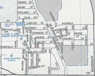 Figure 2. A section of inner eastside Idaho Falls, Idaho.
Dig, if you will, these two pictures. Figure 1 is a familiar section of a familiar part of a familiar town: a bit of our beloved Alphabet district, Portland, OR, from the 2006 Thomas Guide. Figure 2 is a section of the inner east side of Idaho Falls, Idaho, taken from a Seeger map, published by Rand McNally, and copyrighted 1985.
Take a good look at the streets I've focussed on in the Portland map (Fig. 1). Alphabet district streets, everybody knows 'em; Hoyt, Irving, Johnson, Kearney, Lovejoy, Marshall, Northrup.
Now take a good look at the streets in the middle of the clip of I.F. in Fig. 2. You'll notice a street running along the canal called N.W. Bonneville Dr. Just a little below the center it intersects Garfield Street. Going north from Garfield, N.W. Bonneville intersects: Halsey Street, Irving Street, Johnson Street, Kearney Street, Lovejoy Street. On the left hand side of that subdivision, Marshall Avenue connects Halsey to Garfield, and Northrup Avenue connects the west end of Halsey to Lovejoy, capping off Irving, Johnson, and Kearney. One will also note that a few of the street names extend east of the Bonneville Drive canal, but not too far. I.F. planning doesn't require all streets names to continuously extend across the city, so the clip I'm showing you is the extent of these streets withing the Idaho Falls area.
Perhaps what's most "hmmm"-inducing is the standing in of Halsey for Hoyt in the Idaho Falls street pattern. For those who are familiar with I.F., the bold line along the bottom is First Street, an arterial which leads out from the center of town (which isn't far away-I.F. isn't very big) and the bold line along the right is North Woodruff Avenue, a main road which distributes traffic up and down I.F.'s middle east side. That wedge shape in the lower left hand corner is where the First Street-Lomax Street one-way grid splits. Another interesting point is that N.W./N.E. Bonneville Drive is named in relation to its position on the west or east bank of the canal, and whether or not it's north or south of First Street only (there exists S.W./S.E. Bonneville Dr off the south edge of the clipping).
I'm not in any position to research why a handful of streets in a town in North Mormonland have identical names to a similar handful of streets in eclectic Portland, Oregon. It certainly isn't odd that widely separated cities should have similar street names. But it is indeed notable that such closely associated streets in another city have identical names and even mimic the pattern somewhat.
This whole exposition was inspired by Worldwide Pablo's announcment of his visit to grand old I.F. Hopefully he'll get a look, maybe even pictures. I'm engaged myself, but if you want to look at them yourself, here's how you get there.
- Get on I-84. Follow it east to I-86 (once called I-15w), then when you get to Pocatello, go north on I-15.
- Get off I-15 at the Broadway/City Center exit in Idaho Falls. You'll know you're getting close when you see the Mormon Temple. It's visible from a couple miles out.
- Go right off the exit, cross the Snake River (you might take a moment to glance at the Idaho Falls, off to the left as you cross-they're actually rapids augmented by a dam, but never mind) and go straight through downtown to the light at US Hwy 91/26. Hang a left.
- After you go under the railroad overpass, hang a quick right on First Street.
- Proceed about 1 mile west, past the Holmes Avenue light, and start looking for N.W. Bonneville Dr on the left.
- Proceed down N.W. Bonneville Street to one block after Garfield Street. Gawk.
12 October 2005
[metro_transit] Tri Met Responds to High Diesel Prices
TriMet is now spending about $2.20/gallon on diesel fuel, and is looking at prices which may go to $2.50/gallon. Before the fuel market went all sixes and sevens, the budget was for $1.50/gallon.
With that sort of budget pressure, something has to give.
According to this press release from TriMet, things are just about to do so.
The response is twofold. First is increasing fuel efficiency in the fleet. The agency claims that this alone has saved a half million gallons (6.5M gallons instead of 7M annually). So there has been some operational improvements.
But it's not enough to avoid a fare increase.
TriMet further proposed a 15-cent fare increase (10-cents for Youth/Student/Honored Citizen and $2 for montly passes). In order to lessen the impact of the increase, the agency proposed the innovative step of the 7-day rolling pass, which is supposed to allow riders to purchase transit in smaller increments.
The vote by the TriMet board is scheduled for its meeting of 26 October, and, if approved, will go into effect 1 January 2006.
With that sort of budget pressure, something has to give.
According to this press release from TriMet, things are just about to do so.
The response is twofold. First is increasing fuel efficiency in the fleet. The agency claims that this alone has saved a half million gallons (6.5M gallons instead of 7M annually). So there has been some operational improvements.
But it's not enough to avoid a fare increase.
TriMet further proposed a 15-cent fare increase (10-cents for Youth/Student/Honored Citizen and $2 for montly passes). In order to lessen the impact of the increase, the agency proposed the innovative step of the 7-day rolling pass, which is supposed to allow riders to purchase transit in smaller increments.
The vote by the TriMet board is scheduled for its meeting of 26 October, and, if approved, will go into effect 1 January 2006.
Subscribe to:
Posts (Atom)