1861.
Recently Seattle's KIRO radio, one of the biggies and the way-back-when stations, kind of on a par with our own KGW or KEX moved from News/Talk to Sports radio.
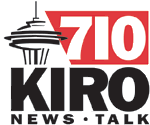
KIRO 710 AM's logo, which I've expostulated on before, looked like this:

And here's the horizontal display:

I've also gone on at length about the simple briliiant genius of this design (follow the slant on the end of the red stripe to the down stroke of the R on the top version and the W on the bottom. This is pure inspiration.
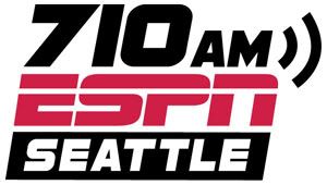
KIRO news talk format has moved to 97.3 FM (I've also opined on the FM version of the logo, which I'm not crazy about). It was apparently in preparation of 710 AM becoming a branch of the ESPN broadcasting empire. Here's the new logo:

I've enrolled in two schools of thought as far as this logo goes:
- Technical Considerations: A logo that works. It's not spectacular though. It won't win any awards. But it does its job well with admirable economy. Most notable is the way the ESPN "font" (If there is such a thing) is translated successfully into the entire logo. The letterforms in the frequency and the city name harmonize very well with the ESPN logo, though there are places (the counter in the A and something I can't quite put my finger on about the S) that make it look like a font that was obliqued by the designer, which strikes a sour chord with me. The choice of the form to depict the 1 in the frequency number is well done, as that allows the 7 to snug in withougt looking forced on. The sound waves work alright, though the logo could do without them.
- Emotional considerations: a real let-down. I fell in silly love with the KIRO 710 AM logo the second I saw it. I've explained before why. The internal structure, the artful sketch of the Space Noodle ... simple but clicks. Nails it nicely. This ... well, there's a great deal to be said for chain store signage. I think it looks awful on a broadcast station. At least they got the red and black from the old logo in there.
I'll expand a little on the thought in point 2, the "chain-store signage" thought. I've listened to radio an awful long time, and can't help (from growing up listening to local giants like KEX and Salem stations like the late great KSLM and KBZY as well as Corvallis's KFLY, which was an AM station back in the 80s) but identify a call-sign with a locality. It's part of the local personality. A skillfully-done local station identity becomes, to me, like part of the local heart and soul. It doesn't have to have such location-specific features but it does have to be unique.
Your local broadcast outlets are part of the local personality. Divest it of local identification and ... well, meh. No passion. No connection. Just the word "SEATTLE" is kind of pale in comparison with the artfully done Space Noodle sketch that expresses all sorts of Seattle intangibles. It signifies the heart and soul of Seattle.
So the re-branding will no doubt work, but it leaves something behind that's valuable. And that's kind of sad, I think.
(H/T to Ben, the gentleman from Seattle. Thanks Ben!)
Tags: KIRO, Seattle Radio, Broadcast Logos, Logo design, 710 AM Seattle, 710 AM
Powered by Qumana

No comments:
Post a Comment