02 January 2010

[art] Wordnik: A Lexicon For The Impatient

2285Wordnik.com is a place, as commenter pril notes, for the psycho word wierdo in us. And truer words ne'er be spoke.
It's the online dictionary for the impatient. From the "What is Wordnik" section of the About:

Wordnik wants to be a place for all the words, and everything known about them.

Our goal is to show you as much information as possible, as fast as we can find it, for every word in English, and to give you a place where you can make your own opinions about words known.

Traditional dictionaries make you wait until they've found what they consider to be "enough" information about a word before they will show it to you. Wordnik knows you don't want to wait—if you're interested in a word, we're interested too!

Once there, you're invited, via a very spare yet beautiful interface, to input a word. That's all you have to do. It'll come up with everything they can find, right now, including example sentences, the meaning, links to other usages on the web, special featured-lists of words that they are like. They seem to browse news, media, blogs, a whole lot of stuff.

There's also synonyms, antonyms, links to flickr streams containing appropriate pictures (probably looking for tags), comments – this is an edited site, you're not allowed to edit, this isn't a wiki, but participation is encouraged. You can submit words, rate words, even tell them to take this word and shove it if you want.

Not sure where to start? Just go to the front page and clicky on one of the words on the lower part of the screen. You'll catch on soon enough. And sign up it you want to participate (it's free).


That's http://www.wordnik.com, you wordwankers.

Technorati Tags: , ,

[art] Nihilism To Go: Destroy Something Every Single Day

2284An act of creative destruction, Destroy Something Every Single Day (http://destroysomething.everysingleday.org/) can inspire your own interior creative commentary on modern times, of which this says something about it, somehow or other.

What they do is what they say. Destroy Something Every Single Day. With a handful of common tools. This is what they did to something called a "skinny cap":


They're just getting started over there as of the 1st, apparently; the only other thing destroyed is a bit of 35mm film (for those of you just getting started, film is what cameras used to store images before we had flash cards).

As long as they don't escalate the destruction to the world and I don't have to clean it up, I'm down with it.

Technorati Tags: , , , ,

01 January 2010

[photoshop] The Big Dot Halftone

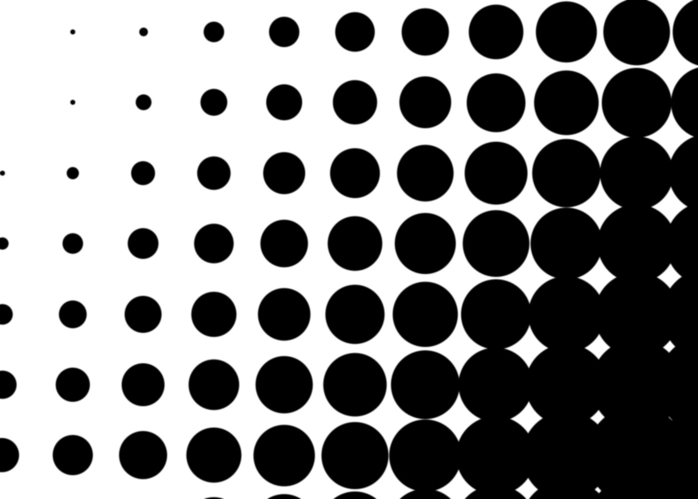
2284Dig, if you will, this picture:


Nifty, yes, You can picture using this for background texture for a funky bit of photoshopping, some sort of retro touch to a design. Well, this is what I call a big-dot halftone, and I can show you how to make it quickly and easily, and it involves alpha channels, which mean you can use it in a dozen-and-one ways, just as a selection.

That's why alpha channels are awesome. You should know about them.

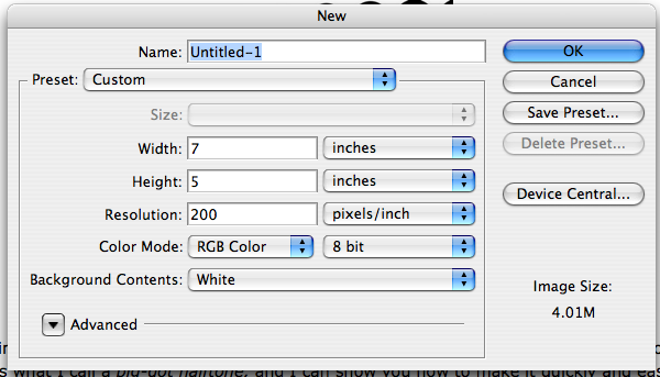
First thing you do, in this case it will be sufficient to open Photoshop (I use CS3) and create a standard photoshop document (I just used 200ppi for no particular reason. Use whatever suits you, though more than 100ppi would probably be better for experimenting, and once you get the hang of it, play with settings):


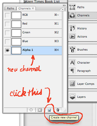
Second thing you do is to create an alpha channel. To do this, go to the Channels panel and click it to open. The standard documents just have (in the RGB case) the Composite RGB channel, and the R, G, and B channels separate. Click on the "new channel" button on the bottom and the channel will be created and automatically named "Alpha 1" and autoselected (rename the channel if you wanna).


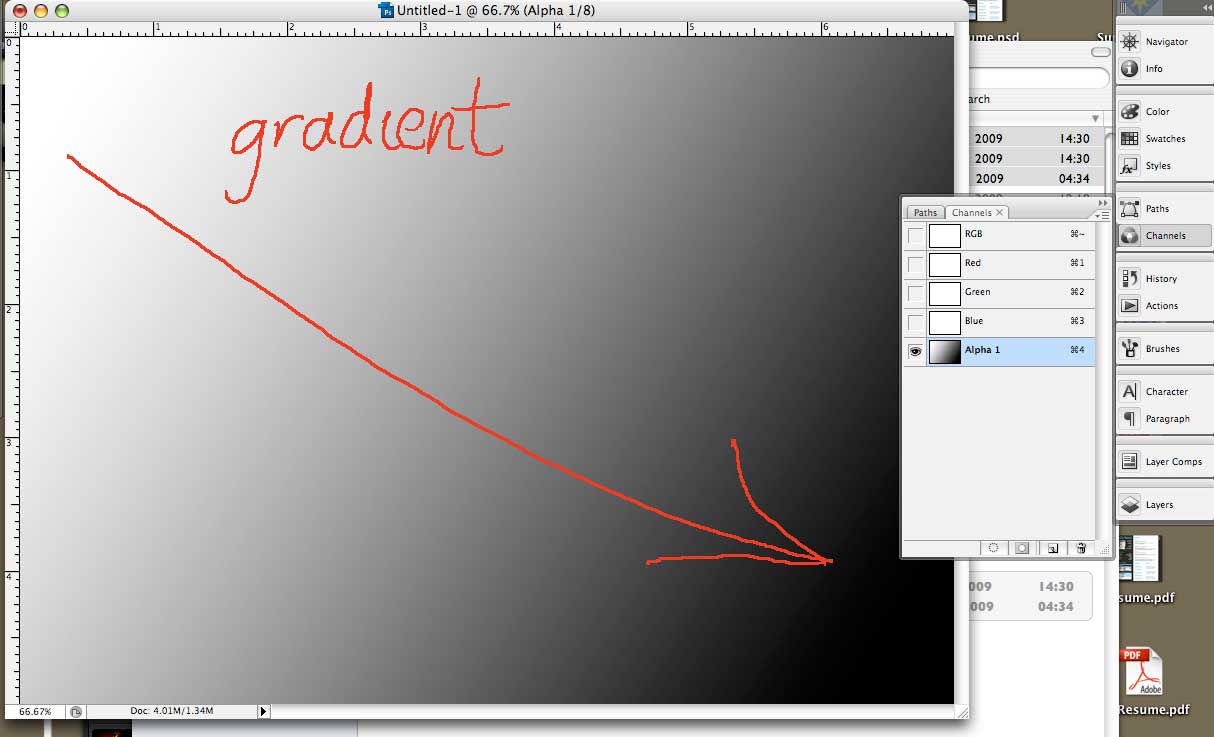
Third thing you do is create a gradient in this alpha channel. I took a linear gradient and just swept it whatever-which-way I felt at the moment.


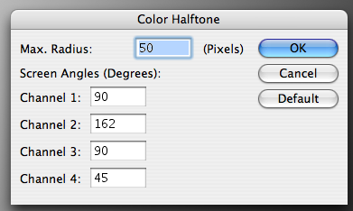
Fourth thing you do is where we start to get to the meat 'n' tatoes of the thing. While still in your alpha channel, Call up Filters > Pixelate > Color Halftone from the menu dropdowns. You'll get this:


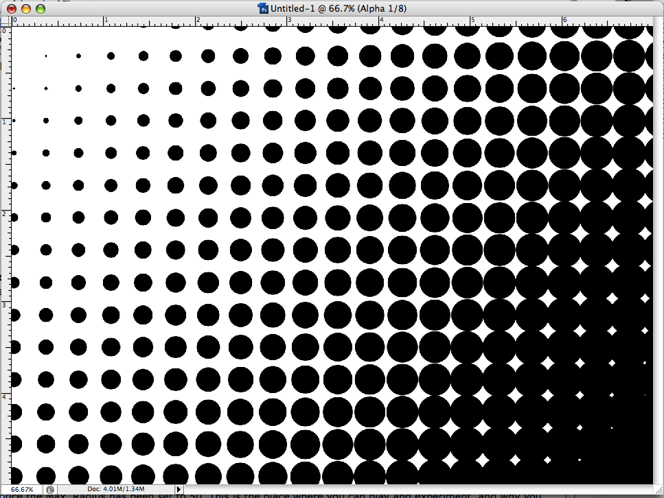
Notice the Max. Radius has been set to 50. This is the place where you can play and experiment, and why you might want to have an eye toward how many ppi's are in your document. But for now, just follow along. Another important thing to notice here is that the screen angles here can be specified for all four channels, but recall when working with black and white only, the only one you have to worry about it Channel 1. I want a up-and-down, horizontal-vertical screen of halftone dots, to I set the Channel 1 screen angle to 90 degress. Here's what I get when I apply the above settings to my alpha channel gradient:


Now, remember this is still alpha channel. It's true that you can do the same sort of thing on the actual PSD by invoking the Color Halftone dialog, selecting the color or channel and invoking that that way, but by doing it in the alpha channel you have that thing that Photoshop makes so very profitable – a saved selection. You know the basic Photoshop workflow - select it and affect it. Well, here you have the selection locked in. Now, by dragging the alpha channel to the Create Selection button on the Channels panel, you have instantly created a selection that you can grow, choke off, fill with whatever color you want. It allows more creative power.

Now you have a way to use gradients, alpha channels, and selections to make funky effets for fills, backgrounds, or whatever. But you can also kick this up to the next level. As you've probably deduced, the rate of dot growth depends on the steepness of the gradient, how close to white the white end is, and how close to black the black end is. And there's more than one way to create a gradient, of course, and by that, I mean make a selection and blur. I've seen other Photoshoppers and tutorial authors do this, and I'll show you how I'd carry this out.

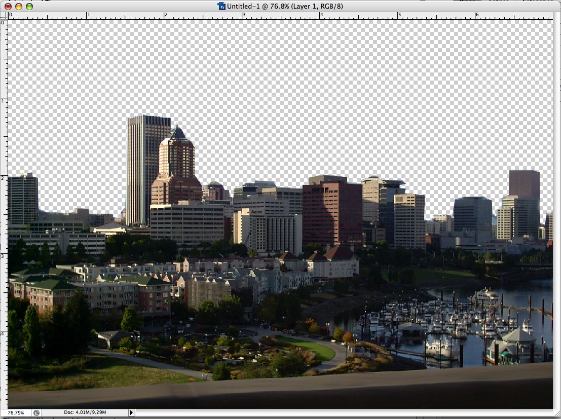
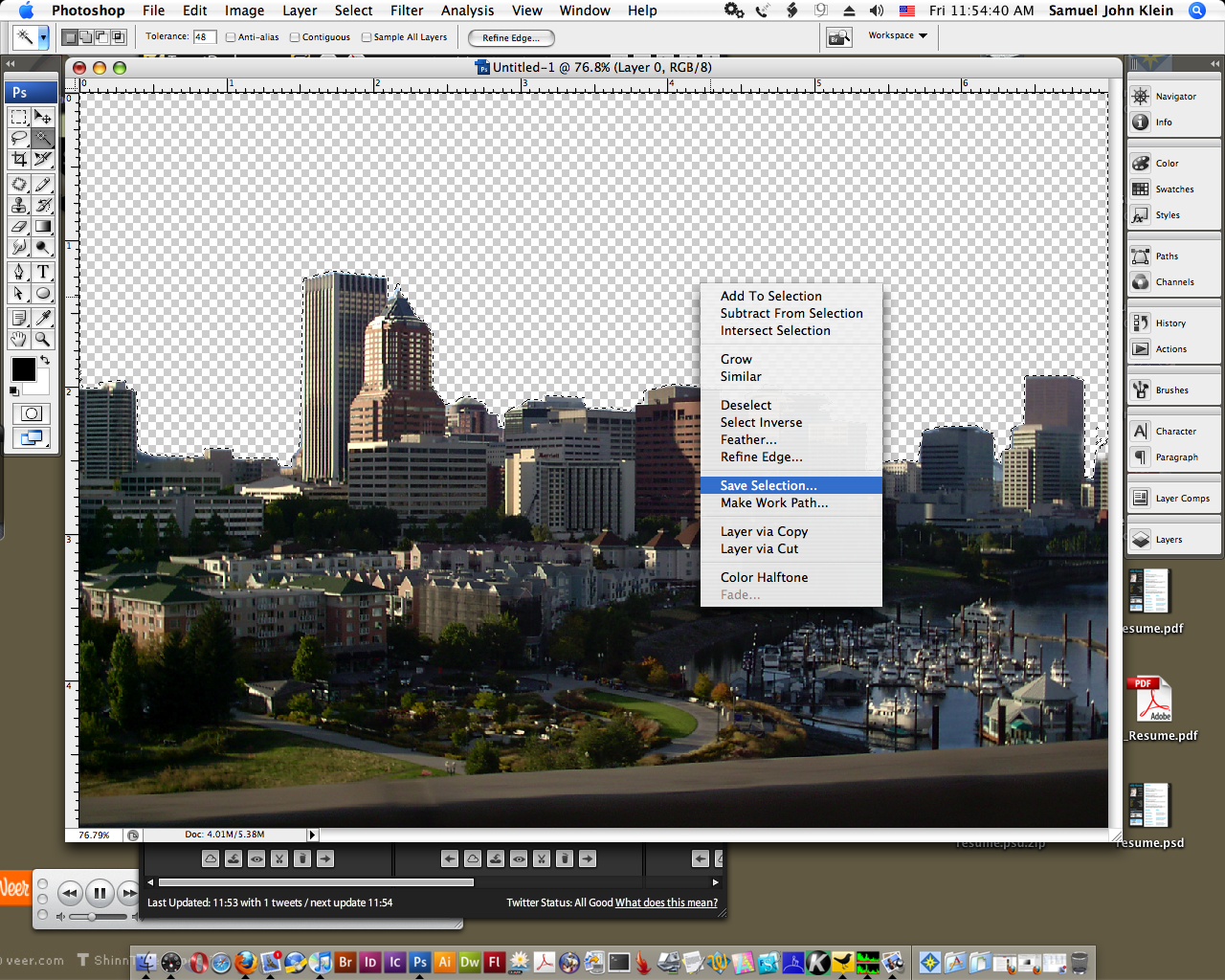
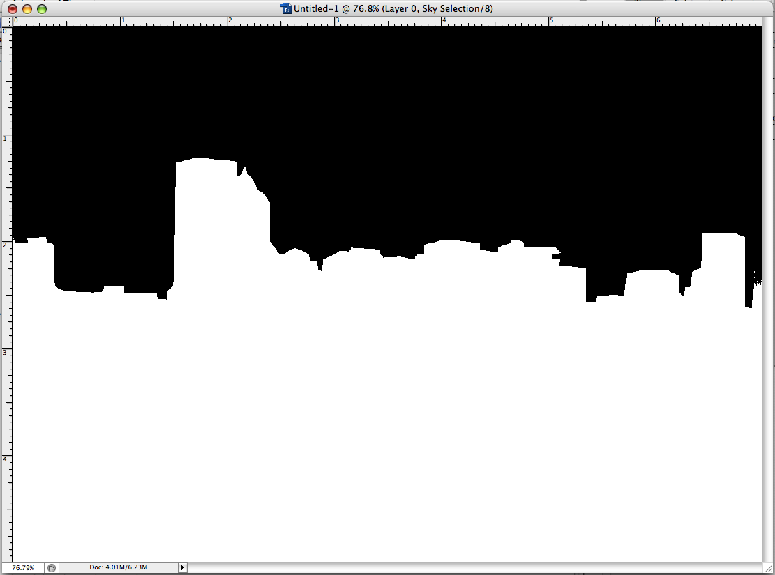
First, get a neat shape you want to decorate. I took one of my favorite pixs and used a path to create a selection that subtracted out the sky and made that clear area a selection. Then, I created an alpha channel with that selection by CTRL-clicking (or right-clicking) to make the screen menu come up, then selecting "Save Selection" to create an alpha channel out of that selection:

1. Picture with sky subtracted out:


2. Selecting the clear area and creating a selection:


3. The alpha channel created:


Now, to create the gradient with blur. To that, we turn to the Photoshopper's best friend, Gaussian blur (how did with ever get along without this genius bit of code?) I appled Gaussian blur to the whole channel and played with the pixel radius until I got something that struck me as close enough for jazz, which, as it happened, looked like this:


I just went with this, knowing I could use the History panel to dial back and try again. It's play time!

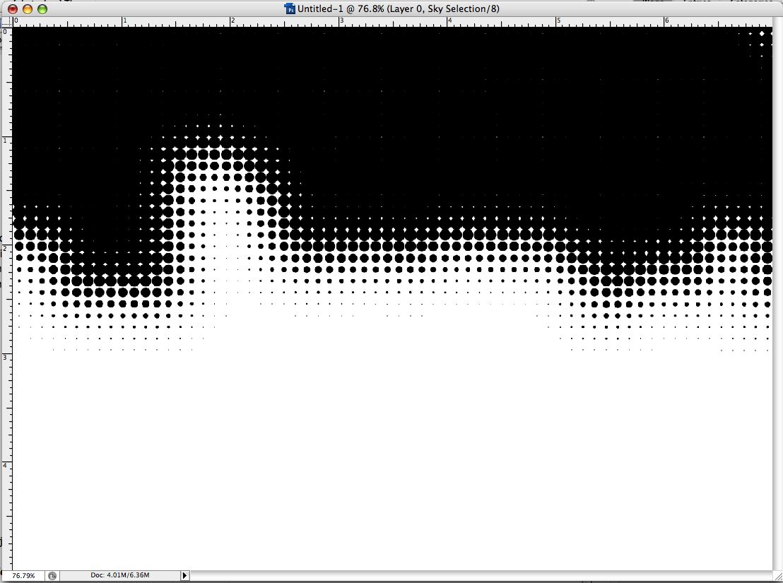
Now, the moment of truth! Using the same Color Halftone settings as before, but reducing the Max Radius to 15 px (I didn't want them too chunky), I got this:


This is looking promising. My alpha channel is good to go, the selection info done and saved. Now, going back to the full composite channel, I create another layer and make sure it's behind my layer with the picture in it. Returning once again to the Channels panel, I drag the alpha channel to the "Create Selection" button, and fill that selection with a nice-yet-unnatural blue tone. That was the journey, this was the destination:


Funky? You bet. This stuff's just looking to be made into one of those black-light-flock posters. True, that. Contact this blogger if you're looking for the rights to do just such a thing.

Technorati Tags: , , , ,

31 December 2009

[liff] Happy New Year … Except For This Lady

2283Craigslist is forever the placer deposit of awesome, and this ad (via Twitterer @portortraffic) will once again prove.

Just a hint: maybe New Year's isn't the best time to break up with your honey:


The text of the ad, which is at this writing still available at http://portland.craigslist.org/mlt/zip/1532400449.html, runs, verbatim, as follows
I have a 1997 Honda Accord with a clear title. I just bought it for my wife but she is on meth AGAIN and I caught her cheating AGAIN. I cant do it anymore.So I am leaving and the car is going too.It is completely in my name so I can do whatever I want with it. I dont drive nothing but my truck and I want her to feel the pain. So first come first serve. I can not hold the car and I want it gone tonight even if I have to meet you half way.I am not going to wait until 2010 to better myself I am going to do it while 2009 is here!!! Please do not call if you cannot pick up tonight. I will as soon give it to a tow service or junkyard. The car drives enginge good 119647 miles the tranny was replaced 2 yrs ago by previous owner have reciepts.Only thing is it really needs to be cleaned it stinks to high heaven. The first night she got the car she and her friends smoked a ton of meth in there. So you will have to shampoo the entire car. I will be pulling it on my car hauler I cant stand the smell. Serious callers only. NO TWEEKERS.253.XXX.XXXX And despite what you might here in the background the car is going she has no say so. I have already verified with the police. She is just mad because she is leaving too. I can give you VIN number to check out with highway patrol when you call.
The phone number has been redacted to prevent crank calls, but moreover, if the offer is fo'reals, it's probably already gone by now. Free running cars being hard to come by and all that. Although the meth smell would be pretty offputting. Get out your bunny suit.

I flagged it Best of Craigslist. Because it's just that awesome.

Update at 19:20: It's gone now, deleted by author. C'est la guerre, mon cher.

Technorati Tags: , ,

24 December 2009

[design] Another Thing Crowdsourcing Design Work Kills ...

2282. … actual creativity, as in at least trying to come up with something original.

As detailed by SpecWatch here, an icon from a site called Vecteezy was used in not only a "contest" on Crowdspring, but also on 99designs. The icon, a round design with graphic elements meant to suggest a tree and leaves, was entered on 99designs to be the idenfitying mark for a charter school. At least this one was worked on a bit; traces of the brush-strokes around the margin were eliminated for a cleaner appearance. It was used without change as the winning submission on Crowdspring for an energy company called Woodlands Solutions.

In the disclosure on Crowdspring, the designer … affirmed in their 'disclosure' that they had " created everything in [their] entry and [they] didn't copy anyone else's concept".

Did the designer fib a little? Read the evidence at SpecWatch and decide for yourself. Even if you think this doesn't cheapen the quality of design work in general, you've got to admit that submitting the same design that won for an energy company as a logo for a charter school is more than a bit of a disservice to the charter school – and could open them up for a lawsuit from the energy company, if they were ever interested in such.

Or … one could spend the extra money on hiring an actual designer who will strive to come up with an idea that isn't merely copied-and-pasted from somewhere else. A real designer will at least take some time to listen to your story, talk to you, get to know you, and try to tell your story as an effective logo.

Paying for pros, in the end, doesn't cost – it pays off with a truly original design that wasn't lifted from a vector icon download site, and a designer who actually gives a care about the work they do for you.

Or, put another way, you get what you pay for.

Technorati Tags: , , , ,

[type] Found Tutorials: 22 Ways To Make Your Type Come Alive

2281.(h/t http://twitter.com/mayhemstudios) Run out of inspiration? Need to make your type jump up and bark for you? Via aggregator Slodive.com here are 22 things you can do about that … including …


… one hot babe.

Oh, yes, the link:

http://slodive.com/photoshop/typography-with-these-22-techniques/

Technorati Tags: ,

22 December 2009

[logo] 10 Best and 10 Worst Identity Redesigns of 2009

2280.From Brand New, the 10 Best (and 10 Worst) ID Redesigns of 2009. They take in a wide swath. This'll have spoilers, but you'll definitely want to surf to the article to read the comments, especially considering the Best of the Best of.

The worst have principled objections. They include the Yale Press redesign which wasn't bad but laments the departure of yet one more Paul Rand logo from the commercial landscape: The Hilton redesign, which rethinks the H but opens up a travel-size can of authentic Photoshop-style bevel'n'emboss, giving it an unexpected design school touch, and the biggest of the worst, the not-very-much-lauded Bing logo, which has caused much mockery from both design geeks and typogrphy geeks alike.

The best? The AOL redesign. While Brand New tries to see the appeal to the zeitgeist that the AOL logo tries to reach for, the commenters seem to want to know what the blogger was on when he rated that one high, lamenting the departure from actual logo "design" that seems inherent in such a "nail-jelly-to-the-wall" approach.

Like I said, it's an adventure. Read all about it:

http://www.underconsideration.com/brandnew/archives/the_best_and_worst_identities_of_2009.php

Technorati Tags: , , , ,

[bloggage] An Award?

2279.Not (despite my best efforts) being one of the most highly-trafficked blogs out there means that when someone give me a pat on the back, it means quite a lot, even if it's kind of an unexpected one.

About two days ago, I received a nod from a web resource I'd never heard of before, called Home Office Furniture Depot, http://homefurnituredepot.net, bestowing a generic "Blog Award" for, apparently, being interesting.

See, I told you all! I'm interesting!

Anyway, they apparently stumbled on my blog on the way to somewheres else, and I like it when anyone says that my stuff is worth a little wastage of time.  So, thanks, Home Office Furniture Depot. Much obliged.

Technorati Tags:

18 December 2009

[maps] Get Ready To Dial 10, Downstaters!

2278.At first it was just us in PDX and Salem. Then they made the rest of the northwest corner of Oregon dial 10.

The fact that I still live in the 503 is something of a consolation, of course.

The three-quarters of the state of Oregon in the 541 have gotten away without having to dial 10 – digits, that is – until now. They've come for you, Eugene, Medford, The Dalles, Ontario, Pendleton, Burns, KFalls, Keno, Suntex, Juntura, Sisters, Culver, Mitchell …

It's your turn now. As of 10 January, here's the way it's gonna be:


You'll have to start dialing 541+ the number for all your calls now, like we have in the 503 since about the year 2000, because you've got enough phones now you'll get what's called an overlay area code for cells and newer lines, 458.

I rib, but I remember the good old days, barely 10 years ago, when we were all united under the proud 503. It's the A/C of my birth, the A/C of Oregon, dammit!

The old days … they aren't so long ago. But they seem an eternity, yes?

Technorati Tags: , , , , ,

16 December 2009

[maps] The Bus-Train Map Design Connection

2277.The various designs of city transit railmaps that can be found in the USA and globally are beguiling works of abstract art, the designs of which seem driven in the main by the famous design of the London Underground, with its simplified and straightened ways and absolute horizontal, vertical, and diagonal lines.

Simplification is good, and it renders a map which can be used. But not always does it render a map that communicates reality. The most useful versions of these connect the abstraction of the rail routes to the reality of the bus network it is supposed to work with. But, as Michael Perkins of Greater Greater Washington correctly laments, this is not always the case:

Out where those spur lines diverge, it's often faster to take a bus between the lines rather than ride into downtown and out again. It's more efficient for the network too, since those trips route people through the congested core unnecessarily. Boston's highlights the major crosstown routes and routes reaching important destinations not served by the rail system.

Could Metro do something similar?

His post (http://greatergreaterwashington.org/post.cgi?id=4289) points out the example of Boston's MTA rail map, which actually shows key transit routes that will get you between rail lines, and does it clearly:


The style of the lines is very well done too.

He gives Portland credit for doing the same sort of thing, though the execution is somewhat different – just the route numbers, not the routes themselves, though the omission of actual routes preserves the communicative clarity given the graphic approach:


The small numbers ranged along the stations tell you exactly which other schedules you should be referring to. The crossings are not given for the city center area in the main; that presumably, with the welter of lines coming together in those areas, is a bit impractical. But in the outer areas it's immensely useful, and helps you get an idea of which route you're going to need before you get there.

It's a simple thing, but a good thing.

Technorati Tags: , , , , ,

[type] Consider H&J's

2276."H&J's" are layout-speak for "hyphenation and justification", and they are the bedrock to successful text-flow in your layout application, be they QuarkXPress, InDesign, Scribus, or whatever.

Modern type and more advanced layout programs seem to take care of most of this for you, but as the article on CreativePro.com at http://www.creativepro.com/article/abcs-hj argues, knowing about your H&J adjustments and how to tweak them can kick your layout game to the next level.

Technorati Tags: , , , ,

12 December 2009

[lit] Your Spoiler-Filled Overview of Stephen King's "Under The Dome"

2275.Finally got through Stephen King's latest event, the brobdingnagian Under The Dome.

I'm not a Stephen King fan, really. At least I don't consider myself one. I have huge respect for his talent, and I'd say I'm a fan of certain stories of his: The Dark Tower I'm absolutely smitten with, I adore The Stand, and regardless of what anyone thinks of him, American man-of-letters or purveyor of prole lit, he is a master of the novel and if he can't hook you, then you're probably without a pulse.

Ask your doctor about Stephen King.

I mean, he's probably read one or more of his books.

When the buzz about Under The Dome started to circulate, the idea of a small burg cut off from the world and left to stew in its own juices got immediately under my skin. Still, I can't put into words why that is. Certainly I thought that King would tell the story in a way nobody else could, especially since he set it in Maine, his home state, in that curious Faulkneresque part of Maine that only exists in his books. He has a certain angle on the dark side of America and Americans which has such a unique voice, and it seemed as though he was probably going to look at that through this.

So, what happens when a cute, rural New England town that welcomes visitors with legendary Yankee hospitality is forced to turn in on itself? Here's what I found, with blatant, bald spoliers.

If you've not read Under The Dome yet and you don't want to find out what happens, then go no further. I'm giving it all away here, and I'm as serious as Big Jim Rennies arrhythmia here.

Spoilers Follow. Read No Further if you don't want to know how it all turns out. In the following, I've colored certain phrases to blend in with the background. To find out what they say, highlight them with your cursor, as though you were copying-and-pasting, or use your browser to View Source.

1. Chester's Mill is Rotten To The Core.

The town of Chester's Mill, Maine, is run like a traditional New England Town. Town meetings, where everyone in the community goes to decide, are headed by elected officials called selectmen. In The Mill, Andy Sanders is the First Selectmen, and thus the senior elected official, Jim Rennie, the local big businessman, is the Second, and Angela Grinnell is the Third. The real power behind the throne is Rennie, who lets Sanders stay out front as the figurehead and sees to it that Grinnell maintains her OxyContin addiction, thus making the Board of Selectmen essentially a rubber stamp for pretty much anything Rennie wants, enabling him to finance a major meth lab, distribution all over the East Coast, and funnelling off of public funds into his own private schemes. The people of Chester's Mill seem largely blissfully unaware of that their town government is corrupt to the core.

2. The People of Chester's Mill Are Not Admirable

Very few of the actual apparent popluation of the town figure into the narrative – out of a stated population of over 2,000, only thirty to forty people are ever mentioned, even if only indirectly. When the population is mentioned, in the Town Meeting toward the last third of the book, they are wearing blue armbands – showing solidarity with the current administration, being gulled into the "with us or against us" terror being instigated by Rennie and his crew.

3. Almost Everybody Dies

The climax of the book comes not, as you'd expect, when the Dome finally goes away, but when Big Jim's super meth-lab, near the town's radio station, goes up in an enormous explosion, caused by the the character they called The Chef, who had been driven beyond functional insanity.  The area under the Dome, which is as near enough Hermetically-sealed off from the surrounding environment as makes little difference, has almost all of the breathable air consumed in the resulting firestorm. The few survivors – numbering less than thirty by the novel's end – survive by breathing outside air forced through the barrier (which is just permeable) by gigantic fans.

4. The "Dome" Isn't Really A Dome.

It develops that the dome is really a column that goes up about 40,000 feet, and whose shape follows the town line exactly. The word dome is used early on by the characters and sticks. The precision of the dimensions of the "dome" is an early "tell" that the barrier is an artifact, not a natural occurrence. This is confirmed in the middle of the book, when some of the local kids find the object that's generating the barrier.

5. Comeuppance Is Messy – And Somewhat Random

The villains in the piece are not difficult to spot, and they are so irredeemably evil that, despite what few sympathies you might have for them – there is ample indication that Junior Rennie's psychopatic behavior is as much due to a medical condition as it is due to having a father who's a cynical hypocritcal sociopathic bully – you're happy that they get done it. The only thing you might regret is that King doesn't allow his victims to deliver the justice they so richly deserve – but each demise, and espcially Big Jim Rennie's, is typically fitting, because in the end, their own sins come back to eat them alive – and those who allied themselves with them are fittingly casualties.

But the rain falls on the just and the unjust – because "stuff" happens. King really understands this.

6. Even The Good Guys Die Unfairly

See 5. above. When Caro and Thurston and one of the "Dorphans" die, I hated King for a few minutes, and then respected him. Because he understands that life is not only unfair, it's downright inscrutable.

7. The Dome Is Not Of This World. Maybe Not of This Dimension

By interacting with the object generating the Dome, characters figure out that the Dome was put there by, essentially, extraterrestrial children who are playing a game and regard us as we might regard ants we kill with sunlight from a magnifying glass. This metaphor on humanity toward those we regard as "lower" is expressed just that way, and expanded upon, with the extraterrestrials – who one of the characters manage to beg mercy from by somehow communicating with them via the box, resolving the crisis – having to be convinced that the people they are killing are actually real beings.

The beings responsible for the Dome are, it's implied, children of a race with abilities far beyond ours, playing with a toy … in a playroom – literally, child's play.

8. The Dome Is A Classic McGuffin

In the end, the Dome's nature and operation are not actually explained, and the origin only hinted at. Why the Dome is there isn't the point, but what happens to the people there – at least from the story's point of view. Indeed, from the point of view of the Dome's owners, the stories of the people trapped there are less than insignficant until Julia communicates to one of the ETs. The story begins just as the Dome comes down, and ends just as the Dome goes away – a period of only about two weeks at the most. In that time, Chester's Mill goes from being a well-mannered, neighborly New England town to all but a fascist hell-on-earth, with a villain who sees nothing beyond the chance to consolidate his hold on the town, dimly confident, in the back of his mind somehow, that he will figure out a way to explain away the carnage if – and when – the Dome ever goes.

The civil face of this small town was just a facade, which ripped away within three days of the Dome's arrival
.

There's a lot of current cultural touchpoints, a lot of message-sending, both intimated and blatant. Take them as you will.

And read the book – it's a corker of a story.

Technorati Tags: , ,

[pdx_liff] That's Why We Call Them Weather Forecasts, Not Weather Guarantees

2274.MSNBC: We're going to be hit by a storm – unless we don't, of course:
Snow accumulation in metro Portland was doubtful on Saturday, according to KGW First Alert Storm Team, though "a chance of weather" remained, with freezing rain still in the forecast.
When it gets down to it, I'll settle for a chance at some weather. Yes, sir.

Though at this time it looks like we dodged the bullet, and considering the way it was last year, that suits us just fine.

Technorati Tags: , ,

08 December 2009

[design] The Cherriots Transit Map

2273.The graphic look for Salem-Keizer's public transportation system - the Cherriots – have changed, and they're looking more slick and together.

The website itself, http://www.cherriots.org, has gotten a major makeover. The old site didn't have major problems with usage, but it looked very dated when compared to sites like that of LTD and TriMet. I'm not necessarily a fan of change for change's sake in web design – one credo I stick to is, if it works, it doesn't need fixing – but it was well past time for a site refresh. The new design fills that bill magnificently.


Navigation is vastly improved, with the long list on the left replaced my a much shorter list, with animated flyout lists. Other services are quickly indentified in the icon-driven lineup on the upper right: the big What's New! in the middle is right where you're going to see it and go right to it.

In the past, I thought the Cherriots route map needed a great deal of improvement. The new design brings the improvment, though it may take a few minutes for you to figure out what it's trying to say to you:


You can get a pdf copy of this directly from Cherriots here
, and the routes and schedules page is at the end of this link. I'll hit what I see are the high points.

The good:
  1. The map is clear and simple despite including more information (the local streets are in a light gray).
  2. Using multiple colors for routes can actually bring confusion. They well-chosen colors here are skillfully chosen, and contribute to understanding.
  3. The three new levels of service (Frequent Service, "Peak-Hour" Service, and Standard Service) are noted two ways: with lines of varying weights (the ones for Frequent routes stand out because they're much thicker), and different route-number symbols (a diamond for Frequent, a square for "Peak-Hour", and a circle for Standard). Together you get a quick visual reference as where you'll need to go where you're more likely to get a bus more quickly (well, in Salem terms, anyway)
  4. The services that actually go out of town – the 1X commuter route to Wilsonville and the 2X route to Grand Ronde – are included as part of the information. In the past, Cherriots kind of floated in space, connecting to nothing in the maps.
The bad:
  1. Too much Eras Bold. Eras Bold forms the names on the route list and also supplies the text for the line key. Eras Bold is a beautiful font, but here I would have gotten something a bit less pretty – say, Myriad works very well in these situations, or even Helvetica Neue.
  2. The route-frequency symbolism, while it works, I find awkward. Most significantly, the three shapes of the route-number icons just seem busy. I think the same thing could have been accomplished by keeping the same shape for all route number symbols, but making, say, the Standard service routes reversed – filled with white instead of filled with color, with the shape and the number carrying the color. It communicates very well for TriMet for the purpose of peak-hour commuter routes.
  3. The term "Peak-Hour" service for the second frequency level is a bit awkward as well. Cherriots "Peak-Hour" service is defined as 30 or 60 minute frequency between 6 am and 9 pm. That's not just peak-hour – that's the whole day.
In whole, though, the redesign of the map is useful, informative, and long-overdue. It looks good and communicates well, so in all, I'd term it a success, and call it well-done.

Technorati Tags: , , , ,

[design] A Particularly Yummy Photoshop Contest

2272.I've opined on design contests before, but there have been times when the object of a design contest is quite a worthy one.

From various inputs I've received word that Portland's singular purveyor of carbohydrates, Voodoo Doughuts, is having a Photoshop contest. Details are here at Oregonlive.com (you'll have to register in order to upload your creation).

Essentially what you're gonna do is create a Photoshopped masterpiece using at least one of the six illustrated donutty products (the Bacon Maple Bar, the Marshall Mathers, the Voodoo Doughnut, the McMinnville Creme, and/or the Texass), and upload it to Oregonlive.com before the 7th of January 2010.

The winner gets a free Voodoo Dozen each month for a year.

Hey, you could do worse.

For your reference, the URL is:

http://www.oregonlive.com/photo-contest/index.ssf/2009/12/voodoo-doughnut-photoshop.html

So, lock'n'load your insulin pumps, and good luck.

Technorati Tags: , ,

04 December 2009

[logo] Seattle's Capitol Hill: A Splash Of Something Green, Or Something

2271.Not very long ago on Twitter, @Vonster tweeted thus:
RT @megankirby: Capitol hill logo causing a flurry. http://bit.ly/80NZpm "Dynamism?" That is unadulterated graphic poopiness.
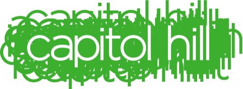
That was too good not to chase down. Here's what I found at the end:


Now, there is a Capitol Hill neigborhood here in PDX, but this happens to be the one in Seattle, Chamber of Commerce office was apparently looking for a bit of a brand refresh.

The structure of the logo should be simple to see even for the beginner: the words "capitol hill", in green, copied many times and turned into a green "cloud" upon which a white-stroked copy of same is positioned in front of it all, knocking out the green color and performing the reveal. The logo talk, as per the Chamber's press release, have this to say about the new look, developed by Bellevue ad firm Kite:

The brand strategy and visual design convey key themes that came up in the research and are part of the overall brand including: inclusivity, energy, diversity and dynamism. The idea behind the design is to visually represent the spirit of the socially inclusive and multi-faceted community by creating a solid background with the name "Capitol Hill" repeated many times.

Not really bad. Kind of hip and looks modern and artsy. But is the message coming through? The comments on the article that broke the change at The Slog, the online blog component of Seattle's The Stranger, suggest that – at best, the commenter (many of whom assert that they are design-trained) are a fun read anyway:
  • This makes me feel like I've had a couple of quadruple venti Americanos.
  • This makes me less regretful that I moved to Ballard in the '90s.
  • epileptic
  • Makes me feel like someone put a roofie in my drink.
But wait! It's not 100% haters, yo:
  • I haven't read through all the comments, cause I wanted to add my first impression without other input. But I quite like it. With the layering of the words it reminds me of the varying levels of the hill topography. The feel of the logo evokes Urban to me. It actually kind of feels like a t.v. show logo, something that would feature hipsters in a soap opera like dynamic. Because of the nature of the hill, I would of course add in some anarchists, urban ag people, and the gays to add flavor.
  • At least they spelled it right
So, you can't please 100% of the peoples 100% of the time. That's life, I suppose.

My review?

Well … it's a logo. And it's green. Green FTW!

Technorati Tags: , , ,

[liff] Twilight: New Moon, The LOLCats Review

02 December 2009

[type] You Can Be My Neutra Face (Even If You're Bold Italic)

2269.If, after you watch this video, you tell me that typographers aren't cool, ya just a hater.

Neutra Face : An Ode On A Typeface (A Bearded Poker Face Parody)

Me just love typeographer teh_funnay, yes, me do.

(h/t to Extensis)

Technorati Tags: , , , , ,

[art] A Master's Tools, Mystical Powers Imbued?

2268.While I was reading the New York Times article that inspired (and was linked to) by the last post, I remembered a bit I read in another book, and the similarities in the human attitudes in the two related bits struck me with maybe a not-too-odd congruence, given that Human peoples love to relate to the cosmos on a spiritual level as they do (I say with a mixture of odd delight and weariness).

In it, the rare-book dealer describes the emotion that came over him when seeing the humble Olivetti Lettra 32:

Glenn Horowitz, a rare-book dealer who is handling the auction for Mr. McCarthy, said: “When I grasped that some of the most complex, almost otherworldly fiction of the postwar era was composed on such a simple, functional, frail-looking machine, it conferred a sort of talismanic quality to Cormac’s typewriter. It’s as if Mount Rushmore was carved with a Swiss Army knife.”

While the metaphoric image of the Four Presidence carved by MacGyver will now forever stick, the real point is the mere knowledge that a master's tools had some sort of creative essence transferred into it seems to be something many, both aspiring artists and those who never aspire to any art, seem to share. In his excellent how-to-draw book, Drawing From Within, former MAD Magazine editor Nick Meglin relates the following:

…When my instructions in class were still met with moans and groans, I would introduce the work of Frank Frazetta, a popular artist and close friend. Frank, Angelo Torres and I were part of a small group of young men who played ball and hung around together in Brooklyn. We shared drawing interests and occasionally attended life drawing sketch classes at the Brooklyn Museum and the Art Students League.

Frazetta had little formal art education, but he was a "natural" from the very start. Invariably, someone in our classroom would approach Frank during the break, and ask about his drawing materials. Some of them actually attempted to buy his "miraculous media" with which he had captured the living form so beautifully and effortlessly. Frazetta never understood why anyone would want to buy his chewed-up pencil stubs!

"They don't even have erasers!" he said incredulously.

How absurd it was to think that it was the drawing instrument and not the artist's hand behind it that was responsible for his remarkable drawings.
It may or may not be stronger within the actual community of artists, such as they are, than the general public at large. As the rare-book dealer found an almost-supernatual respect for Cormac McCarthy's typewriter, the stories about this tendency that really seem to stick with me are when an artist – say, a printmaker or engraver – get to work with authentic tools that a well-known master. They treat them with a reverence and respect usually I see in situations like that of a Catholic Mass, when the pastor is handling the regalia. Utmost humility.

Art comes from the heart, the mind, and whatever you consider a soul; if you believe in a Creator, you are creating kind of in his/her/its image; maybe its naturally human to invoke a sort of animism in the tools the artist uses.

I've heard we humans are "wired" that way.

We humans is funny peoples.

Technorati Tags: , , , ,

01 December 2009

[lit] Cormac McCarthy's Auctioning Off His Manual Typewriter.

2267.Yes, really. According to the New York Times:

Cormac McCarthy has written more than a dozen novels, several screenplays, two plays, two short stories, countless drafts, letters and more — and nearly every one of them was tapped out on a portable Olivetti manual typewriter he bought in a Knoxville, Tenn., pawnshop around 1963 for $50.

Over five million works and a place in American literature, over a period of five decades, and two hugely-selling big-screen movies – out of this:


Photo: The New York Times. Linked.

He won't nod typescriptless though, no worries – he has a replacement:

“He found another one just like this,” a portable Olivetti that looks practically brand new, Mr. McCarthy said from his home in New Mexico. “I think he paid $11, and the shipping was about $19.95.”

Now, that's someone who knows the difference between price and value.

If you're wondering how much it'll go for at auction, it's in the if-you-have-to-ask-you-can't-afford-it category, so I'll just tell you here: Christie's thinks' they'll get $15,000 to $20,000 for it.

I've had typewriters like this. Some of the basic models don't have margin or tab stops. You use the unshifted-L for the numeral 1. It used something called … ahh, what was it? Oh, yes … paper.

They used to have stacks of used typewriters at Goodwill.

Wow.

Technorati Tags: , ,

26 November 2009

[logos] The New AOL Logo Is More Of An Emotion

2266.AOL has come a long long way since 1983, when it was just another online network provider specializing in Commodore 64s (QuantumLink). America On Line rose from a member of that prehistoric scrum to the top of the world for a while – actually becoming a equal, at least in nomenclature, of the venerable Time magazine; the once-geeky haven grew big enough to eat Time Warner to morph into AOL Time Warner, a move seen then as a herald of the New Media, with hands in the old world of print but looking toward the apparently ascendant one of online electronic media and commerce.

Ah, but the best laid plans of mice and men, as they say. As it turned out, just about the time AOL laid out 164 US Megabucks for it, the tech bubble was starting its legendary deflation and the online landscape was beginning its seismic shift away from nation-spanning ISPs and "walled gardens" to the … well, whatever the hell it's supposed to be today. By 2003, the bloom came off the rose, and the AOL came off the Time Warner. By 2005, AOL Wunderkind emeritus Steve Case was not only no longer the excecutive chariman, he was off the board entirely, and now, in 2009, AOL, the ISP That Ate Time Warner, is getting spun off … by Time Warner.

This, of course, means it's time for a re-branding. And that's going to happen as of December 10th.

Throughout its life, the AOL logo has been a rather skillfully-conventional implementation of imbuing a graphic mark with a certain style and letting it stand in for the company. The AOL logos from the late 80s though the 90s and to the doorstep of the 00s were a clever combination of the elements suggesting the A (the big triangle) the O (the upper curve of the swirl suggesting a O) and an L (which is what the lower curve of the swirl suggests). The result is a compact, locked-down logo that contains an energetic heart – kind of the idea of the AOL walled garden, indeed:


As the 80s and 90s ground on and certain fashions fell by the wayside, AOL got rid of the Flashdance inspired typography and simply shifted, as many similarly-named entities seem to over time, to just an initialism:


… a move which was just stylish enough at the time. An interesting point; the letters AOL stopped officially standing for America On Line at this point, and the AOL trigram became a name in and of itself. That hasn't stopped the old-school punters from remembering it as – and still thinking of it as – America On Line (or, as my friends at the time called it, "A**holes On Line").

After the turn of the century and The Biggest Media Merger Evar Until A Bigger One Comes Along, AOL saw the light – realized by a soft light complete with Official Web 2.0 gradients, which actually abstracted the already-abstract AOL logo:


The triangle has become an arrowhead; the AOL logo has become a "play button". Like it or not (and I've seen both opinions – mine is, not bad actually) it's au courant and fairly hip to the trends.

Now, in 2009, the AOL star, rather dimmed, is leaving the Time Warner constellation. The online environment now looks nothing whatsoever like the cosy dialup environment that AOL helped define and poor AOL, even with its hip new Web 2.0 logo, was really feeling out of place.

The first thing one asks onesself after the breakup of a relationship that defines them is usually "who am I? Where am I going now?" And what's AOL's answer going to be, as expressed by it's new logo and identity?


I'm not really sure. You see, all of the above is AOL's new identity – and none of them are. As defined by the company itself:

The new AOL brand identity is a simple, confident logotype, revealed by ever changing images.  It’s one consistent logo with countless ways to reveal.

Just like someone on the rebound – you're everything to everyone. Not even that, really, you're whatever you want me to want you to be, with the true-blue, consistent heart revealed by your ever changing ways. To be exacting, the AOL logo is gone from being AOL to being "Aol." a three letter mixed-case combination which actually pretends to single-glyphdom, with a full-stop bringing the confidence.

Why is it I feel as though I've stepped into a Khalil Gibran poem? The premium seems to be on dynamism. The "Aol." isn't on display, it matches the background and doesn't appear until something steps behind it, it's revealed, as stated, by ever-moving backgrounds, some of them rather pretty in and of themselves, as demoed by the video at this location at the AOL Corporate site. And how pround of this approach is AOL? You can download this video! Here's the link for QuickTime, and here's the link for Flash Video.

I've downloaded it, even though I can't explain why. The whole thing seems New-Coke-y, but AOL … sorry, "Aol.", may be on to something here.

Credit for courage, though, for pushing the evelope as what qualifies as a graphic element to something that's rather like nailing jelly to the wall. Seriously, I'm impressed by the bravado here.

Good luck with that, AOL.

Technorati Tags: , , ,

24 November 2009

[art] Painters Rejoice: Finally A Perfect, Durable Blue – Oregon State Blue

2265.Pigments in paint are made from some amazing things. Tiny beetles, cochineal, give us many reds (as well as the red food coloring that actually goes into food). Ground semi-precious stones (lapis lazuli) give us the blue in Ultramarine.

Biggest problem with painters' pigments is the permanence. Blues and reds are the worst; unless the works are cared for, they fade over time (artists say that they are fugitive). Moreover, some of the chemicals that create these colors are nasty: cadmium, a heavy metal, is used in both reds and blues (that aren't labelled hue; these colors are analogues), Prussian blue can leach cyanide, and cobalt is a carcinogen).

Enter Oregon State University. Creative things come from OSU – did you know that the humble Maraschino cherry originated at OSU Food Science? Well, they've done it again – accidentally:

So it was a pleasant surprise to chemists at Oregon State University when they created a new, durable and brilliantly blue pigment by accident.

The researchers were trying to make compounds with novel electronic properties, mixing manganese oxide, which is black, with other chemicals and heating them to high temperatures.

Then Mas Subramanian, a professor of material sciences, noticed that one of the samples that a graduate student had just taken out of the furnace was blue.

The pigment is a quantum leap but is very expensive to make, based on the materials involved. They say they're looking for less expensive chemicals to use.

Bravo, OSU … from the hallwed academia of Orange comes Oregon State Blue.

Rumors of a truly durable and permanent red are, of course, still crazy talk, along with warp drive.

(via, via and via, and here's the University's announcment)

Technorati Tags: , , ,

[liff] Pareidolia: New Jersey In The Sky

2264.We see what we want to see – or, more appropriately, we recognize what we recognize. And when confronted with a field of random, visual information, we impress meaning upon it, especially if that random information happens to form patterns we are familiar with.

This is what we call pareidolia. It's what we humans seem helpless to resist doing to make sense out of a senseless world. For instance, in this picture (nicked from Strange Maps), the cloud just happens to resemble New Jersey:


Just to see how close, here's an actual map of New Jersey along side:


Uncanny, isn't it? There are some places where the match misses it by a mile, but it's close enough for jazz, as we like to say.

The post at Strange Maps is here, and includes asphalt Maines, many versions of Australia, even a food-based District of Columbia.

Pariedolia is a strange and wild beast. It's why some think there's a human face on Mars; it's why so many see Jesus in peeling paint and the Madonna on a grilled cheese sandwich. We're programmed to recognize things we know, and if things just so happen to fall into a familiar pattern, our recognizer turns on and sees what we recognize.

Sometimes it's a very close resemblance, but sometimes it can be a mile off but still be reminiscent.

The next time you see something that makes you think of something else (Tanzania has always reminded me of Wisconsin, and both make me think of toast. This can lead to an incidence of grilled cheese sandwich), take a moment to let it open some perceptive avenues. Think about how a random assortment of meaningless forces made something that you recognize. Some may see God in the display; some may see the cosmos talking back to them; some may wonder at the amazement that wild impersonal chance can produce.

Thinking about this always makes me go inside and outside at the same time, which, for someone who isn't very religious, is a mind-stretcher, to say the least.

Technorati Tags: , ,

20 November 2009

[liff] Twitter Is Crack Cocaine

2263.Didn't we just know it?

(Warning: Theres a couple of adult words on that. Nothing you've not heard before, but don't go readin' it to the toddlers, K?)

Technorati Tags: , , , ,

[pdx design] Pride Foundations's 25th Anniversary – A Logo Design Contest Worth Entering

2262.As always I'm against "logo design" contests in the broad sense of the word. There are a few out there that deserve one's notice, and I think I've found one.

The Pride Foundation is a NW charity that functions as a philanthropic organization for the LBGT community, (read all about it), and is celebrating its 25th year of service with a 25th Anniversary Logo Design Contest. This differs from the usual logo design cattle call in several significant ways:

  1. The prize is a $250 donation to the non-profit of your choice.
  2. The logo will be used only during the Pride Foundation's 25th Anniversary year.
  3. It's meant to augment the current logo; it's not an attempt to get rebranding on the cheap.
  4. While they promise exposure, they don't promise that this will change your life, though it certainly could.
  5. It's for a charity that serves one of the most vulnerable segments of society right now. Your guardian angel will like it that you do this!
So, here's one logo design contest you can enter that's not evil, in my opinion. I'd at least recommend a serious look. For links to the submission guidelines, rules, and all contact info, check out:

http://www.pridefoundation.org/25th-anniversary-logo-contest/

Good luck.

Technorati Tags: , ,

[IP] U of O Quacks Down On Viral Video – And They're In The Right. Here's Why.

2261.By now, everyone who's curious has seen it or is soon going to because of the buzz … the viral video "I Love My Ducks", by three enterprising UO students … and one registered trademark.

I Smell Roses @ Yahoo! Video

Now, I'll put my cards on the table right here; I'm bored by football – except for college football, and when it comes to that, I bleed Orange. So that's me for you. I think the smell of roses this year is a little stronger in Cow Valley than in Eugene (for more than obvious reasons).

But even though I'm not on "their" side, I'd be the last person in the world to deny their passion for their overrated honorable team. We pick our ponies and we fall in love with them; you roll your dice and take your chances. And sometimes, people who are not lawyers get so in love over their paramour that they forget that things like logos and trademarks and characters like the U of O Fighting Duck – which began life as Disney's Donald Duck – actually belong to someone else, regardless of the emotional investment the fan has.

Or, perhaps, in this case, they just didn't realize this. Or maybe they figured the U would go along once they saw what a good light the mascot was being used in.

The University of Oregon is very very careful about the use of thier marks. Always has been. You might remember in the last political campaign cycle, when Gordon Smith's US Senatorial re-election bid used a font that looked suspicously similar – some thought identical – to the distinctive font found on UO's athletic program, named – appropriately – Belotti Bold:


The probelm with Smith using this font for his campaign is that Belotti Bold is a bespoke font. Just as with so-called "bespoke" fashion, a bespoke font is one developed specifically for a certain customer and not released for sale. The customer – UO, in this case – has the sole right to use and is to whom all permissions must be obtained from.

I can't remember what effect it had on the Smith campaign organisation – I'm sure it embarrassed them just a little – and they removed the very-close-to-Belotti-Bold font from the website.

Actually, while the U of O undoubtedly clearly understands the unspoken message that could be contained within the appearance of the mascot in the video – that the U of O endorses it, at least tacitly – there's more than just that. The U of O Fighting Duck's resemblance to one very well-known Disney character is not just coincidence. As the duck, originally appearing in the 1930s, evolved in artistic depiction over the years, it began to resemble Donald more and more. Walt took note, and the then-athletic director of the U, Leo Harris, who was a friend of Disney, got him to agree on a handshake. Much later, in the 70s, this was formalized as an agreement that essentially licensed the use of the Donald-esque duck to the U of O only, and only by and for Oregon sports.

So, to chase this down to the bitter end, the U of O doesn't actually own the depiction of the duck – Disney does. And Disney allows the U to use it under a set of strict conditions. Conceivably, unless the U takes quick and decisive action, could the Oregon actually lose the right to use it?

The question has been asked and is now on the table. It seems possible. Oregon's marketing dept has actually been stuck in the position of having to be the bad guy.

Moreover, allowing this use would set a precedent. It's funny – when I was a kid, if a parent or someone in authority said "if I let you do it, I'd have to let everyone do it too", I resented that. As an adult I understand that you can't simply pick and choose here. Anyone following Supwitchugirl's effort, if allowed to stand, would be credibly able to point to that video and assert that if they were allowed to do it, so should others. And I'm not a lawyer, but I think they just might have a case there.

So … yeah. It's a painful fact of life, especially for some Duck fans, but the Universitas Oregonensis may seem to be a bit of a bully. But they're on solid ground here and have not only every right to demand the video be taken down but also every right to expect it to happen, the Streisand-effect propagation not withstanding. To protect a most unique relationship giving them the right to use a Disney character for a logo, they would indeed seem obliged to move in a decisive manner.

Some local Duckers are a bit alienated. I can understand why. The U has to be the buzzkill here, and is doing it to a turn. Personally, I don't want to see the Ducks cry over something like this … I'd much rather see them cry the minute the clock ticks off the last second of the Civil War the Beavers win, as they wave bye-bye to their Rose Bowl chance.

Hey, no hatin'. I do bleed Orange though, so there's me for you.

And, as far as I know, Benny Beaver has no cross-ownership issues. So, he has that workin' for him.

Technorati Tags: , , , , ,

15 November 2009

[liff] Ken:By Request Only - Finally Hear What's Behind the Awesomest Album Cover Of All Time!

2260.He's Baaaaaaack …

Ken. By Request Only. The Awesomest Record Album cover of Time, Space, and Dimension. It will never leave the Intartubes:


Have you ever wondered exactly what Ken's song styling sounds like, though? This album is said to have fetched north of $150 when auctioned off at eBay, but what sort of melodic tuneweaving can Ken Snyder do?

Wonder no more.

Click this link to listen to the album on YouTube (or click on the album cover above), where some brave soul has posted the tracks as a playlist.

Not wholly unpleasant, as it turns out. Corny, mawkishly-charming soft songs about sweet things and nice feelings and God and Jesus and stuff. Not Grammy-material, workmanlike but passionate effort, not mad skillz … but not untalented either.

(H/T to Garrido who left this link in the comments to the article at the end of the first link, and found me via some web search apparently. I have no connection or relation to the fellow otherwise)

Technorati Tags: , ,

12 November 2009

[type] Mr Subliminal Tells A Joke In Type

2259.Back in the mid '90s, when Saturday Night Live was still cool and funny [1], repertory cast member Kevin Nealon got a great deal of mileage out a character who was originally named Phil Maloney, an ad exec, but who became known as "Mr. Subliminal". The character delivered a monologue but quickly and sotto voce at critical points inserted clues to how he was really feeling about what it was he was talking about, making it a round commentary on PR in general. As an example (culled from Wikipedia) here's what he had to say about a fellow who inexplicably made world news back in 1994 for being convicted of vandalism in Singapore and was going to be subject to that brutal punishment of which the island city-state is so very famous for:

… the boy admitted to spray painting cars but he's only eighteen and young people often do stupid and impulsive things they later regret Shannen Doherty. I happen to think [pause] that everyone's entitled to one mistake Euro Disney. And I'm not saying there aren't [pause] those who I'd love to see get a good flogging Urkel, it's just that [pause] I'm afraid we've become so insensitive that we've learned to accept the idea of a man's beating in public Pee Wee Herman.

A t-shirt I've seen recently reads "Hi, I'm Hot Sex Mr. Subliminal". You get the idea.

Type gives an excellent route for this. This a sort of "painting with type" that you may hear typographers rhapsodizing about from time to time, and it's quite funny (and since it has to do with web entrepreneurship, ever timely):


as the graphic says, copyright by @Boris,/
http://thenextweb.com.


I can just hear Nealon sotto voceing the white type. And it's all quite funny, with the ring of truth that only a web entrepreneurship professional can bring. And the twist ending is quite good.

And you can all do it with type, and that's what I love about type.

[1] The period that SNL was "cool and funny" seems to be defined for everyone as about 3-5 years in the past, with the standard agreement for everybody being the original Not Ready For Prime Time Players era was pretty much awesome (essentially the first two seasons), though everyone agrees the sixth season was pretty much ass.

Technorati Tags: , , ,

[blog] My Illustrations – A Victim Of My Own Popularity

2258.My hit count (as measured by SiteMeter) per day has been trending upward, which is satisfying to me even if a great deal of them are search hits (though I do get niftyness from Twitter these days). I imagine that it has something to do with the footprint my blog is making – the more I post about the things I care about the more like-mindeds are likely to find me.

Unfortunately, since I'm still poor, I depend on free services to host my images. Photobucket served me very well for a long time but even at my trending-upwards-but-still-modest traffic, I'm now running into a problem I never thought I'd have – in particular here, the 10 MB monthly bandwidth limit Photobucket imposes.

So, as time goes on, I"m shifting my illustration host to Picasa, which makes sense in as much as this blog his hosted by Blogger and the Picasa web interface is cleaner and more intuitive than Photobucket's anyway.

So, if you come here on a search and you get the Photobucket redline graphic, shoot me an email and I'll relocate the graphic. I'm getting to them as I can, assisted by Photobucket's Stats suite.

Technorati Tags: , , ,

07 November 2009

[comic art] The Tintin Sketchbook

2257.There be lots of Tintins here.

And Snowys. And Thom(p)sons. And Haddocks. Even a Thompson Triplet. Sadly, no Bianca Castafiore, Professor Calculus, or even Jollyon Wagg. You can't have it all.

(Update: I have been apprised, by gallery owner Leigh Walton, that there are indeed at least one Castafiore and a couple of Calculuses (?). Next time, I should be more thorough)

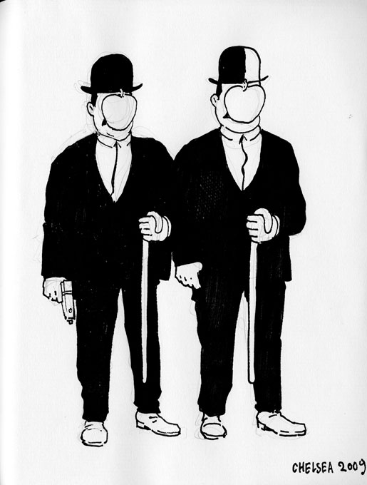
But, there are not only about 100 Tintins/Snowys/Haddocks/Thom(p)sons, there are many interpretations. I particularly enjoy the one I've chosen to illustrate, by artist David Chelsea, since I'm also terribly besotted with Magritte.
From the Flickr description:

Hi, I'm Leigh from Top Shelf. This is a themed sketchbook I started collecting at San Diego Comic-Con 2008. The theme is Herge's Tintin -- any character from the series. So far I've filled up one whole book and moved into a second volume...

100 interesting departures (including a graphic-novel-style realistic Tintin I quite enjoyed can be found here: http://www.flickr.com/photos/phthoggos/sets/72157606566029871/

Go see it.

Technorati Tags: , , ,

06 November 2009

[ad_design] What Might Have Happened If The D&D Club Started Drinking Canadian Club

2256.Last year some ad agency came up with an ad campaign for Canadian Club whisky based on a certain retro perception of The Sixties Dude – a campaign that was a little bit rude, rather un-PC, and played on that proletarian worldliness that could only be bespoke by a tagline such as Your Mom Wasn't Your Dad's First.

Love ya, Mom.

Such ads are ripe for spoofing. And someone did. Beautifully.


Clicky upon the image to embiggen. The copy on the Canadian Club ads reads:

YOUR MOM WASN'T YOUR DAD'S FIRST. He went out. He got two numbers in one night. He drank cocktails. But they were whisky cocktails. Made with Canadian Club®. Served in a rocks glass. They tasted good. They were effortless. DAMN RIGHT YOUR DAD DRANK IT.

Whereas the brilliant copy on this reads:
YOUR DAD WAS A LEVEL 22 NECROMANCER. He didn't bitch about server lag. Your dad put on his ears and his green boots and didn't care who saw. He rolled to feel up his elf girlfriend after kicking Acerrack's ass in the Tomb of Horrors. He set his classmates on edge. He was a nerd before it was cool. And he didn't give two shits about what comic books Megan Fox reads. DAMN RIGHT YOUR DAD PLAYED IT.
Like I said, pitch-perfect. And, I don't know about you all, but you've gotta know that the stereotype of the sexless nerd was just that; as the main character in Revenge of the Nerds sagely noted, "All jocks think about is sports. All nerds think about is sex". True, that. And, I don't know about you all, but those two cuties down in front in the big picture look pretty rowwwr to my inner 17-year-old.

Yep, back then. There were lady gamers. Yes, typically speaking, they were hot. We tried to tell y'all, but you wouldn't listen.

Ah, good times. Good times.

(Thanks to Lyle, who Knew Me Back In The Day™, if you follow)

Technorati Tags: , , , , ,

[maps] Lancashire: 10,000 Holes, And One Invisible Town

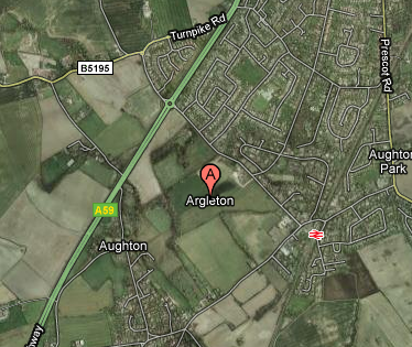
2255.If you haven't heard of Argleton, Lancs, UK, I'm not a bit surprised. It's a bit of a phantom, actually.

If you go to Google Maps, you'll be centered on a spot approximately 10 miles NNE of Liverpool, England, in the Lancashire countryside. Here's a link:


Here's a URL link to the above Google Map
.

Lovely looking place. Quiet green fields; lovely hedgerows; convenient to both the Motorway (that's British for freeway, Clem) A58 and the Aughton Town Green rail station, you won't want for transportation options.

The only thing Argleton doesn't seem to have is … well, you can see above. There seems to be no actual there, there:

The town appears on Google Maps in the middle of fields close to the M58 motorway, just south of Ormskirk.

Its 'presence' means that online businesses that use data from the software have detected it and automatically treated it as a real town in the L39 postcode area.

An internet search for the town now brings up a series of home, job and dating listings for people and places "in Argleton", as well as websites which help people find its nearest chiropractor and even plan jogging or hiking routes through it. The businesses, people and services listed are real, but are actually based elsewhere in the same postcode area.

Neither Google Maps nor the company associated with the provision of the basic data can explain what Argleton's doing there, Brigadoon-like, in a field, just south of Ormskirk.

One wonders how The Beatles would have handled this one, here.

Technorati Tags: , , ,