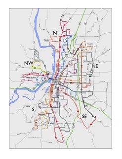
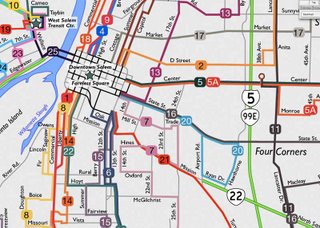
Last issue I mentioned how what the next thing I want to do is typography. I have all he geographic elements I need to make the map informative, now I want to begin labelling things.
It didn't take me too long to decide on a typeface to use for the labelling: Gill Sans. It seems to be very popular of late but not quite to the point where it suffers from the dreaded Helveticitis.
It is actually quite suited to such uses. It's intellectual forbear is a font called Underground, which was developed by Edward Johnston in the 1930s specifically for and for the use of the London Underground. Gill Sans was developed by Eric Gill, a stonecarving/type designing titan of the mid-20th Century, and it seems to be an updating of Underground with subtle humanist touches (the voluptuous curve on the leg of the majuscule R make it one of the most beautiful glyphs in any typeface).
 The type was applied where appropriate to the streets, and to give a better impression of the lay of the land, two subclasses of notations were made:
- Important districts were located and labelled. Two sizes of type were used to indicate hierarchy: a more modest style for notable neighborhood-sized areas, and a larger one for significant centers within the urban fabric (these I deemed West Salem and Keizer)
- In very large type, the five Salem address districts: N, NW, NE, SE, S. This has been a feature of TriMet maps for a long time, and I added them here because I like the look there. The type was left dark but was placed in the stacking order at the bottom so that any streets and line symbols would overlap them–this is another way of making something prominent, yet making it go to the background. Literally, in this case.
 Click on either image it to see them bigly.
No comments:
Post a Comment