2245.In 1996, the legendary digital typographer Zuzana Licko created Mrs. Eaves, a font which was an amazing OpenType revival of Baskerville.
Therein lies a tale.
When one looks into the life stories of the great typographers, one finds, as with lives of other artists of remarkable passion, complex personal lives. Eric Gill has proven to be one, and John Baskerville is no exception. From Emigre Magazine, issue 38:
However, one not familiar with the history of Mrs. Eaves might wonder why there couldn't be a Mr. Eaves, to round out the symmetry (indeed, those familiar with the legend might also find it amusing). At the very least one wonders what a "male" version of this distaff font might look like. This monty, Licko released Mr. Eaves, answering the question:

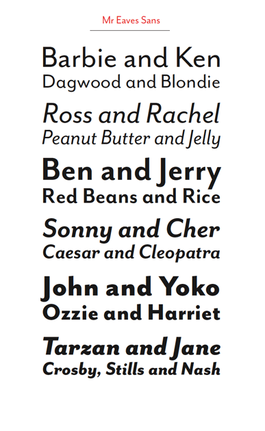
The font Mr Eaves is designed to echo the style of Mrs Eaves but to be more than just a version of the Mrs with the serifs cut off. The ratio of x-height to ascender height gie an impression of classic style, just as with the Mrs, but the clean, modern lines give a current feel, something like a variation of Gill Sans or Myriad. The italic versions, with their obvious but dignified filips, seem to suggest a very refined sort of handwriting. I very much enjoy the curls-up on the bottom of the miniscule l's, and the leg on the majuscule R is something I'm silly in love with. This very much lives at the intersection of modern geometric fonts and humanist, designed fonts – a verson of it, Mr Eaves Modern, comes across as a warm version of Futura.

Graphic copyright Emigre
And now, Mrs Eaves and Mr Eaves live in perfect harmony, which you can avail yourself of at Emigre: http://www.emigre.com/EFfeature.php?di=213.
Technorati Tags: typography, emigre fonts, Mr Eaves, Mrs Eaves, Baskerville
Therein lies a tale.
When one looks into the life stories of the great typographers, one finds, as with lives of other artists of remarkable passion, complex personal lives. Eric Gill has proven to be one, and John Baskerville is no exception. From Emigre Magazine, issue 38:
Licko's selection of the name Mrs Eaves reveals an interesting story. Like his types, Baskerville was, himself, a controversial character. He hired Sarah Eaves as his housekeeper. Eventually her husband Richard abandoned her and their five children, and Mrs Eaves became Baskerville's mistress and eventual helpmate with typesetting and printing. On the death of Mrs Eaves estranged husband, she married John Baskerville within the month. Selection of the name Mrs Eaves honors one of the forgotten women in the history of typography.Behind every great man was a great woman. In Baskerville's case, that was Sarah Eaves.
However, one not familiar with the history of Mrs. Eaves might wonder why there couldn't be a Mr. Eaves, to round out the symmetry (indeed, those familiar with the legend might also find it amusing). At the very least one wonders what a "male" version of this distaff font might look like. This monty, Licko released Mr. Eaves, answering the question:

The font Mr Eaves is designed to echo the style of Mrs Eaves but to be more than just a version of the Mrs with the serifs cut off. The ratio of x-height to ascender height gie an impression of classic style, just as with the Mrs, but the clean, modern lines give a current feel, something like a variation of Gill Sans or Myriad. The italic versions, with their obvious but dignified filips, seem to suggest a very refined sort of handwriting. I very much enjoy the curls-up on the bottom of the miniscule l's, and the leg on the majuscule R is something I'm silly in love with. This very much lives at the intersection of modern geometric fonts and humanist, designed fonts – a verson of it, Mr Eaves Modern, comes across as a warm version of Futura.
Graphic copyright Emigre
And now, Mrs Eaves and Mr Eaves live in perfect harmony, which you can avail yourself of at Emigre: http://www.emigre.com/EFfeature.php?di=213.
Technorati Tags: typography, emigre fonts, Mr Eaves, Mrs Eaves, Baskerville

No comments:
Post a Comment