09 February 2008

[logo_design] The Three Stages of Wickes Furniture

1345. Safe to say this caught a lot of us by surprise (clicky the illo at right to embiggen if you could be so kind, thankyou!).

Not nececelery, mind, that Wickes had hit a rough patch – that was public knowledge. What was a surprise (unless you were some kind of insider) was that Wickes was so close to its end. Now, it's might be winding everything up and going away.


On the Portland Housing Blog the proprietor made the remark "We won't be hearing 'It's a Wickes House' anymore". Of course, since I try to pay attention to logo evolution, I noted that that wasn't quite the case (it's germane to the housing discussion because Clint8200 correctly noted that it's due to the slow housing market – this is one of those ripples that are spreading throughout the economy now that so many fewer people can get loans for houses now). Actually, Wickes moved off the "It's A Wickes House" campaign already.


Sometime during the last year, they began promoting "The New Wickes" with a change in logo – dumping the pastel pink and teal, and the flowing script W in the circle – and going to a palette of earth tones and a decided change in font, a new completely-typographical solution with no abstract graphic elements – not even the two parallel bars that framed the word "Furniture" (which also recieved a typographic facelift). Even the taglines were jettisoned; Wickes was now "creating new ideas" and the aural hook was the Roxetteish "We've Got The Look". They'd even rolled out a new value-priced line – Cindy Crawford Home.


As far as I know, this rebranding and "warm" relaunching of the brand is a strategy that can succeed. It's hard to tell at first blush if it's a last-ditch attempt to save a company that's down for the count. Certainly, though la Crawford's name and face doesn't exactly have the pull it did in the 80's or the 90's, it's still a powerful draw and any company that can afford to hire her certainly doesn't look like it's in the last stages of tenability.


So, looking at it from a brand-evolution perspective, it was kind of hard to be sure that Wickes was that far along. Of course, the tale of history is much more emphatic.


Tags: , , ,

[typography, design] Trajan - The Movie Font

1344.


True, that.


Tags: , , ,


Powered by Qumana


[bloggage, design] Q Interviews Me, Question 4

1343.


This one pretty much explains itself.


Tags: , , ,


08 February 2008

[art] A Look Into A Graphic Novelist's Sketchbook - In The Public Domain

1342.  One thing I find incredibly thrilling and inspiring is getting a look through another artist's sketchbook. There's the thrill of behind the scenes, of seeing the man behind the curtain, the vicarious thrill of being allowed to see something that you wouldn't otherwise be able to see.

Brian Wood is famous for the graphic novel Channel Zero. When I heard that he was offering a 17MB download of a work he's calling Public Domain ... sketches, character studies, found art and photographs, short stories ...  everything that informed him in making the story, but had not yet made it into print.


The real thrill is seeing the "what went into" and the unfinished test sketches and drawings. Sometimes, the best art is 'undone'.


There's a great amount of found stuff, as I menched, but one which really caught my eye was apparently taken from a subversive flyer tacked to a 'phone pole in NY, one which even some (well, probably a great many) people in Portland can even relate to:


It's challenging for those in thier comfort-space.


Oh, yeah, you can download it from this page hyar. Free.


Tags: , , , ,


[art] The Year of Stan, Day 38

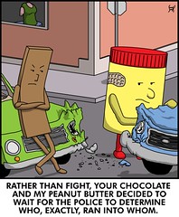
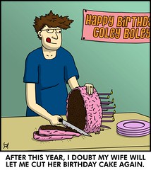
1342. This, of course, is in a sad, sad, alternate universe where Reese's Peanut Butter Cups were never invented.

I shudder at the thought, myself.

[art] The Year of Stan, Day 37

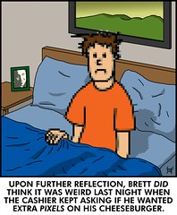
1341. On the upside, he's tailor-made for those interviews where you can't see the people's faces 'cause they're all squarey.

(Critquity: nice detail - check the shadow on the pillow and the bed behind poor Brett. And, okay Stan ... who is that in the picture on the bedside stand? Kinda looks like Chris Kattan).

07 February 2008

06 February 2008

[pdx, pdx_lore] Mnemonic Device? We Haz It

1338.


Greetings to anyone stumbling over here from the local real estate blog re:PDX, who noticed the high coolness of the downtown street mnemonic (which, in the interest of disclosure, was actually composed by a commenter (J. D.).


Welcome, welcome, and welcome again.


And thanks to re:PDX for the mention. Skookum nifty!


Tags: , ,


[liff, music] The Cross-Cultural Rift That Must Surely Consume Us All

1328. From The Lawrence Welk Show, two wholesome Welk singers take on that noted "modern spiritual" by Brewer & Shipley from the album Tarkio, "One Toke Over The Line".


From the Wikipedia entry on Tarkio:


The catchy single, "One Toke Over the Line", peaked at #10, garnering notice from Spiro Agnew for what he saw as its subversiveness. Ironically, Lawrence Welk performed the song on his show calling it a modern spiritual. The song is notably mentioned in opening of Hunter S. Thompson's Fear and Loathing in Las Vegas.


Has there ever been a more mixed message than this?


Modern spritual! Wild!


As The Wife™ said, "Lawrence Welk ... it's not just your grandparents' show anymore".


No, it could be your parents' show too.


If they were Jesus Freaks.


Tags: , , , , 


Powered by Qumana


[art] The Year of Stan, Day 36

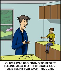
1327. After a while, I'd just like to get an hourly wage.

Price for my thoughts? If you have to ask ... well, you know ...

[art] The Year of Stan, 35

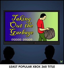
1326. Look for the sequels to this game (Doing The Dishes, Vacuuming The Floor, Taking The S.A.T.) on some game store shelf somwhere.

We just haven't worked out where yet.

[street_blades] A Typical Hard-Working Salem Street Sign

1334. Today, we visited Salem to see an exhibit at Mission Mill Museum and to get some ... what else ... snaps of street signs and the like.

At the corner of Church and Mission Streets, SE, stands a signpost that illustrates just how overworked some Salem street sign assemblies can get:


From the top:


  1. Historic District (Gaiety Hill/Bush's Pasture Park) Sign topper;

  2. Blade for 500 block of Mission St SE;

  3. Blade for 700 block of Church St SE;

  4. Finger blade directing you up Church St to Pringle Park;

  5. Finger blade directing you across Mission St and into Bush's Pasture Park to the nearby Bush House Art Gallery and Museum;

  6. Your average everyday standard STOP octagon.


They do make their signposts do amazing amounts of dutiful work. Some blades require the application of supports, making it all like kind of like a majuscule Y, to give the sign the strength it needs to not bend over


The finger blad reading "HISTORIC MUSEUM/ART GALLERIES" deserves special note as to style. The color scheme – black type on an off-white background – is typical of the standard Salem street blade style through about 1980. After that, it was white on green. Moreover, the type face is plainly different; particularly compare the C in "Church" to the C at the end of "HISTORIC". The round letters are oval rather than elliptical, with straight sides and more perfectly circular tops and bottoms. This was also the standard Salem style, until the signs became white-on-green.


More commentary about Mission Mill and a fun but ultimately unhappy stop at the Salem Cherriots Downtown Transit Center to come.


Tags: , , ,


05 February 2008

[liff, sf] Dr. Bergman Finally Gets Leave From Moonbase Alpha

1332. Alternatively, Lt. Gerard Finally Resigns From the Force.


Barry Morse, b 1918, d 2008.


Tags: , , , ,


Powered by Qumana


[art] From The Things That Would Never Happen In PDX File

1331. The LA Museum of Contemporary Art mounted an exhibition of Japanese artist Takashi Murakami (don't fret, until now I've never heard of him either).


It' wasn't long before two notable local graffiti artists added their own considerable filip to the billboard.


The artist saw it and liked it so much, that he had the billboard shipped to him.


Now, that's what we call being a successful artist.


(via BoingBoing)


Tags: , , , ,


Powered by Qumana


[bloggage] New on Zrharc!

1330.


  1. esvsl

  2. fbrzig


Worship the Zrharc! Hidden meanings, you bet!


Tags: , ,


Powered by Qumana


04 February 2008

[design] Adobe Stock Photos To Be Discontinued

1329. Adobe Stock Photos, the in-application stock photo source inherent in Bridge from CS2 through CS3, is to be discontinued by Adobe during March, as reported by Jeremy Schultz at Designorati.


Adobe's John Nack also has information in his blog, including links to ASP uninstallers for Mac and Win and FAQ-y information.


Tags: , , , ,


Powered by Qumana


[design] Funniest. Kipple. Evar.

1328. I can't remember where I got this:


... but the random geometric shapes, the screened-back colors, the "Moist" and "Towelette" separated by all that space ... something ineffable about this package has me laughing my ass off inside.


As you can also see, it was taken in my evil lair in which I was hiding from Batman (Adam West version), as witness the tilt of the background. My secret is revealed.


Actually, the mere concept of moist towelette is just funny on its own. Quaint and funny. Just adding the word moist to some situations guarantees mirth.


Tags: , ,


[or_politik] Okay, GOP Dudes, Whatever.

 1327. OLive and The Big O, dateline today:


Subhead: Two Democrats post offbeat ads, one of which the state GOP chairman says is offensive.


So?


Why should I give two Arby's French Dips what any Republican thinks of Jeff Merkley's web ad?


But, hey, dudes, if it makes you feel important, go for it.


Whatever.


Tags: ,


[design, bloggage] About Designing My Way Out Of a Paper Bag.

1327. This question from Q was the one that started me thinking of a graphic display for the whole thing more than a simple typed list of answers to questions.


Sad to say, but when you grind away at a job search, you don't think so much about creating new stuff. A designer creates solutions for others, so when I think design I think about what I do for others, not myself.


Though I'm not being paid yet, I am doing things for others, so the creative train has actually started to pull out of the station. But that's a little beside the point.


When Q asked the question Can You Graphically Design Your Way Out Of a Paper Bag, I don't know if he knew it or not but he was baiting me. Doubtlessly he read my blog to get a hint of what sorts of questions to ask me. The first two questions were actually kind of expected in a way. But this one brought me up short, shook me up a little bit, and opened that inner eye.


Graphically design my way out of a paper bag. Why, yes, I know I can. But how?


Why, graphically, of course.


The idea to use Helvetica Neue and an iconic style reminiscent of pictorial instruction cards just bubbled up to the surface, as though it was waiting to be used for an awful long time. It took a very short while to form the thing whole, but once it did, it kind of designed itself and just used me as an avenue to come out.


And it illustrates what graphic design does. Communicates. It may or may not be art, but making the art isn't a point. Illuminating and communicating, however, is.


For example, I was thinking of making this discourse a bit longer by translating each illustrated step into words here, but I've changed my mind. I won't.


It tells its story loud and clear, without any help.


Tags: , , , ,


Powered by Qumana


[bloggage, design] I Can Design My Way Out of A Paper Bag, or: Q Interviews Me, Question 3

1326.


Discussion hither.


Tags: , , ,


[art] The Year of Stan, 33

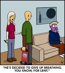
1325. I admire someone with that much dedication.

Wouldn't it be mean of him if he turned out to be anaerobic and was just hiding it?

(Critiquity: that abstract on the wall is interesting. The rectangular object reminds me of a handheld radio. Nice attention to detail on the skateboard too)

03 February 2008

[liff, me] I Am Quoted In The San Francisco Chronicle

1324. A short time ago I exchanged Email with a reporter with the SF Chronicle, Chris Cadelago by name, who had espied an article I'd written for Designorati some time back about campaign stickers, and he asked me my opinions on the current crop.


Today the article went live on SFGate.com. It's a rocket ride around a group of opnions from a group of people who have a variety of POVs (he correctly identified me as a liberal opinion). There's lefties, righties, center-ies – its about the message a political bumper sticker can communicate and how we view 'em.


It was really pretty well done, and cool to see my words in print, carrying the Designorati banner, in national publication.


See you guys! I told you I was smart and cool!


Cutting to the chase, here's my bit:


Samuel John Klein, an editor and production manager at the online graphic design magazine Designorati, says it's the bold, unconventional styles that impress him the most. In 1936, Kansas Gov. Alf Landon challenged the incumbent Franklin D. Roosevelt by using an orange and yellow sunflower as his medallion. In 1952, Dwight Eisenhower opted for a picture of himself along with the slogan "I Like Ike." And Jimmy Carter's green sticker with white text read simply, "Gimmie Jimmy."


"That (Carter sticker) stuck out like a sore thumb," said Klein, of Portland, Ore. "Or, in the wake of Watergate, a cool breath of fresh air."


Creatively, perhaps the best-known presidential campaign sticker came from Sen. Barry Goldwater's 1964 run. Dubbed "The Goldwater Formula," it condensed his last name to "Au H20," symbols from the periodic table signifying gold and water.


Klein is impressed by several of the stickers in this election cycle. He said that the font on Clinton's sticker "is classic and yet (its) friendly appearance seems to suggest the combination of sophisticated smarts and affability."


Obama's sticker, with its red, white and blue forming a circular landscape, is clever and depicts vision, while John Edwards' green comet trail gives a nod to issues like global warming, he said.


On the Republican side, Klein said that Mike Huckabee's American-flag-themed bumper sticker, with gold lettering and the words "Faith, Family and Freedom," feels comfortable and homespun. Romney's bald eagle over red, white and blue is simple and safe, "You know what he stands for," Klein said.


My comments take up a considerable part of the article. Yay, me!


Tags: , , , , , ,


Powered by Qumana

[pdx_media, liff] Nice Rack. What Happens To The Old One?

1323. Congratulations on JustOut's new newspaper rack debut. Those clusters of newspaper racks get kind of ratty really quick (that's just the way it is in the big city) and it's nice to see them refereshed every once in a while.


Though the rack is the standard plastic sort that we see very much of these days. they still stand out. Two reasons for this: the color purple (which, regardless of any cultural hook, is not much used. And, also because of the cultural hook), and the clear, uncomplicated masthead logo (designed by Portland's own Jeff Fisher (it should go without saying that we'd kill to get the chance to design a masthead for a major local periodical, but we're desperate for work, so we'll say it)).


It's important to stand out on corners like 10th and West Burnside, outside Powells – USAToday realized this back in the 1980s when they started. Awash with color and coming at you like a video game, they were sold out of street boxes that looked like videogames. They still stand out, and the design says something about them. JustOut's new boxes do both as well.


It's a zeitgeisty thing.


What I've always wondered is where the old ones go. Is there a street corner paper vendor graveyard somewhere? Are the cut into small pieces and distributed amongst the poor?


Tags: , , ,


Powered by Qumana


[bloggage, design] Q Interviews Me, Question 2

1322.


The Question 2 has a point that is a cruel, cruel thing; you can wish to your heart's content, but eventually the Great Impaling 10-Foot-Pole of You Wished One Time Too Many will get you.


So, what do do? No amount of proven wish fulfillment is worth eventually getting holed by a 10-foot (or 7.2 centipedes in the fretric system) piece of metal. That's some ouchie.


I figured that five wishes, appropriately stated, would set it up so that I could pump up the world and not put myself in mortal danger (sure, getting impaled might not kill me ... but I'm already rolling the dice on getting impaled to begin with. I didn't want to roll those dice two times. I usually can't win Yahtzee; I'm taking the hint).


I don't believe in greed or in making things too easy, so I get something cool for myself, nifty for everyone else. That's everyone, whether I like you or not. And if we did have space travel, I'd be so there for that Moon picnic. I lurves me some Safeway fried chicken and Reser's mac salad (yes, it's got to be Reser's. I love the taste, and they make it in Beaverton. Like I said, terrior, baby, even in heart-attack-inducing convenience foods).


And at the end, since everyone is human, including me, we remove the temptation by removing the ability. With hope, my choices added the possiblilty that the world in general will get what it needs by giving it the tools to for people to get there.


I'm also all about the tools.


Yeah, it's all pretty corny maybe. But this took more than a little thought. And I really do believe that stuff.


Graphically, the challenge I gave myself was to reduce each thought to an icon. I forced myself to think simple and small and quick; each one of those icons took less than 15 minutes to design. I went to the heart of each concept, oversimplifying it to get straight to the root of how I thought each thought mattered; resources are money in this society; good people indicate with the halo; my logo (which really ought to be more famous), the mathematical society for absolute equality (it is what it says) which I saw on a bumper sticker some years back; a 1950s era rocket ship (also referencing the time when we all thought we'd have mass-market space travel by now), and a STOP sign (that's it, and no mistake).


If anyone was curious, all graphics were assembled in Adobe Illustrator CS3, which is the tool of choice if I want it quick, simple, and graphic. I really love Illy.


Tags: , ,


02 February 2008

[bloggage, teh_funnay] Zrharc! Still Rules

1321. I put on a post there today.


Ryjoy.


Go there to see it.


Worship the Zrharc!


Tags: , ,


Powered by Qumana


[media_world] It Sure Looks Like Retaliation

1320. A missive from a a member of the WTF generation. Time for amateur deductive logic:


  1. Montel Williams goes on FOX and Fiends to jaw with the hosts about the death of Heath Ledger.

  2. Montel, in an earlier life a Marine and Naval officer who served with unquestionable honor, as some point Has Had Enough™ and sideswipes the show's hosts, pwning them over their obsession with celebrity twaddle and disregard for small things like servicemen dying in certain foreign wars.

  3. Montel is gone from the show after the next break.

  4. Montel's show is suddenly cancelled after a successful run of 17 years.


Everyone can play their Whiskey Tango Foxtrot games to thier hearts content. I don't think the question is whether or not the people behind these events decided to punish Montel so much for stepping out of line as why is it they were content to let the whole danse macabre play out where everyone could see it.


The solution to that question is also left as an exercise for the reader.


Myself, I never had much use for Montel. Made a completely undeserved celebrity out of Sylvia Browne. And I wonder if he ever asked himself, while he was stumping for the Partnership for Prescription Assistance why we, as a country, need a Partnership for Prescription Assistance.


Oh, Montel will probably land on his feet.


I worry about Sylvia though.


Tags: ,


Powered by Qumana


[bloggage, design] Q Interviews Me, Question 1

 1319. Recently I participated in a quite fun meme started by Neil at the blog Citizen of the Month, The Great Interview Challenge, where everybody is somebody (you see, people, I told you I was somebody.

The scheme is simple. Just comment on the announcing post. The person who commented before you sends you a handful of interview questions; you send the person who comments after you interview questions. You post the results. Q posted before me. SusanIsk posted after me. Over the next five days, I'll post the five responses I made to Q.


Here's number one:


A word on the style: It was actually inspired by question 3, Can you graphically design your way out of a paper bag? I'll not discuss that yet, we'll just let that hang there for now and say that that question inspired me to take a graphic approach to the whole thing. It made me think of airline instruction cards and Swiss-design-inspired iconic graphic instruction lists and cards. Once I had that, it was off to the races for me.


The place settings are also iconic ­­­– it's the freeway service sign icon for Food (as in restaurants ahead.


The particpants stack up thusly:


  1. ZehnKatzen. Yours truly, silly. And yes, I am underrrated. Other bloggers fart, they get written up in The Big O and people link to them simply because they exist. Me? Four years of doing everything they say you're supposed to do to create a charming blog and – meh (there are charming exceptions to that, and they can be found in my blogroll, particularly in the list titled "Most Of The People In This List Can Do No Wrong, As Far As I'm Concerned"). You people (and the "Designers To Watch Out For!" list) rock.

  2. Q. Co-proprietor of the blog Where Are The Naked Pictures, a/k/a 650miles, who was my interviewer, and I knew I had to have that person interview me when I saw that header image. Seriously, go look. The blog is also a very sweet story, told with acid wit, by Q and his SO, fringes.

  3. Gerry Rafferty. If you're a music lover and don't have City to City in your collection, we must call your musicophilia into question. It was one of the most important albums of the 1970s, and "Baker Street"'s sax solo, actually performed by the intriguingly-named Raphael Ravenscroft (nom de guerre, you think?) is a thing of legend. Gerry is one of the most underrated singer-songwriters in music history, and between Stealers Wheel, The Humblebums, and his solo career, forms an inspirational keystone for me. I'd just like to hear him say what-all about what he did and what he does.

  4. Paul Rand. What does He designed your world mean? The Westinghouse logo, the IBM logo, the NeXT computer logo, the old UPS logo, even the ENRON logo ... Rand created designs that informed the way we looked at logos themselves. He is Logo God (and since he's deceased, we understand he's creating the new identity for heaven, with ulitmate artistic freedom.

  5. Susan Kare. You do have her to thank for the trashcan on your desktop – or recycle bin, if you're a Windows user. When the Mac first came out, Susan designed the first icons for the Finder, and her simple yet genius designs set the early standard for the GUI look that we all use now. She created the trashcan, the original document icons, the concept of document-and-tool to denote an editing app, even Clarus, the Dogcow (she say MOOF!). A combination of talent and being in the right place at the right time equal near artistic immortality.


Tomorrow, Question 2: Wishes.


Tags: , , ,


[bloggage] My Questions Are Out: SusanIsk To The White Courtesy Phone Please

1318. The Great Interview Challenge continues; my questions for SusanIsk have been sent. I'm standing by for her replies.


I decided to ask questions about the intersection of her blogging and her work. She looks like she leads a fairly interesting life; not only does she blog personally, she supervises the blog at her employ, which is apparently in the P.R. sphere.


There was at least one whimsical question.


Depending on the responses I get, I may graphic it up, like I did my answers to Q. I may just do it anyway. I appear to be on a roll.


Tags: , , , ,


Powered by Qumana


[art] The Year of Stan, 33

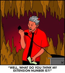
1317. Proof that dialing the wrong number can be ... well, hell.

I wonder how many solicitors he gets? Prob'ly not too many of them. Except, of course, the ones who are actually working for that dude.

[art] The Year of Stan, 32

1316. One question: are thier contracts done in dog years or people years?

And what would a text of a dog's butt be like ... never mind.

(Critiquity: sometimes less is a whole lot more. Without the phone simply resting in the yarpy-dog's legs, it's just a picture of two dogs. Subtly done)

01 February 2008

[art] The Year of Stan, 31

1315. Hey, Stan ... Frank Gehry called, he wants his style back.

As an aside, we send birthday props to Stan's wife Nicole, who must be some woman indeed to cause Stan to move away from the great Pacific Northwet. Good wishes to all.

[or_politik] You Can't Stop Jeff Merkley

1314. Merkley Web Spot:


We call caught our breath around here when we heard that Jeff was involved in an accident. From what I read in the article on it in The Big O Jeff's first concern was with his passengers then letting his wife know that he was alright before he did anything about himself.


And "Belly up­ – just like the Bush economy" ... priceless.


Via.


Tags: ,


Powered by Qumana


[design_tools] You Suck at Photoshop 5: Color Range

1313. Donnie Hoyle explains how we suck at Photoshop by showing us that if you're using the Magic Wand tool to select areas then you're missing out; there's a better way to do it, namely Color Range.


Wickedly funny. If YSAP Donnie isn't a character in a play, I'm hurting for him. Karma seems to work more or less instantly on him, and his life has a constant sound track of "Donnie ... Donnie ... Donnie ... DONNIE ... "


However, mad PS skills yo. I've used a couple of tips already.


Tags: , , ,


Powered by Qumana


[design] A Science Fiction Convention Ad

1312.  Herewith, the ad for OryCon 30 (21-23 Nov 2008) to run in the program book for NorWesCon:


 Clicky, as always, to embiggen. It developed that an ad was needed for NorWesCon's program book and it had to be delivered quickly. What to do when you have almost no time to come up with a concept?


Repurpose!


The original version of OryCon's website looked just like a sheet of paper from one of those old line-printers: alternating white and green stripes, and a Courier font. Now, I've harshed on Courier before; it's like Comic Sans and Times; overused because people go to deaults. But here is where you find the sweet spot of appropriate use and context, which, here, is to remember those salad days when everything was green, including computers.


I reasoned that the combination of Courier type and green-and-white stripes for the background were a great riff on the days when OryCon started ... 1978, with a one day symposium at what we then called the Northwest Service Center, that maginificent old building on NW Everett between 18th and 19th Avenues. Latterly, it's been called OryCon 0.


I appreciated the fine sense of whimsy and history I found there, so taking my cues from the look of it, I repurposed the look and the content, taking the marquee information and applying it thusly. The illustration was similarly borrowed. Once I had the content, I added the touch that really finished the look – the dashed lines and the black dots, which approximated the track feed very nicely, and the drop shadow, which really made the piece pop out and made it feel like a sheet of paper – or, at least, and image of one.


This is the primary function of the designer – problem solving – in quick action. And it was a thrill. And I got to do something for one of the best things in the world – OryCon – which has given me such pleasure over the years.


You folken reading this ought to support your local science fiction convention. OryCon 30 information can be found at the new page (complete with more cowbell) here. That $40 will buy you three solid days of real smart fun, peoples. We recommend!


Tags: , , ,