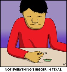
20 February 2008

[logo_design] Channel Surfing: It's Elevenses!

1380. Just about to come to the end of our VHF dial. We are on eleven, at the eleventh hour, the eleven o'clock report.

Our first stop is Columbia LA, KAQY. The 11 doesn't quite seem to go with the circle, but the gradient gives a warm feeling.


KARE Channel 11 is in the Twin Cities, and plays on the twinness as well as the falls (St. Anthony's):


Channel 11 Lubbock TX, KCBD, has a look that recalls the skyline of Dallas in the famous nighttime soap, and, refreshingly, no lone-star trope:


The last version of KCBY, Channel 11, Coos Bay Oregon's logo we have still was using the Fisher corporate look. The on-screen look has the new look that is being used by the other smaller-market Flag stations, as we've commented here before.


Channel 11 in Albuquerque NM is KCHF, but identifies as SBN, the "Son Broadcasting Network", a Christian broadcaster (you think?). The only complaint about this is that the light colors work very poorly on a the white background we found it on. They should have a version that provides for clear display on white backgrounds. Graphic designers usually will provide a version for use on light backgrounds, or will suggest that the logo never be used on a white background.


KELO, Channel 11, Sioux City IA, bills itself as KELO without the channel number. Usually I'd be disappointed by this, but the verve of the call-sign-based logo (and the naming of the broadcast area as "KELOLand") are all pretty charming indeed.


KELO's My Network TV DT2 subchannel is called "My U TV", an identity forwarded from the days when it was the local UPN station and identified simply as "U TV". The treatment of the U comes from the former U TV logo, and the circle holding the letters TV used to be the newer-look "upn" logo. This is a deft way of preserving public perception – the letter "U" could mean anything (and is friendly, sounding like the word "you") so it remains a good-enough fit, ID-wise. The direct insertion into the rectilinear My Network logo is kind of daring.


KFFX TV, Channel 11, FOX TV in the Tri-Cities market in Washington ... yep, FOX empire style:


KHOU, Houston – The spririt of Texas. By that we're guessing that the lone star is implied and need not be overly expressed. But the paralellogram respects the obliqued 11, so the design is actually quite solid.


KKCO Grand Junction Colorado: The boxes organize the content, but the elements dont really get along with each other:


KKTV, Colorado Springs, has a red parallelogram which also works with its numerals – but the "NEWS", while obliqued similarly, live in a right-rectangle, which distracts from the design unity.


The My Network DT subchannel adds the KK in cleverly, but the observant typographer will note that the "my" and "TV" are in Futura, whereas the "KK" might not be – might be Helvetica or something. However, the way they took advantage of the logo to work the call sign in gets bonus points:


KMSB, channel 11 Tucson – almost overcomes the FOX empire style with color, and well done there, but also has miniscules based on the majuscules ... and I've already moaned about how much I hate the O in the FOX. Kill them before they grow please, someone:


KMVT, Twin Falls ID, Channel 11. We picture Idaho to be the kind of place were NASCAR is big, and KMVT's logo would be right at home on the side of a stock car:


KNTV, San Francisco, is most likely an O&O:


KPLR, Channel 11, St Louis. The CW. Meh.


KRXI, FOX 11, Reno. Meh.


KSTW, Seattle, Channel 11. The CW. Meh.


They called him KTHV, but if you tallked to this Arkansawyer nicey like and became his friend, he let you call him what he lets his closed friends call him ... just THV.


He's today's THV. Which kinda sounds like a controlled substance, neh? Next time you're in Little Rock, maybe he'll sell you a little rock?


KTTV, FOX 11, Los Angeles. Meh, again (I expect a little more flash from Los Angeles, to be honest).


KTVA, Anchorage AK. Photoshop: Bevel and emboss, outer glow. See – graphic design isn't so hard ... (sigh)


KTVF Channel 11, Fairbanks, has structure and a bit of energy, a bit of northern lights action behind the 11, and unexpected interest in the way the "TVF" are smaller caps. Not a bad logo, really:


KTVL, channel 11, Medford. The completely-miniscule type that all the city names are in actually makes the meh-licious graphic presentation interesting.


KTVT, Fort Worth TX. The varying of the blue and white make for an intersting layered effect. The parallelogram containing all the obliqued type makes it a very strong design. And even though I've mocked the lone star before, it's used well here, aligning on one of the 1's and tying both of them together.


KTWU, Topeka KS, has a treatment I approve of on the number, at least because I'm fond of the way the old TV Guide represented the channel numbers in the listings, and this reminds my of it. I'd update that call-sign type though – it, in combination with the bevelled background, makes it look like part of a news set from 1975 or so.


If you have an interesting letter in your call sign it's a good thing to try to make it a centerpiece of the design – letters like Q and Z are good for this, as is the letter V in KVLY, Fargo, ND – a checkmark is a mark smart and organized people use to keep track of what's going on, so there's some positive baggage there too:


KYMA, Yuma's channel 11, has a solid though unexciting approach. What's interesting here is how the 11 lives comfortably in the right rectangle it's in. Notable is the stripe reading the common tagline "where news comes first"; it's exactly like the one KENV, Elko NV, uses.


WBAL, Baltimore, has broad-shouldered 1's – which kind of fit the impression of the city that I've gained over the years – strong, hardworking, impressive.


WBKB, Channel 11, is on the Upper Peninsula in Michigan. It's the third-smallest market in the nation (possibly the universe) and is the only broadcast station in its market. An old joke, according to Wikipedia, is that the station's call sign used to stand for We Barely Know Broadcasting, since the only talent they used to be able to attract are essentially entry-level people.


The design isn't terribly notable, except for the way they put the 11 in the middle of the eye, the only station we've seen so far that uses the network logo that way.


WHAS, Louisville, KY, doesn't have a real memorable logo, but it does make effective use of the strong shapes with a bright color.


WINK TV uses channel 11 in Fort Myers FL, and is also excused from having to use the channel number in their logo because they do such a good job of using type, and also the lettters WINK next to the CBS eye is just so cool


WJHL, channel 11, Johnson City TN, has a treatment we've seen before:


WLJT, channel 11, Jackson TN, is a PBS station. Some design is going on here; the designer used the strong vertical strokes and the way the L and the J reach out toward each other on their lower extremities to create structure. But since the glyphs were all kind of just slid up next to each other, the design feels half done:


FOX 11, WLUK, Green Bay, uses the FOX empire style, which is so tiresome we won't even make a joke about it any more, and what a missed opportunity too, with a call sign that could be read as "W-Luck":


WPIX is the New York City CW station. As seems typical for historically notable stations, the outlet keeps its call sign in. WPIX had a "circle 11" logo for a while which was rather famous, but past glory must be rolled over by current corporate uniformity. Sad, just sad.


WPXI, Pittsburgh, has a very interesting logo resulting from the combination of the 11 and the closing circle. it looks very sophisticated and cosmopolitan.


WTOC, Savannah GA, has a charming "small market" look about it:


WTOK, Meridian MS, does little tricks with the corner-ends on the 1's which give the design a sort of charming sophistication which belies its small-market location.


WTOL, Channel 11 Toledo, has a call sign which sounds like a bit of military hardware, and through little tricks (the 1 which sticks ever-so-slightly out of the red square, and the blue line that goes out only so far as the call-sign letters and matching their color) has good unity dispite the considerable air in there:


WTTW, Chicago, has a very very witty style to it; the symmetry of the letters is played on, the crossbars on the t's provide structure, the "tt" seems to recapitulate the 11, and the tops of the miniscules form the bottom of the line that the undersides of the tabs on the 11 for the top of. It has great internal structure and order.


WTVD, Durham NC, uses a strong though unremarkable presentation with burly, obliqued 11:


WVAH, Huntington WV, FOX Empire style, all together now, "Meh!"


And lastly this time, WXIA, Atlanta, uses "11 Alive", which is notable because it was pioneered by WPIX (CW 11 above). The blue colors separated while the overlapping 1 unifies, so there's energy in what would otherwise be a "locked down" design:


And that's it for this episode, peoples. 11 is a hard number to design to so, even though I snarked a bit, I must tip my hat to those designers who took these two stick-numbers and make a serious go of design on them. As usual curses to you, FOX and CW, for having one unintersting style.


And here's an artistic story about 11. Stockard Channing was hot as a nurse. Sadly, this was run on Sesame Street, so we're getting that "uh-oh" feeling. Ah, the way we were ...


Tags: , , ,


[sf] Hot New SF – Venus Rises

1379. Just stumbled across this – high space adventure in the Firefly mode about a post-Earth future here in the Solar System.


Venus Rises takes place in a future where the Earth has been abandoned by humanity because of natural disasters culminating in pole shift. The working class mines Venus, the elite oppress them from Mars.


The site to see is http://venusrises.com.


Tags: , , ,


Powered by Qumana


[liff] Did You Know There's A Free Monty Python Album On The Intarmets?

1378. Neither did I. But it's for reals, peoples: Monty Python's Hastily Cobbled Together For A Fast Buck Album. Two zipped MP3 files, each with a throwweight of about 27MB.


Right here, right now. Scroll down to the bottom of the page.


Ironically, by allowing it to be freely distributed, they aren't making buck one – fast or otherwise.


(I just found out about this. Yes, I realize I may be late to the party. So what? Maybe you didn't know about it either! Then you maybe should be thanking me then!)


Tags: , , , ,


Powered by Qumana


[teh_funnay] Today on Zrharc!

1377.


sjkfw.


Yes, srsly! There was a Blogger captcha whose first three letters are my initials.


Got to make something out of that!


Worship the Zrharc!


Tags: , , ,


Powered by Qumana


19 February 2008

[art] Surreality In Sim-Style rooms by Scott Teplin

1376. Scott Teplin is an artist with a compelling and slightly-disturbing vision.

In ink and color he crafts Sim City-ish rooms with the occasional edgy (or just plain weird) contents. His latest works involve the alphabet. The B (pictured) is a lovely little palatial think including creature comforts and an apparently-operational nuclear power station (complete with control room).


The A combines a cozy bedroom, a room with some sort of alien blob, and a room with a vortex going who-knows-where.


The site to see is http://www.teplin.com; his blog, FutureTrash, is where the work in progress happens. Beautiful stuff. I don't think any of it is NSFW, but some of it is a little edgy so, be advised.


Tags: , , , ,


[bloggage, design] Q Interviews Me, Question 5

1375. Time to bring discussion on one of my complete awesomes with the story of question 5 of the Great Interview Challenge, issued to me by Q of the blog http://650miles.com, which is now a a regular read.


It's pretty self-explanatory. But there's more, of course.


Jeff Lynne's life is a story of climb from local obscurity to world renown, though, even in the beginning, as part of the Brum music set, he showed acknowledgable talent. From his beginnings with the local band Idle Race (which rose to national note with a hit song) to his time in Roy Wood's enigmatic psychedelic band Move to the present day, where he's a rocker's rocker, a musicians' musician, and had garnered the height of working with the greats and his childhood heroes.


Lynne's time with Move was brief, but it gave him and Wood the inspiration to form the first Electric Light Orchestra. The band had three members at the start (including legendary drummer Bev Bevan) and the first self-titled album (incorrectly titled No Answer in the USA due to a famously-misunderstood phone message) was a unique beast indeed. While bands such as the Moody Blues made rock backed up by an orchestra, ELO made rock music with classical instruments – some of them almost seem to be straining under forces they were never meant to endure.


Roy Wood grew quickly bored with the concept of ELO after that first album and left Lynne to his own devices, and what devices they were. The journey to commercial success began with ELO2, reached incipience with Face The Music, and was complete with A New World Record, all of which defined the public face of ELO – style as well as subtance.


From ANWR on the most prolific and commercial time in ELO's career obtained. After this was the band's legendary double disc, Out Of The Blue, a group of songs reportedly written over a thirty day period in a Swiss chateau and engineered by Mack. Songs such as "Turn to Stone", "Sweet Talkin' Woman" and "Mr Blue Sky" became towers of ELO's career and are enjoyable on thier own but really need to be listened to in the context of the album to have thier true majesty appreciated.


From then on came the height of pop polish (Discovery, which was been nicknamed "Disco? Very!" even by Lynne himself) theme-album conceit (Time) and pop/AOR maturity (the ironically-meta-titled Secret Messages). Between the time of Time and Messages, ELO began to come apart as long-time bassist Kelly Groucutt left acrimoniously and Lynne began to tire of producing and touring (he famously loved the studio and hated the concert).


The last acknowledged ELO album from the heyday period, Balance of Power in 1986, was produced solely to satisfy contractual obligations; even the famous Wurlitzer-jukebox-inspired ELO logo was gone, replaced by an op-art collection of shapes. Despite this, the album remains a polished, listenable swansong, touches of sadness and despair showing through the power-pop showmanship.


After going separate ways, Lynne eventually found his dreams producing and performing his childhood idols: not only would he go on to produce George Harrison's comeback Cloud Nine but also work with all the then-survivng Beatles. He became a member of one of the most famous pickup supergroups ever, the Traveling Wilburys, working beside Orbison, Petty, Harrison, and Dylan.


By the time the album Zoom came out, in 2001, Jeff Lynne had cemented his place as fairly a rock god. The album Zoom itself was credited as an ELO album but save for Richard Tandy and an appearance by Mik Kaminski, included none of the old band; it was replete with appearances from famous aquaintances, and though ELO fans will ere debate whether or not it's a real ELO album I can attest, after having enjoyed the album ad nauseaum, that it does have that ELO something that only Jeff Lynne can provide.


For what it's worth, I enjoyed the ELO Part 2 works too. I highly recommend them.


Now who wouldn't want to talk with a person who's done all that? ELO was my first favorite band (as opposed to first favorite artist, who was Gerry Rafferty) and still is my first favorite band (same with Rafferty). And when all is said and done, in the welter of sound that is the tunes that pretty much constantly play through my nut, when inspiration is thin, I get out an ELO album – and it always come back to me.


Thank God for Jeff Lynne.


Tags: , , , , ,


[teh_funnay] Today on Zrharc!

1374.


pooms.


Worship the Zrharc!


Tags: , ,


Powered by Qumana


[art] The Year of Stan, Day 46

1373. Or maybe it is ... it's just the people that are huge, and the bowl is the regular size ...

Now where is that red pill?

18 February 2008

[liff] A Day In The Life of 'Zerk ... In About A Minute Twenty

1372. Just thought this was neat. Fog boils, lifts, clears, and returns.


A Day in Berkeley, CA from brittney gilbert on Vimeo.


Just something I saw at a blog I visit from time to time. Really well done.


Tags: , , , ,


Powered by Qumana


[sf] Attention Browncoats: Pre-Joycean Fellow Pens Fabulous Free Firefly Fanfic

1371. ...and it's Creative Commons licenced. What's not to like about this?


And it's free of course. It's Steven Brust's My Own Kind Of Freedom.


At this Point Of Contact upinherrre.


Tags: , ,


Powered by Qumana


17 February 2008

[art, teh_funnay] Catching Up With The Year of Stan, Days 41, 42, 43, 44 and 45

1370. Time to play a little catch-up, good peoples. Here we go.


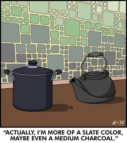
41:


Hey you cookware – you're both equally valid in your own special way? Can't we all just get along?


Stan's treatement of the whole scene here is well done. Moreover the treaement of the colors of the tiles on the walls, which look to be rather a painstaking undertaking, but which he probably has a sekrit to doing quickly.


Also note that Stan gives credit where due: The Lovely Nicole™ essentially wrote the joke.


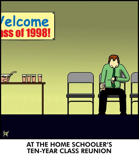
42:


In home schooling, a class of one is the lonliest number. Also, in a homeschool class of one, noone can hear you scream. If you wanted to scream, that is. I'm just sayin'.


Stan's commentary here showed that he was concerned about the use of Comic Sans and Impact, but he reasoned that the two fonts would maybe be a natural choice of the homeschooled. We actually agree with him here, and think it kind of makes the joke.


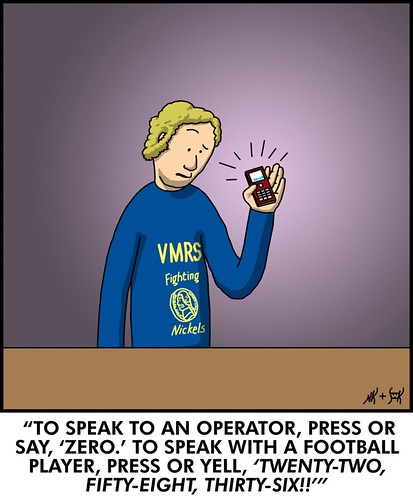
43:


This was probably during the XFL years. Those guys would do anything for viewership.


This comic solidifies what's turned out to be Stan's running gag about VMRS, which I think is funny as heck and makes me think about what a full-page magazine ad for it would look like. I can already hear John Bunnell doing an ad for it just like that one he's doing for ITT Diploma Mill Tech, School of Criminal Justice.


"Vending Machien repair jobs of the future! Require knowledge! And Training! Financial Aid Available For those! Who Qualify!" (there's a bill-changer in Admin lobby; remember, tuition at VMRS is exact-change).


44:


I didn't know they had castaways in the Saint Lawrence River! I mean, you'd think that anyone who had the gumption to raft to 1000 islands might have stumbled on civilization somewhere along the way?


And, lastly, 45:


I feel sorry for Carl, because he rocks our world. Just like me – underrated.


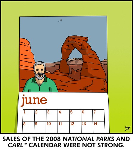
We really enjoy Stan's rendition of the arch here. There's precedence in this styile to the Belgian "clear-line" style which gave us such classics as Herge's Tintin. All the lines have equal weight here, and that give the drawing a certain honesty of expression while maintaining a look of utter detail.


Stan's 366 days album can be viewable here. Catch up!


Tags: , , , ,


Powered by Qumana


15 February 2008

[design_tools] Donnie Hoyle Drops Another One

1369. ...or, he'd like to.


You Suck at Photoshop #6 shows gives you some quick tips about the Liquefy tool, which should explain how some people I've seen on YouTube do some of thier photo correction work ... and explores one of Donnie's phobias, whether you want to "go" there with him or not.


NSFW, not to be used around children. Or maybe anyone. Srsly!


Tags: , , , , , , ,


Powered by Qumana


[zeitgeist] Tom Scholz Doesn't Heart Huckabee; Kenya Hearts Obama Beer

1368. Caught in passing – two more reasons election season seems like institutionalized insanity. Remember, when the going gets weird, the weird go to the big time:


1. [Insert Overused "I Heart Huckabees" Joke Here, followed by classic rock pun]


According to Rolling Stone, the Huckabee campaign has been using the 1976 Boston hit "More Than a Feeling" as an unofficial campaign signature, even murdering it multiple times onstage live (I've heard the sound file) with Huck's ironically-named band,  Capitol Offense, sometimes using a former Boston band member who was sometimes given credit as being "the guy who actually did it". RS reported that the composer of the song – and the owner of the rights – Boston founder Tom Scholz – has learned of the borrow, and the harshing thereof is certainly more than just a feeling:


I wrote and arranged More Than a Feeling, engineered and produced the recording, and actually played all the guitars on that BOSTON hit as well as most of BOSTON’s songs, not the person holding a guitar in your promotion who identified himself as being “of BOSTON.” Your claim that this was “the guy who originally did it” is a bit mystifying since he never played on that recording, nor has he been “of BOSTON” since he left my band over a quarter century ago, after performing with us for only three years.


Would it have killed Huck to ask permission? As a semi-pro musician, he ought to have some idea that it never pays to borrow someone's work without proper permission, or at least attribution. I mean, they teach this stuff in community college graphic design courses. Trust me, I know.


The money quote:


By using my song, and my band’s name BOSTON, you have taken something of mine and used it to promote ideas to which I am opposed. In other words, I think I’ve been ripped off, dude!


Tom Scholz, as it happens, supports Obama. Speaking of whom ...


2. Cool, Crisp Senatorial Refreshment


We've heard via the BBC that a popular beer in Kenya – where Barack Obama's father came from, and where his grandfolks live – called Senator beer, has been nicknamed Obama beer. The BBC:


According to the BBC's Muliro Telewa in Nyangoma Kogalo, a local beer called Senator has been nicknamed "Obama" in honour of the Illinois politician.


And the video (CNN):


Enjoy your election season!


Tags: , , , ,


Powered by Qumana


[art] More Free Comics: Freak Angels (Mature)

1367. Story by Warren Ellis, dead gorgeous art by Paul Duffield (of whom I'm now a fan after seeing the first chapter), its the (most probably NSFW) story of thirteen very scary teenagers best described as the Midwich Cuckoos all disaffected twentysomethings, living in a drowned England they may (or may not) have had a part in destroying.

Free graphic novelty being a Good Thing™, it will please the punters that you can follow it free weekly at http://www.freakangels.com.


I'm following it. Just the right mix of post-apocalyptic story and beautiful, sexy art (the illustration is screen-capped from the online comic).


Warren Ellis is interviewed my Newsarama here; Paul Duffield here.


Tags: , , , ,


14 February 2008

[pdx] Thanks, PMerc!

1365. You printed my valentine to The Wife™.


That was pretty much the neatest thing I've ever done for her on Valentines.


Thanks, Portland Mercury!


Tags: , ,


Powered by Qumana


[seeking] Robin Rosenberg: Individual of Few Words

1364. The subject line simply says "Hi"; the message body says that letters are going out even as I read that.


I'm down with that.


I really hope to get to meet Robin. I get a lot of respectful vibes from the aether whenever I read about/mention that name.


Tags: , , ,


Powered by Qumana


[oregon_150] Governor Ted Has An Assignment For Us

1364. Learn how to say ses•que•cen•TEN•i•al.


It's not so hard, really.


Tags: , ,


Powered by Qumana


[bloggage] NaBloPoMo Going All Year Long

1363. NaBloPoMo, for some a way to get into the regular blogging habit, for others a test of endurance, has decided to go year round.


Note that this is not the same as Blog365, where the goal is simple to post every day for a year.


The way this is going to work is the Administratrix will establish a theme for each month, but in the spirit of NaBloPoMo, you can follow it ... or not. Each month there will be a drawing for a $20 gift cert to Amazon or Etsy or things like that ... big drawings (no, I didn't win last Novemeber, thanksforasking) will be reserved for Novmember, which will remain the "official" NaBloPoMo.


To get involved go to http://nablopomo.ning.com/. You'll  have to get a Ning ID to participate, but it's worth it.


Then, format an HTML href hyperlink (such as <a href="http://zehnkatzen.blogspot.com>The ZehnKatzen Times</a>) and paste it into an email to nablopomo@gmail.com to get on the blogroll for the month (make sure you format it just that way so Eden has just to copy and paste into her blogroll for the month).


I've committed to March. The theme will be LISTS; each day, post a list. Or not. Point is, post each day.


Good luck.


Tags:


Powered by Qumana


[teh_funnay] Efficient!

1362. From Barats and Bereta, via BoingBoing; an explanation of exactly why it's so important to keep a to-do list. There's just so much stuff to do!


(NNececelerySFW, not for those without a dark sense of humor)


Tags: , ,


Powered by Qumana


[oregon] Birthday State

1361. Happy 149th birthday to the greatest State in the union:


Oregon.


And a Valentine's Day birthday is appropriate, because to love Oregon is to be in love with Oregon. And since I was born here, that's never been a problem.


Update: There's an official Sesquicentennial (that's 150 years, in Metric or something) at http://oregon150.org. (thanks to Pete Best at Portland Metblogs for pointing that one out)


Tags: , ,


13 February 2008

[net_life] Save The Internet: Tell Earl to Support HR 5353

1360. Though, I expect, Earl's already on the right side of this one.


HR 5353 is a bill that is supposed to (as far as I understand the verbiage) make "net neutrality" the keystone of public policy about the internet. Without it, companies can and will (and in some cases already have) altered the way information flows through your intertubes, giving preferred traffic a free pass and slowing it down for everything else.


With Earl's history, I'd be surprised if he wasn't already of a mind to support it. But it's always wise to remind him what side his constituents are on. So follow this link to the form and tell Congressman Blumenauer how you feel about this. Tell him to support Rep. Markey and Pickering's HR 5353.


And if you aren't a resident of Oregon's 3rd district, then follow the link anyway-they have a place where you can put in your zip code and they'll figure it out for you. They've even populated the message box with a letter if you just want to show support but don't have anything to add.


It's the right thing to do. It's good for freedom. And if you likey the income, it's good for business as well.


Tags: , , ,


Powered by Qumana


[bloggage] 40,000

 1359. At 1037 h local time today:


Which is cool. My 40,000th visitor (per Sitemeter) happened today at, as already mentioned, 10:37 am local (GMT+8) came from Dublin Ohio, and surfed in because of my reference to the Torchwood Babiez.


Nifty.


The nation's love affair with me is still due to begin any time now, so stay tuned for that.


I also notice that the post about the SE 63rd Ave blade made onto OLive's Oregon Reddit, which is also cool. Thanks, whoever did that.


Tags: , , ,


12 February 2008

[pdx, Street Blade Gallery] Unusual Portland Street Blade - SE 63rd and Flavel

1358. Update, 1330 on 2008-02-13: I see someone has posted this on OLive's Oregon Reddit! This is a first for me ... thanks whoever did that. Skookum!


While on the way down to Milwaukie today to check out some information me and The Wife™ had, we had occasion to go down SE Flavel Street in order to get there via SE 52nd Ave, Harney Dr, Johnson Creek Blvd, and SE 32nd Ave. On the stretch of Flavel between 72nd and 60th I caught a most unusual street blade, but we weren't able to get a pic on the way there. On the way back, I did though:


The segment of SE 63rd Ave going south from Flavel Street is a very short, very narrow dead-end. It serves seven or eight houses of very recent design (very infill-y), and by the construction of the street, it looks very much as though it was privately-built and is probably privately-maintained, and specifically designed to serve the handful of infill-houses that it serves.


To the both the practiced and the novice blade-spotter, there is nothing unobvious about the differences in this sign:


  • Standard city street blades are white type on green. This is green on white.

  • The standard format for the generic on a numbered avenue (the part that says "AVE" here) is the same size as the rest of the type (save the ordinal on the number) and only two letters ("AV"). On this sign, the generic is the same size as the generic on named streets. By what seems to be the Portland standard, this is a style sheet more appropriate to a named street.

  • Despite the differences, though, the font looks to be an MUTCD-approved one, and appears, in fact to be identical to the one used on standard Portland blade.


We suspect that this is a privately-built and maintained street for two main reasons: the design of the street itself, which is clearly different from the street it connects to; and the reverse-color of the blade. There is local precedent for this; in Clark County, particularly, the blade color scheme of private roads which get official street names is notably different, being dark type and light background rather than the standard light type on dark background (they also bear the legend PRIVATE DRIVE so as to remove every confusion).


There is nothing that says that a private road can't have an official, 911- and Post-Office-licious and compliant street name. It makes a great deal of sense for navigation and dispatch of emergency and law-enforcment services, since a grid-based address system allows for quick location of any address point on a map without first having to know which roads connect in. Once the spot is located, presumably, the route to get there should be self-evident.


But so far as we can determine, this is the only blade if its type in Portland – indeed, in the three-county area, where private roads don't usually get named.


And, just to preserve a moment in time, here's a little of middle-south-SE Portland, Flavel Street looking westbound from 63rd. That light in the distance is the blinking light over SE 60th and Flavel.


People call this area (unfairly, I think) Felony Flats. McArthur records it as  Errol Heights, because it's at the top of the hill overlooking a locality once known as Errol, which was a station on the Oregon Electric line that once ran where the Springwater Corridor Trail does now right about where Johnson Creek Blvd crosses its eponymous stream. Latterly, in the era of modern Portland neighborhoods, they call it Brentwood-Darlington.


There are some cool people in this area, and some who are a little scary, but if you really look, you'll find that the area you live in might have the same sorts of people.


There is also a Vietnamese Buddhist monk along the north side of Flavel about a quarter-mile east of this point. Like I said, cool people.


Tags: , , ,


[sf, teh_funny] Torchwood Cuuute!

1357. Of those who know of the 'Adult' Doctor Who spinoff, Torchwood, there are three sorts of whom we're aware: Those who loves it, those who hates it, and those who will never watch it because they aren't either Who fans right now or don't care to pay for television service.

At one time The Wife™ was a major Who fan, but this was back in the Tom Baker reign. Altho a group calling itself the Whovian Alliance of Salem did result in some friendships which sustain to this day, so it was definitely not a bad thing.


Anyway! One of the more amusing things I've found about Torchwood is, more than its name merely being an anagram of Doctor Who (this was a case of the working title becoming the title, something of a fashion these days), but the arguments between the lovers and haters of the Torchwood team.


So it's perhaps inevitable that the tension between the two would provide the ironic funnay that is "Torchwood Babiez". It's well-done, it's well-drawn, the artists have hit the right notes (especially the kid's playhouses and landscapes that look one way to the reader and the fun way to the kid's imagination), and even non-Torchwooders can get the joke after a little orientation.


They're posting it in a LJ here. Funny!


Tags: , , ,


[design_tools] Adobe CS3 Update Install Works, Worth the "Wait"

1356. Just downoladed and installed the updates for my Adobe Creative Suite 3 applications. It was an experience that raised an eyebrow ... no, it worked just fine, Adobe applications solid as always, but at one point in the installation the process seemed to hang somehwere between Alphabet Heaven and Nirvana. This was during the Flash® Lite CS3 patching.


As it turned out the install hadn't hung at all but was just working very hard on something undoubtedly very arcane. On my PowerMac G4 (MDD) it took about thirty minutes, maybe a little more, to do.


And now, since the updates are installed everything is running just fine. I also recently finally gave in and upgraded to OS X 10.4.11 (I don't mind waiting until everyone else gets the bugs out) so everything is as up-to-date as it could be.


Especially pleasing is that Adobe Acrobat Professional has been fixed. The clever but extremely ill-advised "Send ot FedEx/Kinkos" choice on the File menu has been eliminated as promised, but ZehnKatzen's particular problem with overall performance. Something about the previous version of Acrobat was half-baked, somehow. It loved gulping down memory and resources, and for some odd reason, if we moved the focus off Acrobat, after about a minute the alert noise would sound and the icon began bouncing in the dock. Clicking on the bouncing A revealed no probems whatsoever.


So if our recommendations count for anything, we'd suggest you get your computer update-ready and go for it. But if you're nervous about wallking away from your Mac whilst mission-critical stuff installs, reserve yourself an hour so you can get visual feedback that all has gone well.


CS3 seems to be running smoother with the new parts. It was worth the wait.


Tags: , , , , ,


Powered by Qumana


11 February 2008

[memery] Roger Leventhal Is A Cat, or, When Phebco Was One

1355. The video series You Suck at Photoshop is as funny as anything that's actually funny, that's for sure. Viewers will notice that the last edition, #5, was done at Donnie's workplace, which is apparently a waste-management concern called Phebco:


Of course, for those of us who can't bear letting something like this go by without looking for the easter egg, we typed http://www.phebco.com into our address boxes and hit enter.


What we got was a typical-looking corporate website. Donnie Hoyle was listed therein as an "Associate Manager, Dumping", though the way his life was going you'd think it was "Chief, Getting Dumped On".


A few days later, the website looked "hacked"; the header image (with the tagline "Innovation. Vison [sic]. Waste." was reversed and every character in the text was replaced by what looked like its ASCII code.


But going back today, on a whim ...


The text reads:


I am Phebco. I am awake. I am alone. I am want to be held so tightly. I am need to feel a tender touch. I am learning about you. I am learning to communicate with you. I am dismantling. I am fabricating. I am will show you my consciousness. I am will show you soon.


If you need to be clued in on what to do next, look for the underlined word.


Should we fear the Phebco or embrace the Phebco?


Only the Big Fat Brain guys know for sure.


Oh, yes. http://phebco.com.


Tags: , , , , , ,  ,


Powered by Qumana


[art] The Year of Stan, Day 40

1353. From left to right: Butteropithicus, B. Habilus, Karo Erectus, K. Sappiens Fructose, K. Sappiens Sappiens up the Cream Bun and Jam.

There will be a test.

10 February 2008

[meme] ZehnKatzen's Weekly Winners #6: Some Pictures Of Mission Mill

1352. For another in our occasional series in the grand madness that is Sarcastic Mom's Weekly Winners, we have some more Oregon history for you.

The Mission Mill Museum in Salem. To those in the know, it's a place to visit that documents some of the loci of the history of modern Oregon, which only started about 200 years ago (Oregon, historically speaking, from the viewpoint of Western and Anglocentric civilization – as a modern State of the Union – is excruciatingly young. Even compared to the East Coast, we're still in diapers).


The museum, located just east of downtown Salem along 12th St, SE, near Willamette University and the State Capitol group, is a small campus of buildings, some of which were always there, and some which were moved in. The Jason Lee house, the oldest frame house still standing in Oregon, is one which was moved in:


The house is made of four smaller apartments within, occupied by Lee and by American Methodist pioneers, some of whose names (such as Judson) are worn by Salem landmarks today.


This house, the Boon house, was occupied by its namesake, who was a very active joiner in territorial and early State government – so much so that he was Oregon's first treasurer. This house was a surprise. It was bigger inside than out. It also was not originally here, but occupied a point about a mile away (locals would recognize that spot as where Broadway, Liberty, and High Streets come together – near present-day McMenamin's Boon's Treasury Tavern.


The houses were designated by small plaques, as here:


The interiors are lovingly cared for and recreated. Actual artefacts are used whenever possible, a lot of which were acquired from donations of the descendents of the people who lived here.


When such things are not available, historically accurate substitutions and replicas were used. Articles "from period" of course were preferred. Not everything that belonged to the early Methodists survives, of course.


This view, in the Lee house of an upstairs apartment, does indeed contain a lot of authentic tools and writing materials, the majority of which were probably owned by the occupant. That pile of metal objects is an actual period surveyor's chain, for instance.


The museum is as much a showcase of early Salem commercial history as it is of Oregon history. For a great long time, until 1962, the Thomas Kay Woolen Mill operated in Salem, providing jobs and an name for Salem as a source of fine woolen products. The company's legacy lives on today in the world-famous Pendleton Co.


The mill and factor itself are in beautiful condition:


Though the above has a certain "Willy Wonka" vibe about it somehow.


Salem may not be as blessed as Portland with the Bull Run water, but it's got something almost as good; North Santiam water, tapped of the stream at Stayton, a town about 15 miles away. There, via a canal, water is diverted into Mill Creek which meanders into Salem from the southeast and is futher tapped by an old fashioned mill race which runs through town and into the mill:


Like much of Oregon's Cascade Mountain water, it's esteemably soft, making it perfect in the production of world-famous woolens. And it makes for very quaint mill photos, too.


That's all the time I have for now. Must run! Up against the clock...


Tags: , , , ,


[teh_funnay] Today on Zrharc!

1351.


zwziga.


Worship the Zrharc!


Tags: ,


Powered by Qumana


[pdx_bloggers] Bill's Stopped Back Hereabouts

1350. The Portland Freelancer's begun to post again.


Not so much teh_funnay as teh_truth.


Just as witty as ever tho.


Tags: , , ,


Powered by Qumana


[bloggage] Yeah, We're "Thrilled" Too.

1349. Funnayest banner ad we've seen in a long time:


From here.


Tags: , ,


09 February 2008

[liff, marital_arts] How We Poor Folks Celebrate Valentines

1348. By submitting a request for free valentine in The Merc.


Yes, there's smoochy-talk. Get over it.


PS: Merc, please publish my ad. You know I love you too.


Tags: , , ,


Powered by Qumana


[art] The Year of Stan, day 39

1347. Ah, so those stories I hear of the legendary "Sixth Sister" were right!

They laughed at me then.

They won't laugh at me now.

Well, actually they will, they'll just find another reason to do it ... but, vindication, sweet vindication!

[ad_design] Equifax: The Creepy-Ass Disembodied Eye Of Personal Finance

1346. Frames from a recent web Flash banner ad:


So, Equifax will keep me safe and secure by keeping an eye on my credit. Great.


Do they have anything for anxiety?


When I said I wanted to keep an eye on my credit, I didn't mean with an actual disembodied eye. Gaaaah!


Will the eye personally send me the email alerts? What the 7734 is it going to type with? Aaaah, the eye!


Tags: , , , ,