An imporant designers' resource has launched, and I'm pleased as hell to say I have had something to do with it.
Say hello to Designorati.

This is a site for designers by designers-and for people who like design and designers. It aims to inspire and inform as well as just be a good time for all.
Designorati embraces a range of topics right now: Graphic Design in general, Desktop Publishing (tho' I prefer the term layout artistry), In-House designing, Illustration, and my two specialities right now, Cartography and Typography.
Any design-oriented or arcane matters about maps will happen at D:Cartography, for which I invite what readers I have to visit from time to time. Local Address Nerdery will still happen here (soon, I promise, I promise!). I certainly haven't forgotten my first true love!
I'm telling you: this is gonna be big. Watch Designorati.
Extreme Makeover: Quark® Edition
 A topic of commentary from time to time is the ongoing fortunes of Denver-based software engineer Quark, Incorporated (and for which, incidentally, what the other site I write for, QuarkVSInDesign.com, is a central theme).
Here's a quick recap, since I haven't mentioned anything about it lately. Almost everyone is familiar with MS Word and MS Publisher. Club newsletters and small-circ periodicals couldn't exist without them (which, I'm sure, is to Microsoft's delight). MS Publisher, to be specific, is what we call an layout editor, which is much more than a word-processor: it allows the user to arrange, handle, and style text, graphics and pictures in ways a word process just cannot do.
The market was pioneered by Aldus Corporation who, when the Mac was introduced, came out with Pagemaker (now an Adobe product). Pagemaker was supreme until Quark's layout app, XPress (now just referred to as Quark and usually in print as QuarkXPress) lapped PM in the high-end typography department. This was about 1989 or 1990. Quark has been king of the hill ever since, and became peforce complacent, releasing updates to the app when they more or less felt like it. XPress 4 debued in about 1996 and the app stayed there until 2001. Meantime, Adobe, which dominated digital design in almost all other sectors, wanted a page layout app to complete the crown. They had Pagemaker from the aquisition that extincted Aldus, but the code base was old and couldn't be expanded anymore. Even a versioning up to PM V7 didn't provide what it took to compete.
However! A team of refugees from Aldus had already started work on the successor to Pagemaker. Adobe salvaged them and thier work and began on Adobe's challenger to Quark; a program to be called "InDesign". The design press, noting Quark's fat, happy, and unconcerned status, smelled blood in the water and termed it the "Quark Killer"; in the meantime, Quark's customer service and responsiveness had become legend in the industry for aloofness and poor quality. People were ready to jump.
The first version of InDesign, 1.0, raised eyebrows but was hardly ready for prime time. Quark could still feel secure. This was about 1998 or 1999. When InDesign 2.0 came out about 18 months later, it really started to get notice; it still wasn't the Quark Killer but it was much improved. People started to convert over, but it still wasnt the David to Quark's Goliath. It was much improved, in all, and people started looking to InDesign 3 to finally challenge Quark.
InDesign 3 debute as part of a new Adobe constellation-the Creative Suite, comprised of InDesign 3, Photoshop 8, and Illustrator 11-but the nomenclature was now to affix CS to all apps (InDesign CS instead of InDesign 3). Judging by the press, InDesign CS means the Quark Killer had arrived. People started to switch; more service bureaux began accepting .indd files.
During this time, Quark upgraded to Version 5 (typically regarded as feature-poor and somewhat buggy) and finally came into the OS X world with QuarkXPress 6. With additions such as the QuarkVista XTension (image editing within XPress) and PSD Import (finally allowing Quark users to import Photoshop docs without having to have Photoshop to convert them to TIFFs or EPSs) gave an impression that Quark was on the case and acknowledging the InDesign insurgency. Reaction seemed largely mixed. It was now a race for feature parity, and despite Quark's lead in installed user base, conventional wisdom seemed to acknowledge that InDesign now led.
And then Adobe released Creative Suite 2, and with the Bridge (GUI front end connecting all programs), Snippets (XML objects that can be drug and dropped at will) and Adobe Stock Photos, amongst others, Adobe has not only arrived in layout, it's making inroads.
Figures are hard to come by, but the feedback and comments I see in designer's fora indicate that people are talking. And switching.
I told you all that to tell you this:
Quark has since acknowledged it has a contender and has started to answer. They have slowly been releasing what Quark 7 ought to look like-more customizable, more open-source, "job jackets", such as that. Visit Quark.com and the site for XRay Magazine to find out what they have in store.
They still had the same graphical approach that they've had since the mid-90's, however. And, in terms of design, and especially with Quark's baggage, that's an eternity.
So, on 9 September, they completely redid themselves. Now a Pantone 368-green highly stylized Q and fresh graphic treatmen adorn the whole site, from one end to the the other. Quark had big guns on the case, from a unit of the august Young and Rubicam, to Pantone color goddess Leatrice Wiseman. Even Pantone itself is playing along, dubbing Pantone 368 "Quark Green".
It created buzz. Designers paid attention. And opinion on Quark is still mixed, so the buzz was mixed too. But it did get attention.
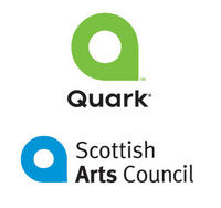
 Then the Scottish Arts Council happened. Jeff Fisher, of Jeff Fisher LogoMotives (and one of my personal heroes), posted a simple message to the Yahoo! Graphic Deisgners Resource Group: "This is interesting..." and a link to Quark, and the link to the Scottish Arts Council. Similar. Damn similar.
And the buzz continues. It's not all family friendly, such is the reputation of Quark. With them winding up to pitch QuarkXPress 7, which is seen by many as a make or break proposition-make it and Quark continues to stay major, break it and Quark stands to become the new Pagemaker-this big-gun rebranding and major image remodeling could become at least a minor embarrassment. And Quark really doesn't need things that look like missteps. They have lost a lot of goodwill in the design universe over the past few years, and Adobe has been making hay while the sun shines on it.
Quark continues to try to get out of the bed it made for itself to lie in, and it's too early to count it out. This will continue to merit watching.

1 comment:
I like it! I haven't looked at every last page (I've only sampled it) but I really like it. I'm adjective challenged, otherwise, I'd say more. :)
Post a Comment