
The developement of the Cherriots System Map continues apace. To see what I've got going so far, I'm putting some of the individual toys I've been playing with together to get some sort of idea of what direction I'm going in. So, making sure that all the basic route alignments are in place, I turn on the layer with the route number icons, nudge all those into position where I want them, and here's what I have:
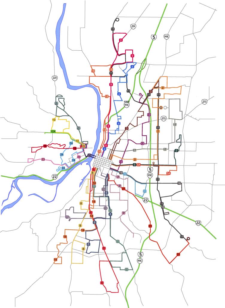
Click on the map to see it bigly. There's not much to say about the changes themselves that I've already said, but I do think I'm not being presumptuous to say that the polish of the map has much improved. There was a cöordinated strategy of improving readability and informational content that is starting to pay off. I'm so far rather pleased with the improvement work thus done.
To give an even clearer idea of how far I've brought the design, let's do a little side-by-side, before and after, hot map-on-map action:

The downtown area looks a whole lot better: I was bothered by the disorganized feel of the original. I simply like the look of the new route numbers. The street labels are still not there, but we'll be moving on to that very soon now. The river's route through the map adds both interest and information in a two-for-one deal. And, not least, the insistence of accuracy adds a certain perception of attention to detail that comes through to the viewer.
Next, what I've all been waiting for: typography.
2 comments:
If I may make a suggestion, you might want to do something slightly different with the I-5/99E/22 lines. They help make it more useful as a general-purpose map, but to my eye they look like bus routes at first glance. I suppose it's because they are the only thing besides routes that are in color. (Well, okay... the river is in color too. But it looks very different from a bus route.) Maybe change the green line on those to a grey line, retaining the black border? Not sure.
Alan:
Your point was very well taken. I already got a look at it a few hours ago when I was in a place I couldn't respond so I was able to turn it over in my mind and I see what you're getting at.
Having the expressways/freeways in color could take them, visually speaking, out of the class of the supporting road network and nudge them toward that of the route symbols. Your proposed solution is a doable one, and I'll implement that and see how it looks and then post that for all to see.
Don't worry if it doesn't show up right away; I'm working like a cartoonist on this one, in particular, I'm a few versions ahead of the point I'm actually displaying. Fortunatel Adobe Version Cue makes it relatively simple to go back to an earlier version and make a change or change it on the current version and save what I was already doing as a former version.
Post a Comment