The machine that hosts pixs for this blog, photo1.blogger.com, seems to have been abducted by aliens. Any button or graphic that emanates from there has, for the nonce, been replaced by a corresponding black void.
Until they come back, I have two rough-n-ready email contact links in the sidebar.
Update: This looks systemic: Regular reads that use Blogger to host thier images (such as regular read Loaded Orygun) seem to be missing images too.

By Samuel John Klein of Portland, Oregon - Graphic Designer without Portfolio, aspiring artist who dawdled too long.
24 June 2006


[design, advertising] Actually, iThinkistilldo
 The iPod. Isn't it a cultural force? You bet. Do I still want one? Definitely. Is the world an unjust place because I don't have one? That's prima facie correct. That said, is it still on my wish list? Of course.
America is a land of people who like being different, but frequently one suspects that Being Different™ for the masses comes with an EULA that states that you can be as different as you want, but just as long as you're different just like everbody else does. Looking at the iPod in that wise, there may be some point to those who hold that the iPod is more a cultural virus–and not necessarily a good one.
Myself, I look at it as a toy, maybe the most fun one out there today. I do have a concern about a certain homogenization of culture however; I love vanilla, but I also like spice. So, when something surfaces that speaks to that concern, I'm almost compelled to check it out.
One may have seen about the numerous "iDon't" billboards and adverts. Dare to be different? Hey, I just might be up for this. Let's see if I'm wanting to sign up.
When I got to the site iDont.com, I was presented with a very nicely designed package: rough-n-tumble graphics against a stucco wall, trim, tight Flash that didn't take forever to load on my dialup connex (that, per se, is big points with me) and a consistent, unified look that created a "world" that the surfer visited. Nicely designed site that emanated revolution that was entertaining even though the revolution seemed a bit too polished and studied.
I particularly enjoyed the way the spray paint would drip down from the menu items when I moused over them. Nice touch.
But what's the point of iDon't? Fortunately, you can go right to "The Alternative" and check it out...what sort of power-to-the-people message are we sending?
The SanDisk Sansa e270 MP3 player, it would seem.
Excuse, please? Rebel against The Man who, up until now, has been unable to force an iPod on me due to price, by getting...someone else's digital music player. That I still can't afford.
Now, to give the competitor his due, the SanDisk looks like it has a hell of a lot going for it. CNet (see the link in the 2nd 'graf up) gave it an 8-of-10 on the editor's review scale, citing value for the money–12-preset FM tuner, well-designed interface, good form factor, good price points, big capacity, multiple formats including video, apt positioning against the iPod Nano.
Go ahead and read the review, and make your own mind up. It looks like a rather good little MP3 player.
But, for some reason, I feel a little bit cheated. It's not really an insurgency, is it, if someone just wants to get me to buy thier MP3 player instead? By leveraging interest by tugging on one's desire to 'not follow the herd', somehow if, at the destination, I'm not presented with something more than merely "check out Our not-iPod", the cover comes off the manipulation and I just feel like I'm being played with.
In an article in the news section, a gent named "Eric the Sheep Herder" cited the consistent criticism as thus: why not present a toe-to-toe feature comparison? I suppose saying it makes it so, on the virtual side. My critique is more along the lines of: why must everyone who comes up with a competitor to the iPod automatically position it as the anti-iPod? Think about it: every digital music player which has been marketed has defined itself by how it isn't like an iPod, and by this standard I find the iDon't campaign's biggest weakness. It's easy not to have an iPod; just don't buy one. Life has existed before the iPod; it will (I hope) exist after.
The iPod conquered the market by truly being unexpected and new. It stays at the top by reinventing itself. Somehow, Apple knows how to stay the lead dog. The other dogs want you to think that thier just as good as the lead dog by being like the lead dog but not being the lead dog, which is apparently the preferred choice of fashionable conformists. The also-rans will reamin the also-rans as long as they compete by the terms Apple defined with the iPod, or until such time as owning an iPod actually becomes unfashionable (and the way things are going, it's hard to see when that will happen).
I went to iDon't feeling interested; I came away feeling like iBeenhad.
And I still want an iPod.
Technorati Tags: iPod, iDont.com, SanDisk, Sansa, MP3 players, viral marketing
22 June 2006
[news] Katrina: The Times-Picayune Explains it All To You
Many people, myself included, had a hard time conceptualizing exactly how much of New Orleans was affected by the Katrina disaster last year. We of course had no trouble understanding the story of the photos, but most of us, I gather, have very little understanding about how much of the city was affected (to hear the news, the Lower 9th Ward was the only area that got hit).
The Times-Picayune, however, has done us all a service; an interactive flash graphic presentation that, through the use of maps and time, gives anyone a great idea of the sequence of events, how they contributed to the catastrophe, and exactly how much of the city was involved.
While NO is 100 river-miles from the Gulf, it must be remembered that the Mississippi is a very loopy river at this point, and you might have to go, for example 10 river miles to go 5 lateral miles (I'm just spitballing here to make the point).
And, while NO covers more land (345 sq. mi. vice 145 sq. mi), it also should be understood that the area of NO is coterminous with Orelans Parish, in the Oregon context, it would be as if the City of Portland extended from Sauvie Island to about Corbett. Significant areas of incorporated NO area include swamplands, tidal lands, and undeveloped lands.
What a most apropos comparison would be is population. Before Katrina, NO had a population of about 450,000 (a little more than 100,000 less than P-town). After the disaster, the city was all but completely depopulated, and even now, estimates of the city's population run between 195,000 and 225,000.
Magintudes in mind, then, go see the video, which is soon to be one of the most-linked-to out there.
Technorati Tags: New Orleans, Hurricane Katrina, flash mapping
The Times-Picayune, however, has done us all a service; an interactive flash graphic presentation that, through the use of maps and time, gives anyone a great idea of the sequence of events, how they contributed to the catastrophe, and exactly how much of the city was involved.
While NO is 100 river-miles from the Gulf, it must be remembered that the Mississippi is a very loopy river at this point, and you might have to go, for example 10 river miles to go 5 lateral miles (I'm just spitballing here to make the point).
And, while NO covers more land (345 sq. mi. vice 145 sq. mi), it also should be understood that the area of NO is coterminous with Orelans Parish, in the Oregon context, it would be as if the City of Portland extended from Sauvie Island to about Corbett. Significant areas of incorporated NO area include swamplands, tidal lands, and undeveloped lands.
What a most apropos comparison would be is population. Before Katrina, NO had a population of about 450,000 (a little more than 100,000 less than P-town). After the disaster, the city was all but completely depopulated, and even now, estimates of the city's population run between 195,000 and 225,000.
Magintudes in mind, then, go see the video, which is soon to be one of the most-linked-to out there.
Technorati Tags: New Orleans, Hurricane Katrina, flash mapping
20 June 2006
[design] GDUSA Annual Contest Entry Deadline Approaches
For those of you just hankering to enter a design competition, we note that the publisher of the free monthly GDUSA is staging thier annual design competition, and the entry deadline is this Friday, 23 June.
For more information, go here: http://www.gdusa.com/contests/agda.php
Good luck.
Technorati Tags: design, design awards, design competitions, GDUSA
For more information, go here: http://www.gdusa.com/contests/agda.php
Good luck.
Technorati Tags: design, design awards, design competitions, GDUSA
[distractions] Hell's Kitchen, Three Eps Along
 There have been so far three episodes of the FAUX reality show, Hell's Kitchen, about which I waxed giddily previously. We'll make a brief textual pitstop to proclaim this an Official SunDial Earth Station Guilty Pleasure™ (along with syndicated judge shows and Cheaters) and move along.
The two teams this series are gender-specific; yes, the producers of HK have used that somewhat-dubious device, stale, and done-to-death, of "The Battle Amongst The Sexes" to add a level of tension to the proceedings. The XX-XY tensions seem just as staged sometimes, and turn out, now and again, to be a real distraction, when the producers let themselves dwell on it to a level sometimes just short of offensive. To understand the hackeneyed level of implementation, understand this: in the first episode, Chef Ramsay announced, grandiloquently, that "for the first time in the history of Hell's Kitchen, there would be a men's team and a women's team".
For the first time in the history of a two-series reality show that's but one episode into Series Two? Seems we're crossing Rubicons daily around here.
But enough digression. I just wanted to get that out of the way. It is, though sometimes a notable irritant in the specific, speaking in the overall it's not such a huge flaw, though I think it should be regarded as a badly done sideshow.
But enough. I promised I was done with that digression. The show, three episodes on, has delievered on many of its other promises; drama, crisis, victory, torment, and Chef Ramsay's inimitable motiviational stylings. If you take a side trip to FAUX's site, you'll find that out of the original twelve aspiring chefs, four are 86'd:
From the Red (Women's) Team: Polly.
From the Blue (Men's) Team: Larry, Gabe, and Giacomo.
That's right, you who are keeping score: From a total of six chefs on each team, the Red still have five, but the Blue are down to only three. Right now, it ain't easy bein' Blue.
Episode 2, more or less
Each of the 86's chefs had thier own reasons for being boosted. Larry's end, sadly, was self-enabled; either he's in a dear physical condition that needs to be diagnosed or he didn't have the will to press on, who knows, but by the end of the episode 2 he turned up missing and then called in from the hospital, an apparent victim of an anxiety attack that developed physical symptoms. Gabe was asked to leave after a magnificent failure of a dinner service that saw the Reds complete ten entreés, but the Blues not a one. Giacomo seemed to have the spirit but never, as Chef Ramsay implored him to do, quite "got a grip".
On the second show the Blue kitchen broke down when Tom and Giacomo couldn't get the communication straight between the meat station (Tom) and the sides station (Giacomo). That's not necessarily saying that Tom was a culinary genius there, but when Chef called on him for status he was able to say without hesitation that he had one chicken and one duck ready for sides, and Giacomo didn't know what he was doing, or what was going on, and it showed: arms flailed about, eyes darted about in the panic, and various words came out of Giacomo's mouth not connecting to any sentence whatsoever.
At the end of that episode, the Blue team (having not gotten any entrées out at all vice the Red's ten) were declared the losing team for the round. In what must be a working lesson in how to make the tough decisions an executive chef must make, Chef Ramsay chose Blue who screwed up the least as the "Best of the Worst" and charged him with making two nominations for elimination. The beneficiary/victim of the dubbing: Garrett.
There was much dithering on Garrett's part and politicking on behalf of the some of the Blues, they returned to the dining room and made his noms: Giacomo (which I expected) and...Tom? Like I said, Tom was no star but he was hardly the worst of the crew. Garrett ought to have chosen Gabe, who was a complete tyro in the kitchen. Chef Ramsay gave Tom a chance to defend his continuation on the show, and Tom stepped up to the plate, taking ownership of the comms probelms between himself and Giacomo. Won over, Chef asked him to return to the line, and then–to our pleasant surprise–called Gabe up, overruling Garrett's noms.
Garrett was thus 86'd.
The Reds, who had won the round, got the prize: a helicopter ride to a LA-area eatery that specialized in haute-cuisine based on wild game. The Blues got to stay behind to do preps work.
As far as the Red's only casualty thus far, Polly, since this happened there was so much drama under the bridge that I honestly can't remember why she was ejected.
And Through to Episode Three
 The overwhelming feeling one gets from watching both teams operate, regardless of thier relative success so far, is that they all were pretty much used to operating solo, and they don't have that comms thing down. Most of the mistakes and embarrasments to date have come from bad communications.
And, actually, the service so far has been on the far side of shabby. Me, The Wife™, and most people on my socio-economic stratum wouldn't put up with waiting fifteen minutes for a cup of diner-grade coffee, never mind real haute-cuisine. The two teams, many members of which had much more than the average bear's culinary production experience and more than one of which claimed catering experience (Polly whose bio claims ownership of a catering business as well as feeding her six home-schooled kids in a setting reminding one of a restaurant, was the first ejectum on the Red team), were completely unable to competently serve even one diner in episode 1, and in episode 2, disgruntled aspiring diners deserted the restaurant before even the Red's ten entrées got through the pass (on which Chef Ramsay remarked "This is the death of a restaurant").
The second dinner service is not much better, but the Reds did improve as illustrated. The third service got better still–both teams had appetizers flying through the pass, but the Red team was the only one (still) getting entrées out. The Blues were the saddest of sad sacks, constantly getting on each other's nerves and still not commmunicating–with Giacomo still flopping about like a puppet without a hand in, especially. The team just was not knitting together.
That's not to say the Reds didn't have thier problems and flaws. Heather is the rising star of the Red team and, as far as I'm concerned, just about the only one who has been able to enter the zone at all during the play of the game (even to the point of delegating her station to the other members of her time whilst obviously in distracting pain, all the while being administered emergency first aid by Chef Ramsay after suffering a serious burn–a high personal moment that was not lost on Chef). Watching Heather work, you can being to see the same sort of concentration, focus, committment and passion that characterizes Chef R when he's in his zone. She has stuff down cold almost instantly and begins to direct the team–which is usually taken badly by Sara, the (in my opinion) worst member of the Reds. She gets directed by Heather smartly and efficiently and falls in line but, once the camera is on her for her reaction, moans and complaines about the respect she's not getting, which is stupid at this point: Heather is her better, and Sara needs to figure this out, or I think (hope) that when (or should I say if) the Blue team finally pulls off a victory in a challenge or a service, she's the one that needs to go.
Though on the Red side the pitiful story of the night of ep 3 was Maribel, who was in charge of the meat station and allowed herself to run out of Wellingtons, and then was so inept with getting a single lamb Wellington out that the diners walked out in disgust. Overwhelmed by one Wellington is certainly not an epitaph I'd like to have attached to me.
The victors of ep 3 were, once again, the Reds. They got a prize of an afternoon on a yacht, escorted out by Chef Ramsay (and beginning to develop schoolgirl crushes on him), and the Reds got to stay back in the restaurant and do the laundry–the women's laundry, by hand. And, had to 86 one of thier own.
Due to the reduced state of the Blue team, Chef R gave them a new winnowing procedure: each member was to nominate a fellow member for elimination. Tom and (once again) Giacomo were offered up for slaughter, and Giacomo was at last sent packing (surprising me) with Tom dodging the bullet once again. While Tom did do a huge bellyflop right out of the zone in the kitchen during the night's dinner service (which resulted in the Red team getting a hell of a lot of entrées out over the Blues none), Giacomo actually forgot to turn on the oven.
"Thank God" reacted Tom to not getting eliminated.
"No, thank Giacomo...for being just a little worse than you were" corrected Chef R.
The State Of Play at the end of Episode Three:
Red Team Members Remaining: Heather, Sara, Rachel, Virginia, Maribel.
Blue Team Members Remaining: Garrett, Tom, Keith.
Next Episode: The Kitchen opens for lunch–which is apparently a rowdy kid's birthday party. We also saw tantalizing glimpses of Chef Ramsay boiling over. This is one of the show's selling points, but he seems to be kicking it up a notch here. Yeah, BAM!.
Various High And Low Points I Missed Because I Tried To Cover Too Many Bases With This Post:
- Just because Heather is the most promising chef we've seen so far doesn't make her a better person. She is too apt to rise to the "Battle of the Sexes" bait the teams have been given. In ep 3 Garrett made a gratuitous chauvinistic remark at the Red team, who was returning from the yacht outing. Heather spent the afternoon, apparently getting completely bent out of shape over it and gave Garrett the what-for over it–which he did deserve, but he just accepted silently, hopefully embarrassed for a)saying it at all and b)playing along with such a stupid plot device anyway.
- Best Moment of Ep 2: A diner whining about the percieved lack of pumpkin in his risotto. Chef R agrees to give him it in one of two ways: either sliced or diced, but only if he sticks it up his backside.
- Best Moment of Ep 3: A diner complaining about waiting more than an hour from and a half is sympathized with by Chef R: "For the first time in my career, I'm working with a kitchen full of Muppets"
- The enigma that is Keith: So far, Keith has had to sit out a lot. He hasn't gotten to do a lot of cooking. Now with the Blue team down to three members, they'll have to depend on him. The catch is, of course, he has to bring it.
- And A Question for the Ages: Just WTF is it with all this risotto, anyway?
Technorati Tags: Hell's Kitchen, reality TV, Gordon Ramsay
18 June 2006
[design] The Employment of a Designer
Of course, one of the ideas about getting a design education is getting a design job. I do keep my hand in, but the search for permanent employ continues.
This last week I had a great interview. Talked with the hiring party for about 1 and a half hours, went over my resume, my knowledge, what they do. It looks good so far. There are other applicants, of course, but those of us who "make the cut" in the interview phase (and I have been intimated that I am one of them) will be invited to do a sort of assignment for them.
You see, they know I can use QuarkXPress, Illustrator, Indy, et.al. What they don't know yet is if I understand what I can do with what they have. To wit, within the next week, I expect to download a few files from thier ftp server, to create two pieces; one to thier design philosophy, and one to whatever end I want.
I'm pretty sure I understand thier philosophy (the stuff sells itself really) and I can have fun. I think I can pretty probably nail this one. Stay tuned.
In other SunDial design news, my pet volunteer project, the Sierra Club's Oregon Chapter, Columbia Group's newsletter, the Columbia Overlook, has had the Summer issue put to bed. This is not only rewarding but challenging. Four times a year, at the beginning of a given month, my Editor Mark emails me a list of .doc files and graphics and I forge this into a document with message and intent.
This is design at its best really. At the edge of the project there's a sort of vertigo, not knowing what you'll work with and what problems may (or may not) emerge. There is the employment of a certain Winnowing Shoehorn of Doom™. Edits here and there. PDFs mailed out for review. At the end of the process is a very tight product that improves each time I do it.
Designers–having trouble finding something to do? Find a non-profit with publishing needs. You get to contribute to a cause and you get to stretch your muscles and your mind. Can't be bad, trust me!
My Columbia Overlooks, except the current one (which isn't published yet) can be downloaded from here. I did the ones from Winter 2004 forward. A past classmate, Caty Kehs, whom I remember most fondly, did the ones before that; I'll always appreciate her for this opportunity. (Update and Correction, 2006,1906: My term as Columbia Overlook editor extends back to Fall 2004, not Winter 2004. Caty did Winter, Spring and Summer 2004 issues. The Times regrets the error.)
The tool: Adobe InDesign CS and CS2, FWIW.
Technorati Tags: Newsletter, layout, Adobe, InDesign CS2, Sierra Club, Columbia Overlook
This last week I had a great interview. Talked with the hiring party for about 1 and a half hours, went over my resume, my knowledge, what they do. It looks good so far. There are other applicants, of course, but those of us who "make the cut" in the interview phase (and I have been intimated that I am one of them) will be invited to do a sort of assignment for them.
You see, they know I can use QuarkXPress, Illustrator, Indy, et.al. What they don't know yet is if I understand what I can do with what they have. To wit, within the next week, I expect to download a few files from thier ftp server, to create two pieces; one to thier design philosophy, and one to whatever end I want.
I'm pretty sure I understand thier philosophy (the stuff sells itself really) and I can have fun. I think I can pretty probably nail this one. Stay tuned.
In other SunDial design news, my pet volunteer project, the Sierra Club's Oregon Chapter, Columbia Group's newsletter, the Columbia Overlook, has had the Summer issue put to bed. This is not only rewarding but challenging. Four times a year, at the beginning of a given month, my Editor Mark emails me a list of .doc files and graphics and I forge this into a document with message and intent.
This is design at its best really. At the edge of the project there's a sort of vertigo, not knowing what you'll work with and what problems may (or may not) emerge. There is the employment of a certain Winnowing Shoehorn of Doom™. Edits here and there. PDFs mailed out for review. At the end of the process is a very tight product that improves each time I do it.
Designers–having trouble finding something to do? Find a non-profit with publishing needs. You get to contribute to a cause and you get to stretch your muscles and your mind. Can't be bad, trust me!
My Columbia Overlooks, except the current one (which isn't published yet) can be downloaded from here. I did the ones from Winter 2004 forward. A past classmate, Caty Kehs, whom I remember most fondly, did the ones before that; I'll always appreciate her for this opportunity. (Update and Correction, 2006,1906: My term as Columbia Overlook editor extends back to Fall 2004, not Winter 2004. Caty did Winter, Spring and Summer 2004 issues. The Times regrets the error.)
The tool: Adobe InDesign CS and CS2, FWIW.
Technorati Tags: Newsletter, layout, Adobe, InDesign CS2, Sierra Club, Columbia Overlook
15 June 2006
[design] The American Package Museum
 Design geeks know that package design is a particularly unique subschool of design. Package design influences what we buy, loads our expectations of what we'll find inside, and forms sentimental associations that we carry with us all our lives.
Peep, por examplay, the photo illustration of the old Dr. Pepper bottle...with the old 10, 2 and 4 clock positions, deemed ideal by someone in marketing Back In The Day to suggest people take a break with the Dr. These days if you drank a high-fructose-corn-syurped soda at 10 AM, 2 PM, and 4 PM I suspect you'd test positive for Type 2 Diabetes by 6 PM...but I digress (It was a simpler time, neh?)
The neat thing about the internets is (unless the big guys manage to steal them from us, of course) if you can't find a site documenting what you want to see you can put one up. This is apparently what the suspiciously-pseudonymously-sounding Ian House has done by erecting the virtual edifics of the American Package Museum, with a fair-sized armful already of historic packages that have graced American pantries and market shelves through the consumer age.
They are clearly authentic and delightfully enthralling. The collection isn't as big as I'd hoped it to be but I'll be he'll accept exhibit donations.
It's The American Package Museum, and we give it five stars. Sam Bob says check it out.
Technorati Tags: graphic design, package design, online museums, commerical history
14 June 2006
[philosophy] Unexpected Masters of Teaching Passion
 We rather famously and smugly say we don't watch much television. With the broadcast fare across the vast wasteland getting of slenderer worth as time goes on there's just not much reason to turn it on, and when it comes to satellite or cable I just don't care for the feeling of having to watch the idiot box or I'm out money.
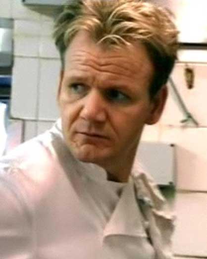
Some shows do get under our skins, however. One is the Fox series Hell's Kitchen, which just started it's second run. What it is that originally attracted me I'm not quite sure–perhaps it's the joy of watching a group of people willingly submit to the abuse of Gordon Ramsay, gleefully watching as all these people have thier "I'm all that" beat right out of them, and not having to feel guilty about it because they let themselves right in for this abuse.
They wanted it, baby, they got it. I won't be crying for them
But, as I've watched the show, I've begun to identify a vibe coming not only from Chef Ramsay but also from the contestants that make it the farthest. One might call it spirit, or maybe drive, or maybe ambition, or maybe just "knowing what one wants".
There's a better word for it: passion.
It's taken me a long time to know what passion is, and that it's more than just a convenient (and somewhat inexact) synonym for intensity. After I realized what passion meant (for this I thank Pariah Burke) it was a short leap to understand that without a passion for something, life is just really just a tedious passage from sunrise to sunset, about 22,000 times, depending on your lifestyle and genetic makeup.
Another way to think of passion is a fire that drives.
Take Chef Ramsay, for instance. To say he loves what he does (being a world-class chef, that is, not being, as my old Dad might have said, a "sunuvabitch"), is really being half-hearted about it. He has passion to prepare the finest food imaginable. It's the fire that drives him. This is why he's so demanding, and why he has such a short fuse; I imagine that, from his point of view, if you're there to be on his team, then you have to have the same committment, the same eye on the same goal, uncompromisingly. If you're not skilled enough, if you're faking it just to look good or get admired or get famous, then you're going to get the blunt end of his rage when you, inevitably, let him down.
I get the idea that he's not really there to be famous (although doubtlessly prosperity is its own reward–he is rather wealthy, and an international television star besides). Rather the fame and fortune came because he does what he does the way he does it. The passion made the fame possible–not the other way round. And it's this passion that makes him such a fascinating person to watch.
In as much as he's earned Michelin's three stars for his efforts, we'd have to admit that results, in this case, speak for themselves.
Personally my passion is now design. And a function of this view is that now I can't see myself without striving to do something in design. What successes I've had have been the greatest personal high I've ever known, and that high is worth repeating no matter how well one gets paid for it (naturally, I'm hoping for prosperity too).
And people doing things passionately are–no other way to say it–fun to watch. It's almost as though thier high from being in the zone is contageous. Already, on Hell's Kitchen, it's becoming astoundingly obvious that, whether or not they know it, some are there to act out thier passion, and others are there so, down the road, they can say "I was on a television show once," and get out thier discs and show people. Hell, maybe that's not so bad, after all–how many of us can say that? Some are striving for the prize and thier passion and the best is already coming out in some of them, and that too is fun to watch.
Impassioned people show us what we're like at our best. They teach by example; that just a little passion for something in your life–even if it's nothing that will ever make you rich or famous–elevates even the most mundane life.
Learn passion, and life takes on a certain color and depth that it didn't have before.
This is why I admire Pariah Burke, and why I admire Gordon Ramsay. This is why I prattle on about logo design and map design.
Now if I can only get people to acknowledge my overall genius...well, nobody said it would be completely easy.
Technorati Tags: Hell's Kitchen, Gordon Ramsay, passion
13 June 2006
[logo_design] Ubuntu: Communicating Commonality
After writing about how we have the new FreekBox from Free Geek, I began looking into Ubuntu. After all, if you've a passing interest in OSs, as I do, it's hard not to be interested.
Surfing to the Ubuntu web page, http://www.ubuntu.com, I found something even more interesting than that; a concret demonstration of how the message of relation and commonality can be communicated through three similar logos that leave a different impression.
Firstly, the Ubuntu logo itself (in the interests of disclosure, all graphics have been nicked from the Ubuntu website. Message to Canonical Ltd.: consider coming up with graphics for journalists. Please.):

The word ubuntu, as is by now well known, is a word with roots in the Bantu culture, which emphasizes community. It's most popular translation is humanity towards others, but my favorite (as well as one which communicates the software's apparent ethos to me best) is "the belief in a universal bond of sharing that connects all humanity".
Free, empowering community, people helping others. Pretty simple. Ubuntu Linux is, of course, free, and they'll even ship you a pressed CD of the current release if you ask.
The particularls of the logo are direct, simple and friendly. Warm colors seem to evoke a welcoming feeling; the graphic is a dead clever abstraction of community (three people in a circle linking hands), and the logo font is particularly apt; a simple, strong sans serif that looks almost hand drawn–it reminds me of a child writing in the sand.
There are allied projects: Xubuntu, Edubuntu, and Kubuntu. Here are thier logos:



The three tell individual stories whilst maintaining a strong and obvious alliance. The Xubuntu and Kubuntu projects are Ubuntu with focus on desktops other than Gnome: respectively, Xfce and KDE. Both communicate strong alliance through symbol (the rodent mascot of Xfce and the eight-toothed gear from the K Desktop Environment logo) and typography (the extensions of the word ubuntu) and individuality (for Kubuntu and Xubuntu) by the use of the signature colors of the desktops.
The simple change to the Ubuntu logo for Edubuntu (Ubuntu intended for a classroom environmment, naturally), though, makes me smile the most. Colors are maintained, meaning it's closer to the parent than any of its siblings, and the turned up arm of one of the abstract figures instantly evokes an image common to many cultures; a child in a classroom raising his or her hand to be called on.
Simple changes that preserve the family circle but which, unequivocally, evoke a different personality for each sibling. Clever, direct, and brilliant.
Technorati Tags: logo design, ubuntu, linux, kubuntu, xubuntu, edubuntu
Surfing to the Ubuntu web page, http://www.ubuntu.com, I found something even more interesting than that; a concret demonstration of how the message of relation and commonality can be communicated through three similar logos that leave a different impression.
Firstly, the Ubuntu logo itself (in the interests of disclosure, all graphics have been nicked from the Ubuntu website. Message to Canonical Ltd.: consider coming up with graphics for journalists. Please.):

The word ubuntu, as is by now well known, is a word with roots in the Bantu culture, which emphasizes community. It's most popular translation is humanity towards others, but my favorite (as well as one which communicates the software's apparent ethos to me best) is "the belief in a universal bond of sharing that connects all humanity".
Free, empowering community, people helping others. Pretty simple. Ubuntu Linux is, of course, free, and they'll even ship you a pressed CD of the current release if you ask.
The particularls of the logo are direct, simple and friendly. Warm colors seem to evoke a welcoming feeling; the graphic is a dead clever abstraction of community (three people in a circle linking hands), and the logo font is particularly apt; a simple, strong sans serif that looks almost hand drawn–it reminds me of a child writing in the sand.
There are allied projects: Xubuntu, Edubuntu, and Kubuntu. Here are thier logos:



The three tell individual stories whilst maintaining a strong and obvious alliance. The Xubuntu and Kubuntu projects are Ubuntu with focus on desktops other than Gnome: respectively, Xfce and KDE. Both communicate strong alliance through symbol (the rodent mascot of Xfce and the eight-toothed gear from the K Desktop Environment logo) and typography (the extensions of the word ubuntu) and individuality (for Kubuntu and Xubuntu) by the use of the signature colors of the desktops.
The simple change to the Ubuntu logo for Edubuntu (Ubuntu intended for a classroom environmment, naturally), though, makes me smile the most. Colors are maintained, meaning it's closer to the parent than any of its siblings, and the turned up arm of one of the abstract figures instantly evokes an image common to many cultures; a child in a classroom raising his or her hand to be called on.
Simple changes that preserve the family circle but which, unequivocally, evoke a different personality for each sibling. Clever, direct, and brilliant.
Technorati Tags: logo design, ubuntu, linux, kubuntu, xubuntu, edubuntu
12 June 2006
[net_life] Anyone Want a Job With A Print Design Junta?
Ahhh, Craigslist. Home of some of the funniest typos in the world. Witness, from this job posting, for a Graphic Designer, which company wants print design and a proven multi-tasker:
I'm wondering if 2 of the 6 go by the names of "Juan" and "Evita".
The Wife™ wonders also if people using other names can apply.
As do I.
Technorati Tags: Funny, Craigslist, typo
Company has 30 year history in its community and a 6-peron staff.
I'm wondering if 2 of the 6 go by the names of "Juan" and "Evita".
The Wife™ wonders also if people using other names can apply.
As do I.
Technorati Tags: Funny, Craigslist, typo
11 June 2006
[design] We Find Adobe Employees Quite del.icio.us
Employees of Adobe Systems, the graphical software powerhouse, have decided to show the world what they like; there is a new folder on del.icio.us they've just begun to populate.
Said John Nack on his own Adobe blog:
(Via João Carlos de Pinho on the OmniPilot InDesign mailing list)
Technorati Tags: Adobe, Adobe Systems, Adobe Creative Suite
Said John Nack on his own Adobe blog:
Adobe folks have started populating del.icio.us, the popular sharedI just visited there, and it's up to 276. They aren't letting dust gather, that's for sure.
bookmarking application, with interesting bits relevant to Adobe apps &
users. The root is http://del.icio.us/adobe, and from there you can go to
more specific areas (e.g. del.icio.us/adobe/Photoshop or
del.icio.us/adobe/AfterEffects). Luanne Seymour, a member of the group doing
this work, hastens to point out that this effort has just begun & the set of
links isn't yet comprehensive. That said, it's growing every day.
(Via João Carlos de Pinho on the OmniPilot InDesign mailing list)
Technorati Tags: Adobe, Adobe Systems, Adobe Creative Suite
[design] Fabulous Freebies for InDesign and Blogging
If you design and blog, there are two sources you need to know about.
Rorohiko Ltd for spiffy Indy plugins
The first, and tattoo this on a body part if you have to, is a NZ concern called Rorohiko, Ltd. These people make the niftiest InDesign plugins this side of Slendro, and no kidding there.
Rorohiko, which means "computer" in Maori, means "lightning brain" (hiko=brain, roro=lightning), and they have lightning skills too. They originated the Sudoku InDesign plugin (which is free) and now they amaze with the Lightning Brain Story Parker, which allows you to shuffle text and picture frames off to the side and then snap them, precisely, right back to where you had them before. Saving this one step can only but lubricate the ol' workflow.
Another amazing thing they're doing is a beta test version of something you'll love if you don't like Bridge or don't have the Creative Suite; Image Library Loader. This installs a new item on your menu bar; with a document open you pull this down and get the dialog that allows you to specify a directory to load images from. Do so, and you get a small display that looks like an Indy palette that has all the images displayed–with hardly the overhead of the Bridge (which not even I need open all the time).
Image Library Loader is in beta; go to this link to get it.
One important thing to know about these is that Rorohiko calles them scripted plugins. They're scripts that act like plugins, but before you can use them you have to install the Active Page Item Runtime plugin; this allows Indy to interpret the others.
Rorohiko is mad brilliant, and I am in awe of thier considerable skillz. Bookmark'em, get the free goodies (not just free plugins but they have free PDF Sudoku puzzle books and other cool stuff) and then go back for the pay stuff.
Magical Sheep, the Magic Bookmarklet
I must say, I'm impressed by the innovation of the bookmarklet.
I'm sure that many of you already know what those are; I just found out about them. Apparently what you do, is in your bookmark, instead of having the URL where the URL is supposed to go, you put javascript. It lives in your bookmarks bar just like a hyperlink, except when you click it, the script runs and works its mojo.
At the end of this link is a bookmarklet/favelet archive by Improbulus, the British author of a blog called "A Consuming Experience". The archive at current has four freebies, and if you like tagging but are at the moment married to Blogger you'll want the Technorati Tag Magic Sheep Bookmarklet. It's the first item on the list.
Being identical in appearance to a hyperlink (as far as the browser is concerned), installing it couldn't be simpler: look for the link that reads "Technorati Magical Sheep Bookmarklet -- Baaaaaaaa!!" and drag it to your bookmark bar. That's all there is to it! After that, just click the link, type your tag terms in the input box separated by commas, and in a split second it coughs back another sheet with the whole HTML sequence autoselected for copying and pasting.
Since I've decided to tag my posts, this has made it a breeze. And, as an added bonus, it's auto-rapped in a class ("technoratitags") so that you can style it with CSS. And multiple term tags? It puts in the plus-sign for you!
So what are you waiting for? Grok these!
Technorati Tags: Rorohiko, Lighning Brain, Sudoku, InDesign, A Consuming Experience, Magical Sheep Bookmarklet, tags, free tools
Rorohiko Ltd for spiffy Indy plugins
The first, and tattoo this on a body part if you have to, is a NZ concern called Rorohiko, Ltd.
 These people make the niftiest InDesign plugins this side of Slendro, and no kidding there.
Rorohiko, which means "computer" in Maori, means "lightning brain" (hiko=brain, roro=lightning), and they have lightning skills too. They originated the Sudoku InDesign plugin (which is free) and now they amaze with the Lightning Brain Story Parker, which allows you to shuffle text and picture frames off to the side and then snap them, precisely, right back to where you had them before. Saving this one step can only but lubricate the ol' workflow.
Another amazing thing they're doing is a beta test version of something you'll love if you don't like Bridge or don't have the Creative Suite; Image Library Loader. This installs a new item on your menu bar; with a document open you pull this down and get the dialog that allows you to specify a directory to load images from. Do so, and you get a small display that looks like an Indy palette that has all the images displayed–with hardly the overhead of the Bridge (which not even I need open all the time).
Image Library Loader is in beta; go to this link to get it.
One important thing to know about these is that Rorohiko calles them scripted plugins. They're scripts that act like plugins, but before you can use them you have to install the Active Page Item Runtime plugin; this allows Indy to interpret the others.
Rorohiko is mad brilliant, and I am in awe of thier considerable skillz. Bookmark'em, get the free goodies (not just free plugins but they have free PDF Sudoku puzzle books and other cool stuff) and then go back for the pay stuff.
Magical Sheep, the Magic Bookmarklet
I must say, I'm impressed by the innovation of the bookmarklet.
I'm sure that many of you already know what those are; I just found out about them. Apparently what you do, is in your bookmark, instead of having the URL where the URL is supposed to go, you put javascript. It lives in your bookmarks bar just like a hyperlink, except when you click it, the script runs and works its mojo.
At the end of this link is a bookmarklet/favelet archive by Improbulus, the British author of a blog called "A Consuming Experience". The archive at current has four freebies, and if you like tagging but are at the moment married to Blogger you'll want the Technorati Tag Magic Sheep Bookmarklet. It's the first item on the list.
Being identical in appearance to a hyperlink (as far as the browser is concerned), installing it couldn't be simpler: look for the link that reads "Technorati Magical Sheep Bookmarklet -- Baaaaaaaa!!" and drag it to your bookmark bar. That's all there is to it! After that, just click the link, type your tag terms in the input box separated by commas, and in a split second it coughs back another sheet with the whole HTML sequence autoselected for copying and pasting.
Since I've decided to tag my posts, this has made it a breeze. And, as an added bonus, it's auto-rapped in a class ("technoratitags") so that you can style it with CSS. And multiple term tags? It puts in the plus-sign for you!
So what are you waiting for? Grok these!
Technorati Tags: Rorohiko, Lighning Brain, Sudoku, InDesign, A Consuming Experience, Magical Sheep Bookmarklet, tags, free tools
09 June 2006
[oregon_transit] Bad News For Cherrioteers

Some months back, C-Tran, Clark County's public transit system, went through a period of marking itself up for deep cuts in anticipation of a possible levy defeat at the polls.
The levy was supported, and while C-Tran's service isn't exactly what it once was, it's much better than it could have been.
They've just been through the same experience down in Salem, but the story went the other way:the Cherriots had a bond measure defeated. This measure, which might have expanded service, perhaps even (at long last) added Sundays (I believe that SKT is the largest district in Oregon without it), means that Cherriots is going to have to cut to keep the budget balanced, and if you have to depend on it to get round Salem, doing so is about to get harder.
Check out this page at the Cherriots website. The cuts are rationalized along two lines: heavy weekday cuts only, or milder weekday cuts and complete elimination of Saturday service, for the time being.
It's sad, I think. Salem, despite her modest size, was always a tough town to get around in if you didn't have the automobile option–having spent all my teenage years there, I know this intimately. I remember, during the mid-1970s, Cherriots (then a department of the City of Salem) was forced to drastically cut back routes to just within the city limits. Not too many routes went beyond into the county (Salem has always had a very slender suburban area), but I lived on Abiqua Court SE about 1/3 beyond the end of the then-Four Corners line. Between that time and the establishment of the Salem Area Mass Transit District (which extended to the urban growth boundary, thus taking the suburban fringe back into the service area), it was tough to get round if you just had two wheels.
Hamman Stage Lines and a couple other private carriers established shuttle services for the fringe (me and my waggish friends at the time promptly dubbed them the "Hamman Eggs") which, in my area, carried me to the Lancaster Mall so we could transfer to the Chemeketa line. But as a substitute for transit service in Salem–which has always been thin, no more frequent than weekdays, half-hourly, and only till about 7pm)–it really wasn't much.
The un-carred in Salem need encouragement, not discouragement. Sunday service there would be nice, and it's something I wish I had when I lived there. Actually, transit funding overall is a broken thing, but since I have no suggestions to make it better, I'll leave it at that, for now.
In the meantime, Cherriotteers have a hard choice to make. The link to the Cherriots webpage above also has a public meeting schedule where you can go to make your voice heard. If you get round town on the bus, you really ought to.
That, and get ready to wait longer for your bus–what buses are left.
Technorati Tags: oregon transit, salem-keizer transit, Cherriots, service reductions
[net_life] I have Google Analytics
That title pretty much speaks for itself. Finally got my Google Analytics invite today and I've enrolled ZKT in it.
Also people have varying attitudes about Google; I issue this as a sort of warning.
But I am interested in who reads this blog and where they come from. When I started it, more than two years ago, I was just playing around. As I got deeper into being a designer I want this blog to be more about my passion; about design, bad, good, and otherwise, and believe it or not, I understand there is a person or two out there who actually come by here to see what I have to say about it.
While ZKT continues to be a more unabashed forum for my design views than my writings on Designorati or QuarkVSInDesign, it will also continue to be more Oregonized (and more than occaisionally feature my personal reactions to being a Portland resident, Address Nerdery, and that stuff). So, its for me, first, but it's also for the tens of people a day who stop by and glance. I want the part that others come by to see to not be a waste of thier time.
Technorati Tags: Google, Google Analytics, blogging, The ZehnKatzen Times
Also people have varying attitudes about Google; I issue this as a sort of warning.
But I am interested in who reads this blog and where they come from. When I started it, more than two years ago, I was just playing around. As I got deeper into being a designer I want this blog to be more about my passion; about design, bad, good, and otherwise, and believe it or not, I understand there is a person or two out there who actually come by here to see what I have to say about it.
While ZKT continues to be a more unabashed forum for my design views than my writings on Designorati or QuarkVSInDesign, it will also continue to be more Oregonized (and more than occaisionally feature my personal reactions to being a Portland resident, Address Nerdery, and that stuff). So, its for me, first, but it's also for the tens of people a day who stop by and glance. I want the part that others come by to see to not be a waste of thier time.
Technorati Tags: Google, Google Analytics, blogging, The ZehnKatzen Times
08 June 2006
[net_life] Google Search Hit of the Day
This came from Tehran, Iran: google earth pernography.
Gosh, I hope he finds some. Whatever it is.
Technorati Tags: google, search terms, strange
Gosh, I hope he finds some. Whatever it is.
Technorati Tags: google, search terms, strange
[pdx_life] Free Geek is Teh Cool
 As your future Arbiter Of Taste™, it is of course incumbent upon me to tell you what's good.
FreeGeek is good. Of course, many of you don't need to be told this, but it's amazing what they get done down there.
My The Wife™'s old computer, a Pentium MMX 200 (I kid you not), checked out three days ago. Blown power supply, and, from our parts-is-parts backstock, we had exhausted all the old power supplies. Had to go out and get one, and we've had good experiences with them getting odd and interesting stuff before.
Going there in search of the power supply stock (we had planned on an excursion to Fry's if this didn't pan out) it became obvious that, despite the decent stock of power supplies of many ratings, the ones there didn't have the leads we needed. You see, we were looking for AT power supplies.
But wait! The fellow behind the counter simply went back into the...well, back area...and came up with two AT power supplies that were "semi-tested" (he said he plugged them in and the fans spun. Worked for us).
And while we were at it, we looked for a replacement CD drive. Found a tested CD-RW job that was IDE (The Wife™'s CD drive had been busted some years back in a fit of pique (hey, we all have 'em)). It works on the old fossil (the computer!) but we don't have the proper driver (and it's Win98 anyway, so we wonder if it's worth the trouble so it doesn't burn, but it reads, and right now, that's enough.
And I finally fell for one of the Freekboxes. For those who don't know, those are computers put together by the volunteers at FreeGeek, but we bought a StoreBox, which was one of the models put up for sale in the Thrift Shop: 197MB RAM, 56K modem, ethernet, ATI Rage 3D video card, and good to go with Ubuntu Linux 5.10. Now, we're home-representing Open Source, which is important because Linus lives in the area and has a day job in Beaverton now (as it was, we already ran OpenOffice.org (as it will be recalled) on the Macintosh here).
So what was the damage?
- Two AT Power supplies (gotta have one for backup) at $2.50 each: $5.00
- A tested (and working) 8x CD-RW:$4.00
- A complete and working computer system with Ubuntu Linux, complete with The GIMP so The Wife™ can play with her Photoshop files without having to wait for me to move aside so she can work on 'em in my professional copy of Photoshop CS2, and a free trouble ticket for resolution of one problem of any description: $35.00
- Having more cool toys and a working system back for The Wife™ without breaking the bank:Priceless.
As your Future Arbiter of Taste™, we give thumbs-up (and continued patronage and active consideration of volunteering) to FreeGeek.
Did you know: if you want a computer and can't afford one, FreeGeek will train you to assemble FreekBoxes, and, once you get six put together, you get one of your own for free...and training in how to use it? You can also adopt a computer by doing recycling work for them.
Did you also know: FreeGeek is going national, with local versions in Chicago, Indiana, Michigan, Pennsylvania, and Olympia?
Update and Correction 2006,0608@2045: The Wife™ informed me that the 8x CD-RW drive costed $8, not $4. My bad.
Technorati Tags: FreeGeek, Open Source, Ubuntu, Recycling
07 June 2006
[liff] Linking Park, Portand, Oregon
 (Nota Bene: there is an offical "adult" cuss word in this post. You have been advised).
I'm going personal on this post. Hope all y'all don't mind.
Portland is pretty much the center of my universe.
I've always adored Portland. Though I'm a native Oregonian (one of only about 24, as far as I know) I was not born in Portland. I don't make a secret of it, but I keep that fact in the background, since I get this feeling it makes a dent in my local-boy mojo.
I was downloaded about 50 miles south-southeast of here, and grew up as a child of the teevee, waking up to Ramblin' Rod but never getting the chance to go (as I found out later from some people, it wasn't exactly an epochal experience–not a bad time, but hardly the tear-up we say on KPTV every day). I often have said that the only real mistake I ever made in my life was not being born here; somehow the worst day I have in Portland beats the best day I could have pictured having anywhere else.
Now that I'm a Big Boy™, and computer lidderate, and terribly impressed with my own words, I keep what my tens of readers peruse each day. Not too bad actually; I get to be a member of a community and even if my aim to be Your Arbiter of Local Taste™ doesn't play out, in 30 years (assuming there's still a civilization then) I'll be able to say "Remember the day? When we still had electrcity an' all? Yeah, I had a blog."
Anyway! The point of this whole thing (and I do have one) is that I had a very gratifying experience today, local-blog-linkwise. And I don't usually announce who I link to (though reciprocation is always a given), because...well, I'm actually not sure why not. Maybe I think I'm being too much of a braggart or something. I'll get therapy.
Anyway! I happend to, in my random reading of the digest list at OrBlogs, stumbled on this post on Metroblogging Portland (which I stop by occasionally because of its witty design and wittier contributors) and noticed that a bit of shameless self-promotion would have been a-ok.
Well, as Jeff says, if you don't toot your own horn, nobody else will. So I self-promoted, which is also something a designer just needs to do (see, I worked design in here! In Yer Face!!!...eh, 'scuse me. Sorry).
Yesterday was the most heavily trafficked day this 'blog's seen in a while. First of all, thank y'all for stopping by. Made my day (it was a pretty good day all round, but that was definitely a high point).
There have indeed been blogs I've added to my own blogroll (the local part is accessable under the heading "Blogging, Oregon Style"). There are a bunch there, and I get round to reading all of them by and by (dialup will force you to budget your time, you see), some, lately (Preemptive Karma, FURIOUS Nads!, for example) getting more reading than others (nothing personal to the rest of you–there are only so many stops I can make per day).
As a direct result of the Metblogging posting, I've added a few today:
- Metroblogging Portland (aber naturlich)
- Welcome To Blog
I was particularly pumped when a local designer linked me: Jeff Fisher's Blog-oMotives. Jeff Fisher is one of my personal heroes; an article in TheO a few years back about him was one of my direct inspirations for attending PCC to get a degree in Graphic Design (I have other local heroes; you'd be surprised what a big design town Portland is. Or maybe you wouldn't, who knows, but these folks happened long before our now-vaunted addiction to "the creative class". Not that I'm totally against that; I'm trying to get some of this economy addicted to me, but I'm digressing again).
Ever notice how finding someone linked to your blog without telling you feels like finding a lost $20 bill ion the street?
And, to finish off (for now), a good review always lifts one's spirits; over in the comments of that Metblogs posting I got the following prop from dieselboi (who I've had in my blogroll for a while)
I think Zehnkatzen Times and Laurabush.info are the shit!I understand the compliment, and I appreciate the association.
I love living in Portland. Word.
Technorati Tags: Portland Oregon, Portland Blogs
06 June 2006
04 June 2006
[font] The O RLY Font
 We return to the O RLY owl just for a moment.
This cheeful, surprised fellow is captioned by the now-famously expressed question in a quite distinctive font. This font has been searched for (and this very blog has been search-pinged) in a search for what they refer to as "The O RLY Font".
In an attempt to add to the typographic literacy of everybody out there, I'll tell you what it's actually called: Kabel Bold (link to Monotype Imaging's page, where you can purchase it if you so desire), one of the Kabel range developed by typographic giant Rudolf Koch in 1924, and named for (and perhaps inspired by) the then-new transatlantic cables that were being laid ("cable" in German is das Kabel). Monotype Imaging has this to say about it:
Traditionally, German foundries have been more energetic in soliciting new designs from artists who are not specialist typographers. An example of this tradition was the career of Rudolf Koch, who designed Kabel in 1926, and which was named after the first trans-Atlantic cable. Kabel is a sans serif design of peculiar characteristics, suitable for short texts. It produces a striking effect on the page, providing modernistic feel. Although in many respects it resembles the simplicity of Futura, the unique shapes should help to identify Kabel from any other sans serif. The design was redrawn by ITC in 1975 under license from the Stempel foundry to create the ITC Kabel font family.There're probably free versions available; you're on your own there. The late site orlyowls.com (which seems to have died the unexpected death) offered a link to a free version that caused my system to gag (maybe it was Windows TrueType?)
With respect to the late Mr. Koch, it is not known whether this has caused him to spin in his grave. For all I know, he may have been cremated.
There. Aren't you all glad you asked?
Technorati tags: fonts, Kabel, Koch, O RLY
03 June 2006
[design] Quark, Inc + QuarkXPress 7 = Not good enough?
When one talks of QuarkXPress (and the company Quark) one will invariably get into a discussion of how screwed up Quark, Inc has been.
For a long time, Quark had a distant, disdainful attitude toward its customers, and it could afford it, for reasons I've delved in depth many a time. The bad will built up during those days still sits like hard stone with some people.
Of course, it's easy to conceptualize it, but occaisionally an example reminds you that "hey! they really did crap all over thier customer base for a while" in a way so palpable that one can see that Quark, despite an improved XPress, has a job of work to do.
I'm going to go out on a limb here: gut feeling. I'd say that Quark has at most two years left before it's vaunted customer base erodes to make it the equal of InDesign in every way.
Certainly, as I've said, QuarkXPress 7 is a much, much improved XPress. But these are changes that XPress should have been through back in, say, 2002 or 2001. If they had adopted an impove the program at any cost strategy then, InDesign might still be a distant second, instead of only that way in installed base (last three years of buzz have it that Indy has outsold XPress).
Among the greatest improvements were interface changes that included docking palettes, a context-sensitive Measurements palette (with live changes) and a funadmental workflow change that renders the need to go to dialog boxes to change attributes (one of the most touted "advantages" of QXP) a matter of taste.
These are things that make QuarkXPress behave more like...InDesign.
QuarkXPress is listening to its customers, as it turns out.
Technorati Tags: Quark, QuarkXPress, design
For a long time, Quark had a distant, disdainful attitude toward its customers, and it could afford it, for reasons I've delved in depth many a time. The bad will built up during those days still sits like hard stone with some people.
Of course, it's easy to conceptualize it, but occaisionally an example reminds you that "hey! they really did crap all over thier customer base for a while" in a way so palpable that one can see that Quark, despite an improved XPress, has a job of work to do.
I'm going to go out on a limb here: gut feeling. I'd say that Quark has at most two years left before it's vaunted customer base erodes to make it the equal of InDesign in every way.
Certainly, as I've said, QuarkXPress 7 is a much, much improved XPress. But these are changes that XPress should have been through back in, say, 2002 or 2001. If they had adopted an impove the program at any cost strategy then, InDesign might still be a distant second, instead of only that way in installed base (last three years of buzz have it that Indy has outsold XPress).
Among the greatest improvements were interface changes that included docking palettes, a context-sensitive Measurements palette (with live changes) and a funadmental workflow change that renders the need to go to dialog boxes to change attributes (one of the most touted "advantages" of QXP) a matter of taste.
These are things that make QuarkXPress behave more like...InDesign.
QuarkXPress is listening to its customers, as it turns out.
Technorati Tags: Quark, QuarkXPress, design
02 June 2006
[meme] Tag! I'm It! (a/k/a The Meme Of Four)
Not often do I recieve a meme. But this is it...I've been tagged!
The culprit: the impassioned Italienne and Designorati colleague, Elisabetta Bruno.
Oh yeah? Well see here, E, I can bring it! Meditate upon the following truths:
Four Jobs I've Had:
Four Places I'd Rather Be Right Now:
You're it, people!
The culprit: the impassioned Italienne and Designorati colleague, Elisabetta Bruno.
Oh yeah? Well see here, E, I can bring it! Meditate upon the following truths:
Four Jobs I've Had:
- Night Janitor
- Taxicab Dispatcher
- Answering Service Operator
- Coat-of-Arms Designer
- The War of the Worlds (1953 George Pal Edition)
- Tron
- The Andromeda Strain
- Tie: Kung Pow!–Enter The Fist/Venus The Ninja (a/k/a Matching Escort or Fury of the Silver Fox or Jin fen you long)
- Salem, Oregon
- Portland, Oregon
- Idaho Falls, Idaho
- Orlando, Florida
- Space:1999
- Mission:Impossible
- The Prisoner
- Have Gun, Will Travel
- Lincoln City, Oregon
- Vancouver, British Columbia
- Victoria, British Columbia
- Detroit Lake, Oregon
- Box Mac & Cheese Dinner with Tuna or Ground Beef
- Wiener Schntizel mit Spätzle und Rotkohl
- General Tso's Chicken (extra spicy)
- Anything my The Wife™ is cooking
Four Places I'd Rather Be Right Now:
- In a nice, well-lit office, designing logos
- In a nice, well-lit office, doing layout
- Council Crest
- Berlin, Germany
You're it, people!
29 May 2006
[distractions] The Outfield's First New Album in 14 Years
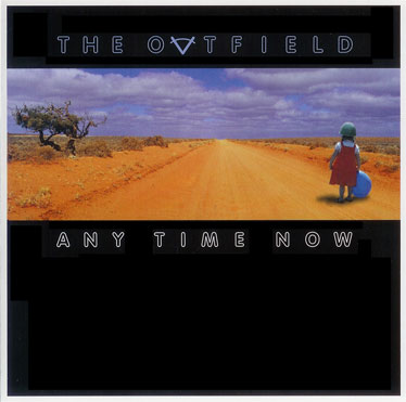 Back in the Eighties, it was, bassist Tony Lewis sang in a clear, bright, strong voice:
Josie's on a vacation far away,That song, from the album Play Deep, got big play on the radio and on MTV that year, as did a couple other cuts from it: "All the Love In The World" and "Everytime You Cry".
Come around and talk it over
There's so many things that I wanna say
You know I like my girls a little bit older
I just wanna use your love tonight,
I don't wanna lose your love tonight...
Hailing from London's East End, and at first calling themselves "The Baseball Boys" (after that gang out of that bizarre move The Warriors), bassist and singer Lewis, budding guitarist and songwriter John Spinks and drummer Alan Jackman renamed themselves to "The Outfield" when they decided the original name evoked too much of a negative image.
While thier sophomore effort, Bangin', got little notice as I recall, the third album, Voices of Babylon, rendered a very memorable title tune that gets under your skin and stays there. Through subsequent releases, Diamond Days and Rockeye, Spinks' production and musicianship gained polish and Tony's voice remained distinctive (even as the band lost Jackman), and the band forged ahead even though old Moe Mentum was trying to swing the other way.
As a band, The Outfield get little respect I find. I myself came to them late, but I have trouble finding good entries on them in rock music chronicles. This is highly unfair. They have done cool, fun, rocking music that's also accessable while remaining passionate, all the while staying straight-ahead, guitar based rockery that has enough hooks and neat melody to get attention.
The band itself is still together, and fourteen years on from Rockeye (and six years since the interim Extra Innings (Unreleased) comes the enticing, tune-filled Any Time Now. For the past two weeks it's about the only music I've listened to.
The hooks, good melodies, and compelling lyrics are all there, also the hintings of rockers well into thier forties thinking about the world and politics and the future, but also radiolicious bits such as what would be the ready-for-radio album signature "It's All About Love", the sedcutively arranged "Photograph" (this one in heavy personal rotation), and the world-aware "Wasted", "Rainbow's End", and "Peace".
I so totally dig this album. Being an Outfield fan has been a frustrating experience of longsuffering, with a band that never tours outside the southeastern US, and an aloof fan club. Getting this album is like a dash of water in the middle of the desert. Some obvious production problems are evident (there are abrupt cuts on the ends of fadeouts) but the music is just as strong, as well written as Spinks has ever done, and Tony Lewis's clear, high voice still ranks with me as one of the most remarkable in rock music.
Any Time Now, flaw included, is tasty enough that it leaves me hoping they'll release more. And not after another fourteen years.
Technorati Tags: The Outfield, Tony Lewis, John Spinks, 80's Music
28 May 2006
[design, web_design, ethics] designplagiarized
Stumbled on this wonder today, tripping upon the witty and wittily-designed (and magnificently-executed) design chronicle pull to inflate.
It has developed that a design firm calling itself "designinspired" put up a website that was rather well designed. It couldn't help but be; it apparently was lifted, right down to the CSS and the copy text, from the Duo Consulting website. Read Adam Howitt's account of the theft here, complete with damning evidence.
I occaisionally think of having to be creative on demand–it is rewarding but also wearing just a little bit. Nicking a design concept here and an idea there sometimes is damned tempting, but this, as I've said to someone recently, is one reason why we thumbnail, thumbnail, thumbnail.
Anyway! Some people can copy just a little bit and it becomes inspiration, because you use what you've seen to create something that is inspired but different. But what do we make of someone who's so short on an idea that they simply lift a complete design from someone else, then put it up on the web, thinking nobody would notice? Quark, Inc. learned this one the hard way.
Seriously. I'm still scratching my head on this one.
Exculpatorily speaking, the design firm in question has taken down the website and issued an apology for the theft (realizing that the chief export of Chuck Norris is pain. Nobody has checked with Vin Diesel to find his feelings but I'd bet he'd be similarly moved). All that remains at http://www.designinspire.com is a "coming soon" card:
 Now, that just seems familiar...where have I seen that before...
 Naaah. Maybe it's just me seeing this...
Postscript: Brady J. Frey, proprietor of pull to inflate, makes two cogent points which rather stand on thier own. Firstly:
Word.
It has developed that a design firm calling itself "designinspired" put up a website that was rather well designed. It couldn't help but be; it apparently was lifted, right down to the CSS and the copy text, from the Duo Consulting website. Read Adam Howitt's account of the theft here, complete with damning evidence.
I occaisionally think of having to be creative on demand–it is rewarding but also wearing just a little bit. Nicking a design concept here and an idea there sometimes is damned tempting, but this, as I've said to someone recently, is one reason why we thumbnail, thumbnail, thumbnail.
Anyway! Some people can copy just a little bit and it becomes inspiration, because you use what you've seen to create something that is inspired but different. But what do we make of someone who's so short on an idea that they simply lift a complete design from someone else, then put it up on the web, thinking nobody would notice? Quark, Inc. learned this one the hard way.
Seriously. I'm still scratching my head on this one.
Exculpatorily speaking, the design firm in question has taken down the website and issued an apology for the theft (realizing that the chief export of Chuck Norris is pain. Nobody has checked with Vin Diesel to find his feelings but I'd bet he'd be similarly moved). All that remains at http://www.designinspire.com is a "coming soon" card:
 Now, that just seems familiar...where have I seen that before...
 Naaah. Maybe it's just me seeing this...
Postscript: Brady J. Frey, proprietor of pull to inflate, makes two cogent points which rather stand on thier own. Firstly:
If you’re a client or potential client of Design Inspired, I’d ask yourself this: If a company will rip it’s own designs from other designers, how unique will your product be from them? What exactly are you paying for then?This comment stands on its own, and touches on the subject of originality that I myself have been exploring lately. Then, wittily:
Maybe it’s just me, but when I see the term ‘inspired’ within a design companies title, I almost always become suspicious — it’s akin to a car sales man asking me to trust him… if you have to showcase the meaning, you’re aware the fact you’re blatantly lacking within that very description.No, it's not just you. It's kind of like that unwritten rule that anytime a rock'n'roll song or album actually includes the term rock'n'roll in its title, then you just know it's trying too hard.
Word.
27 May 2006
[design] Does Stock Suck?
Gently wafting my way this last week were numerous opportunities to consider the concept of originality.
A discussion on the Graphic Designers Resource Group at Yahoo! Groups inspired me to write this piece over on Designorati regarding the thought of using clip-art as the basis for a logo design. My short take: while there may seem to be good reasons of the moment to do so, clip art for logos is a terrible idea.
Somehow, also, I stumbled on a link to a great (and knowingly funny) piece on the Forty Media site: Top Ten Stock Photography Clichés. A title like that just begs to be read, so go do it already.
The article was found via this post at the About Desktop Publishing blog, maintained by another member of the Legion of Triply-Named Designers, Jacci Howard Bear. And, with respect to About DTP, on Designorati I did an overview of the free open source layout app Scribus, which she also linked to (thanks, Jacci, that did happen to brighten my day!)
This (and following a few links on this post at About DTP) has gotten me ruminating on the nature of the stock image beast. Stock is big business (just price some) and a lot of designers use a lot of it.
Actually it makes sense in many venues. But does it undermine the creative's milieu in the end?
The weak spot, as I see it, is well expressed by Jacci, if I may quote her:
I am someone, however, who has a modest digital camera, average illustration skills, and can compose a picture and frame a shot. I, Samuel John Klein, am a multiple design threat.
I can do it all.
A discussion on the Graphic Designers Resource Group at Yahoo! Groups inspired me to write this piece over on Designorati regarding the thought of using clip-art as the basis for a logo design. My short take: while there may seem to be good reasons of the moment to do so, clip art for logos is a terrible idea.
Somehow, also, I stumbled on a link to a great (and knowingly funny) piece on the Forty Media site: Top Ten Stock Photography Clichés. A title like that just begs to be read, so go do it already.
The article was found via this post at the About Desktop Publishing blog, maintained by another member of the Legion of Triply-Named Designers, Jacci Howard Bear. And, with respect to About DTP, on Designorati I did an overview of the free open source layout app Scribus, which she also linked to (thanks, Jacci, that did happen to brighten my day!)
This (and following a few links on this post at About DTP) has gotten me ruminating on the nature of the stock image beast. Stock is big business (just price some) and a lot of designers use a lot of it.
Actually it makes sense in many venues. But does it undermine the creative's milieu in the end?
The weak spot, as I see it, is well expressed by Jacci, if I may quote her:
If you are pulling your images from some of the most popular clip art packages or from shareware and free collections on the Web then chances are that you will see the same images popping up on fliers, in ads, or gracing newsletters and Web pages.Royalty free illustrations and stock photography are relatively inexpensive. Their ready availability is what makes them attractive and what makes it likely that someone else will use that same image. You have to ask yourself how likely it is that someone else, including your competitor, will use the exact same image and how much will it matter if they do.
One of the goals of a design is, in many applications, to be memorable. There are situations, I suppose, that one would actually want to design toward a common, unremarkable vocabulary, but I can begin to see how the use of stock might actually contribute to a banalization of our cultural design vocabluary.
I am someone, however, who has a modest digital camera, average illustration skills, and can compose a picture and frame a shot. I, Samuel John Klein, am a multiple design threat.
I can do it all.
25 May 2006
[liff] It's Towel Day

Celebrate, Celebrate. Get your towel, wear it out and wear it proud. Do you know where your towel is?
From The Hitchhiker's Guide to the Galaxy:
A towel, it says, is about the most massively useful thing an interstellar hitch hiker can have. Partly it has great practical value - you can wrap it around you for warmth as you bound across the cold moons of Jaglan Beta; you can lie on it on the brilliant marble-sanded beaches of Santraginus V, inhaling the heady sea vapours; you can sleep under it beneath the stars which shine so redly on the desert world of Kakrafoon; use it to sail a mini raft down the slow heavy river Moth; wet it for use in hand-to-hand-combat; wrap it round your head to ward off noxious fumes or to avoid the gaze of the Ravenous Bugblatter Beast of Traal (a mindboggingly stupid animal, it assumes that if you can't see it, it can't see you - daft as a bush, but very ravenous); you can wave your towel in emergencies as a distress signal, and of course dry yourself off with it if it still seems to be clean enough.
More importantly, a towel has immense psychological value. For some reason, if a strag (strag: non-hitch hiker) discovers that a hitch hiker has his towel with him, he will automatically assume that he is also in possession of a toothbrush, face flannel, soap, tin of biscuits, flask, compass, map, ball of string, gnat spray, wet weather gear, space suit etc., etc. Furthermore, the strag will then happily lend the hitch hiker any of these or a dozen other items that the hitch hiker might accidentally have "lost". What the strag will think is that any man who can hitch the length and breadth of the galaxy, rough it, slum it, struggle against terrible odds, win through, and still knows where his towel is is clearly a man to be reckoned with.
[design] QuarkXPress 7 Is In The Wild
 On 23 May, the long-awaited QuarkXPress 7 was released by erstwhile DTP king Quark, Inc.
It, as I've intimated here, boasts new features:
- Transparency ("color-level" transparency)
- Composition Zones, which allow for mulitple layout artists to work on a single document.
- An improved interface, with dockable and undockable floating palettes and a much-improved context sensitive Measurments palette, allowing users to approach an InDesign-like experience (access of most all functions through palettes), but enough like the traditional Quark UI that Quarksters don't have to change thier ways.
- Job jackets, which enable project specifications to travel with the file itself.
- And the most unique feature, for Quark: a street price of $749 (about $250 less than previous versions) and an upgrade price of $249, regardless of version, from version 3 through version 6.5. As Sandee Cohen points out here (at CreativePro.com) that's a significant improvment from earlier, where Quark charged you more depending on the age of the version you upgraded from.
The only competition for QuarkXPress 6.5 wasn't Adobe, though...it awas also QuarkXPress itself, specifically QuarkXPress 4. 5 wasn't recieved well and 6 didn't compel. The new XPress looks like just the sort of XPress that Quarksters have been wanting, and should keep committed Quark fans "on the rez".
Of course, because of past sins, Quark has lost a lot of former users; it's position at the top of the DTP heap (enterprise and single user) can no longer be seen as secure. Adobe's insurgency has kicked Quark in the ass, and after the cool reception 6 and 6.5 got, Quark finally brings it with 7.
I wouldn't expect this to be the InDesign "killer" (an ironic term, that), however. The shops and indviduals that have switched to Adobe aren't likely, given the many reasons why they left, switch back to Quark. I personally wouldn't say that XPress has pulled even with InDesign, exactly, but XPress 7 will keep Quark in the game...and keep Adobe innovating.
Having used both, while QuarkXPress 7 is a very good product now indeed, the company that makes it still has to stay on the game to keep up.
Really, regardless of whether or not you're a hardcore Quarkster or an unabashed InDesignista, we're all gonna win on this one. Quark's going to keep Adobe on its toes, and back the other way as well.
Quark, Inc: http://www.quark.com
QuarkXPress 7: http://www.quark.com/products/xpress/
24 May 2006
[design] Redesigning Cherriots: Part 6: The Key and The Frame
 This is part six in a series. For Part 1, Go herewise; for the last chapter, here.
Now that I've got a lot of what I want on the ground, I'm wanting to give key information to the map.
The primary informational point of the map, the lines, are numbered and can clearly be seen, but they have, in Salem, historically had names, and the names are important too (as well as give the map a local character. They have cool names such as "12th and Sunnyside", "State & Fairview", "Laurel Springs", &c. This information is also prominent on the signs of the buses themselves, so the cross referencing is important on the abstract informational level.
So, I set about making a route list, and the best way to map the information in the key box to the information on the map itself is to copy route number icons from each route on the map and match it to a one-to-one list. The first illustration shows how I've done it. There is also a scale bar, to give the reader an idea of how much distance a mile actually is (as well as give anyone using the map a way to ballpark how much time they'll need to get to the nearest bus stop) and the required North arrow (because nothing says map more than the presence of a North arrow). The North arrow is also created as an Illustrator symbol and saved to the symbols palette.
I also wanted to dress up the frame that I laid in behind the map in the last step (though I hadn't mentioned it, the map is easier on the eyes when the background is neutralized, thus the gray tone of the background box). I also had a little problem: the ends of the paths were, of course square with the axis of the paths, and that made it feel unfinished.
The answer I arrived at can be seen above. Taking the N out of the North arrow and scaling it down, it was a simple matter to lay them on the map margin, and with destinations beyond the map indicated, it becomes a way to give an idea of Salem's place in the region (as well as, with the routes to Oregon Garden, Oregon Coast, Silver Falls Park, Detroit Lake et. al indicated, a quick guide to regional attractions).
After distributing these appropriately around the edge of the map, I have the following:
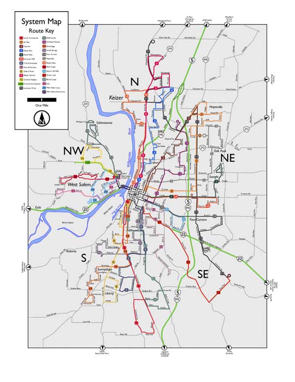 Once again, I have to say, I like the progress of it so far. It's really looking kind of slick, I think.
Next, I'll be adding some more key information–as well as starting work on an inset map for downtown.
23 May 2006
[Address_Nerd] Portland Signs: N. Benton Avenue
 North Benton Avenue signs, courtesy of the lovely and talented Stan Kost.
North Benton Avenue is a short street, limited to just a couple of long blocks just north of the Rose Quarter. It runs parallel to the Willamette River, as it was part of the original plats of the city once known as Albina, and crosses N. Broadway just before the intersection with Interstate Avenue and the Broadway Bridge.
It defines the 400 block on N. Broadway.
Benton is a name which looms large not only in Oregon and the Willamette Valley (we have a county named Benton, centered on Corvallis) but in the American West (there is a Benton County we're familiar with in Washington state and some others in other states).
The man who it was named for, Thomas Hart Benton (1782-1858), was a United States Senator from Missouri who served for thirty years. He and a certain Senator Lewis Linn, also of Missouri, were strong advocates for the inclusion of the Oregon Country into the United States. He also advocated for the Donation Land Claim system, which allocated free land to settlers coming to Oregon, thus forming the basis for a great deal of settlement in the Valley (the city of Portland's original land covered two DLC's, one which today is downtown Portland south of Burnside, the other Old Town and central NW Portland.
Today the main function of N Benton Avenue is to allow access to the parking garages north of the Memorial Coliseum along Broadway and the Portland Public Schools headquarters building, which is located along N. Dixon Street, one block north of Broadway, via Benton.
The photo up top contains two blades, which illustrates a notable style variation. Typically the street type is two letters only, in this case it would be "AV" (as on the left). The sign on the right uses a three letter abbreviation, "AVE". This is nontypical style for Portland street blades.
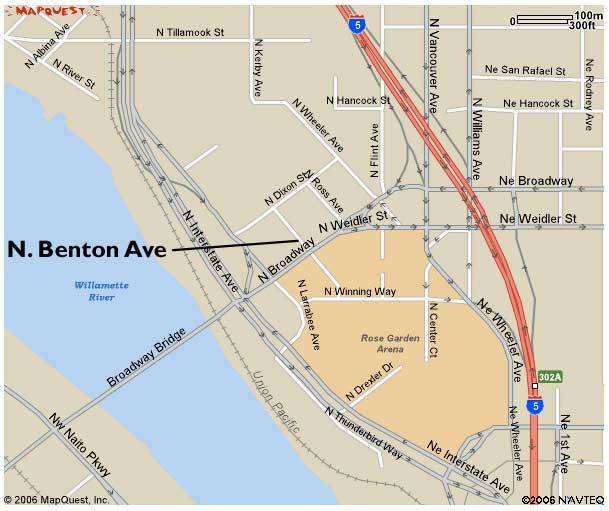
17 May 2006
[design] InDesignSecrets.com goes live
 Rejoice, InDesignistas! David Blatner and AnneMarie Conception, two of the hottest InDesign gurus going right now, have débuted a must-bookmark site, InDesignSecrets.com.
It's just started, but tune in. When they give this stuff out for free (including the podcasts), you want to be on board for this stuff. Having dialed in to a couple of web seminars from David, I know for a fact he's a great communicator. To those who know thier gurus, AnneMarie should also need no introduction.
The current post details the peek InDesign Conference members were given to the upcoming InDesign CS3, due to ship next Spring.
We say, check it out. We've added it to our blogroll, in the "Tools & Inspirations" section.
15 May 2006
[pdx_cartography] My Map of New Columbia
Check this out, my people:
 Click upon, of course, to see it bigly.
Tired of trying to find a single official map of the area called "New Columbia", I visited the invaluable PortlandMaps.com and used those maps (your tax dollars at work, people!) to create my own map of the area.
Looking at an old map of the area, Woolsey Avenue and Wollsey Court made big lazy loops that looked kind of like a big lima bean. All that is gone now, replaced by a compact little grid bend a little askew from the cardinal directions. Not a bad idea, really; I understand the area is very lovely now.
The map was built in Adobe Illustrator CS2
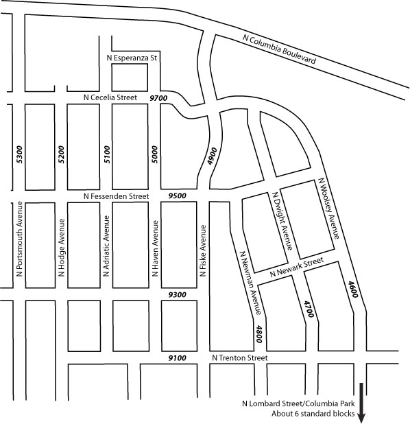 Click upon, of course, to see it bigly.
Tired of trying to find a single official map of the area called "New Columbia", I visited the invaluable PortlandMaps.com and used those maps (your tax dollars at work, people!) to create my own map of the area.
Looking at an old map of the area, Woolsey Avenue and Wollsey Court made big lazy loops that looked kind of like a big lima bean. All that is gone now, replaced by a compact little grid bend a little askew from the cardinal directions. Not a bad idea, really; I understand the area is very lovely now.
The map was built in Adobe Illustrator CS2
Subscribe to:
Posts (Atom)