16 March 2010

[Out 122nd Way] Rossi Farms, NE 122nd and Shaver

2351.
Rossi Farms is a working farm on NE 122nd Avenue at Shaver Street. At one time, it was a few miles out in the country. Those times have changed, needless to say.


The farmhouses left on the Rossi property, in the 3800 block of NE 122nd Avenue, are in sight of the I-84 122nd Avenue overpass, a very large K-Mart, a few gas stations, a state liquor store, and Parkrose High School.


NE 122nd Avenue is a very wide street with five full traffic lanes and traffic that, at times, approaches freeway dangerousness. And it goes right through the Rossi property, with about 3/4ths to the east of it and 1/4th to the west. All along the north side of the property runs Shaver Street.


The Washington Cascade foothills are visible from the place, and on cold mornings when there are low-hanging clouds, the effect is a little bit etherial.


Rossi Farms have been around since 1860. Its neighbor to the northwest, Parkrose High School, hasn't been there quite that long.


Most farms I know have aren't embedded in urban neighborhoods, but if it was, Parkrose would be the appropriate one.


4000 block. Two perfect miles north of Burnside.


Mount Hood is prominently visible from the corner of NE 122nd and Shaver, and it makes a fitting backdrop.


Anyone who doubts that the Rossi Farm is still a working farm need only note the trucks and shipping pallets on the north side of the very-farm-looking barn there. I don't know what produce they grow there, but they do grow produce.


The Rossi Farms logo combines the country and the city. They know what they have here – an original, Portland-quirky, charming gem in the east of the city.


It's not the country any more – it's the suburbs. But still the farm survives.


… and it's very convenient to the freeway. Thoroughly modern.


With the rising sun washing out some of the urban details you can maybe still daydream about what the surroundings might have been like if they were still all country and fields.

If you want to feel like a country mouse for a few minutes, the Rossi Farms is a good place to go by. They even have a faux-Western village and stage events occasionally.

Technorati Tags: , , , ,

[design] A Happy Flowchart – How Designers Fail

2350.
A person I follow on Twitter – who's just started following me (thanks, guy!), Jason Tselentis (or @JasonTselentis, if you want to follow him, and you should) referred me to a flowchart he designed to be on a postcard heralding the talk How Designers Fail. It's got warmth, wisdom, and a little self-referential Designer humor, and it made me smile a bit, and that's why I want to share it here – not only because it's rather appropriately designed: not too much, not too little, just right:


Clicky to embiggen, of course. It looks like the sort of talk I'd like to attend, if AIGA Portland would ever bring Jason out here.

Until that time, you can peep Jason's stuff here:


Technorati Tags: , , , , ,

14 March 2010

13 March 2010

[design] XTC's Go 2: Another Cover Where The Type Is The Art

2348.
Referred to me by Ben Lukoff after peeping the Chumbawamba cover two postings back, is this, the RECORD COVER for XTC's 1978 Album, XTC's Go 2:


The text, in full, reads as follows:

This is a RECORD COVER. This writing is the DESIGN upon the record cover. The DESIGN is to help SELL the record. We hope to draw your attention to it and encourage you to pick it up. When you have done that maybe you'll be persuaded to listen to the music - in this case XTC's Go 2 album. Then we want you to BUY it. The idea being that the more of you that buy this record the more money Virgin, the manager Ian Reid and XTC themselves will make. To the aforementioned this is known as PLEASURE. A good cover DESIGN is one that attracts more buyers and gives more pleasure. This writing is trying to pull you in much like an eye-catching picture. It is designed to get you to READ IT. This is called luring the VICTIM, and you are the VICTIM. But if you have a free mind you should STOP READING NOW! because all we are attempting to do is to get you to read on. Yet this is a DOUBLE BIND because if you indeed stop you'll be doing what we tell you, and if you read on you'll be doing what we've wanted all along. And the more you read on the more you're falling for this simple device of telling you exactly how a good commercial design works. They're TRICKS and this is the worst TRICK of all since it's describing the TRICK whilst trying to TRICK you, and if you've read this far then you're TRICKED but you wouldn't have known this unless you'd read this far. At least we're telling you directly instead of seducing you with a beautiful or haunting visual that may never tell you. We're letting you know that you ought to buy this [place album format here] because in essence it's a PRODUCT and PRODUCTS are to be consumed and you are a consumer and this is a good PRODUCT. We could have written the band's name in special lettering so that it stood out and you'd see it before you'd read any of this writing and possibly have bought it anyway. What we are really suggesting is that you are FOOLISH to buy or not buy an album merely as a consequence of the design on its cover. This is a con because if you agree then you'll probably like this writing - which is the cover design - and hence the album inside. But we've just warned you against that. The con is a con. A good cover design could be considered as one that gets you to buy the [album format], but that never actually happens to YOU because YOU know it's just a design for the cover. And this is the RECORD COVER.

Isn't that delicious? They get you with the wit, mess with your head a little, and go out on the same note they went in on … kind of like Samuel Delaney's Dhalgren, only much shorter and with a lot less surrealism.

Are they having you on or having the laugh of you or letting you in on the joke? And how can you be sure either way?

But the design point comes in when your eyes course over the typewriter font (which, in 1978, probably was done by a typewriter) and the stark white on black. The message goes up the side of your head with a two-by-four … a somewhat pretentious and sarcastic two-by-four, but a two-by, none the less. And the type carries the artistic impression of a bare, direct message.

This could have come out of any modern 'zine, so, doubleplusgood there.

Unlike Chumbawamba's album, though, the block text is not the entire title, which is XTC's Go 2 only.

Technorati Tags: , , , ,

[meme] Edward Hill, the Russian Rickroll, Simplified

2347.
You think you've seen everything you need to see about Edward Khil', but you ain't seen nothing until you see this remix.

Does it pull him out of the uncanny valley or only put him deeper? You be the judge:


I think it makes it just a little more awesome. And, by awesome, I mean scary.


Technorati Tags: , ,

12 March 2010

[type] The Greatest Modern Album Cover To Date

2346.
I love album covers, even though they've become small.

Hey, things change. Vinyl LPs are a niche product now, and that's just the way things are. But the big covers … aaah, I digress.

The Chumbawama release, The Boy Bands Have Won, is not one I've ever listened to. But I would pick it up on the strength of this cover:


The Boy Bands Have Won is the title you'll usually hear, but it's not the whole title. The whole title is that big block of text, which runs:

The boy bands have won. And all the copyists and the tribute bands and the TV talent show producers have own. If we allow our culture to be shaped by mimcry, whether from lack of ideas or exaggerated respect, you should never try to freeze culture. What you can do is recycle that culture. Take your older brother's hand-me-down jacket and re-style it. Re-fashion it to the point where it becomes your own. But don't just regurgitate creative history, or hold art and music and literature as fixed, untouchable and kept under glass. The people who want to try to 'guard' any particular form of music are, like the copyists and manufactured bands, doing it the worst disservice, because the only thing that you can to do music that will damage it is NOT change it, NOT make it your own. Because then it dies, then it's over, then it's done and the boy bands have won.

So that's the whole title. I understand it holds the world record for the length of album titles. I like the way it tells us that what we do should be influenced by what comes before, if any sort of art is to be healthy, and even though we all stand on shoulders of giants if we try to create anything our own individual humanness is what makes things unique.

And I don't mean to say I dislike pictures as cover art – far from it. But every time I tell people you can draw pictures with type, I want to point out things like this. Color. Arrangement of type. Message. It hooks you, or you need to check for a pulse.

I've already crufted too much commentary on this. Add your own – here or in yo'head.

Technorati Tags: , , , , ,

[art] The Why Cheap Art Manifesto

2345.
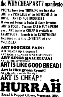
This is one of the greatest little posters ever.


It doesn't require a whole lot of comment, except to point out that type is fun and thoughts like this occasionally need to be re-seen (I've posted this here before), but I can't quite put it into words why, because it becomes trite, so maybe some further commentary is beyond words.

Insert your own. Here, or in yo'head.

Bread and Puppet is still kickin' it: http://breadandpuppet.org/

Technorati Tags: , , ,

[bloggage] Blogger Template Designer – Template Design for You, Me, and Everyone We Know At Last?

2344.
Well, that's what I certainly hope.

While most of my friends and the cool kids find themselves blogging on WordPress and suchlike, with all thier awesome cusomizability, I've stayed with Blogger because it's comfortable, forgiving, and familiar. I customize the front page of this blog to the limit I feel comfortable doing so.

The problem with taking it to the next level with Blogger is the template code. I've programmed in Pascal, Euphoria, even Lisp, but this is what I call abstruse! No insult intended to the Blogger developers, of course, it works and I don't have to fret about it and that's what I want. But what I also wanted is a way to take my customization even further, to bring this to some level where it's completely different.

Well, Blogger in Draft (which I've made my dashboard home in order so as not to keep missing the nifty as it happens) has a new thing – Blogger Template Designer, which looks like it will abstract the Blogger template design process to a new, more friendly level. Right up my street, I'd say:

We’ve added a fair bit to Blogger over the years, but one thing that’s been constant for some time has been our collection of templates. While a number of talented designers around the web have offered their own fresh and interesting designs that you can apply to your Blogger blog, our stock set has grown a bit stale, and you’ve noticed. You let us know — in the forums, on Twitter, sitting next to us on airplanes, even from across the counter at a Harvard Square stationary store, and we’ve been listening.

Today we’re taking a big first step in improving not just our template designs, but all the ways that you can customize the look and layout of your blog.

So a lot of us, myself included, are going to be poking around in Template Designer over the near term and seeing what we can come up with. The possiblities certainly seem exciting, and an amazing, visually exciting browserscape just might happen.

Or maybe everything will start to look like MySpace. I sure hope not, that!

Oh, I'm just woolgatherthing – this is some pretty nifty stuff, and I'm going in there with the big crayon to be sure.

One other thing: if you create a new template, tweet about it with the hashtag #newbloggertemplate, and Blogger might feature yours some time.

Technorati Tags: , , , ,

11 March 2010

[logo] I Have A Logo To Donate To The Delphine Campaign

2343.
It's all over the place, and dang that I wasn't able to catch it earlier, but US Senate candidate Marc Delphine today tried to push the envelope on the concept of there being no such thing as bad publicity.

In need of a striking identity for his upstart campaign to replace Oregon senior Senator Ron Wyden his campaign, through processes still unclear, to come up with this:


… which is very dynamic. And also, not terribly original. Because, as any fan of the NHL's Columbus Blue Jackets might creditably say, Been there, done that …


… got the t-shirt.


You can go on all you want about derivative logos and matters of difference, but aside from the subtraction of the red circle and the addition to a flappity-flourish on the end of the banner, it's the same thing – flipped. In perhaps a predictable ways, the Delphine campaign appeared to try to eat their cake and still have it by simultaneously accepting responsibility and deferring blame to the mythical volunteer "Aaron". This following from The Oregonian via the progressive website Blue Oregon:

On the logo issue, Delphine said he thought a volunteer named "Aaron" designed it and donated it to his campaign. Delphine said he does not have any other information about "Aaron."

Delphine referred questions about "Aaron" to his Web site administrator, Jerry DeFoe. DeFoe said he does not know who created the logo and questioned whether it is worth pursuing.


I'm hoping "Aaron" is working under an assumed name. Actually, "Aaron" probably is an assumed name, if you follow me.

Look, everyone hopes their political campaign logo can hit a home run, like the President's did. It'd be nice if it would. But my experience runs toward two places here: first, you don't really need a groundbreaking logo for a polticial campaign – all it really has to be is a little bit catchy. I didn't think George W Bush's electoral logo – the W with the flapping American flag – was particularly genius, but it was effective, it filled its role well, and it was memorable enough. Most of the time, if you just catch yourself a few five-pointed stars and got some stripes in there, you'd have a win instead of a PR face plant.

Put my money where my mouth is? Okay. Now, I'm not the kind who votes Libertarian, so this is not an endorsement of Delphine's campaign or even his political presence, but here's something for you – (this has, all of a sudden, turned fun):


There, I fixed it for you. Is it perfect? No. Logo treatments out of the box never are – or rarely are. But there's a star and a blue stripe, suggesting the flag. Red, white and blue – it's all there. Even used the big red star to form the dot over the "i". The flag in the background? Free photo stock from the Stock Xchange (http://www.sxc.hu). It's still a little bright and busy for the foreground, but I'd adjust this in a second round; this is, after all, a rush job. Done in Adobe Illustrator and Photoshop, for what that's worth.

And you know what? If Mr. Delphine wants to use it – hey, go ahead. Just give me credit.

Technorati Tags: , , , ,

[net] ZehnKatzen On Delicious

2342.
I've recently started up on delicious again, Pariah Burke's CreativesAre Community Toolbar making social bookmarking just a click away.

Want to share something with me, keep track on what I'm interested in, or just connect bookmarkedly? I'd be thrilled to have you (yes, you!) in my delicious network. The link is over at the top of the sidebar, just below the link to the Behance online portfolio, or you can just go to:


Hope to see you there …

Technorati Tags: , , ,

10 March 2010

[design] Making A Business Card In Photoshop

2341.
You can think of a million reasons to have a business card and a million situations to have one. You could also find out the figures you need to make it or … Tutttoaster has a nifty perspective on the basic-basic of the business card workflow that you can peruse. The tutoral file (included at the end of the posting) contains all the layers that were in the tute: The front looks like this:


And the back looks like this:


It's a nice design, but why not download it and come up with your own variations – if you're a designer, you shouldn't be satisfied with what you get handed, anyway. Never be satisfied with the default!

It's a fine foundation to build all sorts of business cards in, including your own, and with cheap business card services proliferating by the day, it's a fine file to have in your collection, or alter to your own workflow.

If you're any sort of designer, even if your an unsuccessful one like me, you'll want to do that.

Technorati Tags: , , , , ,

06 March 2010

[filler] Deleted Post

2340.
Content Removed at respectful request

[liff] Edward "Trolololol" HIll: In Soviet Russia, Rickroll Plays YOU!

2339.
They call him the next Rickroll or the Russian Rickroll, and he will drag what's left of your sanity straight to Hades after this worms your way into your bean(Important And Serious warning – if you were the kind who was nearly driven to insanity by Numa Numa, then UNDER NO CIRCUMSTANCES SHOULD YOU CLICK THE VIDEO; IT IS INDESCRIBABLY MORE DESTRUCTIVE OF YOUR SANITY!):


He's Edward Hill, or Edward Anatolyevich Hill, or Eudard 'Khil, and he's pretty much crawled up into everyone's beans and is going to lay there a while, so, here's the mystery revealed:

Of the last list item above there is some very intellectual verbiage considering the vokaliz nature of the performance. Particularly chewy food for thought:

Hill's version seems nothing if not perverse, but what a bit of contextualization helps us to see is that this is not at all the result of his own innate weirdness, or of the innate absurdity of the song he has undertaken to sing.

About 90% of the recent commentary on Hill's performance maintains that it is so bad it's good, while the remaining 10% maintains that it is, simply, good. To my mind, if there is a stroke of brilliance in this performance, it is the genial wave Hill gives to the audience as he exits whence he came. He bids farewell as if we have just experienced something genuine together. But what could that have been? He hasn't even said anything. I thought here of Tolstoy's cranky reaction to the Moscow debut of Wagner's Ring Cycle, in his incredible work, What Is Art? Echoing a concern about what it is that art is supposed to do, raised already by Pascal (who encourages readers of poetry to imagine a state of affairs in which a person actually has the properties a poet attributes to them, e.g., a girl who actually has cherries instead of lips), Tolstoy wants to know why those people on the stage are singing instead of talking if what art is meant to do is to capture something real about human experience, and why, once we reduce their sung words to their mere content, we should be at all interested in what they have to say (mostly childish fantasy stuff about forest spirits and valkyries). 

Hill hasn't said anything, yet he bids farewell as if he has. What bit of reality is this meant to reproduce? What kind of perversion of that original reality does it involve? It's hard to react like Pascal or Tolstoy, since the art hasn't told us anything about the reality that's been transfigured. One can only say, in the manner of a YouTube commenter, WTF. Magomaev never invites you to say this. His interpretation makes perfect sense: he is a man in a night club enjoying himself, so much so that he feels inspired to use his very voice as a musical instrument. Hill is doing something altogether different.


The first takeaway was of the almost surreal, somewhat spooky oddity of it all. I'm repeatedly listening to Roxy Music's Avalon to wash the edginess of it away, and to a degree, it's working. I'm not necessarily arrogant about the art I'm familiar with being somewhat better, but it is familiar, and therefore relatable to.

Well, this is how one stretches one's enevelope, yes.

Still it leaves me with the "uh-oh" feeling a little. And since you're going to be directed, Rickrollingly, to this clip at one time or another, well … forewarned is forearmed.

Technorati Tags: , , , ,

05 March 2010

[web] An A-Plus Tutorial On Adding Social Sharing Buttons To Your Website

2338.
I read a whole lot of tutorials all the time on design and art, whether or not I mean to use the information. And lately, I've been reading tutorials on how to do web image design and coding, just as part of my self-imposed Adult Education program. And I've seen a lot of tutorials via Twitter.

Twittering designers show that it's possible to create a website design in Photoshop, which is possible if you're doing conceptualizing work, but transferring those to Web code is another matter. Few, if any of these tutes, however, provide you with a way to translate the design into code, which is kind of a cop-out, in my perhaps-unfair opinion … sure, you can mock up a great website concept in Photoshop (or even Illustrator, and Pariah Burke's showed me how you might translate that Illustrator design right into web code), but is what you just mocked-up translatable?

Richard Darrell has just done the necessary. It need not be mentioned that sharing websites and blog posts get Tweeted, Dugg, Delicioused, etc, etc, all the time. Your content might be more likely to go there if you provide buttons to make it easier for the reader. I found the button at the bottom of each of these posts by going to AddToAny.com and embedding code in my Blogger template (the service of which is less satisfying these days … but that's for another program).

Richard's tutorial, hosted at his site Raster Rebels, shows you not only how to create some pretty spiffy looking buttons (don't click 'em, they're like nipples on a dude right now):


With all the fashionable gloss and clever take on the symbols (I like the way they're all tilted 45 degress right), but … and here's the best part … he also provides you with the code that will enable yout o make the buttons truly yours. That's something few tutorialists bother to do, and that's why I commend this to anyone curious as to how to make it for themselves.

Technorati Tags: ,

[signs] Pedestrian-Street ROW Blades In Seattle

2337.
Ben Lukoff, a Seattle area dude of no small renown and a fellow street-blade obsessive, posts some nifty shots of Seattle street blades at his flickr stream. One which caught my eye details how New York Alki signifies pedestrian ways that are aligned in street rights-of-way.

My fellow Portlanders may be aware of how we do it. A simple standard street blade is erected at the place where a street would be if it were built there, leading to the interestingly-dissonant scene of what looks like a walkway with a street name. Some, in the west hills, align with staircases.

As I recall, Oregon City's famous Municipal Elevator downtown was, at some time or another, designated a right-of-way called Elevator Street, but that's a digression of height as well as breadth.

Anyway! Via Ben's Twitter stream I found he'd posted this picture, which really caught my eye:


There he is, the little Crossing Guy on the end of the blades for E Mercer Street and 31st Avenue E, indicating that the city ROWs go through, but just as pedestrian paths (and, perhaps, terminating at the corresponding Open-For-Travel streets.

The font seems to be Clearview, but it seems a little off somehow.

A notable addition would be the st superscript next to the number 31 on the 31st Avenue sign. Standard Seattle style up to now will have been to use for 31 Ave E, eliding the superscript.

But it's the Crossing Guy that I really like to see there. Makes quite a statement.

Technorati Tags: , , ,

04 March 2010

[branding] The Mouse Sets The Oregon Duck Free

2336.
The status of the Oregon Duck … the Donald Duck-oid fellow who's represented the Universitatis Oregonensis all these years, via a most unique handshake agreenment between Walt Disney himself and the then-University of Oregon AD Leo Harris (and later qualified by a ton of provisos) has undergone a seismic change today, as reported by the Eugene Register-Guard.

The image was allowed to be used by the U of O in certain ways and in certain venues only. This included the mascot costume, which essentially belonged to Disney though the U of O had to build it and pay for its upkeep. The mascot was only allowed to appear at games, which is why the Rose Bowl booster video by a YouTube Duck consortium calling itself Supwitchugirl almost became as famous. Off-license uses of the Duck tended to put the unique agreement between Eugene and the Magic Kingdom (no, not the Oregon Country Fair) in jeopardy, and I'm certain nobody needs to be clued in on just how jealously Disney guards its symbols, marks, and copyrights.

Well, those days of dancing around Mickey and the gang are over; Disney has entered into an agreement with the U of O that says, essentially, the Oregon Duck costumed mascot and Donald Duck have diverged enough that the aren't the same thing anymore:

… The UO/Disney licensing agreement remains in effect for the printed logos on sweatshirts and the like. But the costumed Duck mascot now answers only to the university.

In an agreement finalized this week, Disney acknowledges that the “current incarnation of a costumed character featured at the University of Oregon’s athletic and promotional events (the ‘Oregon Duck’) is not substantially similar” to Disney’s Donald Duck character.

So, now, Supwitchugirl – and anyone else who wants to use the Duck mascot in a video – can go ahead and do so, inasmuch as they can either get the Athletic Department's permission, or, heck "borrow" the costume for a few hours (hey, it is a college. These things happen).


Clearly not the same thing.
Representation of Donald Duck © Disney. Still.

Congratulations, U of O. I mean, I'm a Beaver fan and all; I'm not exactly uncorking the champagne here. And the Beavers are still gonna be all up in your act this next season.

Not even the spirit of Uncle Walt can keep that from happening to you.

Technorati Tags: , , ,

03 March 2010

[art] Local Web Publication on NW Native Plants Uses One Of My Photos

2335.
Wallace W. Hansen's NW Native Plants is a Salem nursery in what I've detected to be an emerging trend of marketing flora native to this area to area gardeners. I don't know how profitable it is yet, but it seems to have been carving itself a bit of a niche. Certainly it's a timely thing, and a delightful thing besides (Ivy is a problem, and did you know that they found kudzu in Oregon a while back?)

Last month the webmaster of Wally's site, Jennifer Rehm, contacted me about using one of my photos of our trip to the Mission Mill Museum in Salem to illustrate the NW Native Plant Journal, an issue about plants along streams (both of which you have a surfeit of here in NW Oregon). This one, to be particularly exact:


Particularly appropriate for living along streams. This is a view down Salem's Mill Race, which is a canal which diverts some of the flow from Salem's Mill Creek to a propitious place for the early Oregonian European colonists to start one of Salem's first major commercial enterprises – The Thomas Kay Woolen Mills. The location is now a wonderful museum.

I consented to allow use of the photo in return for credit and linkback, and Jennifer is indeed a lady of her word. It appears on Page 23 of the current NW Native Plants Journal:


Good layout, appropriate type. And my photo. What's not to like here?

If you want to get a closeup looksee of it, go to NW Native Plants and download the NW Native Plants Journal, and turn to page 23. And if you're a Oregonized gardener, consider buying from NW Native Plants, because, speaking as one Oregon native about others, you just can't have too many of us around!

Thanks, Jennifer!


Technorati Tags: , , , , , ,

[logo] Ubuntu Has A Nifty New Logo

2334.
Just peeped via something somehow, with version 10.04, the open source (and free-as in beer) Linux OS Ubuntu is getting a keen new look:

Here's the main logo versions:


In my opinion, the Ubuntu logo has always been one that hit a home run. But this new, more typographical approach for me was love at first site. Drawing its inspriation from a bunch of type design I've seen lately, such as Myriad and Clearview, coming up with a simple clean sans-serif (provided this wasn't an off-the-shelf font solution) and making the lovely graphic Ubuntu logo mark a sort of supersciripted typographical mark, sort of like an asterisk with a whole lot of extra meaning.

All of the Ubuntu marks are getting the treatment, and in others parts that aren't strictly OS, such as the Kubuntu projects, spatial positioning and that beautiful font they're using do the job. Canonical's website is reportedly getting an update too.


Technorati Tags: , , , ,

02 March 2010

[web design] So, Who Says I Have No Impact? My Blog Postings Get Used In Web Design Classes.

2333.
I haven't gotten a great deal of feedback from a lot of my web writing. It's a happy thing when I do.

So you can imagine that, a few days ago, my day was brightened considerably when a couple of older artcles over at Designorati were referenced by this blog posting, which belongs to a college level art course called ART 1359: Design for the web. It's completely obscured as far as which college it does belong to, but plugging the class name and title and the words "Cedar Valley" gleaned from the text indicates that the Dallas (TX) County Community College District teaches such a class.


The articles regard the difference between internal and external CSS files and what exactly the "Cascade" in CSS is and what it means. They must have been pretty acceptable if a design instructor decided to offer them up as reading via the class's blog, and remember that feeling I've talked about betimes, when you find that something you blogged about wound up answering a question someone had that you never knew would be asked? Got that feeling here.

So, hey, I was happy to offer it up for the common weal. I'm glad it seen as useful, and how many of you have had your blog articles used as fodder for classroom instruction?

So, see? Pretty nifty!

Technorati Tags: , , , , ,

01 March 2010

[art] Fool Brittannia: Brit Photogs Like to Take Pix In Public? You'll Love This …

2332.
… and by love,  we mean, of course, hate. Looks like the Her Majesty's Government is out to get photographers, mostly by making copyright much harder to maintain, and by making it impossible to get pixs in public without going out and getting releases from pretty much everyone you might meet.

I don't know what it is about politicos sometimes. The Intarmets makes them crazy. I personally acknowledge that some tweaking might be necessary in the age of drag and copy, even though I think the DMCA is used more as a bludgeon than a shield, but that's what you get when you let 19th century thinkers in the 20th Century try to define the landscape of the 21st.

The DMCA has its flaws and its strengths. But if you think the DMCA is bad news, you'll probably take it in a choice between it and the UK's proposed Digital Economy Bill thats making its way through Parliament right now, though what I've read of it will do more to strangle whatever digital economy they have there – at least amongst the little guys.

This article at the web site Photoactive portrays two millstones that the Lord Mandelson is trying to hang round the necks of British photogs right now. Both are pretty obnoxious.

The first one is bad enough: it will effectively strip copyright from works photographers create unless they register each one – and each version of each one – with a government agency that is yet to be created. That runs counter to all conventional wisdom about creative ownership – and that CV seems to echo the Berne Convention, which is a fairly-commonly accepted international standard, which boils down to, essentially, when you create it, you copyright it automatically. That's a very clear, understandable, and common-sense standard that anyone can wrap their beans around and seems quite reasonable. Of course, you can't charge for that; that's probably the rub.

The second one is, if it could be possible, even worse. One of the things about taking public photos is that you don't have to get permission from everyone in the photo to publish it. There is a principle called a "reasonable expectation of privacy", which essentially boils down to if you don't want to have a picture of your face taken in public, don't show your face in public. That's why they call it public. I shudder to think of all the epochal photos of people that would never have happened if the proposed UK standard was in force anywhere … I think of The Kiss (excerpted illustration right, used under fair use) by Alfred Eisenstaedt, the famous photo of a grateful sailor bowling over a pretty nurse on V-J Day in 1945 in Times Square.

Under the Digital Economy Bill proposal, any picture taken in public will be considered to contain private information on anyone in the frame. That means you can take a picture in the street but you can't publish it unless you either pay or get a release from anyone who'd of been in the shot?

Could you do that? I couldn't. I'm willing to bet that, no matter what resources that any UK photog has, they don't have nearly enough to secure the rights to take entire street scenes. And I doubt The Kiss would have ever happened.

More locally, some time ago, PMerc's Matt Davis (if I correctly recall the sitch) snapped a picture of a fellow reclining on his stoop in NE somewhere, maybe it was up Alberta or something, and when it appeared on his blog, the subject demanded compensation.

While the area of his front porch might be physically sacrosanct, since you can be seen by God, Zeus, Horus and everyone on your front porch, you don't have the right to demand payment from anyone who happens to snap you. And the picture itself was kind of charming in a disheveled, slatternly way. How much of life would we all miss through the eyes of inspired photographers if we decided that just because you were in a public place you really were in a private one? Or how little sense that actually makes?

Of course, the Lord Mandelson probably thinks nothing of it. And Britain is, sadly, a country where there are so many CCTV cameras that even George Orwell's house is famously under scrutiny by several. And some English songwriter made a song that was about what mad dogs and Englishmen do.

Well, this law is about as daft as it gets, and that's before you even try thinking about the curtailments of civil liberties – a subject I'll leave for the reader to deduce.

As far as dogs go, this sure looks like one. It's to be hoped that cooler UK heads prevail.

You don't promote a digital economy by preventing the proles from taking part in it.

Technorati Tags: , , , , ,

[liff] RIP T-Bone Wolk: "Like Losing My Right Hand" – Daryl Hall

2332.We strike the low note today and hold it long, because the legendary Tom "T-Bone" Wolk, bassist, Hall and Oates sideman for thirty years, and bassist of the NBC Saturday Night Live house band during the G.E. Smith years, has passed away at the incredibly untimely age of 58.

No further comment should be necessary
.

Technorati Tags: , , , ,

[pdx] Become A Fan of "Portland Was Built On An Ancient Unicorn Burial Ground" On Facebook …

2331. … and not just because the graphic I made in this chapter is the front page graphic for it.


Although, IMHO, it's a very good reason to.

Technorati Tags: , , ,

25 February 2010

[design] KWHSS: A Logo and Website Header For A Medieval Club's Conference

2330.The Society for Creative Anachronism's College of Heralds – the group within the society that does work announcing at tournaments and events, researches and documents names and designs for coats of arms – in my not-so-humble opinion, the closest thing America has to a true Heraldic college, one that grants coats of arms and such in the manner of the English College of Arms – is having a symposium coming up in June, the Known World Heraldic and Scribal Symposium, or KWHSS. I've spent a bit of time designing for that effort (disclaimer: The Wife™ is the "autocrat") and I'm going to spring this on her, this combination of header image and insular uncial-style font that I've just bashed together:


The logo – gold crossed trumpets behind a a dragon's head emerging from a red quill pen – combines three essentials. The trumpets are the traditional SCA emblem for the College of Heralds, the quill represents the scribes, and the dragon's head represents the Shire of Dragon's Mist – the hosting branch. In the SCA, the membership is organized into nineteen territories or "Kingdoms": "An Tir" is the Kingdom comprising Oregon, Washington, the Idaho Panhandle, and a great swath of western Canada (from BC all the way over to Saskatchwan).

The character of the An Tirian lands has long been compared to that of Ireland, specifically the area the conference is being held in (Dragon's Mist comprises Washington County) so the Irish-style Uncial type seemed a natural. I was fortunate to find the font at FontSpace, it's called Irish Unci Alphabet, and while all the Gaelic-themed fonts there are very good, very few of them have numerals in the set. This one does, and I recommend it. It's free (as in beer), by the way, and the license allows for commercial use.
* No Relation

Technorati Tags: , , , , , , ,

[design] The Museum of Forgotten Art Materials

2329.I'm a little dismayed. I thought that art materials were evergreen. I mean, an eraser doesn't stop erasing just because you do all your design and art work on a computer. And these:


… rule, baby. You just don't know! In the meantime, scoff if you will, but if The Change happens, or it gets past peak-whatever, I'll still be happy drawing, and you'll be crying about it. Oh, yeah, laugh while you still have electric power, bee-yotches!

In the meantime, the entire museum is very charming, and it's here:


Enjoy, seriously.

Technorati Tags: , , ,

19 February 2010

[web] A Great Website Design – Marred By Comic Sans

2328.It's easy to complain about Comic Sans, I know, but when you see a website that could have hit it out of the park without it … well, you cry and die a little inside. Something must be said.

I give you the front page for Short Run Cards, one of the many purveyors of fast, inexpensive and (we assume) quality business cards you find today. There is nothing not to like about the website … almost.


Use the link in the previous graf to get a good close look in your browser. But, really, the graphic style is a home-run winner. Retro style, limited palette working it like a champ … and if you watch it long enough, the capital R in the dead-clever sign flickers. The message on the drive-in screen (a clever reference to the name, drawn from the world of movies) flickers and changes.

So, you move down to the text – and there it is. Comic Sans. Overused so much that it's tired even where appropriate.

Now, I don't have a specific beef against Comic Sans except that it's overused. It was originally developed by Vincent Connare for the late, rather unlamented Microsoft BOB user environment (the one which, famously, Melinda Gates was project manager on before she married Teh Bill), it was, as legend has, inspired directly by comic lettering for an appropriate application (one meant to make a user-friendly front end program all that much more chummy and cozy).

Comic Sans has been used in circulars, flyers, warning signs … in as much as this isn't such an inappropriate use, it's fine, but in this context, what it says to me is that the design stopped at the site layout. Every part of a website communicates, and if a little more care were chosen in choosing the font to support the design, this would have been completely kicked up to the next level, rather than almost made it.

So, suggestions. It's one thing to carp, it's another thing to offer an alternative. Happily, there are alternatives for Comic Sans out there! A few of them are even free!
  • Visit:  Ban Comic Sans for this list of free fonts for both Mac and Windows. BCS has adopted a kind of Vandal-storm-the-castle approach, but they do offer alternatives for the overused font. Many of them are quite pretty and are designed well.
  • Visit: Blambot http://www.blambot.com/. Blambot is nothing but comic-style fonts. There is a range of free fonts amongst the even-larger range of retail fonts. There's a lot to like here too.
  • Visit: Fontscape Comic Sans Alternatives at http://www.fontscape.com/explore?9BU. The top three alone are more than able alternatives to CS that look good, have about the same approach, and by simply not being CS send the message that "hey, the designer thought about the font and didn't just go with the default.
  • Visit and Read: Chris Barr's "The Comic Sans Effect" at http://chris-barr.com/entry/the_comic_sans_effect/. Also writes about Papyrus, the thinking man's Comic Sans. And suggests alternatives.
Point is, even where it's appropriately used, CS can communicate a lack of imagination, and on a website as good-looking as Short Run Cards's is, that's a pity. It makes a great website just a teensy bit less great.

(hat tip to DesignThatRocks, who pointed me to this website via one of his tweets)

Technorati Tags: , , ,

18 February 2010

[logo] Gaijin 4komo KIRO-FM

2327.The Reaction Guys on the KIRO FM logo rework:


They like it … they really like it.

Technorati Tags: , , , , ,

[web] Advisory: Firefox 3.6 Doesn't Do Preview From Dreamweaver CS3

2326.This is something that may impact your workflow if you use Adobe Dreamwever CS3 (and maybe CS4).

Dreamweaver designers are well-familiar with the quick-preview button on the Dreamweaver interface, and with the increasing presence of Firefox in the browser market, more and more web designers have a reason to have it point at Firefox.app.

I had just installed FF 3.6 earlier tonight and was designing along, working on a website, and clicked for the preview ... nothing. Firefox came to the front but no web page loaded.

I tried re-pointing the preview in Preferences – still no joy. I tried repairing permissions – nothing. The edited HTML file was there, all right – but Firefox wouldn't quick-preview from DWCS3. Searching teh Google showed me that it wasn't just me: a fair number of Web designers had turne up the exact same thing.

Right now the solution that works the best is just downgrading to Firefox 3.5.8. Skinnable Firefox is nifty, but it isn't a deal-breaker. I'm going to watch to see if Mozilla can give us a workaround that's less work than pointing the web browser at "file://Sundial_Four/Websites/Whatever".
Or, if you're not bothered by this problem, just Dreamweaver CS3-away. Just remember, if you want a preview in Firefox 3.6 (which is otherwise quite sweet) then you'll have to work around.

Technorati Tags: , , ,

[logo] KIRO-FM Updates That Logo …

2325.… and it's better. Still not great, but better.

Lest you think I'm simply belittling it, let's take a tour … A three-logo tour.

Some time back, Seattle's KIRO was AM talk radio, and they had this logo:


… and I fairly rhapsodized about it. And why not? To align the slanted end of the red stripe with the leg on the front of the R is cleverness of the highest order. The well-done Space Needle icon is just icing on the cake here: the alignment trick sets up an internal structure that makes the whole thing hang together just on the alignment alone. This was a logo done right.

Well, KIRO moved to FM, and debuted this:


Which I took a dislike to for two reasons: First, the stacked FM just makes the thing ring with discord, and the rejiggering of the numbers and the type in the red stripe knocked the slanted end completely out of alignment with the leg of the R. The nifty in the logo had been killed and the body hidden somewhere, maybe on Mercer Island, who knows.

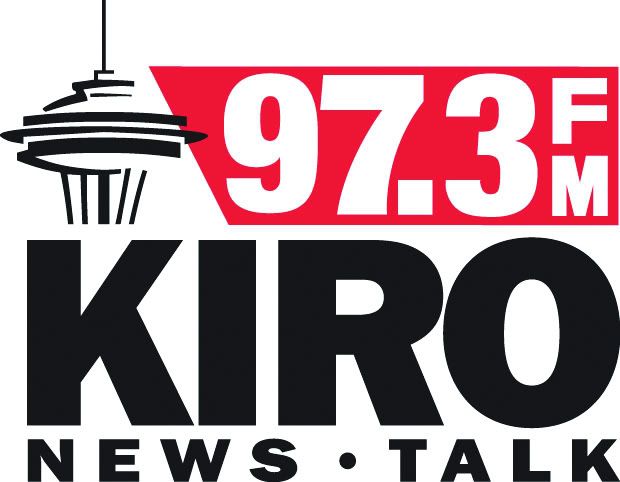
Well, our Seattle correspondent Ben alerted me to a new alignment of the parts – and here we have it:


They've applied some textual healing. And, like I said, it's better. Not great but better.

On The Upside:
  1. The stacked type is gone, gone, gone. The problem with the stacked type, even for something as minor as two letters FM, is that it brings your eyes up short. You're reading, left to right, and then ZANG you have to jink upward. It's unnatural. Eyeflow is, as far as I'm concerned, as important in a typographic logo as it is in any textual context.
  2. The black type – red stripe – black type makes for a stable, ordered logo. Business-like. Presents a sober, serious image for a news-talk station, which is appropriate.
  3. I've not said too much about it before, but I like the Space Needle drawing. Or maybe I did say something about it, I don't know, but I can see why they'd be reluctant to let that go.
  4. The way the Space Needle graphic breaks out of the boundaries keeps the logo serious without becoming too locked-down and boring.
Of course, a logo watcher and aspiring designer is never ever satisfied. We can find fault literally anywhere.

On The Downside:
  1. Is it just me, or does that 7 look a little too thick to be with the 9, 3, and decimal point on the top?
  2. I still miss the dead-cleverness of the original logo. I admit it. Maybe I love these things a little too much.
So, kudos to KIRO for recognizing the problem with the stacked type and going with this approach. It's a logo that does the job that it was meant to do and doesn't make the eye regret looking at it and, in logo design as I know it, two outta three ain't bad.

Sometime soon I might redesign this logo just as a something-to-do, hypothetical project. I have wondered if I could do it better, in case anyone wonders.

H/t to Ben for the headsup.
 
Technorati Tags: , , ,

17 February 2010

[logo] Iconic Logo = A Ton Of Money? Depends.

2324.In an article at Logo Design Love I saw today, the blogger asks the following question:
Can we create a truly iconic logo without the backing of a very fat wallet?
And I'd say it depends on what you mean by create.

One of the most well-known and iconic logos from out of Oregon is, of course, the fabled Nike swoosh. Its creation is the stuff of serendipitous legend. The designer who created it, Carolyn Davidson was, as the record shows, a design student at PSU at the time who was billing Nike as a design consultant at the rate of $2/hour (remember that this was in Nike's "Blue Ribbon Sports" era, and the year was 1971. Even $2 went rather a bit further then than now).

The famous logo itself cost the embyonic Nike all of $35 – once again, in 1971 dollars (Using the neato-mosquito calculator at http://www.measuringworth.com/uscompare/, this is, by the CPI measurement, about $182 – still a bargain). Later, when Nike finally strode the Earth like Colossus, they had Carolyn to a company lunch where she was given a nifty ring with the Swoosh and a bunch of stock (the amount and value of which remain a secret, but I don't think it's presumptuous to assume that the amount was $A Whole Lot).

So, one world-renowned logo was obtained, at the front end, for $35 and the mad skills of one young designer.

Or did Nike's relationship with Weiden+Kenney and Michael Jordan – where a metric ass-ton of money was spent, rather profitably – create the icon? Or, if the Swoosh wasn't simple genius from the start, would it have been iconic from that point on? Or did that deft move merely give the icon its power?

It's a little like lightning striking. But I think as long as you have a solid design, lightning's more likely to strike. I'm sure anyone reading this can think of a handful of icons that had money and talent helicoptered in just to debut to a "meh" from the zeitgeist.

No matter how much money you spend, if you got a solid design, you just might go far. You've certainly improved your chances.

My advice: If you get your design work at a bargain – make sure you go back and thank the designer appropriately if it turns out that you make it big.

(I need not point out that the Nike logo is copyright Nike, yes?)

Technorati Tags: , , , ,

[cartoon art] Everywhere I Look, I See Your Face ...

2323.One thing I remember Scott McCloud hinting on in one of his amazing books on comics is demonstrated very well here, with this picture from a blog I stumbled on, Emilia's Illustrated Blog (used with permission):


There's a lot to like about the illustration. The ladies thereon are simply very very pretty. The outfits are stylish and executed well. The drawings are, dare one says, sexy. But there's one surprising thing that might not stick out, and I'll give you all a closeup so you can see (if this missive's title didn't give it away):


You've caught it now if you've noticed that, aside from a different set of eyebrows on one and a redder shade of lips on same that the four faces are, in fact the same face. The girls are quadruplets!

This can be a very effective shortcut for the illustrator wanting to 'people' an illustration. I don't know about anyone else viewing the complete illustration, there's enough going on in the illustration that the similarities in the faces aren't immediately apparent.

This of course doesn't take away from the fact that the illustrator is rather talented. If you look around on her blog, you will see that she has the mad skillz. If you think of it as a tool, then there's simply an appropriate use, and this is the epitome of an appropriate use. I wouldn't base a comic strip on it, for instance, but as an illustrator's tool, it's magnificent.

The whole point is that the prospect of drawing multiple people – and a person is about the hardest thing you can draw realistically – can be intimidating. McCloud pointed out in one of his books (Making Comics, I think it was), essentially, that the range of things a face can do can be represented with a limited set of things. An open mouth can mean talking, yelling, yawning, and it kind of depends on the context. The four ladies above seem entirely different people – but it all has to do with the context: the hairstyles, the dresses, even the attitudes one reads into them.

Moreover, Emilia's use of this tool shows an understanding of the fundamentals of illustration design that only a true pro would aspire to.

Understand your context, and the proper tool will usually present itself.

Technorati Tags: ,

14 February 2010

[comic art] Why I Admire Barry Deutsch

2322.This illustration of Mirka's family from Hereville is a good example of why I admire his work so much:


It's hard to argue that there's true talent when such simple lines can weave such an emotional story in one single panel.

It doesn't matter what kind of family you grew up in … if you grew up in a family, and that includes most of us, this will resonate with you. It's human.


Technorati Tags: , , , ,

11 February 2010

[branding] Quietus: Why It's Not Selling Well Amongst Film Buffs and PD James Fans

2321.NOTA BENE, 12 March 2010: I noticed getting linkage from this discussion thread at Newtek.com, and I'm flattered. Thanks very much! If you care to, hang about a while, leave a comment … I enjoy getting visitors, and I'm always out to make new friends, especially as perrcepive as you folks are. Moreover, despite the title, I don't know for sure how many units "Quietus" sells anywhere, so imagine the word "probably" in there. Judging by the quality of the discussion at the source of this link, you guys Get It™, however! 

Also check out my public bookmarks on delicious (http://delicious.com/zehnkatzen) and consider adding me to your network! Thanks!

So many things could be settled with a simple web search really.

If you listen to talk radio as much as I do (too much, according to The Wife™), you've heard of an OTC homeopathic home remedy for tinnitus called "Quietus".

Now, if there's anyone in the audience who saw the Curarón fillum Children of Men or the PD James novel The Children of Men, could you tell me what Quietus was in the movie?

It's not just me that's saying that:

But savvy film buffs and avid readers may recall that Quietus was a key element of both P.D. James' dystopian novel Children of Men, and the 2006 film adaptation by Alfonso Cuarón. In the book, Quiteus refers to government-sanctioned mass drownings that are available as an option to elderly citizens who can't afford nursing homes. In Cuarón's film, Quietus is a suicide pill that's freely advertised to residents of an overpopulated, financially disadvantaged future world. The drug's cheery ad line is "You decide when."

Now, I'm not saying I'm some marketing genius, and, as far as I know, the Quietus tinnitus OTC product is selling just fine. But I can't hear one of their commercials without thinking of the drug in Children of Men. And it's not so embarrassing, I suppose; the market seems to be quite forgiving; I remember Quark's rebranding about four years back, and the great one back in 2004 where Google didn't check to see if the mark "Gmail" wasn't already being used by a British financial firm (scroll to end of this article: http://www.pcworld.com/article/115586/googles_gmail_already_under_fire.html)

It's the power of branding, and why you should be ever-so-careful. And do at least one web search – and see what else comes up.

Technorati Tags: ,

[type] Shavian, An Alternative English Alphabet

2320.I've been doing a great deal of reading about shorthand scripts, and have found out a great deal about them. The biggest revelation is that shorthand, to work, has to – to some degree – abandon the alphabetic sytem of writing in favor of phonetic symbols.

What that means, of course, is that each glyph, character, or symbol might represent a sound instead of a letter with which you construct them. Gregg shorthand is, in my opinion, a very good illustrative example of this. When you write via Gregg, you put what you hear through two filters; the first discriminates the sounds, the second maps them to squiggly glyphs representing phonetic atoms rather than decodes them into the letter combinations which create the sounds. Speed is gained by efficiency in writing; the sound-based glyphs and brief forms dash down an entire word in a squiggle, loop, and dot.

Phonetic sounds are not just the province of the shorthand writer, however. Something that seems to fit between the glyphic discreteness of Latinate script and the squiggles of pure shorthand is something called the Shavian alphabet. This system, developed in the late 1950s-early 1960s, depends on new glyph forms having little if anything to do with the 26-character Latin alphabet we all know intimately. Moreover, each letterform maps to an individual English sound.

The legend seems to have it that, in his will, the great Irish playwright George Bernard Shaw left a monetary prize to be granted to the person who developed a phonetic alphabetic system for the writing of English that, since it was to depend on sounds rather than letters, would be a more efficient and economic way to write English and, since it was based on sounds, easier for the English learner to pick up the language. Originally it was to be developed by Sir Isaac Pitman, developer of the Pitman Shorthand system, but due to disuptes the Trustee opened it up to a worldwide competition. This was won by a Ronald Kingsley Read, who developed the first Shavian alphabet and was appointed its sole designer.

The Shavian alphabet is characterized by an inherent sense of order and logic. This (source) is the system that Kingsley Read developed and is known as the original Shavian script:


The Shavian alphabet comes in three basic types and a fourth auxiliary type. The first two types cover the consonants, and are called Tall (for unvoiced consonants) and Deep (for voiced consonants). The third time are Short letters, and cover the vowel sounds. The Compound (called "ah", "awe", "are", "or", "air", "err", "array", "ear", "ian", and "yew") are blends of two short sounds (except that last one there), and provide for what they call "rhotic" speakers, that is, those dialects that voice the "r" in the word "hard", for a fast example.

The eye will probably pick up right away that the Deep letters are 180-degree rotation of the Tall letters, and the short letters have mostly graphically reflective pairs. These sounds (with a few exceptions) are the voice-unvoiced versions of the same sound. Note also the pairs of tick marks between the letter pairs: they are all the height of a Short letter, or, as a typographer might say, "x-height". The graphical definition of a Tall letter is one which starts on the baseline and goes to ascender height; the graphical definition of a Deep letter is one which goes to the descender.

The real fun of Shavian (anything having to do with the playwright Shaw was called Shavian) is that, even though it's sounding out English, it looks so delightfully extraterrastrial. From Omniglot, here's the text of Article 1 of the Universal Declaration of Human Rights:


The translation of which is:
All human beings are born free and equal in dignity and rights. They are endowed with reason and conscience and should act towards one another in a spirit of brotherhood.
Another thing about Shavian which is a great deal of fun is the letter names. You might have noticed that, in the letter list, a word typifing the sound made by each letter is displayed. That is the actual name of the letter. Reciting Shavian would go Peep, bib, tot, dead, kick, gig, fee, vow … all the way through to ian, yew.
That makes me feel kind of antic inside, in the good way.

The apparent hope of Shaw was that a library of publications would obtain after his death but challenges to the will assured that only one mass-market Shaw script publication would ever happen: A Shavian-Latin edition of Shaw's Androcles and the Lion. But there is some interest in Shavian and it's infected me a little; I'd like to learn this along with any other shorthand system I take up – which will most likely be an attempt at Gregg.


Technorati Tags: , , , ,