1931. At the end of this posting about the new style of Portland street blade, Paul Vandeventer, of Los Angeles CA, left me the following feedback:
Hey, Paul, thanks for asking. It's actually quite flattering. But here's what I think you were looking for. Let's go to the corner of NW 10th Avenue and Flanders Street in our legendary Pearl district:

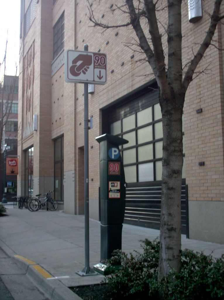
(click here to embiggen this and to go to the Photobucket album where large versions of all these illustrations are located) At first I was afraid that I wouldn't know what to look for but when I went down to that corner, I knew what Paul was talking about immediately, which I think sort of proves his point. Moreover, if you look down about midblock, you'll see a sign that locates the parking ticket dispenser for you.
Let's get another look. These signs are crucial, because unlike a city where parking meters are located at every parking space, you need these signs to be in your face as you drive by. They need to be noticable at eye level and they also need to be simple enough to be read quickly while still containing enough information to deliver the proper message.

This is an ever better view of one. There are letterforms just below the symbols to small to see, but you know at once that you'll be paying to park here. That's just the beauty of hierarchy. And it's at a height that's impossible to miss as you're driving past. We saw many of them as we were driving through. They're almost impossible to miss.
Let's move in real close, and see just what sort of information each sign delivers:

Can it get clearer than that? The questions of what, when, and where is amply answered by the sign, and every intersection has them mounted on every corner showing in the direction every car is likely to be coming in. The symbology even shows you what the shape of the machine it is you have to be looking for.
Here is what that machine looks like, from the street side (you fellow Portlanders already know this):

It's a system that is clear and unambiguous. It pretty much documents itself. Each different parking limit has a distinctive color and very clear signage designed to be seen by a person with normal vision from up to a half block away (as we saw in the first one)
It's so clear that one thinks that even someone from the City of Pasadena could use it. Your mileage, of course, may vary.
Technorati Tags: Portland Street Signs, semiotics, parking signs, Parking in Portland
I need a picture of a sign I saw near Flanders and 10th Ave NW in Portland. It depicts a hand dropping a coin, as if into a parking meter, and is meant to remind people parking their cars at the curb to pay for the time they'll be there at a nearby parking kiosk. I need it to prove to the City of Pasadena, where my wife was shopping when she was ticketed, that a clearer, more direct means of communication exists by which a city can easily convey by signage their expectation that folks will pay. Pasadena has misleading verbal signs that fool people into believing that one hour of parking is free...and then there parking patrol officers tag cars with expensive tickets. Hope you've got one of them in your archive somewhere. Thanks.
Hey, Paul, thanks for asking. It's actually quite flattering. But here's what I think you were looking for. Let's go to the corner of NW 10th Avenue and Flanders Street in our legendary Pearl district:

(click here to embiggen this and to go to the Photobucket album where large versions of all these illustrations are located) At first I was afraid that I wouldn't know what to look for but when I went down to that corner, I knew what Paul was talking about immediately, which I think sort of proves his point. Moreover, if you look down about midblock, you'll see a sign that locates the parking ticket dispenser for you.
Let's get another look. These signs are crucial, because unlike a city where parking meters are located at every parking space, you need these signs to be in your face as you drive by. They need to be noticable at eye level and they also need to be simple enough to be read quickly while still containing enough information to deliver the proper message.

This is an ever better view of one. There are letterforms just below the symbols to small to see, but you know at once that you'll be paying to park here. That's just the beauty of hierarchy. And it's at a height that's impossible to miss as you're driving past. We saw many of them as we were driving through. They're almost impossible to miss.
Let's move in real close, and see just what sort of information each sign delivers:

Can it get clearer than that? The questions of what, when, and where is amply answered by the sign, and every intersection has them mounted on every corner showing in the direction every car is likely to be coming in. The symbology even shows you what the shape of the machine it is you have to be looking for.
Here is what that machine looks like, from the street side (you fellow Portlanders already know this):

It's a system that is clear and unambiguous. It pretty much documents itself. Each different parking limit has a distinctive color and very clear signage designed to be seen by a person with normal vision from up to a half block away (as we saw in the first one)
It's so clear that one thinks that even someone from the City of Pasadena could use it. Your mileage, of course, may vary.
Technorati Tags: Portland Street Signs, semiotics, parking signs, Parking in Portland
Powered by ScribeFire.

1 comment:
Even though Seattle has these, Portland's are so much "prettier" somehow.
Post a Comment