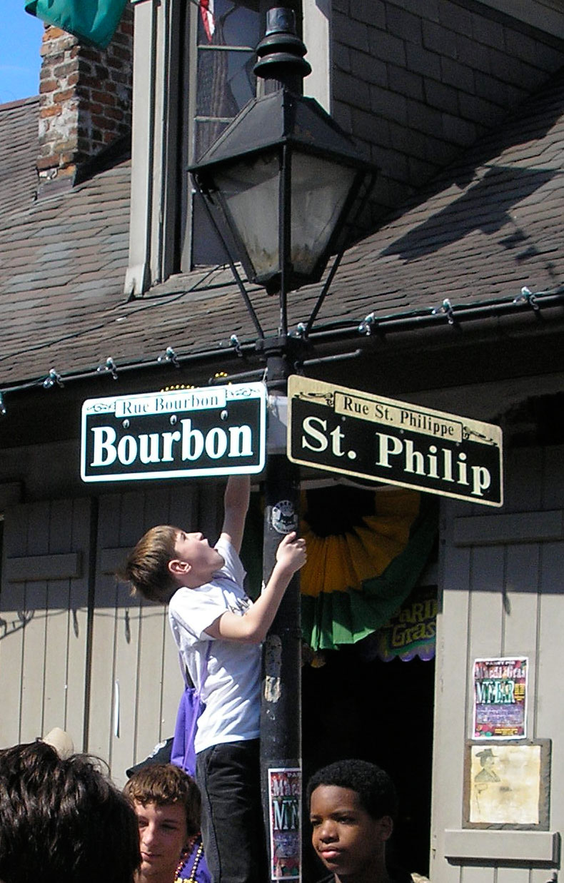
1957.For the newest addition to the Gallery, let's go down to the streets of the Vieux Carré, from which Portland's (and this blogger's) favorite formerly-of-NOLA-but-now-back-in-NOLA mystery writer, Kevin Allman, checks in with this lovely shot:

You really can't include a picture of a bona fide French Quarter street blade without including some of the street life around it. New Orleans has that charming reputation for a reason, yo.
Kevin tells me there are many variations of street blades in NOLA, an I'm presuming it's because the city has a singularly-colorful history. The one you're most likely and remember as tourist and as illustration are the blades in the French Quarter, I'd wager.
And, as information design, they aren't ideal-ideal. They don't have a directional; they don't say whether the way is a Street or an Avenue; they don't use FHWA-approved typeface one. But they work nonetheless and they please me mightily, visually. Why, for a person who's obsessed about a street blade that will help you navigate am I so down with this design?
It's an extension of the art and effective atmosphere and attitude that draw so many there for the annual celebration and contribute in a note-perfect way to the attitude of the area. The most charming part of the sign is the box in the upper center that contains the historic name of the street expressed in French.
A technical point worth noting is the bracketing used to mount the signs. Three rivets through attach the sign to right-angled support which has an angle at the corner which is, itself attached to the post; this puts the blade up front-and-center as the star of the show (which is actually a very designerly thing to do) while leaving the blade unencumbered by hardware which requires gripping one side or the other of the sign itself. The design can come right up to the edge of the blade.
The whole street-scene picture provided me by Kevin is too cool not to share in toto, so get a good look at this:

You can't have a picture of New Orleans without some of its people really. Kevin really has an eye for the moment, does he not? The fellow in the hoodie up from, distracted by something; the punky girl with the pink wig, hot miniskirt and legs, and amazing boots on the left; the two youths just hangin' under the post, and the kid climbing up it for who-knows-what.
It's a warm photo. Invites you in.
Technorati Tags: Street Blade Gallery, New Orleans, Kevin Allman, Mardi Gras, NOLA, French Quater, Bourbon Street

You really can't include a picture of a bona fide French Quarter street blade without including some of the street life around it. New Orleans has that charming reputation for a reason, yo.
Kevin tells me there are many variations of street blades in NOLA, an I'm presuming it's because the city has a singularly-colorful history. The one you're most likely and remember as tourist and as illustration are the blades in the French Quarter, I'd wager.
And, as information design, they aren't ideal-ideal. They don't have a directional; they don't say whether the way is a Street or an Avenue; they don't use FHWA-approved typeface one. But they work nonetheless and they please me mightily, visually. Why, for a person who's obsessed about a street blade that will help you navigate am I so down with this design?
It's an extension of the art and effective atmosphere and attitude that draw so many there for the annual celebration and contribute in a note-perfect way to the attitude of the area. The most charming part of the sign is the box in the upper center that contains the historic name of the street expressed in French.
A technical point worth noting is the bracketing used to mount the signs. Three rivets through attach the sign to right-angled support which has an angle at the corner which is, itself attached to the post; this puts the blade up front-and-center as the star of the show (which is actually a very designerly thing to do) while leaving the blade unencumbered by hardware which requires gripping one side or the other of the sign itself. The design can come right up to the edge of the blade.
The whole street-scene picture provided me by Kevin is too cool not to share in toto, so get a good look at this:

You can't have a picture of New Orleans without some of its people really. Kevin really has an eye for the moment, does he not? The fellow in the hoodie up from, distracted by something; the punky girl with the pink wig, hot miniskirt and legs, and amazing boots on the left; the two youths just hangin' under the post, and the kid climbing up it for who-knows-what.
It's a warm photo. Invites you in.
Technorati Tags: Street Blade Gallery, New Orleans, Kevin Allman, Mardi Gras, NOLA, French Quater, Bourbon Street

No comments:
Post a Comment