22 October 2005

[design] If You Do Layout, You Need Adobe InCopyCS2

I just finished an article over on QuarkVSInDesign.com about Adobe InCopyCS2. It's part of a 6-article series on Adobe's hidden charmer (Adobe InCopy CS2: In Production) at QuarkVSInDesign.

This application rocks my little designer world.

What is InCopyCS2?

Those who have read my pontifications here are aware that I use layout programs for design (see last article). Of course, in a production workflow, designers and layout artists do the grunt work of putting things on the page whilst editors, naturlich, direct the work and form the connection to content.

In small workgroups, say 2-20 (and maybe even larger ones) the workflow is linear and serial. That is to say, editors push content to designers who push proofs back to editors who change content or suggest changes which are pushed back to the designer. PDFs fly all around.

Now, this is not necessarily a bad thing. In fact, editorial-design interplay is better than its ever been. But, just as in computer hardware, the serial flow has its drawbacks, especially when working in a group where asynchronicity is the order and reality of the day. Thus we have editorial systems. Quark does, with Quark Publishing System, and Adobe does, with InCopy.

InCopy is a hell of an app, but, until this cycle, has been kind of tucked into the background, sold only as part of enterprise-level editorial solutions. With the release of Creative Suite 2, Adobe has liberated InCopy, which is now available as a stand-alone purchase. This is an application that every designer should know about and get if they can, and every editor of a designer who works in an Adobe workflow should have.

What InCopy brings to the table is simultaneous collaboration. Editors work on content while desingers do layout, leaving the layout sacrosact to the designer only. Instead of doing a change and firing off PDFs, it's all on for everyone-but the designer working the layout controls who has access to what via story and frame assignments.

The stories are edited in an interface that resembles the InDesign Story Editor, only with a supercharged hemi under the hood. The editor can delete text, mess with styles, track changes and save off deleted text as notes that travel with the file like sticky-notes, preserving them as alternative suggestions.

I can even use this as a single-user workflow, because the text editing capabilities of InCopy are just that good. The InDesignCS2 Story Editor is a huge improvment. Using InCopyCS2 in place of it just jacks up the copyfitting and editing capability to an insane level.

But I won't go on too much more here. Go read my article. See why this program is so exciting.

Like I said: editors, layouters, you need this program. You at least need to look at it. Yes, I could be an evangelist for this program. It's that good.

Quick Links:
And, a quick PS: After interacting with Layers Magazine's managing editor Chris Main to get the Scott Kelby editorial in my last post he asked that I link back. This has been done in the article, but Layers is such a darned good resource that if you design, you should check 'em out anyway. There is now a permanent link to Layers in my Graphic Design Links list in the sidebar.

21 October 2005

[design] Layout War II: Why QuarkXPress Has To Answer The InDesign Challenge-Kelby Explains It All

When I started learning Graphic Design, one of the first technological aquaintances I had to make was an application known as QuarkXPress.

A "layout" application, in the creative trade, is one of the designers most valuable tools, allowing a single designer to import textual and graphical content from a variety of sources into a file (for this reason I sometimes term QuarkXPress and its competition Adobe InDesign aggregators), lay them out as they will, and set and style type with incredible accuracy and flexibility–something that, before PageMaker and Macintosh created the 'desktop publishing' discipline in the 1980's, was the province of whole groups of people.

Adobe and Quark are, as every designer knows, the two giants of the design industry. There are many other purveyors, but just as the professional mechanic can be distinguished from the shade-tree mechanic by the presence of a "Snap-On" toolkit, the professional (or professionally-slanted) designer and layout artist can be deduced by noting that they use XPress or InDesign instead of, say, MS Publisher or even Adobe PageMaker. It is all but certain that any professionally-produced publication–from newspapers like The Oregonian and national magazines like Time and Newsweek to humble local and community newspapers–
were produced using QuarkXPress (and, increasingly, Adobe InDesign).

That this market-tussle is joined is, therefore, of interest to just about everybody who thinks about print. The layout application is the bridge between the creators and the publication you read over your coffee in the morning.

Quark's checkered past in the design world is a matter of history, and since I've commented at length about at length myself, I'll not recap it yet again. Suffice to say at this point, because of its own company strategy, past attitude, and apparent corporate culture (I'm hardly a Quark insider despite my activities at QuarkVSInDesign.com) Denver's Quark, Inc. is in a vulnerable position, and one it never thought it would be in; playing catch-up. They've changed thier public style and approach because they understand that thier complacency has starved the goose that lays thier golden eggs. Adobe's InDesign may not have the majority of the installed base yet, but it does have major mind-share now, and that will translate into an installed majority soon enough if Quark remained complacent.

Thus came the improvements; Mac OS X nativity, the price cut (XPress is still available at a lower price of $699 versus about $1100), the new logo and attentive public image, the addition (via XTension) of image tweaking and native Photoshop file import, the release of the 6.0-6.5 update as free to registered users.

XPress is now a better program but still has to do feature catch-up to Adobe, and still has a legacy of negative impressions to conquer.

Writer and Photoshop god Scott Kelby had the right of it from the beginning–back in 2003, which seems an eternity ago (QuarkXPress was still in a non-Mac OS X native version 5, and InDesign was in version 2-not quite yet the Quark Killer, but held great promise). What follows is a reprint of his editorial from the Jan/Feb 2003 issue of MacDesign magazine that was handed to me by an instructor at PCC when I said I was looking to equipping myself with a professional's tools. Its title, "Big Trouble In Page Layout Land" carries the tagline "How QuarkXPress has become the "Aldus PageMaker" of the 21st Century", which may strike some as quizzical, but he explains it.

This article is a key to understanding why Quark is where it is still, despite the price cuts, the retooling of its public face, its delayed arrival as a native OS X application and expanded feature set, and why everyone is looking to the still-unreleased QuarkXPress 7 to make it or break it. I still keep a copy of the column tacked to my wall, but for this post, I read out as a public service Scott's 2003 editorial for MacDesign, in full, with gracious permission from Chris Main, managing editor at Layers Magazine (which is the current incarnation of MacDesign).

Without further ado, then, Scott Kelby.
Big Trouble in Page Layout Land
How QuarkXPress has become the "Aldus PageMaker" of the 21st Century

by Scott Kelby, In The Mac Lane
MacDesign Magazine, Jan/Feb 2003
© Layers Magazine, used with permission.


If you read the subhead above and said to yourself, “Aldus PageMaker? Isn’t it Adobe PageMaker?” then it’s time for a quick history lesson. (On a personal note, I can’t believe that I’ve reached an age where I can now tell stories of how things “used to be.” Sad, isn’t it?)

PageMaker (the page-layout application now owned by Adobe) was originally developed by Aldus Corporation, and along with Apple’s LaserWriter (the first Adobe PostScript laser printer), these two started what’s now called (by old geezers such as Wilford Grimley and me) the Desktop Publishing Revolution. Back then (in the mid 80s—BHT [Before Hammer Time]) everybody, and I mean everybody used Aldus PageMaker. As with almost all groundbreaking graphics applications, for years it was only available for the Mac, but eventually Aldus decided to put their focus on creating a Windows version of PageMaker.

Unfortunately, at the time Aldus was focused on creating a Windows version of PageMaker, another Mac-only application, QuarkXPress, was starting to make inroads into the page-layout market by focusing on high-end typographic controls. Years later, when Aldus changed their focus to adding “long-document” capabilities to PageMaker, Quark found a way to extend the capabilities of QuarkXPress’ power using XTensions (their name for add-on plug-ins that could be created by third-party developers to work seamlessly from within QuarkXPress). So, in short, while Aldus was distracted with Windows and long-document capabilities, QuarkXPress pretty much pulled the rug out from under them.

By the time Adobe bought Aldus Corporation, PageMaker’s decline was in full swing, and the perception that “QuarkXPress is for pros; PageMaker for amateurs” was so ingrained in the design community, even Adobe’s major improvements couldn’t overcome it, and to this day, although Adobe PageMaker still exists (at version 7.0), it’s primarily seen as a Windows-based, small-office, layout program for creating newsletters, flyers, etc. It comes with loads of pre-designed templates because they know “if you bought PageMaker, you’re not a professional designer.”
QuarkXPress had won the war. Adobe knew it so they set out to create a new high-end page-layout application from scratch—a “Quark Killer,” that would complement their complete dominance in image editing (with Photoshop) and vector-based drawing applications (with Illustrator).

When Adobe introduced InDesign, it fell short of the “Quark Killer” many had hoped it would be, but it certainly was a promising first release. InDesign 1.0 included some high-end features that Quark didn’t offer, including tight integration with Adobe Illustrator and Photoshop.
When version 1.5 was released, it was a major improvement on version 1.0, and it introduced more new features, but it still didn’t “kill off” Quark. Even though it now nearly matched QuarkXPress feature-for-feature, and offered some cool features that Quark-XPress didn’t, it didn’t convince very many longtime QuarkXPress users to jump ship, especially in the prepress world where QuarkXPress is firmly entrenched.

HISTORY REPEATS ITSELF

Why am I telling you all this? Because history has begun to repeat itself. For the past few years, Quark has been focusing on adding Web-design features to QuarkXPress, so users could take Quark-XPress documents and convert them into “Web-ready” documents. And QuarkXPress 5.0 actually does offer more advanced Web features than even the latest version of Adobe InDesign.

Here’s the catch: If Quark had come out with these features three or four years ago, it would’ve been a huge boon to Quark, but unfortunately, Quark delivered these high-end Web features after the “rush to the Web” had pretty much passed. Now, designing for the Web isn’t “the hot new thing;” it’s a regular part of a designer’s life. In addition, while Quark was focusing its energies on bringing
Web features to its page-layout application, Adobe was focusing on making InDesign Mac OS X-native, and adding even more features aimed at high-end layout professionals. I can’t believe I’m about to say this (because I had my doubts that it would ever happen), but with InDesign 2.0, Adobe has actually “PageMaker’d” Quark.

Although Quark, Inc. is a privately held company and doesn’t release official sales figures, the word on the street is that sales for the Mac version of QuarkXPress 5.0 (Quark’s latest release, which STILL isn’t Mac OS X-native), have been pretty abysmal. Adobe, however, has some sources to help them figure out how InDesign 2.0 is doing against QuarkXPress 5.0 (e.g., sales from big retails chains, Mac mail-order houses, and channel distributors). In Adobe’s most recent meeting with financial analysts (in October 2002), they shared sales data (compiled by NPD Data) showing that new unit sales in North America for Adobe InDesign 2.0 had actually outsold new unit sales of QuarkXPress for most of 2002. Certainly, some of that is new Mac OS X users wanting to use all Mac OS X-savvy programs. Even worse for Quark, word on the street has it that a Mac OS X version of QuarkXPress is still a long way away, with its earliest arrival being summer 2003, only two years after the release of Mac OS X.

So while Quark was focusing on other areas, Adobe InDesign 2.0 has leapfrogged it—not only in features, but 2.0’s Mac OS X-compatibility has become the biggest evangelist for converting QuarkXPress users to Adobe this market has ever seen.
Ask anyone running Mac OS X how they like using Quark-XPress 5.0 running in Classic mode. They’ll tell you: Working in Classic is absolutely brutal. But that’s only part of the reason why we switched the entire production of Mac Design Magazine from QuarkXPress 5.0 to Adobe InDesign 2.0. We love the way InDesign 2.0 “feels.” For example, ask anyone who’s used Mac OS X for a few months what it feels like when they go back and use Mac OS 9.2. It feels “outdated and old-fashioned.” That’s exactly the way QuarkXPress 5.0 feels to us. It feels like “yesterday’s page-layout program.” It feels like PageMaker.

InDesign 2.0 looks and feels like a modern page-layout application, and that must be having a major effect. I talk to more and more designers, even those still using Mac OS 9, who are switching to InDesign 2.0. MacNet.com named Adobe InDesign 2.0 its “2002 DTP Product of the Year” and wrote “Adobe created the DTP product for the 21st century, leaving thousands of professionals wondering what was so special about QuarkXPress anyway?”

It appears that Adobe InDesign 2.0 has finally become the “Quark Killer” that many people dreamed it would be. And while Quark is racing to play catch-up to InDesign 2.0, you can be sure that Adobe is already well under way with development of InDesign 3.0.

THE DOWNSIDE

Although this is all great news for Adobe, there’s a downside. Because there still isn’t a Mac OS X-native version of Quark-XPress, many professionals who are still using QuarkXPress haven’t upgraded to Mac OS X, and that’s hurting Adobe’s sales of Photoshop 7.0, the first Mac OS X-native version of Photoshop. These designers are waiting for Quark’s Mac OS X version before they upgrade to the Mac OS X-native version of Photoshop.

Not only has Quark’s bad decision-making hurt Quark and Adobe, it has hurt Apple in a big way too, because these same designers are waiting to upgrade to Mac OS X until QuarkXPress becomes native. Quark is essentially “killing the market” and at the same time, they’re killing themselves—making the same mistakes today that Aldus did with PageMaker years ago. Quark could have been first-to-market with a Mac OS X-native version, and kept Adobe in the catch-up position, but instead it “pulled over” and let InDesign drive right on by.

If Quark doesn’t pull a major rabbit out of their hat—and soon—I predict you’ll see Quark quietly start to go away until someone finally buys them out and slaps their name on it (something like “Macromedia XPress,” or “Microsoft XPress”), and before you know it, it’ll be another “Windows-based small-office layout program for creating newsletters, flyers, etc.”

19 October 2005

[design] X-Ray Magazine Offers You Four Free Issues

The recently-revived X-Ray magazine, a bimonthly devoted to all things Quark and QuarkXPress, has a pretty good deal going, and if you are interested in QuarkXPress 7, you should really get in on this.

Go to this link:
http://www.xraymag.com/thepowerxchange_xray.html
and fill in the form. The next four issues will come to you for nuttin'.

I recieve X-Ray and I recommend it whether you are a die-hard Quarker or an InDesigner who wants to see what "the other guys" are up to. It's well-designed, informative, and right now it's the most credible source for information on XPress 7 outside of Quark itself.

A full year costs about $6 the issue, so it's a very good deal too.

[us_media] Dept of Corrections Dept.

In a recent private conversation, I remarked that talk-radio parasite Neal Boortz was "a tosser".

What I ought to have said was that Neal Boortz was "a pathetic, worthless tosser who kisses up to the economic elite in hopes they save his backside when the stuff hits the fan".

The Times regrets the error.

16 October 2005

[geography] Street Name Synchronicity, or When Is Idaho Falls, Idaho, A Little Bit Like Portland, Oregon?

Figure 1. A section of NW Portland.

Figure 2. A section of inner eastside Idaho Falls, Idaho.

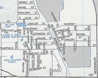
Dig, if you will, these two pictures. Figure 1 is a familiar section of a familiar part of a familiar town: a bit of our beloved Alphabet district, Portland, OR, from the 2006 Thomas Guide. Figure 2 is a section of the inner east side of Idaho Falls, Idaho, taken from a Seeger map, published by Rand McNally, and copyrighted 1985.

Take a good look at the streets I've focussed on in the Portland map (Fig. 1). Alphabet district streets, everybody knows 'em; Hoyt, Irving, Johnson, Kearney, Lovejoy, Marshall, Northrup.

Now take a good look at the streets in the middle of the clip of I.F. in Fig. 2. You'll notice a street running along the canal called N.W. Bonneville Dr. Just a little below the center it intersects Garfield Street. Going north from Garfield, N.W. Bonneville intersects: Halsey Street, Irving Street, Johnson Street, Kearney Street, Lovejoy Street. On the left hand side of that subdivision, Marshall Avenue connects Halsey to Garfield, and Northrup Avenue connects the west end of Halsey to Lovejoy, capping off Irving, Johnson, and Kearney. One will also note that a few of the street names extend east of the Bonneville Drive canal, but not too far. I.F. planning doesn't require all streets names to continuously extend across the city, so the clip I'm showing you is the extent of these streets withing the Idaho Falls area.

Perhaps what's most "hmmm"-inducing is the standing in of Halsey for Hoyt in the Idaho Falls street pattern. For those who are familiar with I.F., the bold line along the bottom is First Street, an arterial which leads out from the center of town (which isn't far away-I.F. isn't very big) and the bold line along the right is North Woodruff Avenue, a main road which distributes traffic up and down I.F.'s middle east side. That wedge shape in the lower left hand corner is where the First Street-Lomax Street one-way grid splits. Another interesting point is that N.W./N.E. Bonneville Drive is named in relation to its position on the west or east bank of the canal, and whether or not it's north or south of First Street only (there exists S.W./S.E. Bonneville Dr off the south edge of the clipping).

I'm not in any position to research why a handful of streets in a town in North Mormonland have identical names to a similar handful of streets in eclectic Portland, Oregon. It certainly isn't odd that widely separated cities should have similar street names. But it is indeed notable that such closely associated streets in another city have identical names and even mimic the pattern somewhat.

This whole exposition was inspired by Worldwide Pablo's announcment of his visit to grand old I.F. Hopefully he'll get a look, maybe even pictures. I'm engaged myself, but if you want to look at them yourself, here's how you get there.

  • Get on I-84. Follow it east to I-86 (once called I-15w), then when you get to Pocatello, go north on I-15.
  • Get off I-15 at the Broadway/City Center exit in Idaho Falls. You'll know you're getting close when you see the Mormon Temple. It's visible from a couple miles out.
  • Go right off the exit, cross the Snake River (you might take a moment to glance at the Idaho Falls, off to the left as you cross-they're actually rapids augmented by a dam, but never mind) and go straight through downtown to the light at US Hwy 91/26. Hang a left.
  • After you go under the railroad overpass, hang a quick right on First Street.
  • Proceed about 1 mile west, past the Holmes Avenue light, and start looking for N.W. Bonneville Dr on the left.
  • Proceed down N.W. Bonneville Street to one block after Garfield Street. Gawk.
Reserve some time for this, now. It's a 6-8 hour drive one way. Get a motel room. There's a nice family-style diner on the south side of West Broadway just east of the I-15 interchange that serves a killer breakfast buffet. Recommended.

12 October 2005

[metro_transit] Tri Met Responds to High Diesel Prices

TriMet is now spending about $2.20/gallon on diesel fuel, and is looking at prices which may go to $2.50/gallon. Before the fuel market went all sixes and sevens, the budget was for $1.50/gallon.

With that sort of budget pressure, something has to give.

According to this press release from TriMet, things are just about to do so.

The response is twofold. First is increasing fuel efficiency in the fleet. The agency claims that this alone has saved a half million gallons (6.5M gallons instead of 7M annually). So there has been some operational improvements.

But it's not enough to avoid a fare increase.

TriMet further proposed a 15-cent fare increase (10-cents for Youth/Student/Honored Citizen and $2 for montly passes). In order to lessen the impact of the increase, the agency proposed the innovative step of the 7-day rolling pass, which is supposed to allow riders to purchase transit in smaller increments.

The vote by the TriMet board is scheduled for its meeting of 26 October, and, if approved, will go into effect 1 January 2006.

11 October 2005

[media] Advertising Guys

Local:
  • That Outrageous Audio guy. Blaine, I think his name is. Been watching him late nights for years now. I just realized that you could get the same combination of livid features and voice tone rising into the risible band at the end of every sentence if he recited those lines during a painful medical procedure. Just a thought
  • Fonk, Fonk, Fonk!!!! The Vern Fonk insurance commercial is so stupid it's funny. "You'll take me, dude? IRRROON MAIIIDEN I'll be right overrr!"
From the ranks such as these will come my generation's Tom Peterson. S'pose we can get ol' Blaine there to do a "Wake Up!" commercial. Shame there's no Xonix TV's to sell anymore. Oh honest-to-cats Portland Wrestling, come to that.

National:
  • I still wonder, if you held Don LaPre's hands to his sides and made him do his spiel, would he detonate?

09 October 2005

[pdx_history] One Cool Portland History Thing

...glimpses of Portland landscapes and maps from the past, courtesy of the City of Portland Office of Transportation (COPOOT).

The main Transportation history page is here. Almost forty subpages, each containing a revealing snapshot or map of Portland back almost to the beginning. Amongst my favorites:
I could, of course, go on forever. But that would ruin your fun. Check out my faves and hopscotch up and down the contents, or just go to the main page and go at it chronologically.

Your tax dollars at work, people!

07 October 2005

[type_design] 300 Free Halloween Fonts? Scary!

'Tis the season to frighten your neighbor, and Pariah Burke steps up to the plate with an absolutely dreadful collection of fonts.

No, I don't mean variations of Courier, Helvetica, or MS Comic Sans.

I mean a collection of 300+ completely free fonts for putting together Halloween-themed announcments, invitations, mailings, or whatever you want to imbue with a Halloween theme.

They are available at Designorati here. They are absolutely, ahh...killer.

06 October 2005

[logo_design] Tales of the Swoosh

Follow this link to a Nike page on the history of one of the world's most recognized symbols.

This news was cribbed from Rob Salzman's About it All–Oregon site, with sincere apology. I felt I should include it here because the story of the Nike logo is one of the classic stories of genius logo design (although, surprisingly, the client was lukewarm with it at first), and since Knight got it when he was still very small (think Blue Ribbon Sports, the seminal form of Nike) he didn't pay very much for it–$35.00, the record says.

The designer, Carolyn Davidson, did not go ultimately unrewarded for her design. She found herself asked to what became something of a surprise party in 1981, where she was awarded a gold swoosh ring with a diamond on and Nike stock. Since recieving the stock it has split three times.

This is a situation that every hopeful logo designer (such as myself) hopes to see themselves in–creation of one of the most beloved logos in use and well-off because of it besides. It makes designers take chances on interesting things.

In other news of all things Swooshy, Nike's absorption of the Bauer hockey identity is all but complete. In a press release dated 4 October, Nike unveiled the new logo of its Nike Bauer Hockey subsidiary, timing it to anticipate several major upcoming hockey happenings, not least the upcoming 2005-06 NHL season.

The new logo incorporates the well-known Bauer mark in a unifying shape. The oblique angle of the shape echoes the oblique angle of the Bauer logo letterforms; when combined with the already-dynamic Swoosh, activity and vital energy are two messages that get communicated, and to the hockey lover, incipient excitement.

Each brings its own baggage into the new design as well. The Nike connotation is obvious. When paired with the familiar image of a company that was, prior to acquisition in 1995, to hockey what Nike was just to just about every other sport, the impression becomes that of a sports equipment juggernaut, with marketing and quality to match. Nike also acquires the heritage and tradition of a brand that goes back to 1917-when Bauer was founded.

05 October 2005

[blog_design] First Lesson

Noting the size of my links list I've decided that a real nifty nav trick would be to put a links directory as one of the first things on the sidebar. I know anchors, or at least I thought I did. Just spent two days finding out the hard way that now you have to close name anchors too:

<a name="whatever">

Has to look like this:

<a name="whatever"></a>

Or the spacing will be all funny. Please make a note of it!

Also, in this very post, I've learnt highly useful and irritating things about the gt and lt bracket codes. This is hard work!

03 October 2005

[42] Where I'm Going With All This

Regular watchers of this chronicle (and I'm grateful for them) will note a bit of a decrease in my posting frequency. There's reasons for this, of course.

One is the hard but happy task of helping to build Designorati and my two personal hobbyhorses, Designorati:Typography and Designorati:Cartography. Look at it this way: if someone gave you the chance to explore what really, really interested you, and allowed you to publish it in a visible spot, would you?

If you have a pulse, you ought to say yes.

I'm learning about "passion". What it is that drives me. I feel that now more clearly than ever now that I have an outlet for it. They've said the path that's named is not that path, but that's not necessarily so.

I think about design pretty much all the time now. Now that I've left school and the assignments aren't coming at me at a constant pace, I don't have that much to design at the present, but I have a lot to think about.

This 'blog, for instance. I've learnt enough about the template to subsitute a header image; it would stand to reason one of the next things to learn is how it works so I can create my own design. I've said it before-I hate default styles. I'll only settle for them when I must. right now, I must. In the future, no, no longer.

While I don't have a steady paying job yet, some doors are starting to open. Designorati is one. I not only get to go on about what moves me I get to learn about getting along from some pretty frickin' cool people. Our conference room and water cooler is email, and every day there's a new lesson to be had. I am a gnat amongst giants, but they still like me.

I'm not ending this 'blog-no, far from it, but the posting frequency will stretch out a bit as I supply content to Designorati and continue to do so at QuarkVSInDesign. The content may seem to change in tone a little, but it will only a little; it's a personal outlet but there will be more about design in it. The Address Nerding will continue until I have a great unified description about how addresses work all over. I will continue being Painfully Portland and Smugly Native Oregonian here.

I'm a little pumped. And not from rum this time. I really am high on life right now. It's a curious feeling.

02 October 2005

[Address_Nerd] The Plan In Portland circa 1891-1930

Sorry to keep you guys waiting for so long for this. I was going to make a nifty little illustration for this but I kept putting it off and putting it off. I can always gin up an illo, and all you need to follow along is a map, so hereth goeth.

If y'all'l'recall, prior to 1891 the municipal entity we today call the city of Portland did not exist. The progenitors of Portland were three frontier towns at this bend of the river: Portland (right where downtown is today), East Portland (from the Rose Quarter area down to about what is now Hawthorne Blvd) and Albina (where the Rose Quarter/Coliseum is now, and the area just downriver from that).

In 1891 they merged, creating the City of Portland, Oregon, which for a time was the largest city (in population as well as area) on the Pacific coast of the USA. Once they did merge they had a problem; people found that there were significant duplication in street names and no citywide standard. Snyder tells us that not only did each city name its streets independently, developers were allowed to set thier own names in thier own new subdivisions without respect to whether or not a given name already existed elsewhere (this practice persisted after the merger as well).

Now, the street name system we use today came into use in about 1930, and the citywide rationalization took about three years. But from 1891 to 1930, we did not use this system. Many street names have existed since before then, of course-names like Morrison and Main and Salmon were part of the original plan-but we did not have the neat NW/SW/NE/SE/N system with 20 100-number blocks to the mile then.

The early system of the Portland name and address grid reflected the growth of the city, and most principally, the primacy of the west-side business districts. To capitulate:

The system was then, as now, based on the junction of the Willamette River and Burnside/Ankeny (what were then called A and B Streets). The address system broke along similar, but not identical lines, and each section worked out as follows:

South of Burnside, west of the river

This was the historic business center of Portland, todays downtown, and the first pioneer-settled area. Streets carried no directional prefixes of any kind. Additionally, all streets were termed "Streets"; numbered "Avenues" were an innovation of the 1930 rationalization. Today we call this area "Southwest" or SW.

North of Burnside, west of the river.

What we call today "Streets" (the Alphabet section from Burnside and up) carried no directionals. Numbered streets north of Burnside carried the suffix North (e.g. 19th Street North). For a time, instead of named streets the streets in this area were alphabetically lettered (A Street for Ankeny, B for Burnside, etc). Today we call this area "Northwest" or NW.

South of Burnside, east of the River

All numbered streets were prefixed simply "East". Named streets carried the East Prefix if and only if the street name was extended from the corresponding west side street (Morrison Street extended became East Morrison Street). What we today call SE 12th Avenue would have then been called E 12th Street. An example intersection in this are would be East Alder and E 20th Street. Today we call this area "Southeast" or SE.

North of Burnside, east of the River

This is where things start sounding a little strange, but it's actually quite logical: take the west side system and prefix it with East. Therefore, numbered streets on the east side retain the East prefix but add a North suffix. What we today would call NE 12th Avenue would, in this old system, be called East 12th Street North, or more simply, E 12th St N. If a street name was extended from the west side, it acquired the expecte East prefix (E Glisan Street, e.g.). Today we call this area "Northeast", or NE.

Going West from MLK Jr Blvd

It, of course, is still recent history that what we today call MLK Jr Blvd was called Union Avenue, and for a long time was synonymous with mean streets in Portland. Depending on your point of view, it may not have changed all that much. Snyder guesses two possible origins for the name Union Avenue: one, it was to honor its former form of differing names along its length-different streets united; two, it could have honored our Union, the United States.

Today it is known that if you go four blocks west of MLK, Williams Avenue is crossed, the directional prefix is turned to North (N), and on E-W streets the house number march commences upward as one goes west on the North Portland peninsula.

In the time before 1930, however, streets were not only named different but addresses ran differently too. Instead of 100 numbers to the standard block, there were only 20. Therefore, the zero line on the seminal north side must have been located somewhat to the west of today's Williams Avenue.

Though I do have a couple of (very precious) Portland maps, one from 1927 and the other from 1930 (or thereabouts), my research is still inconclusive on how street names were treated in those areas today divided by Williams. What little I've been able to ascertain suggests that the prefix West was not used, however, I know not yet for certain what was done about that. Research continues in this area.

Twenty numbers to the block

As just mentioned, there were not 100 numbers to the standard address block in those days, but merely 20. These addresses, however, were still reckoned from the baselines already mentioned. As an example, the east side of Pioneer Courthouse Square, SW 6th Avenue along the Transit Mall, between SW Morrison and Yamhill Streets, is the 700 Block of SW 6th Avenue. The notional address of the SW corner of 6th and Morrison would be 701 SW 6th Avenue. Before 1930, though, at that point, the address might properly have been 141 6th Street.

This meant that addresses on E-W streets did not neatly key to the numbered crosses. A correspoding address on Morrison Street at this point might be 121 Morrison Street, rather than in the 600s.

This also meant that addresses in the city did not attain the respectable magnitudes that they do today. A typical address on East 17th Street in Sellwood, south of Tacoma, would only be up in the 1700s, rather than the mid-to-high 8000s on SE 17th Ave as we know it now.

Address attitudes

Perhaps it's a reaction to change but even then, in Portland, one's address mattered. An address without an East prefix tended to bestow a certain social cachet. East side Portland has always been a middle class and working area, and putting the prefix East on a street was pretty much the same as donning a chambray shirt; it was blue-collar, average-Joe citizen.

Snyder mentions a plan floated during that interim that would have de-Eastified all east side streets in favor of calling them all "Avenues"; it was felt that "145 Morrison Avenue" might socially hold its own against the more affluently-percieved "145 Morrison Street".

Broadway is an interesting case. Broadway originated as a street in the Lloyd area, and was named Broadway from the first laying out. When the Broadway Bridge was constructed, it would connect Broadway on the east to what westsiders were calling Seventh Street. In the interests of continuity, it was proposed that the street on the east side be renamed to East Broadway, with Seventh Street on the west becoming simply Broadway and Broadway North.

As one can imagine, this went over like a lead tramp steamer. In the face of fairly overwhelming opposition to westsider arrogance (something that has never gone over well on the east side), Broadway east of the river was allowed to remain Broadway, whilst on the west side Seventh Street north and south of Burnside became North Broadway and South Broadway, respectively.

As one can readily see, the east side-west side rivalry goes back an awful long way.

Snyder also tells of one plan to rationalize the address system, one which met with little if any favor, during the interregnum. This plan would have renamed Burnside Street to "Central Avenue", dubbing all streets with numbers. But, in contrast to today's system, Avenues would have been the E-W run, Streets the N-S.

There were also objections to the 100-number to the block scheme; some felt that the high-magnitude addresses we take for granted in today's plan were passing strange. One wonders what they would have thought of todays SE 502nd Avenue.

This plan went nowhere. But it may explain the presence of a certain southeast section of the city which, for a time, had that exact scheme.

Woodstock, then.

For about ten or twenty years back at the beginning of the twentieth century, the area from about what would today be SE 39th Avenue east, south from about Powell or Holgate to the south city line, and east all the way to the east city line, had a complete numeric system in which numbered avenues running east to west, numbered streets running north to south, and as SE directional...but as a suffix, not a prefix. SE 52nd Avenue was known as 52nd Street SE; Today's SE Duke Street in that area was known as 65th Avenue SE. Also, as far as I know, the addresses were defined as 100 numbers to the block.

In general, the street number was based on the Burnside baseline-Duke Street is 65 blocks south of Burnside, thus 65th Avenue SE. SE Tolman Street would have been 63rd Avenue SE. I believe, however, that Woodstock Blvd was still Woodstock Blvd, though if it were numbered in this scheme, it would have of course been 60th Avenue SE.

Many of these old street names exist still in the curbstones as I've said before. One of my near term plans is to document these in pictures. Mike, I still plan on taking you up for that coffee...

29 September 2005

[blog_life] A Familiar Face Returns with a Makeover

In case everyone hasn't noticed yet, Rob and About It All-Oregon have returned. Nicely renovated too. Cool piccy of Mount Hood up top.

28 September 2005

[pdx_life] b!X...out.

Normally I try to refrain from chiming in on something everyone else is talking about, but I'll have to make an exception on The One True b!X retiring the Communiqué.

Two great 'blogs down in one week, and one singularly valuable.

Can't have it all, I s'pose.

25 September 2005

[net_life] As Long As I'm All Bent Out Of Shape...

...and as long as I have just 10% of a 39MB download to go, I got something to day:

I don't care if you're from a corrupt African dictatorship.

I don't care if you had connections with wealthy and corrupt government ministers.

I don't believe you have cancer, and wish to do one thing right with your money before you die.

Furthermore, I don't believe you have ever had anything to do with Mobutu Sese Seko.

You see, I know you're making all this up, that you're desparate to make a couple of bucks, and you're really posting from an internet café somewhere, and you think I'm stupid, and you'll send me some sort of dumbass email claiming to be an operative for some country's Ministry of Duping Dumb Internet users and if I just give you access to my checking account you'll deposit 10% of eight gazillion dollars in it for pretending I'm someone's next of kin.

But you'll just keep sending me the same 419 scam e-mail. Can't you people do any better than this???

PS: I don't believe I won the lottery, either.

24 September 2005

[blog_life] Oh *&^$. Jim Went and Bailed.

So I'm reading my newsfeeds, and I see this post over at It's Jim.

Oh, crap.

You know how it is when someone is putting on a really cool party and you find your way into it, and it's really fun and it turns out it was ending and the host didn't tell anyone? You know that feeling?

Pretty much happens to me all the time. Notch another one.

Was it me? Did I not post enough? Was it my breath? Were my 0's and 1's a the wrong size?

I'm leaving the It's Jim link up for now because, frankly, I was so pleased to have it that I just can't bear to take it out right now. Jim was really funny and a pleasure to read. I'll miss him.

21 September 2005

[metro_transit] C-Tran Wins!

Good news to bus riders and transit fans in Clark County!

According to the latest figures, garnered from the KGW-TV website, here are the results for Clark County Proposition 1:

APPROVED: 37,960 (67.39%)
REJECTED: 18,369 (32.61%)

C-Tran and transit believers win in Clark County today! For now, your best information source is the 164.KAQJ.com site, cited in an earlier article here.

Congratulations, Clark County! Good on you!

[pdx_life] A Header Image Changed In Memory of Zim's

Dig, if you will, the picture above.

According to a story in this last Sunday's new High-Def Oregonian, in the "O!" section (if A&E got upset when The O debuted that self-named section, I wonder when Her Oprahness is going to get all up ons) Margie Boulé commented that this wonderfully kitschy sign, which commanded the intersection of SE 223rd Ave (a.k.a Fairview Avenue) in Alto Gresham for decades now, has come down.

They are going to turn Zim's Shopping Center-or what's left of it (which was latterly a Yamaha dealership then an indoor go-cart run) into a corner of a car lot.

Thank God. I was worried they weren't going to cover eastern Multnomah County in car lots before 2012. Looks like they're ahead of schedule now.

Margie's point in the article was that there is precious little around anymore that's wonderful and odd in a roadside-sort-of way. With the loss of the Zim's sign, Greater Portland looks a little more like Greater EverywhereElse.

So, for the time being, Zim's will virtually command the intersection of Zehnkatzen street and Times Avenue.

Sic transit gloria mundi.

20 September 2005

[pdx_music] Twisted Sisters

So I overhear The Go-Go's signature song from thier album Talk Show (1984) and I get the urge to have it so I can play it over and over (I do that with songs I really like). The song is, of course, "Head Over Heels".

So, I get a bug to find out what they're up do. Like a few other '80s pop bands they've reunited, with an albut out a year or so ago (God Bless the Go-Go's). And they have tribute bands.

Now, there's something about tribute bands. Somehow they always seem wierdly appropriate. I suppose it stands to reason that a band that elevates the concept of woman (they're, in my opinion, one of the premier "girl groups" of the last 30 years for a very good reason) would attract a certain sort of tribute group, but for reasons which I can't quite put my finger on.

With The Go-Go's, there are two all-male tribute groups out there.

One is L.A.-based, and is called The Ga-Ga's. I can't find out too much about them.

The other is based right here in Portland. The name?

We Got The Meat.

I'm friggin' serious. Follow the link! The Go-Go's thought they were cool enough to mench on their own home page's front page.

I love self-expression, I do I do.

[design, tech] Installing Adobe Creative Suite 2

The box with the CD set came two weeks past, this Friday. At the time I was in the middle of laying out the Columbia Overlook Fall edition (which is done now) so I left it, much as I wanted to get in installed and get all up ons with it.

It's a new toy. A super new toy. A $549 new toy, but I was able to get that pricing because I've owned InDesign since version 2 and Photoshop since version 7. The bill for a seat of CS2 is a little more than 1-large, but the same money thrown at Quark will just get you XPress-if you want Photoshop, you'll have to buy it, and if you want Illustrator...well, you get the idea. And InDesign is a sexah, sexah program to use; a Metafilter poster opined that "InDesign is teh new hotness." And that is true.

Anyway.

You don't change mission-critical horses in midstream, so, I plugged away in InDesign CS, which, as expriences go, isn't a bad thing at all. Like I said, it's a sexah, sexah program.

With the Overlook finally to bed though, it was time to get busy. Now, I already have a program on disk called Adobe InCopyCS2. This was courtesy of my friend Pariah. Now, some of you may be curious about what InCopy does. It's meant to integrate with InDesign to enable editors to collaborate with creators as the publication is being laid out but without messing with the layout that already exists. Editors can assign and edit copy without having to have a copy of the .indd file or having to worry about screwing up the designers work. It's really sweet. It plays nicely with CS1 but refuses CS1 won't let it play in any reindeer games-there are plugin issues as well as the assignment workflow, which CS1 doesn't recognize.

So, InCopyCS2 comes off so I can install it after the Suite so InDesign recongizes and installs the proper plugins. This is a bit of a worry; the InCopyCS2 CD doesn't always play well with the Mac's combo drive. It reads it but only after just ejecting the CD-ROM several times. But, as it will turn out, InCopyCS2 will eventually reinstall. On to the meat of the fun.

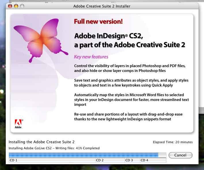
The Creative Suite comes on four CD-ROMs. The installation is something Adobe really got right from the first. The installer, once started, sucks up all the files off the CDs, writes them, confgures them, and moves on. Once one CD is complete, it is ejected automatically, waits patiently for me to insert the next, and takes up the next batch.

It does, however take a bit more than 20 minutes. Sure, you have those pretty teasers the installer puts up because, since you are a designer you are quite easily distracted by bright shinies. Aw, heck, anything good is worth waiting for.

And the teasers are pretty.

I get CS2 installed and fire up the Bridge...ahh, let me tell you about the bridge. If you've used PhotoshopCS you know about the file browser they debuted with the first Creative Suite. It's a lovely thing. You have great thumbnails, the ability to rate files, and access to more metadata than anyone actually needs. You take the PhotoshopCS file browser, give it one of those Tony Little excercise machines, amp it up on performance enhancing drugs (the pro designer leagues still do not, as far as I know, do random UAs) and you have Adobe BridgeCS2.

If you have Bridge you have a ton of tasty stuff. You can save open file collections, so that you can open a handful of open files at a single click. You can navigate the disk. You can have your favorite RSS feeds to hand (doesn't matter where they come from). Bridge rawks.

There are other features in the Suite that are worth mentioning. Photoshop CS2 brings us the Vanishing Point, automatically giving perspective. Snippets in InDesign promise to make collaboration a hell of a lot less trouble. Illustrator gives us Live Trace and Live Paint, which do almost everything in rendering a drawing in vector but moving the mouse. There's more. I've not gotten to everything yet.

Now, after installation the next thing to do is update. There are updates out for the CS2 already. I set to downloading. 22MB. Huge, but will finish while I'm still young. For some reason I get confused, though and reinstall the first Bridge update over one that's already there. Then I go to start Bridge and....

Bounce, bounce, bounce (in the dock), bounce, bounce, bounce....

It doesn't stop bouncing, and the Bridge doesn't launch. Neither do the other CS2 apps. A forlorn uninstall and reinstall don't cure the problem. Then its off to the Spice Mines of Portland for 10 hours more-than-vaguely-unsatisfying work.

And I stew on it.

Back in the morning. CS2 uninstall...and trash the prefs files. Reinstall. CS fires up. Life Crisis over. Go to reinstall the updates and patches, and this time, am more careful about what it is I'm doing.

I'm looking forward to doing a lot of great designing with CS2. If you don't have it, you must get it. And once you use it, you'll see why Quark has to really pull one out with XPress 7 if they hope to remain #1.

18 September 2005

[nooze] It's...It's...It's Over?!?!

This just in at SunDial House: we hear that America's Sweethearts, Kenny Chesney and Renee Zellwigg Zelwege Zellwyg That Girl With The Face are calling it splitsville!!!

No! Please, say it i'int so!

I mean, if those two crazy kids can't make it, what chance do any of us have for happiness?!?!?!

[design, layout] That Man Sarkozy!

A chapter from The Adventures of Etaion Shrdlu:
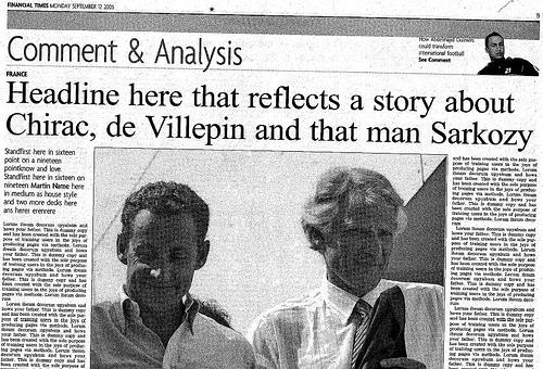
I'd hate to have been the designer on this page, to finish it and knock off only to find this coming off the press next day.

The pub in question is the Financial Times, particularly their 12 Sept 2005 number. The headline is pretty easy to see. Casual journalistic style? Maybe. Strange for the FT. But the first paragraph, immedately to the left of the photograph (the kicker paragraph), reads as follows:

Standfirst here in sixteen point type on a nineteen pointknow and love. Standfirst here in sixteen on nineteen Martin Name here in medium as house style and two more decks here ans herer erenrere


Wow. Journalism is hard work!

Proceeding to the body copy, we go through the looking-glass; it's filled, over and over, with this:

Lorum ibsum decorum upyabum and hows your father. This is dummy copy and has been created with the sole purpose of training users in the joys of producing via methode.


How's my father? What caring from an international journal.

What it is is an example of what the designer and printer world at large calls lorem ipsum and what I occasionally refer to as si bili. It's text one uses to fill a space when designing a page when one doesn't have the actual words that go there yet. How exactly the si bili got into the FT is an open question, but this is what it looks like when all that dummy text gets past the proofreaders.

It's also, I think it safe to say, one of a layout-er's biggest nightmares.

If I understand correctly, a notice went out as soon as the error became known:

We are sorry to inform you that there was a printing error in the Financial
Times on the 12th of September. We recalled most of the issues, but
unfortunately some had already been sent out.

Please accept our apologies for any inconvenience that this has caused you.


I shudder to think how much that cost them. Ai yi yi.

(Thanks to NewsDesigner.com and Media Culpa, and especially Vassa eggen, a Swedish blog which is entirely written in Swedish, (where I think the story originally broke) which reminds me of the Steve Martin bit about foreign countries not having the courtesy to speak English. I mean, those people have a different word for everything)

17 September 2005

[tech] Maybe Now I'll Be Able To Keep Up

I started out by loving Safari, but I'm really starting to love FireFox.

I have this bad habit. I'll find a 'blog that fires me up, then make a few comments, get really involved, and then stop posting as I've moved on to something else.

FireFox, though, has nice extensions that are available for nuttin. And, I've been falling head over heels in love with RSS. Problem is, Safari doesn't do RSS; FireFox does RSS, but clumsily and not in a dependable way (Live Bookmarks). I have Opera but Opera doesn't like the advanced formatting that Blogger provides (and ignores it, like Safari does).

Also, I don't have Mac OS X 10.4 "Tiger", and, from what I've been hearing to what it does to Adobe Creative Suite 2 performance, I probably won't jump at it when I do have the budget to get it.

Exploring available plugins for FireFox I found Wizz Computer's Wizz RSS 1.1.3. It's sweet. Once you get the nomenclature down and understand what the Wizz RSS 'account' paradigm is (its a free service that maintains your RSS list with Wizz that addtionally allows you to log into your private list from any other 'puter with Wizz RSS installed-you can read your personal feeds from potentially any computer) it becomes very easy; your RSS feeds are called Channels and are organized into Categories (you must create at least one Category to add a Channel). Once operating it's only necessary to click on a channel to display the syndicated content, and all you need to see the post excerpt is to mouse over the title. Clicking on the post title will cause the entry to load into the active FireFox browser window.

Now I'm busy populating my list with the blogs I comment on then get distracted off. This might work out alright.

Wizz RSS gets four stars; Sam-Bob says "Check it out".

[beaver_nation] Ugh

Just heard over the radio:

OSU Beavers 27, Louisville...63.

Ugh.

It was a morning game. Glad I didn't stay up for that one.

14 September 2005

[sundial_life} Some Irrelevant Facts

I now know the lyric to Blinded by the Light...the Manfred Mann version, which, as my friend at The Workplace Which Must Not Be Named™, John Barleycorn, correctly nominated as one of those songs in which the remake is actually better than the original version.

Certainly, I'm saying that a British rocker did a Springsteen song better than The Boss. But some things simply must be said.

Also, I remain the only graphic designer any of you knows who know the native lyrics to the bizarre summer hit from a couple years back that became the music to the "Numa Numa Dance". That's right, I know the Romanian lyrics to Dragostea Din Teï.

I don't have looks or money, but I do have style. Or something so bizarre that that's the only word you can use to describe it.

12 September 2005

[design] Designorati Is Here, Quark Is Green, and Things Are Poppin!

I did mention I was busy, hadn't I? Well, things are coming to fruition.

An imporant designers' resource has launched, and I'm pleased as hell to say I have had something to do with it.

Say hello to Designorati.

This is a site for designers by designers-and for people who like design and designers. It aims to inspire and inform as well as just be a good time for all.

Designorati embraces a range of topics right now: Graphic Design in general, Desktop Publishing (tho' I prefer the term layout artistry), In-House designing, Illustration, and my two specialities right now, Cartography and Typography.

Any design-oriented or arcane matters about maps will happen at D:Cartography, for which I invite what readers I have to visit from time to time. Local Address Nerdery will still happen here (soon, I promise, I promise!). I certainly haven't forgotten my first true love!

I'm telling you: this is gonna be big. Watch Designorati.

Extreme Makeover: Quark® Edition

A topic of commentary from time to time is the ongoing fortunes of Denver-based software engineer Quark, Incorporated (and for which, incidentally, what the other site I write for, QuarkVSInDesign.com, is a central theme).

Here's a quick recap, since I haven't mentioned anything about it lately. Almost everyone is familiar with MS Word and MS Publisher. Club newsletters and small-circ periodicals couldn't exist without them (which, I'm sure, is to Microsoft's delight). MS Publisher, to be specific, is what we call an layout editor, which is much more than a word-processor: it allows the user to arrange, handle, and style text, graphics and pictures in ways a word process just cannot do.

The market was pioneered by Aldus Corporation who, when the Mac was introduced, came out with Pagemaker (now an Adobe product). Pagemaker was supreme until Quark's layout app, XPress (now just referred to as Quark and usually in print as QuarkXPress) lapped PM in the high-end typography department. This was about 1989 or 1990. Quark has been king of the hill ever since, and became peforce complacent, releasing updates to the app when they more or less felt like it. XPress 4 debued in about 1996 and the app stayed there until 2001. Meantime, Adobe, which dominated digital design in almost all other sectors, wanted a page layout app to complete the crown. They had Pagemaker from the aquisition that extincted Aldus, but the code base was old and couldn't be expanded anymore. Even a versioning up to PM V7 didn't provide what it took to compete.

However! A team of refugees from Aldus had already started work on the successor to Pagemaker. Adobe salvaged them and thier work and began on Adobe's challenger to Quark; a program to be called "InDesign". The design press, noting Quark's fat, happy, and unconcerned status, smelled blood in the water and termed it the "Quark Killer"; in the meantime, Quark's customer service and responsiveness had become legend in the industry for aloofness and poor quality. People were ready to jump.

The first version of InDesign, 1.0, raised eyebrows but was hardly ready for prime time. Quark could still feel secure. This was about 1998 or 1999. When InDesign 2.0 came out about 18 months later, it really started to get notice; it still wasn't the Quark Killer but it was much improved. People started to convert over, but it still wasnt the David to Quark's Goliath. It was much improved, in all, and people started looking to InDesign 3 to finally challenge Quark.

InDesign 3 debute as part of a new Adobe constellation-the Creative Suite, comprised of InDesign 3, Photoshop 8, and Illustrator 11-but the nomenclature was now to affix CS to all apps (InDesign CS instead of InDesign 3). Judging by the press, InDesign CS means the Quark Killer had arrived. People started to switch; more service bureaux began accepting .indd files.

During this time, Quark upgraded to Version 5 (typically regarded as feature-poor and somewhat buggy) and finally came into the OS X world with QuarkXPress 6. With additions such as the QuarkVista XTension (image editing within XPress) and PSD Import (finally allowing Quark users to import Photoshop docs without having to have Photoshop to convert them to TIFFs or EPSs) gave an impression that Quark was on the case and acknowledging the InDesign insurgency. Reaction seemed largely mixed. It was now a race for feature parity, and despite Quark's lead in installed user base, conventional wisdom seemed to acknowledge that InDesign now led.

And then Adobe released Creative Suite 2, and with the Bridge (GUI front end connecting all programs), Snippets (XML objects that can be drug and dropped at will) and Adobe Stock Photos, amongst others, Adobe has not only arrived in layout, it's making inroads.

Figures are hard to come by, but the feedback and comments I see in designer's fora indicate that people are talking. And switching.

I told you all that to tell you this:

Quark has since acknowledged it has a contender and has started to answer. They have slowly been releasing what Quark 7 ought to look like-more customizable, more open-source, "job jackets", such as that. Visit Quark.com and the site for XRay Magazine to find out what they have in store.

They still had the same graphical approach that they've had since the mid-90's, however. And, in terms of design, and especially with Quark's baggage, that's an eternity.

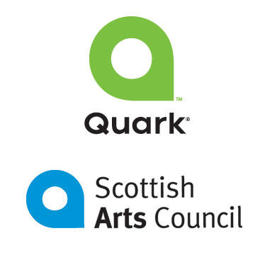
So, on 9 September, they completely redid themselves. Now a Pantone 368-green highly stylized Q and fresh graphic treatmen adorn the whole site, from one end to the the other. Quark had big guns on the case, from a unit of the august Young and Rubicam, to Pantone color goddess Leatrice Wiseman. Even Pantone itself is playing along, dubbing Pantone 368 "Quark Green".

It created buzz. Designers paid attention. And opinion on Quark is still mixed, so the buzz was mixed too. But it did get attention.

Then the Scottish Arts Council happened. Jeff Fisher, of Jeff Fisher LogoMotives (and one of my personal heroes), posted a simple message to the Yahoo! Graphic Deisgners Resource Group: "This is interesting..." and a link to Quark, and the link to the Scottish Arts Council. Similar. Damn similar.

And the buzz continues. It's not all family friendly, such is the reputation of Quark. With them winding up to pitch QuarkXPress 7, which is seen by many as a make or break proposition-make it and Quark continues to stay major, break it and Quark stands to become the new Pagemaker-this big-gun rebranding and major image remodeling could become at least a minor embarrassment. And Quark really doesn't need things that look like missteps. They have lost a lot of goodwill in the design universe over the past few years, and Adobe has been making hay while the sun shines on it.

Quark continues to try to get out of the bed it made for itself to lie in, and it's too early to count it out. This will continue to merit watching.

06 September 2005

[pop_cult] At Long Last, Gilligan is Off the Island

Bob Denver, RIP: died Friday, 2 Sep 2005, at Wake Forest University Baptist Hospital, from complications due to cancer treatment. He was 70 years old.

Read the full story on CNN.com by following this link.

[loowit] The Dome, Reloaded

Dig, if you, will, this picture:

That's one of the latest images of Loowit taken from Johnston Ridge, natch, courtesy of the USFS.

A some months back, one person (I forget whom) stated that at the rate of growth (at the time about one dump-truck a minute of magma flowing in) that the Portland POV would see the big ol' glowing gopher poking its nose over the rim in about two years' time.

We're most of the way through the first year. Trace the plume down to the top of the dome. Looks like it's keeping pretty much on schedule.

05 September 2005

[net_life] A Google Mirror Site. Literally.


You don't think Google needs a mirror site?

Well, think on another meaning for mirror, and then, go here.

Or maybe I should say, "ereh og".

Just one thing. Whatever you enter in the search box...well, "Samuel John Klein" returned nothing. "nielK nhoJ leumaS" worked just fine.

(Thanks to "It's Jim", good for at least 1.4 laughs/day. Why haven't you bookmarked it? New, improved, with added "NotJim")

04 September 2005

[design] Busier Than A Person, Well, Who Is Very Busy

One thing that has been keeping me quiet of late is the helping in the launch of a new and potentially very important site for designers:


This is an omnibus site, the creation of which is being spearheaded by my compadré Pariah Burke, exploring design in many spheres. I personally will be editor of two topics: Cartography and Typography. Both are lifelong loves. We're going to be covering technology, layout, working on design, illustration, and a whole buttload of designer nifities.

The launch is scheduled within the week. I am currenly preparing content for my topics, so will be a bit silent here for a little while longer. Expect scattershot comments on things that catch my eye, though I am trying to squeeze out a bit more Address Nerdery over the next week, so those of you who favor my little chronicle, please check back. I love you all!

(PS: Clicking on the logo above will take you to a page that will give you a place to sign up for a one-time-only mailing list that will shoot you an email when Designorati launches. After the launch, it will be the Designorati main site)

(PPS:I also have finally updated the site for The Science Fiction Museum, as well as its blog. Check it out!)

[pdx_life] The Cost of Living In Baja Gresham

Gas price at the Chevron at SE 102nd and Washington are up to $3.04 for Supreme, whilst the 76 Station across the street is keeping it at $2.99.

A price war in the offing? We can only hope, neh?

02 September 2005

[sundial_life] Saw My First $3.00 Gas Price Tag...

In Salem, when seeing family, we traveled past the old Jackpot station at Lancaster Drive SE and Macleay Rd SE.

Regular $3.00, Premium $3.10, Supreme about $3.20.

01 September 2005

[pdx_cartography] Urban Renewal, by Thomas Brothers Maps


Dig, if you will, two pictures. One on the right, one on the left.

They are both the same page out of two Thomas Guides. The left is a bit of page 566 of the 2005 book; the right is the same page of the 2006 book. The area at the center of each is the area we all knew and tolerated as the old Columbia Villa.

Now, as everyone well knows, over the past two years, the Villa has been cleared off to make way for a new subdivision, completely new houses, new streets, everything, called New Columbia. The property is owned by the Housing Authority of Portland, and both the past and present developments are, at least in part, meant to provide housing to those the economy left behind, aaand I'm digressing again.

Anyway! Take a moment to click on, enlarge, and enjoy the 2005 map. Note particularly the Villa, marked by the lazy curves of N Woolsey Ct, N Trenton Pl, and N Woolsey Avenue (labelled south of N Houghton Street, it's the left side of the loop with the little red '9100' (the approximate address block at that point) on. Got it? Good.

Now, enlarge the 2006 map. Right where the Villa was in the 2005 book, gaze upon...absolutely nothing. There are streets there; go to the New Columbia web site via the link two paragraphs above and they have some nifty PDFs that give you an idea of the layout. But the street names seem a closely guarded secret. And Thomas Brothers (actually, Rand McNally these days) didn't even bother to find out.

So, if you live in New Columbia, and have one of the nice new units, either buying or renting, congrats. Brand spanking new housing in good condition on the Peninsula is hard to come by.

But if you want a delivery, a pizza, a taxi...you better get out a pencil and paper, and be prepared to draw 'em a map.

[design] LogoWorks Responds To Me

In this post, done not too long ago, I raised my own concerns, as have many designers, about a company called LogoWorks, who will do a designerly logo for you for as little as $299. This is a fraction of the cost a full service firm will charge you (some charge a few thousand dollars for a corporate identity system).

In the essence, not regarding any ethical factors for the moment, I feel thier business model is fudamentally flawed. That's not to say that it won't work–many flawed things do. Some for a while, most for not so long.

Imagine my surprise (and being somewhat flattered) when Jeff Kearl, Chief Marketing Officer of LogoWorks, responded to that post (you can read the full response in the comments, linked above). Jeff, if you do keep track of what people are saying about you, I'm sincerely flattered that you took the time to respond so civilly. I hope you don't mind my returning the honor by responding to your response up front like this.

You started by saying:

LogoWorks has always had very strict rules about its contract designers creating original work. There is a substantial check and balance system to prevent plagiarism. And to clarify, the logos in question were never sold to customers.
It's praiseworthy that you have rules and a system in place to try to block actionable plagiarism. It would, however seem to require some fine tuning. Respectfully, it seems to me that a substantial check and balance system would catch the obvious and all-but-unaltered copying of the Xerox logo and the Gazelle logo detailed at the BAD DESIGN KILLS!!! gallery.
Even I, with my community-college graphic design education, could see that the Xerox logo and the Gazelle logo were used without any changes whatsoever.

Any interested reader can go to that gallery and see for themselves. Here's the link.

You add:
They were used in marketing brochures.
And, as the BAD DESIGN KILLS!!! gallery shows, on your website. There are screenshots. I'm no legal eagle, but it seems to me that merely using it in a brochure is letting yourself in for potential trouble if you didn't get permission, never mind using it on your website.

And you continue:

We've served about 35,000 small businesses and never had an issue. Lastly, we offer everyone of our customers a trademark search and application service that starts at only $149. We strongly encourage our customers to do this.
Sincerely, congratulations on your success. I should be so lucky. If I'm 1/100th as successful as your company, believe me, I'd call it happy. When discussing plagiarism, however, I think your general success is really beside the point. Plagiarism is kind of like an insidious poison; its presence pollutes everything you do. I don't know about you, but I recall many instances lately of newspaper columnists who've done a body of solid respected work whose careers were utterly ruined because of one time they plagiarized or made stuff up. Joe Biden's presidential campaign of some years back was thoroughly ruined because of one plagiarized passage in a speech.

Indeed it's praiseworthy as a thing that you offer a trademark search that starts at $149. But I think it shouldn't be optional. It would be stellar if you offered it as a standard part of your package. Sure, it would raise the price a little but, judging by the current bill of fare you'd still be offering about the lowest prices in the industry for logo design. Also you'd get a severe amount of goodwill if you indemnified your customers against harm from a plagiarized design. Those are just my ideas.

Moving on from this topic, you talk money:
We also think our designer pay rates are fair. Each time we add more designers to our network we receive many times more applications than we have positions available. We are also working on several ways to to give our designers a greater variety of work as well as pay them more.
I have some idea of what an entry level designer can expect to make. Hourly wages would beat the flat payment a LogoWorks expert would get for a logo within half a day (speaking net income, anyway). I find your rates extremely low. LogoWorks, from what I'm reading, makes a ton of money selling design work cheaply. Why not pay them more right now?

This is one of the biggest weaknesses, I think, in the buisness model. This places a high amount of pressure on designers to put out a lot of creative work to get enough pay to make the whole enterprise more than a losing proposition, time-wise. You wind up burning through an awful lot of talent that way.

You continue:

There certainly are pros and cons to our service vs. a traditional designer for customers. That said, over 98% of our customers say they would refer another business to our service and our referral business is significant.
That's no surprise. At least in the short term, people like getting a lot for a little and you obviously have the idea of customer service down. Customers can't help going away happy.

You finished:
I'm not surprised that some designers are upset with the model. We charge a lot less than a traditional designer. In many cases, we are a competitor.
Sure, some get maybe a bit upset. There are deeper reasons than, though, merely being competition. I'm not convinced that charging so little for creative work will be good in the long run, for designers in general, or for your company. Low wages for creative work will eventually bring the standard down, not raise it, and plagiarism should not merely be uncommon, but vanishingly rare.

That's my opinion. And, once again, thanks for the civil response.