24 June 2014

[liff_in_OR] Newberg's Classic Dairy Queen Sign

3119.
Newberg is the first town you get into after leaving the Portland Metroplex going south on Oregon State Hwy 99W. It's the vanguard of wine country, the sentinel admitting you to that charming area known as Yamhill County.

At the entrance to the center of town, the highway splits into a couplet made up of First Street and Hancock, and this continues for about ten or twelve city blocks. At the west end, the two streets snap back together, cross the railroad tracks, and head on southwest to the land of the eternal traffic jam, Dundee. And, if you didn't look quickly, you'll have missed it.


404 West First Street. It's a DQ that looks quite a bit like just about every other DQ you're likely to see; cream-colored walls, red mansard roof.  But there's something that might catch the eye a little more than other things, especially if you have an eye for the classics.

Some ten-fifteen years back, the DQ wasn't the commodious sit-in place it was, it was a traditional drive-up. Anyone familiar with the adorbs little DQ drive-up and sit-out at SE 56th and Division here in Portland will be able to picture this. It was quite a bit the same. Well, about ten or fifteen years back, the Newberg DQ decided to give its patrons the inside-dining experience. I was sad, a little. It's nice to sit inside with your burger, but the old-fashioned burger driveups have a charm that can't be denied or resisted.

But they kept the old sign. Standing fifteen or twenty feet up, on a stout pole that shows a bit of rust, the stylized ice-cream cone keeps happy watch on the western entry to Newberg, taking in the equipment rental place, a Dutch Bros, a trailer court across the way, and a 100% Hispanic tire-seller across the street.


Whether or not you'd ever live in Newberg, there's a definite American-small-townness that recalls the rosy memories of prim little farming towns. The past wasn't perfect, but certain facets were adorable.

In Newberg, some of it can be found under the sign of DQ. Roadside neon, the way it used to be … and still is.

23 June 2014

[liff] The Scrub Jays Of McMinnville

3118.
There is a bit of property down in McMinnville that we are obliged to maintain, for reasons which are not germane to the following discussion. Suffice to say that we have to do a couple of very hard jobs down that way at least once a year. Money is expended, Gatorade is consumed. It's typically hot work, though this iteration, while it happened on the official first day of summer, happened during weather that was fine yet temperate – occasional clouds, some overcast holding off the heat of the day 'til the mid-afternoon. Best for landscaping a tough job.

Over the past several years, we've had bird visitation. Typically after the long grass gets cut down and before the creatures who exist on the dirt surface had a chance to get underground, the jays came.

California Scrub Jays, they call them. Here's a handsome fellow scouting the just-cut grass for nommage:


We've noticed that they happen each time. It's not a visit unless we see some jays, really. They're like friends, in a way. This time, we had a few moments to look and observe … and we saw some family behavior there that was quite delightful.


A couple of jays were visible at most times in the sweetgum maple that exists at the front of the property. At first we thought it was simply a mom and dad bird protecting the nest.


But it became evident when we saw the fluffy down on some bird butts that what we probably had was at least two adolescent fledgelings taking some first flights. There was at least one adult that seemed to be keeping tabs on the kids, who perched on the wires and yelled at us to get out of their yard.

I always wondered about birds and wires. They take to them so naturally. I always thought that birds like this had a cosmology, and just as some of us monkeys think that since the Universe made us possible that the Universe evolved for us, I figured birds knew that us humans existed so that wires would develop for their perching.


But we figure we have occupants on the place that take care of it for us, at least, in that birdy way. 

[pdx] Photos On Sunday: SE 122nd And Division - Distressed Neighborhood Central

3117.
They call my area of town 'distressed'.

It sounds like a sort of concern, and I'm sure it's well-intentioned. I'm wiling to give it that much of the benefit of the doubt. I'm a pretty big fool, however, I'm not that big of a fool, and I've noticed that the dubbing of a Portland neighborhood as being distressed is usually something of a prelude to it being shined and polished up and made 'livable', but, somehow, not affordable to the people that, at one time, had been the heart and soul of the neighborhood.

So, 122nd and Division - heart of an area evolving the name Midway, called by some of us Democrats Bedrock, and thought of by many Portlanders west of 82nd Avenue as Gresham, is 'distressed'.

There is 'concern'. And, while it's true that the area east of I-205 tends to get less of the public weal than the more fashionable areas of town, it seems when the attention is finally paid, it always seems to end in tears for the people who have always been out here. We do notice, with some satisfaction, that the densities called for in the 1996 Outer Southeast Community plan are being toned down a bit, with an eye toward leaving the single-family-home character of areas around SE 122nd Avenue and SE 136th Avenue alone, though the damage has already been done along SE 136th, which is having to grow up fast in the wake of the death of Morgan Maynard-Cook last February.

Look at all that distress
Areas like Powellhurst-Gilbert, Hazelwood, and Mill Park are studies in contrasts.  Highly-travelled neighborhood collectors with the uncurbed character of country roads serve thickly-populated residential areas. Intersections have beautifully-designed corners with modern curb-cuts that lead to no sidewalks at all. Infill housing sets cheek-by-jowl with homes that have existed for 40 or 50 years, if not more, all laced through by thronging boulevards such as SE Divsion Street and SE Stark Street, lined with businesses ranging from the swanky to the shabby. But, mere blocks off any of these arterials, and it's as quiet and prim as any upscale westside back street.


It is also very diverse in my area of town. Several businesses catering to the Latino population operate near SE Stark and 122nd and SE Market and 122nd. The tienda next to the 7-Eleven at 122nd and Market is a glory to visit, and if you want pan dulce, my friend, this is your place. The Mingala Halal market in the shopping center at Division has every packaged noodle soup you could ever want (and some you'd not be entirely sure about but you just have to try, to say you've done it).

I see people who dress differently than me and speak differently than me and I'm in love with this. This is Oregon; if I wanted to be surrounded by white people and never challenged by a single thing, it's not hard to go to a place to find People Like Me. But who needs that? Besides, our travel budget rarely supports a jaunt outside the city limits these days. Home is like travelling around the world without having to leave my back yard.


The skies are just as blue out here, the trees, just as green. Maybe they're using some definition of the word distressed that makes sense to someone who sees a ton of money to be made amongst the aging apartment complexes, scattered vacant lots, and wide pounded boulevards of Outer East Portlandia.


Oh, I don't refuse to see that this area of town has its problems, and a misguided city planning policy 
has exacerbated them to a degree. But where some fret, I find a certain sort of ragged beauty. Sure, a few places could use a bit of spruce. But to be condescending in concern is to continue to treat this area as Portland's red-headed stepkid, which has been the problem all along.

This area is just as much Portland as the fashionable parts are.

This is the idea that Those Who Wish To Reinvent Us must proceed from. No Portland City Commissioner comes from anywhere east of César E Chávez Blvd, and sometimes, though I like most of them very much, boy, does it show sometimes.

Yes, it's another snap of Mt Hood as seen through telephone
poles. Deal, people, deal.


19 June 2014

[#liff] Meanwhile, In The Triffid Patch, a/k/a Our Back Yard

3116.
Got plants? We do. Our back yard is a little cultured and a little wild; thanks to an off-hand remark The Wife™made last night, I now call it the Triffid Patch.

It's appropriate.


We're ah, casual gardeners. We have a few vegetable plants in containers, the yard is kinda overrun with dandelions, and in the decade-plus we've lived here, we've had roses.

In as much as the container plants go, I'm working my way up. First two tomato plants and a green bell pepper. Then two tomato plants and 2 peppers - the green bell and a jalapeño. This year, three tomatoes, a green pepper, and a Yummy mix sweet pepper plant.

The jalapeños didn't fare so well. And one of the pepper plants got savaged in the night by … something. We know not what, nor are we sure we wish to. Chupacabra? Zanti misifits? Republicans? I don't know. We'll let the night maintain its secrets. We shall not, as they say, go there.

The roses were a bequest from the previous owners, who apparently cultivated them for show. We were nowhere near that hep on it, and had intended to have them taken out and rehomed at people so inclined to keep them. We still may. But for now, we've watched them go through some interesting evolution. It would seem that grafts have been placed onto other rosebush stocks; they would exhibit some different blossoms, but that seems to be breeding out as time goes on.


The blossoms that have survived have been quirky and beautiful, in a wild way. Deep rich color, as in the above … or attenuated, delicate shadings, as this one below.


A couple of bushes along the north fence, however, have this deep, deep, deep, red color. The eye looks upon this ultra saturated thing, and thinks velvet. That must feel like velvet if touched. 


As it is, the eye cannot look at it without the vibrant red pushing some of the eye's own receptors into near-overload. I can almost sense it as a palpable physical sensation myself.


It's a bit like frozen flame.

18 June 2014

[#art] All Over Coffee with Paul Madonna

3115.
Add this man to the list of artists without which I cannot do.

Paul Madonna is a SF-based artist who does one of the most singular comics out there. All Over Coffee is a impressionistic masterpiece, with moody, visually-delicious drawings of San Francisco street scenes with bits of text strewn within. The text itself is, at best, tangentially referential to the picture; the text seems to provide a sound track to what is happening within the picture, kinda. 


It's very subjective. You can imagine the text as someone thinking to themselves about something that something in the picture referenced; a snatch of a distant conversation heard by the person at the POV; or just text living in the picture.

It's the perfect blend of word and picture, forming a poetry and music of its own. Sometimes the words live within the picture, forming a grim, yet funny existential punchline.

Ultimately what a person sees within an All Over Coffee strip is what they find there; you will probably see what you bring to the experience. And, to be sure, the idea of putting only-vaguely-sequitur words with images is hardly something new or unusual. The way Madonna does it, though, is unique … though it defies embodiment in something as surly as mere words, it certainly is there. There's something approaching vulnerability there, the artist's vulnerability, his love of his hometown, and the pure liberating passion of drawing that make the series absolutely beguiling, and once seen, never to be forgotten.

I've lusted for Madonna's  first eponymously-named collection for quite some time, drawn in by the beguilement that cannot be quite expressed in print. Some weeks ago, I found a copy at Powell's, only to be disappointed that someone had razored-out a single page. Bad human! but at our last visit, last Sunday evening, there was a copy, at a price.

All Over Coffee is now mine to leaf through whenever I want. They have a copy at +Multnomah County Library, and I encourage any of you all to check it out when you can. There's a second volume of AOC collected, Everything Is Its Own Reward, which I shall lust over perforce.


17 June 2014

[#logo] The Vincent Price Legacy Logo - Best Thing I've Seen Today

3114.
Or maybe I'm in a macabre mood, maybe that's it.

To anyone with a horror-movie bent (or maybe hunch-back, if you prefer), Vincent Price is an icon amongst icons. I remember growing up during the latter half of his career, just after he'd made is greats and was doing more television work than film. Funny thing about Vincent, though … he could star in the most throwaway piece of TV tripe but just having him there made the whole thing watchable. He was rocking the idea of being an past-one's-peak actor long before William Shatner even started to make it fashionable.

He did it by being a compleat personality. There was Vincent the aesthete, Vincent the intellectual, Vincent the style maven, and - most notably - Victor the gourmet cook and author, doing his small and stylish part to make the world safe for the modern foodie.

It's a bit unfair, though not inappropriate, to think of him as merely a horror film icon.

Toward the latter period of his life, he lent his considerable mind toward art. There is a museum of art and his legacy that exist in his name. The Vincent Price Legacy, http://vincentprice.com, is where you connect to all that awesomeness. But what's got me enthused today is that I stumbled on this pitch-perfect logo, which encapsulates all the sophistication, charm, wit, and style of the great man:


This is the first  time I've seen it and it is sooooo perfect.  Understated and urbane …

What I usually say?

Wish I'd of thought of it.

[#design] The Official "Portland In 2016" Westercon Bid Ad

3113.
I'm kind of the junior partner in this arrangement, but I'm thrilled just to be along for the ride. Far too infrequently do I get to look at awesome up close.

What you see, here, is the official ad for the "Portland in 2016" bid effort to land Westercon 69 for the Rose City, which will appear in the program book for at Westercon 67:


Quite the thing, neh? And I get to say that I contributed.

A precis:

The design suprema here is Meredith Cook. She has the sharpest design mind I've come across lately and I've found her incredibly inspiring. She's guided the the design effort so far and planted the seed (and did the hard beginning work) that grew into the goodness that is, and is sure to come. The general artistic appearance of that logo comes from her. I contributed a few ideas that serve to give it a little more character; it may or may not be what it is because of the bits I suggested, but it wouldn't have been at all if it weren't for her.

The base photo, that of that night-time Portland skyline, is my own work (as I detailed here). By making the bid effort logo circular, Meredith's design has enabled it to be used in the cleverest way …  the moon-over-town, lighting and illuminating a sky full of things that we love about Portland, and that sell Portland as the place for the envisioned Westercon 69. the whole effect is pure visual poetry to me, because as a place for fandom, Portland needs not too much more selling (at least in my personal, fairly smug opinion).

Westercon 67 is taking place in Salt Lake City this next month. That is where the vote will happen; anyone who wants to support our effort is welcome to do so (there's even a Pre-opposing contribution option, for those sufficiently perverse).

Portland in 2016 has Facebook and Twitter presences for those of you so inclined:

So, go support. Who knows … you might win a date with a unicorn!*

*Maybe, I guess. I don't know from who, but anything's possible … if you believe!

14 June 2014

[#art] A Change of Carrier

3112.
I've decided to join the messenger-bag generation.

It's cool. I'm usually a few years late to just about any party, anyway.

If you don't know if I'm hangin' around or not, you can usually tell that I'm here if you see my backpack. It's a habit I picked up never-you-mind how many years ago and I've probably kept too long, but in an unfriendly world that don't love you back no matter how hard you love it, you have to have your security blanket.

We all do, I think. I fancy I'm just a bit more honest about it than some. Then, I care less and less what anyone thinks about what I do as I move through this part of my life; I'll do what I can to cope.

My backpack has been part of my identity for a long time. It holds a lot of things that are important to me that I want to keep near; the sketchbook I'm not drawing in; the book on creativity I'm not reading or using, the art supplies I'm apparently hoarding up against the apocalypse. But backpacks encourage a sort-of hermit crabbish-ness, in which I carry my notional studio on my back. As long as my right shoulder isn't killing me (how I've avoided tendonitis all these years, I can't tell you) I figure I can carry anything. Or everything.

Whether or not I can kickstart my own engine, a touch of parsimony is called for, I think. Will it improve my creativity at all if I don't figure I have everything I need and inspiration will spontaneously combust from inside the recesses of the thing?

I don't know.  Anything's worth trying once.

I also have a taijtu (see illo) patch that will simply look stunning on the flap.

And so it goes.

13 June 2014

[#design] 600-Or-So Portland-in-2016 Bookmarks For Westercon 67

3111.
The Wife™ had a little busytime project.

You see, we're involved on the edge of a little group that's trying to bring Westercon 69, in 2016, two years hence, to Portland. The bid will be voted on at Westercon 67, being held this next month in Salt Lake City, and we have been promoting.

And, by we, I mean a rather divers group of passionate individuals doing what they can, when they can, and making it count. The sun our planets revolve around is the inimitable Lea Rush; entropy fears her, scattered card decks stack themselves at her mere approach. I am essentially a graphic design support grunt at this point, and provide support to Meredith Cook when and as she needs it. The Wife™, she handles the office we've called "Mailroom".

In case you ever needed to know
what more than 600 bookmarks
looked like, here you go.
How to Support
the Bid
(click to embiggen)
At this point, it is as such: a call came a day or so ago from Lea wondering how many bookmarks were left. We had started a stock of 5000; less than 2500 are left (we may have a handful or two left over before this is done, and this is no sin … we own lots of books which require marking), and the mission; send 600-or-so of them to Westercon 67's ComCon. Mailroom snaps into action: The Wife™ counts out the required number, packages them up, and gets them ready to go.

They're in a box, right now, ready to be shipped. Inspired by the example of those around us, the proper amount of energy is leveraged for the maximum effect. USPS Media Rate is our faithful friend, and Westercon 67 will have the bookmarks.

Which are sweet, by the way. Featuring the logo designed by Meredith with assistance by myself, they feature a picture of a night-time Portland skyline snapped by the ViviCam 3705, the Plastic Fantastic, back in 2009. 'Tis a picture I'm most proud of, and I'm equally proud that it may help, in a small way, win a very significant moment in time for the fandom of the Rose City. This is the bookmark:


Like I said, sweet! The night-time scene has a little bit of Tron and Matrix-y stuff going on there. Great mood setting. The round patch is the offiical Portland In 2016 logo, done by Meredith with help from myself. This is the photo it was based on:


 And that was in January, 2009. Photos are forever …


And they make, I'll say again, sweet bookmarks.

Presupport is still available. Clicky to embiggen the back of the bookmark, on the left above (there's even a QR code for your enjoyment) for terms, or go to http://portlandin2016.org to find out more.

Yeah. This is something that should happen. 

09 June 2014

[#pdx] Photos on Sunday: Mr Plywood and Mount Hood From Downtown Montavilla

3110.
Not too many photos on this edition of Photos on Sunday, because we had a real day of downtime. And, noting the way I feel right now, it was needed. 
But that's as may be. Today, The Wife™ needed a bit of board for a little thing she was trying to do to organize the closet, so we do what we usually do in these cases: we went to Mr. Plywood, in downtown Montavilla, at 76th and SE Stark. It's been in Portland a long, long time … I don't know what year it was founded in, but I remember the dryly-narrated commercials that Mike Falconer used to do back in the 70s. Since there are fewer and fewer of the good old local retailers that exist around here that did when I was a kid, we put a high importance on patronizing them. We do, after all, want to help them stay in business for as long as they can.

Mr Plywood's store is hard to miss. 7609 SE Stark Street, that's on Stark Street, on the north side, filling the whole block between 76th and 77th. You won't miss it, if only because it's big sign, made of the mascot, draws your attention.

Inside, it's your local lumber store … with an accent on the finished plywood sort of thing. Because, name.

Me and The Wife™ love it because the prices are good, the service is knowledgable, and if you stop in as a regular, they treat you like a friend. The Wife™ loves the access to materials. I love the free popcorn.

I've gone on in other venues about free popcorn at hardware and building supply stores. To this day, wife says I need some dowling or a cedar board, and my mouth starts watering.

The store's in two main sections; the upper part, where the cashier is, the aisles with building and wooodworking supplies, and the finished plywood. Rougher stuff is in the other half of the building, which is reached through the large door with these delightful signs over:


They love DIYers and I love those signs. And observing the proceedings in the upper room is the store's eponymous mascot … "Mr" Plywood.


In all his precise geometrical glory, he beams warmly to all who patronize.


But there something about him … those eyes …


Do you see they way they look? The way they seem to follow you across the room? The way they look not only at you … but into you? (cue theremin at this point. You may not want to, but you have to)


They bore into you in searing honesty … they are the abyss of building materials, and as you look into them, THEY LOOK INTO YOU!!!!! AAAAAAAUGH!!!!!!

Okay, now that I've turned a perfectly charming store logo into something you're afraid will meet you on the other side and chase you after death, let's move on! Mr Plywood is located in what I think of as 'downtown Montavilla'. Montavilla is the neighborhood on the east side of Mount Tabor from the rest of Portland, and begins pretty much at the toe of the mountain. It's main east-west axis is the one-way couplet of SE Stark and Washington Streets, from 76th to 82nd Avenues, where there are a flock of shops, a really nifty coffeehouse called the Bipartisan Cafe, and the best movie theatre on earth … The Academy.

For those who know me well, I'm about to go into another couple of photos where I further if possible, fetishize Mount Hood. I am what I am.

The mountain is visible from downtown Montavilla, and the best view is from the upper end, near SE 76th, in front of the Mr Plywood store. Taking the lessons in creating telephoto-style pictures a couple of missives ago, it quickly occurred to me that this was a chance to juxtapose the distant mountain with the human habiliment in the foreground. I remember seeing similar pictures taken of Mount Rainier from the Seattle suburbs when I was a kid, and they really had impact … impressions of them stayed with me to this day, and are playing across my mind as I write this. Here's what I came up with, and the result really pleases my aesthetic sense.


The real coup, I think, is the tall facade to The Academy, even though it blocks the view of a shoulder of the mountain, its intrusion into the scene makes it kind of a valuable statement. The above is cropping a zoomed-in photo, and this …


… is at a few levels of digital zoom, which I'm finding, the Canon S-100 handles with deftness.

And it's Mount Hood, Wy'east, which is its own justification.

07 June 2014

[photo] Have You Seen This Bee? BECAUSE SHE'S AWESOME!!!

3109.
Earlier today we were at Tony's Garden Supply. This is a wonderful nursery near SE 104th and Holgate Boulevard and is the kind of hometown garden center I remember growing up … locally owned, very very friendly and very very knowledgeable.

We got a Yummy Mix pepper plant, a petunia (the really pretty kind with the dark, dark blue, almost indigo stripes), a big pot to do some transplanting in, and got some advice on how to save The Wife™'s Italian flat-leaved parsley plants. Free protips; you can't do better!

But it's a riot of color, and plants wontonly dripping with pollen, and where there's pollen … we kind of hope these days, from what we've heard, it's kind of grim for them … there's bees. And I hated bees as a kid, because stingy-stingy-owie-owie, but I'm an adult and I have maybe a better understanding of bee boundaries. And I saw honey bees and bumble bees, and since I read maybe a little too much news I fret over the fact that there aren't so many bees now. But they were chillaxin', lazily-but-efficiently picking up pollen from the flowering plants at the front gate.

I'd been wanting to pict a bee for an awful long time. They are fascinating creatures. So I pointed and shot and hoped, and reviewed the photos, and look at this, will you!


Not only did I get a fabulously clear picture of afore-intimated apian, I so lucked that I caught the wings, momentarily, at rest. And, I'm a leg man … and check out them shanks, yo, just brimming with pollen.

I am proud of this picture. And that is one awesome bee.

[pdx] Telephoto Fun on Portland Streets With The Canon PowerShot S-100

3108.
Telephoto means one thing to me and, being an undisciplined amateur photographer, that's probably not accurate, but the result is an artful compression of distance.

SE 82nd Avenue looking south from SE Schiller Street
I've always adored telephoto shots because they draw a real interesting line between a kind of abstract expression and reality. It's like you're getting this fantasy world mixed with reality, 2-for-1.

SE Holgate Blvd looking west from about SE 105th Avenue

The way the posts and poles lining the street bunch up, the far comes near, forms fascinating shapes and defines entrancing spaces which capture the eye the way Celtic knotwork always does. Your POV goes exploring in interesting spaces that are both fantastic and real.

SE 122nd looking north from SE Morrison Street
The 'telephoto' shots taken by the Canon PowerShot S-100 aren't, strictly speaking, telephoto. Technically speaking, a telephoto lens uses a sequence of lenses called the telephoto group to create a light path that's longer than the physical length of the lenses. But you can come up with a pretty good simulation if you zoom in tight enough with the S-100, sort of what cinematographers would call an in-camera special effect. In its largest format, too, it combines the astoundingly-good optical zoom with a few levels of  digital zoom to get a zoom level of up to 20X. After that, it's a matter of framing and composing, or even cropping, to frame the viewpoint.

I'm finding the paltry knowledge I have about composition is actually going a long, long way. Some sense of composition is becoming key to composing good shots - or, at least, shots I like. The generous viewing screens of modern digital cameras are, of course a big boon, try WYSIWYG.

The levels of digital zoom seem to suffer some acceptable degradation of quality, which is to be expected. As I learnt with the old ViviCam 3705, the faithful Plastic Fantastic, digital zoom is a matter of taking the inside of the photo, blowing it up, and cropping. You get zoom, but the quality can be very bad. On the Canon S-100, though, it's good. I tried a very ad-hoc experiment; the above picture of 122nd is shot at maximum optical zoom and cropped. Left there is the same general view shot with maximum optical and digital zoom. The quality is good enough, to my tyro eye, to use as an effective illustration.

The view southbound down SE 122nd Avenue from the safety island by the Midland Library is maybe a little less expansive but the far away massif of Mount Scott, the layers of traffic signals, the shimmering warmth radiating up from the street and the bunched-up light poles ranging away in to the distance make up for what it lacks, compared to the former shot.

I do like this camera, I do.

SE 122nd Avenue looking south from near
the Midland Branch Library (just south of Morrison Street)

06 June 2014

[#AddressNerd] Fractional Blocks In The Portland Street Blade 2.0 Design

3107.
While cities try to be planned in even chunks, life isn't perfect. The ideal is digital; the reality, analog. Streets oft-times happen where they happen.

A good example of this is the grid layout of Salt Lake City, where the address block is a standard thing and the street can concievably land anywhere in that block. For example, a two standard streets, one the 35th and the next the 36th, would be named 3500 South and 3600 South. A street about 1/3 of the way between 3500 South and 3600 South might be named 3530 South. One eight-tenths of the way could be named 3580 South.

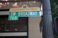
On this plan addresses are childs' play to augur in on. As you travel north or south on any street that would cross these, you just glance right or left to see how the addresses are running. A bit dry, perhaps; an address like 455 West 3530 South is mathematically exciting but literarily dull. But Portland's signage acts just like this. Check this blade fro SW Broadway near PSU that I snapped some time ago. The tab reads 700. SW Broadway is the 7th block west of the river in Downtown. The blade is telling you not that the block down the SW Broadway face is 700, but that you are either entering or leaving the 700 block of whatever cross street you're on. As in SLC, the crossing-street system assumes you don't need to be reminded what street you're on, but you do want to know how far up or down the street you're on without having to crane your neck left or right and hope to see the number as you go past.

If SW Broadway were a street in SLC, it would be South 700 West. 

I frame the concept thusly because it sets the stage for this next picture; the intersection of NE Pacific Street and NE Holladay Court.


The intersection of these two streets do not happen on an even address block point, and the new way of street-blading Portland attempts to address this. As someone who loves precision in such things, I'm kind of over the moon here. A bit of commentary perforce: in raw terms, the intersection of NE Pacific Street and NE Holladay Court is of two streets that are defined as east-west runners. They therefore have very similar blockface numbers. However! One has to remember that when you look at that block index, you're not looking at the the address on the street that is named but the address on the street you're already on that's defined by the point of the crossing street. Thus, NE Pacific Street cuts across NE Holladay Court at approximately 13050 NE Holladay Court; NE Holladay Court intersects NE Pacific Street at the address of 13020 NE Pacific Street.

If that weren't bewildering enough, this blade set might make you cross your eyes:


This is a few hundred feet back, where Holladay Street bends to become Holladay Court. Not exactly an intersection as one might think about it, until one thinks about it: it's an intersection, just one where a street name changes. Each block index reads 13000; this intersection is where the 13000 block begins and ends on either street.

It's a little challenging to get used to if you're a new Portlander; the only other Willamette Valley city I know that does it this way is McMinnville. Eventually, it'll click, and once it does, it'll seem like the most organic and natural thing … as long as you start with the idea that you already know what street you're on, and this tells you what's coming and going as you travel.

And the font? That's Clearview, baby. Looks good to me!

05 June 2014

[#pdx] Photos On Sunday: East Holladay and Earl Boyles Parks

3106.
Parks here in Outer East Portlandia seem a little few and far between. In a city famed for its green spaces and park system, it's proving to be a bit of a struggle to solve. Perhaps it's because someone hasn't yet figured out how a developer can make a ton of money off it, I don't know. Who knows.

The neighborhood trees
muscle up to East Holladay Park
Shutting off the cynicism for a moment, part of it is, you just have to know where to look. West of 82nd Avenue, the parks are brazen hussies; they just throw themselves at you, shamelessly; get out of your car, park it, bub, and enjoy me!!! They're the only part of the empire of Portlandia that isn't some sort of passive-aggressive. There are awesome parks on the Heavy Eastside, they're like gold or water; they're where you find them. This turns the hunt into about equal parts aggravation and treasure quest.

Rose hips, East Holladay Park
This first park, you'll see what I mean. It's called East Holladay Park, and despite its geographically-specific name, it's not just down the road from Holladay Park, near the Lloyd Center, unless, for you, just down the road means a seven-mile trip out the Banfield Freeway and NE Halsey Street. But then, there are some fitness freaks here in Portland …

Oh, me. Anyway. to get to East Holladay Park, you do indeed go out NE Halsey Street into the veldtlands to deep East Portland. Go east on Halsey to NE 128th Avenue, and south on 128th to NE Holladay Street. About 420 feet, give or take, east from 128th, Holladay Street bends and becomes Holladay Court, and that's where the park's entry is. What makes East Holladay hard to locate is that this is its only obvious entry, otherwise it's surrounded by homes on 2 long sides and a PGE substation on the third. Other streets dead-end at the park's edge and provide local entry that way; the only public parking area is the one where NE Holladay St becomes NE Holladay Ct at the 13000 block.


The parking lot (a dated version of which  can be seen in Google Maps Satellite view) is both visually pleasing to look at and a version of the green ways of doing things we try to put into operation here in Portland wherever we can. Instead of a sheet of asphalt, square pavers form a surface smooth enough to drive or walk across while the seams between open into the soil, alleviating the problems inherent in water sheeting across a normal parking lot and simply sloughing off onto the streets and soil surrounding it, taking advantage of the ability of the ground and the vegetation to filter out the nasty bits in the same way that our unfairly-lambasted bioswales do

It's also visually charming, making one feel as though one is walking across a cobbled courtyard. Rather sophisticated, actually.

The area of the park is wide open. This was actually a bit disappointing as we were hoping for a place to spread out with art supplies and diary and play, but there's no picnic tables there. Truth be told, the space is a bit bland, but I can't hold a grudge against all that luminous green. There is a spiffy new, bright, pretty, fun-looking play area, so the area is undoubtedly getting real-world likes from every neighborhood kid.

Fun time at the park: enabled.
The other one is Earl Boyles Park. I suppose we missed it all this time because there's no obvious signs leading to it, and it's similarly ensconced in the neighborhood near SE 112th Avenue between Powell and Holgate the way East Holladay is in its nabe. The best access we were able to find is SE Center Street going east from SE 104th Avenue. On the south, east, and west it's surrounded by houses and trees; there is an access on SE Boise Street. North side of the park is bounded by the properties of Ron Russell Middle School and Earl Boyles Elementary, on SE Bush Street west of 112th Avenue, and while there's ready access from Bush Street the space between the north bound of the park and the street is taken up by Ron Russell's sports field, so the park's presence is perhaps not so obvious from there.


By the time we'd gotten to Earl Boyles Park, the sun was beginning to get rather low in the sky, and the long rays were being played about with by the foliage, leaving the grass and tree boughs even more luminous than the park before. There's a water feature which can be activated somehow, and the kids were playing in it … a high, proud fountain. We were delighted by this. We've seen quite a few Portland parks in which the water feature was either deactivated or a thing of the past.

I feel rather abashed. This is the park we've been looking for; pleasant access, a nice grove of trees, a fountain pad for the warm bodies that summer in Oregon naturally obtains. A place with tables to sit and take in the world, and to watch the sun linger on the horizon, like it tends to do hereabouts.

Earl Boyles Park. Sunset. 2nd of June, 2014.
And we just kind of stumbled on it. Well, the best things, you usually find them that way. Serendipity, they call it. Just what you were looking for … but not when you were looking for it.

That's why life is mysterious, in the good way.