
 Fault Quark, Inc. for many things, but dont fault them for not getting busy when they absolutely have to.
The Winter of the Logo's Discontent
Some months ago, it happened, Quark finally brought to the public a redesign that was long in coming. Discarding the old familiar water lily in favor of a dressed down and modernistic majuscule Q, in Pantone 386 (renamed by Pantone "Quark Green"). It looked like a good move.
In nearly no time at all, though, the digital design community took it apart. Evenutally, rather far from appearing the canny move it was intended to be, it began to look like the biggest self-inflicted PR bruise Quark delivered itself since the Hardworking Clown/Valor Cross Media affair of October 2004.
Like or hate Quark, like or hate XPress, I don't see how any thinking person could have drawn the conclusion that the Quark PR machine was The Gang Who Couldn't Shoot Straight. I'm still scratching my head of the Hardworking Clown.
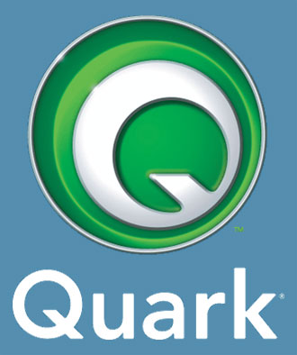
But Quark, no stranger to rising from the ashes, has come back with a new new logo. Welcome to the New Quark V2.0. Instead of an abstract shape (which some tend to confuse with a lowercase "a") we have a new badge which, in its full aspect (shown here) would look just as in place on the bonnet of a luxury car as it would on a software package.
 Personally, I'm a fan of this go. The flat version (just the Pantone 386, no bevelling or lens flare) stands very well on its own and is an apt substitute with what they had before.
Just as with the Novermber 2005 logo, though, Quark has no shortage of ready critcism, but on style points this time. Commentary I've seen on the design cites the use of bevelling as being "amateurish" and the tiny lens flares looking like dropped pixels.
These of course are valid calls; they are indeed weaknesses that I wonder would have gotten past my community college instructors. The redesign is, I think, sound however (maybe they should have just come out with the flat version). It has a lot more going for it than against it, but living as it does in the wake of the rather embarrassing November 2006 identity rollout, it has to live that down just as QuarkXPress 7 has to live down the reputation of a company that claims it's found customer service religion.
You, Too, Can Get A Look at the Future of Quark
Another notable development in the Quarkiverse is the release of QuarkXPress 7 Public Beta 2.
At about the end of February, Quark announced somehing that the digital design community ha been waiting for, it seemed, almost since the beginning of time; the first betas of XPress 7 was not only released, but it was released to the general public. I've played with it and noted my reactions not only here but also on Designorati.
Long story short: I'm pleased with it, but it won't be the InDesign beater than some may hope for. But it will keep XPress in the game; for those who like this sort of thing, it should be just the sort of thing they like.
The first Public Beta was time-bombed; if you still have it on your system, it won't work now. Quark has, however posted the Public Beta 2, and it's a free download, but time-bombed to expire on 1 May. Still, it's a good idea to get your beak into this one if you're and InDesignista and wonder what you'll be missing, A Quarkster wondering if it'll be worth getting excited about, or just someone who wonders what the hell all this electronic layout brouhaha is all about anyway. Anyone with an interest can download the 116MB beta.
You can read about the program and sign up to play at Quark's site here.
No comments:
Post a Comment