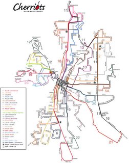
I became insipred to do the same with a couple of more modest arrangements: Salem's Cherriots and Greater Eugene's LTD. In the middle of crafting (in Adobe Illustrator CS2) a duplicate of the extant Cherriots System Map online version, I got a bit sidetracked, however. I may, at a time in the near future, anagram a Cherriots map, but I hit upon something much more fun and mind expanding, at least to me.
Before going on, I'd like to show my work product (at that time) off. I'm rather proud of it. Click at it to look at it bigly;
 It's a 93K low-quality JPEG that is 975px x 1240px. It should blow up to about an A4 sheet in size.
The aim, in my opinion, of a transit map, is quick communication. It ought to tell you, hopefully at a glance, how you need to use the system to get from where you are to where you want to be. This, IMHO, is its highest function.
What follows is a bit of critique. If the original designer is reading these words then please don't take any negative-seeming words personally; I'm designing to what I think a transit map should do and to my own tastes, governed by my lifelong love of the printed map (and a not-insubstational transit map collection from cities nationwide). The following observations are mine, and mine alone.
The Cherriots system map as extant does its basic job adequately, but I find it personally a bit unstatisfying to look at. The route network hangs in limbo connected to nothing and not at all connecting the viewer to the reality of the area it serves. It includes an absolute minimum of information; the only extra information are a star-in-a-circle (for "Major Transit Stop of Hub"), and a small bus-front view graphic identifying Park & Ride lots (none of which feature any information about the Park & Ride lot)
It seems very much probably the the type in the map is Helvetica Neue. Now, everyone's heard of Helvetica, but I'll bet nobody can point out an example. There's a reason for this: back when it was first released into the wild, in the 60's, it was an exemplar of that design outlook called the "Swiss School". Swiss design of the day seemed to focus on the functional, with an emphasis on clean, no-nonsense form. The face Helvetica appeared and took the world by storm; at the time it was a revolution in type design.
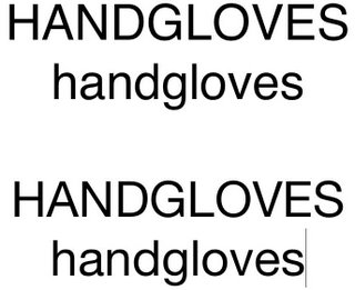
It became so popular, however, that it became ubiquitous, and then overexposed (just like Paris Hilton and Lindsay Lohan). Type carries mood and atmosphere, but when it's all over the place it becomes banal and unremarkable, and the coventional wisdom amongst typographers is that that is just where Helvetica is right now. Subesquently a font called Helvetica Neue was designed which has a little more warmth to it, but the ordinariness of Helvetica still speaks out loud and clear. Check the following illustration:
 (Top, Helvetica regular; bottom, Helvetica Neue regular, as snapshotted from Apple's Text Edit. The fonts used are the ones I had available on my system at this time)
Close–nearly indistinguishably so. Anyway, and to bring my font-prattling to an end, the point isn't that Helvetica is eeeville, not necessarily anyway. There are fonts that just blare out loudly "I used the defaults on this and dove on in", and thanks to Helvetica's overexposure, despite the continued exisence of the need of such fonts, designers tend to shun it. I have no actual dislike of it, but even I sometimes call it Velveetica Overexposed.
Other typographical sins include a sort of disordered feel to the type, as though it's all jostling with the lines for position. The big, horsey route numbers look like they're out to hunt down the street names. Some street names sit awkwardly alongside the lines they identify, as do the line numbers aforementioned.
Now, some may debate me on this point, and I'll respect that, but it just seems a not-altogther fitting calling card for the transit system of Oregon's second-largest city. The more I looked at it the more the maps for Portland and Eugene's systems came up: polished (though I'm still not entirely thrilled at the new TriMet look it is consistent and carried off professionally). I particularly enjoy LTD's elegant map; they get a lot done with only one color.
It was about this time that I fantasized about how I would redesign the Cherriots system map if I were given the job. I started identifying things I would do differently and decided I ought, in this case, walk my talk. I have a version in work right now in Adobe Illustrator CS2, and over the next few weeks or so, I'll post versions of my work to put the process on display.
Design is a process, which in this case somthing line a "Choose your own adventure" book. I love the process, and I love sharing the process.

No comments:
Post a Comment